Обзор лучших ресурсов по разработке бренда, разработке упаковки
contact us | ok@ohmycode.ru
contact us | ok@ohmycode.ru
Established in 1895 in the small England village of Holcombe as J.W. Foster and Sons, Reebok, as it was renamed in 1958 (after “rhebok”, a type of African gazelle) is a “worldwide designer, marketer and distributor of fitness and lifestyle footwear, apparel and equipment.” With headquarters in Boston, MA, and a subsidiary of Adidas since 2005, Reebok has transitioned over the years “from a traditional sports brand to a brand focused on fitness” which means that instead of doing shoes and apparel for specific sports like basketball, soccer, or baseball they do so for more general fitness like functional training, running, combat training, walking, dance, yoga, or aerobics — to wit, they are the official footwear and apparel sponsor for UFC, CrossFit, and Spartan Race. Last week, Reebok re-introduced its “vector” logo and new identity designed in collaboration by their in-house team and New York, NY-based Darrin Crescenzi.
Today, Reebok announced that beginning in 2020, it will unify under one brand logo and wordmark, leveraging its most recognizable and distinguished assets - the Vector logo and “drop-R” wordmark.
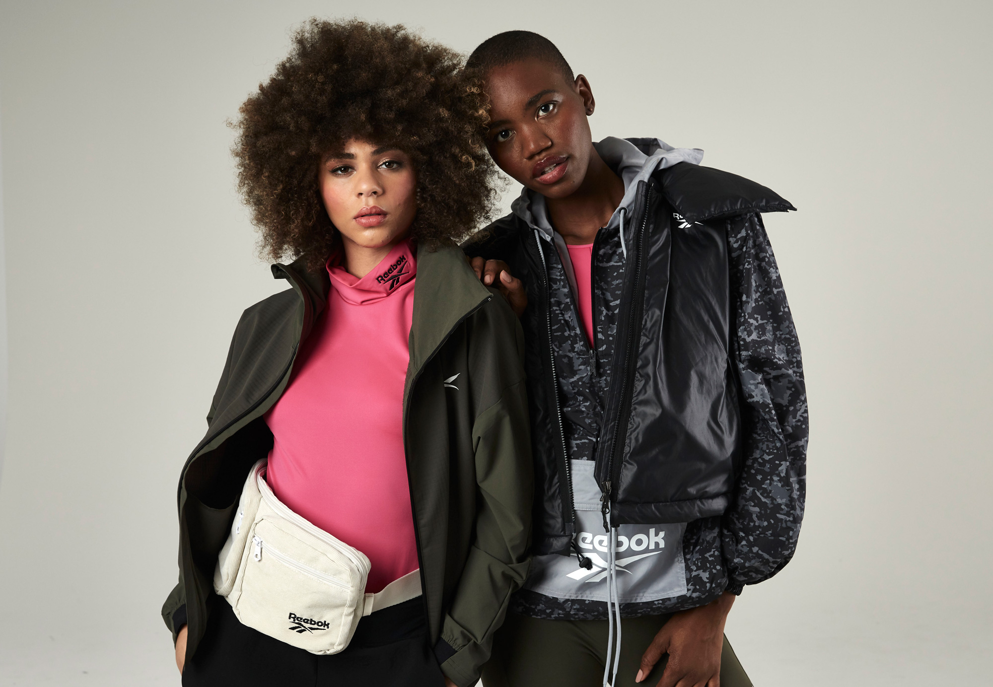
The wordmark and logo will be fully integrated across all Reebok sport and lifestyle products, including footwear and apparel, while an exclusive early release of sport styles featuring the Vector logo will be available this month. This evolution shines a spotlight on Reebok’s proud heritage, connecting its rich legacy to its exciting future.
The Vector logo was first introduced in 1992 and has been used in various forms since, most recently on Reebok heritage and lifestyle products. The new Vector logo is an updated, subtle modern evolution of the original. The Reebok Delta logo, which was first introduced on product in 2011, will continue to be used on select product, including CrossFit and UFC-branded Reebok apparel.
The previous logo was a reflection of the change of Reebok’s focus as the “Delta” icon had started as the identifier for the company’s CrossFit products and evolved into the company logo. Its more “hardcore” look helped signal a new personality for the brand and establish some distance with Nike and even parent brand Adidas. As in my 2014 review of that change, five years later, I still don’t find the Delta icon particularly great but I think it worked well to propel Reebok forward. The old wordmark was fine and had some subtle personality to it but nothing that will be missed.
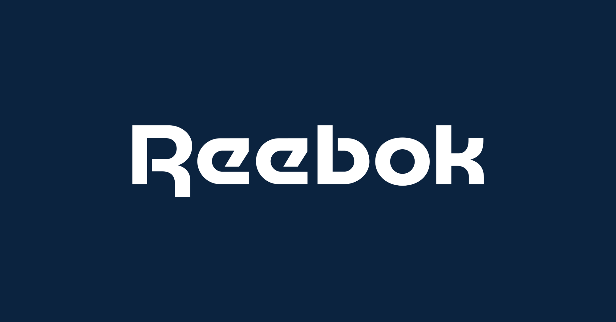
The new logo is a return to the 1990s logo and the closest Reebok has had to an equivalent of Nike’s swoosh or Adidas’ three stripes. The dynamic “Vector” icon has been cleaned up for another go-round and the changes are all improvements, especially making the top and bottom flat for crisper placement and alignment with other elements or simply for being on its own. To me, the most exciting part is the return of the wordmark in one of the most 1980s-tastic fonts of all, Motter Tektura. I know I speak more from nostalgia than any other relevant cognitive function but I really like that wordmark and the opening up of its spacing makes a huge, positive difference. I also like the return of the blue to replace the black as it provides a softer look and a color palette that supports Reebok’s “American-inspired” positioning.
Reebok’s culture is hyper-focused on creating innovative and memorable product — historically that has not translated into a mandate for disciplined visual identity. Over the years, the brand has employed dozens of interesting, but ultimately ephemeral, logo marks. With a mission to unite Reebok under one future-facing banner for a new decade, our challenge was to comb through Reebok’s vast archives to understand what mark had the equity and potential to represent their blend of performance and lifestyle products, and then modernize that asset for today’s communications needs and latest methods-of-make.
Resurrecting the Reebok Vector logo satisfies every goal we had — it’s beloved, dynamic, and looks amazing on footwear and apparel. To bring the logo forward into 2020, I redrew the Vector and wordmark to improve their reproducibility on product and legibility at smaller sizes, by increasing spacing and refining curves all around. Working closely with Reebok’s in-house team, I created new identity guidelines for communications and product, and helped the organization to execute the new vision across product, retail, digital and packaging. The united effort within Reebok to transform their product and experiences around the globe has been inspiring to watch.
The few applications shown above are pretty nice, with a hint of retro-ness to them that can potentially have the effect of older consumers falling back in love with Reebok and maybe young consumers finding it as curious as vinyl records to give it a go.
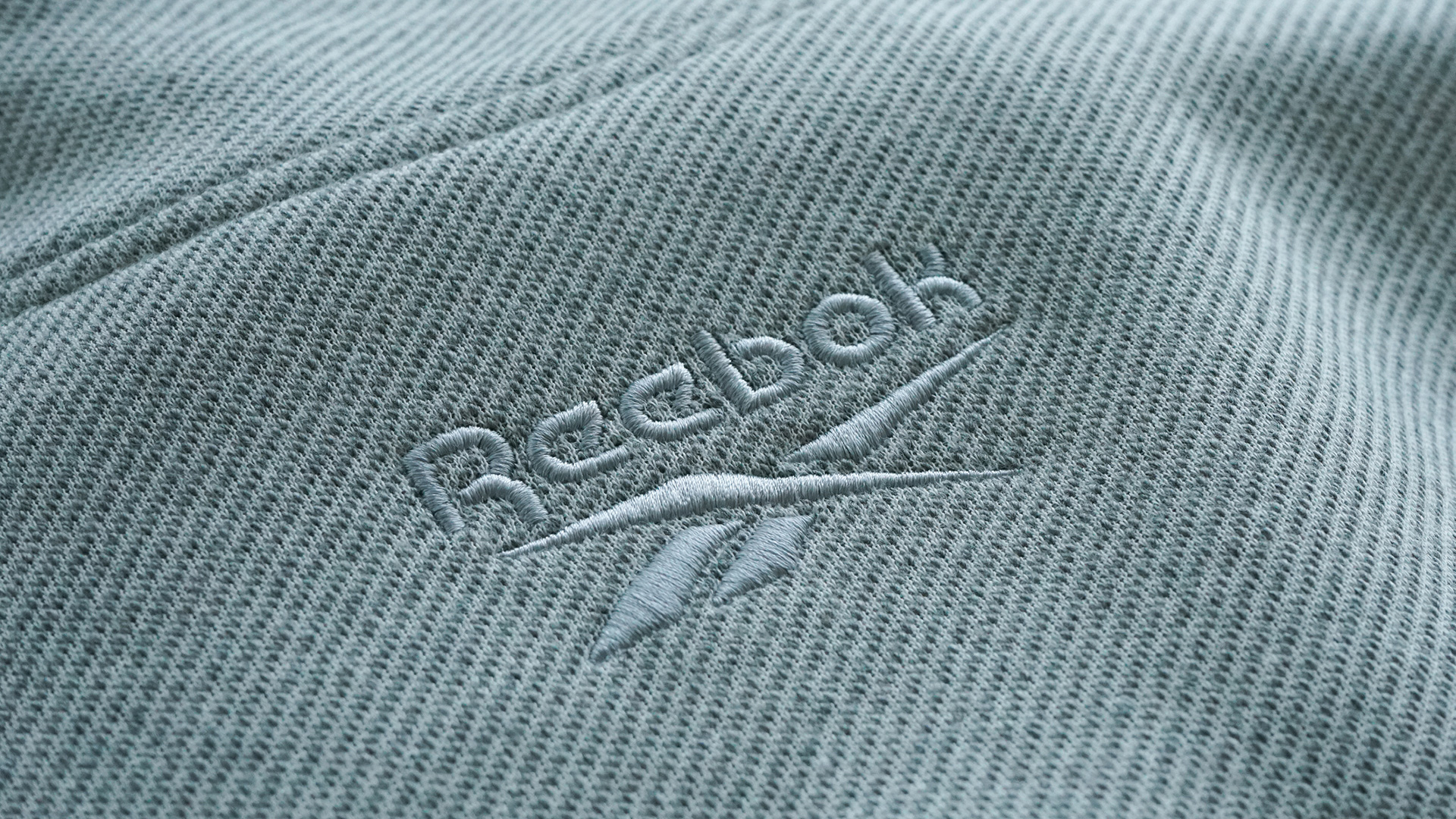
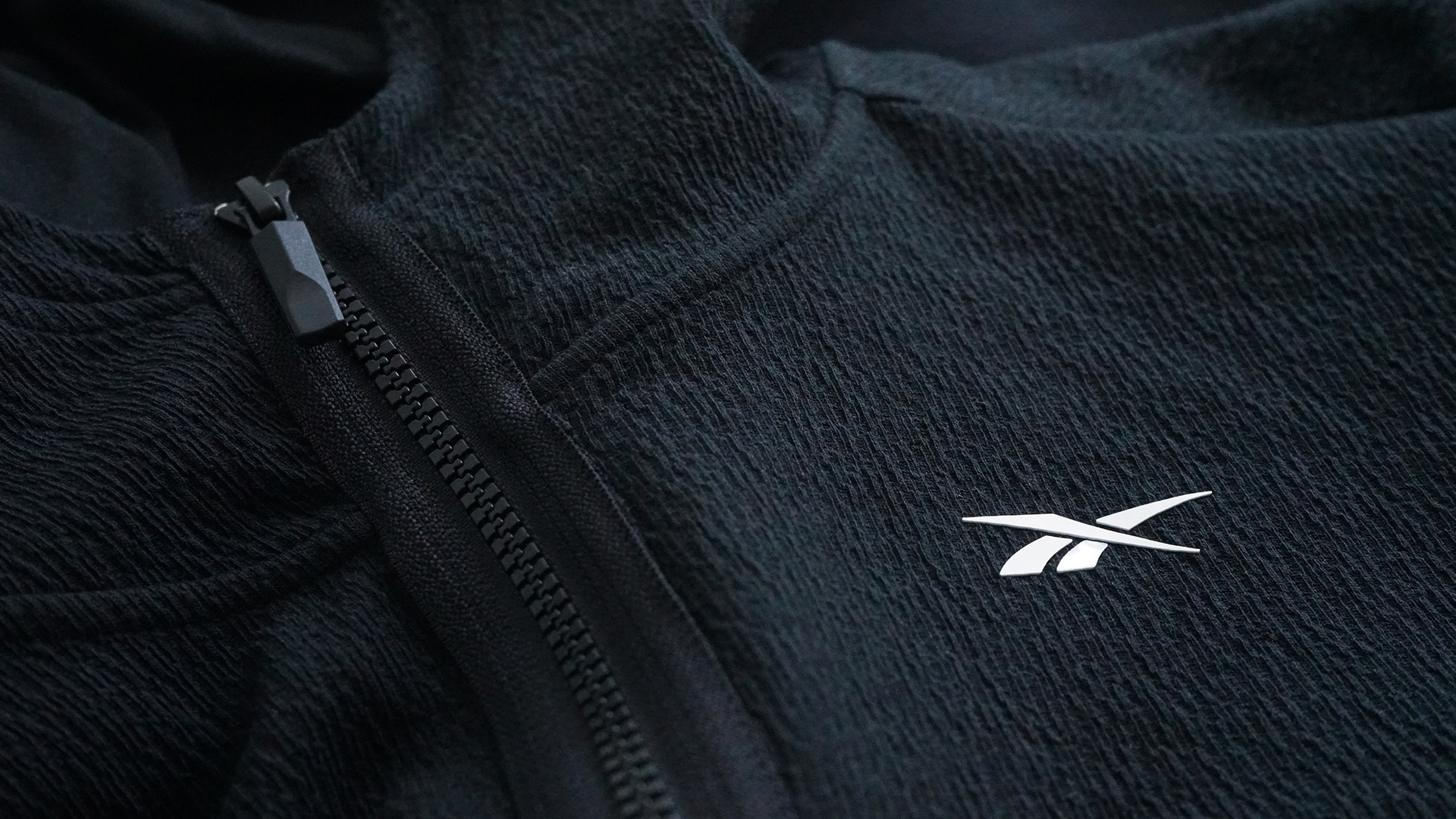
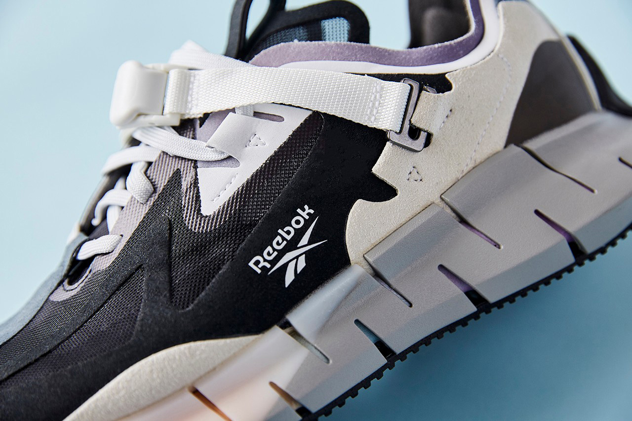
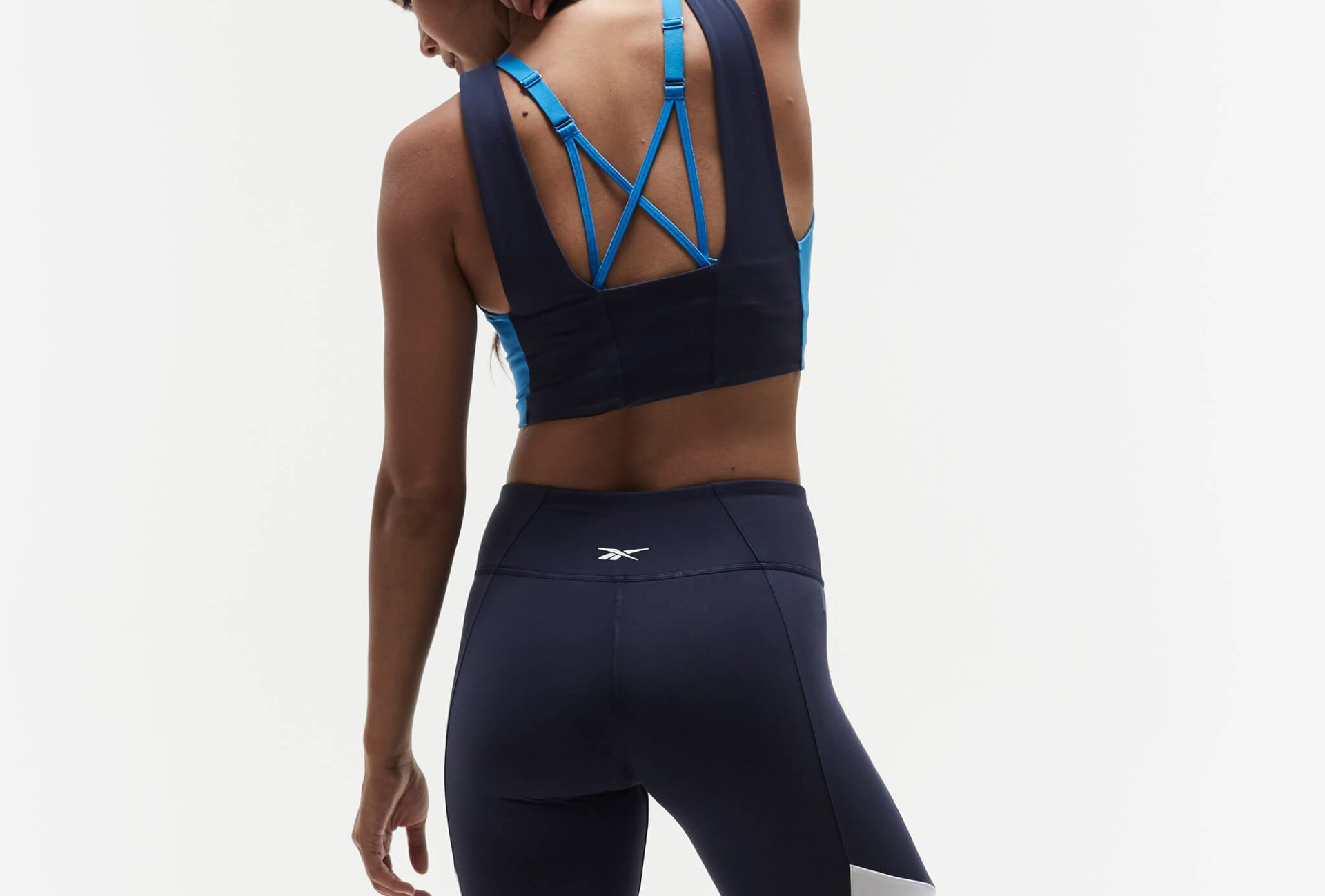
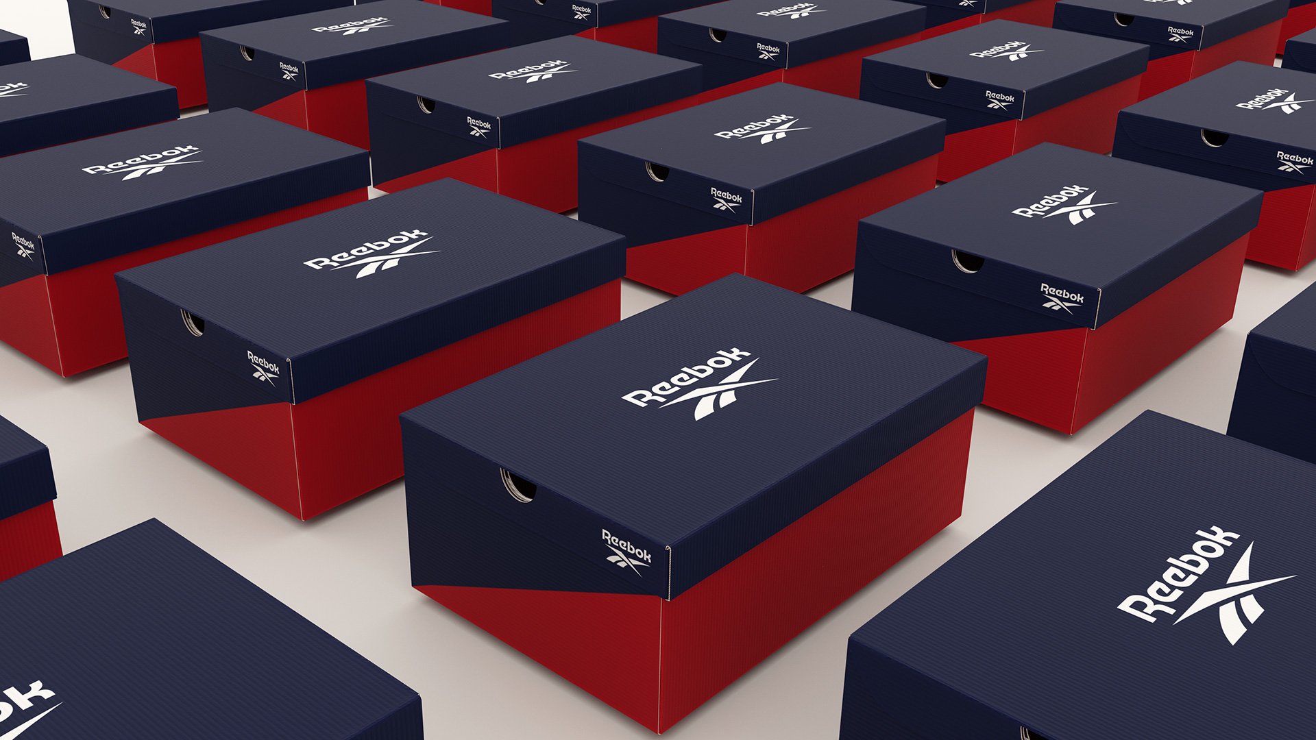
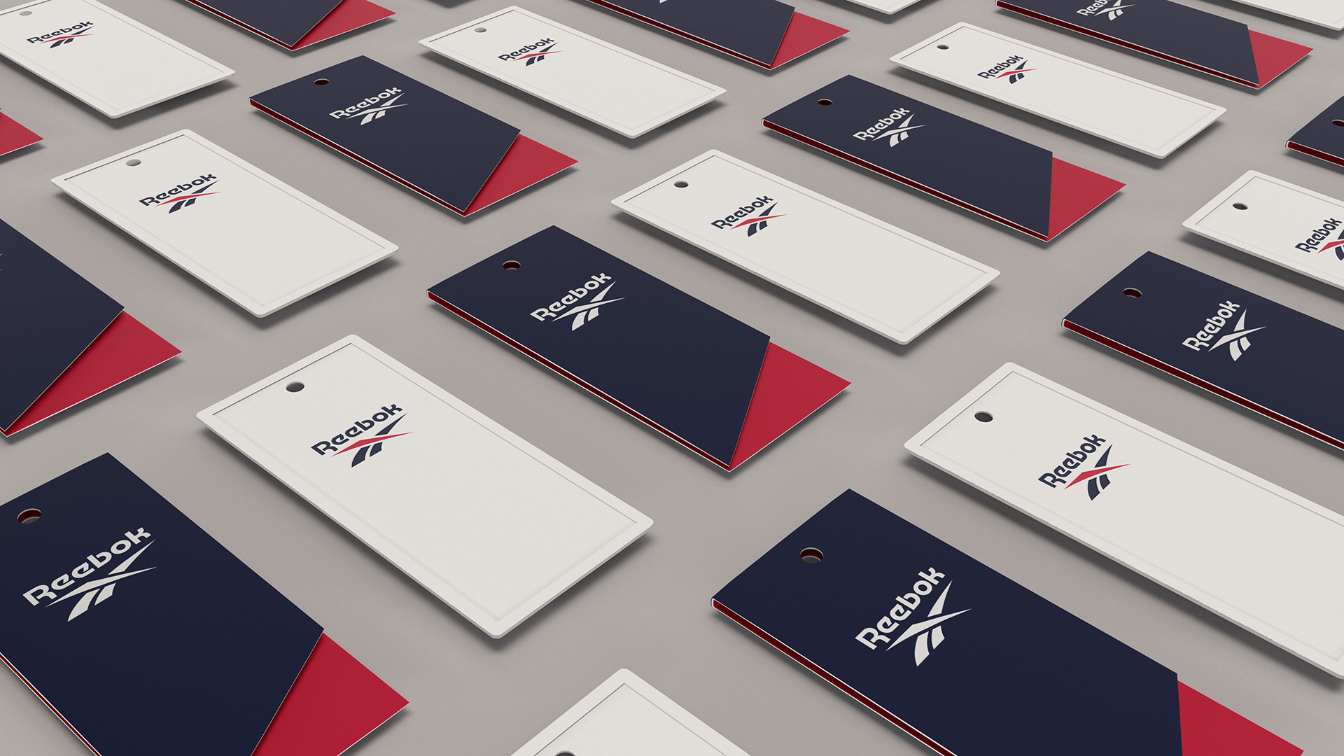
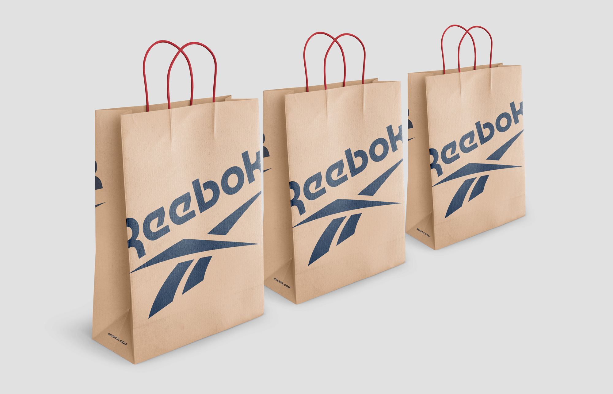
On the products, the logo looks great whether the icon is on its own or with the wordmark. Both are easy to reproduce and work well in the different production methods. The embroidered wordmark at the top of the image set above is particularly good in how the simple strokes of the character adapt to the limitations of embroidery.
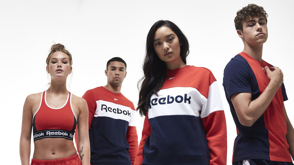
The two images above, not gonna lie, they are cool as shit. There is something very bad-ass and confident about them that really transforms the way I think about Reebok… so at least with this potential consumer, dear Reebok, you won.
On the flipside, they kind of lost me with the video above. It’s just a bunch of random ENERGY! stuff with bad typography. But, to its credit, that probably triggers, in a good way, another segment of the audience that’s not me.
Overall, I think this is a very positive change that reasserts Reebok’s legacy and history in a way that is contemporary and engaging in a way that makes it different not just from Nike and Adidas but from other closer competitors like Under Armour or even Lululemon.
 each year since publication began in 2006

 Новости Союза дизайнеров
Все о дизайне в Санкт-Петербурге.
Новости Союза дизайнеров
Все о дизайне в Санкт-Петербурге.