Обзор лучших ресурсов по разработке бренда, разработке упаковки
contact us | ok@ohmycode.ru
contact us | ok@ohmycode.ru
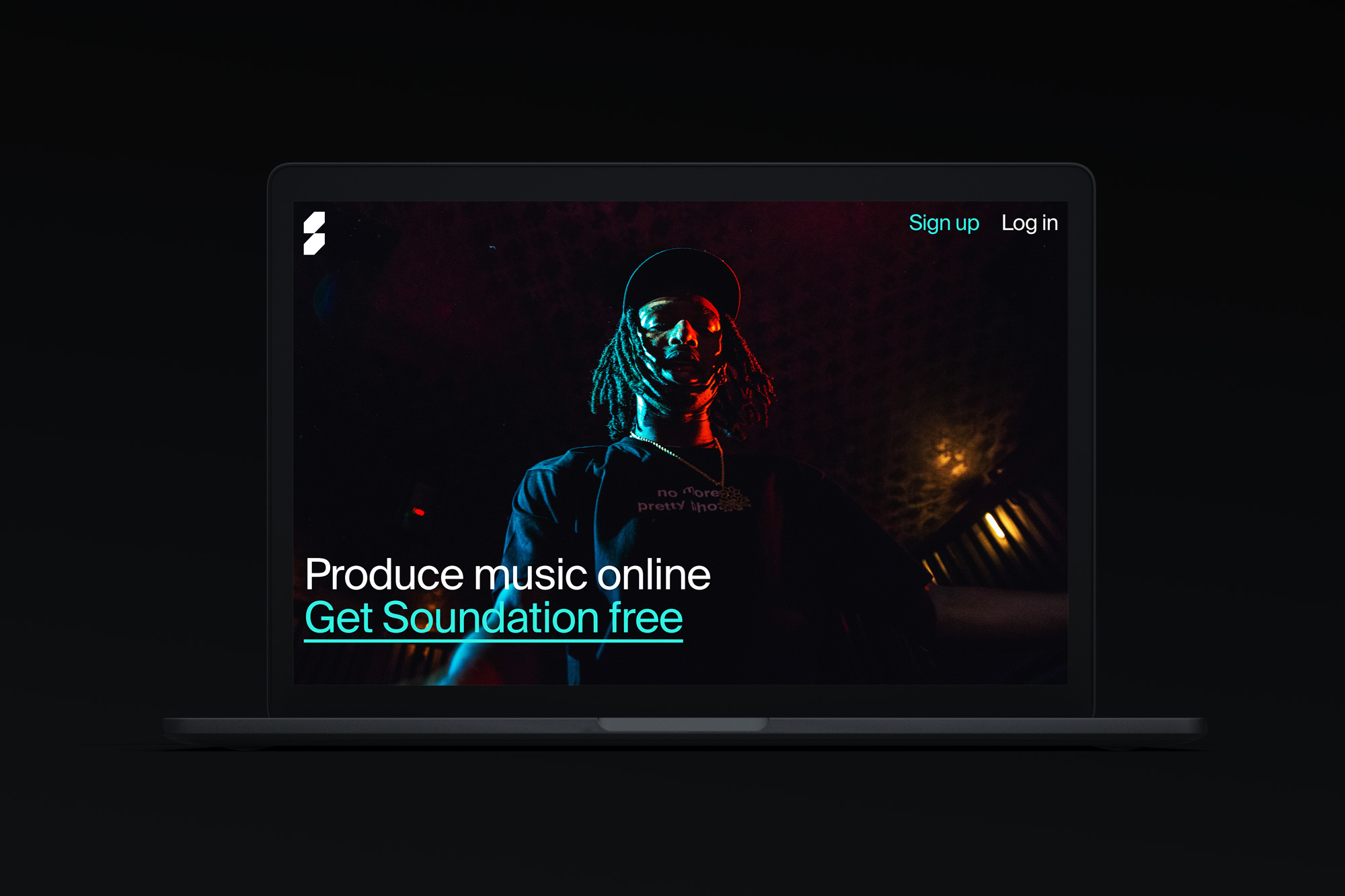
Established in 2009, Soundation is a powerful and high-quality online music production service for upcoming and established producers. Based in Stockholm, Sweden, the platform has attracted over 75,000 users and provides a “studio” to produce, remix, and record music directly on a browser; access to thousands of sounds, loops, effects, and instruments; and a like-minded community to share and collaborate with. At the end of last year, Soundation introduced a new identity designed by Stockholm-based Kurppa Hosk.
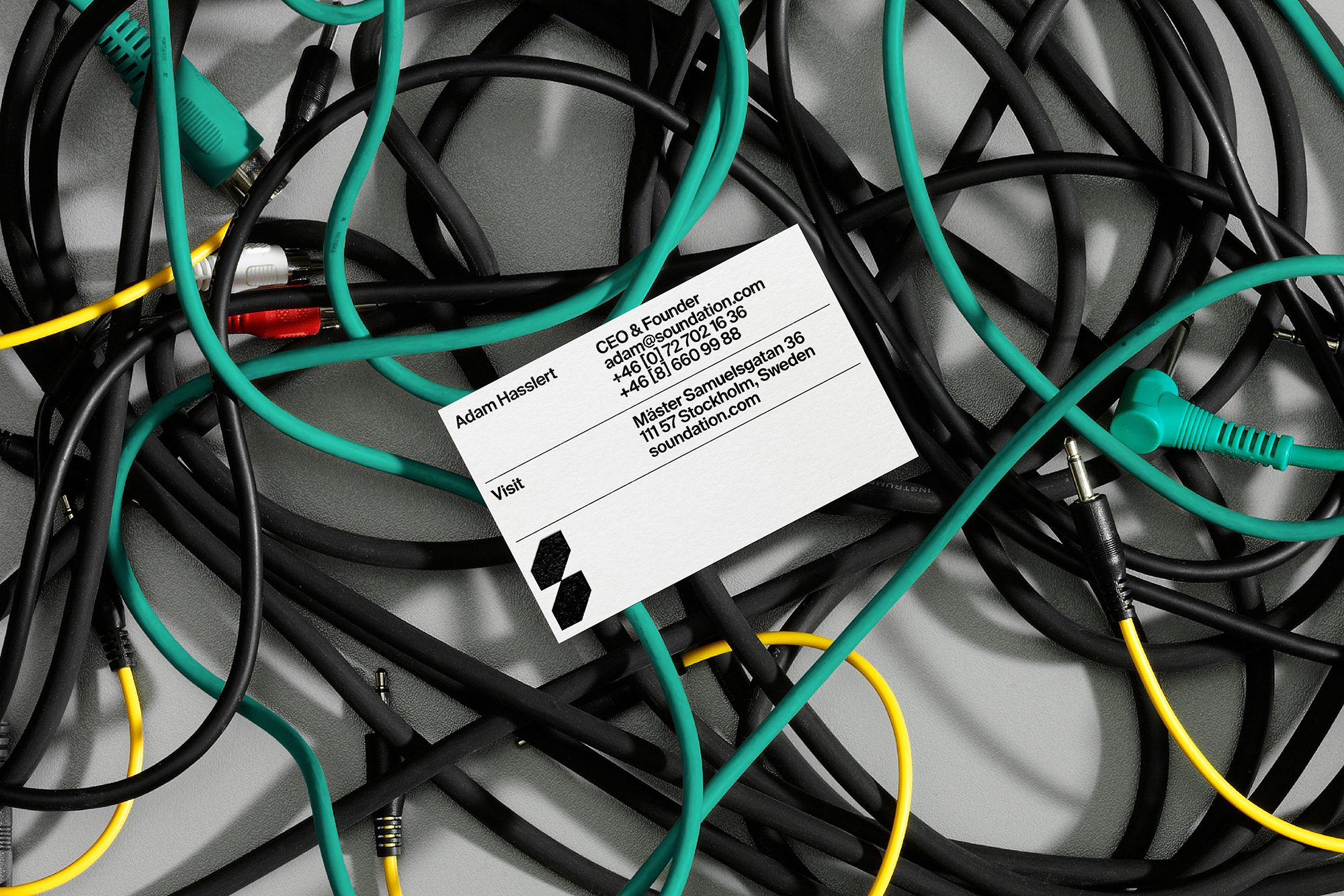
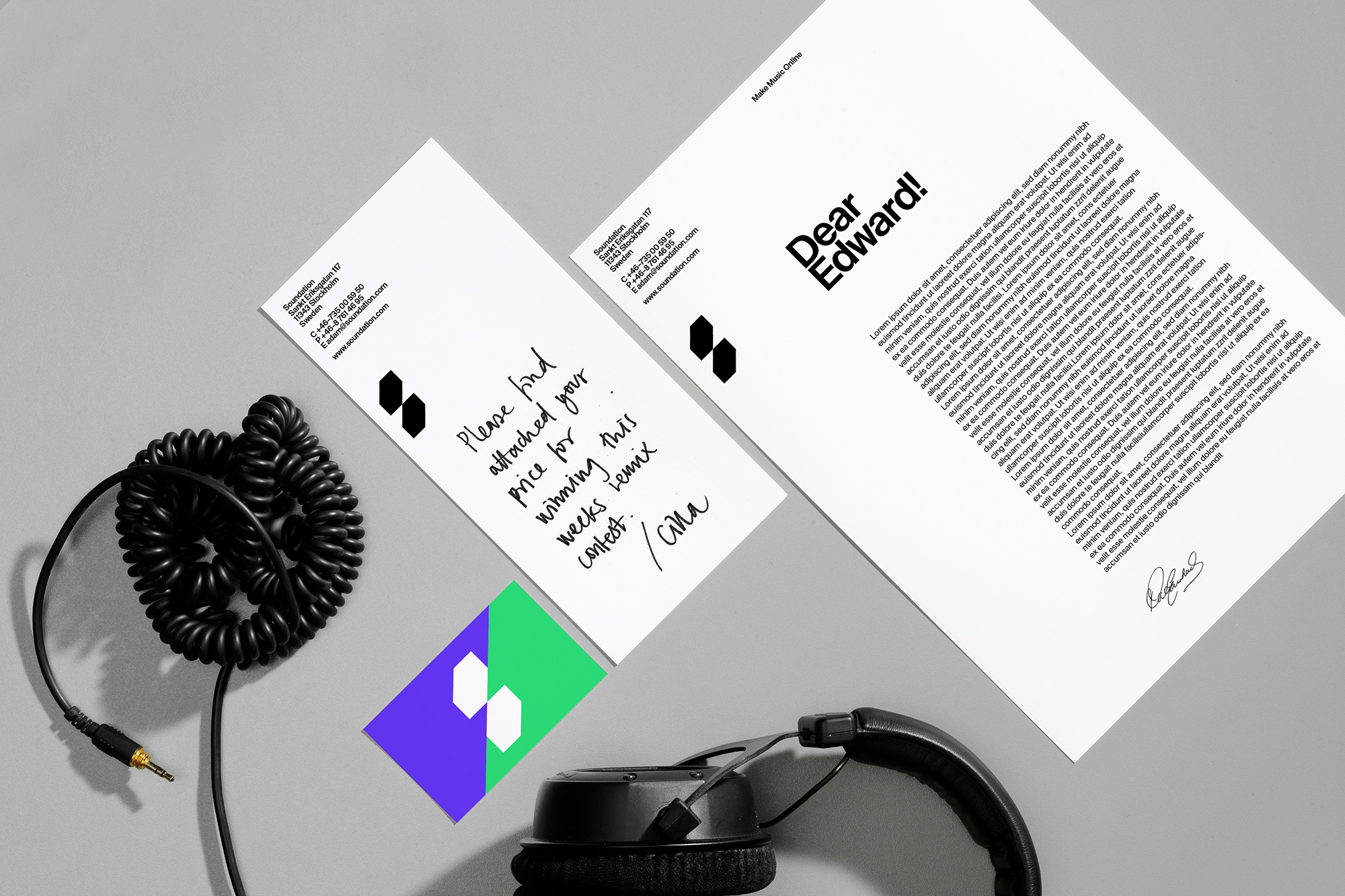
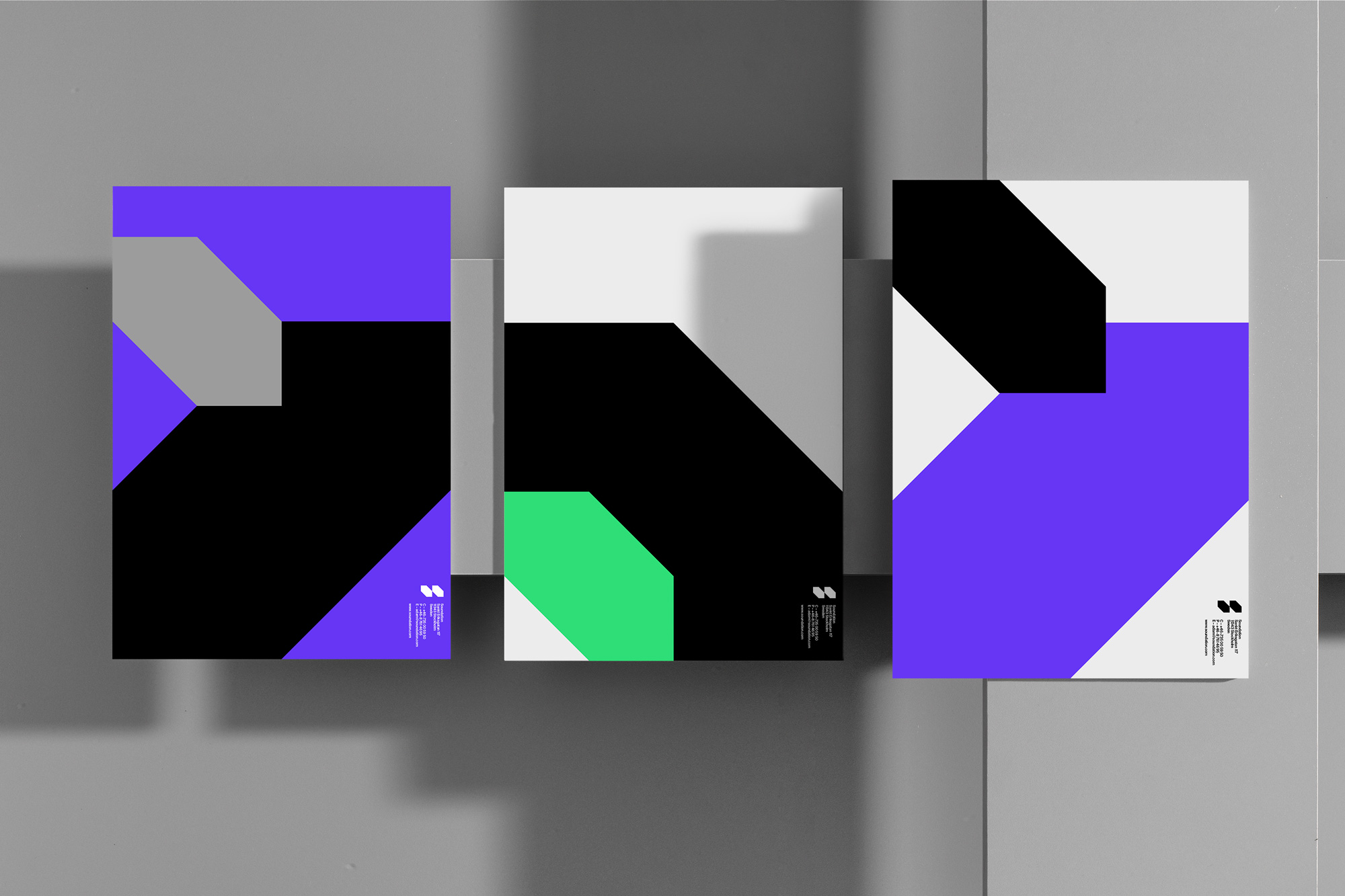
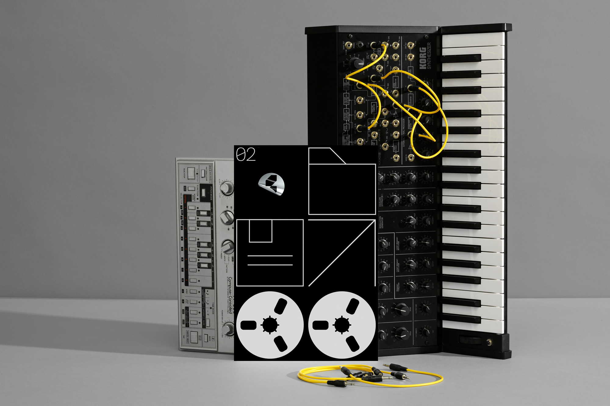
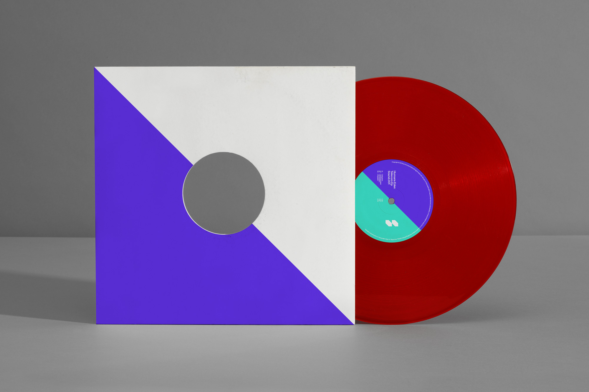
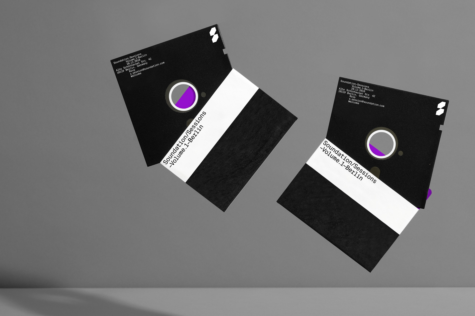
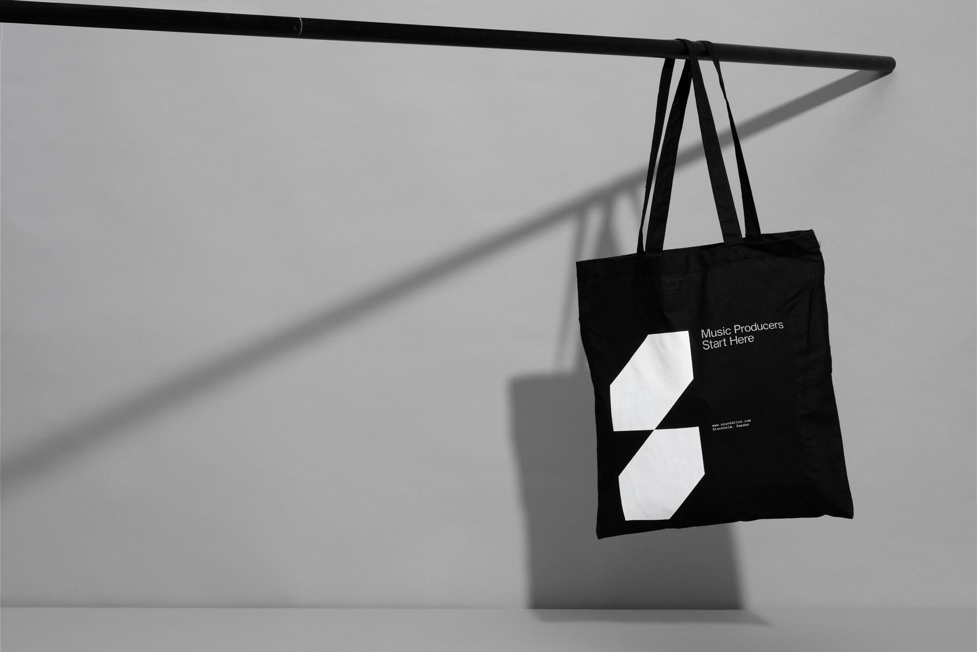
Kurppa Hosk designed an experience that communicates the brand’s new ambitions: to facilitate musical creativity around the world. The design overhaul showcases a visual language that is consistent across all channels and touchpoints. Two interconnected rectangles in 45° angles signal precision and can be used separately throughout the identity.
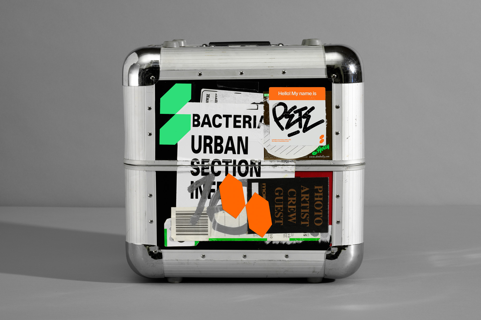
The icon in the old logo I’m guessing was the hole where you put an audio jack — I’m also guessing there is a technical term for that hole — but I’m not sure what the notch cut-out in the outer ring was meant to be. In any case, it wasn’t too exciting nor did it feel like cool things would happen if you used Soundation. The new logo has a much more trendy, music scene aesthetic that I think would be more inviting to the type of audience they are looking for. The abstract “S” icon is cool and hip and paired with Suisse Int’l it takes on a covetable European-ish, cool-kid vibe. If this were for a corporation or consumer product it would be all kinds of gratuitous but for this particular service, it feels appropriate.
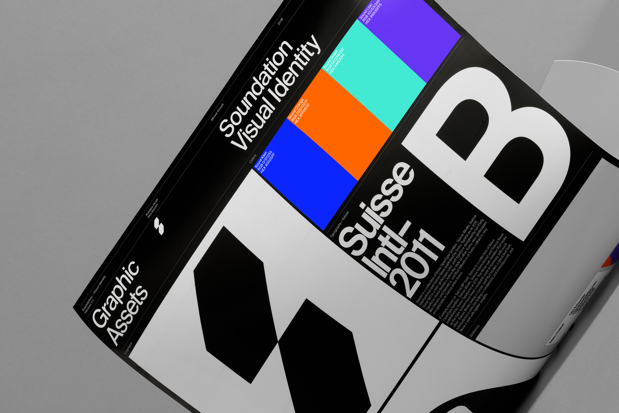
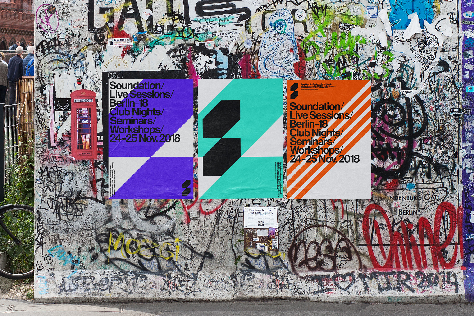
The identity makes some interesting uses of the 45-degree angles but for the most part — the very Swiss flush-left-ragged-right type, the bright colors, the dramatic type size changes — it’s stuff we’ve seen many times before in many decades prior. To me, what makes this a little better throughout the applications is the abstract “S” icon which stands out nicely in all the layouts and odd things created.
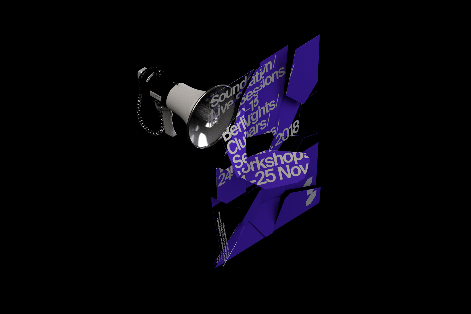
Overall, this may not be entirely groundbreaking but it feels very appropriate and relevant to the client and their audience and it creates a sense that if you use Soundation cool things will happen… like megaphones shattering glass posters, so count me in.

 Новости Союза дизайнеров
Все о дизайне в Санкт-Петербурге.
Новости Союза дизайнеров
Все о дизайне в Санкт-Петербурге.