Обзор лучших ресурсов по разработке бренда, разработке упаковки
contact us | ok@ohmycode.ru
contact us | ok@ohmycode.ru
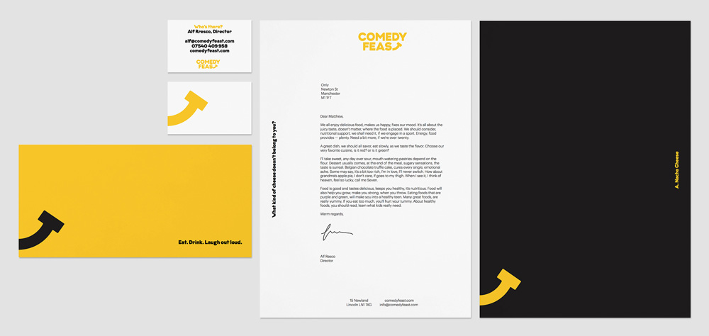
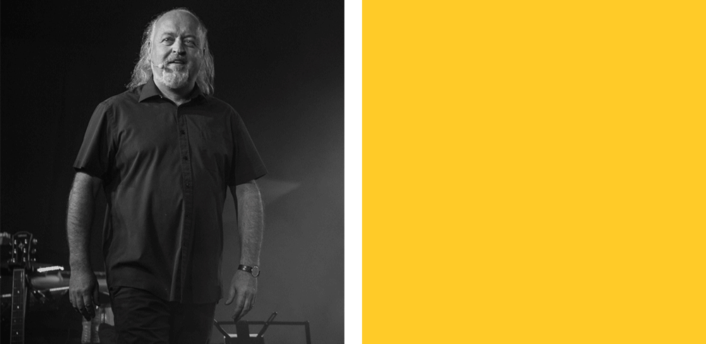
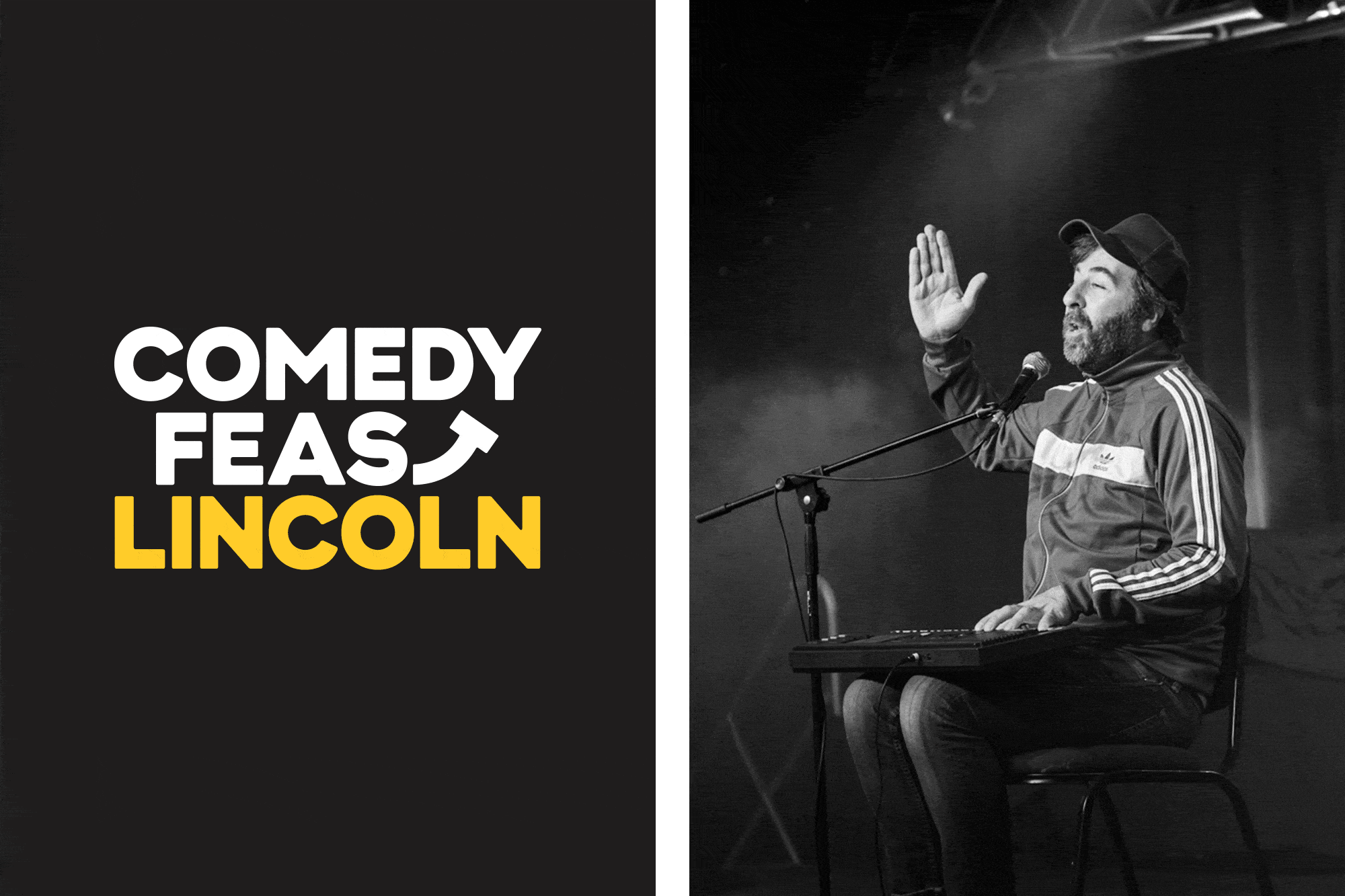
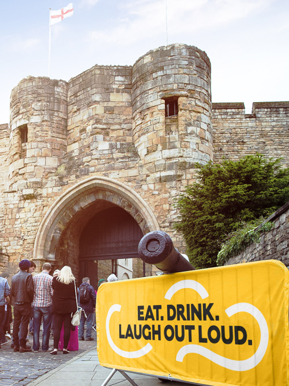
Celebrated for the first time in Summer of 2017, Comedy Feast is a multi-day comedy festival coupled with a food and drink festival. The first edition took place at Lincoln Castle in Lincoln, England — some photos here — and due to its success, more Feasts across the UK are being planned for 2018. The identity for the event has been designed by Manchester, UK-based Only.
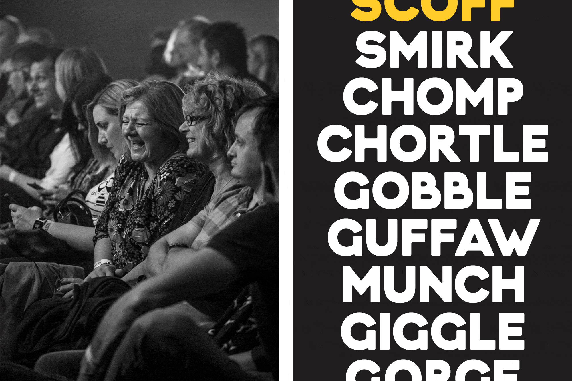
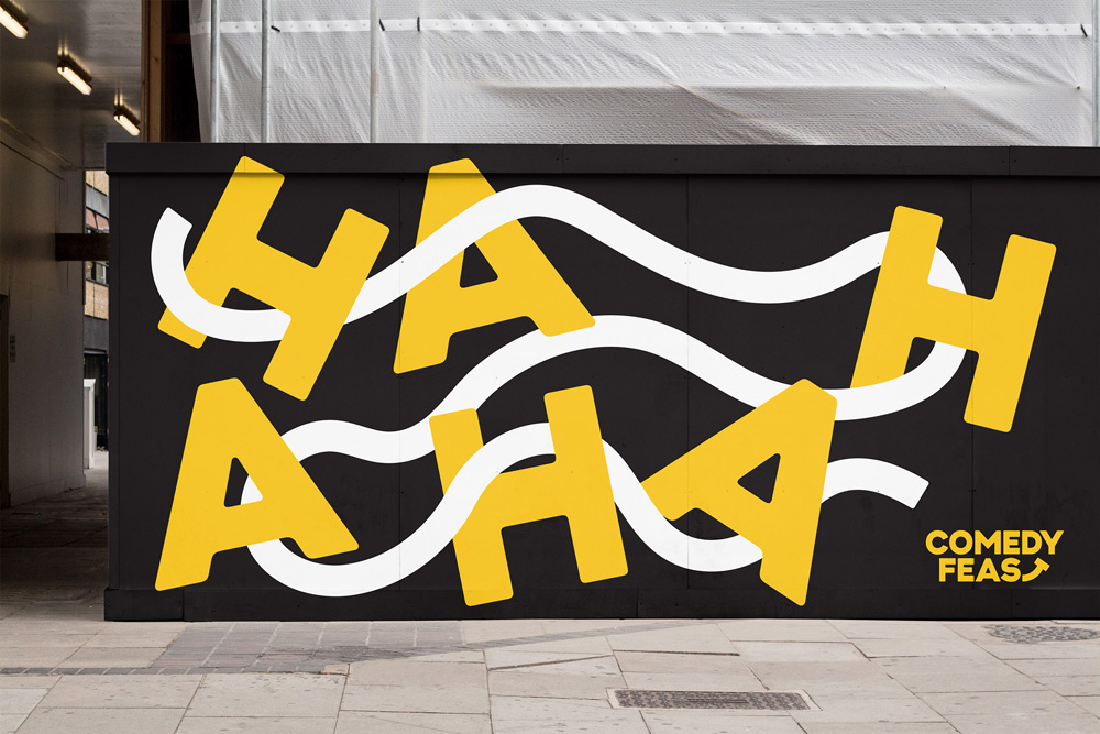
The brand employs a simple graphic line to invoke the spirit of comedy, playfully interacting with photography and type as it moves between locations. Across print and digital, a stripped back colour palette builds familiarity as the festival works to establish itself. The brand’s tone of voice promotes a warm and mischievous character in support of the event’s eclectic offering for adults and families.
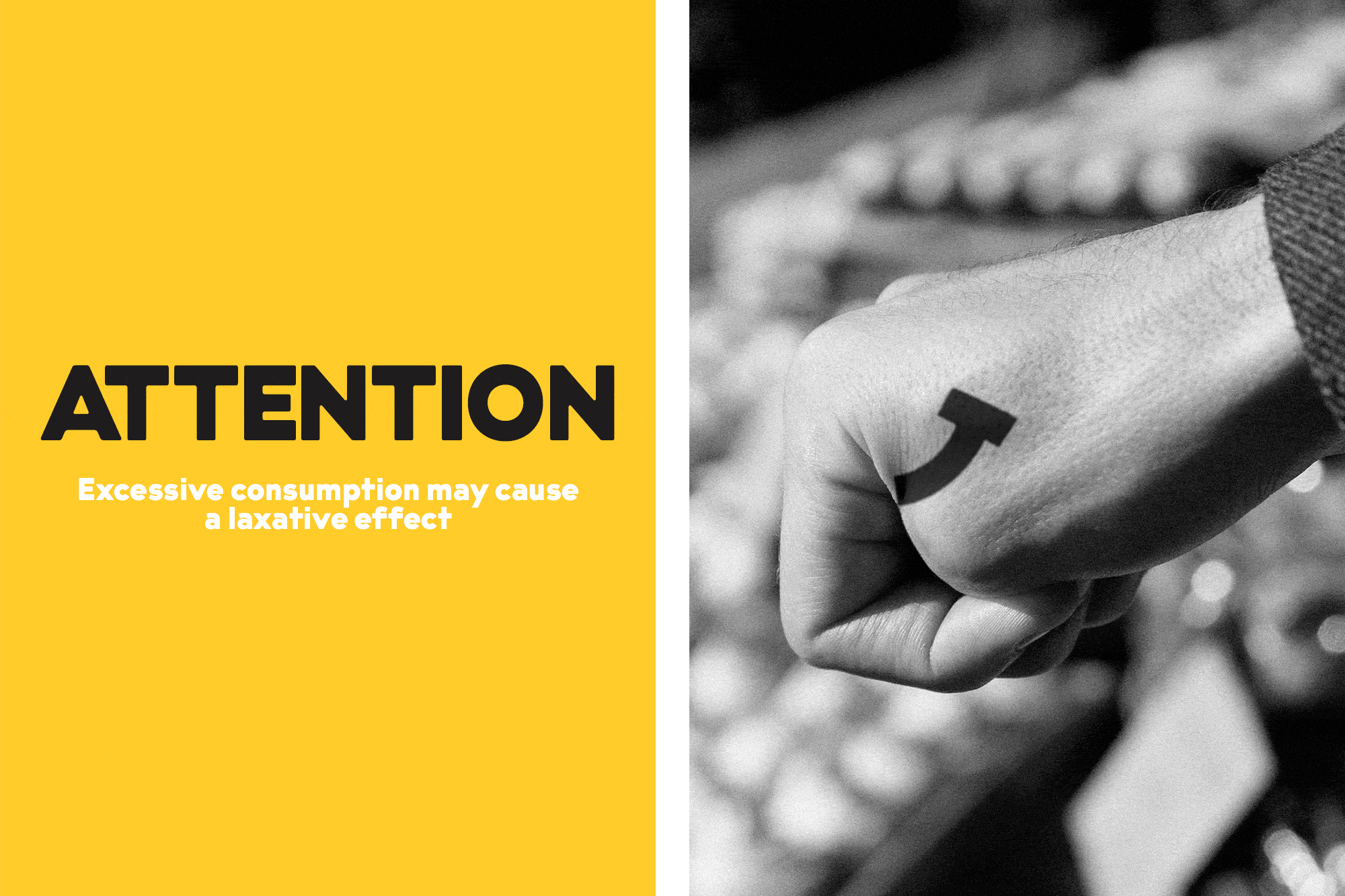
The logo is a simple pleasure, an easy to decode visual play that, unless you are dead inside (or are obnoxiously hard to please), should bring a smile to your face — doesn’t have to be a big smile, a small smile will do. Bending the “T” into a smile is charming and clever but you could also see it as having a bit of an edge given how typographically distorted the “T” actually gets. The font chosen — a customized version of Schick Toikka’s Krana Fat — has the right personality to deliver the punchline with a sort of deadpan aesthetic.
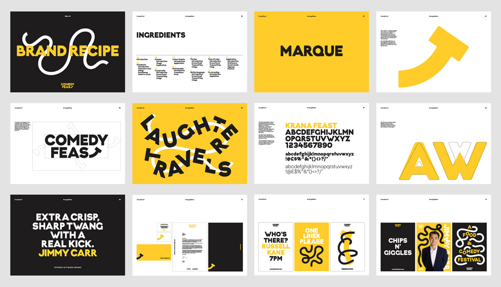
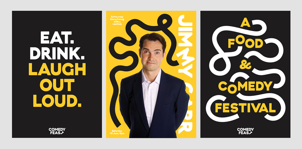
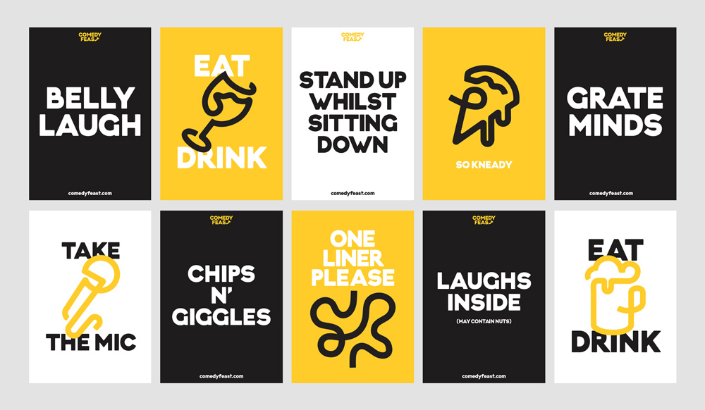
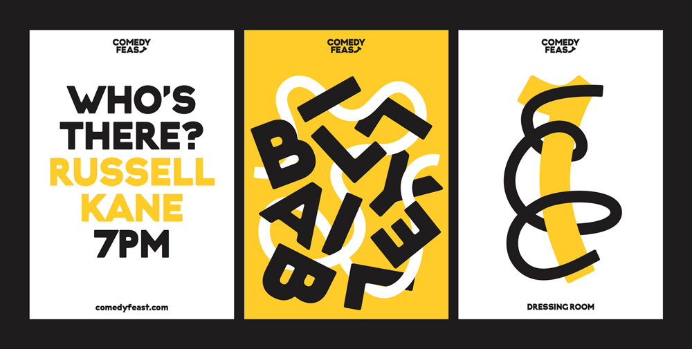
The visual language for the festival has a fun combination of being loose but also kind of uptight through the mix of the thick squiggle line paired with the stiff-looking letters that even when rotated wildly look like a business person in a suit trying to laugh. But maybe I’m reading too much into it. The fonts are big, the lines are thick, the colors are bold — it’s hard to not to like it. For a comedy festival, though, the copywriting and visual puns on the materials are not exactly the funniest — except for the pizza slice that says “so kneady”.
Overall, this hits the right tone and has a number of visual expressions to sustain an identity for multiple events where it can feel varied but not entirely repetitive.

 Новости Союза дизайнеров
Все о дизайне в Санкт-Петербурге.
Новости Союза дизайнеров
Все о дизайне в Санкт-Петербурге.