Обзор лучших ресурсов по разработке бренда, разработке упаковки
contact us | ok@ohmycode.ru
contact us | ok@ohmycode.ru
Established in 2018, Guta is a chain of coffee shops in Ho Chi Minh City, Vietnam, that combines the tradition of Vietnamese street coffee culture with the variety of contemporary coffee shop offerings (e.g., drinks with whipped cream on top). Guta has grown quickly and efficiently in the last year, now counting with almost 60 stores that range from roaming carts, to small booths, to full-blown stores, most of them providing a Vietnam staple: a tiny plastic chair to place on the street and sit on. The new identity for Guta has been designed by local firm M — N Associates.
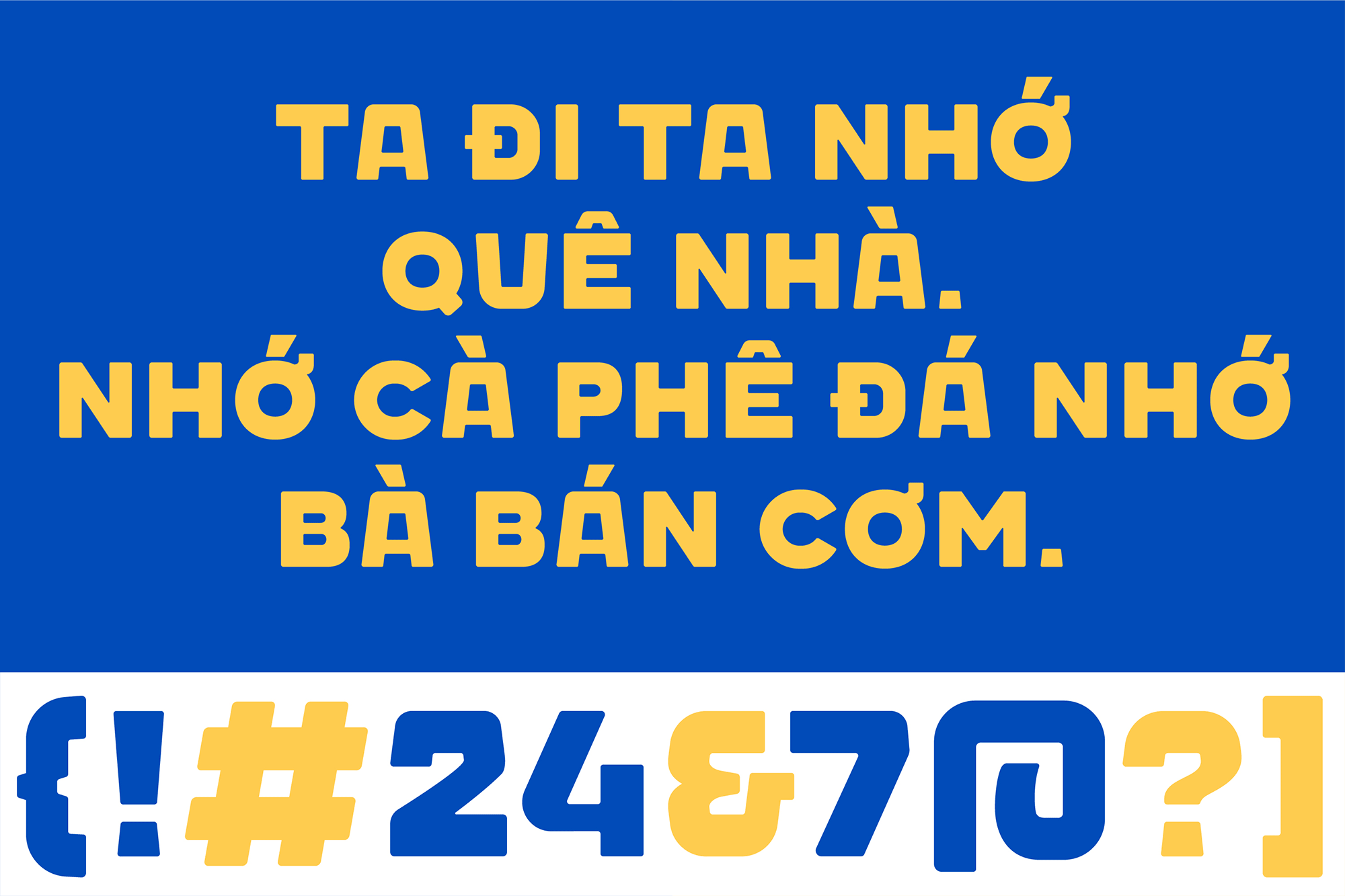
Guta is from a Vietnamese verbal slang, from “gout /gu/” in French and “ta” in Vietnamese, together stands for the term “our style”. Representing for Guta’s brand spirit, they proud to serve a decently good strong Vietnamese coffee. From the most common culture of Saigon, street-coffee has become a fundamental habit of not just Saigonese but also Vietnamese. Beneath the habitual culture, there’s always a “plastic chair”, small and convenient to setup anywhere to become a small coffee shop.
The graphic system was taken over by the iconic chair as center combined with all surrounding environmental elements and people behaviors. All together, creating a complete unique “style” for Guta and echos what the brand comes from.
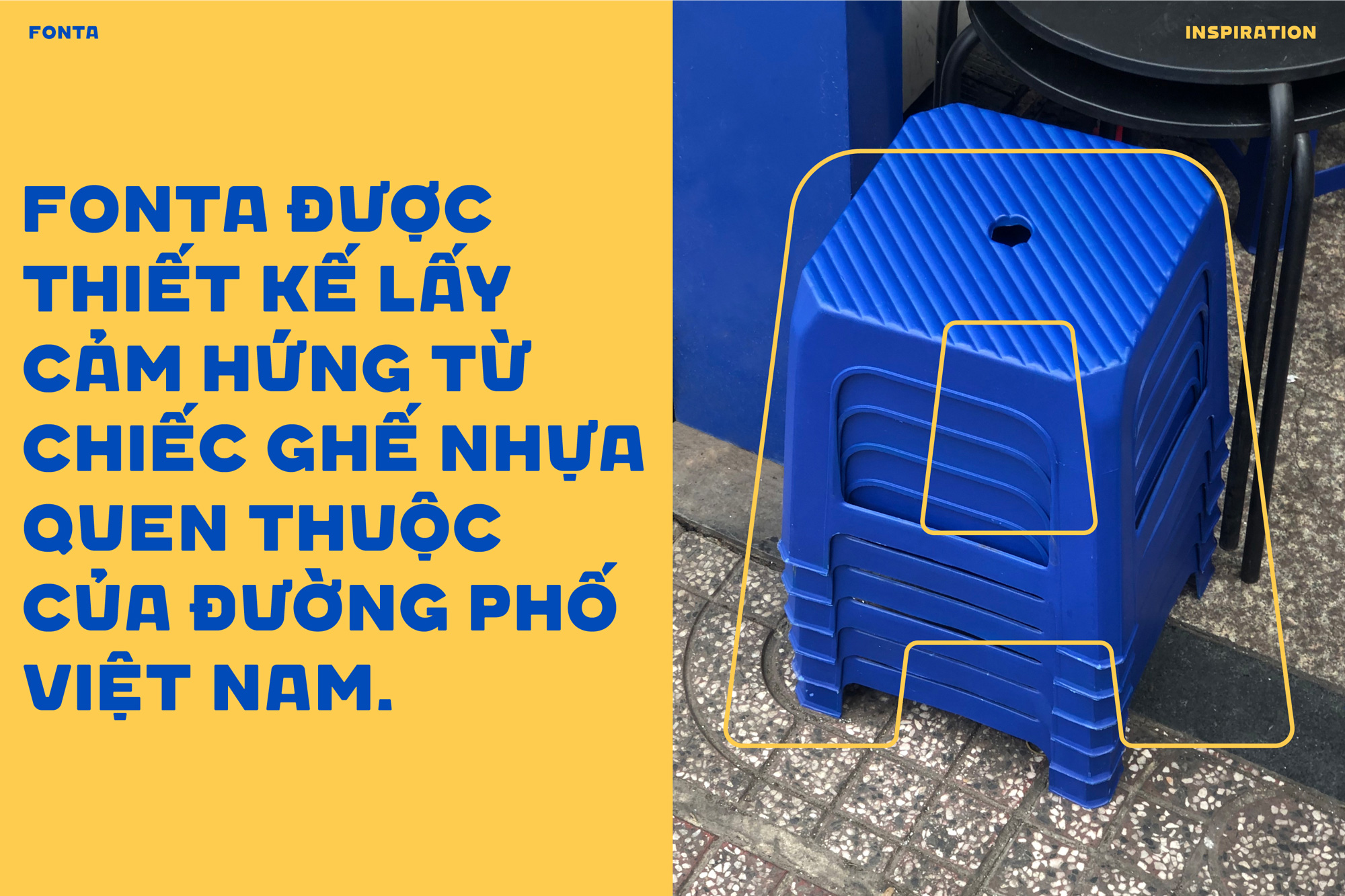
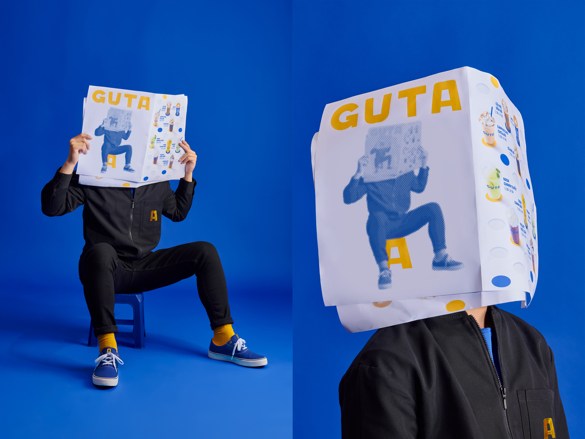
The old logo was bad with its overly playful font choice, super tight kerning, and oddly tall “E”, but not entirely terrible as it was welcoming and friendly. The new logo drops the “cafe” part, allowing “GUTA” to be more prominent and introduces a custom wordmark that at first feels kind of clunky with its bottom-heavy “U” and top-heavy “A” but, spoiler, once you see that those shapes are inspired by the stout plastic chairs that people sit on while enjoying street food and drinks it takes on a whole new level of charming and appropriateness. I really wish the “G” were different and somehow more in tune with the other letters because then the logo would be a total home run. The updated blue and yellow makes the logo (and identity) a lot livelier and easy to spot.
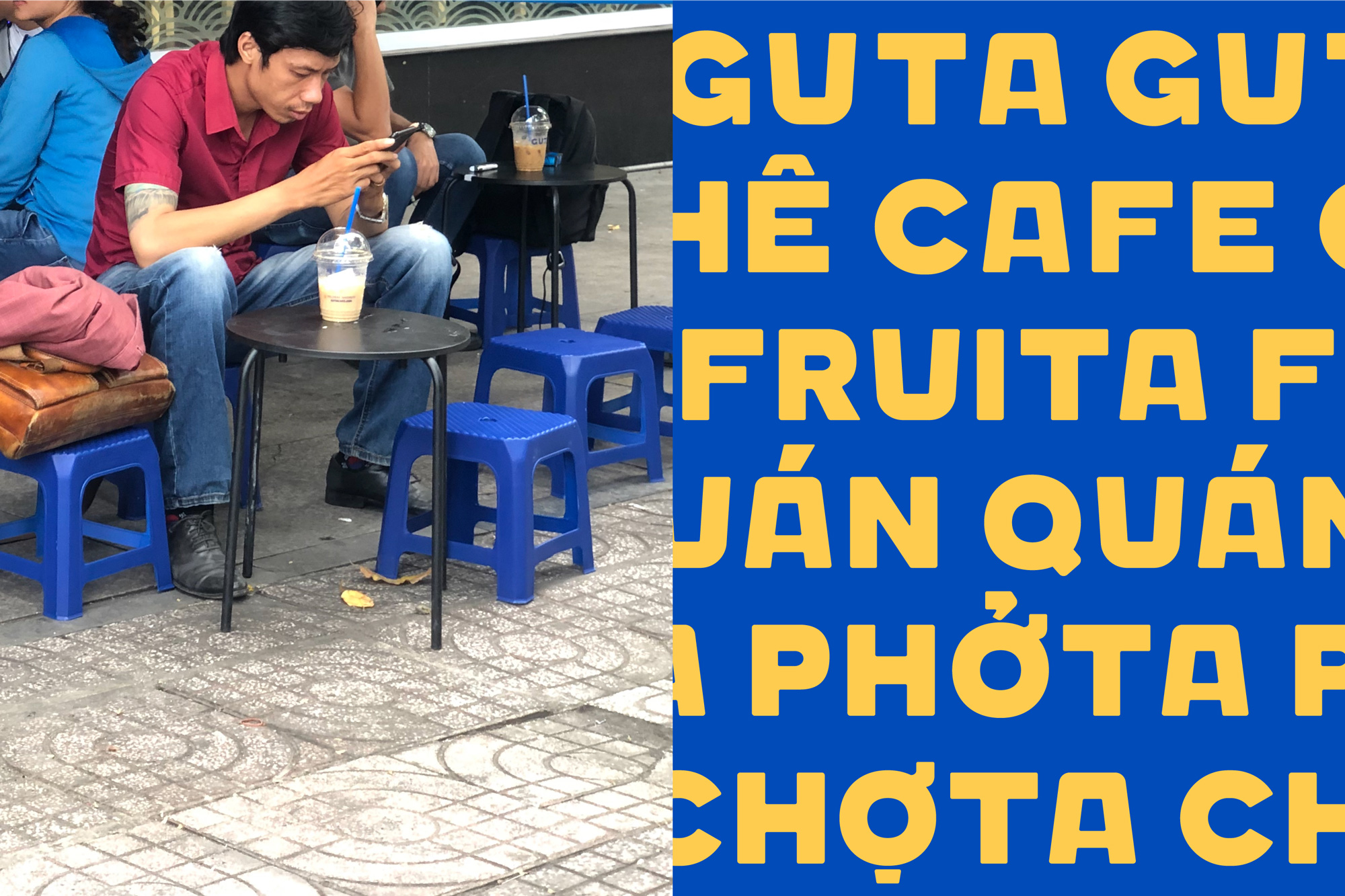
Featuring the chair and Vietnamese diacritical marks, we has developed a custom font named after Guta, FONTA (our font), only for the extension of Guta child brands and special communication tools. After their success on rebranding, Guta has been growing from several stores to nearly 60 stores around the city and opened new child brands like PHỞTA (Phở noodle) or CHỢTA (convenient local store).
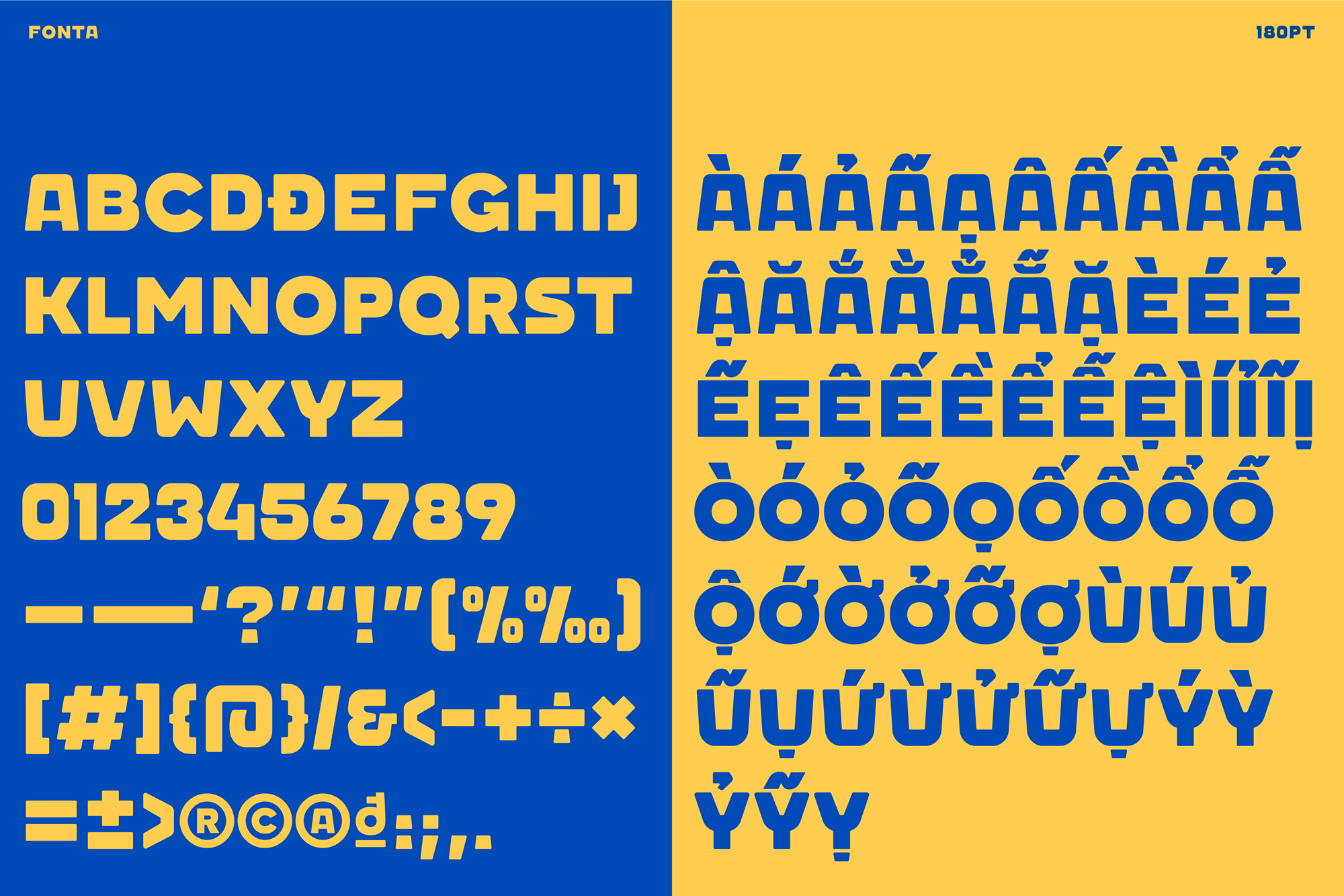
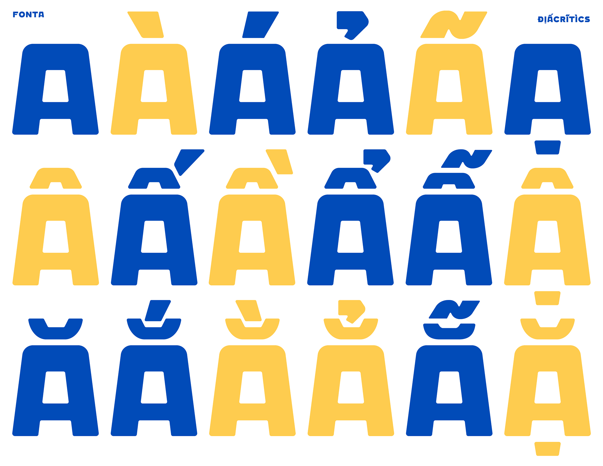
As spoiled in the paragraph above, the logo and custom typeface are inspired by the unique shape of the stool/chair that is so commonly used and provides a strange but delightful graphic reference. The resulting typeface is mostly great but the round characters (“C”, “G”, “O”, “Q”) stand out oddly. The numerals are awesome and the zero is more nicely resolved, which hints at what the “G” in the logo could have looked like. In general, what I like most about the typeface is that has a raw-ish vernacular aesthetic as if it were a hand-painted sign for a single store.
Here’s the usual habit for kicking start of the day for everyone who loves street coffee. They sit on a plastic chair somewhere shady and surrounding with greens, with a cup of coffee and a newspaper. After finishing their news and coffee, they started hanging out or ready for work.
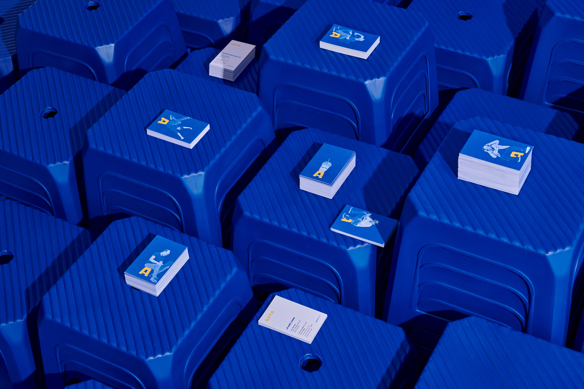
The halftone printing effect on newspaper was regarded as communicating visualization for the brand and echoed different characters who sit on plastic chair around the country, from office worker to lady hawker. All together, reflecting a unique yet familiar culture of Vietnam street coffee for Guta philosophy.
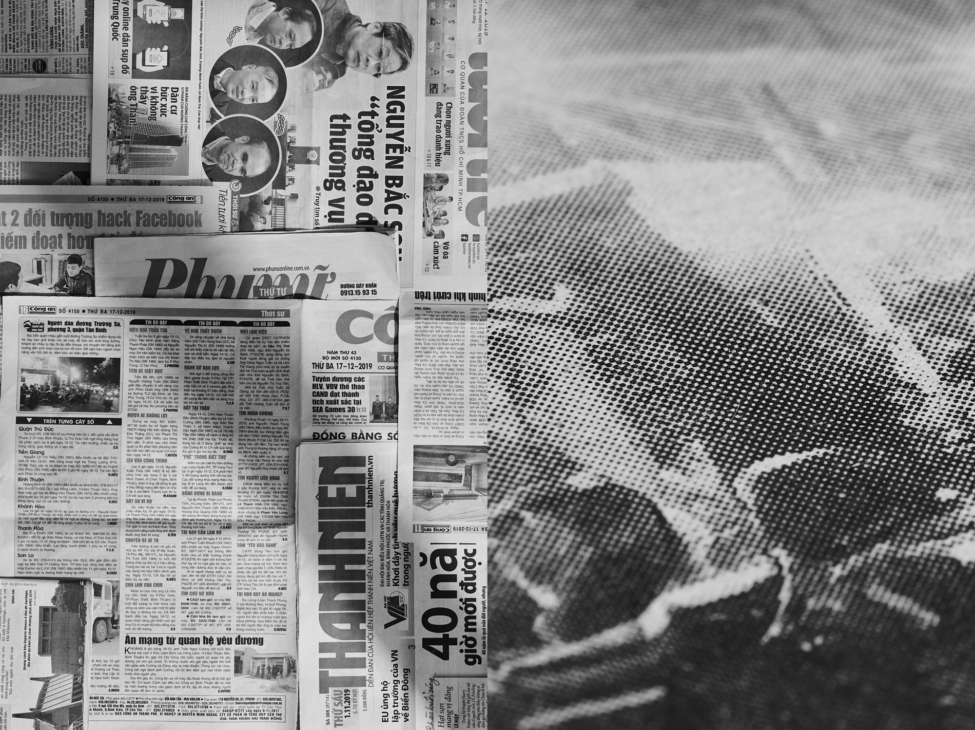
Every character was selected carefully and representing a wide range of different characters from young to old, from blue collar to white collar. Each character with unique pose express their personalities and broaden brand visualization. All combines together, visualization and color palette, creating a unique yet consistent brand expression, easily to be adapted and extending according to marketing purposes.
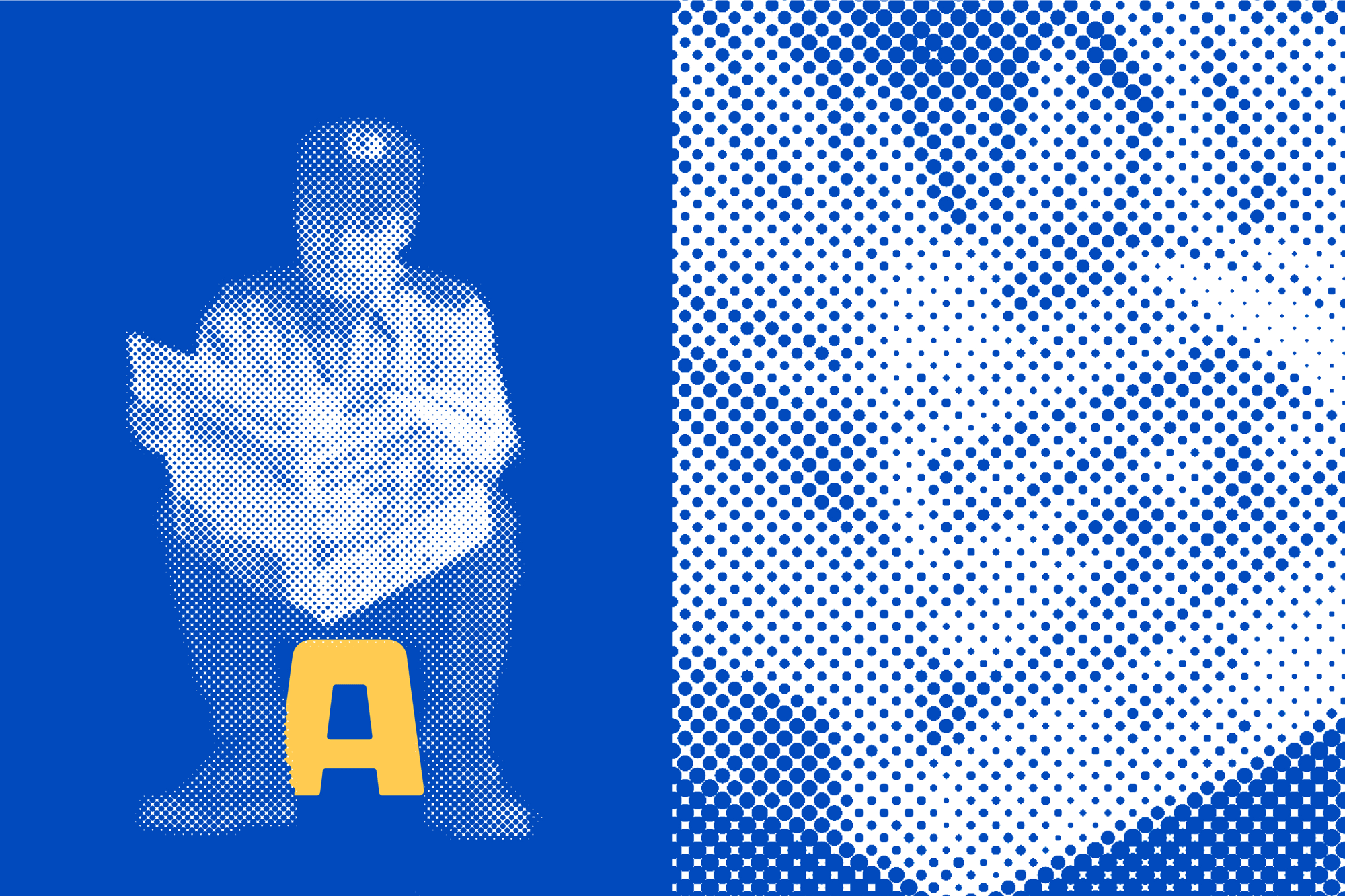
The idea of bringing in the halftone texture of newspapers into the identity is appropriate and fun. The execution of applying it to people and then Photoshopping them to sit on the “A” is kind of crude and at first I didn’t like it but, like everything else so far, there is a weird charm to it and in its purposeful lack of sophistication is a welcome respite from the more common slick illustration styles we’ve been seeing over and over.
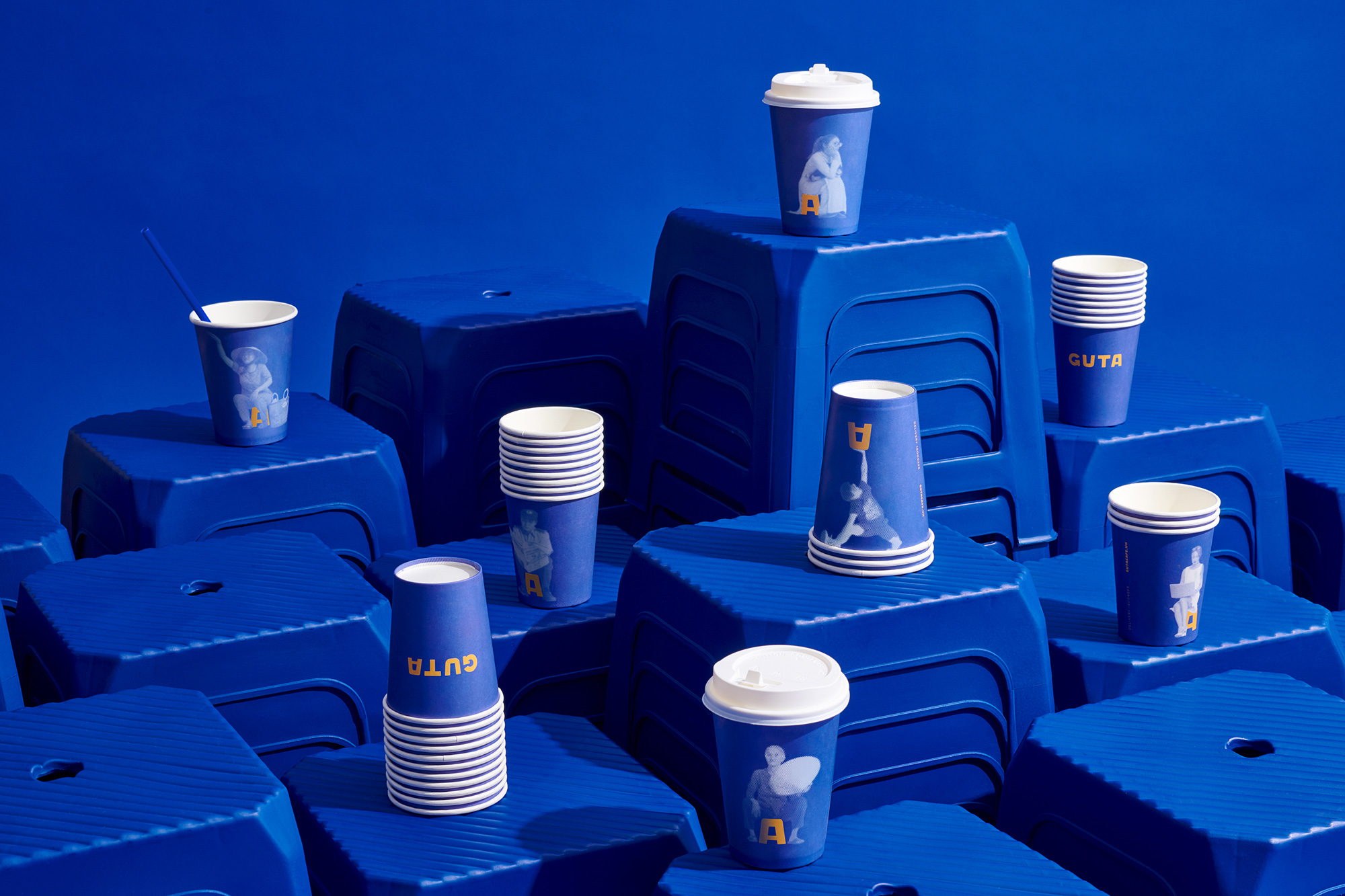
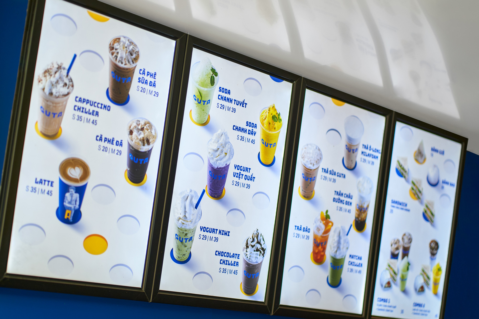
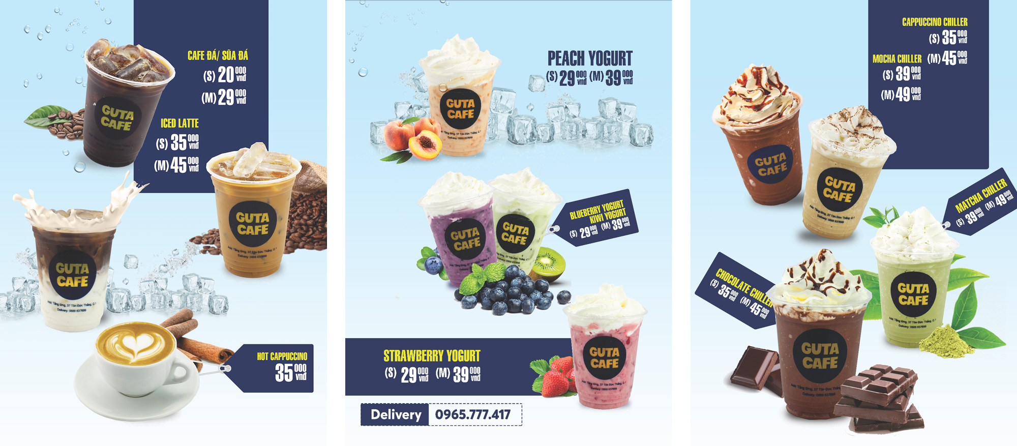
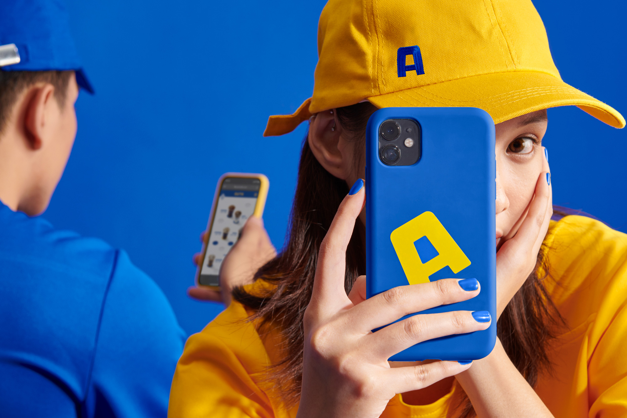
The applications are pretty good with big and bold type and colors. The presentation of the products is neat too, with the drinks placed amid “holes” that are also references to the chair.
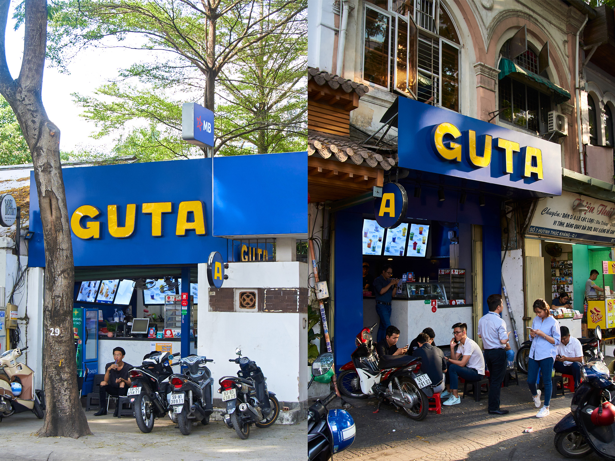
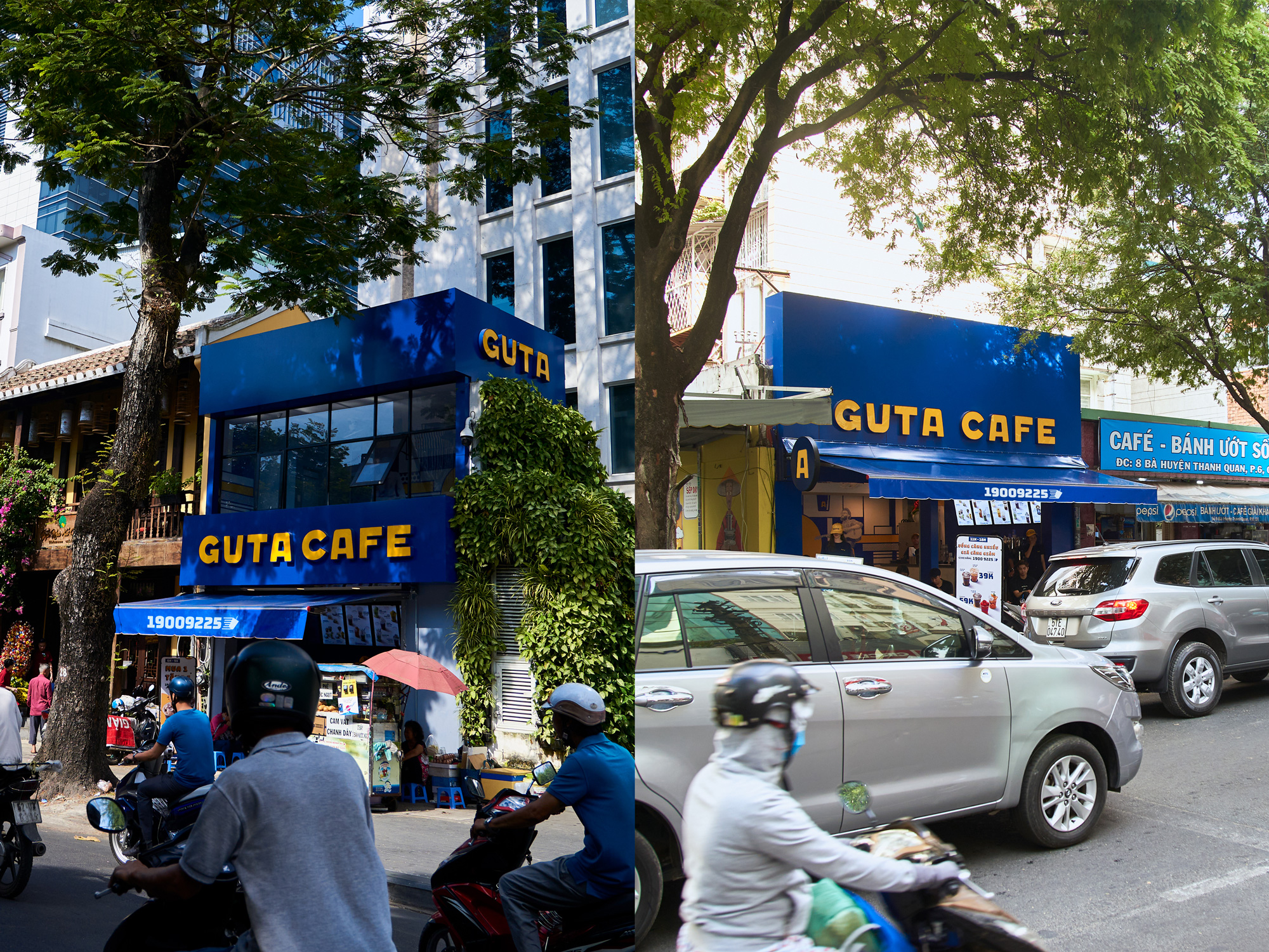
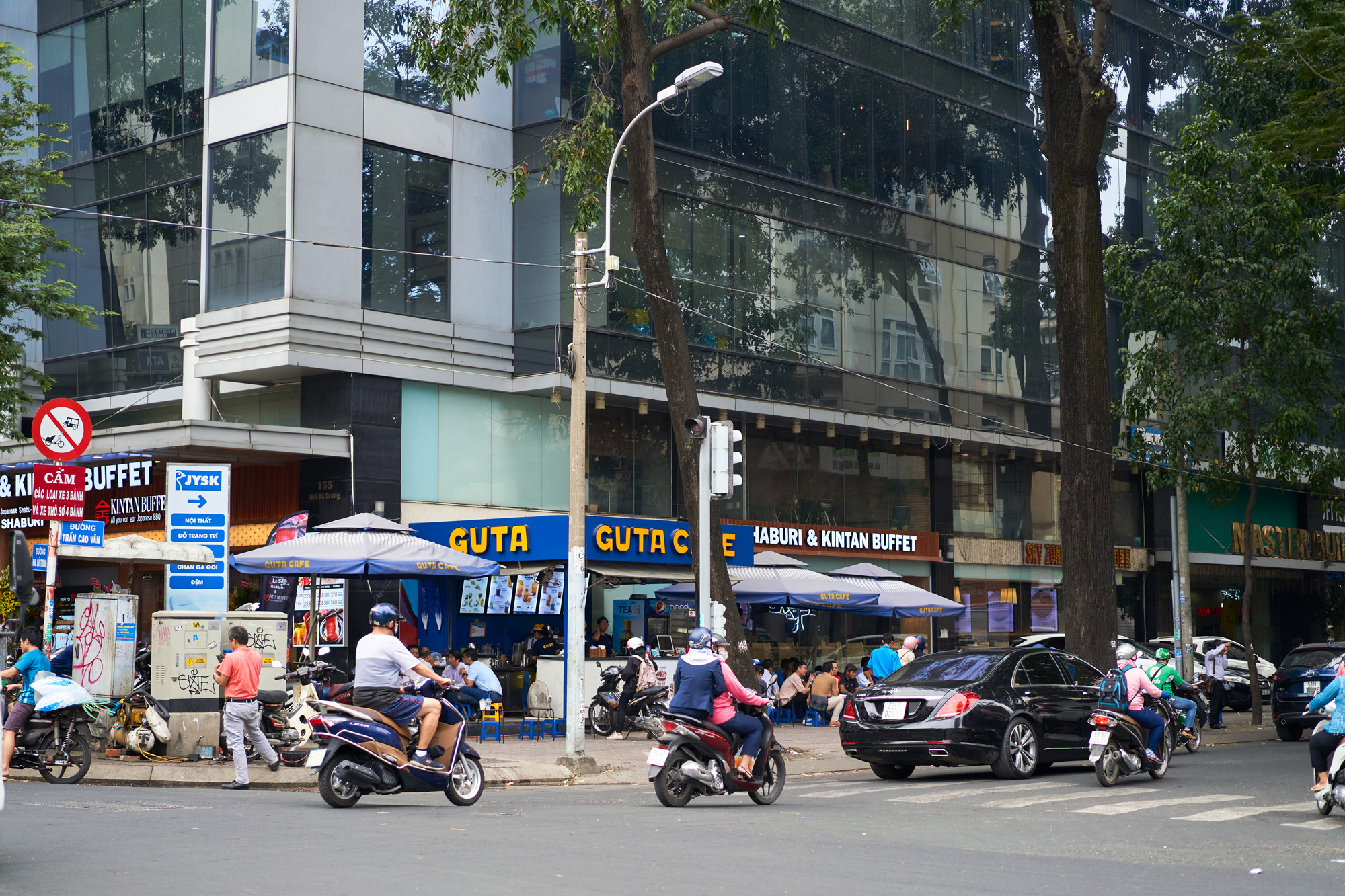
My favorite aspect of the identity are the storefronts. They are so effective, looking as recognizable as Starbucks’ green storefronts but these in particular have the rare of effect of both standing out and blending in. The former through the bright color palette and the latter through the logo that has that hand-painted vernacular feel I mentioned earlier, making each location look as if it has been there for a long time.
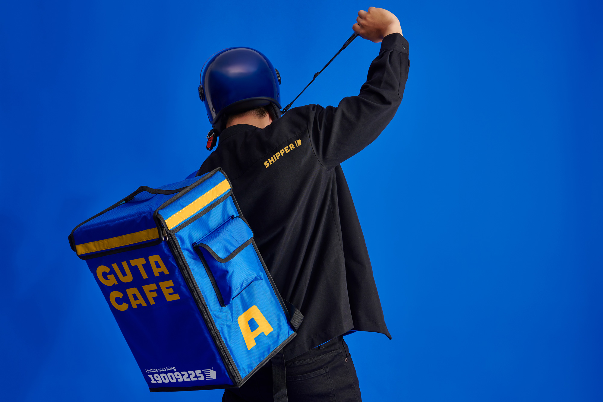
To achieve comfort and functionality when serving outdoor in humid, sunny weather, uniform was designed with minimal basic 4D light Tshirt comprehending with shorts. In detail for branding, there’s an upside down pocket symbolized for the A-chair symbol.
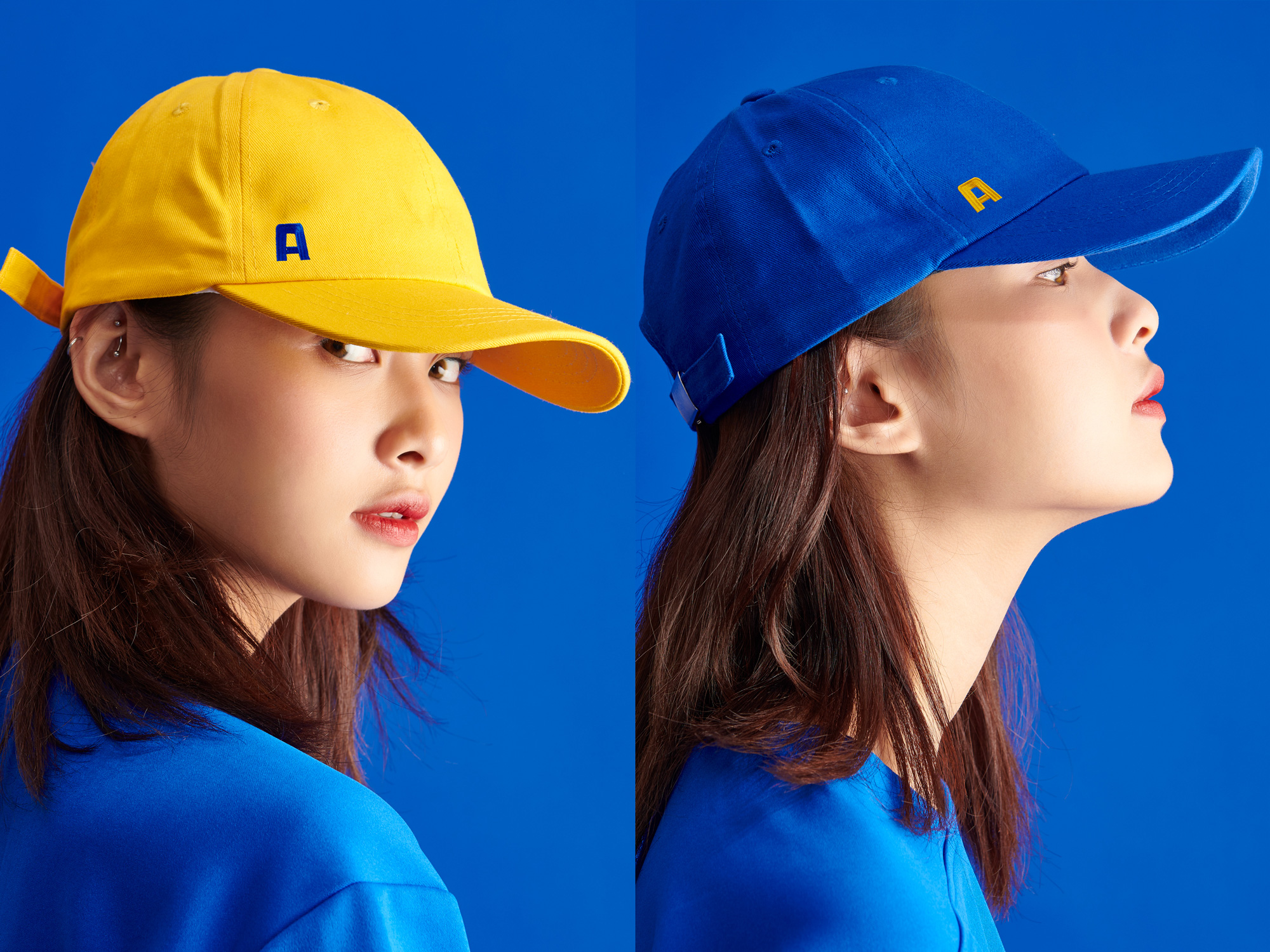
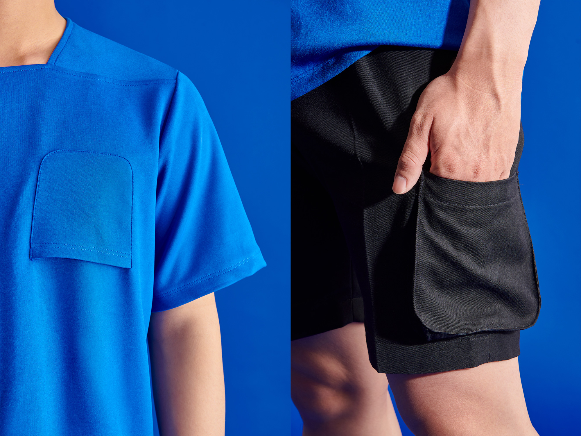
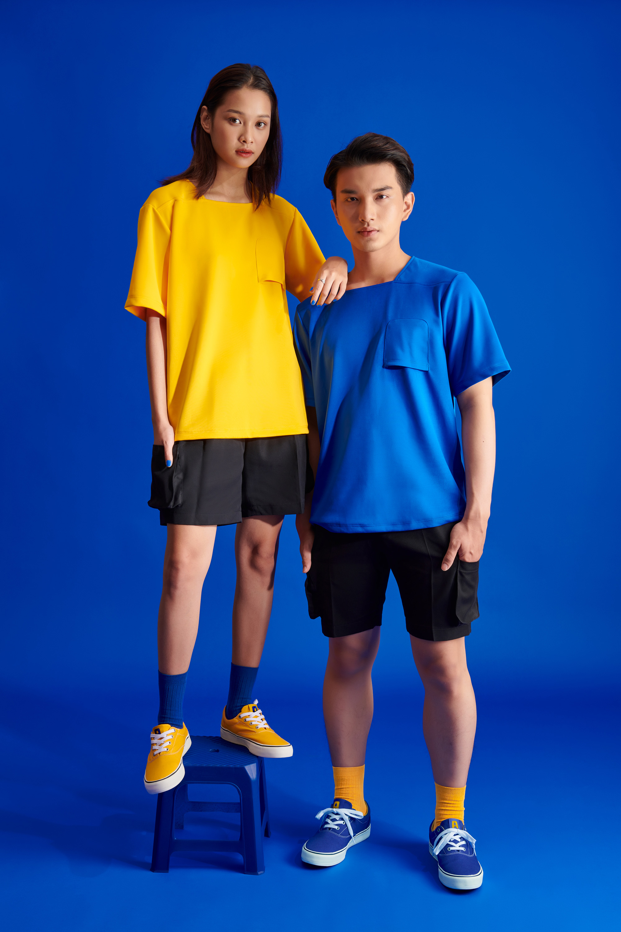
The uniforms, for both baristas and delivery people, are great, with a simple, bold, and youthful vibe. I LOVE the upside down pocket on the t-shirts that, once more, references the chair. Yes, it’s a useless pocket but most pockets on t-shirts are so at least this one is on brand.
Overall, I think this is really great. It doesn’t follow trends, it’s culture-specific, and the ideas and concepts are very well implemented from start to finish all while giving Guta a highly recognizable identity as it literally takes to the streets.
 each year since publication began in 2006

 Новости Союза дизайнеров
Все о дизайне в Санкт-Петербурге.
Новости Союза дизайнеров
Все о дизайне в Санкт-Петербурге.