Обзор лучших ресурсов по разработке бренда, разработке упаковки
contact us | ok@ohmycode.ru
contact us | ok@ohmycode.ru
Established in 2006, Badoo is the largest social discovery network in the world with the mission to “provide the best technology for people to meet, because happiness is better shared”. More colloquially, it’s one of the most popular dating apps in the world. Headquartered in London, UK, it counts with over 476 million users across 190 countries and is available in 47 languages. Each day, users spend an average of 1.8 hours on Badoo for a total of over 12 billion swipes and more than 300,000 people sign up daily. Recently, Badoo introduced a new identity designed by their in-house design team, MagicLab Design.
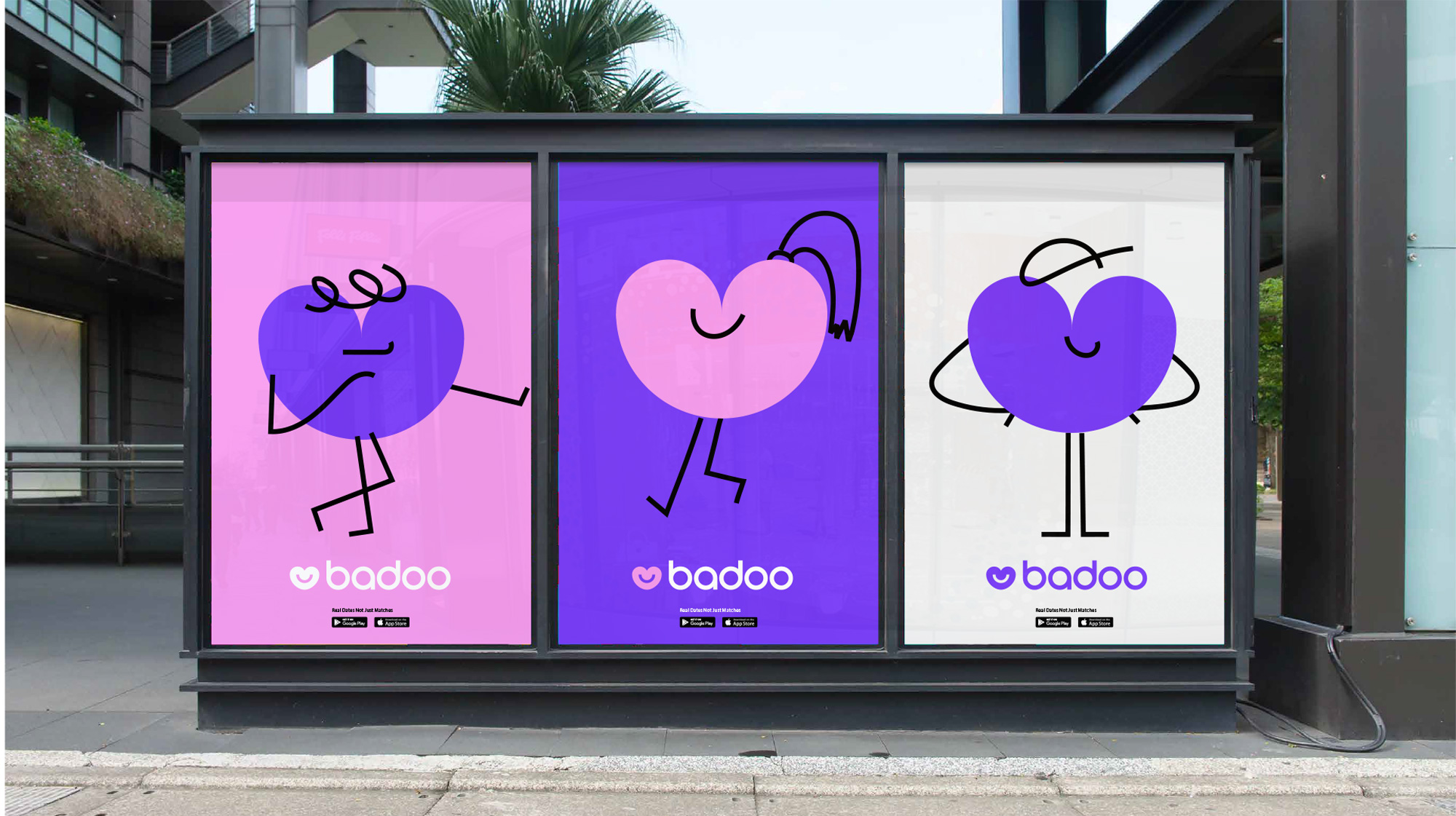
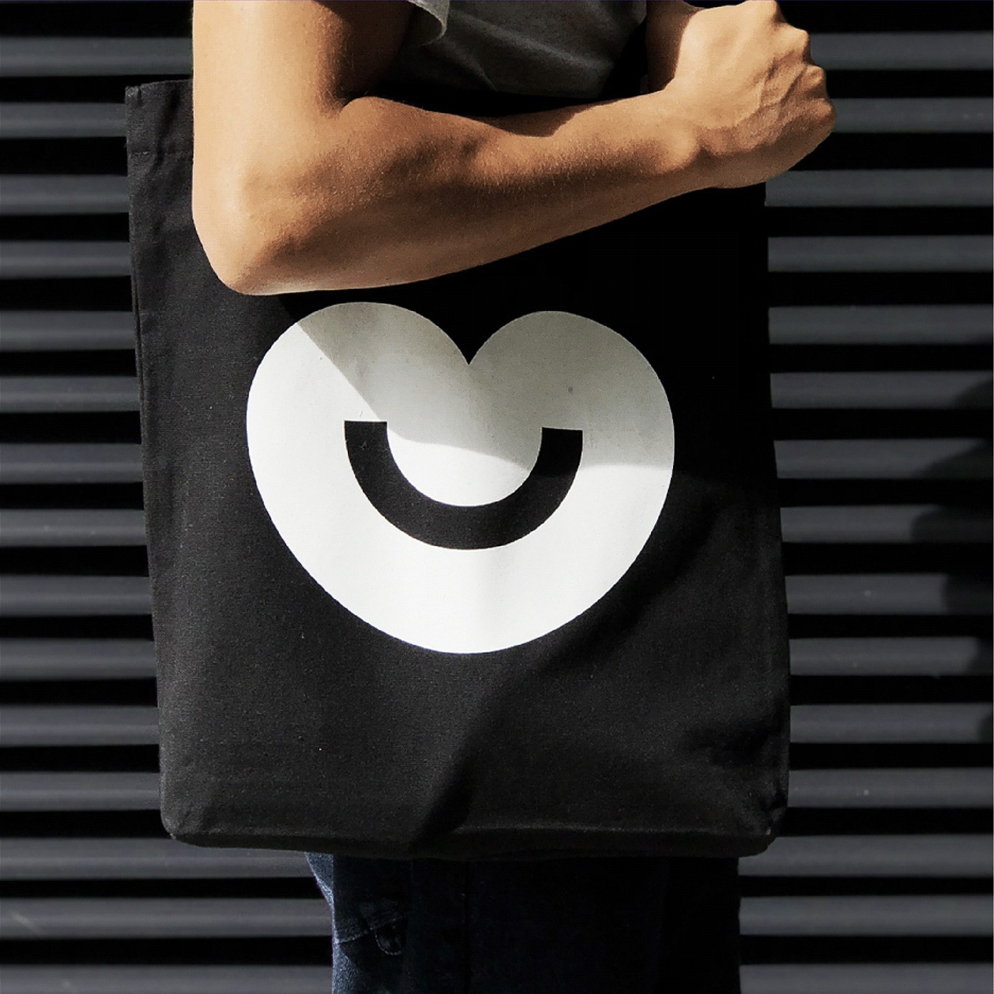
The Badoo logotype consists of two parts: the graphic symbol and the wordmark. The previous symbol wasn’t distinctive and was lacking emotional touch, so our goal was to create a new one that evoked the positive emotions, warm feelings and happy memories around real dates. Our new symbol is approachable, friendly, human and welcoming.
The old logo was a significant (and positive) evolution of what Badoo was before it. The introduction of the heart as the icon and a super clean geometric sans serif wordmark opened the door for a playful and more sophisticated identity. One of the problems with the old logo was that the heart was just that, a heart, lacking any real ownable traits and the in-house design team recognized that relatively early on, three years after the redesign. (That may sound like sarcasm but it’s not; for a semi-large brand, three years is not that long and it’s feasible for it to change without much damage incurred, especially when the change is not as drastic as is the case here.) The new heart now has a roundier silhouette and a big, wide smile that’s quite charming. I do think this is a detail that transforms the heart from a generic graphic to a brand-specific graphic for Badoo. I like how the smile is a perfect half-circle, matching the perfect circles used in all the characters of the wordmark, which remains the same as last time. Moving to a softer color palette seems like a good choice… I liked the vibrancy of the old one more but I don’t dislike this in any way.
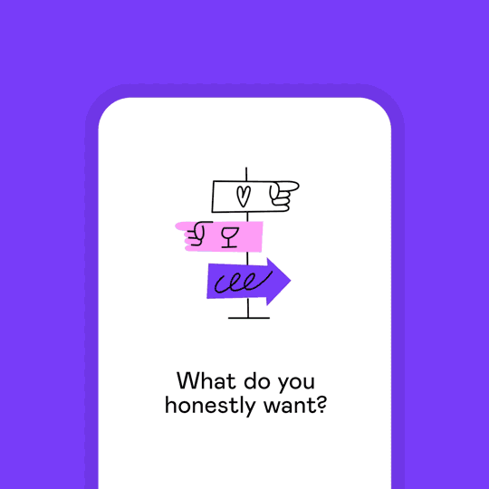
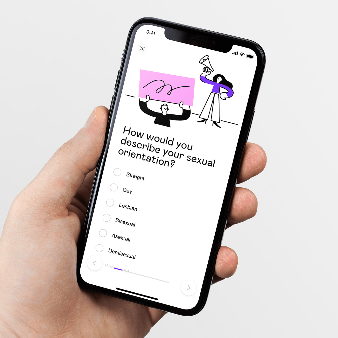
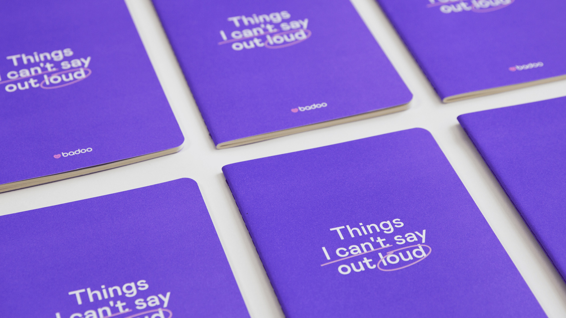
One of the key elements of our new identity is the addition of handwritten elements, which helps us to create a more human look and feel, to draw attention to the most important parts of the copy. We also created an additional typeface to complement this approach and evolve our ways of expression.
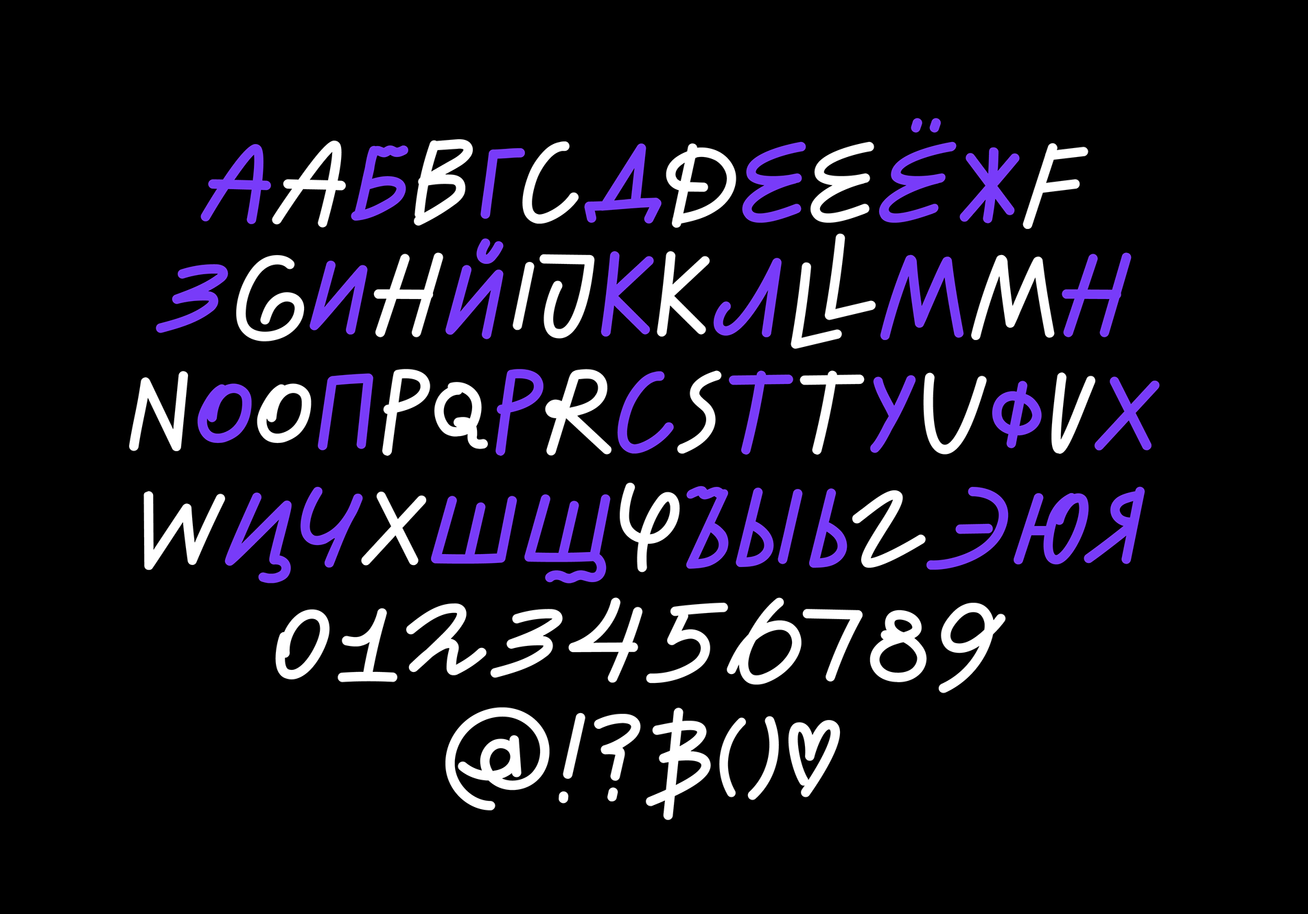


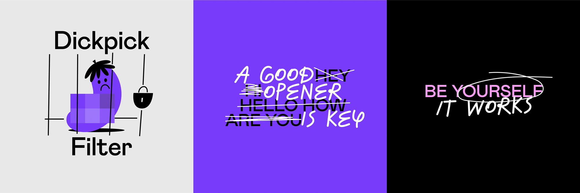
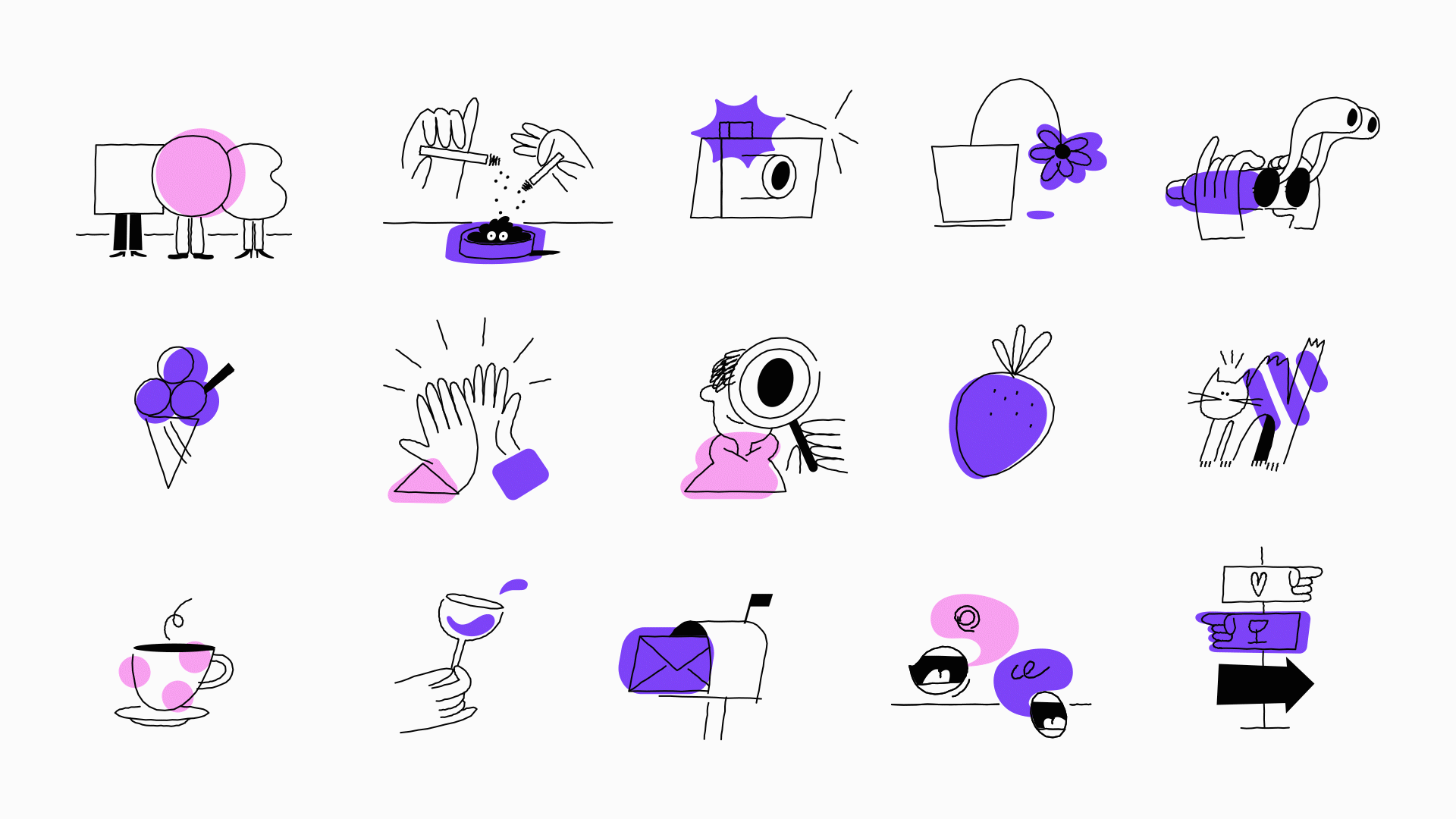
The biggest change in this version of the identity is the introduction of handwritten elements, including a custom typeface, a series of scribbles, and illustrations which are all, individually or together, something we’ve seen often but there is something unique about all these that makes them a little more engaging and memorable. I’m particularly fond of the illustrations with their funky italic-like slant and nice use of overlay.
We bring all our community’s emotions, feelings and memories into one space, using clean, simple and flexible layouts with lots of space around each element. Imagine a memory board, moodboard, or love notes and you’ll be on the right lines. Our branding doesn’t require us to stick to a visual super-structure to create artworks. Instead, we usually deploy a basic grid with a scaleable number of images - and of course, all our media is designed to remind users of the joy of real connection.
We want our photos to capture the honest moments between everyday couples, friends and lovers, so we’re focused on capturing real emotions and real people. We want to steer away from staged photography and move towards something more realistic and unscripted.
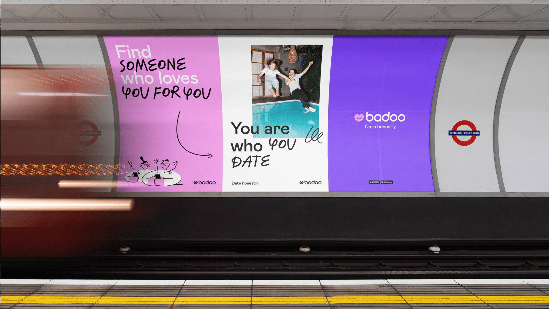
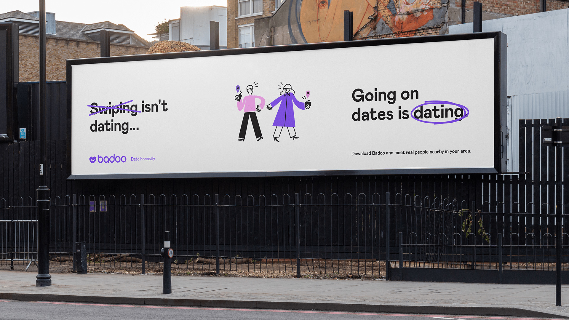
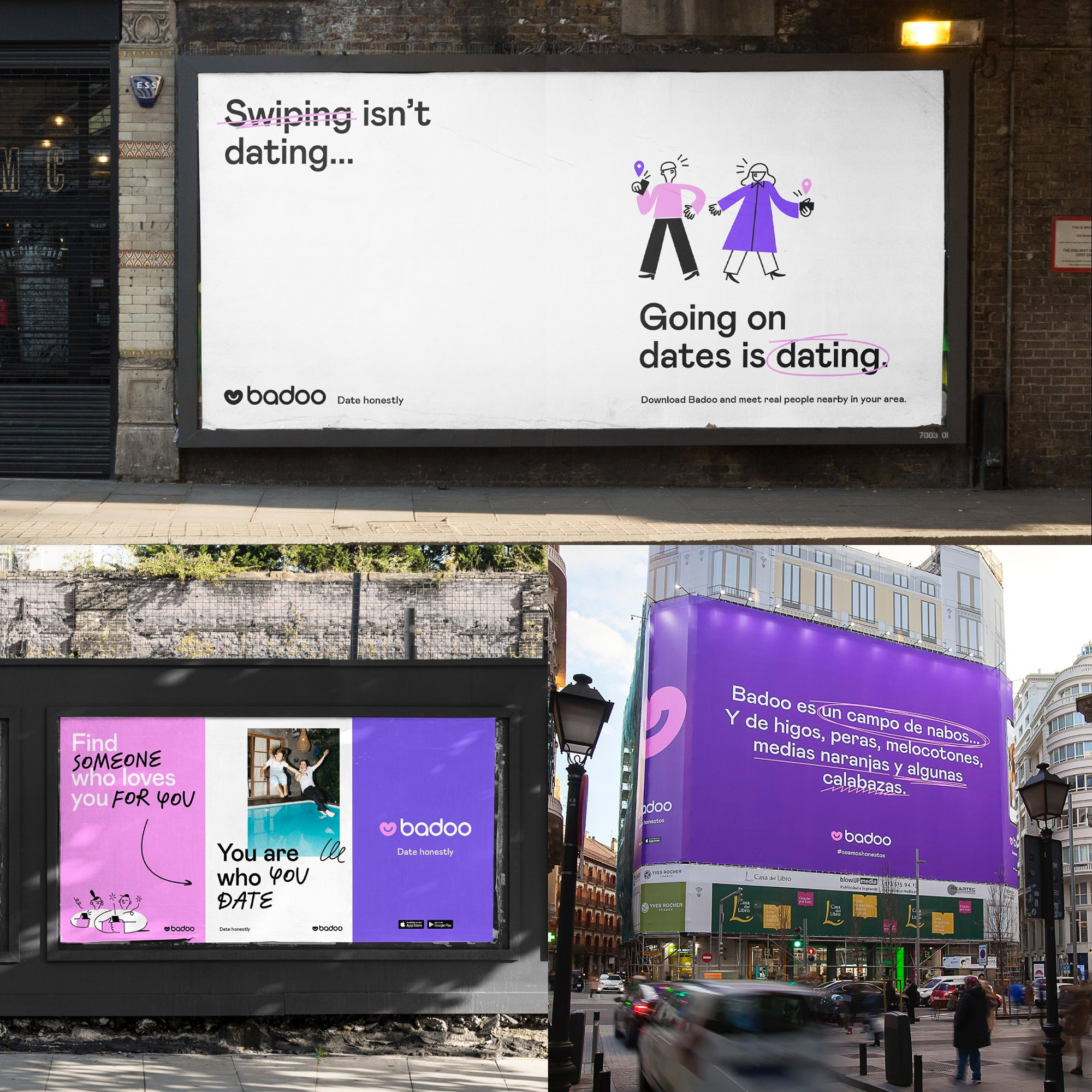
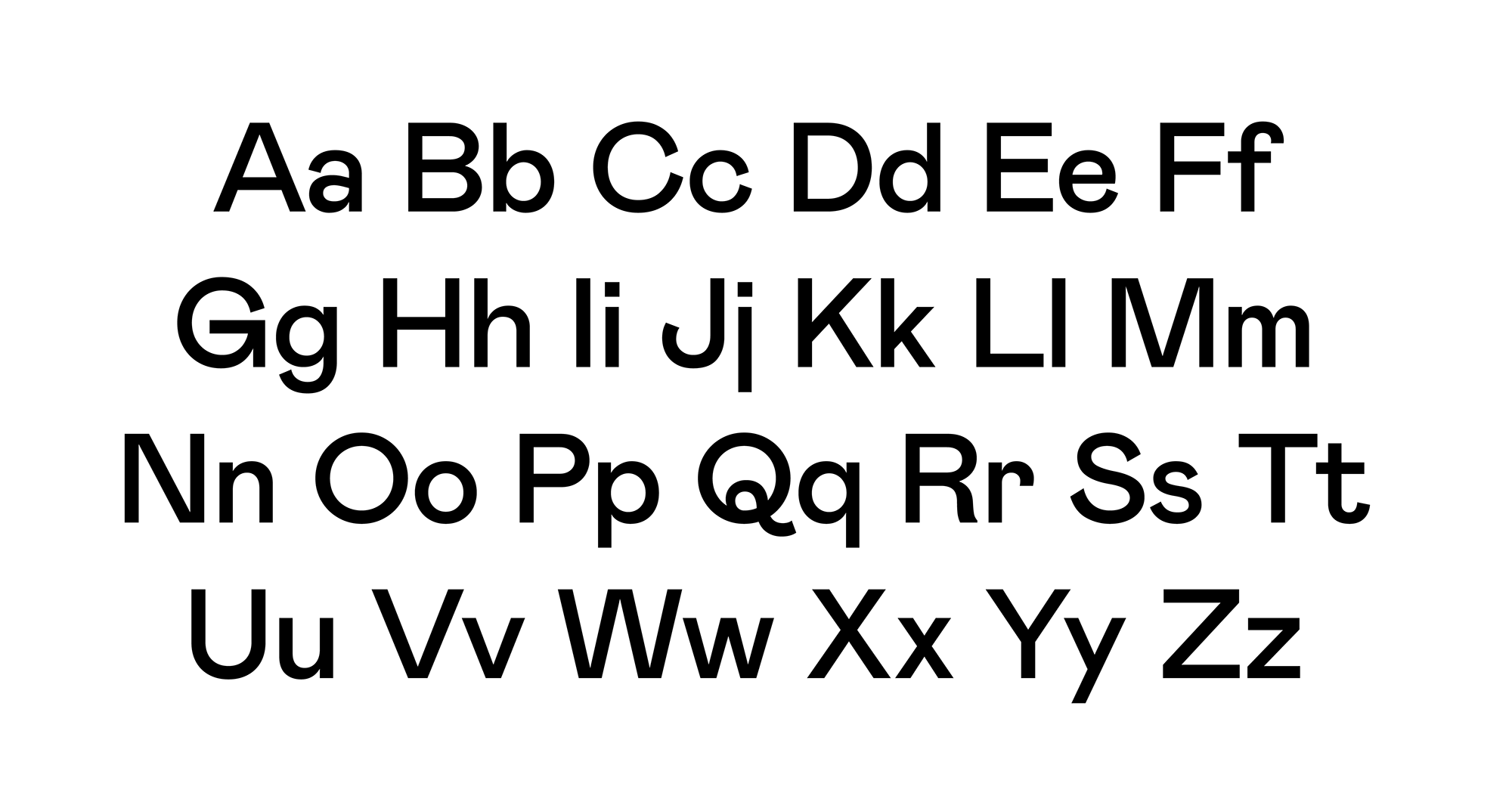
The applications are quite nice, making good use of all their elements. Colophon Foundry’s Mabry does a great job as the “straight man” that helps the handwritten typeface, scribbles, and illustrations stand out. The limited color palette of black, white, pink, and purple looks great too.
Overall, this feels like an evolution that makes a lot of sense, where Badoo needed something more unique to them and they took it as an opportunity to add a human touch to the playfulness established by the previous redesign.
 each year since publication began in 2006

 Новости Союза дизайнеров
Все о дизайне в Санкт-Петербурге.
Новости Союза дизайнеров
Все о дизайне в Санкт-Петербурге.