Обзор лучших ресурсов по разработке бренда, разработке упаковки
contact us | ok@ohmycode.ru
contact us | ok@ohmycode.ru
“Courmayeur is a town and comune in northern Italy, in the autonomous region of Aosta Valley. At an elevation of 1,224 m (4,016 ft) above sea level, it is located at the foot of the southern side of Mont Blanc, at 4,810 m (15,781 ft) the highest point in the Alps and western Europe (see Seven Summits), and is crossed by the Dora Baltea. Courmayeur shares administration of Mont Blanc with its neighboring commune of Saint-Gervais-les-Bains in France, and is consequently able to claim the title of highest commune in Italy. Courmayeur also shares access to the famous glacial ski run of the Vallée Blanche with another French town, Chamonix, which sits at the opposite, northern, side of the Mont Blanc massif.” (Wikipedia)
Interbrand (Milan, Italy office)
N/A
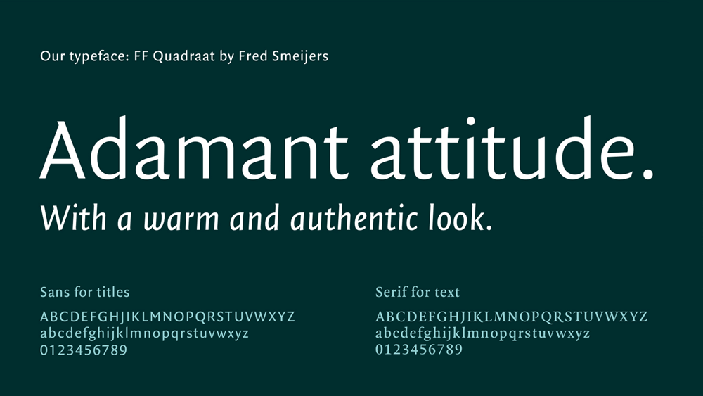
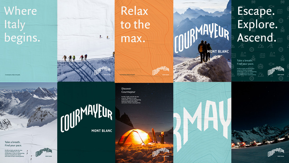
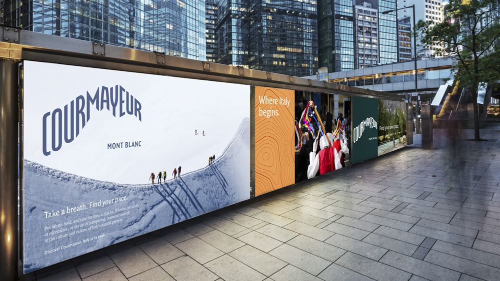
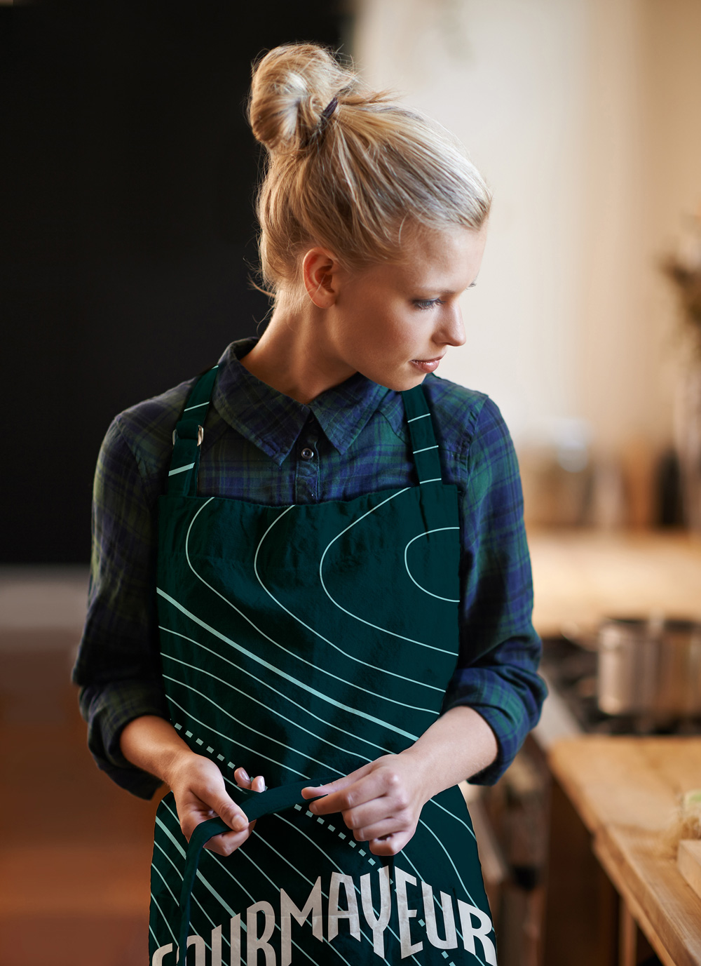
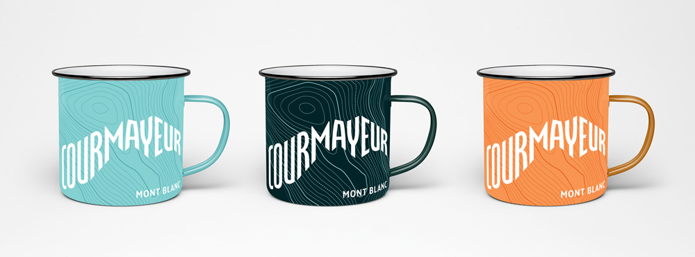
The logotype features a dynamic and unusual custom lettering with a clear footprint, inspired by the Italian profile view of the Mont Blanc. The typeface family Quadraat by Fred Smeijers, with its warm, slightly classic and expressive look, was chosen to support the visual system. The fresh and vibrant color palette, inspired by nature, aims to appeal to a young target. Some details, such as the icons and a texture based on level lines of the area, enrich the system adding to the creation of applications and merchandising.
The icon in the old logo was quite nice, with the silhouette of Mont Blanc making the shape of a crown — casting a sophisticated Game of Thrones vibe. The wordmark, though, was way, WAY too tight which was made even more noticeable by the way, WAY too loose tagline. The new logo is… different. WAY different. When I first saw it, without knowing where or what Courmayeur was I could tell immediately it had to do with a mountain and this is not to say that my powers of perception are above average but that the logo makes it plainly obvious. Adding "Mont Blanc" at the "foot of the mountain" logo confirms it and also establishes its own kind of associations. The logo is hard to digest but, heck, it's daring and interesting. I could give a pass to all the characters, except the "R"s, those feel mangled more than any of the others. In application, the logo gets a slight lift in making it look more upscale, striking a nice balance of coming across as rugged and outdoorsy with a slight spa-ish bent. Overall, bonus points for weirdness and making a logo that is very location-specific but the execution could have enjoyed the benefit of a letterer.

 Новости Союза дизайнеров
Все о дизайне в Санкт-Петербурге.
Новости Союза дизайнеров
Все о дизайне в Санкт-Петербурге.