Обзор лучших ресурсов по разработке бренда, разработке упаковки
contact us | ok@ohmycode.ru
contact us | ok@ohmycode.ru
Established in 2012, Duolingo is a free, science-based language-learning platform that has become one of the most common used ways to learn a new language. Offering 91 total language courses for more than 30 distinct languages online as well as in Android and iOS apps, Duolingo has 300 million users worldwide. A big part of its appeal is that it’s built to feel like a game, allowing users to compete with friends, earning points, leveling up, and earning virtual currency, all in bite-sized lessons that are easy to get through. We have covered Duolingo twice: in 2013 when they first redesigned their owl from creepy-robotic to fun-cartoon-y and in January of this year when they kept the cartoon-y approach but flattened the angle and created a cohesive set of illustrations. Recently, Duolingo introduced a new wordmark and a more formalized visual language designed by London, UK-based Johnson Banks.
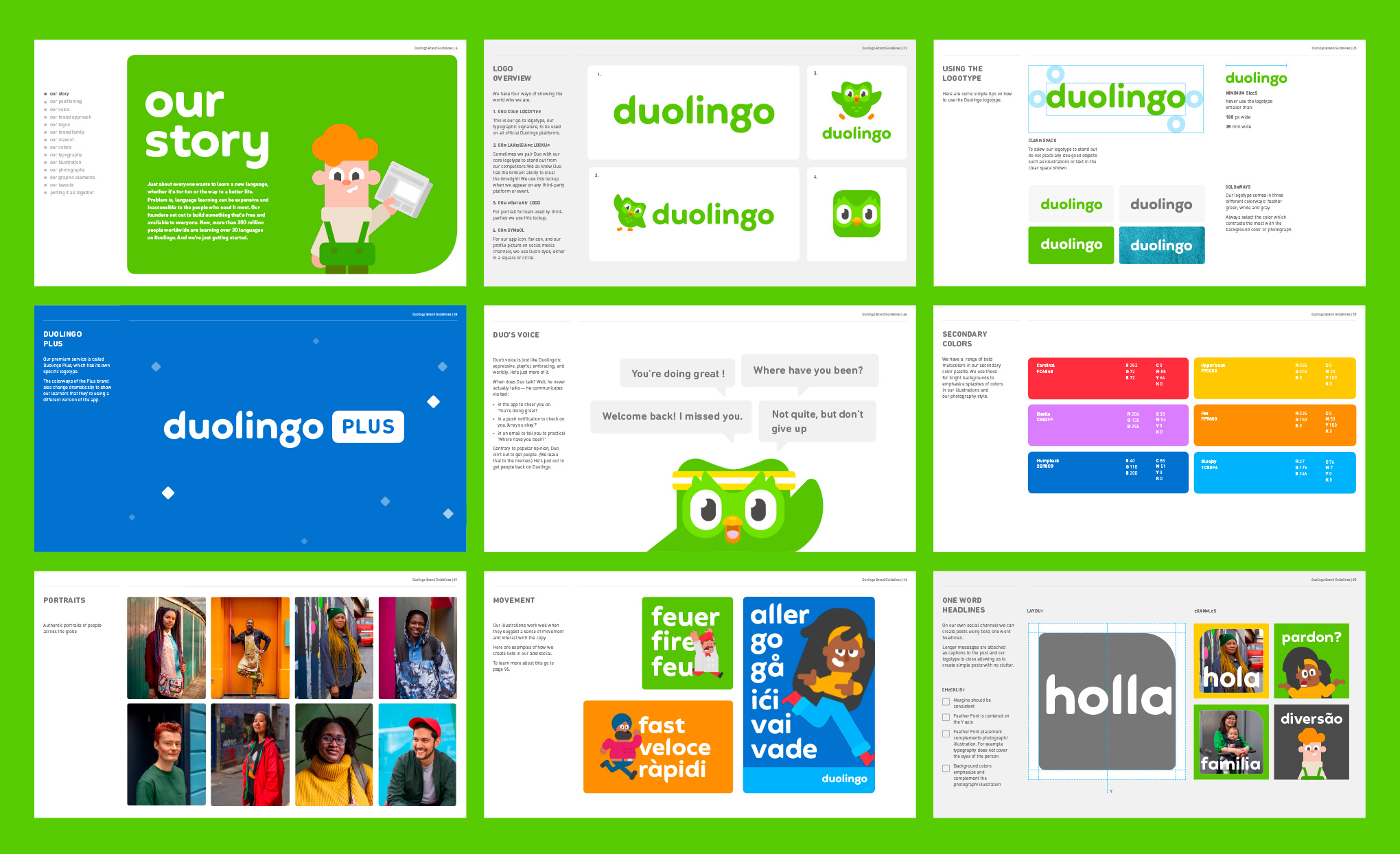
Visually, their owl mascot (Duo), the core colour, and their illustration style were broadly working. But they lacked clear guidelines on how to use the brand ‘away’ from the app environment. A growing list of projects and initiatives - such as their ground-breaking online English test - were also pushing at the boundaries of the brand structure.
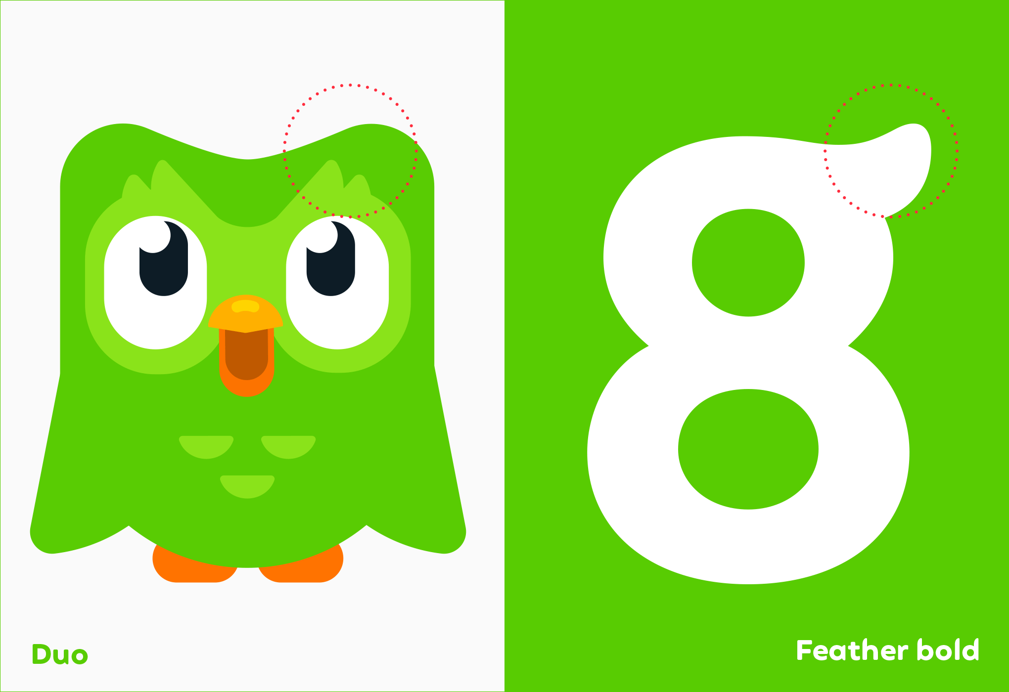
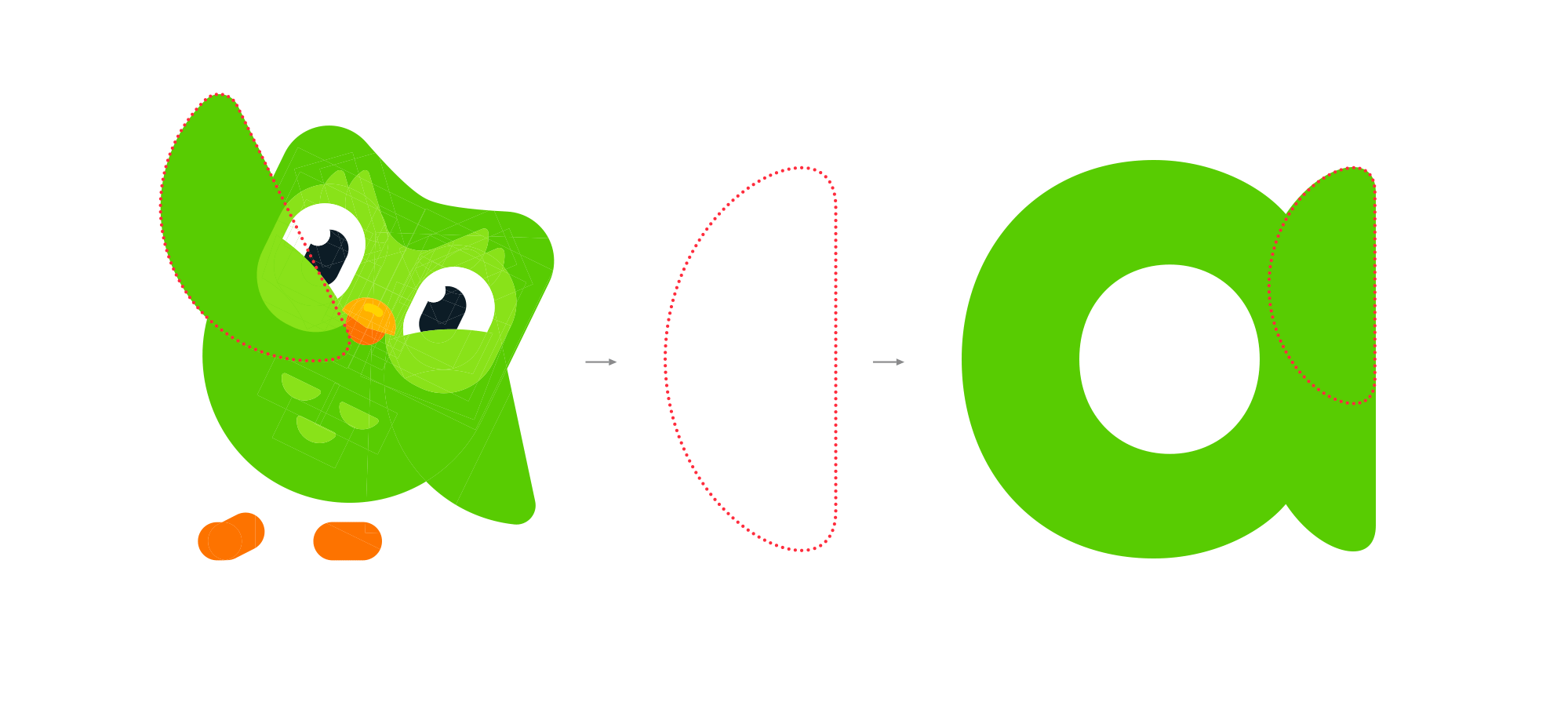
As we experimented with juxtaposing the mascot with their name, a ‘what if?’ unlocked the solution. Instead of using neutral typography alongside the symbol (like every other tech company), we redrew the logotype drawing inspiration from Duo’s feathery form to reflect the company’s quirky personality.
Our initial attempts to do this looked odd. But bit-by-bit we began to solve the logo conundrum, and started planning a bespoke typeface. With the help of typography specialists Fontsmith, we fine-tuned the logotype and then extrapolated the idea out into more characters. […] Little quirks, such as the flick of the lowercase ‘g’ were used sparingly, beta versions were crash-tested and eventually ‘Feather Bold’ was ready.
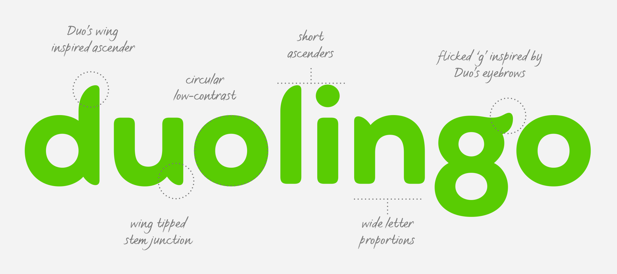
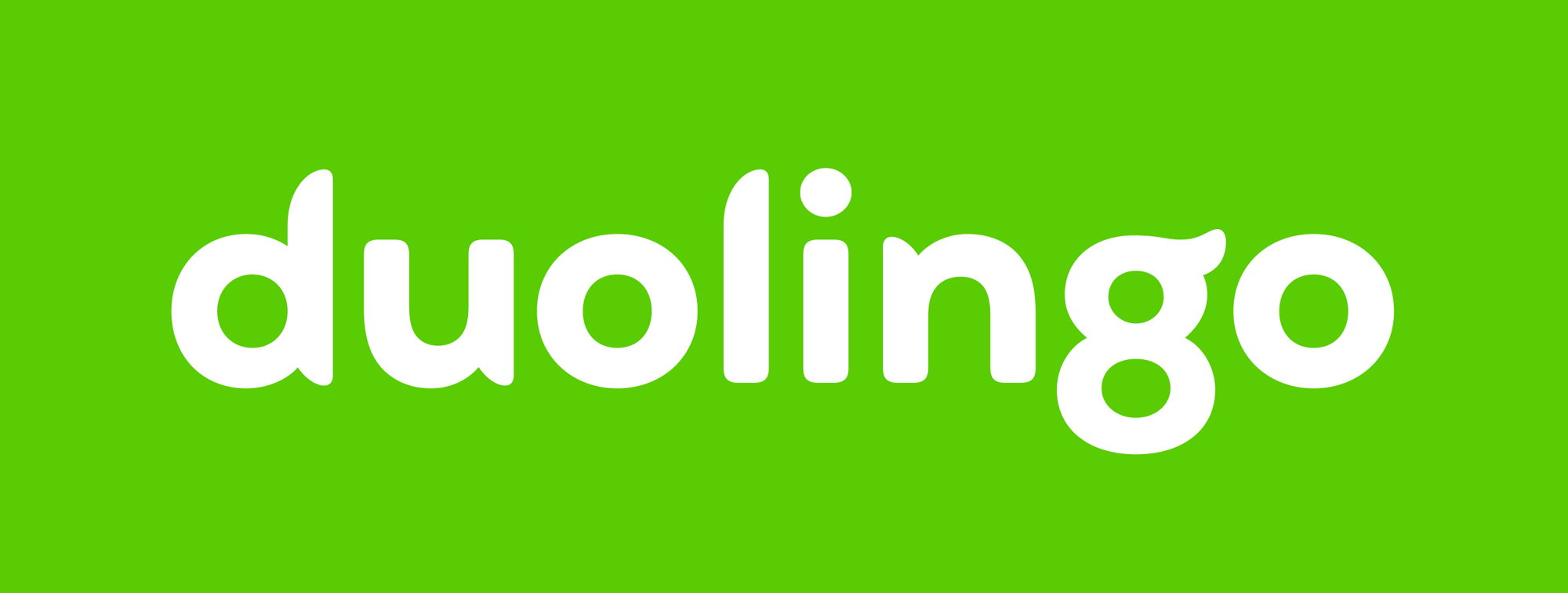
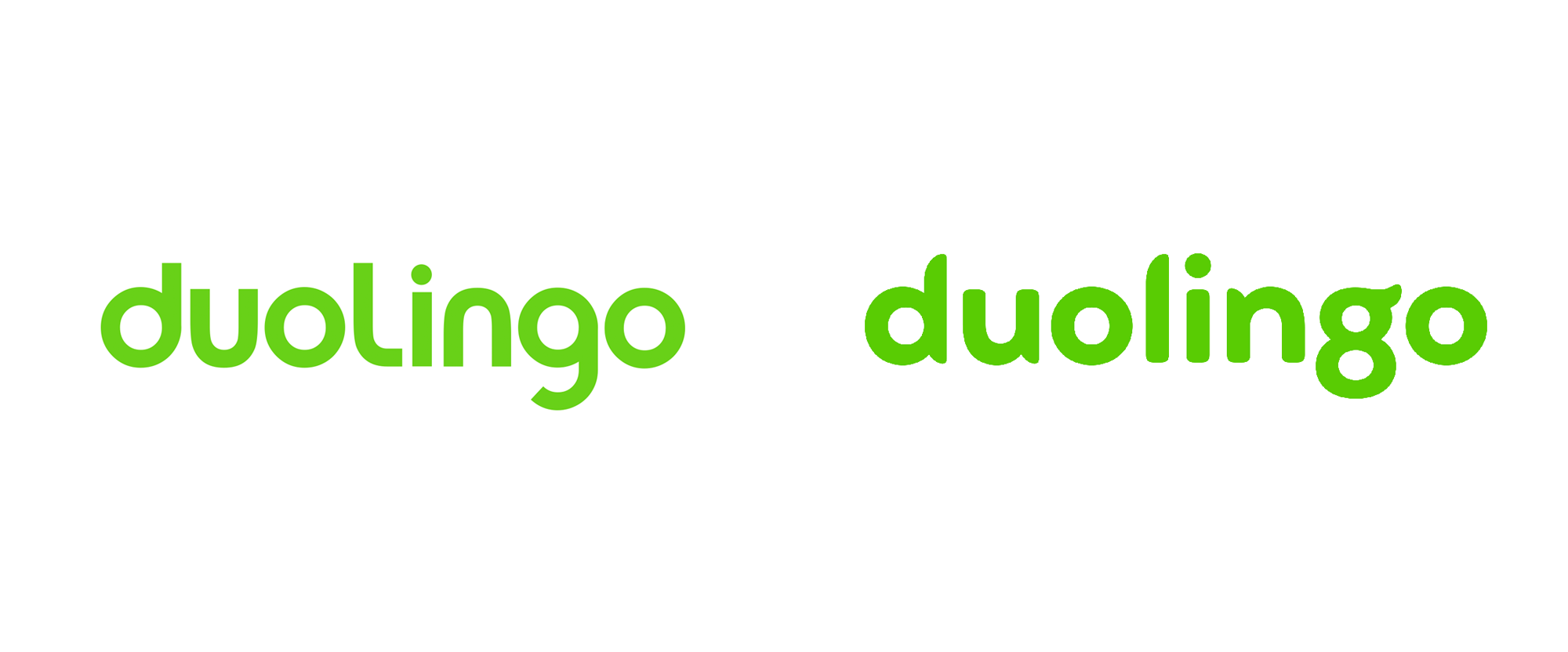
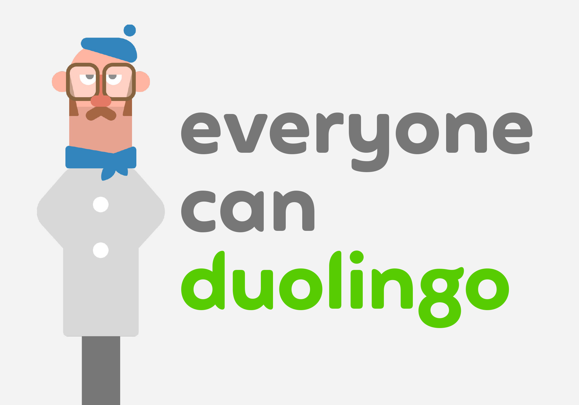
The previous wordmark was not very good even though it had a simple geometric sans structure… the “l” and the “g” were badly executed and oddly disproportionate and the squat ascenders yet long descender of the “g” made it very awkward. The new wordmark strays from the generic sans trend with a charming, bold, and quirky custom approach that matches the playfulness of the owl mascot in spirit while taking a few visual cues from it in execution. The “g” in particular sets the tone, being the most “interpretative” letterform, taking some liberties and perhaps even risks — my money is on at least 10 comments below being “duolin8o” — but it’s fun and memorable. The slightly exaggerated round corners and the long tapers on the curves of the stems are nicely executed. It’s a great evolution that builds on the unique personality of the brand.
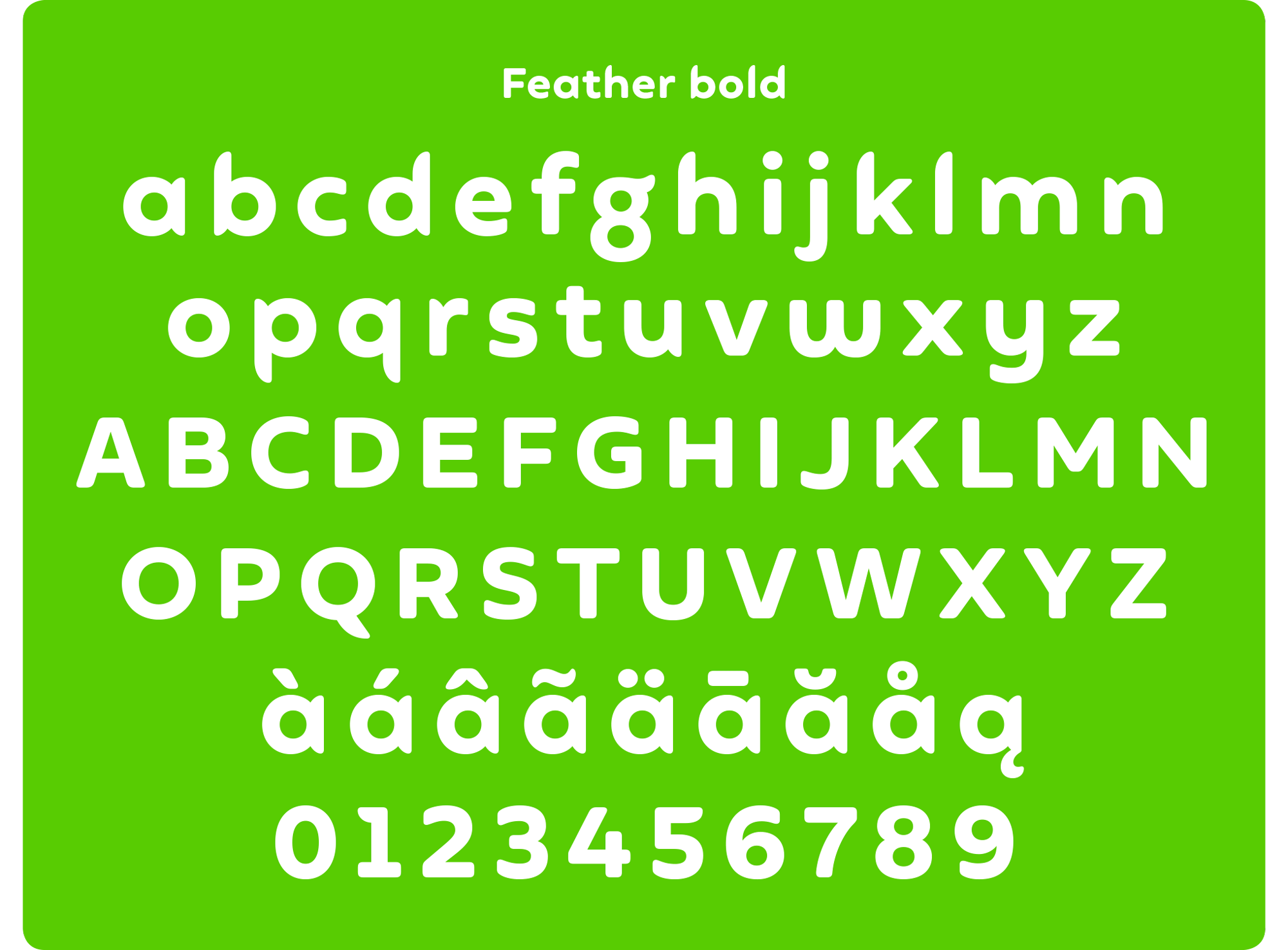
The expanded typeface is great. It has a very good balance of being techie and playful while smartly avoiding being too quirky and turning into more of a jokey display font.
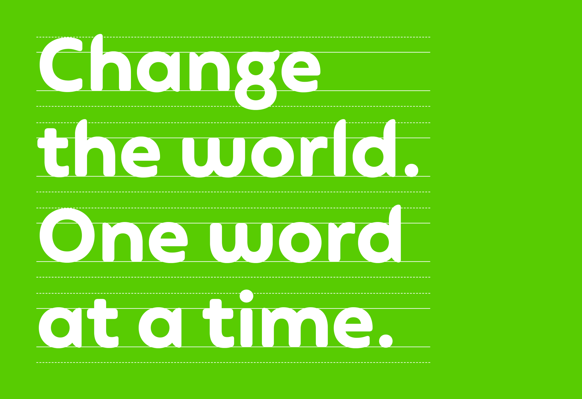
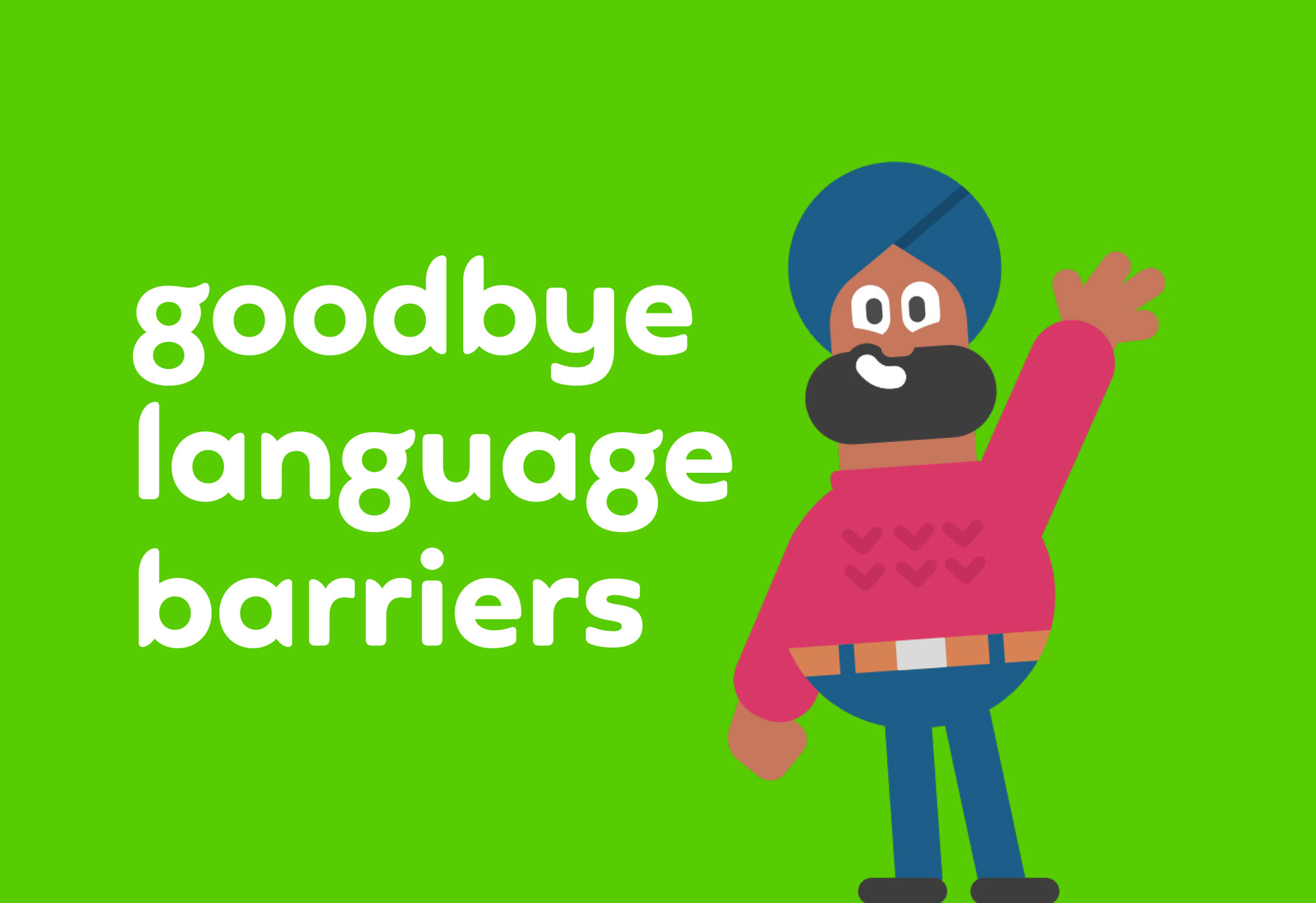
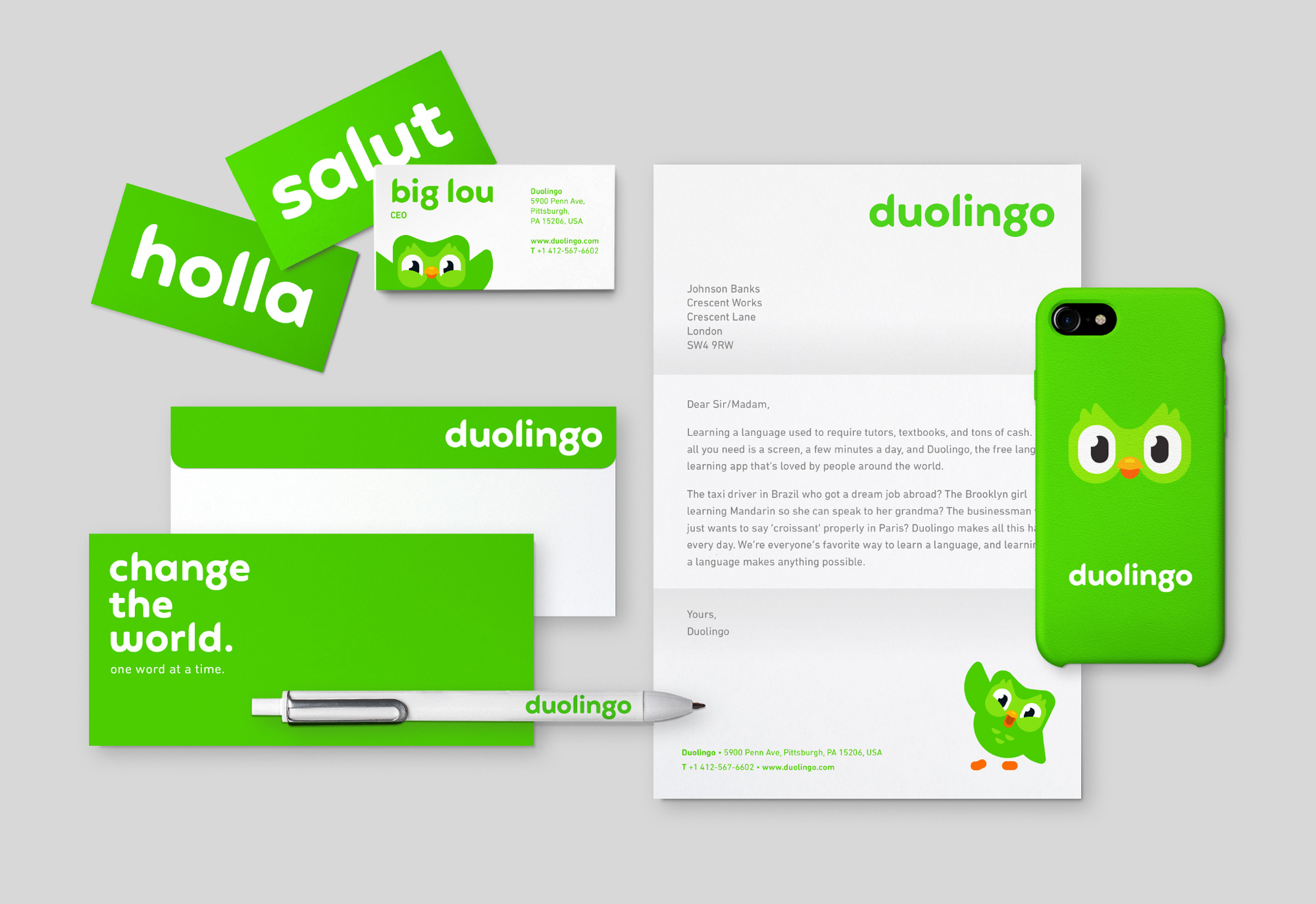
In parallel, we had developed a clearer tone of voice and messaging approach so the next task was to take all the elements and composite a clear set of guidelines that brought all the new elements together.
This included new logo lock-ups, revised core colours, typographic styling, illustration guides and other graphic elements.
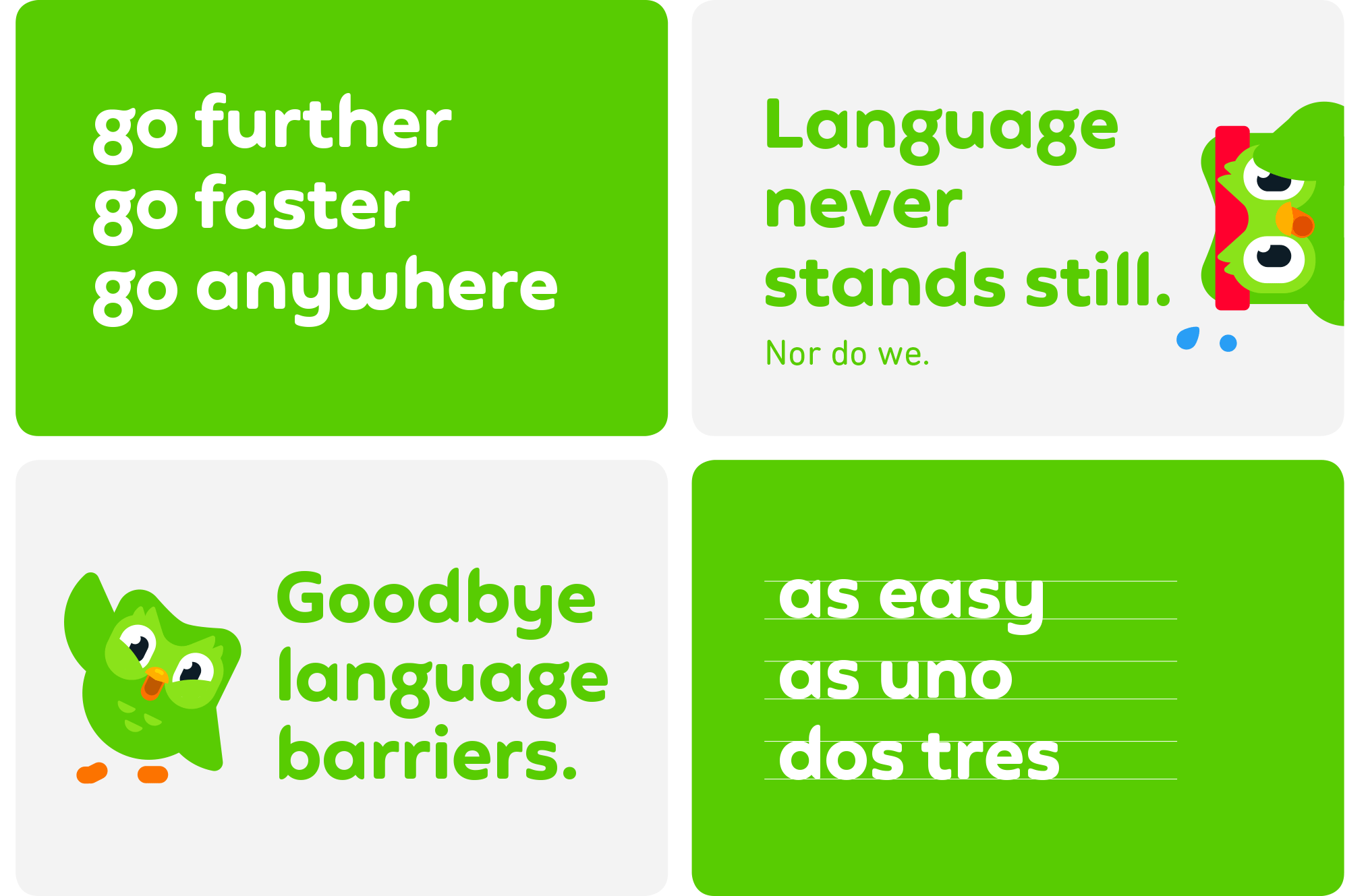
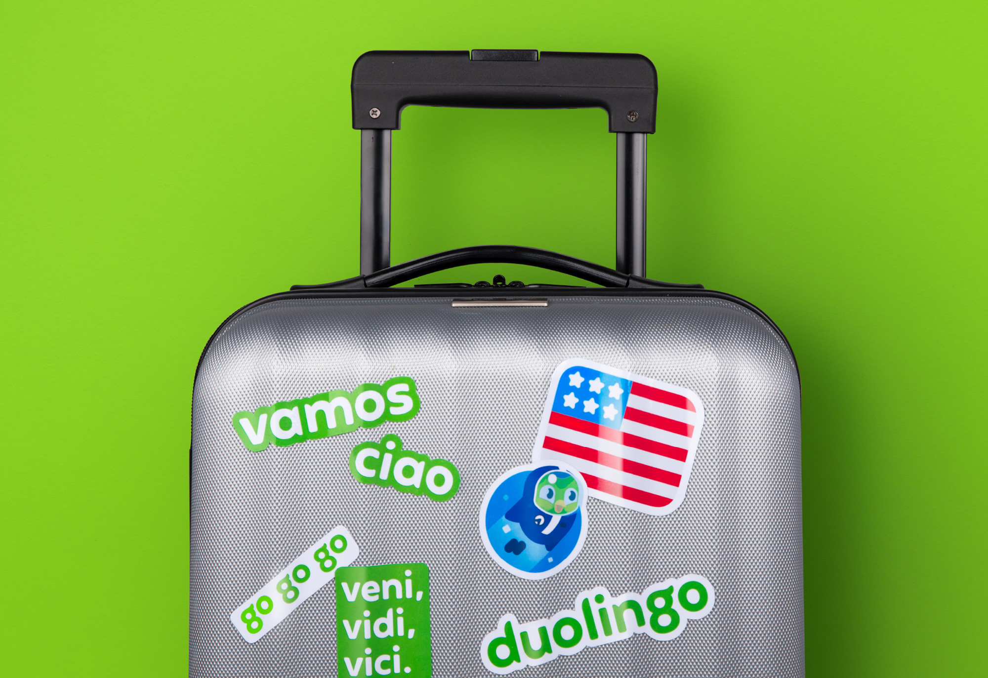
All these new elements are now being rolled out across multiple digital and physical touchpoints, including a brand ‘takeover’ at Pittsburgh airport, advertising campaigns in Europe and many plans for future merchandise.
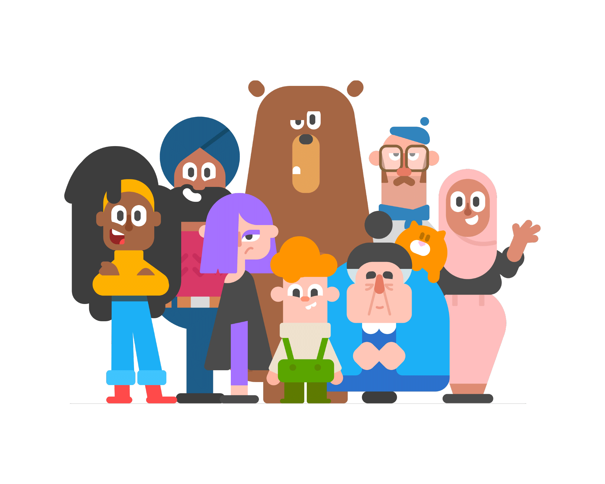
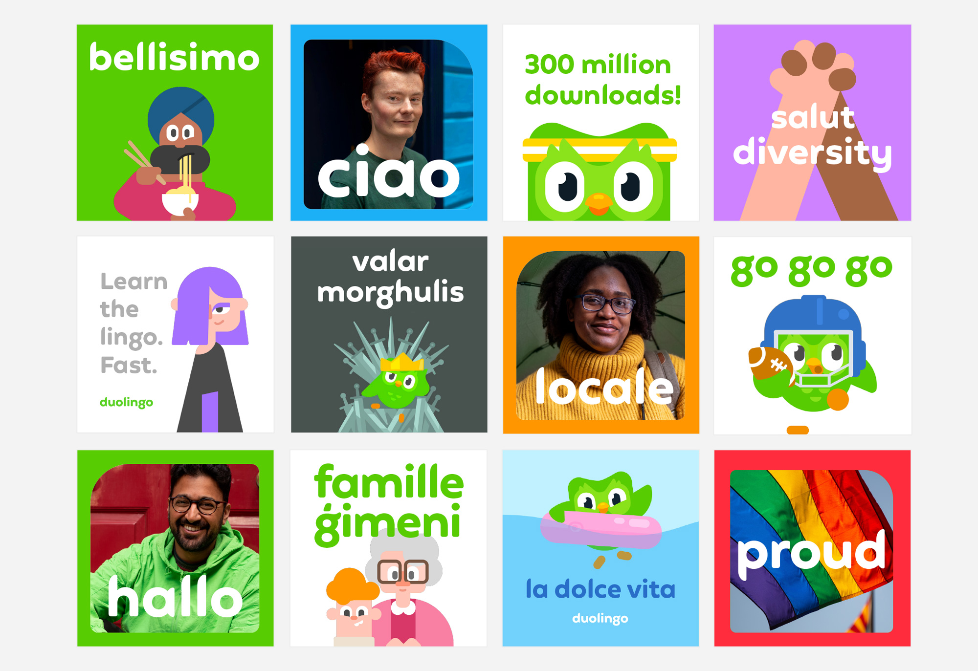
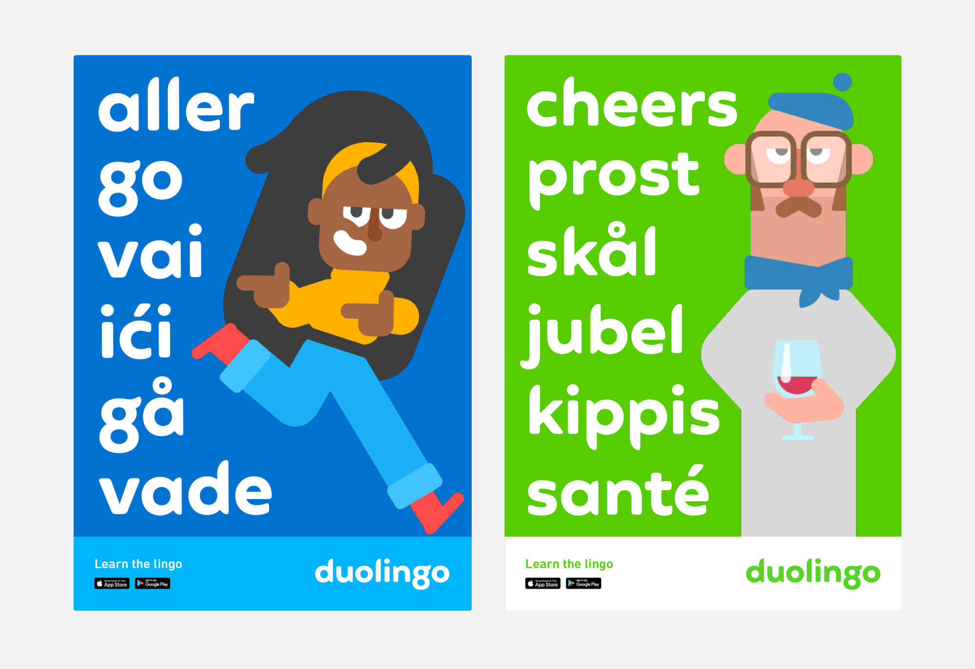
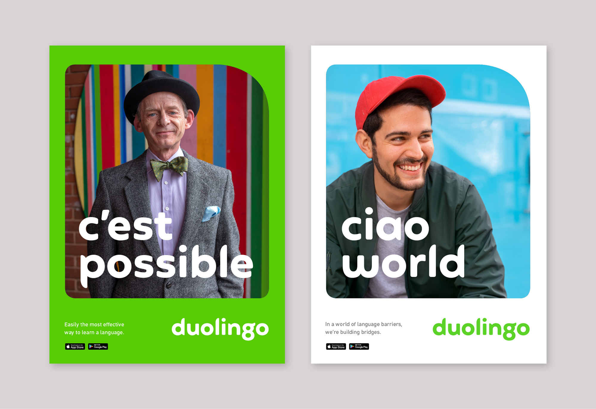
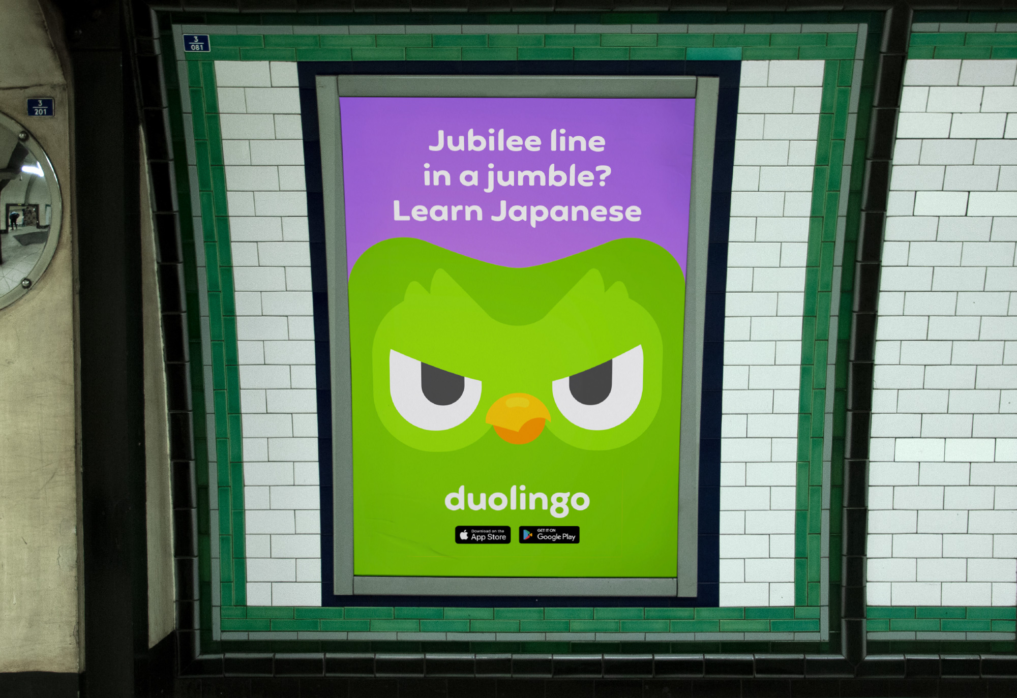
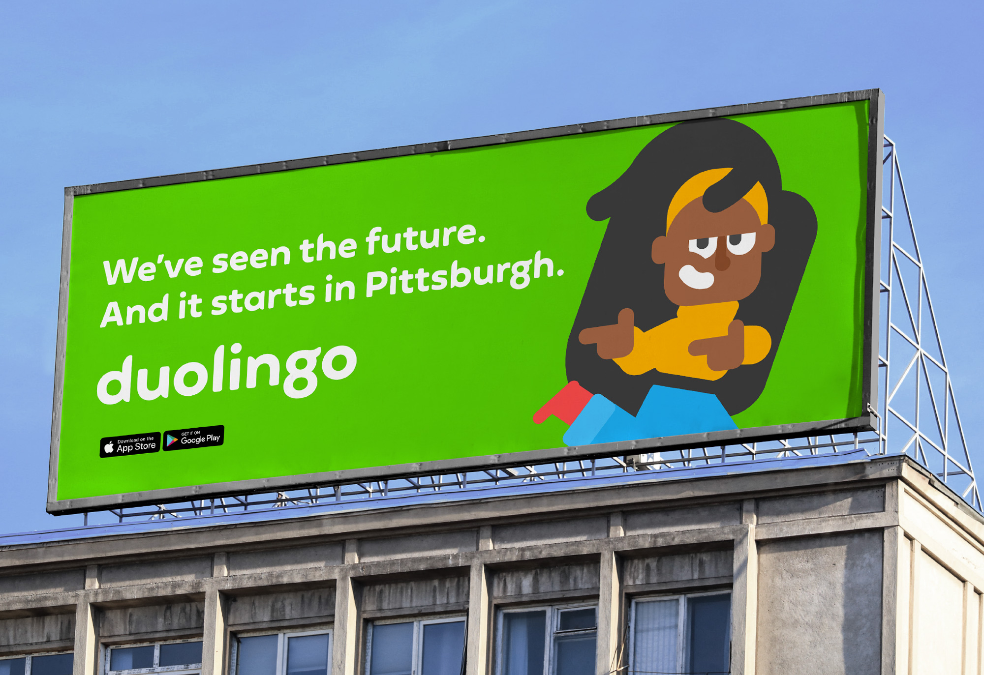
Most of the applications, for now, feel a little half-cooked and perhaps it’s because most of these are proof-of-concept or set up as guidelines to be starting points. Still, there is some additional visual element or some more interesting connecting thread missing to make the applications be more than just big type with big illustration or photo arranged in straightforward layouts. Nonetheless, with their fun illustration style, bright green color, and now a distinctive typeface, these have a lot of potential to evolve.
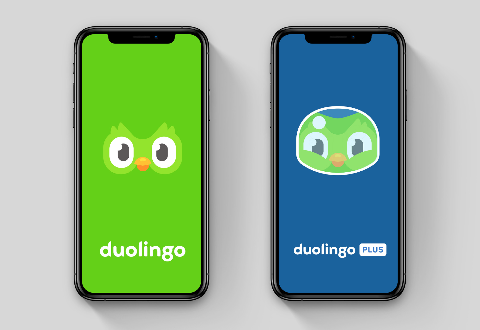
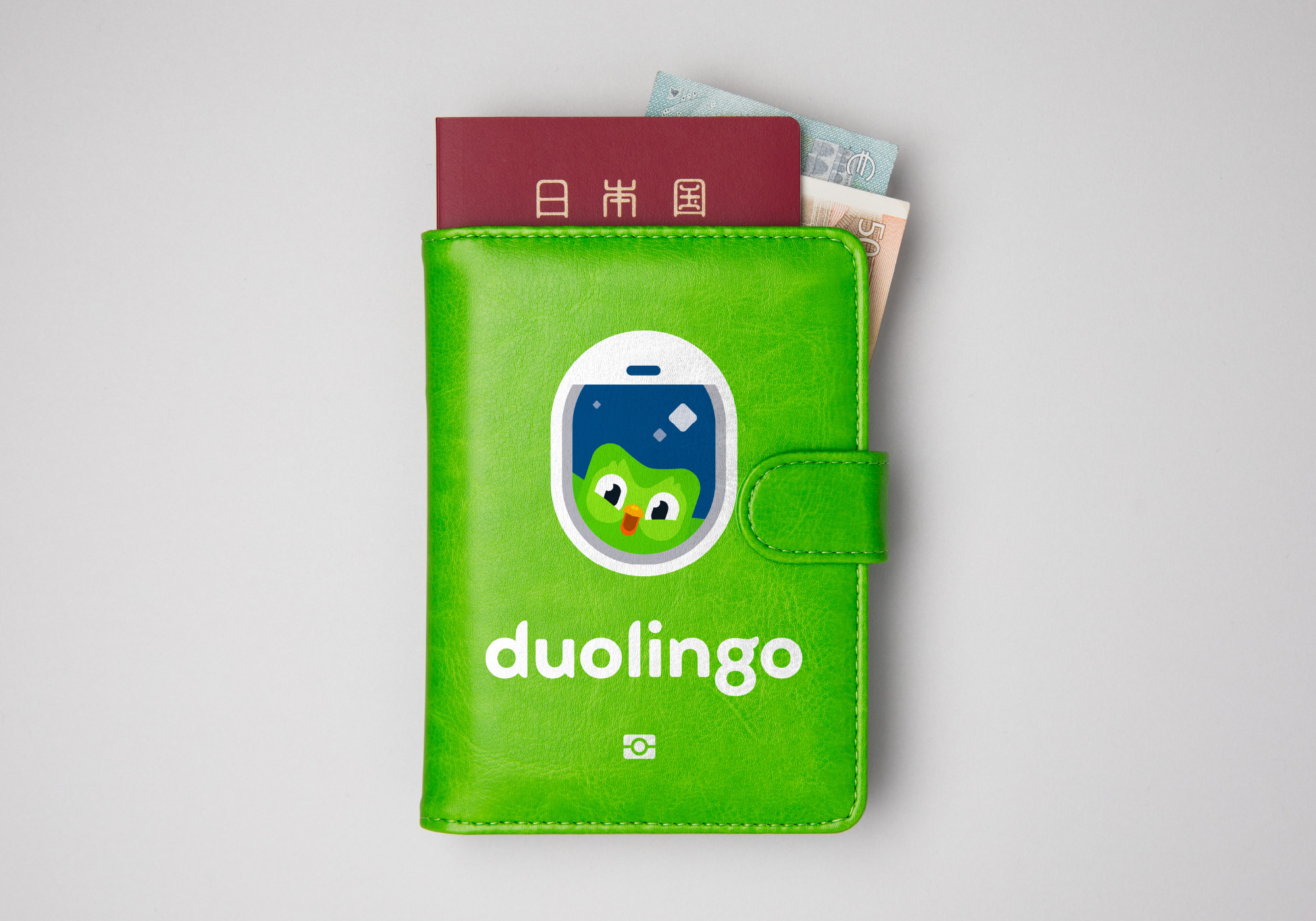
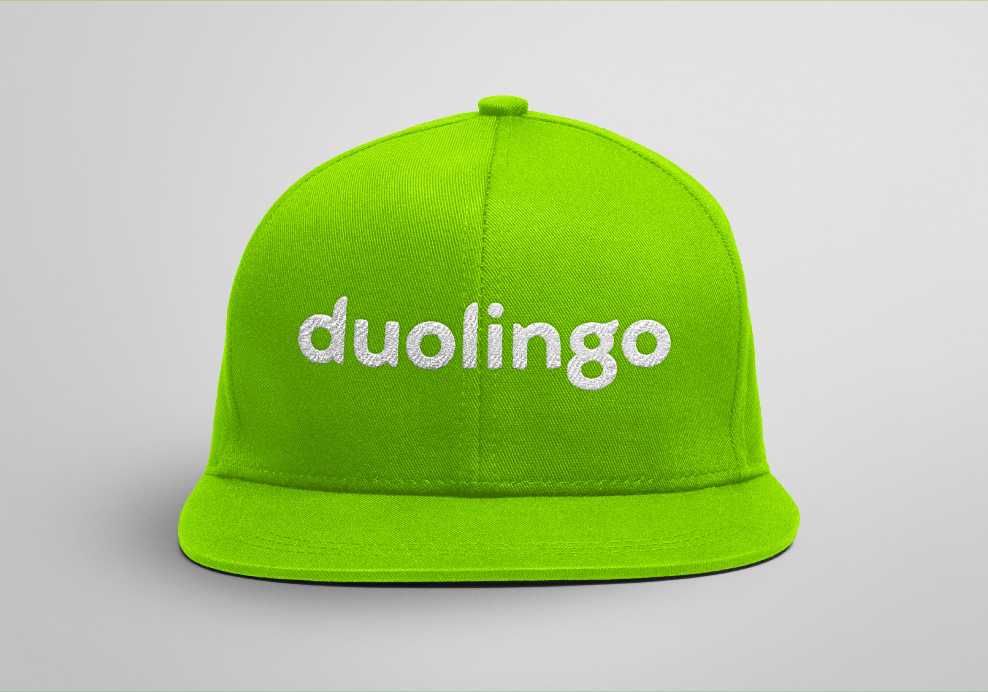
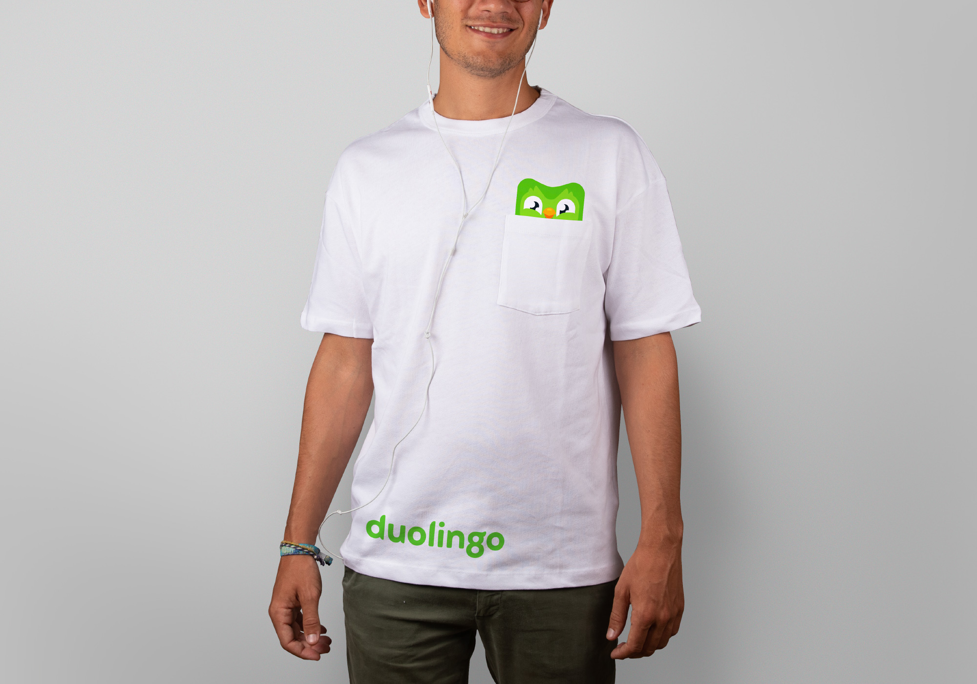
Overall, this builds effectively on the colorful, bouncy, lively, and engaging nature of the platform while expanding the visual ecosystem around the increasingly popular owl.
 each year since publication began in 2006

 Новости Союза дизайнеров
Все о дизайне в Санкт-Петербурге.
Новости Союза дизайнеров
Все о дизайне в Санкт-Петербурге.