Обзор лучших ресурсов по разработке бренда, разработке упаковки
contact us | ok@ohmycode.ru
contact us | ok@ohmycode.ru
Launched in 2013 (originally as the European League of Legends Championship Series), the League of Legends European Championship (LEC for short) is the professional eSports league in Europe for Riot Games’ extremely popular League of Legends multi-player online battle arena video game. The league consists of a season split into Spring and Summer competitions with ten teams competing in each and the respective winners battling for the World Championship. Regular season matches, played live at an arena in Berlin, Germany, attract around 300,000 to 400,000 viewers on Riot Games’ YouTube and Twitch accounts while the championship game can easily reach nearly 1 million viewers. Recently the LEC introduced a new identity designed by London, UK-based DesignStudio. (There is also a North America league but this project only applies to the European league).
Our new logo captures ‘Unleash Together’ - an explosion of triumph and celebration. The two sides represent the two competing teams, coming together as one symbol to depict the league’s arena and crown.
The mark comes to life in animation, rising from the ground and twisting to show off its dimensionality. These motion behaviours reference the energy and magic in gameplay. The symbol is modern and stands boldly beside other sports brands.
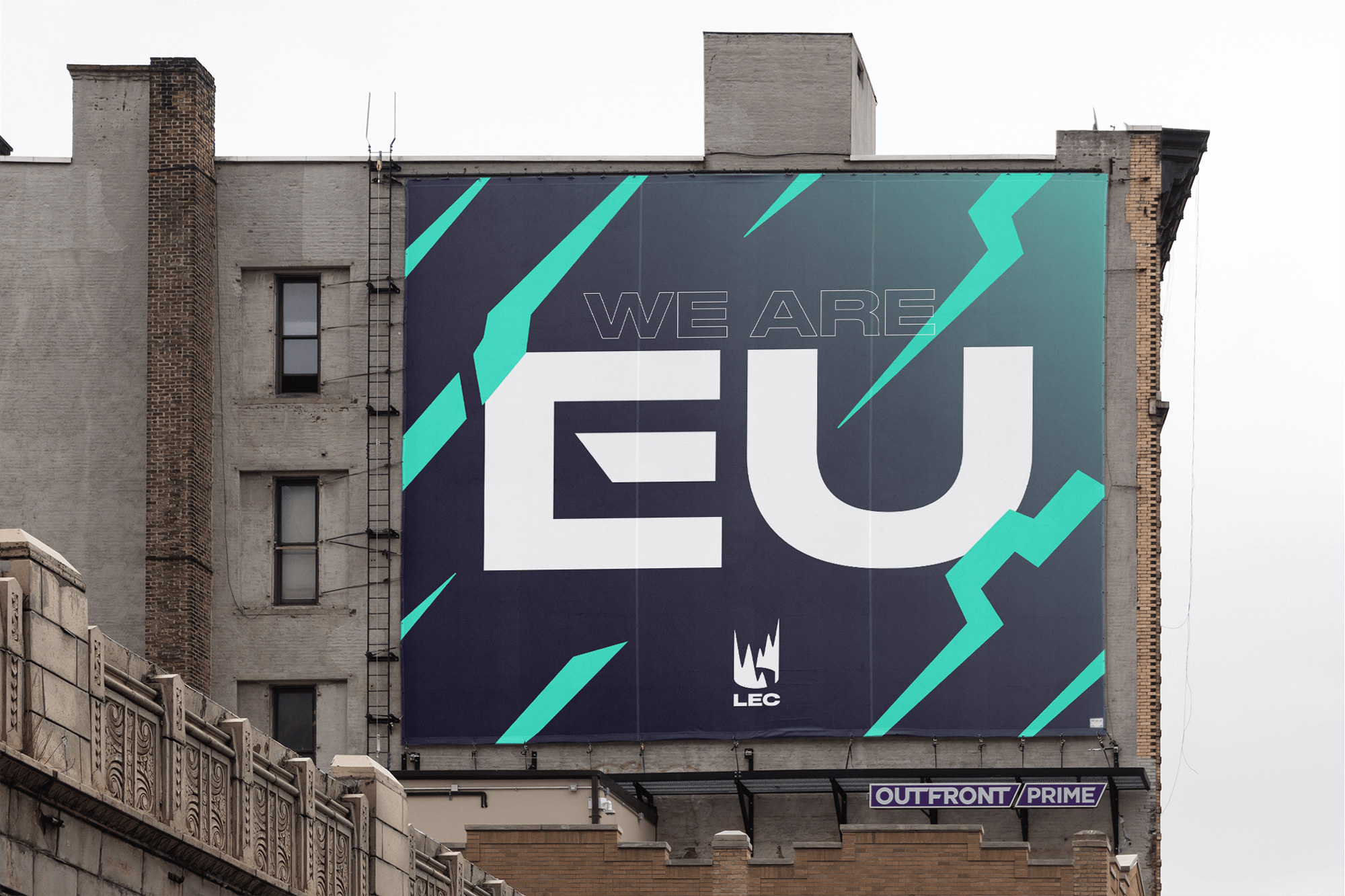
The old logo used the typography from the League of Legends logo and built it into a nondescript badge to make it look as professional as other regular sports leagues around the world. There is nothing wrong or terrible about it but it nothing great either. The new logo completely departs from the old one (and from the North American league) with a new crown icon that looks like an elevation diagram or financial chart exploding from the ground up and it looks bad-ass. I first interpreted the icon as statistics from the game but then did think “hey, that looks like a crown too”. I like the energy it has, its asymmetry, and that it looks like no other recent logo. The full accompanying wordmark is good and bold in a condensed font but there is something missing in the extended “LEC” version — not that it’s bad, it just doesn’t seem as cohesive as with the full name.
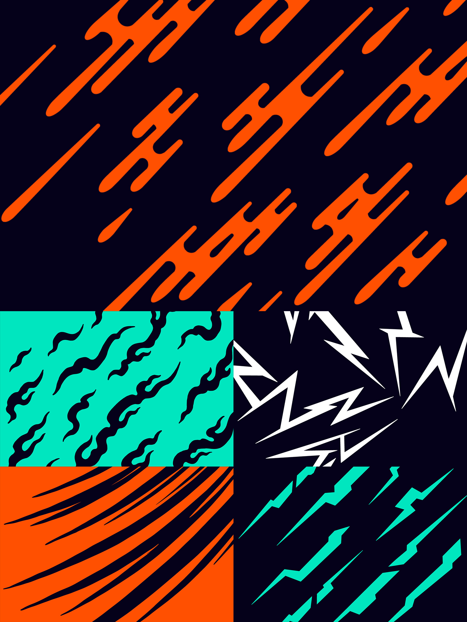
Our wider graphic language is inspired by League of Legends’ explosive energy and the clash of teams, fans and cultures in our league.
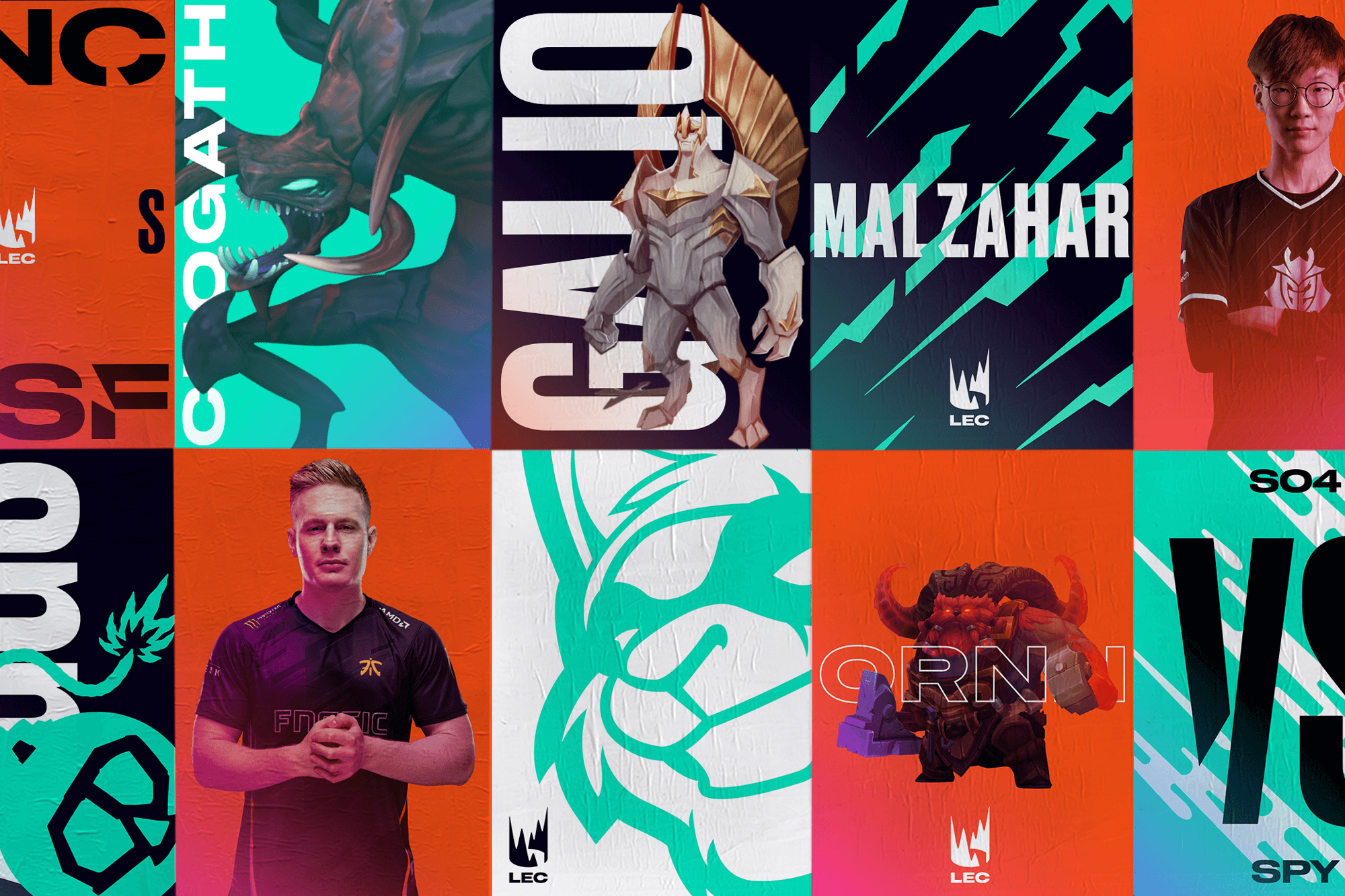
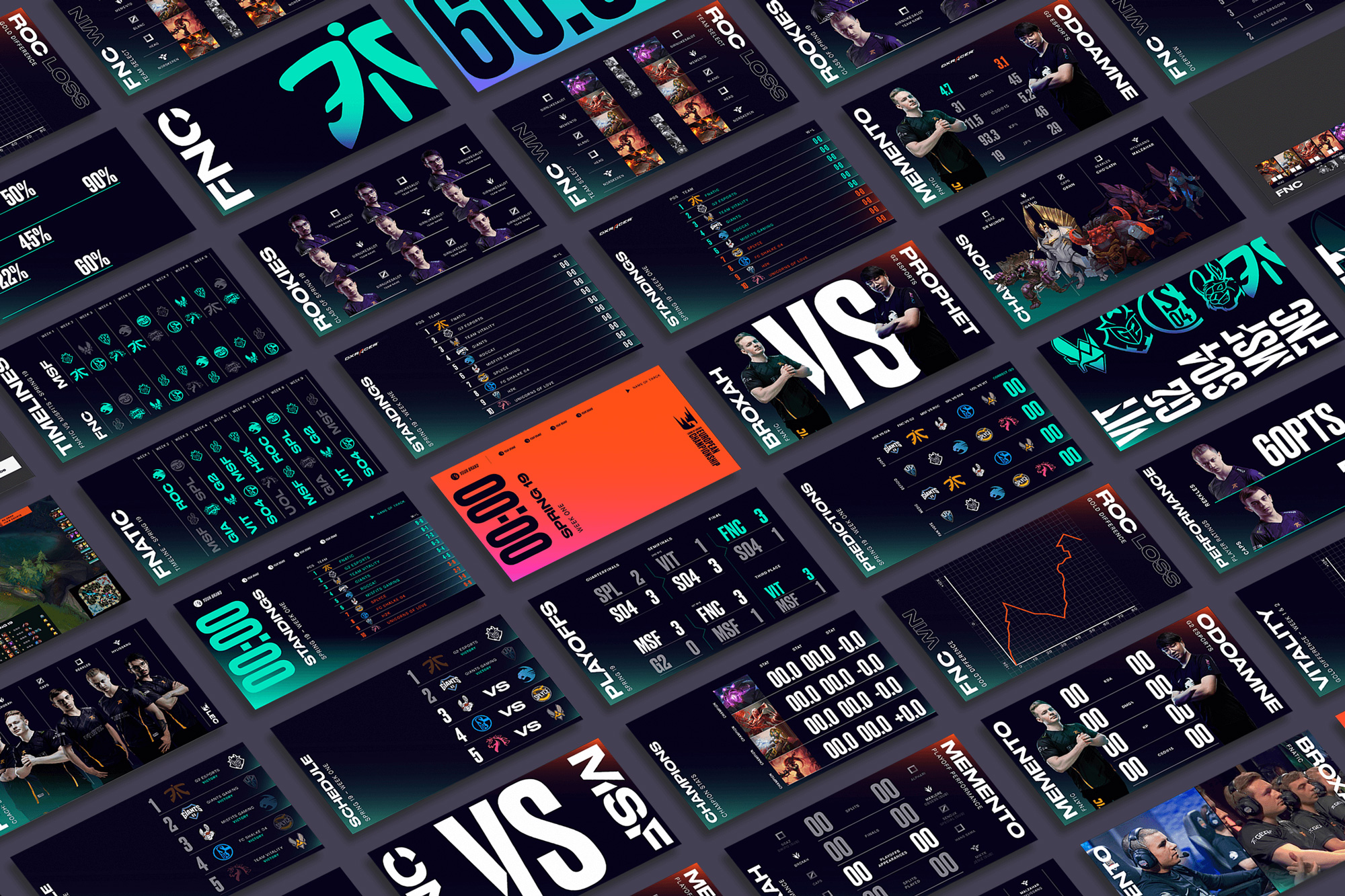
We’ve created five graphic textures that reference different energies in the game: Rush, Surge, Strike, Blaze, and Blast. They can be used as bold backgrounds, or paired up to clash and contrast.
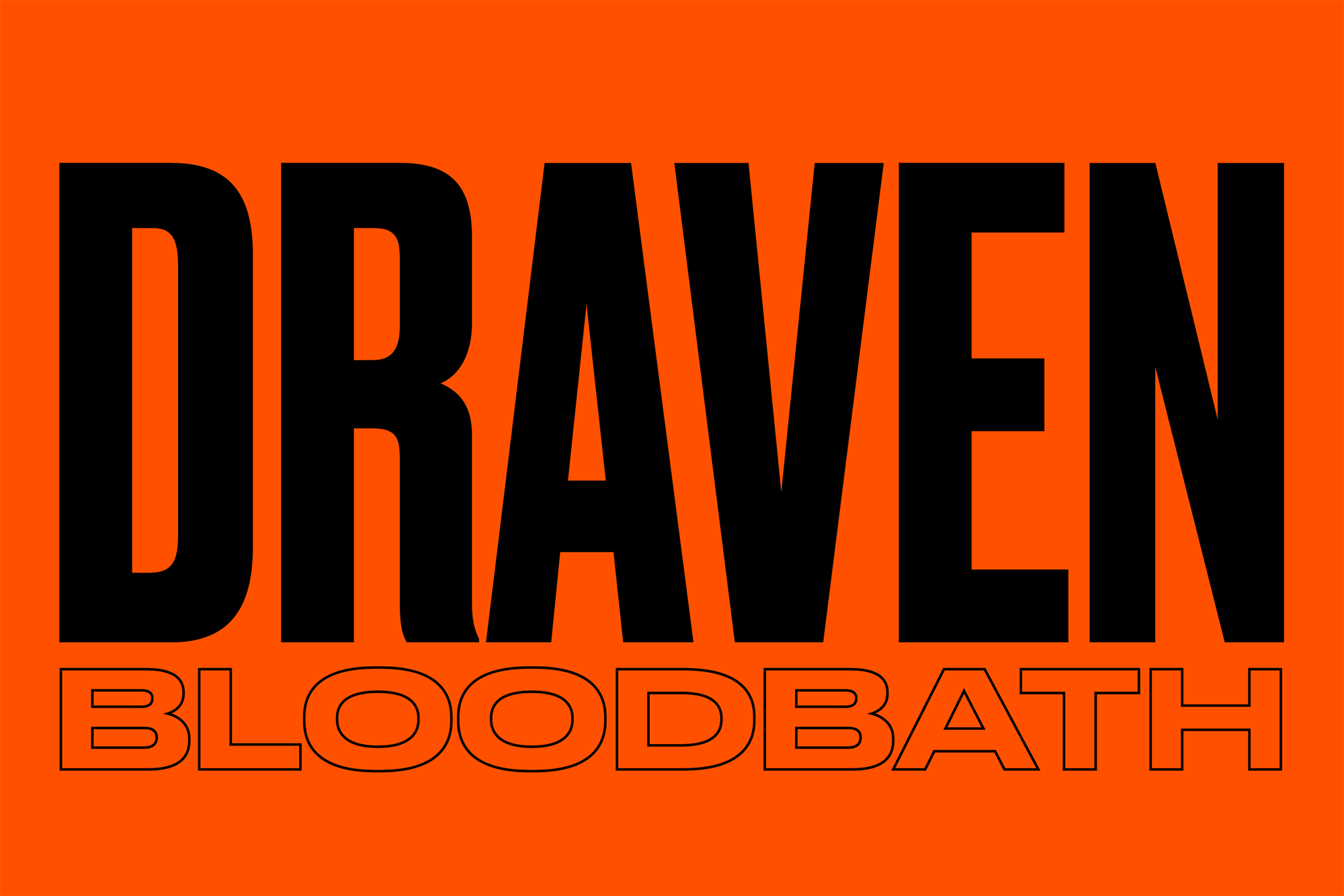
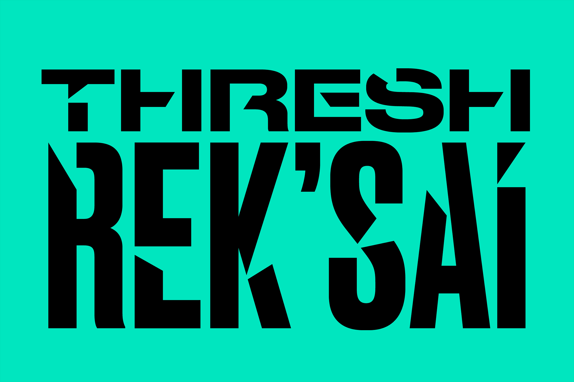
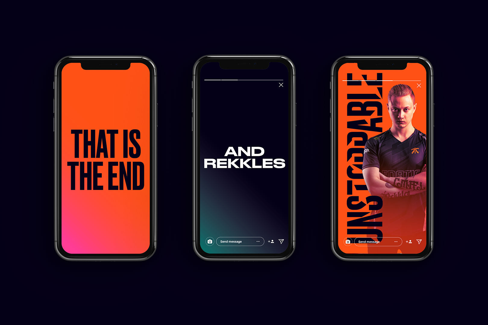
Reminiscent of old European boxing posters, the typography is all about high impact. Two typefaces, Gatica and Druk, oppose each other in layouts. In collaboration with Commercial Type, Druk has been slashed and cut as if it has lived through a battle.
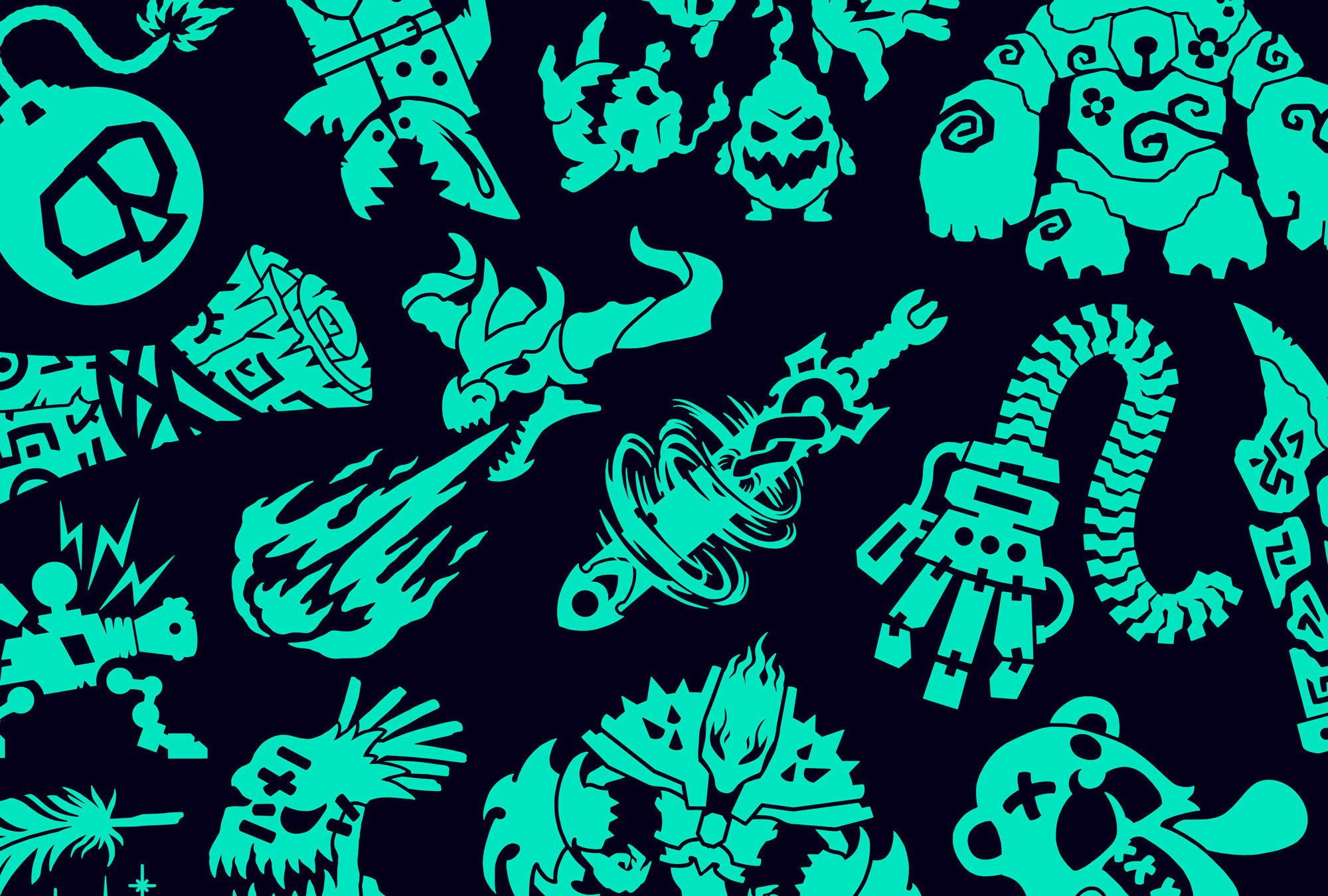
Our set of illustrations, inspired by tattoo flash, add another playful element to the brand’s visual language. We commissioned illustrator Daggers for teeth to create 141 bespoke illustrations for each League of Legends’ champion. These illustrations can be used in merch and be worn by fans with pride.
The patterns, typography, and illustrations are all fun and raw, eschewing polish and sophistication for exuberance and ruggedness. None of it is my jam — particularly the slashed fonts — but I don’t have any bread in the game, which is a metaphor, I think, for “I don’t have to like it because I’m not the target audience”. It’s not that I don’t like it but when I see the elements I do think “Kids these days…”.
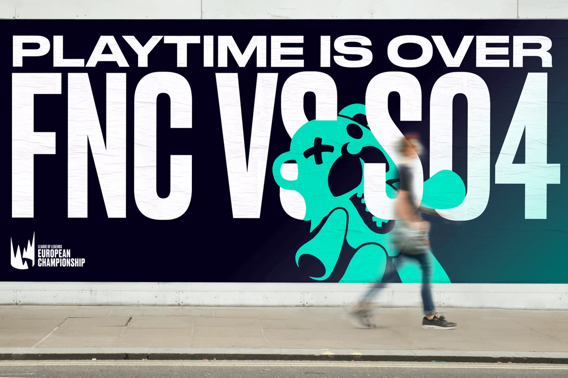
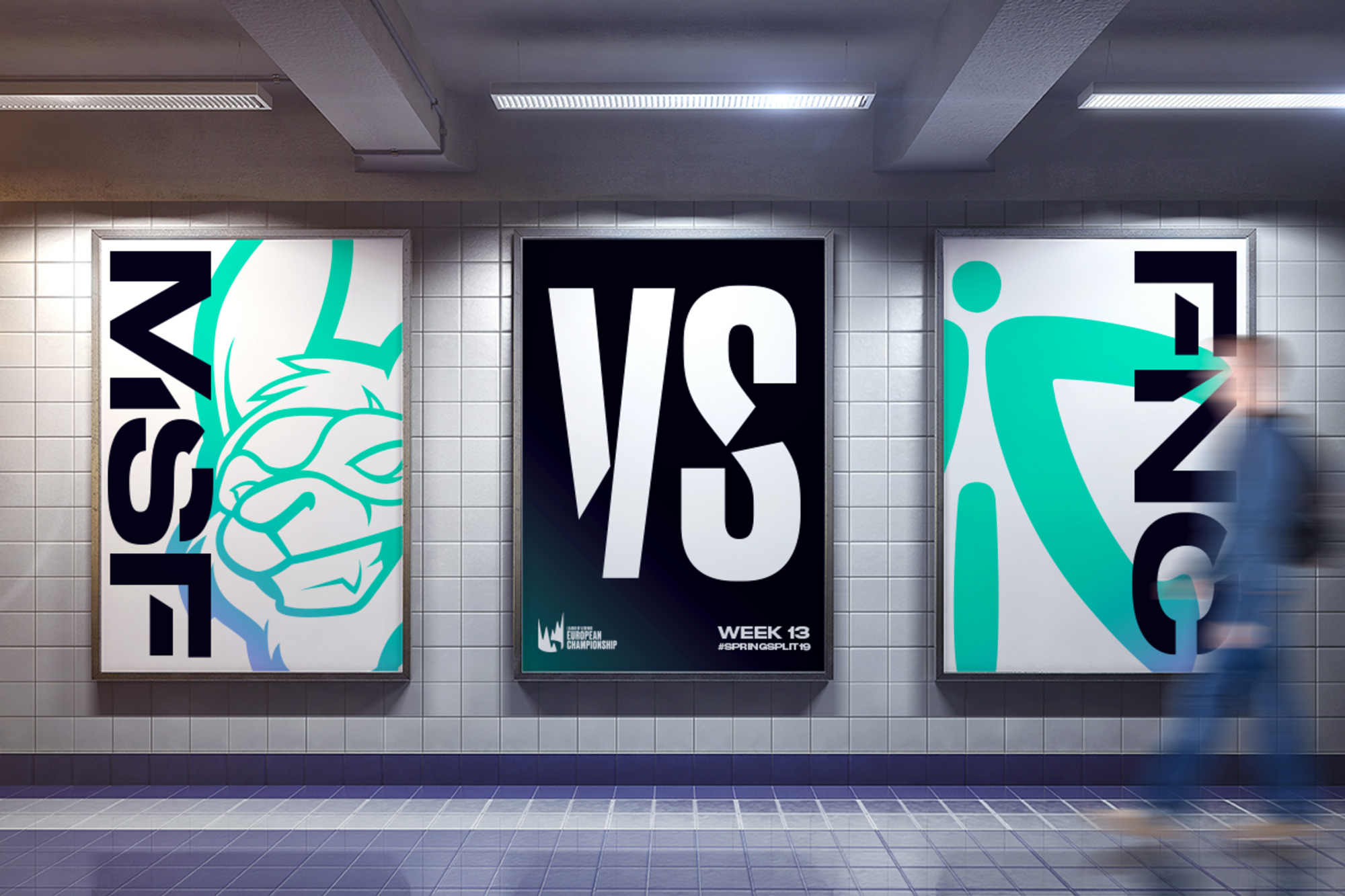
The elements come together energetically in the layouts which only have one volume level, 10. My favorite thing in the application remains the logo, as it looks great as the endorsing mark for all the shoutiness.
The new broadcast package is uniquely designed for LEC digital channels. The foundation of this is our dynamic motion principles; Unleash and Clash. Born from our strategic proposition and visual language, these movements represent the energy and excitement unleashed when teams clash together in battle. We fill the screen, use typography boldly to create impactful layouts, and layer players and champions to make it feel like the content is bursting from the screen.
The broadcast graphics are pretty cool. With more limitations to convey things clearly than in the mock-up posters, I feel like this reigns in the bold aesthetic of the league in a more interesting and engaging way than the static applications. The typography and layouts are exciting and are a great contrast to traditional sports broadcast graphics — from which, sure, this derives some cues but takes some things closer to the extremes (I’m looking at you sideways countdown clock).
Overall, this is pretty great and I mostly appreciate how it gives the eSports league a language more of its own, instead of trying to build on the visual legacy of regular sports.

 Новости Союза дизайнеров
Все о дизайне в Санкт-Петербурге.
Новости Союза дизайнеров
Все о дизайне в Санкт-Петербурге.