Обзор лучших ресурсов по разработке бренда, разработке упаковки
contact us | ok@ohmycode.ru
contact us | ok@ohmycode.ru
Established in 1969, CETT (which originally stood for Centro de Enseñzas Turísticas, Center for Tourism Teachings) is a leading higher education school for Tourism, Hospitality, and Gastronomy, affiliated with the University of Barcelona. Providing bachelor, masters, and postgraduate degrees as well as vocational training and continuing education, CETT currently has over 2,400 students enrolled — 25% of them from outside Spain — and a network of nearly 20,000 alumni. After its first 50 years, CETT has introduced a new identity designed by the Barcelona office of Mucho.
It is through experiences that we connect with the world and with others, that we live. The aesthetic experiences that all three —Tourism, Hospitality and Gastronomy— provoke is what binds these areas together. The word experience in itself bears resemblance to the educational richness, growth and transformation that a student has exposure to during their time at CETT, both personally and professionally.
“Through experiences” is, therefore, the tagline of the brand and sits at the core of the brand narrative and identity. When accompanied by verbs, the tagline becomes a living organism that supports the key messages of the brand: Grow through experiences, connect through experiences, learn through experiences, open minds through experiences, are but a few examples of these.
Both the quotes about the design and the video above are a little too philosophical for a school about tourism, hospitality, and gastronomy and I’ll admit that I was a little put off by both — I would have accepted “We thought this looked cool, so we ran with it” instead. With that out my system, let’s continue…
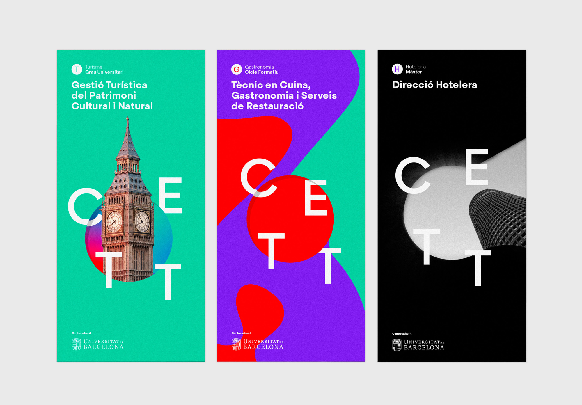
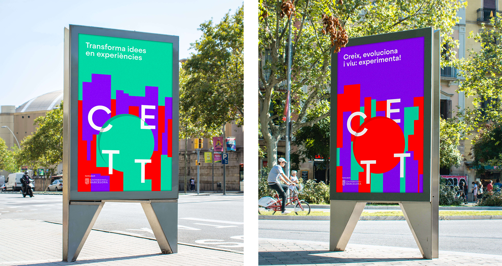
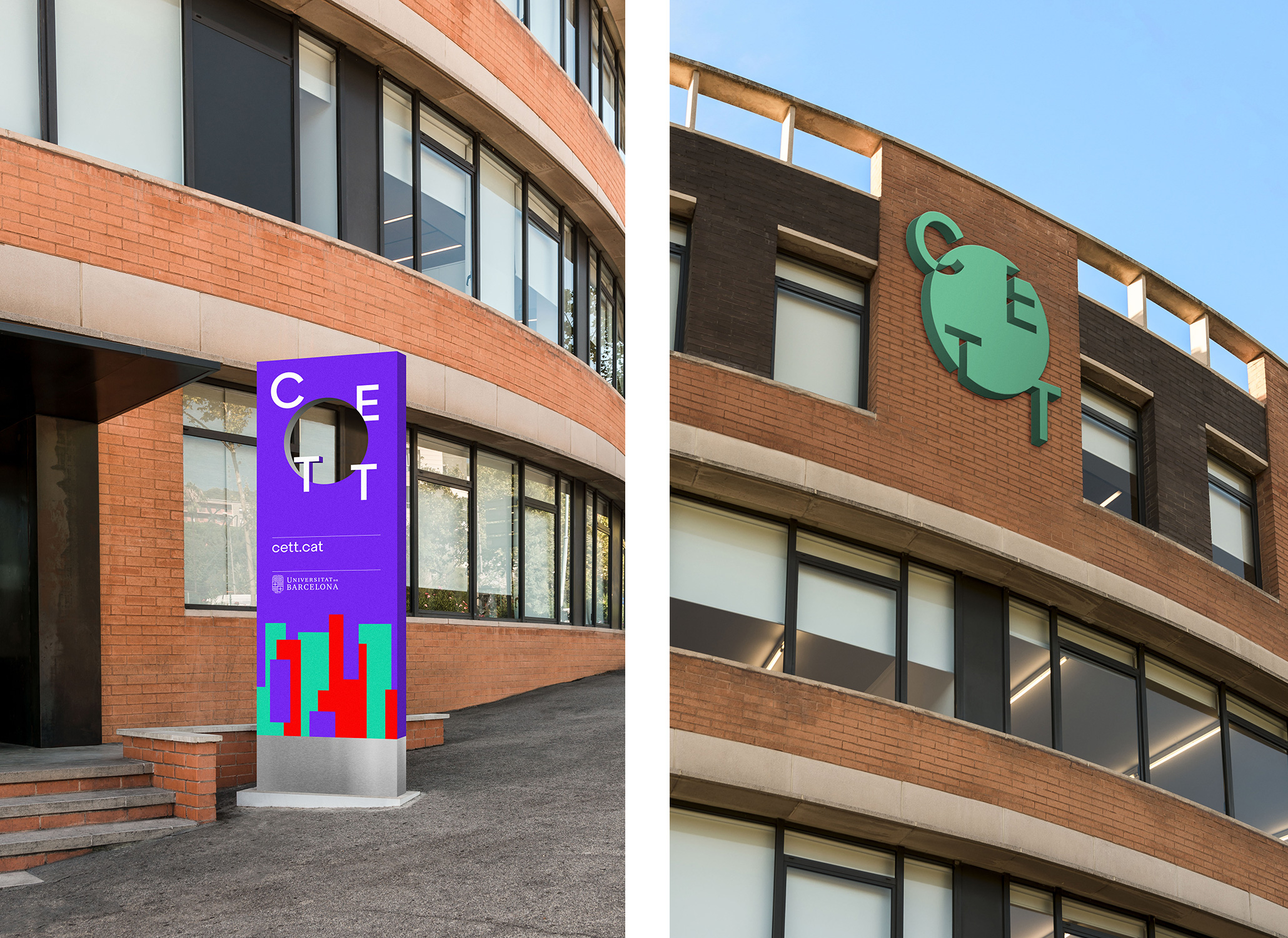
The circle is the main element of the new brand identity. It represents the transformation of the student into a professional, but it also represents an open look, a new perspective.
The circle is used both as a container, either with pictures or textures inside, or as a graphic element. The latter shifts the focus to the surrounding content, becoming the circle a more explicit representation of the brand logo.
The circle —with its pictures, textures and variable positions for letters— highlights the importance of values like flexibility, dynamism and adaptability, which are a fundamental part of the culture at CETT.
The old logo would have been great for a computer-related vocational school. It wasn’t great and it wasn’t terrible other than in its default-looking typography but someone, somewhere, at some point had a semi decent visual idea with that “E” and the ligature “T”s. The new logo, in its barebones application, is okay. The composition of the CETT letters around a circle is interesting enough although a little confusing as to why only the “C” changes color as it interacts with the circle. The wordmark is fine and because of how long the name is, the simple sans serif approach is perfectly appropriate here. Let’s move on to the more vivid applications of the logo.
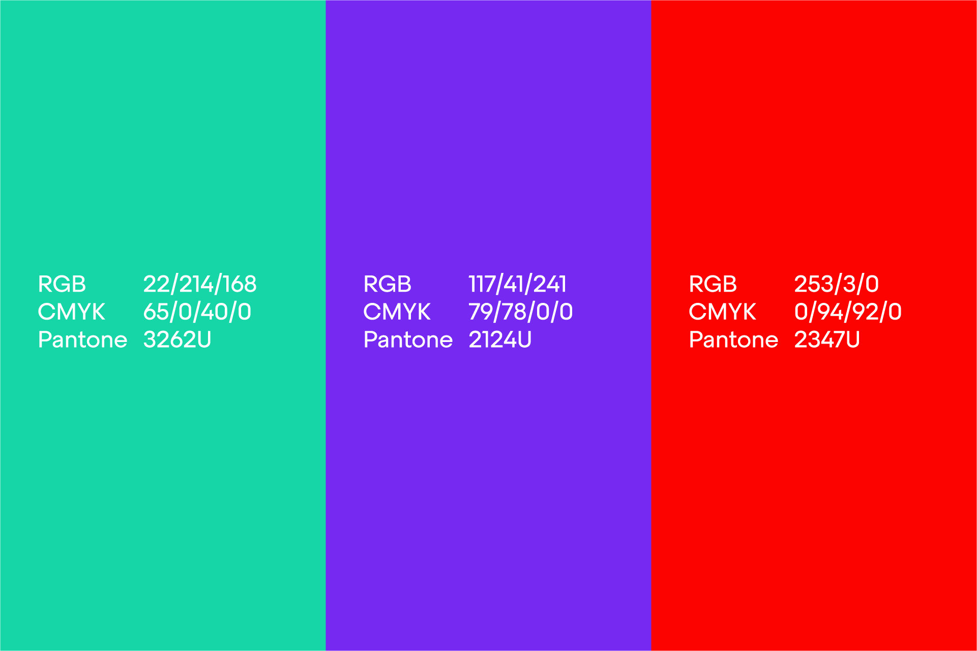
The rich palette of the brand represents life and the abstract world of senses, delivering a vivid visual experience. The differentiation between the programmes employs a unique set of three colours and textures, designed as graphic resources, that also support a variety of corporate communication.
This versatility facilitates the adaptation of the brand to all sorts of environments, particularly digital ones. It is the digital-native generation that is now experiencing CETT. Their world is one of textures, movement, and sound; and so, to fit in and be embraced the brand needed to behave accordingly.


Let’s first talk about the textures: I have no idea what’s going on or what they have to do with tourism, hospitality, and gastronomy but, heck, I love looking at them, especially in motion. The colors also seem wrong and uninviting as they relate to tourism, hospitality, and gastronomy but, heck again, I really like the combination. The textures contained inside the circle, which also grows an inner shadow in these versions, look pretty cool. I still don’t quite get the logic of what letter does what as it crosses the circle — some shift and react to the shadow, others nothing happens to them. Anyway, did I mention I enjoy looking at these?
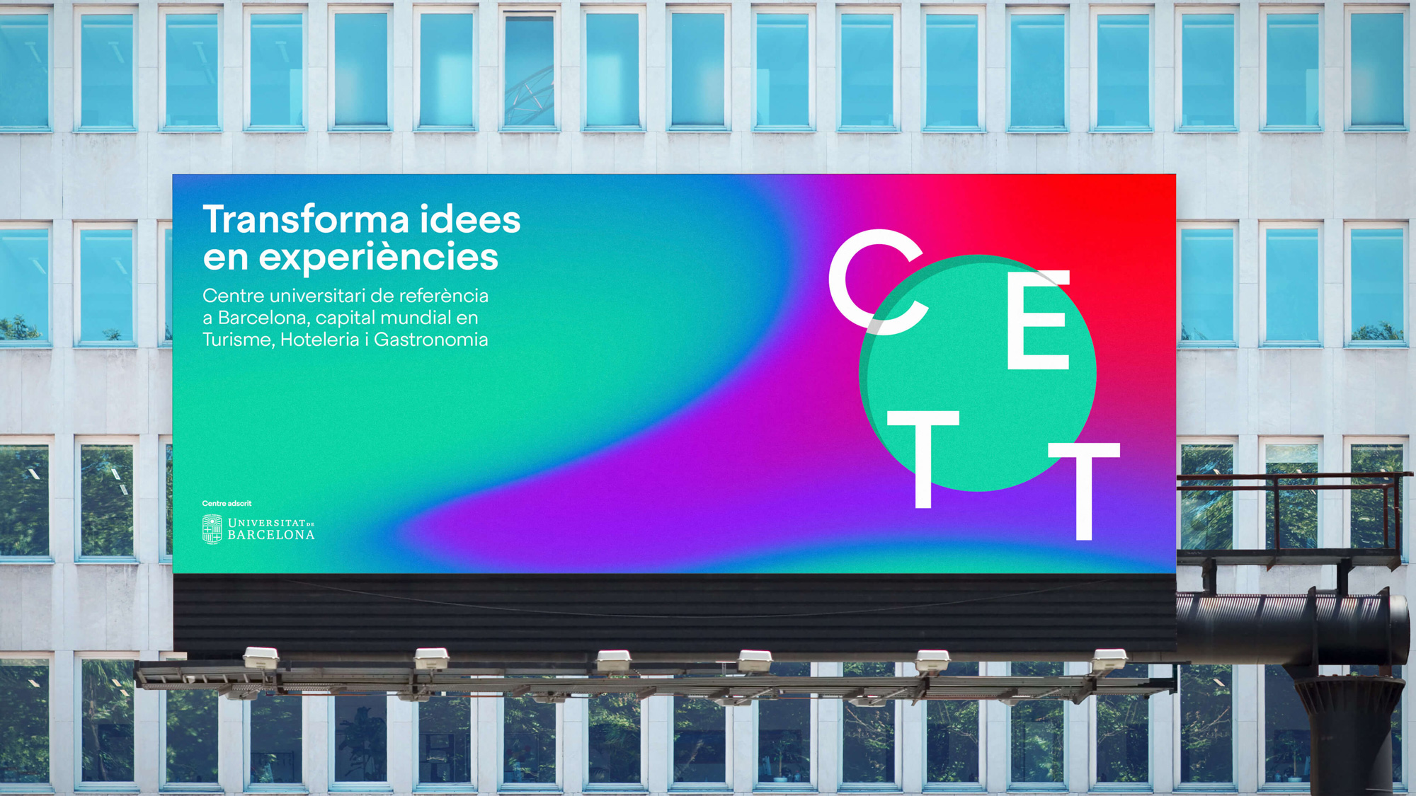
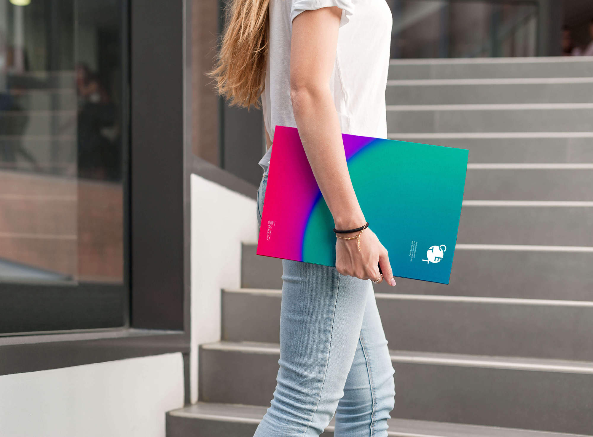
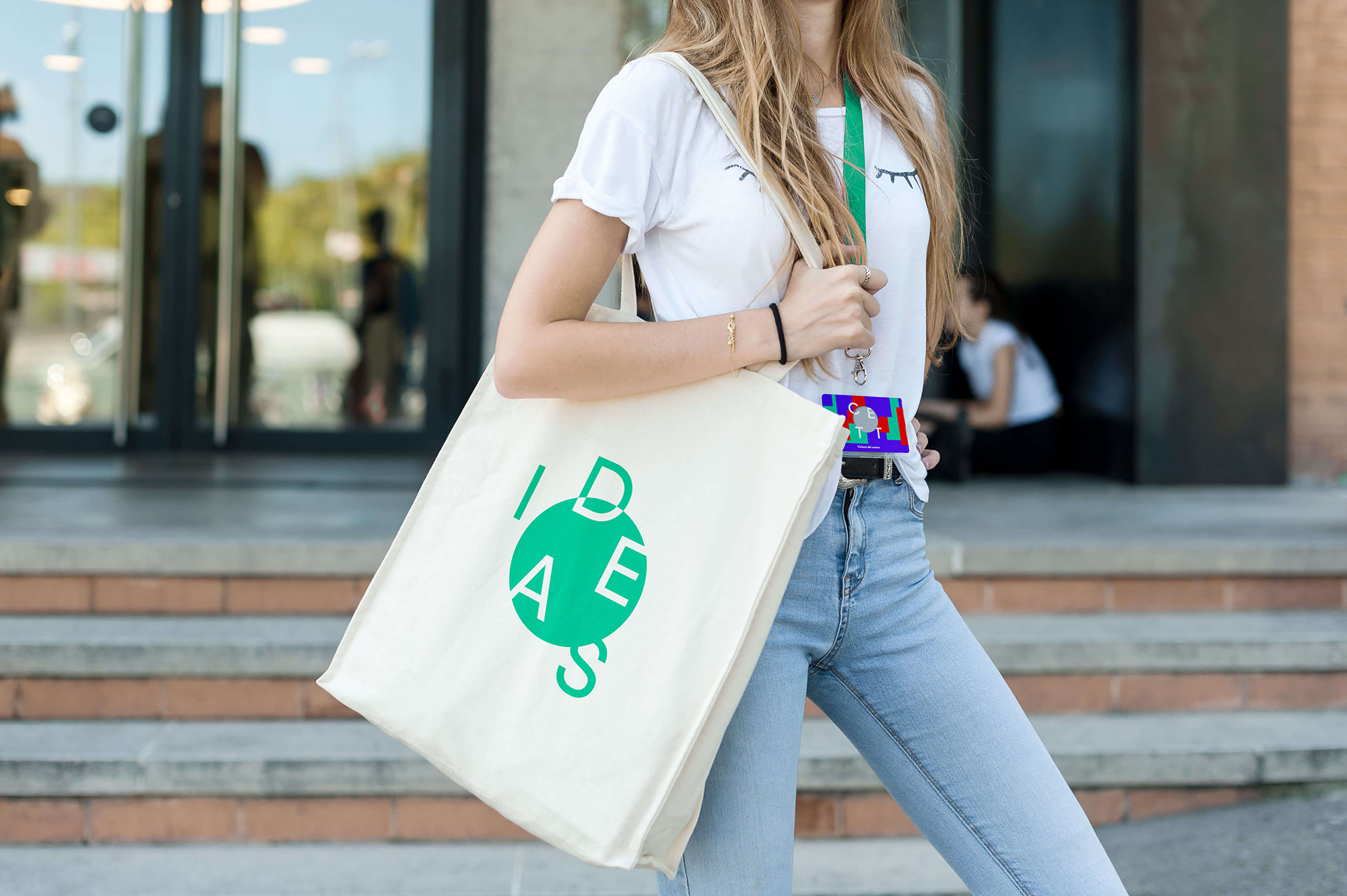
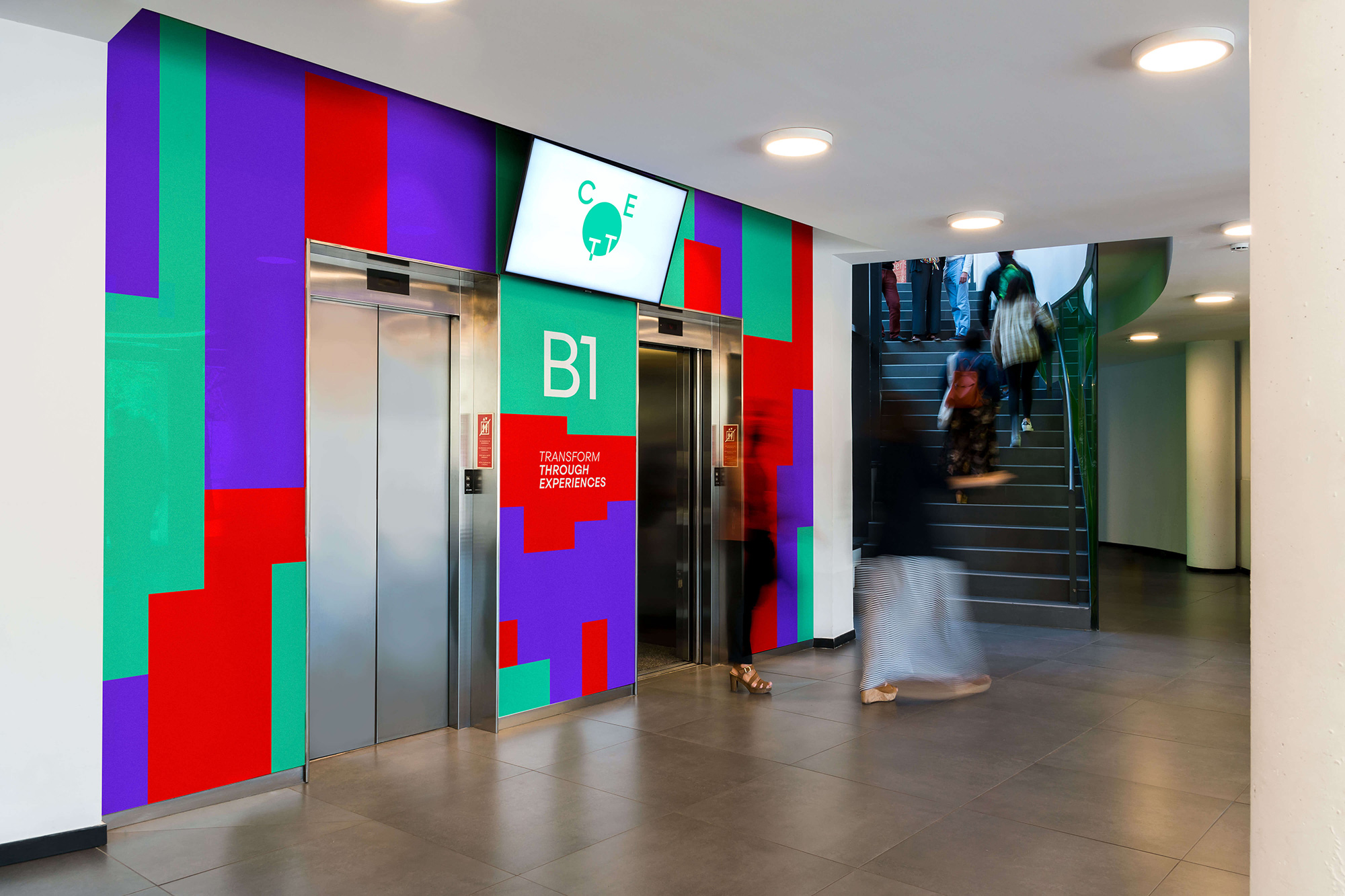
The applications have a good variety to them, integrating imagery into the circles and backgrounds or just relying on the textures. The best ones are the applications with the softer gradients — like, that folder, the most pared down of renders, is the one that looks the most convincing — and, to me, the applications with the thick bar texture look kind of cheap and messy. Overall, I think with some reigning of graphic design impulses this could be pretty good. I’m not sure if this works for this school but then again I really don’t know what kids in tourism, hospitality, and gastronomy are into these days.
 each year since publication began in 2006

 Новости Союза дизайнеров
Все о дизайне в Санкт-Петербурге.
Новости Союза дизайнеров
Все о дизайне в Санкт-Петербурге.