Обзор лучших ресурсов по разработке бренда, разработке упаковки
contact us | ok@ohmycode.ru
contact us | ok@ohmycode.ru
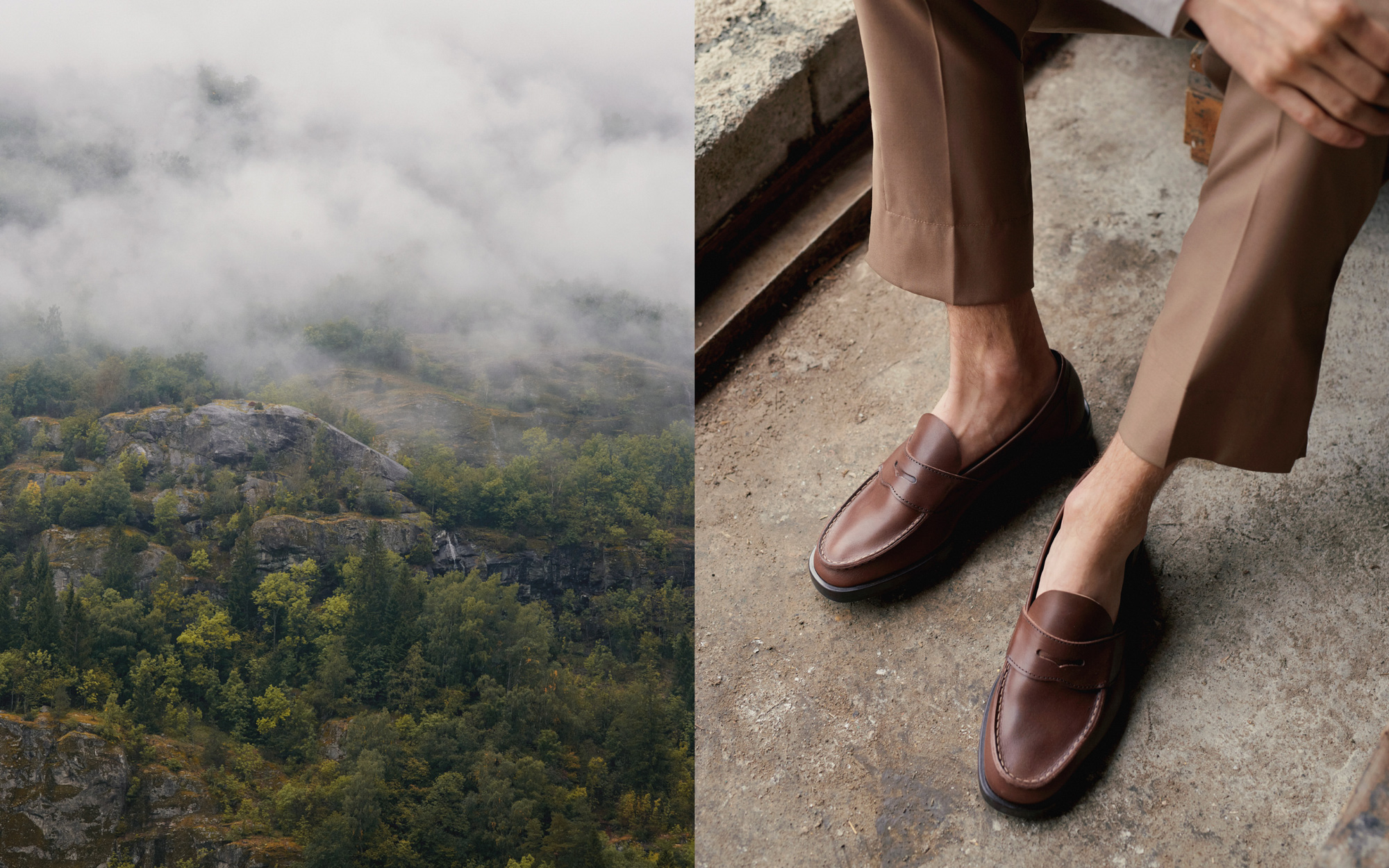
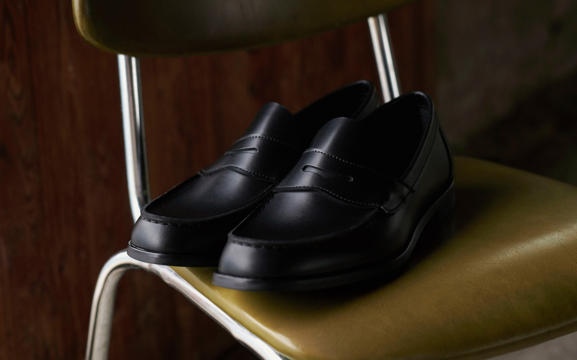
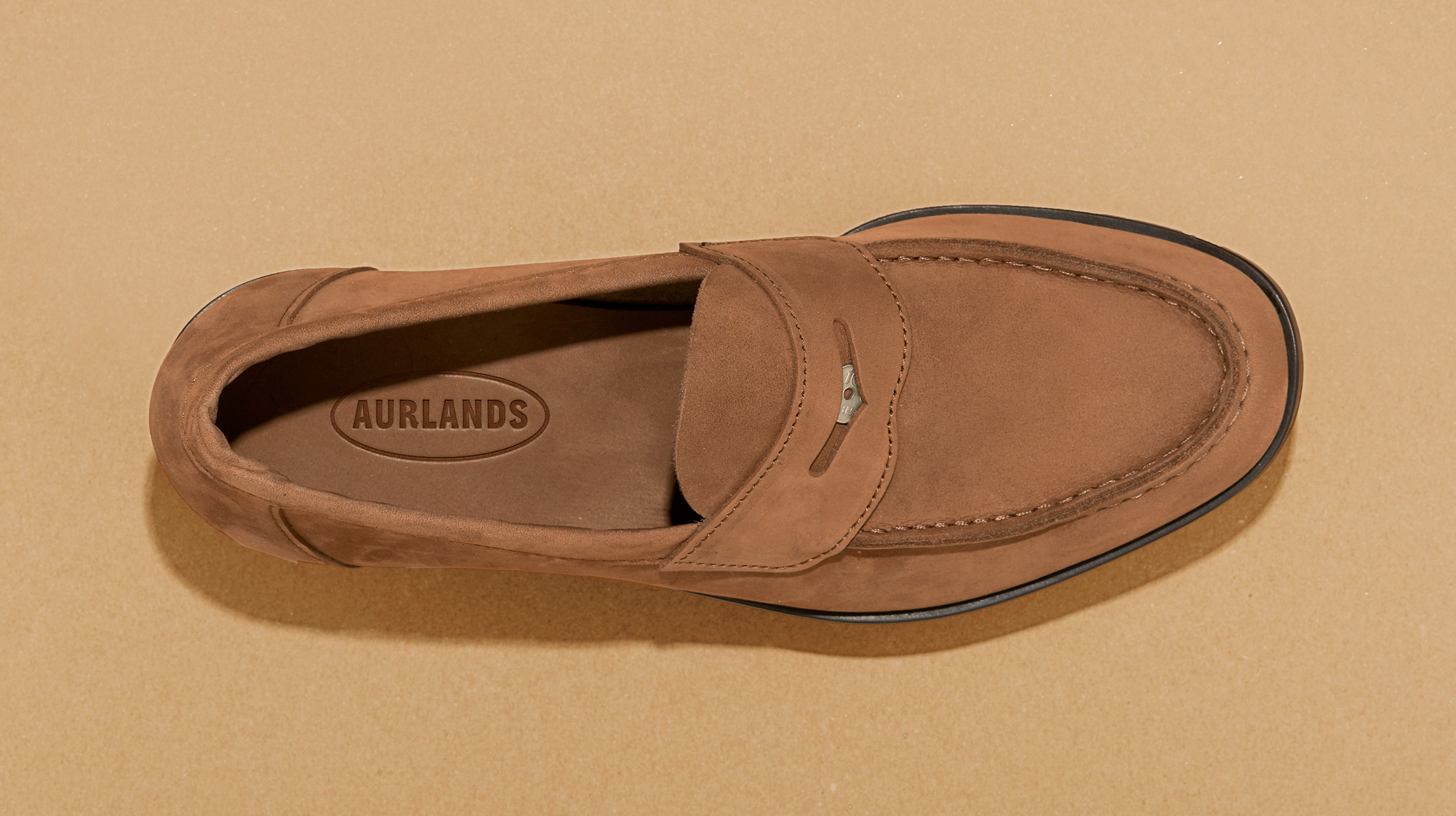
Loosely established in 1908 when Nils G. Tveranger set up shop as a cobbler in Aurland, Norway, a village in the deepest of the Norwegian fjords, Sognefjorden, Aurlands is a shoe manufacturer with a limited but influential range of styles. After learning the trade in Boston, MA, Tveranger first created moccasin-style shoes and in 1926 he had the vision to put a penny across the instep and history was made: the Penny Loafer was born. During the 1930s the Aurland village became a shoe haven, with nearly 20 shoe factories rolling out kicks. Today, Aurlands is the only one that remains and is still doing every shoe by hand. With a new Penny Loafer design and an ambition to be more well-known, Aurlands has introduced a new identity designed by Oslo, Norway-based Heydays.
The new identity celebrates the rich history of the village, and helps move Aurlands from being a local handcrafted product to a modern fashion brand, on all platforms and in all markets.
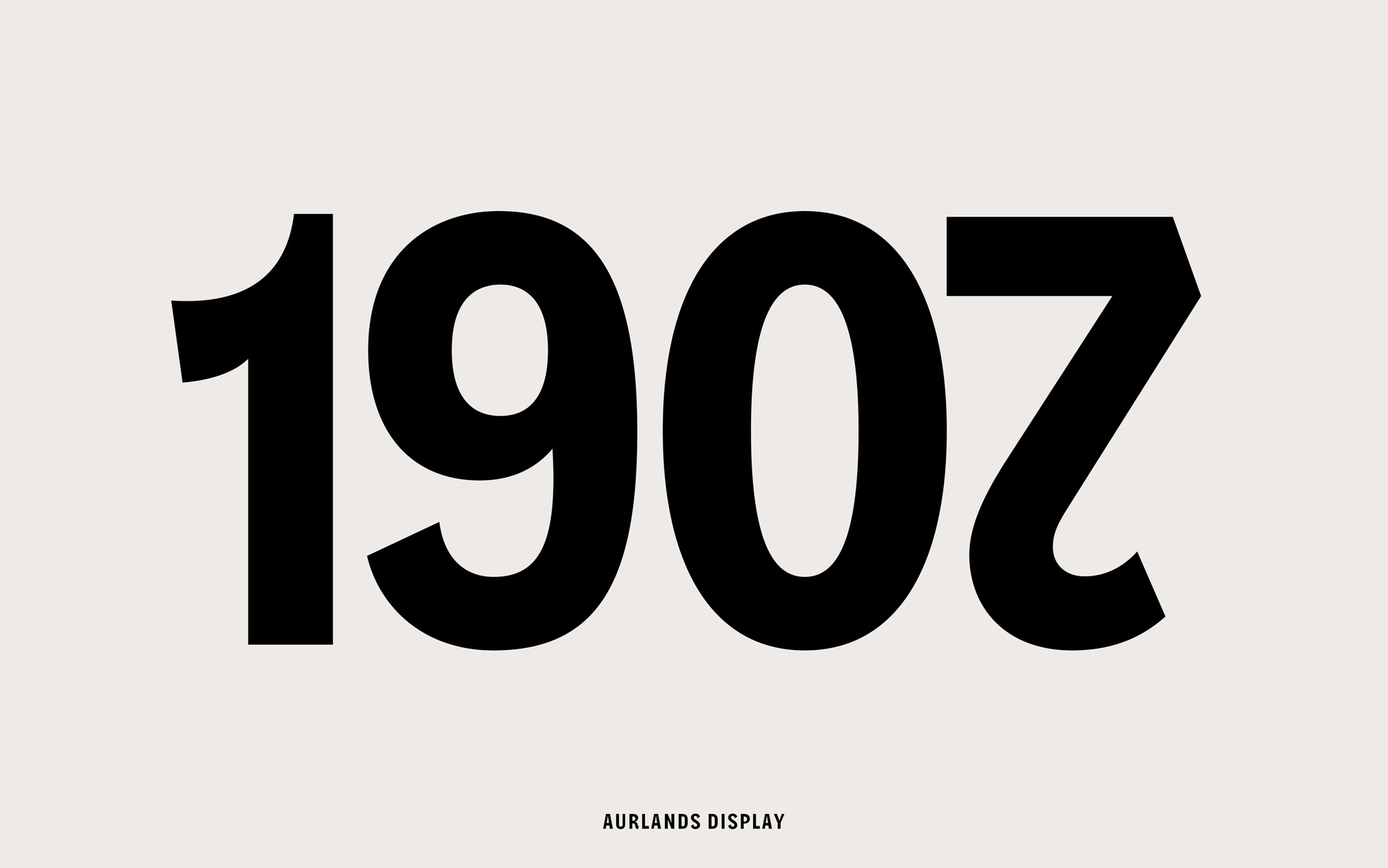
Just like the philosophy behind the shoes, the Aurlands Display typeface (developed together with Ellmer Stefan) combines Norwegian robustness and function with the flair of soft curves and endings. Designed to be used at large sizes on simple backgrounds and imagery, the typeface delivers the message of a modern factory with deep roots in shoemaking history.
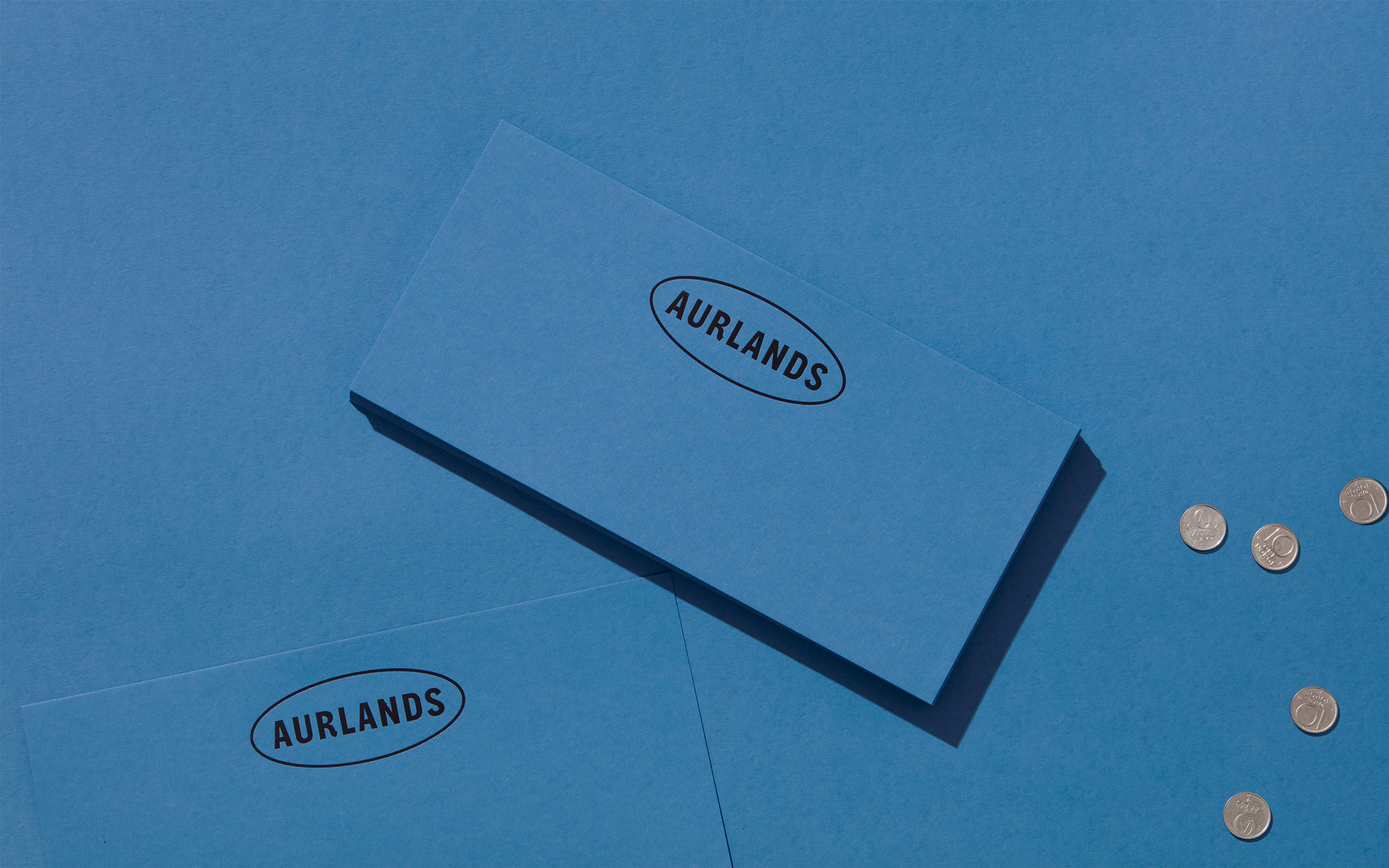
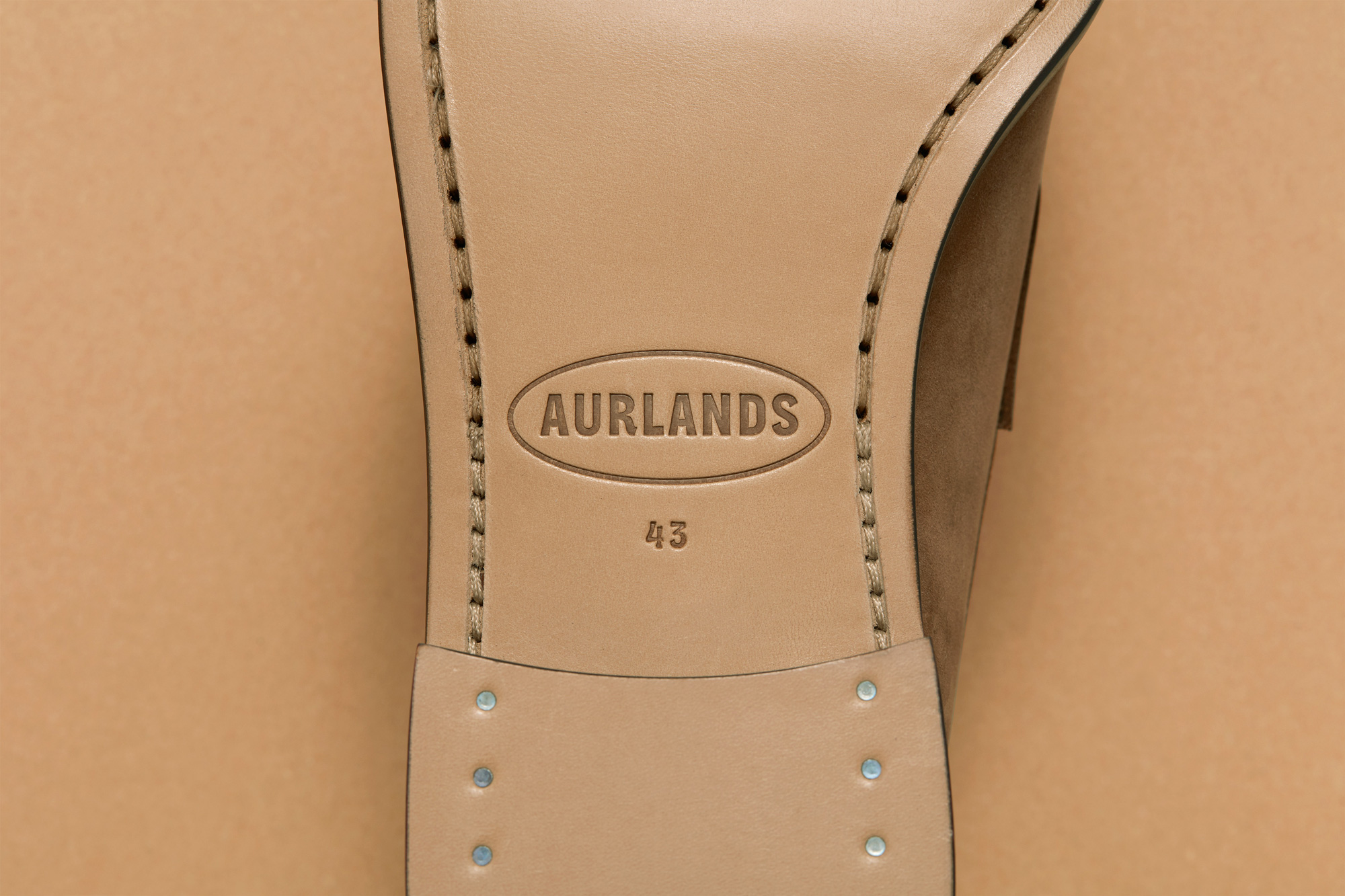
The old logo was kind of cool with its pronounced italic and it would have probably worked forever but the new logo has a much better and unique presence through a custom font rooted in some historical references (below), from Tveranger’s old “logo” to the grotesques of the nineteenth century. I wish the logo itself somehow had one or two more flairs as seen throughout the font to make it stand stronger on its own — like, I love that “R” and would love to get more of that in the logo. I also wish the oval were a little more of a wonky, less perfect shape to match the aesthetic of the font but, at the same time, I do like it.
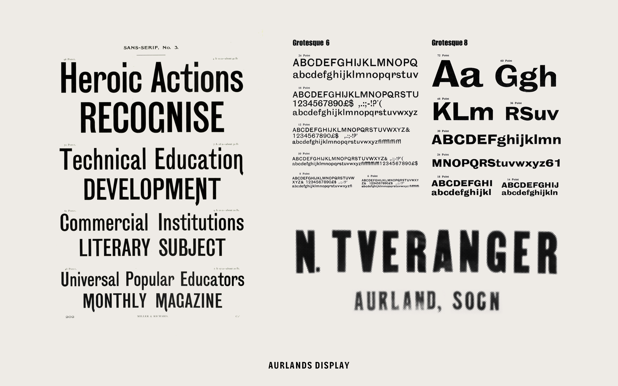
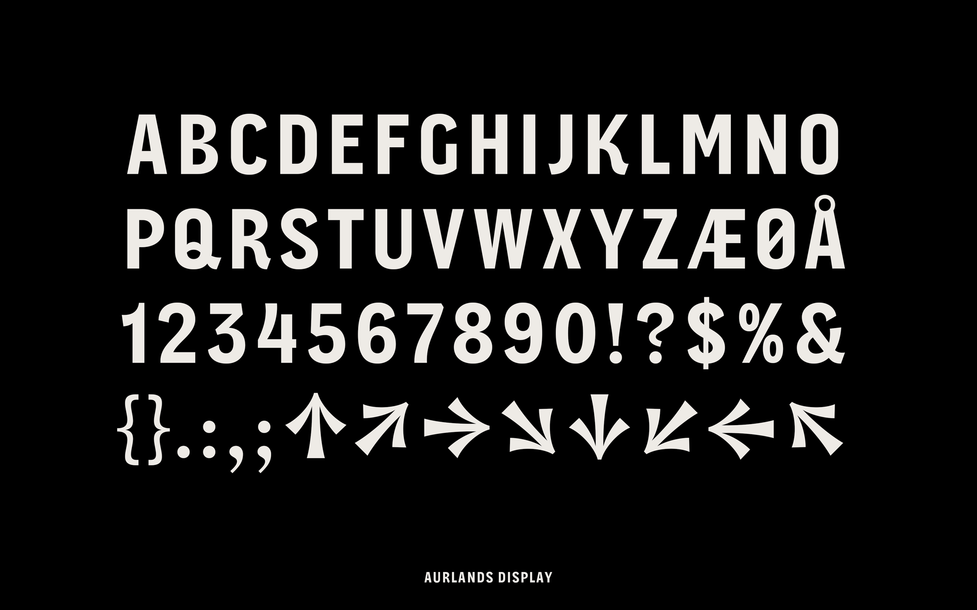
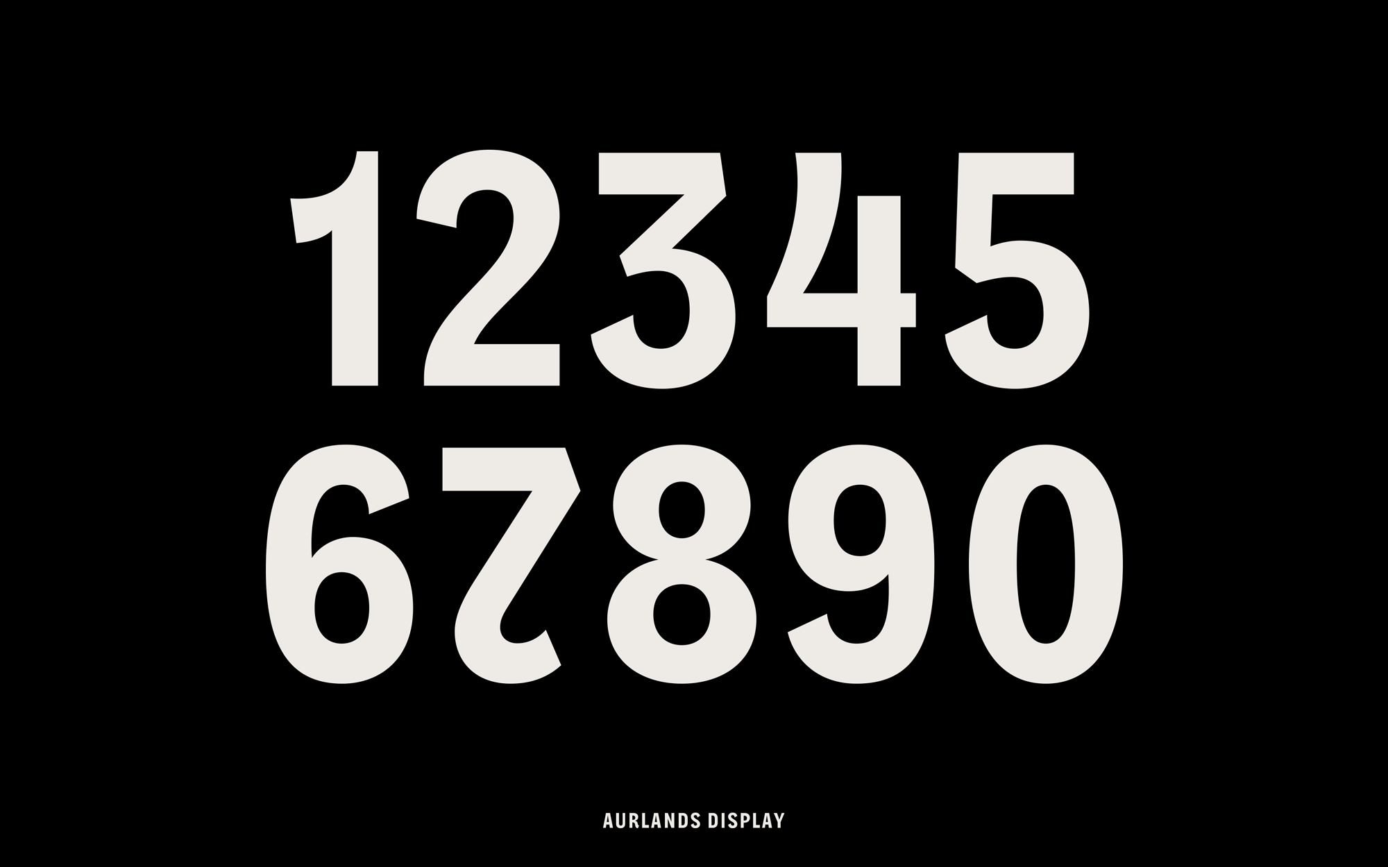
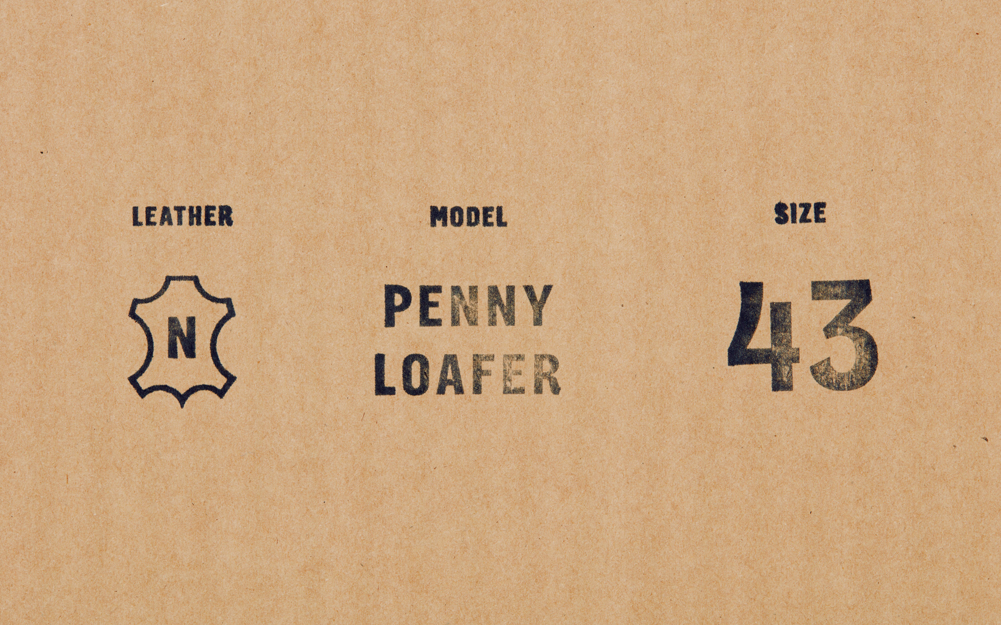
I really like the custom font, especially the numerals and the arrows. It has a very unique aesthetic and I like how it’s not over the top with every character forced to be quirky.
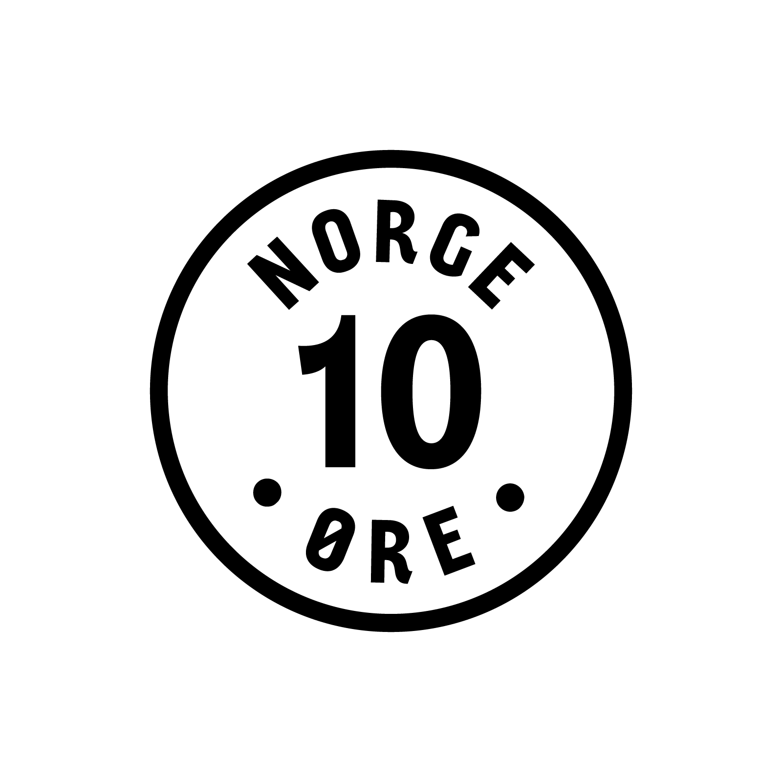
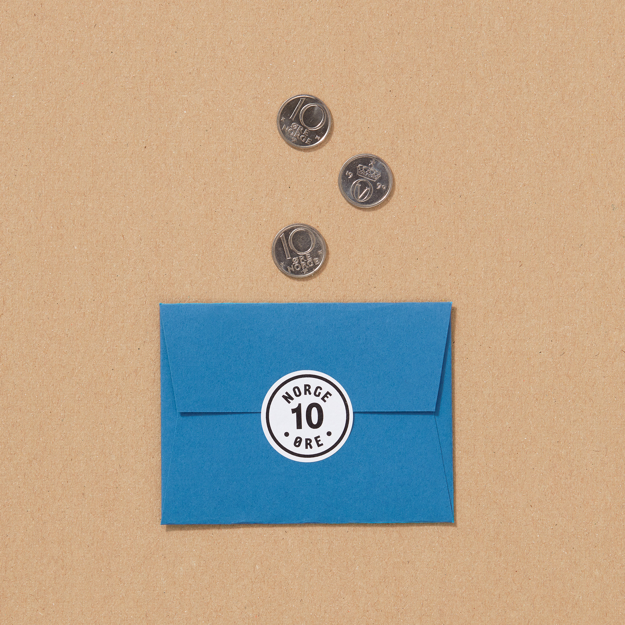
The identity introduces a few icons to pepper throughout the applications. The modern interpretation of the Norwegian penny — technically a “tiøring”, a tenth of a Norwegian Krone — is great and serves as a sticker for an envelope that Aurlands gives out with two tiørings for each purchase. These coins actually went out of production many years ago, but Aurlands has many thousands of them.
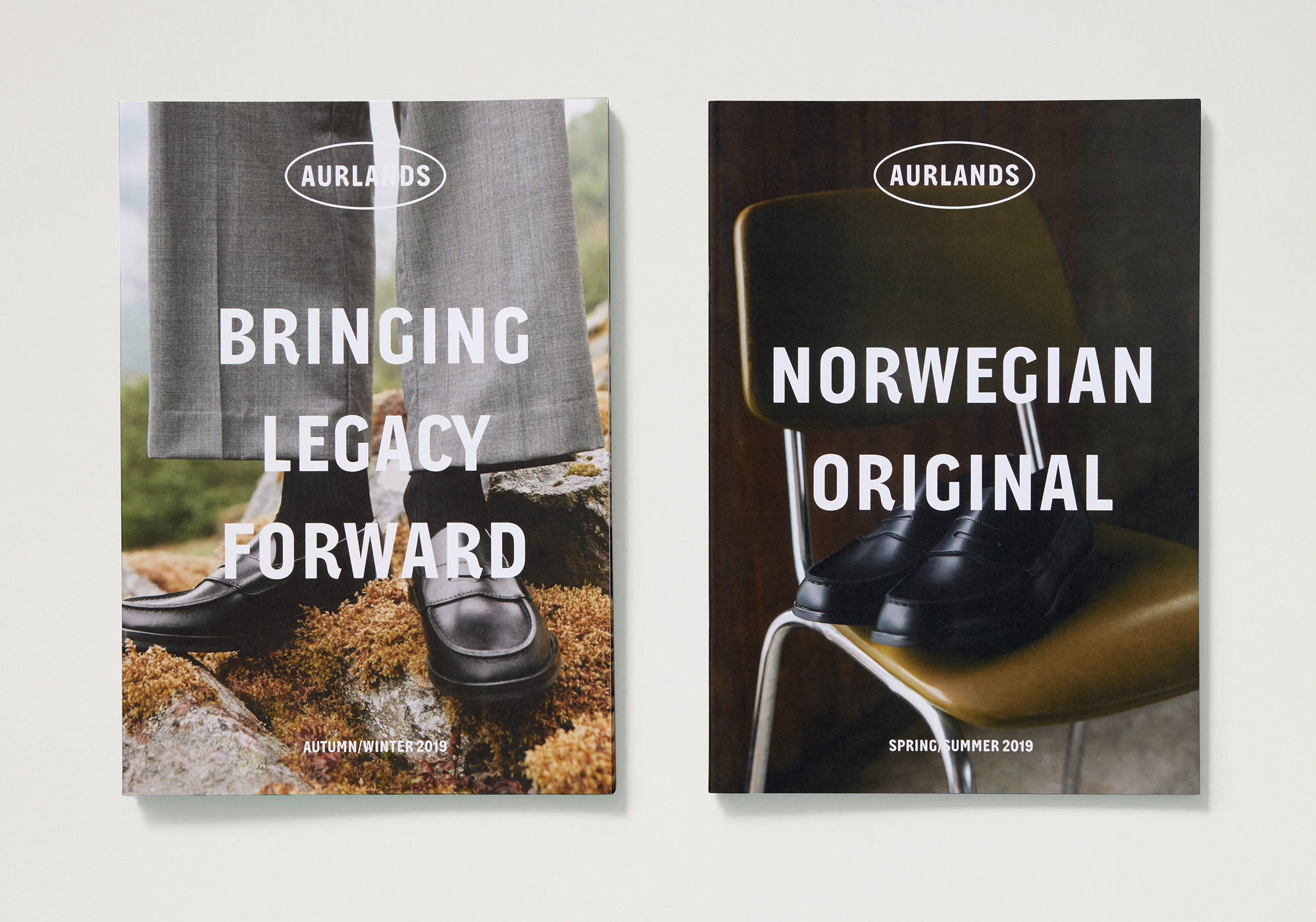
The combination of photography with the logo and custom font pretty great and it’s nice how the font can take on almost three separate looks as the logo, the headline, and the caption (for the date).
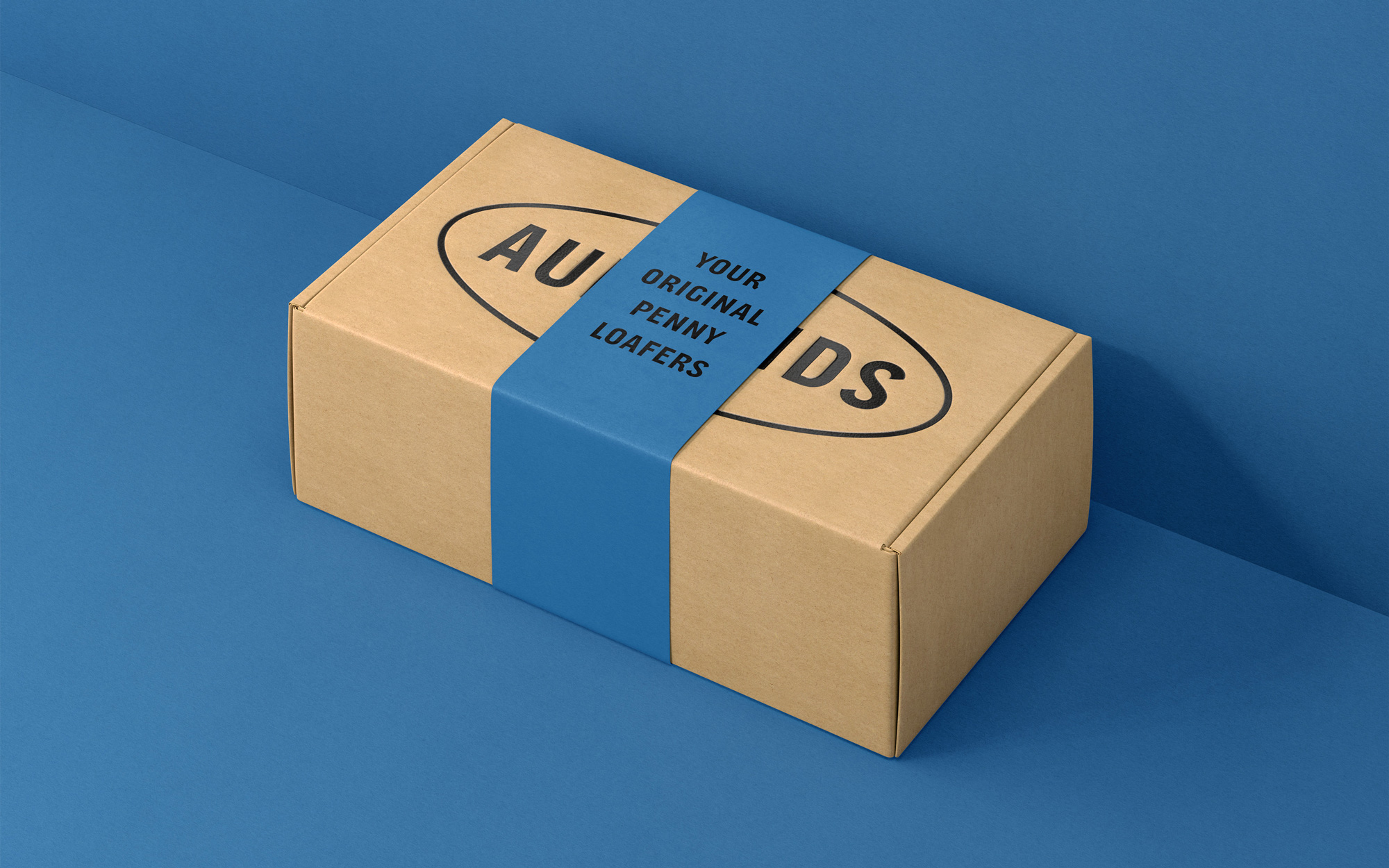
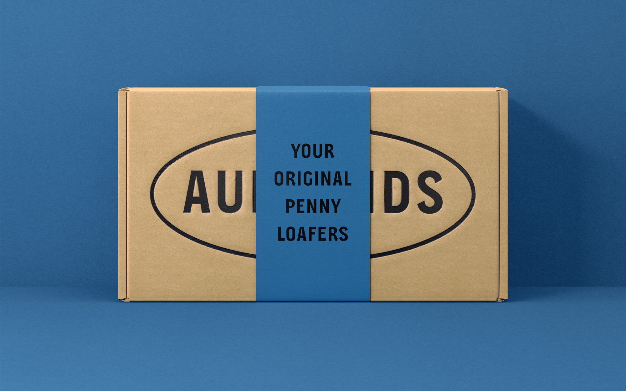
The applications are super straightforward and I love the combination of the kraft boxes with the selected blue, which is the perfect midway point between “that blue” and the more exuberant 100% Cyan.
Overall, this is a great evolution that makes the brand feel familiar and comforting but, just as well, it exudes a bit of a cult-like status for those that if they know, they know.

 Новости Союза дизайнеров
Все о дизайне в Санкт-Петербурге.
Новости Союза дизайнеров
Все о дизайне в Санкт-Петербурге.