Обзор лучших ресурсов по разработке бренда, разработке упаковки
contact us | ok@ohmycode.ru
contact us | ok@ohmycode.ru
Established in 1895 through the will of Swedish chemist, engineer, inventor, businessman, and philanthropist Alfred Nobel, who left much of his wealth after his death to its formation, the Nobel Prize, first awarded in 1901, honors those who “have conferred the greatest benefit to humankind”. The will defined the five categories the Prize would cover: chemistry, literature, peace, physics, and physiology or medicine — a sixth, in economic sciences, was introduced in 1969. Bestowed by Swedish and Norwegian institutions annually, each recipient (or laureate) receives a diploma, medal, and a cash prize that varies each year but hovers around the million-dollar range. Since its introduction, 590 prizes have been awarded to 935 laureates — a single prize can be given to a maximum of three people — that have ranged from 17-year-old Malala Yousafzai for peace to 96-year-old Arthur Ashkin for physics. This December, to coincide with the 2018 ceremony, the Nobel Prize introduced a new identity designed by Stockholm, Sweden-based Stockholm Design Lab.
The Nobel Prize is a strong global brand with great integrity and credibility. In order to manifest its heritage, to clarify the sender and to prepare the brand for the future - the Nobel Prize needed a design strategy that is common to all stakeholders. A one-brand approach, paired with a structured nomenclature system and a clear visual identity, the ambition was to create synergies and push the organisations in the same direction, in order to ensure long-term preservation and strengthening of the brand´s unique position. The solution required a strong visual idea and a holistic brand identity as a solid foundation. The requirements on the identity system were for it to be manageable, applicable and flexible enough to work throughout the different organisations, with an emphasis on digital presence, social media and public events.
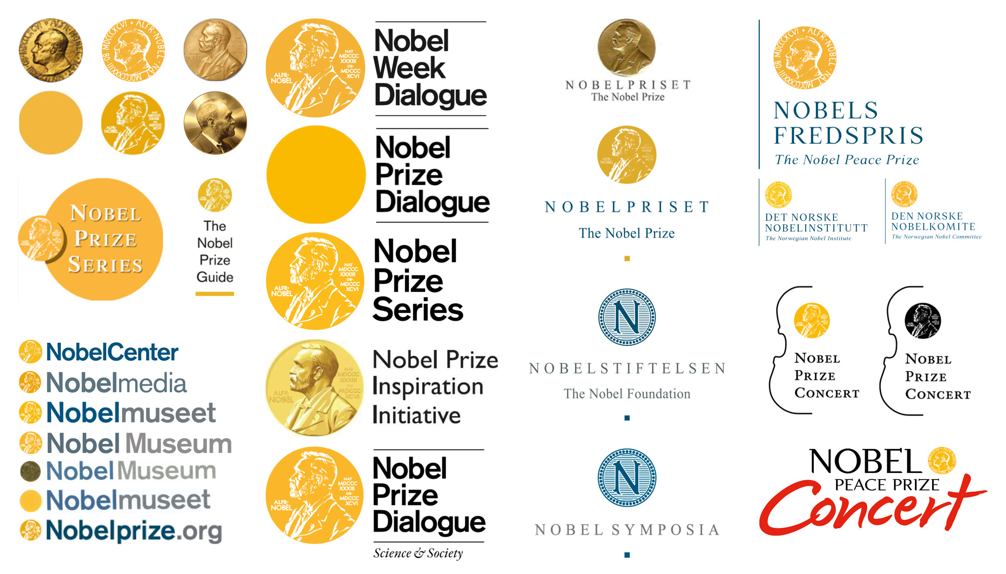
When bad design happens to good organizations! It’s not that it’s bad… most of it, individually, is decent but as a whole it was way all over the place.
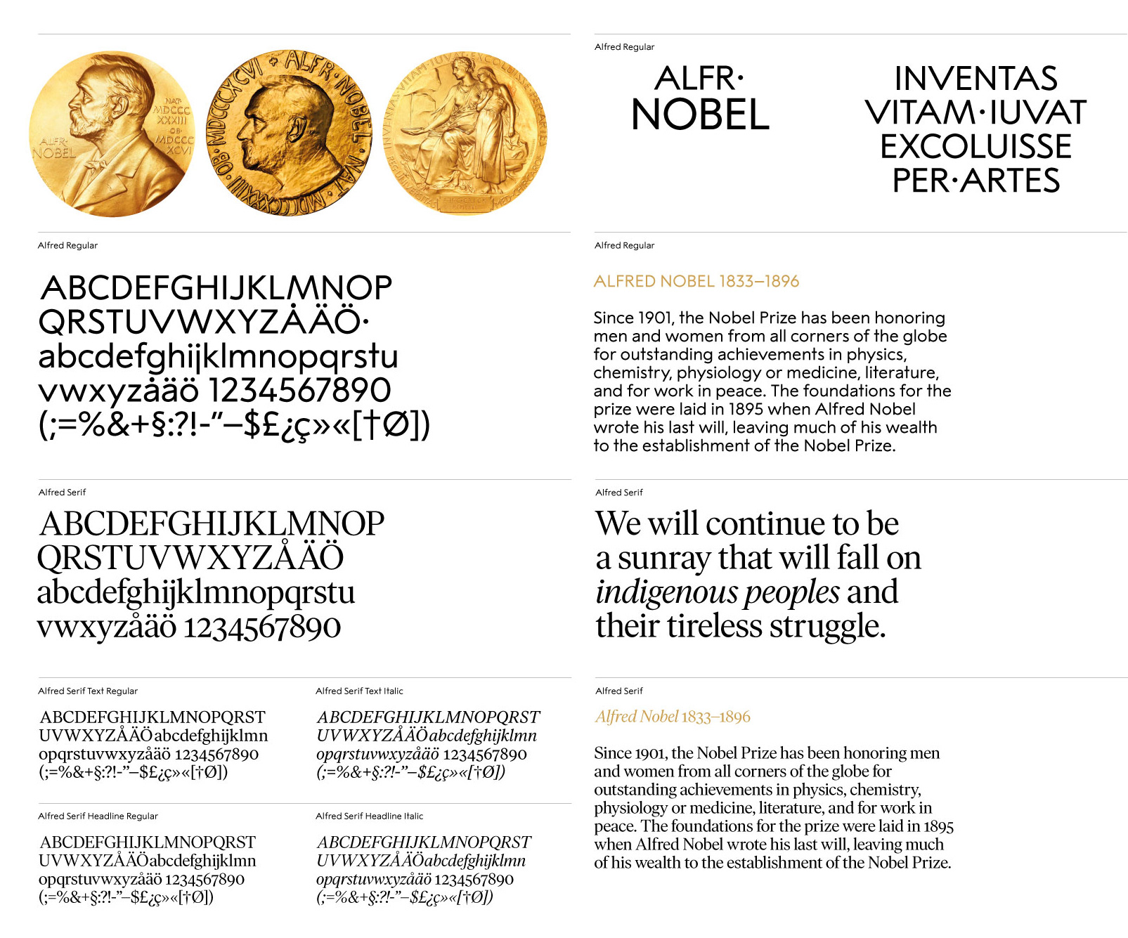
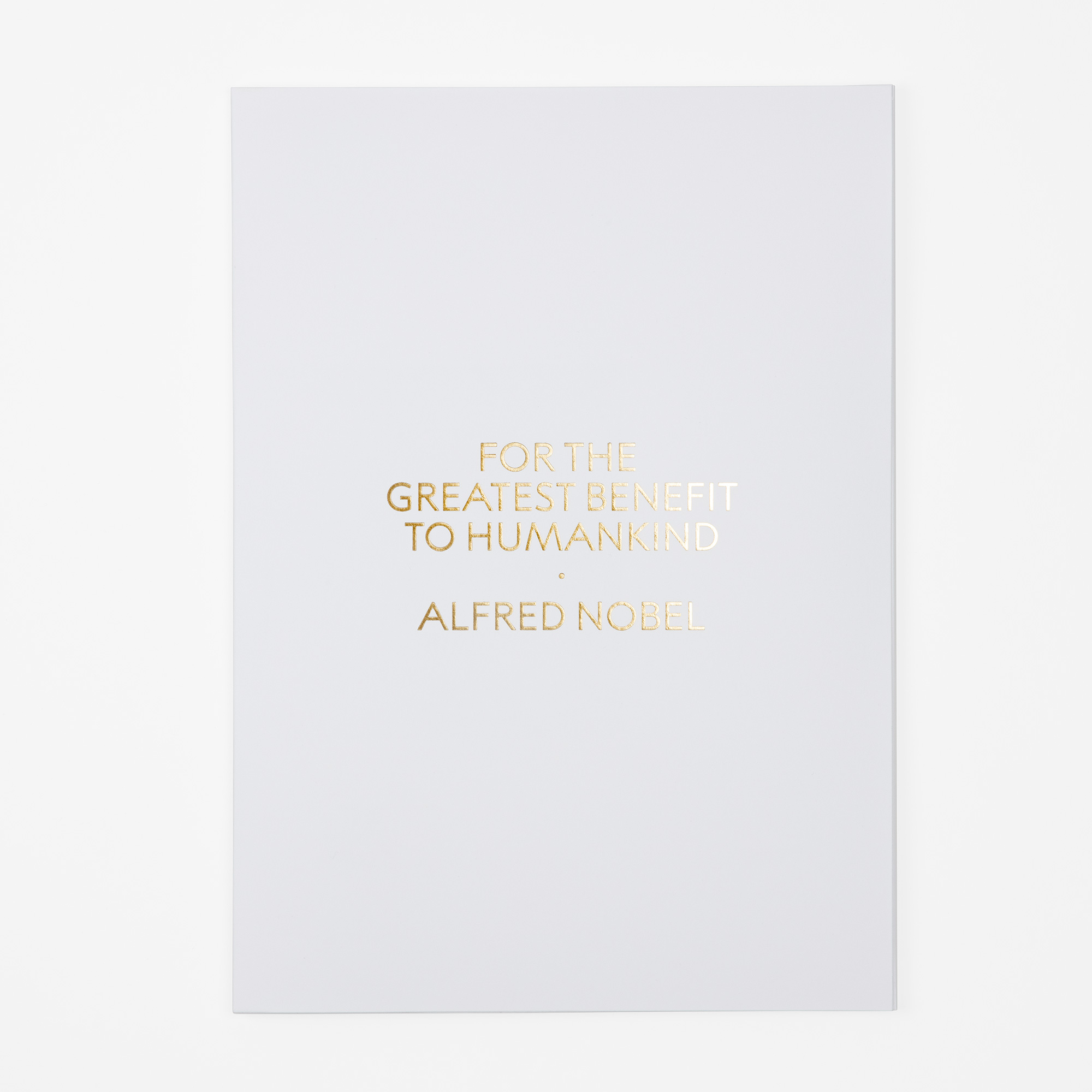
The natural springboard for the development of the visual identity is the Art Nouveau gold medal that was first handed out in 1902 - the wordmark, typography, colours and the fifth element all spring from this one source. A common identity that will increase the possibilities for recognition, consistency and more effective communication efforts that strengthens the unique position of the Nobel Prize.
The old logo, or at least one of the logos that looked to be the closest to a formal Nobel Prize logo, wasn’t great, using Times (or something Times-New-Roman-ish) and a fuzzy rendition of the medal. It got the job done but it wasn’t going to win any design prizes of its own. The new logo is very, really, super nice. There is something very stately, handsome, and dignified about it — part of that feeling is the association with the Prize itself but that alone can not carry a logo, as the old one demonstrated. Another thing I really like about this logo, in contrast to the recent trend in fashion logo design in particular, is that this one shows the proper place to use an all uppercase, unassuming sans serif — here it makes sense and it works perfectly. The fact that it came from the typography on the medal is conceptual icing on the very well executed cake.
The uniquely drawn typeface, Alfred Regular, originates from the letters engraved in the golden medal. As the primary font and also used in The Nobel Prize wordmark, it will gain recognition in any touchpoint.
The upper case lettering is based on classic geometric shapes, but with varying width and a high waist, giving it a unique and ownable character. The lowercase letters are designed in the tradition of early 20th century sans serif typefaces, like Akzidenz-Grotesk, Berthold Grotesk and Futura.
Alfred Sans was developed in parallel with the secondary font, Alfred Serif. Both typefaces are designed to fit together and complement each other, functionally as well as aesthetically with a focus on readability and thus secures long term usage.
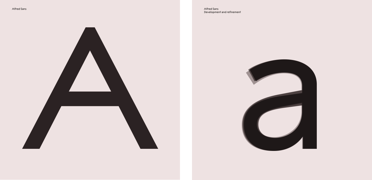
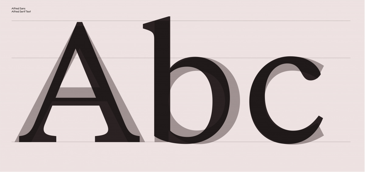
As a font, Alfred Sans is like a much more interesting Gill Sans. I love the exaggerated wideness of the angled letters like the “A” and “V” and the high waist of the “R”. Alfred Serif is nice too but I like the Text version more than the headline, which has very thin thins that look a little jarring when paired with the logo or the sans. But that’s a minor quibble as the pairing is quite nice.
The new visual identity is formed to meet the criteria for today’s and tomorrow’s organisations and brands to communicate, but with great respect to the legacy. The words access and excellence evolved to become our guiding principles, steering the tonality and quality of work throughout the project - an inclusive and sharing attitude with the awareness that the sum of all details constitutes the total impression.
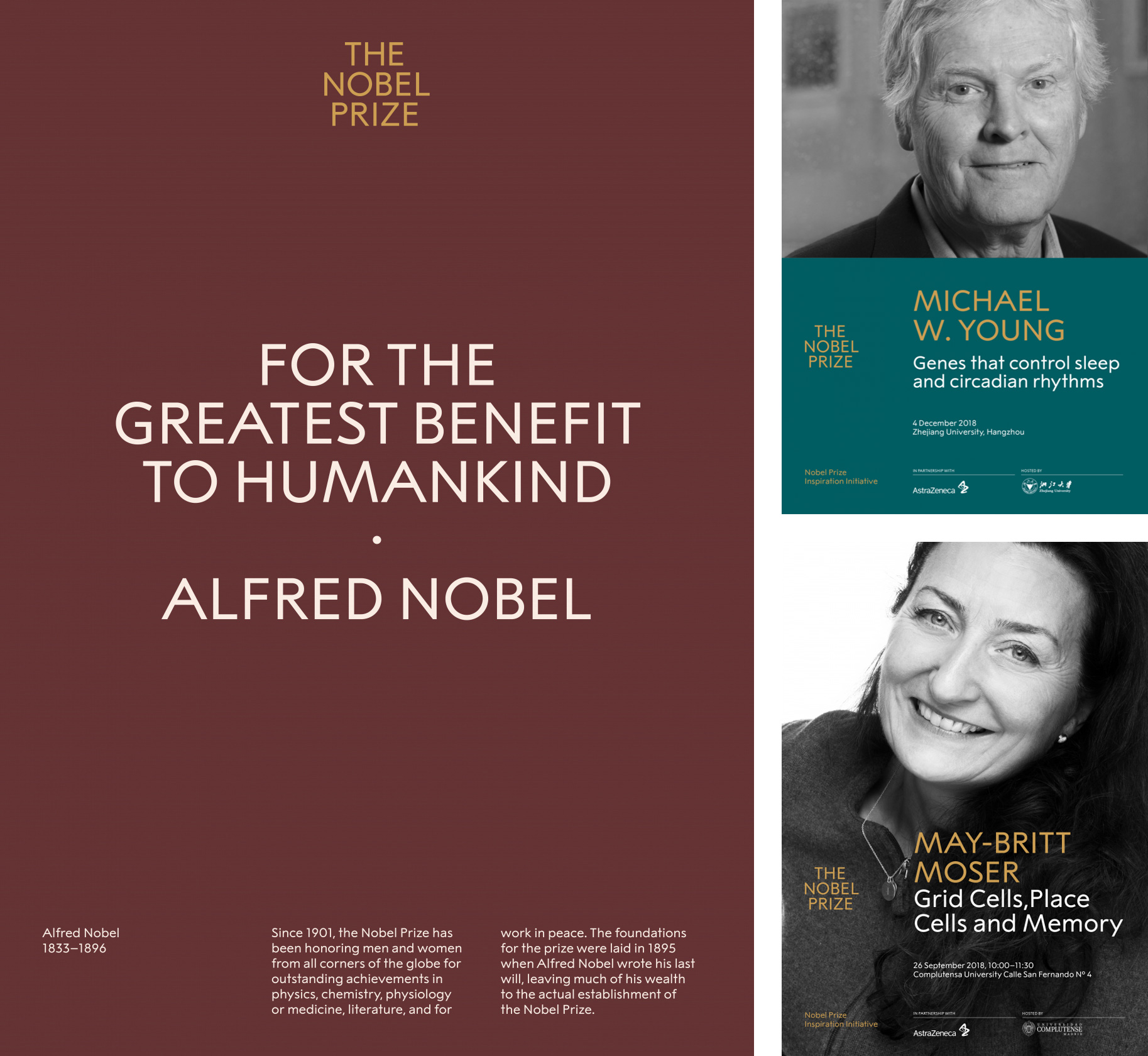
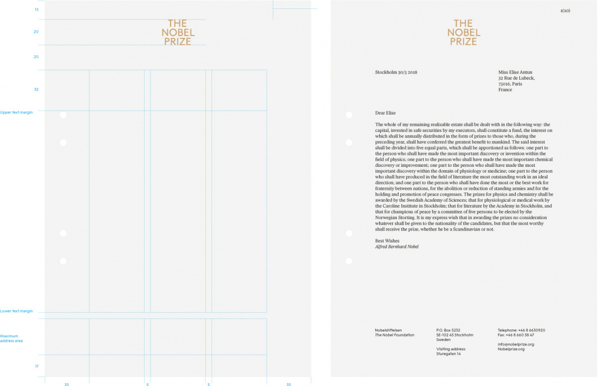
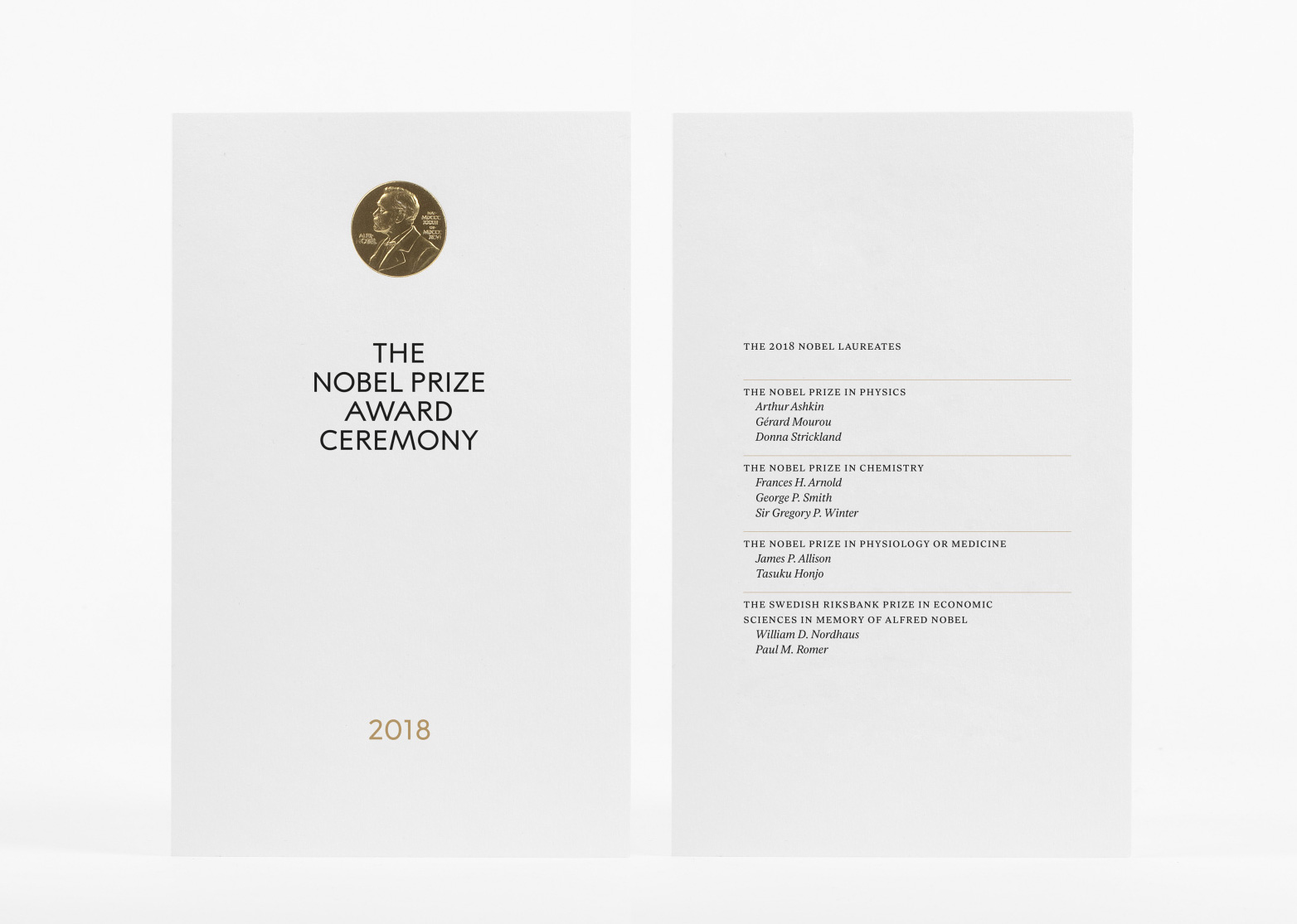
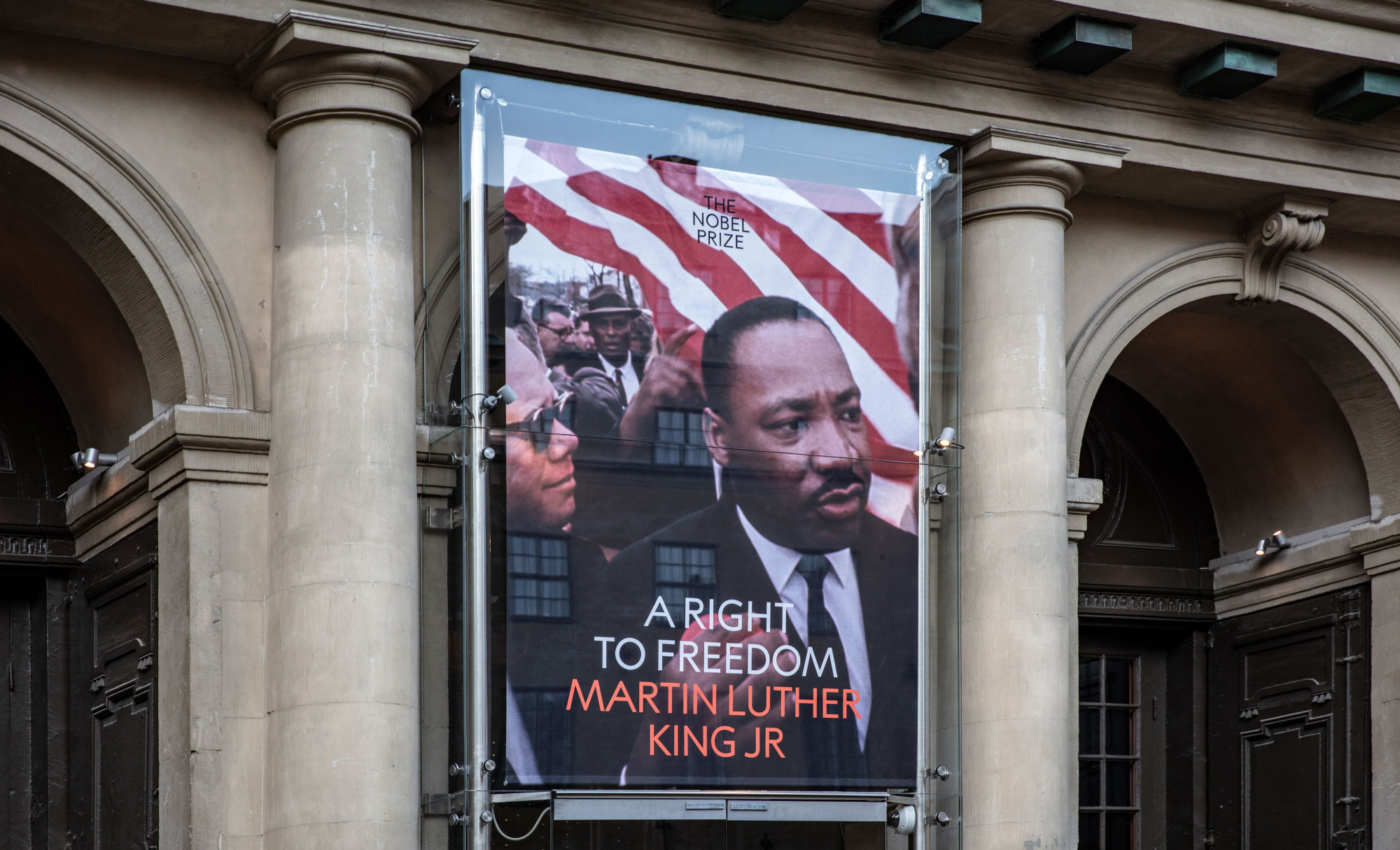
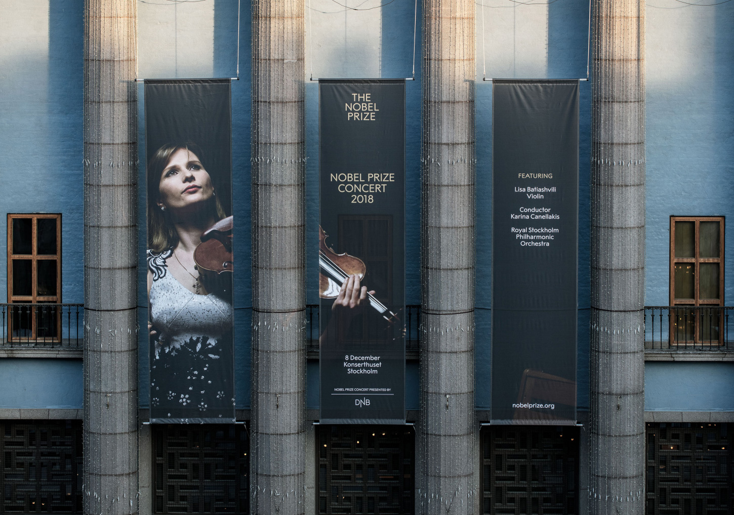
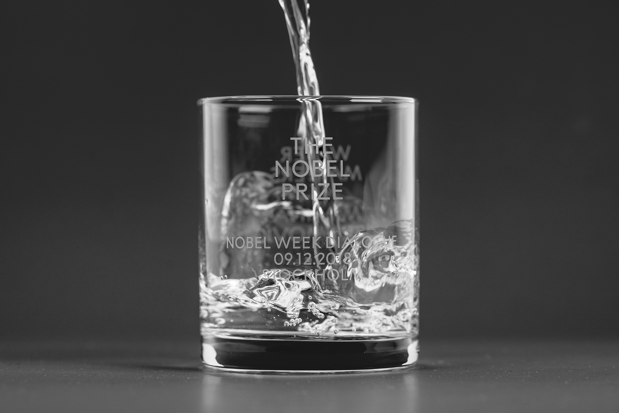
The institutional applications are all class, with generous amounts of white space and centered arrangements not to be messed with. Other, more outward applications begin to add some color and imagery while keeping the stately layouts for a nice balance of old and new.
Overall, this is exactly what it needs to be. It’s simple, elegant, and confident and both represents and conveys the significance of the Prize.

 Новости Союза дизайнеров
Все о дизайне в Санкт-Петербурге.
Новости Союза дизайнеров
Все о дизайне в Санкт-Петербурге.