Обзор лучших ресурсов по разработке бренда, разработке упаковки
contact us | ok@ohmycode.ru
contact us | ok@ohmycode.ru
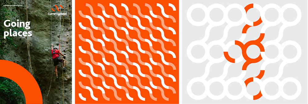
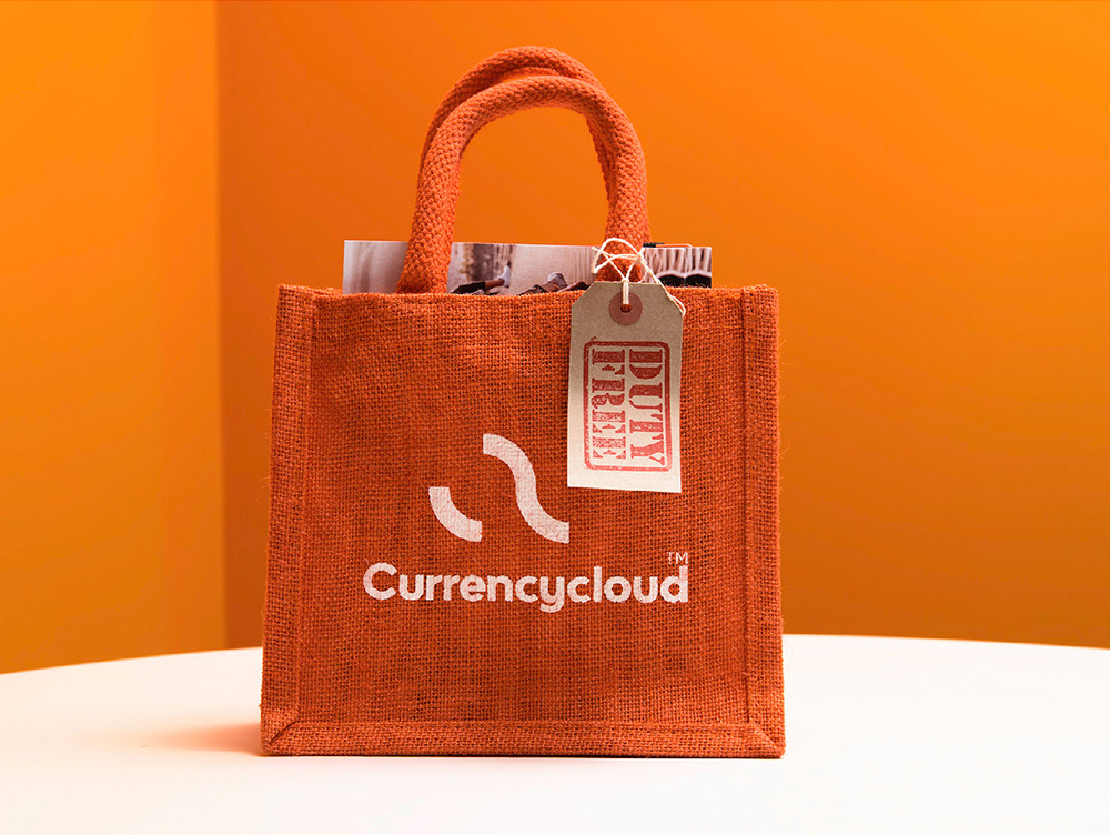
(Est. 2012) Currencycloud exists “To re-imagine the way money flows through the global digital economy so that it creates a better tomorrow for all. Our second-generation Payment Engine is at the heart of everything we do. It’s a cloud-based platform that our clients rely on to automate the way they send and receive money internationally. Incorporating over 30 currencies in 212 countries, our Payment Engine can securely automate the full payment lifecycle - from receipt of funds to conversion and payment - to deliver simple, transparent, and fast transactions.”
Everywhere Brand (London, UK)
Everywhere Brand project page
2014 Brand New Review
As I noted in the original review, the old logo had some potential and it seems like in 2 years of existing it never reached it and was probably too limiting for the long run so it's not a complete surprise this changed… to something that will most likely change again in 2 – 3 years, maybe 4. Even without a quote from the designers, it's easy to see what the intentions are: two "C"s that make a cloud shape for, you know, cloud-based stuff and signify connectivity through the interlocking middle shape. Basic but arguably effective. The one big problem with the execution is that middle shape, where it's obvious that two quarters of a circle were joined in Illustrator, which creates a flat transition between the curves. You have to customize that joint, folks. Put some elbow grease on those beziers and construct a smooth, flowing curve. Sometimes it's fine to let Illustrator do its default thing but when it's the center point (literally and figuratively) of your logo you have to smooth it out manually. Type: geometric sans. Check. To their credit, it makes sense as it pairs unobtrusively with the icon. The secondary sans serif is a nice choice on its own but not sure it fits in with the geometric everything. Patterns are very basic. Again, you gotta push it. Overall, the logo went from a bad-ish trend to a decent trend that at least has more legs for a longer stay.


 Новости Союза дизайнеров
Все о дизайне в Санкт-Петербурге.
Новости Союза дизайнеров
Все о дизайне в Санкт-Петербурге.