Обзор лучших ресурсов по разработке бренда, разработке упаковки
contact us | ok@ohmycode.ru
contact us | ok@ohmycode.ru
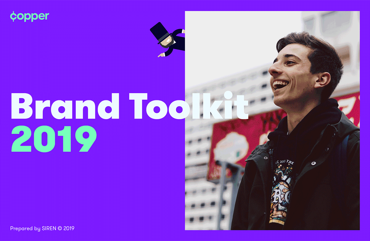
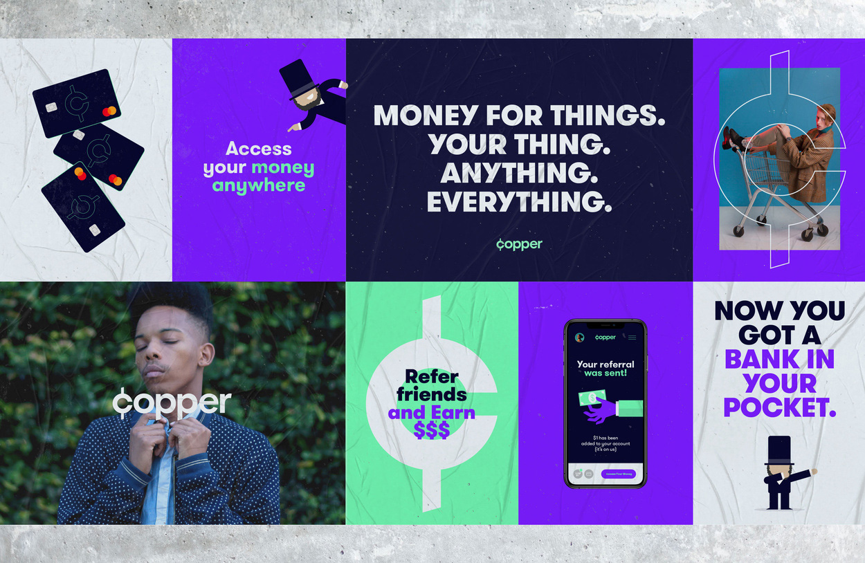
Established in 2019 and launching this year, Copper is an all-digital bank, built specifically for teenagers. Through a mobile app and a debit card, Copper aims to both “[teach] teens how to make smart financial decisions by developing patterned behaviors” and “gives them access to the digital economy” — all through an FDIC-insured environment. The app allows teenagers to receive money from parents/guardians, friends, or people they do chores for, as well as allowing them to send money to their friends, or make monthly payments on a loan or purchase. Copper is currently available on a waitlist basis but they have introduced a new identity designed by San Francisco, CA-based Siren.
Welcome to the #NewHustle. The road to banking and financial literacy is a long and thorny one, so we created an integrated identity based on the foundation of The New Hustle — the path to financial freedom being rooted in a solid education.
The old logo had the right idea, putting an abstract penny in place of the “o” but it wasn’t executed in any kind of engaging or creative way. The new logo makes a different interpretation of the penny: instead of a circle and the color, it emphasizes its value, changing the “c” to a cent symbol. It’s not earth-shatteringly conceptual but it does take a couple of seconds to make the connection, making the logo a little more, literally, engaging. Visually, I like how the vertical line of the cent plays off the “p”s in the name, with the same length and angle cut at the ends. The monogram on its own looks good and not that it will ever be as recognizable as any major financial entity (like Chase or Mastercard) but it has barely enough uniqueness — mostly because no one uses “¢” anywhere anymore — to stand on its own. The super bright, RGB-happy colors are understandable… it’s fintech, it’s for teens, it’s app-driven… but they are rather annoying and expected.
Once you see the rest of the identity, the above icons and illustrations seem like they are from another project and I think I like that other project more, except for the Halloween-esque hand drawings. The icon set is actually pretty good with the circles being split in half at different angles with a subtle color split of black and purple.
Copper is a living, breathing brand. Not only does the identity consist of all the usual facets (logo, typography, colors, etc) — it also deepens its ability for storytelling and user engagement by way of Abe. The number one #CopperBoss, Abe exists to guide you to financial freedom.
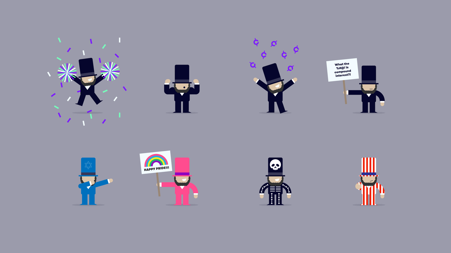
Where things take a turn, perhaps not for the worse but for the questionable, is with the introduction of the Abraham Lincoln caricature, which I feel like it drags the target age of 15 - 18 down to 10 - 13 and it’s probably the older teenagers who would be the main target audience as they have more earning/spending potential. I think the Abe character is too uncool and playful to really connect with the audience OR their parents. The idea of introducing a character seems right but I think it needed something much more irreverent.

Bringing the brand to life in the digital realm, we mapped out a streamlined landing page utilizing subtle animations.
The site fluidly guides users to the Copper app — which SIREN worked closely with the Copper development team to bring to life. The app needed to be intuitive and enlightening, so we crafted a user experience that leveraged the visual language to engage as well as educate.
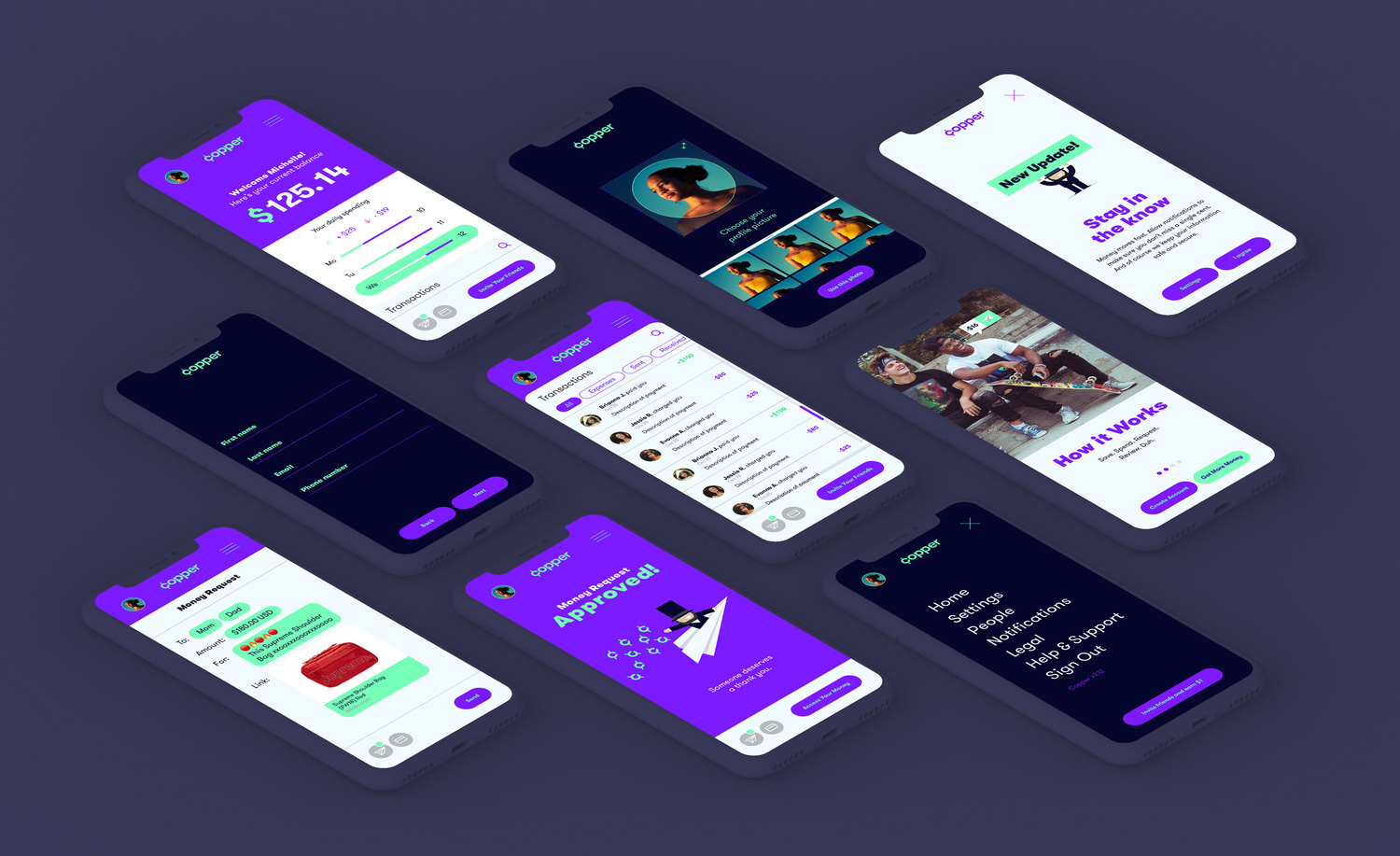
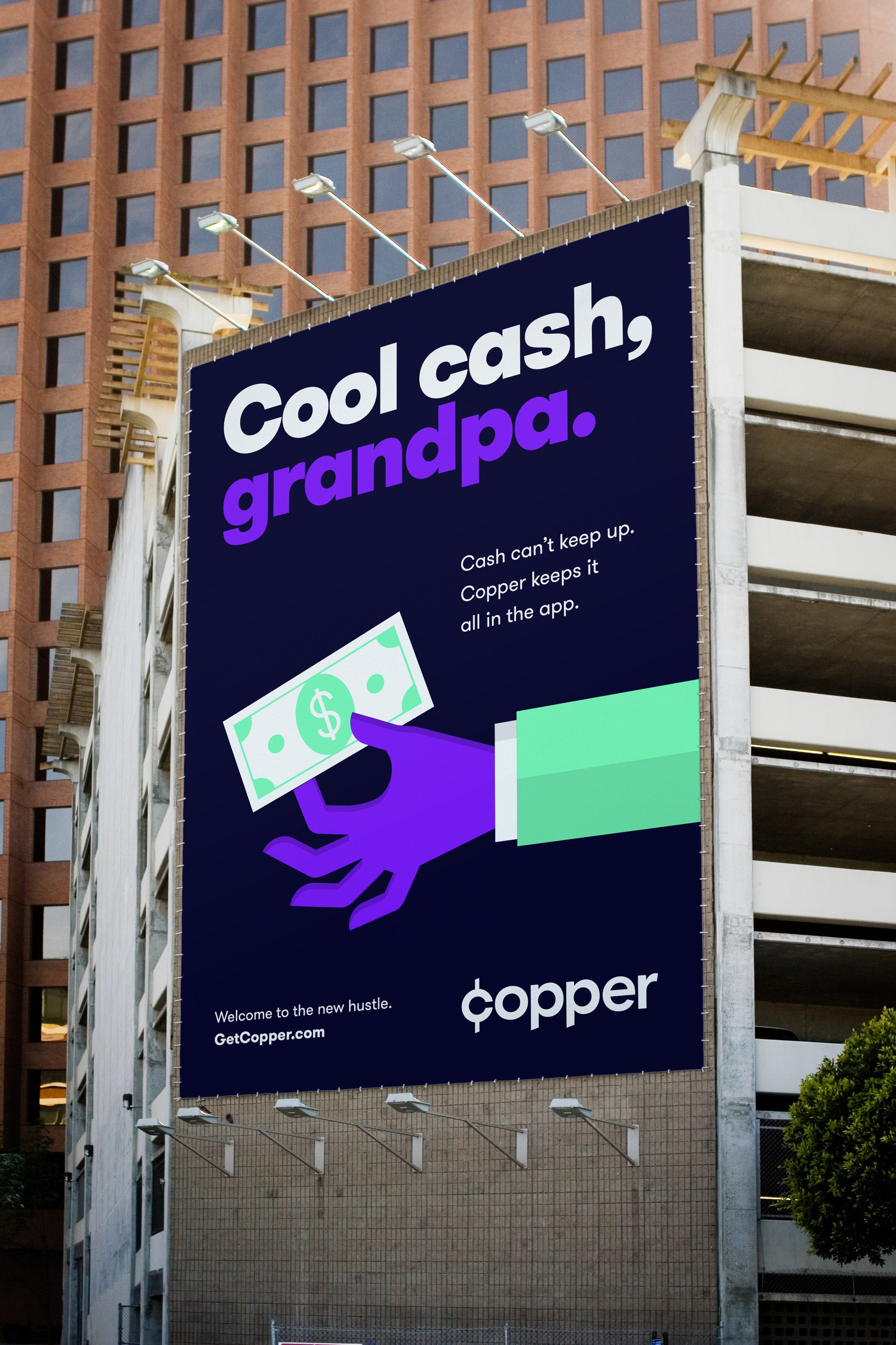
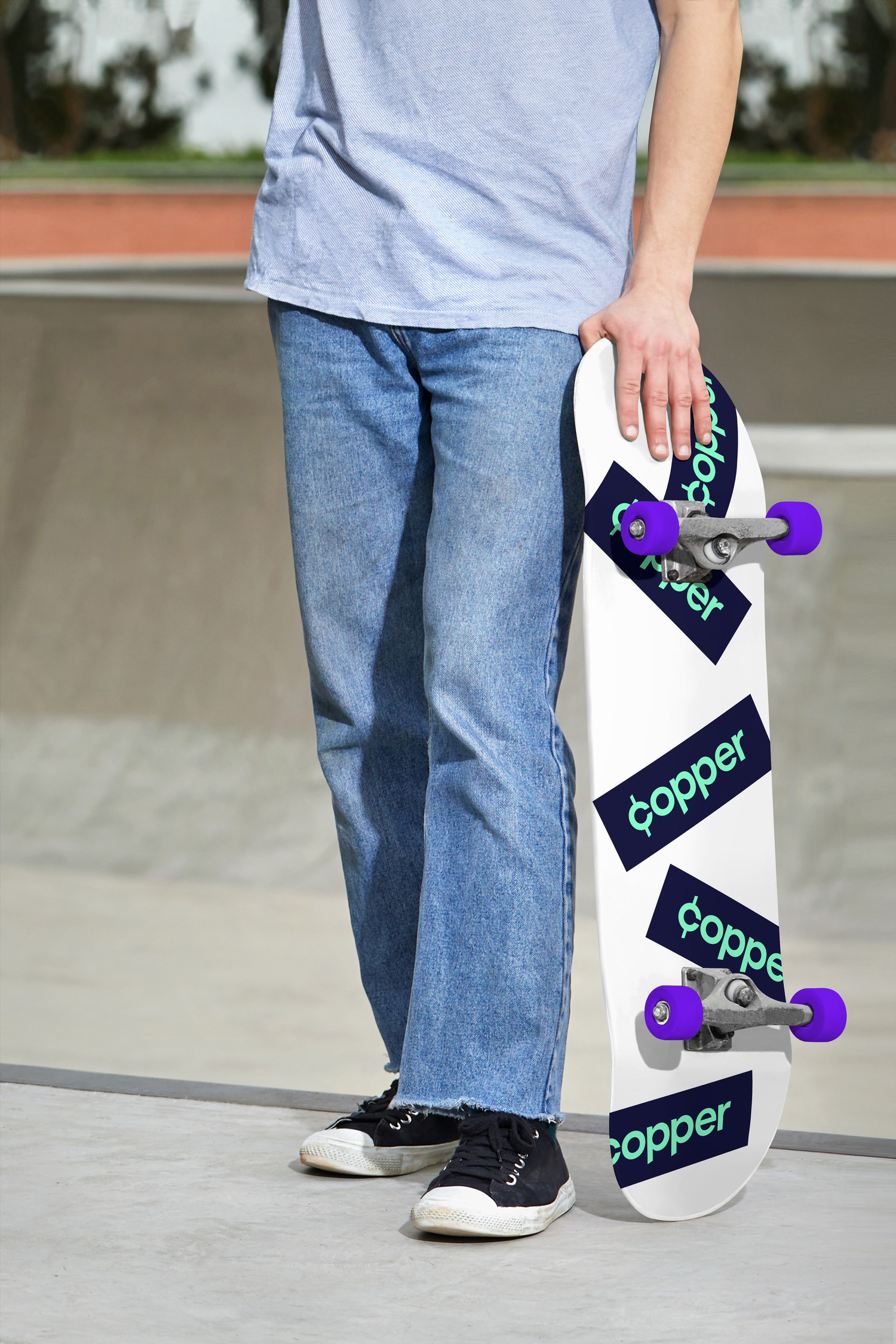
The applications are all well executed and visually striking on the surface but the copywriting, imagery (illustration and photography), and general attitude feels out of touch and like it’s trying way too hard to be cool and appeal to the young generation. This definitely feels like adults trying to talk to teenagers and not fully succeeding. The image directly below probably sums up this nagging feeling: that skateboard isn’t something that’s ever gonna happen in real life. To end this paragraph on a positive note, I’ll admit that I do enjoy the moments where cent icons are being thrown like confetti.
Overall, probably not a surprise summary when I say that I think this misses the mark in most ways in terms of connecting with the audience. What I do think it does right is in making Copper look like a legit, contemporary, fintech brand that can be trusted by parents because it looks and feels like a number of other digital-first services. But that’s just my two cents. Ba-dum-dum-tss.
 each year since publication began in 2006

 Новости Союза дизайнеров
Все о дизайне в Санкт-Петербурге.
Новости Союза дизайнеров
Все о дизайне в Санкт-Петербурге.