Обзор лучших ресурсов по разработке бренда, разработке упаковки
contact us | ok@ohmycode.ru
contact us | ok@ohmycode.ru
Established in 1769, Dartmouth is a private, liberal arts, Ivy League research university in Hanover, NH, that consistently ranks among the world’s top academic institutions. It counts with 1,066 faculty members and approximately 4,300 undergraduate students across more than 40 departments and programs and 2,000 graduate students in the schools of arts & sciences, medicine, engineering, and business. Recently, Dartmouth introduced a new identity designed by New York, NY-based OCD.
The Dartmouth wordmark is based on lettering crafted by renowned type designer Rudolph Ruzicka, a longtime resident of Hanover, New Hampshire. During site visits and long stays in the Rauner archives, the [OCD] team found many items bearing his handiwork including the College’s bicentennial seal and plaque and the design of the Dartmouth Medal first given out in 1973 and still awarded today. Type designer and co-founder of XYZ Type, Jesse Ragan, a long-time Ruzicka scholar, helped revive the lettering to create the new wordmark unique to this Ivy League institution.
The old wordmark was perfectly fine. It looked Ivy League-ish and it did its job but there wasn’t anything particularly memorable or distinctive about it. Although the same could be said for the new wordmark, the “genetics” behind it cement it solely to Dartmouth by originating from references to its history and previous artifacts while being beautifully crafted and very well calibrated for print and digital and large and small use. The wordmark has a great classical look — as of something chiseled centuries ago — but paired with the range of green colors it takes on a fresh, contemporary air.
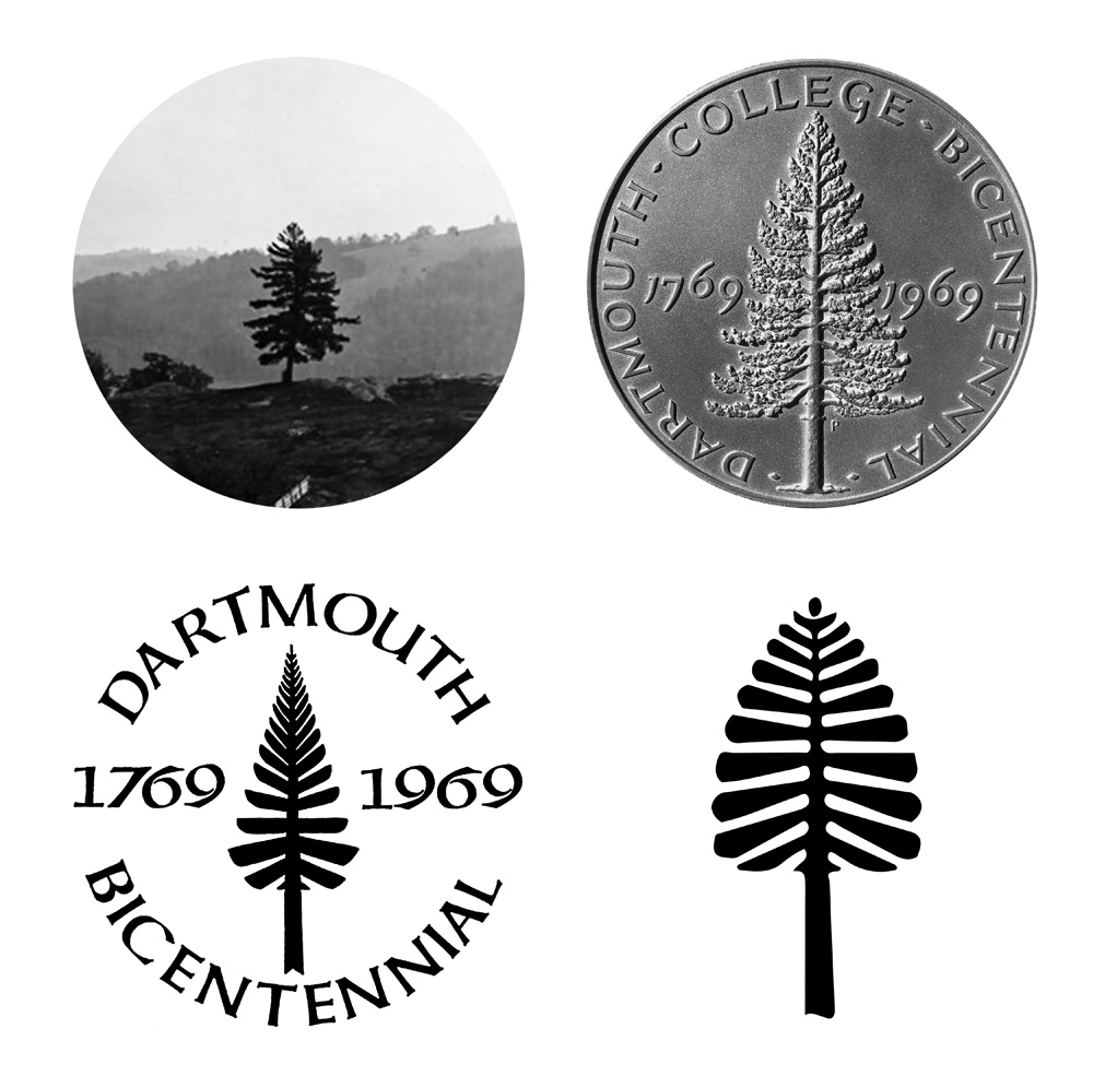
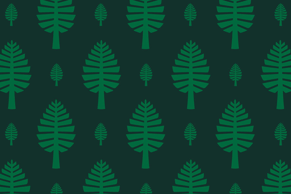
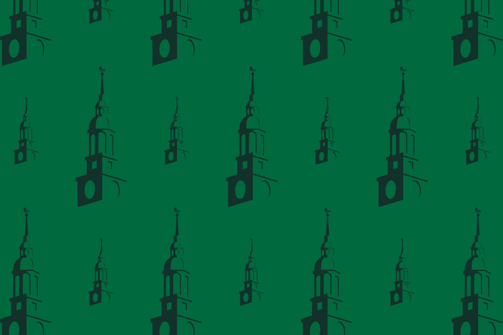
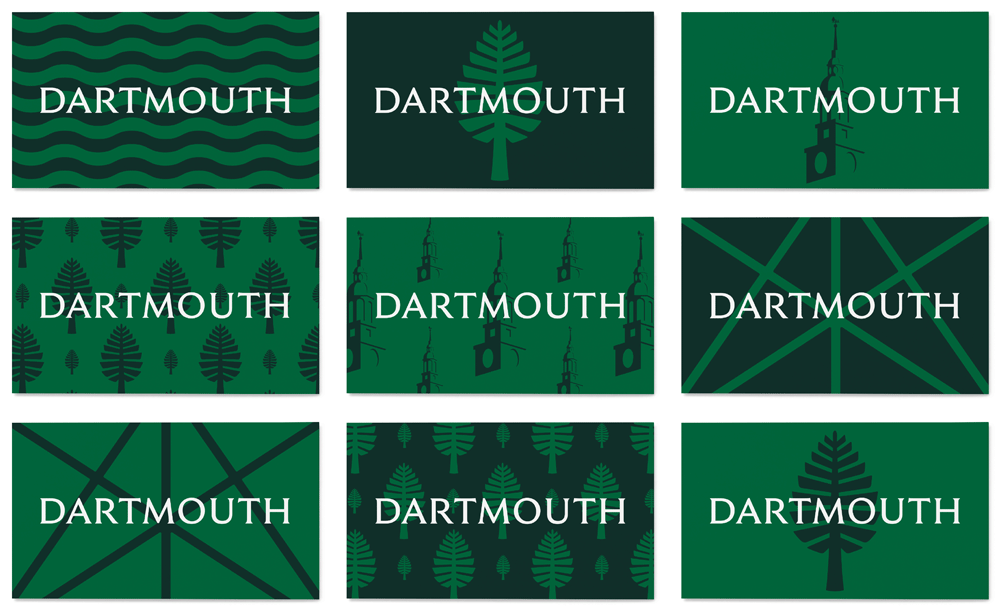
At the heart of the Dartmouth identity is the Lone Pine, a storied tree that was known as a gathering spot for seniors in the early 1800s before being cut down in 1895 due to damage from lightning strikes. The stump is still used for commencements and special events.
The first Lone Pine symbol was created to celebrate the bicentennial in 1969 by another Hanover-based designer, John Scotford. Variations of the Lone Pine were used sparingly over the years until it was embraced by Dartmouth Athletics as a symbol of resilience and a signifier of its unique location.
OCD redrew the Lone Pine with the goal of preserving its original distinctiveness while also pushing its craft and storytelling. Opening the spacing between the branches helped improve legibility at small sizes. Strengthening the trunk helped make the shape more recognizable to people who are not Dartmouth grads.
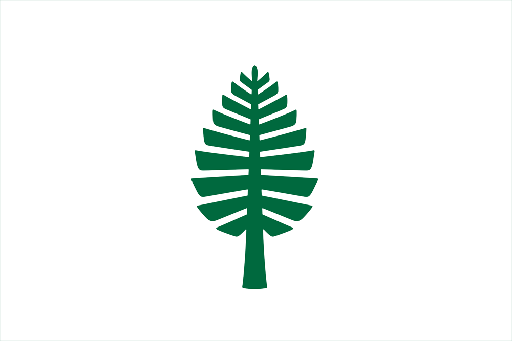
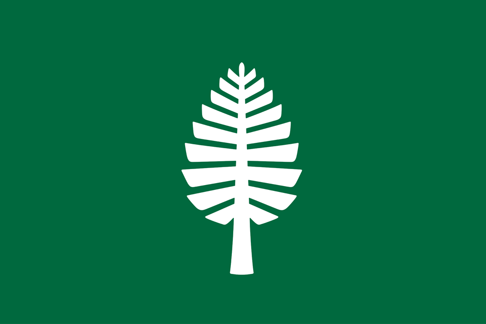
The subtler aesthetic of the wordmark is complemented by this bold, graphic redrawing of the pine symbol, which is, again, beautifully drawn and doesn’t fall for any current-day trends of being too geometric or single-thickness-ed. I love the curved bottom of the trunk, it’s such a great detail that turns this from a drawing of a pine tree to a more considerate, deliberate mark.
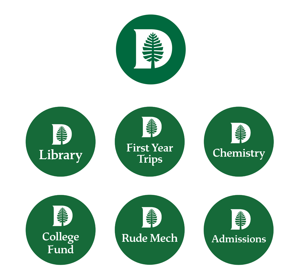
As the elements of the identity system came together, a new college insignia emerged. The Dartmouth Pine (colloquially known as the D-Pine) honors the college’s legacy and tradition while building a fuller, more complete and more inclusive visual language.
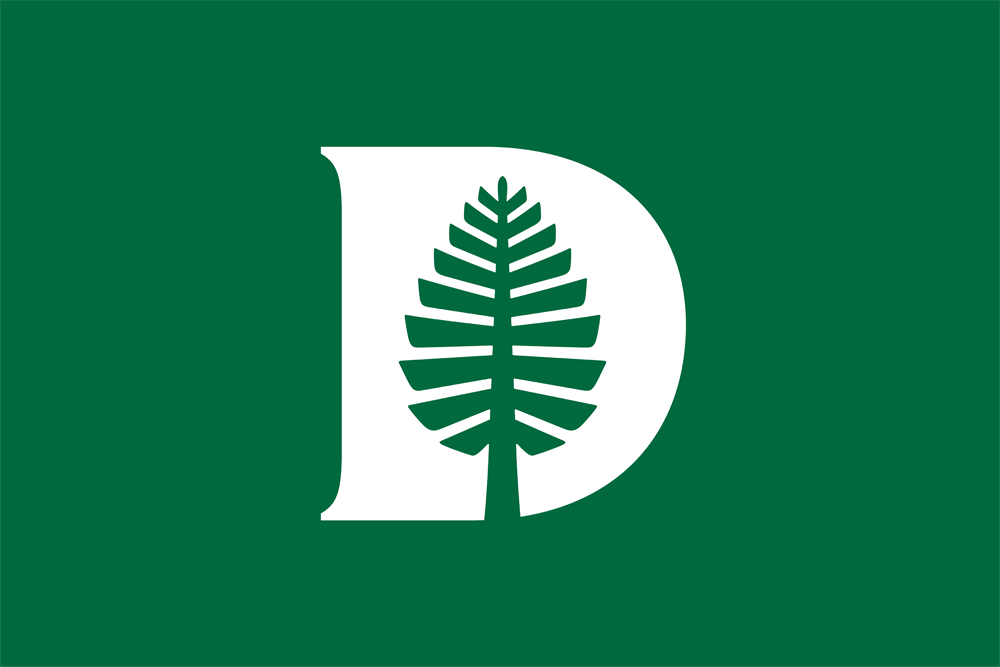
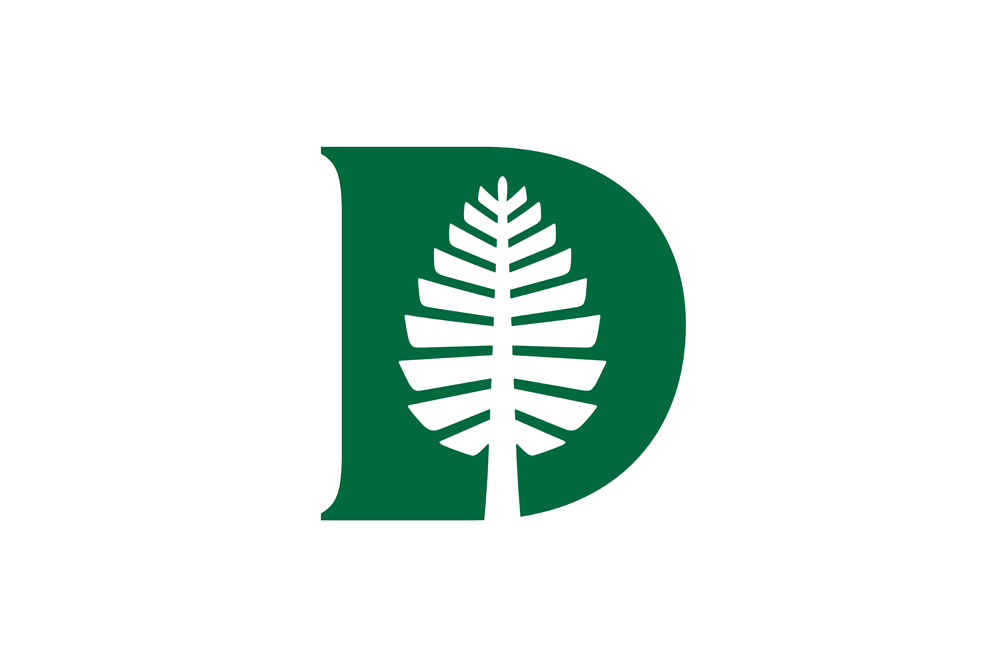
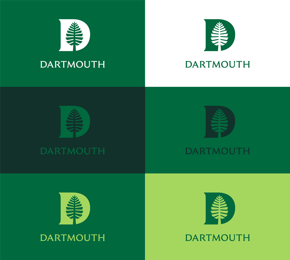
The pine then blends with the outer shape of the “D” from the wordmark to create yet another excellent mark for Dartmouth that marries the best of the two elements: the elegance of the subtle serifs of the wordmark and the graphic-ness and texture of the single pine. The color combos, again, give this mark a great look.
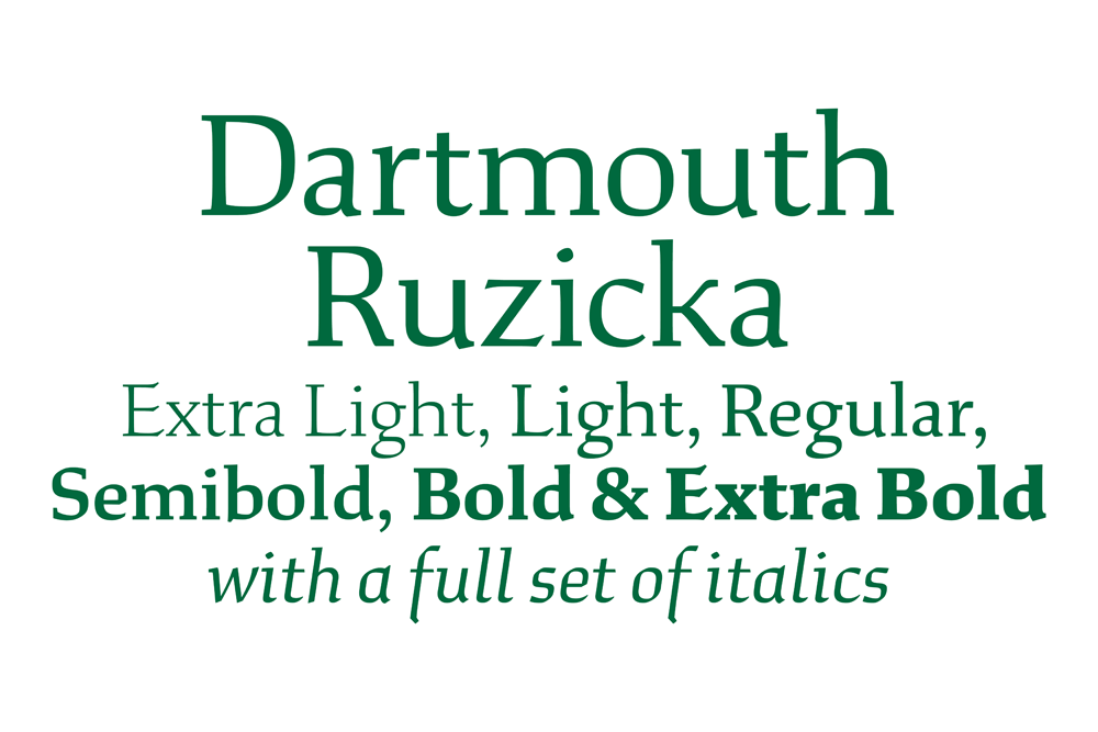
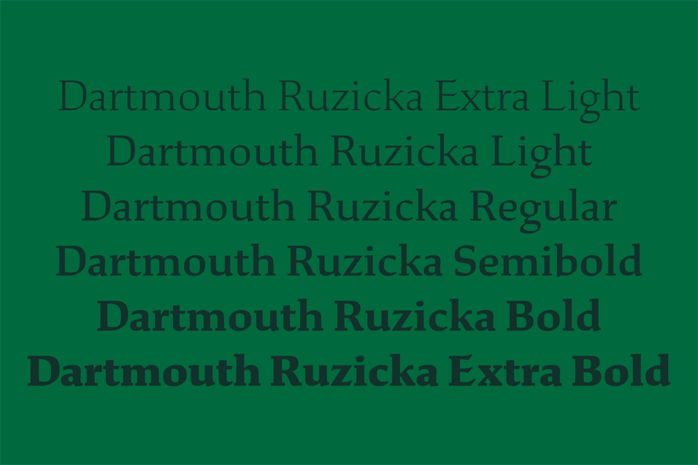
We continued to work with Jesse Ragan to develop a family of typefaces for Dartmouth. The family, appropriately named Dartmouth Ruzicka, consists of eight weights and accompanying italics inspired by the work of the late Rudolph Ruzicka, designer and author of Studies in Type Design.
Ragan picked up where Ruzicka left off, refining the letterforms while maintaining their crisp, calligraphic structure. The chiseled edges, angular details, and other subtle flairs add up to create a timeless elegance that is perfectly suited for Dartmouth College.
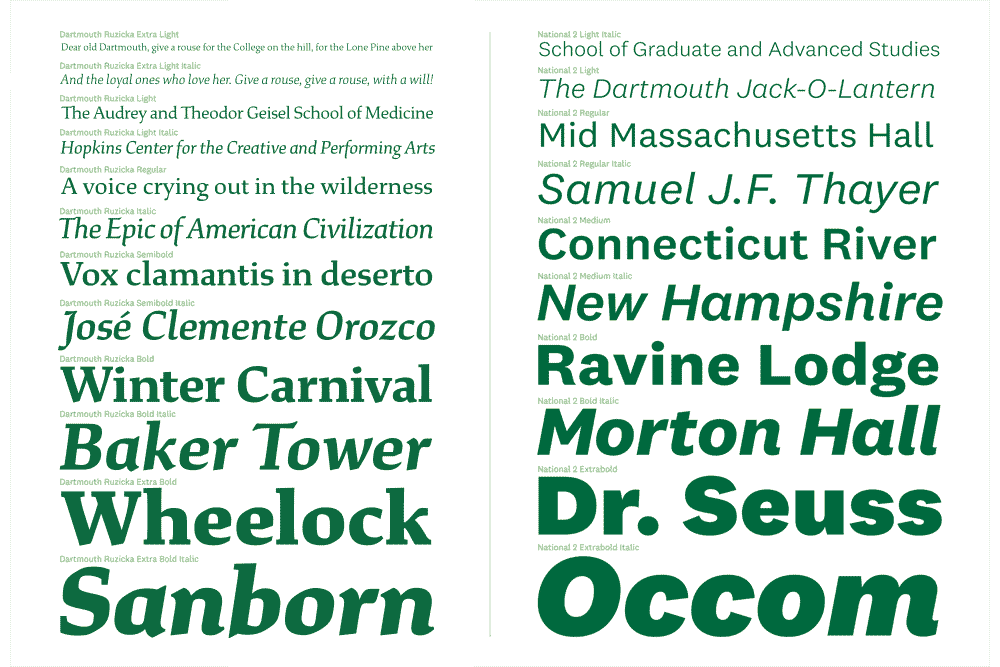
The type family by Jesse Ragan of XYZ Type is — apologies for sounding like a broken record — another beautiful element of the identity and a proper case of a relevant, custom and proprietary type family (that is not the 100th variation of a geometric or Humanist sans serif) that is rooted in the history of the institution.
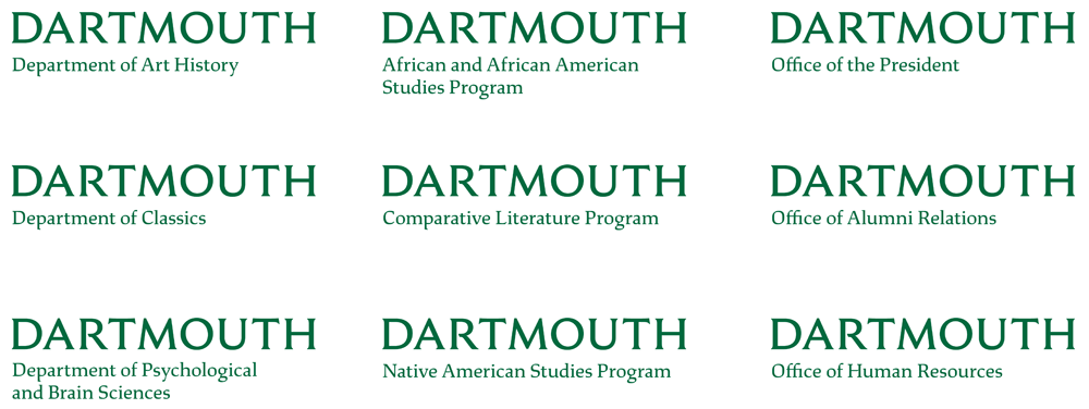

Really strong, simple, and nicely varied extensions for colleges and programs.

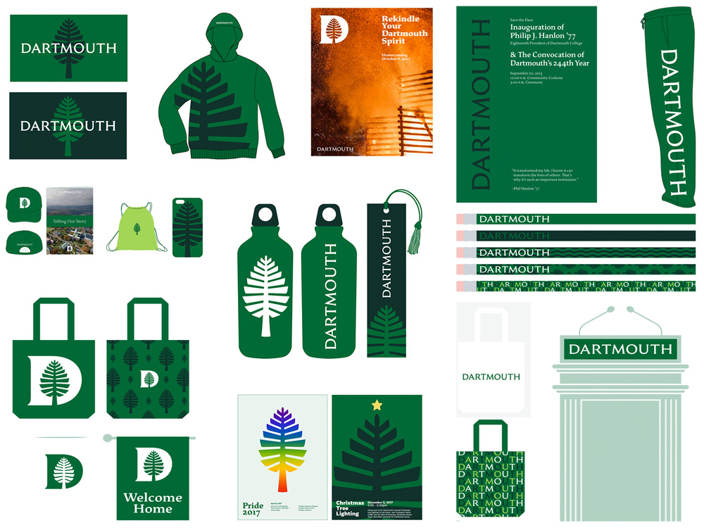
Overall, I find this redesign stunning, perfectly suited for an Ivy League college, and all the references taken from Dartmouth’s hundreds of years’ worth of materials — you can see some pics of it at the end of OCD’s project page — make it a unique and relevant solution.
Thanks to Andrew Citrin for the tip.

 Новости Союза дизайнеров
Все о дизайне в Санкт-Петербурге.
Новости Союза дизайнеров
Все о дизайне в Санкт-Петербурге.