contact us | ok@ohmycode.ru
contact us | ok@ohmycode.ru
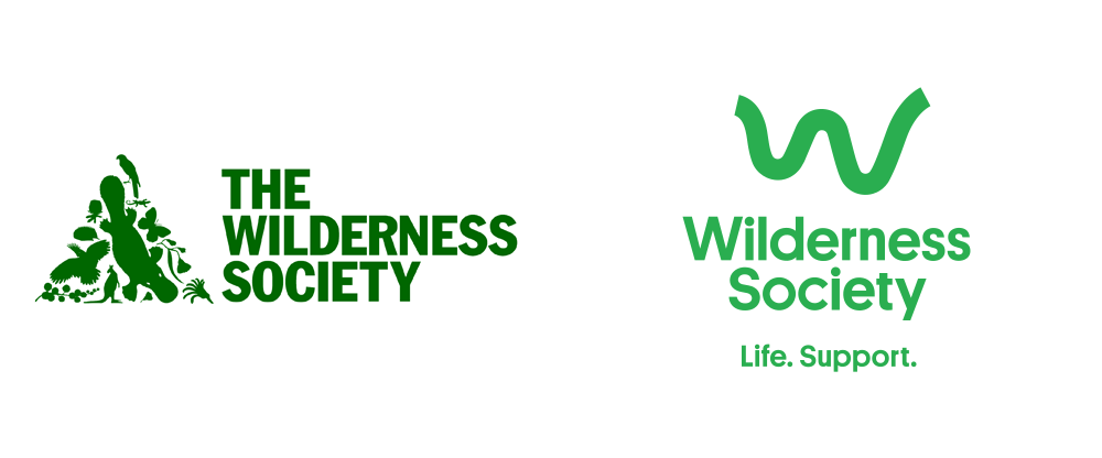
Established in 1976, the Wilderness Society is a nonprofit organization in Australia working to “support the living world that makes all life possible”. It first came together with a campaign led by 16 people to stop a dam from being built on the Franklin River in Tasmania. Today, the organization counts with over 30,000 volunteers and members who help fight deforestation, secure better laws for conservation, and protect Australia’s nature preserves. Recently, Wilderness Society introduced a new identity designed by Windsor, Australia-based Alter.
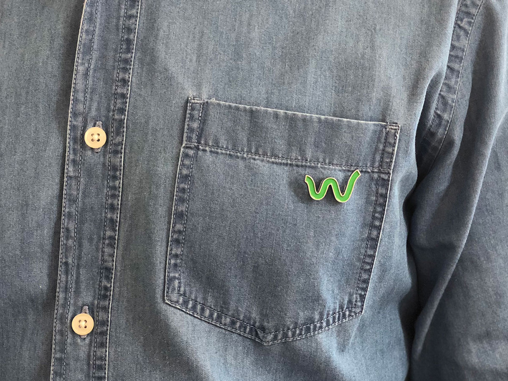
The logo is a wiggly line dubbed ‘The River’. It’s a simple and natural concept that’s about the forces which shape and support life. It’s a mark that meanders through its surroundings. An organic, friendly and playful tool. We tried not to over-engineer it, preferring to retain an expressive and intuitive finish.

The old logo was very good, immediately conveying that this organization was about animals and nature — perhaps its one fault was that it placed too much emphasis on the platypus making it look more like an animal conservation agency but platypi rock, so it can be forgiven. The triangle configuration made it look urgent somehow and the all-caps wordmark looked serious. Where the old logo was abundantly literal, the new one is abstract and demanding interpretation… it’s clearly a “W” but the river reference might not be as immediate for everyone. (I saw it right away — not that that makes me special but I did have my doubts about whether there was something else to it.)
Also, where the old logo was more descriptive — as in “we are going to protect these kind of animals, and these kind of plants, and these kind of little berries” — the new one is able to broadly encompass all the different actions of the organization and broaden the perception of its scope. Visually, I like it; it’s a simple mark, it’s organic, and it builds on the current minimalist trend but in a slightly quirky way. The wordmark is fine, if a little expected.
The river motif can expand, animate and be used to communicate ideas.Or it can be used in almost infinitely variable configurations across collateral.
The river crops is a good idea and it yields some interesting compositions. My only misgiving would be when the curves are colored pink as they look like intestines, but, I acknowledge I might be alone in that.
There’s also an adventurous quality in the execution, consciously moving toward the language of outdoor and active brands. We use this positive energy to frame a hopeful and engaged environmental conversation.
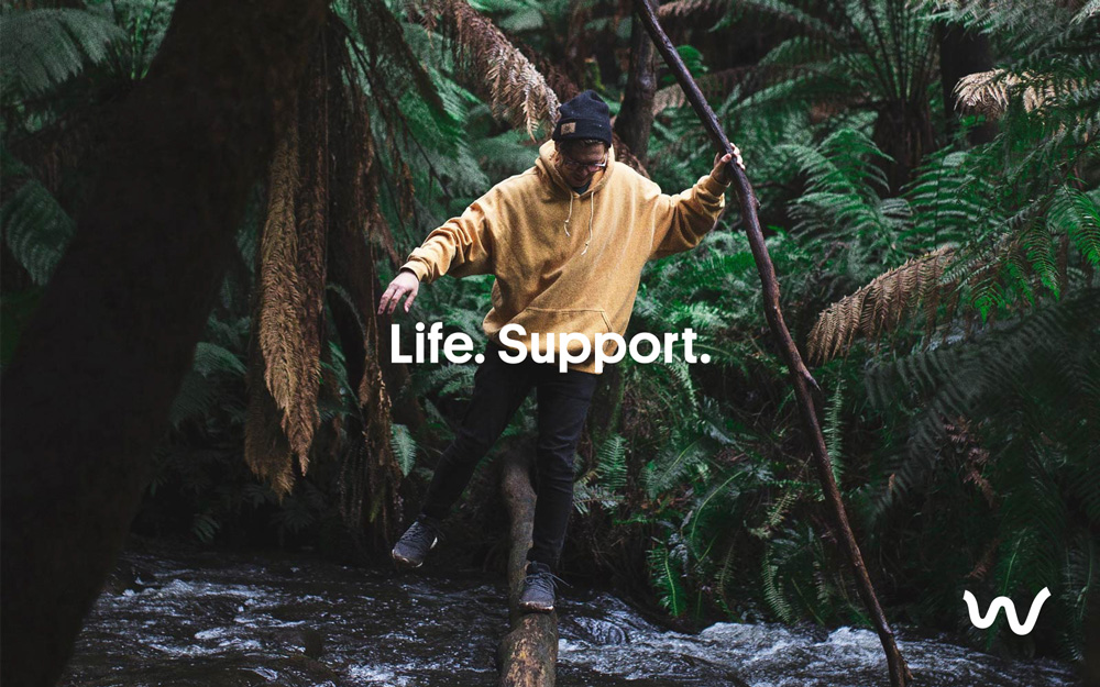
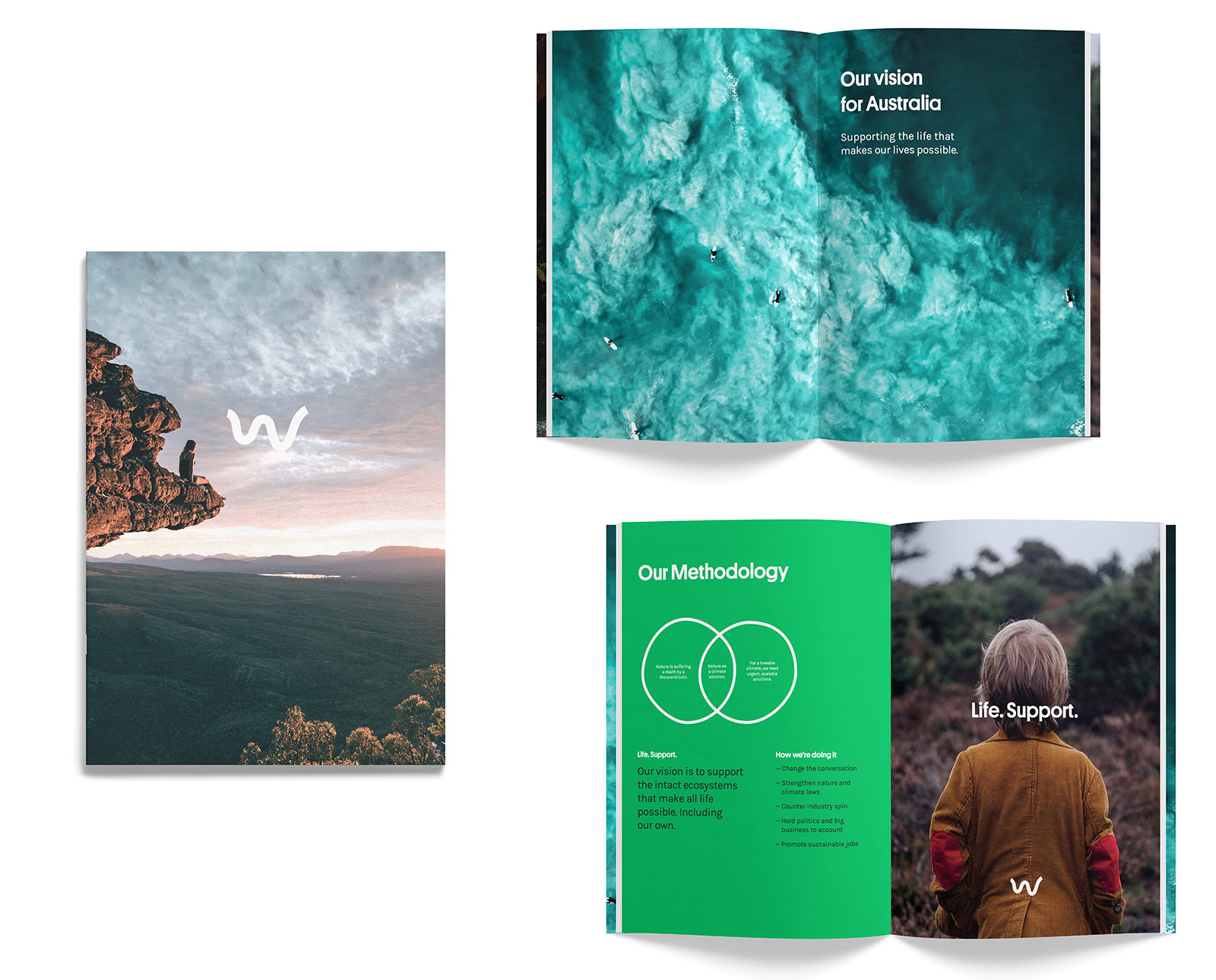
The limited applications shown (or at least the photography style) point to a very outdoorsy/backpacking/hiking aesthetic that looks cool but I wonder if it’s the right message. Like, is it too much of an Instagram model vibe that perhaps undermines the cause of the organization? Time, and more applications, will tell.
To coincide with the new identity launch, Wilderness Society also launched the “Save Ugly” campaign to help raise awareness of the value of some of Australia’s creepier creepy crawlies. The campaign is punctuated by a Jim Henson-The Dark Crystal-esque-meets-Aardman film made extra catchy with a singing, dancing, rapping Rosario Dawson. It’s definitely worth the 3 minutes. Overall, and prettiest-moth-ever aside, this is a smart redesign that opens up the interpretation of what this organization does beyond plants and platypi.
Thanks to James Lake for the tip.

 Новости Союза дизайнеров
Все о дизайне в Санкт-Петербурге.