Обзор лучших ресурсов по разработке бренда, разработке упаковки
contact us | ok@ohmycode.ru
contact us | ok@ohmycode.ru
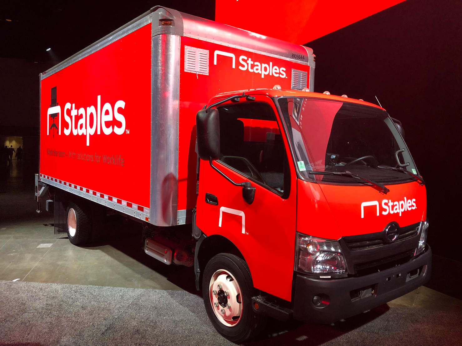
Established in 1986, Staples is an office supply retailing corporation with more than 1,500 stores in North America. Aside from its consumer retail operation, Staples works directly with companies through dedicated account teams to fulfill their office needs — something they have been building on more strongly since 2017 when private equity firm Sycamore Partners bought the company. Over the weekend, at its 2019 Sales Conference, Staples introduced a new identity. No design credit given.
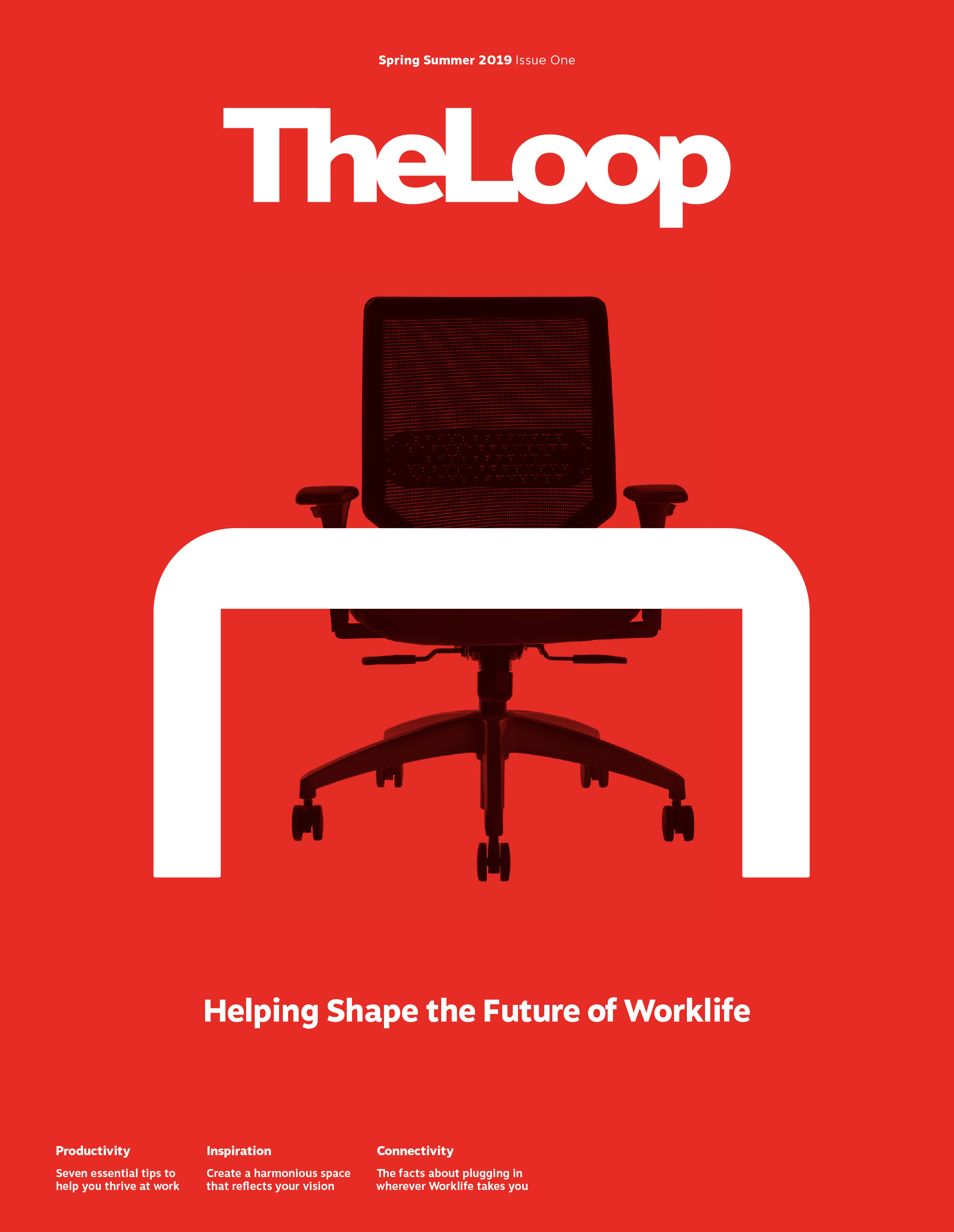
I have always liked the idea behind the Staples logo, of turning the “L” into a bent staple; the execution is harsh and too Helvetica-y for my taste but it worked. It looks old now, though, maybe more so by its association to the struggling concept of brick-and-mortar retailers. The new logo takes the old staple, opens it up, and turns into a table, or at least that’s my interpretation based on the chair graphic used in multiple other places. It’s not… bad. It’s not great either but it gives them an icon to work with, something they didn’t have before. I find the logo more endearing if I think about it as a giant staple, which sometimes it still looks as such as long as there isn’t a chair behind it. The wordmark is decent, with a wider structure than the default geometric sans and relatively eccentric spur on the “a”. Combined, they make for a really wide logo but, again, it’s not bad.
There is no real reason to bring up to Staples Canada except that I want to because I find this so troubling. They are separate companies in separate countries but us and Canada are pretty close to each other that we sometimes go into the other’s territory and it’s just so weird to see the same company name executed in similar but different ways. Before each country’s Staples redesign at least they shared the same logo. I doubt customers in either country will be confused by this but it’s the kind of thing that jolts me awake at night from a nightmare, drenched in sweat, screaming “STAPLES HAS TWO LOGOS”. But I digress.
Per the videos above and some of the stuff below, you can see that Staples is really making an effort to be well designed and infuse their brand with a little more slickness while trying to elevate the status of their icon. I won’t lie, I do not hate the above gentleman’s swag — I’m actually thinking, “Not bad”, and nodding.
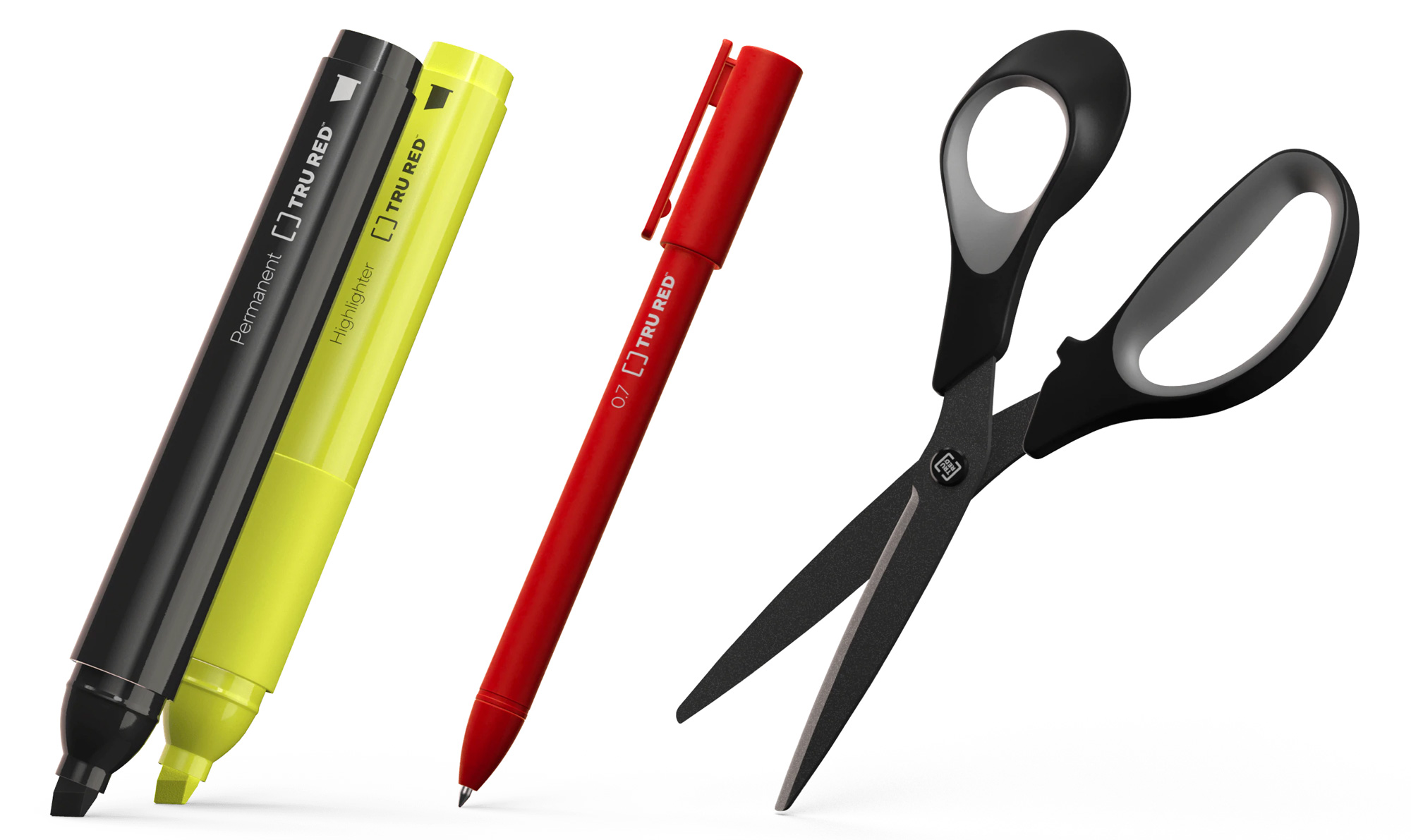
As part of the reboot, Staples is introducing its own brand of select products, TRU RED, and, once more, they are not bad. The website presenting the products is fairly ambitious and the branding on the products looks pretty convincing.
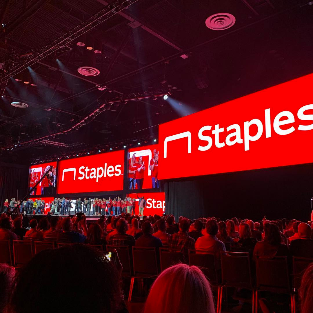
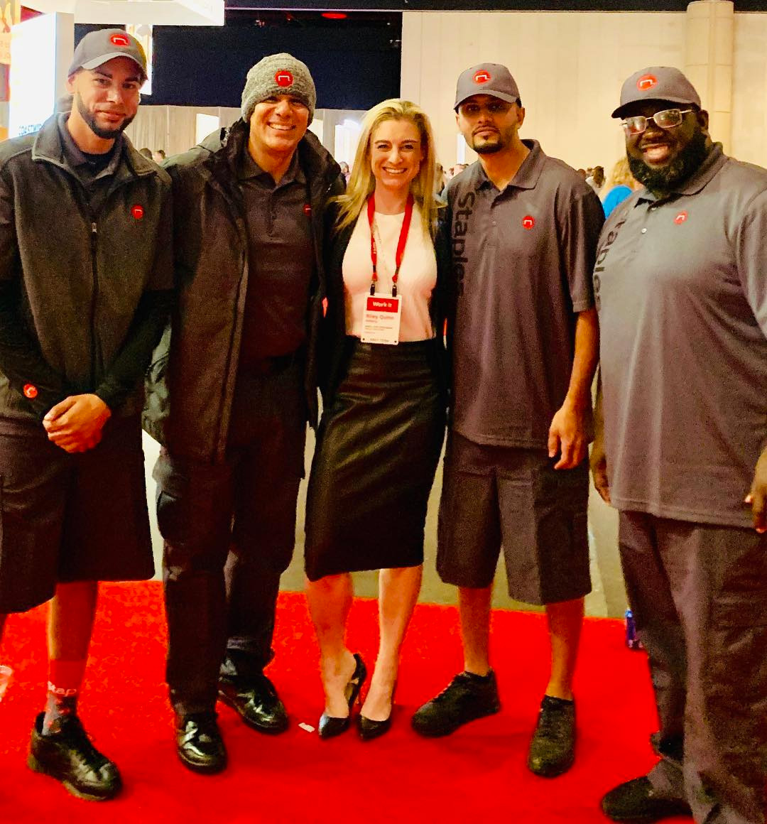
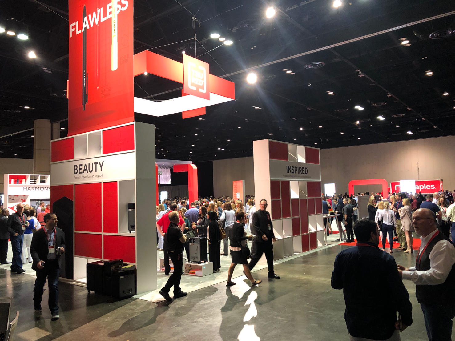
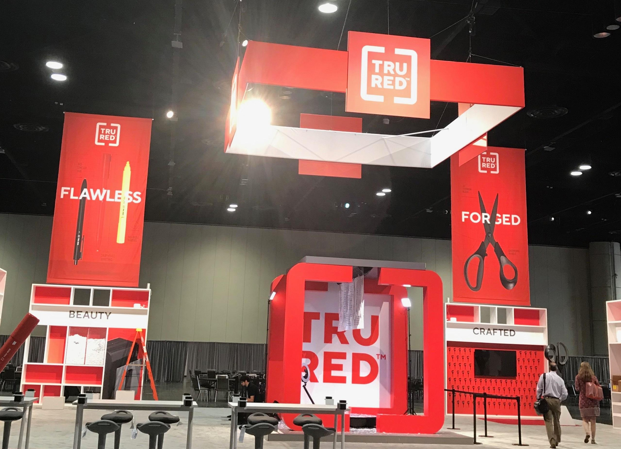
The 2019 Sales Conference apparently was a blast — check the #worklifesolutions tag on Instagram and LinkedIn — and it gave Staples plenty of opportunity to show off they new brand and products, which, yet again, didn’t look bad at all. I guess by now you can deduct that I was expecting this to all look bad — I should have just titled this review “Not bad”. I’m pleasantly surprised how well things look. It’s all, like, one round shy of being really good but it’s definitely not bombing — for the most part. The video below is a reminder that large corporations have a really bizarre understanding of what “cool” is.
Nonetheless, and one instance aside, this is a fairly decent update and one that was needed — we may all have nostalgia for the old logo but if you walk into any Staples everything looks like nostalgia. Old and out of date. This will help infuse their brand, and likely their stores, with a relatively fresh coat of paint. As with the Best Buy redesign, I question how effective it is to redesign with so many stores having a sign outside that will take years and thousands of dollars to replace. Still, with Staples placing more emphasis on its B2B operation, the redesign will have its biggest impact there.
Thanks to Aaron Ricchio for the tip.

 Новости Союза дизайнеров
Все о дизайне в Санкт-Петербурге.
Новости Союза дизайнеров
Все о дизайне в Санкт-Петербурге.