Обзор лучших ресурсов по разработке бренда, разработке упаковки
contact us | ok@ohmycode.ru
contact us | ok@ohmycode.ru
Established in 1999, Right to Dream is an academic and elite football academy based in Ghana that prepares its students through a development model comprised of three core areas: football, education, and character. What started as a single dusty soccer pitch is now a facility with eight grass pitches, dormitories, gymnasium, and even a LEGO Innovation Studio. Currently, there are 95 boys and girls from across West Africa on full scholarship at the Academy with the opportunity to access two main graduate pathways: professional football or student-athlete scholarships to the US and UK. In the last decade, over 40 of their graduates have secured student-athlete scholarships to the U.S. and more than 30 have become professional footballers. Right to Dream Group has an office in the U.S. where they support the students that come over and they are also the owners of Danish Superliga club, FC Nordsjaelland (FCN), creating a stronger segue from the academy to the professional sports world. Recently, Right to Dream introduced a new identity designed by San Jose, Costa Rica-based Pupila.
Sometimes it seems as if the few people who actually try to achieve change for good… just got everything against them. For over two decades now, the Right to Dream Academy in Ghana has been fighting against the most unimaginable odds to inspire and achieve change through the passion of football. From small communities to big cities and entire nations in West Africa, they’re focused on their purpose: To develop the future African leaders of tomorrow through the combination of education, their passion for the beautiful game, and most importantly, through a strong and committed character development program.
As we got closer to the brand, we started to understand that this was something way bigger than just another football academy, we defined it as a transformative movement. Thanks to an old friend @sebmoruah who involved us, and gave us the opportunity to rethink the identity, to actually fly to Ghana, to get involved with the kids, staff and owners and, finally to design a more new visual language that actually translates the unique and truly inspiring work of Right to Dream.
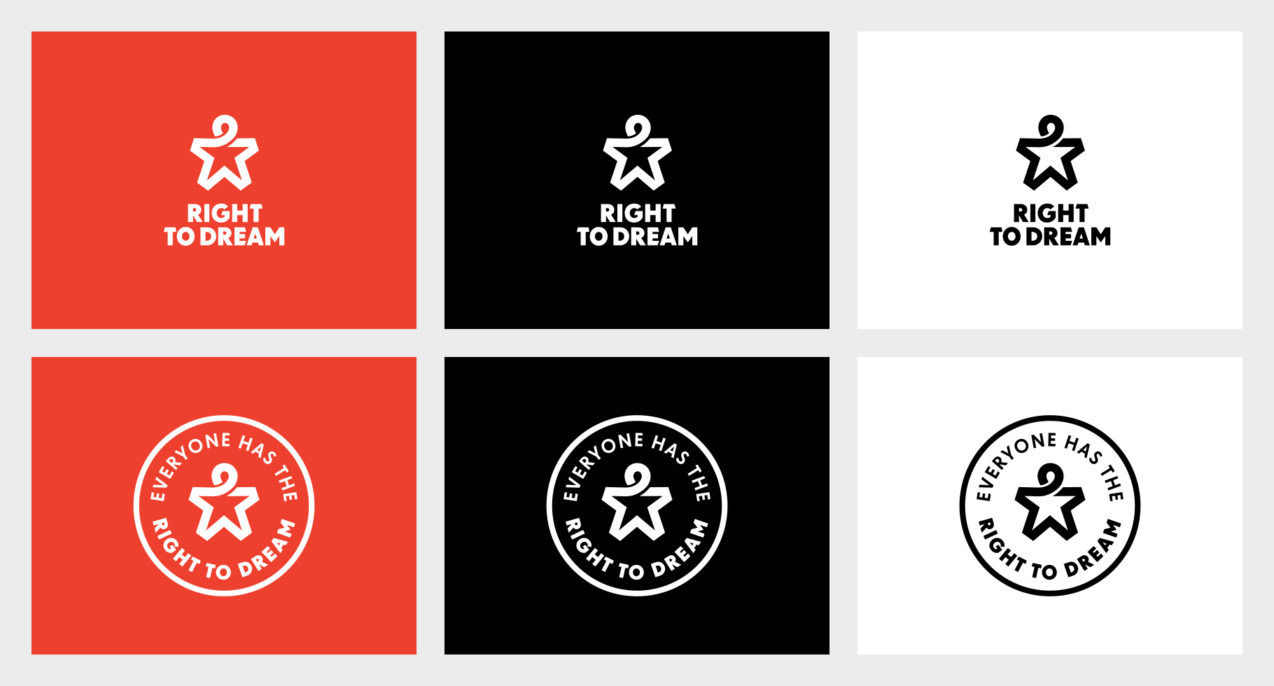
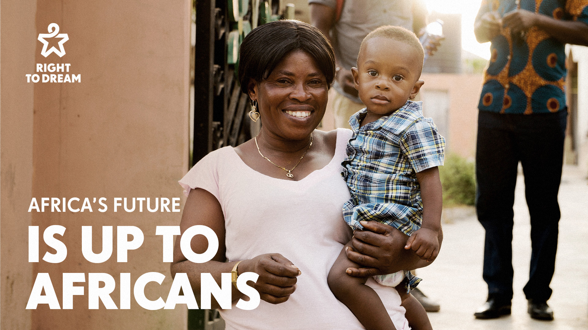
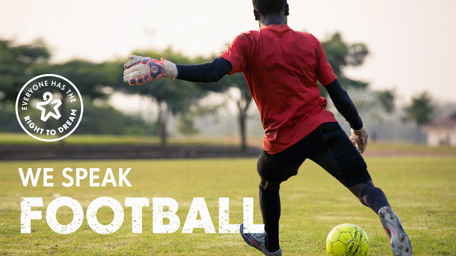
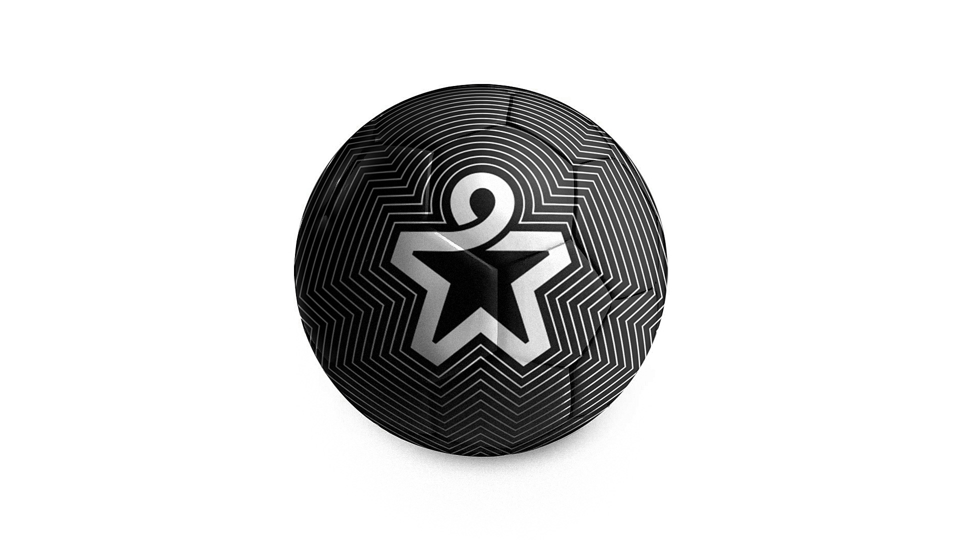
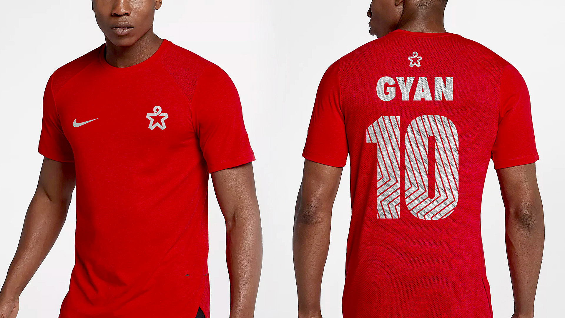
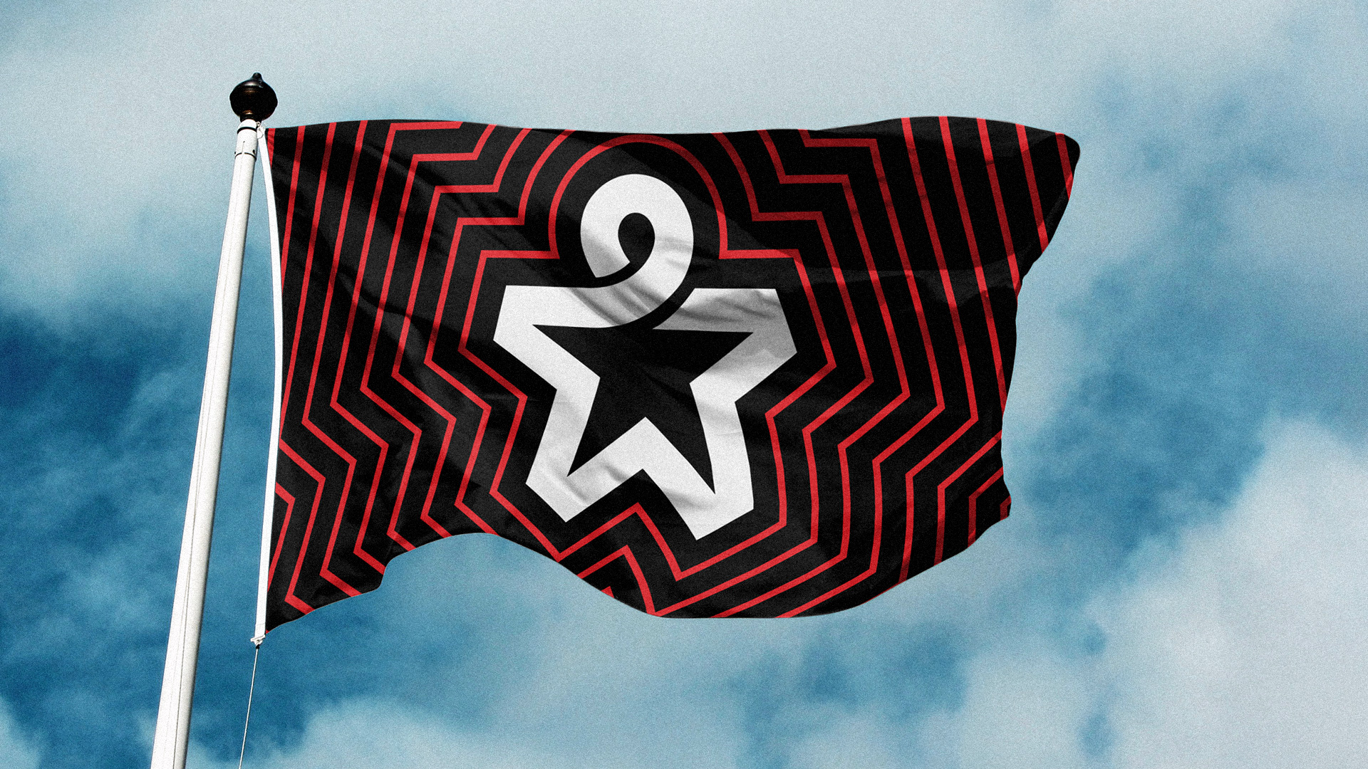
The old logo is ripe for plenty of sarcasm and graphic snobbery put-downs but, like the dusty soccer pitch they started with, this organization did what it could with what it had and succeeded — and that deserves respect. The old logo wasn’t “good” by traditional design standards but it definitely exuded personality and grit, which, really, is more than we can say for a lot of today’s logos and the new logo could have easily faced the same fate as these — instead, a great new icon leads the organization’s efforts. While a star and a human sprite are fairly cliché and generic, they have combined the two in a really fantastic way. The thick stroke goes seamlessly from pointy to curvy and the overlap effect even creates a ribbon effect reminiscent of the AIDS (and other important causes) ribbon. The pointy insides and flat outsides of the star is a great solution that keeps the icon from looking like an army-esque mark. The supporting device of the ripple effect is fun and energetic — I like the sharp-corner version better than the rounded-corner version in the Academy logo but both are good. The wordmark, set in FF Super Grotesk, is a great bridge between academics and athletics, looking serious but featuring some subtle spiky angles. (It also reminds me of Kabel, which is secretly one my guilty typographic pleasures.) It seems like a weird thing to praise but I really like that the color palette is red, black, and white instead of all the random colors ever as is so common now.
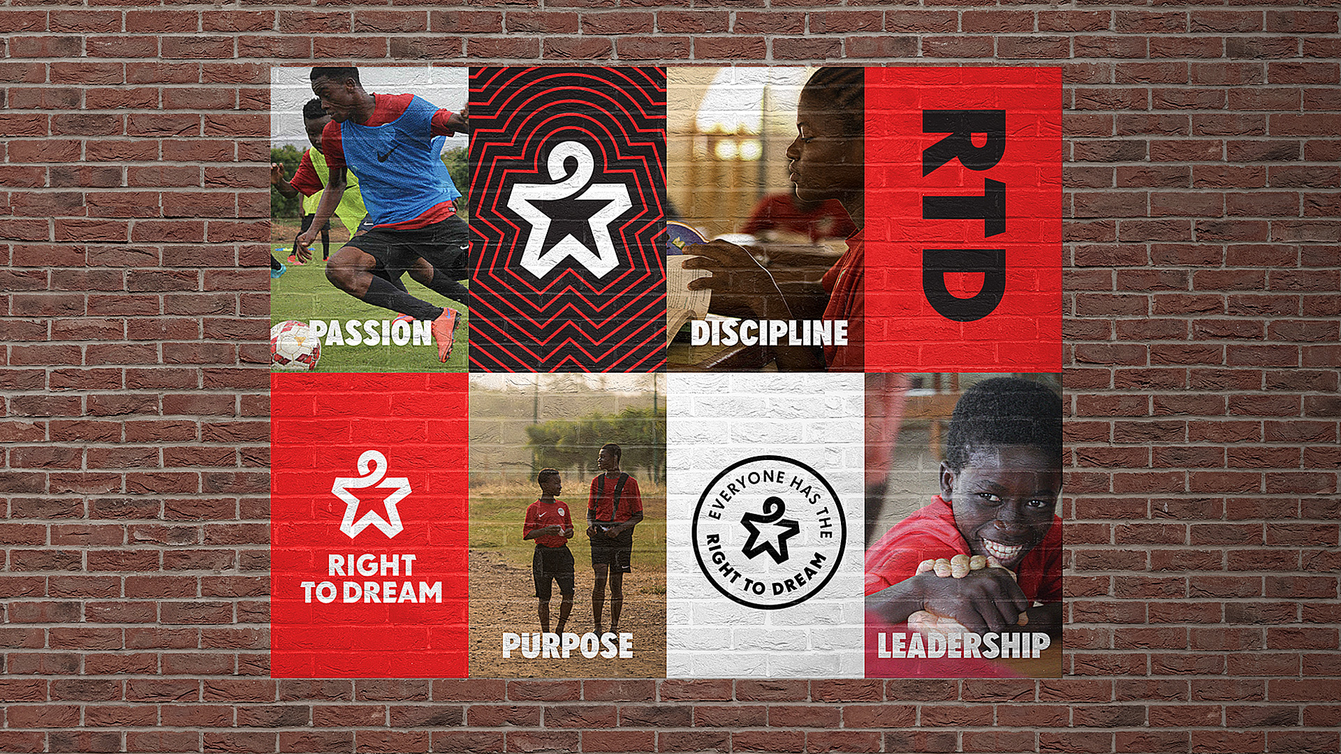
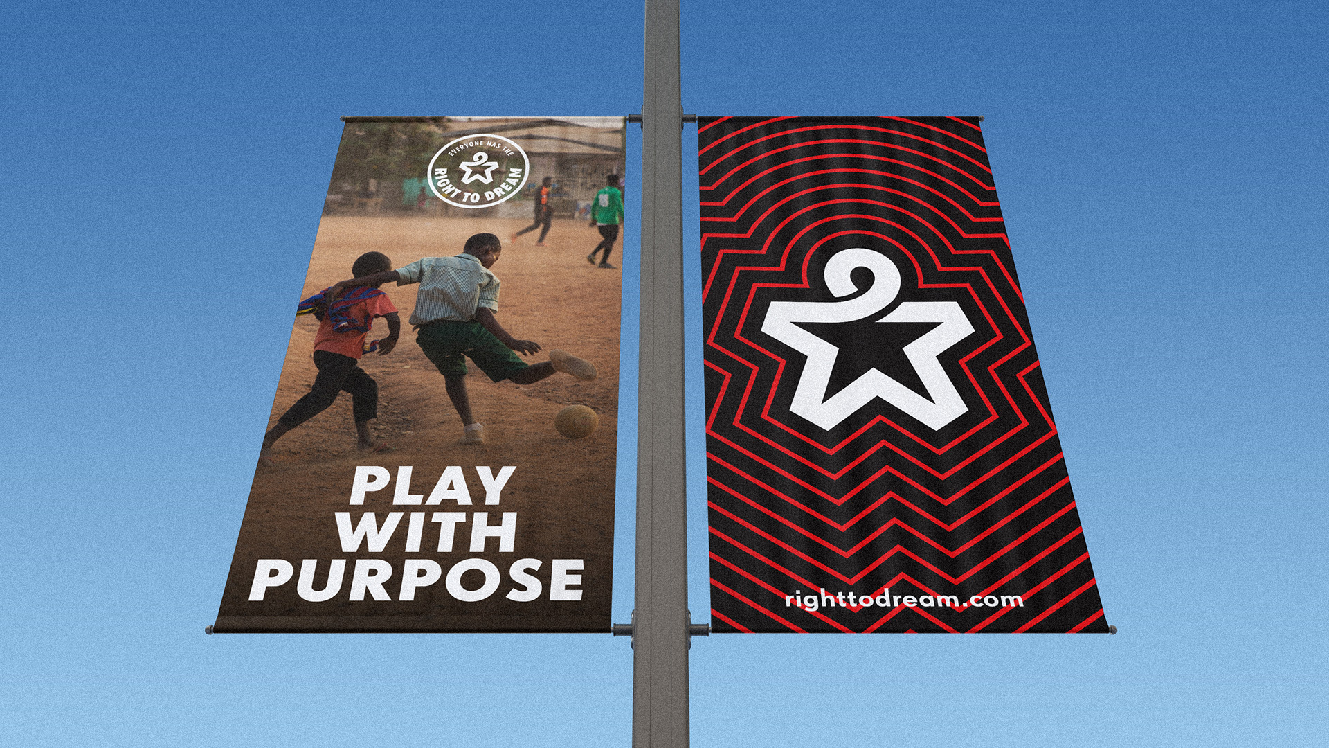
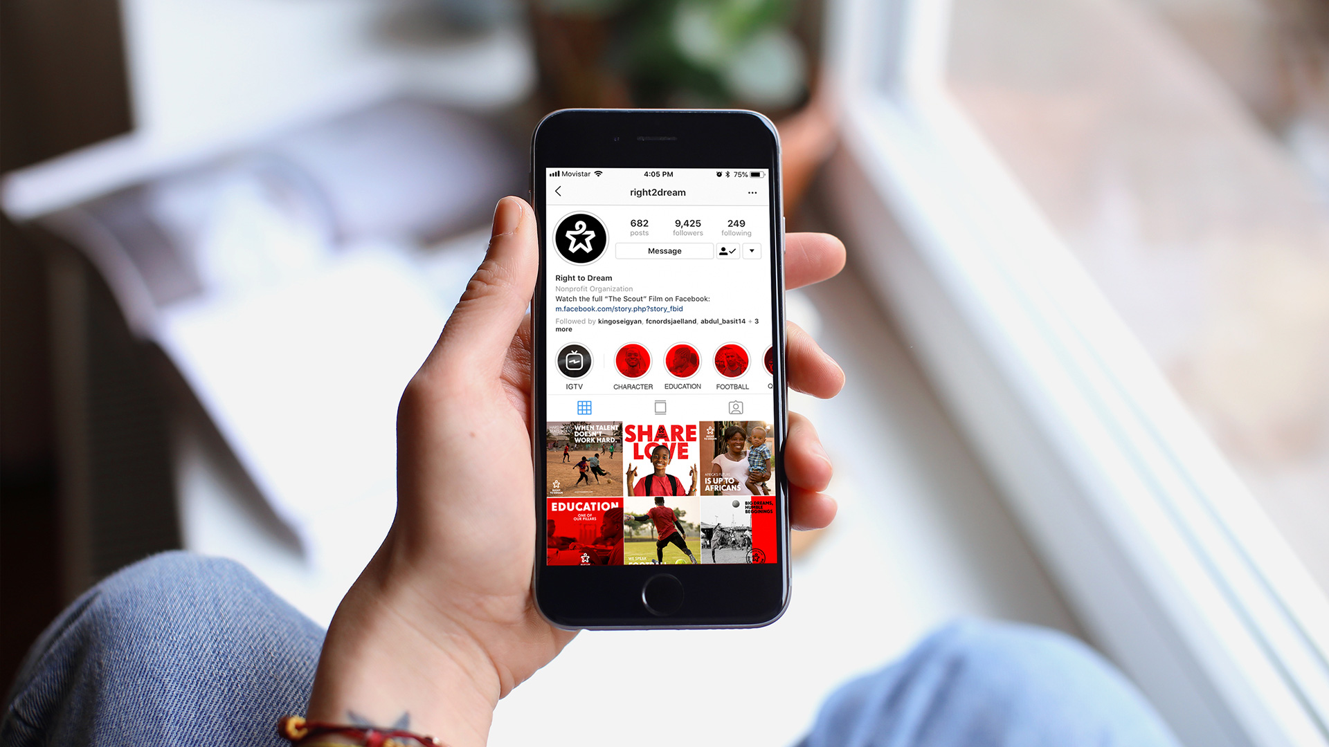
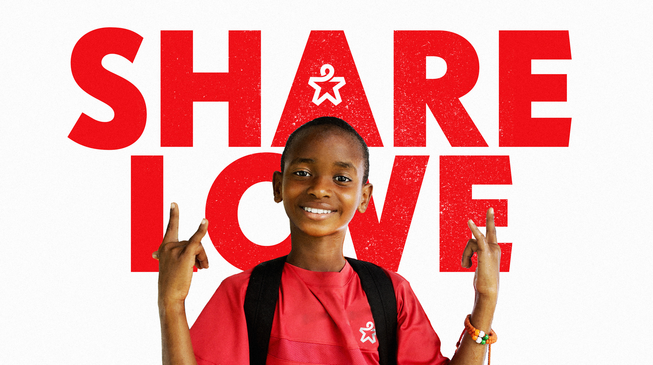
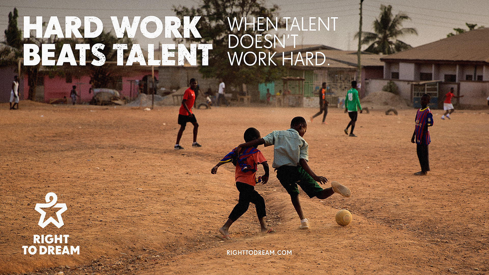
The applications are fine… FF Super Grotesk does a surprisingly good job in establishing a recognizable identity — especially with those “E”s. I’m not super crazy about the grunge effect on some of the typography but I’ll admit it looks really great on that “SHARE LOVE” image.
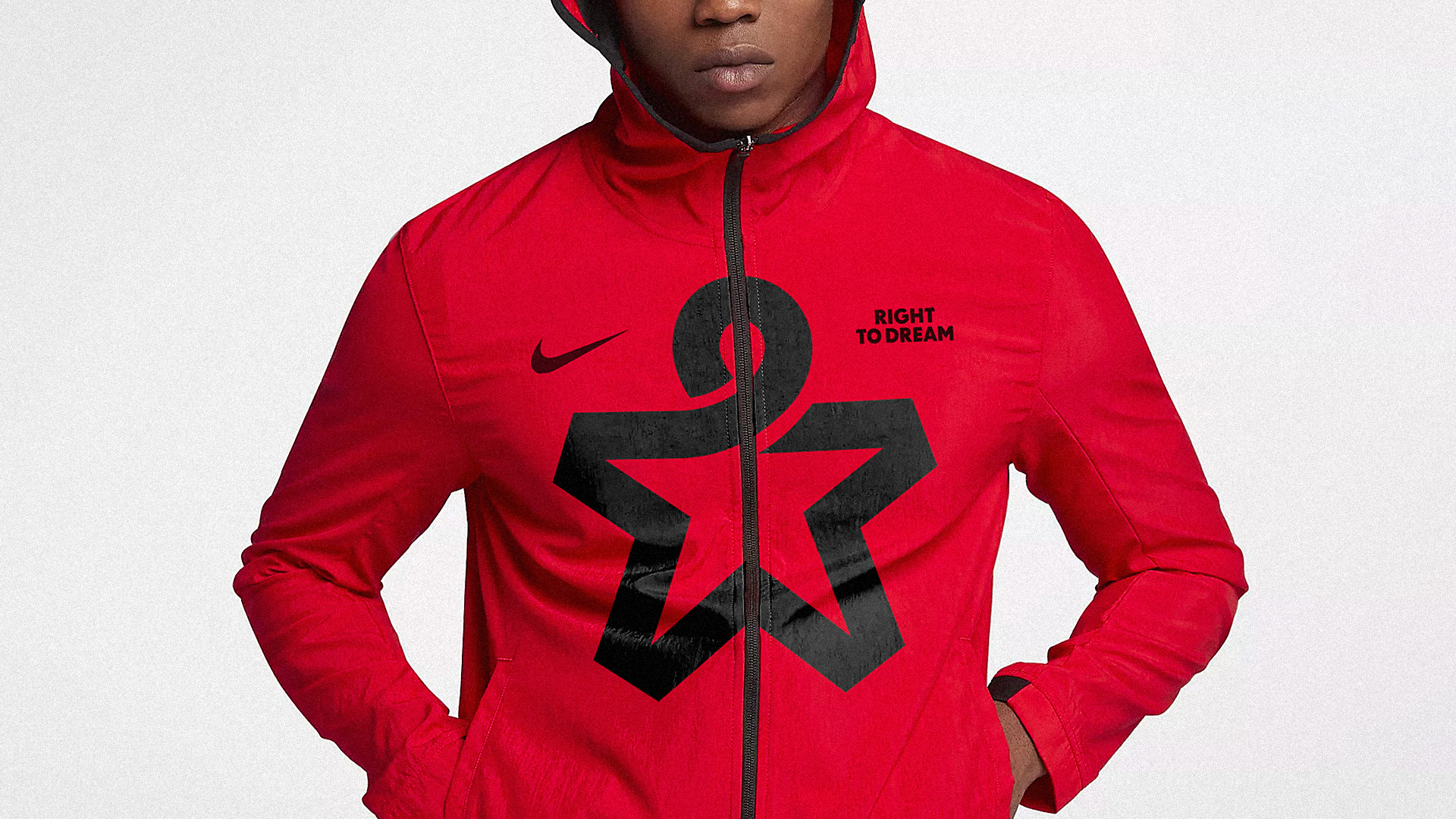
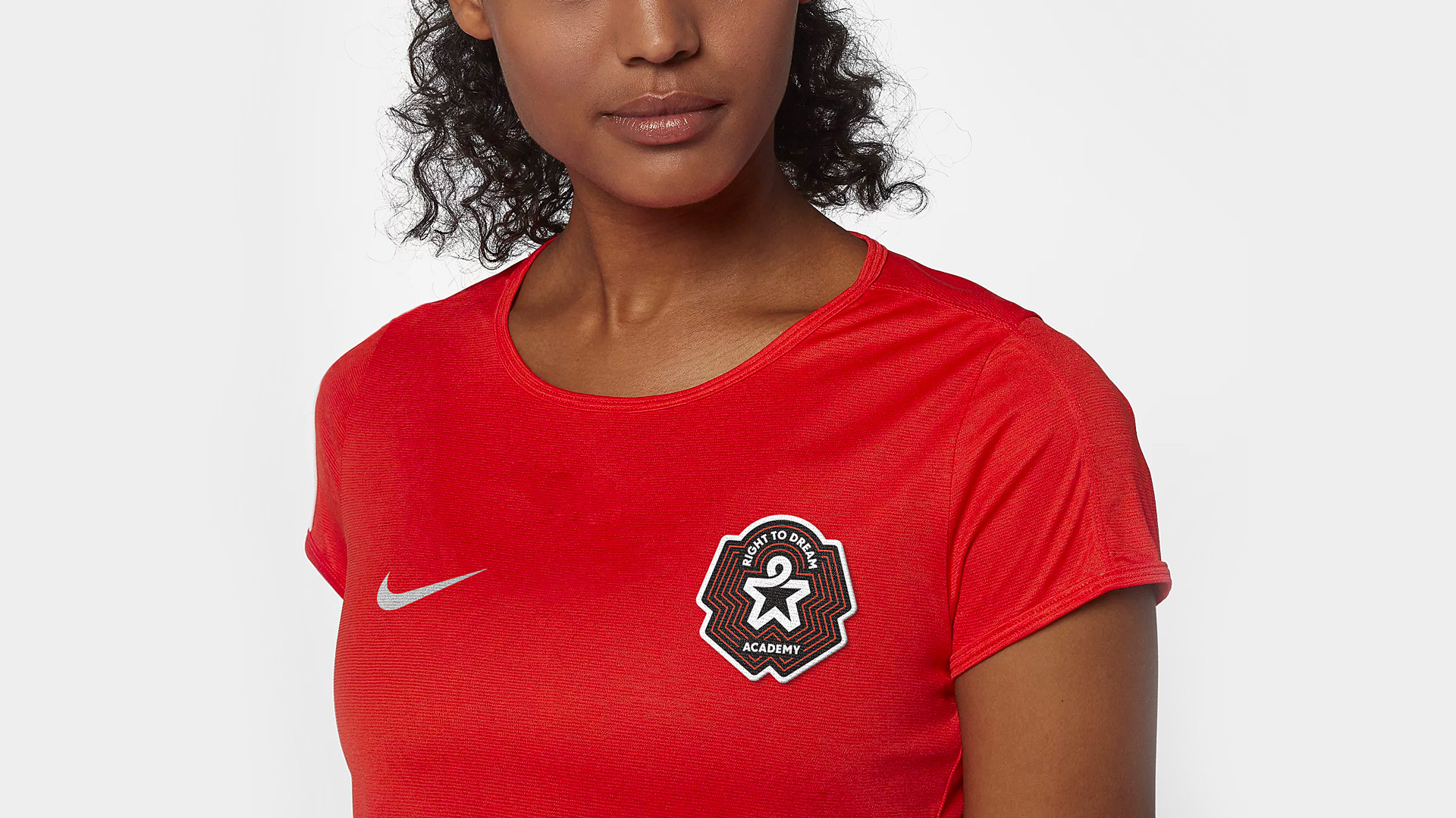
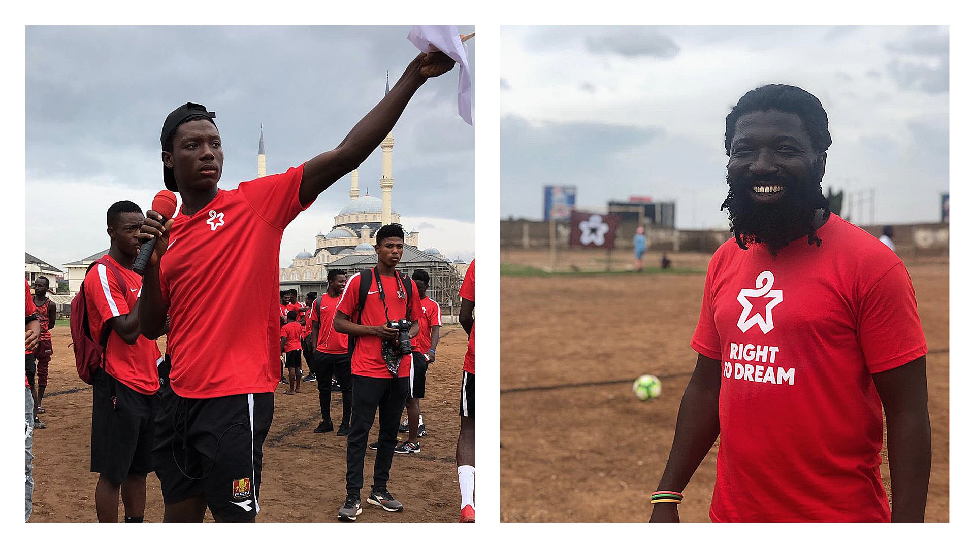
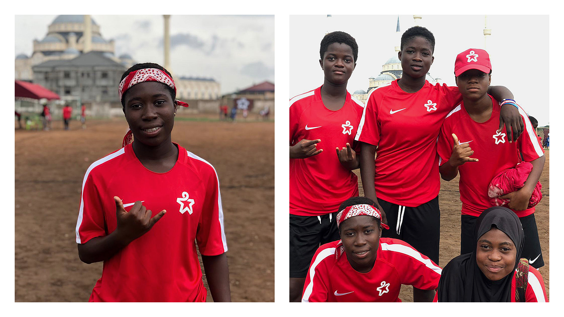
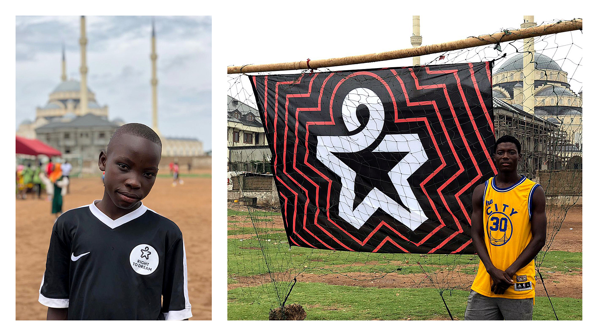
In the end, the strength of the icon is what carries — nay, propels — this forward. Not only does it look great on whatever you put it on but, more importantly, it creates an instant bond between those wearing it. A great job for a great cause.

 Новости Союза дизайнеров
Все о дизайне в Санкт-Петербурге.
Новости Союза дизайнеров
Все о дизайне в Санкт-Петербурге.