Обзор лучших ресурсов по разработке бренда, разработке упаковки
contact us | ok@ohmycode.ru
contact us | ok@ohmycode.ru
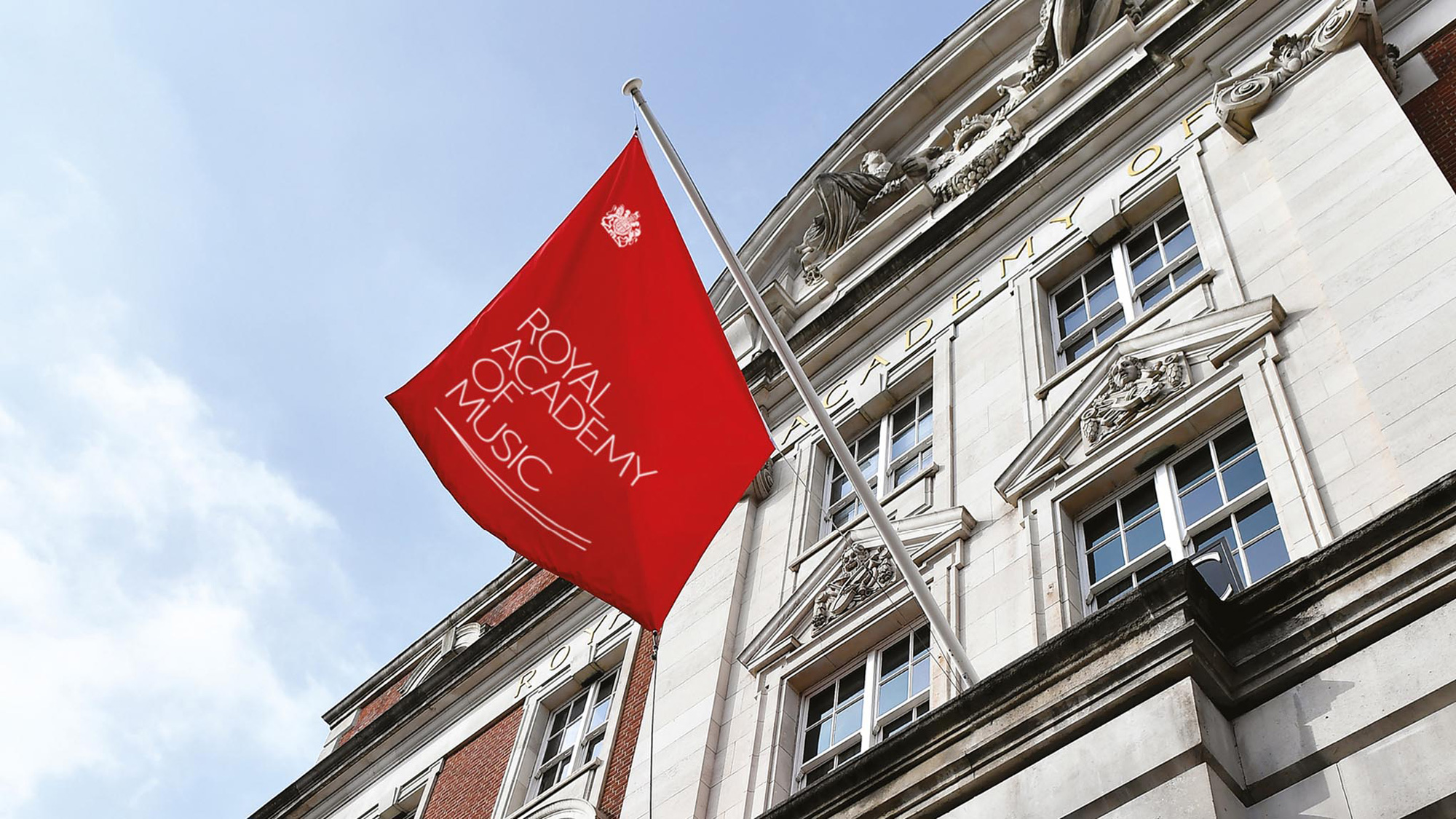
Established in 1822, the Royal Academy of Music (RAM) is the oldest conservatory in the UK that received its Royal Charter in 1830. Located in London, it offers undergraduate and postgraduate education through more than 400 teachers to approximately 800 students across four categories: Performance, Conducting, Composition, and Research. Its most notable alumni are Sir Elton John and Annie Lenox, among many others. Students perform operas, symphonies, and musical theater regularly in the Academy’s concert venues. Beyond traditional students, RAM also provides programs for musicians up to the age of 18 through its Junior Academy and works with around 6,000 people beyond their enrolled students and staff each year for continuing education, workshops, and seminars through its Open Academy, a community and participation department. Recently, RAM introduced a new identity designed by London-based Johnson Banks.
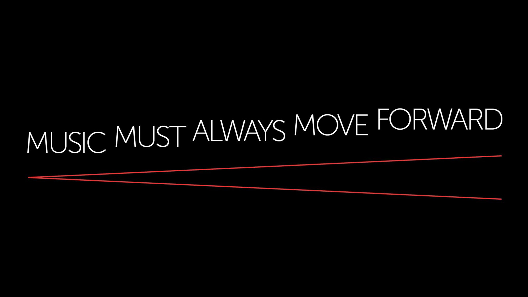
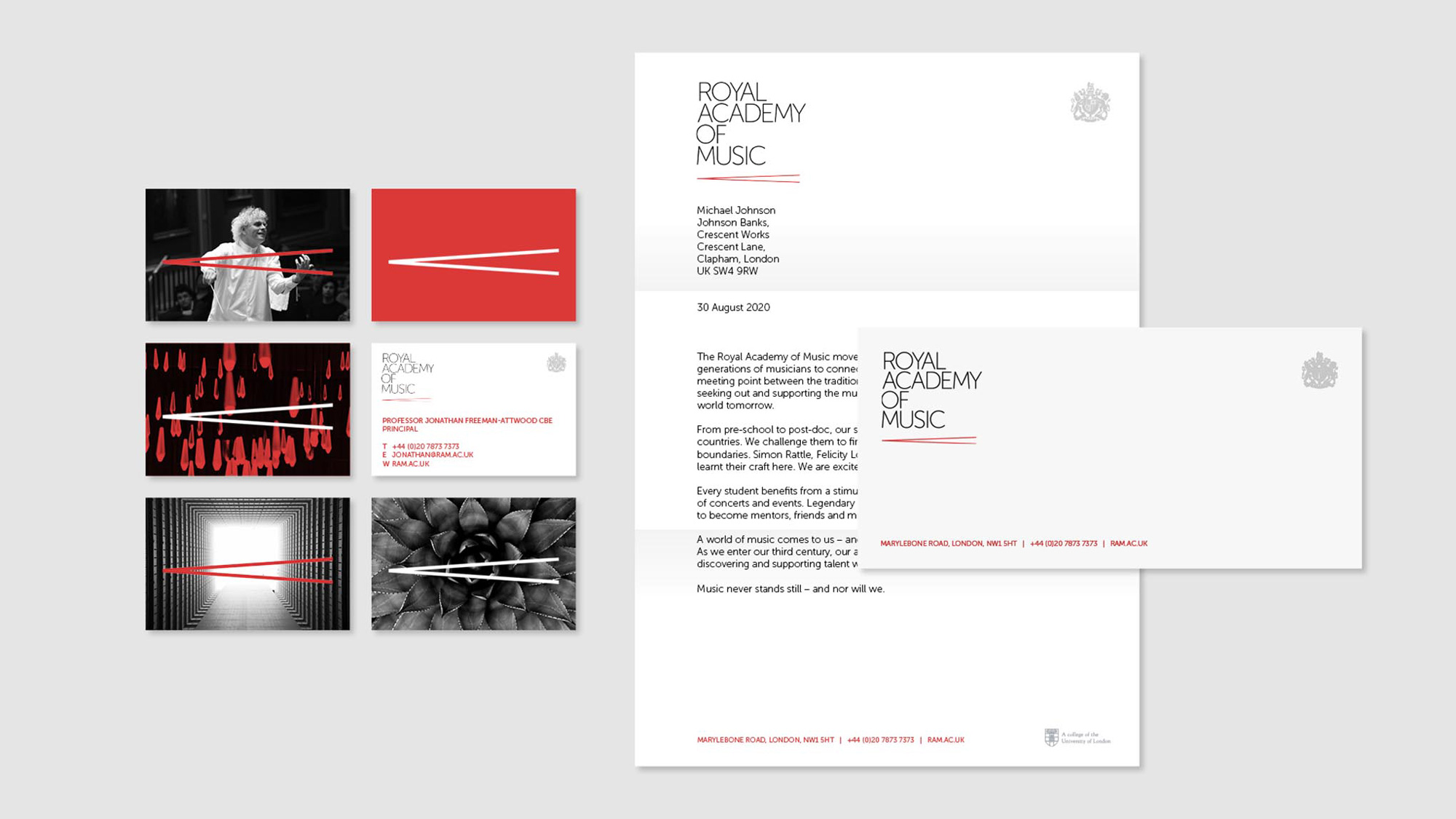
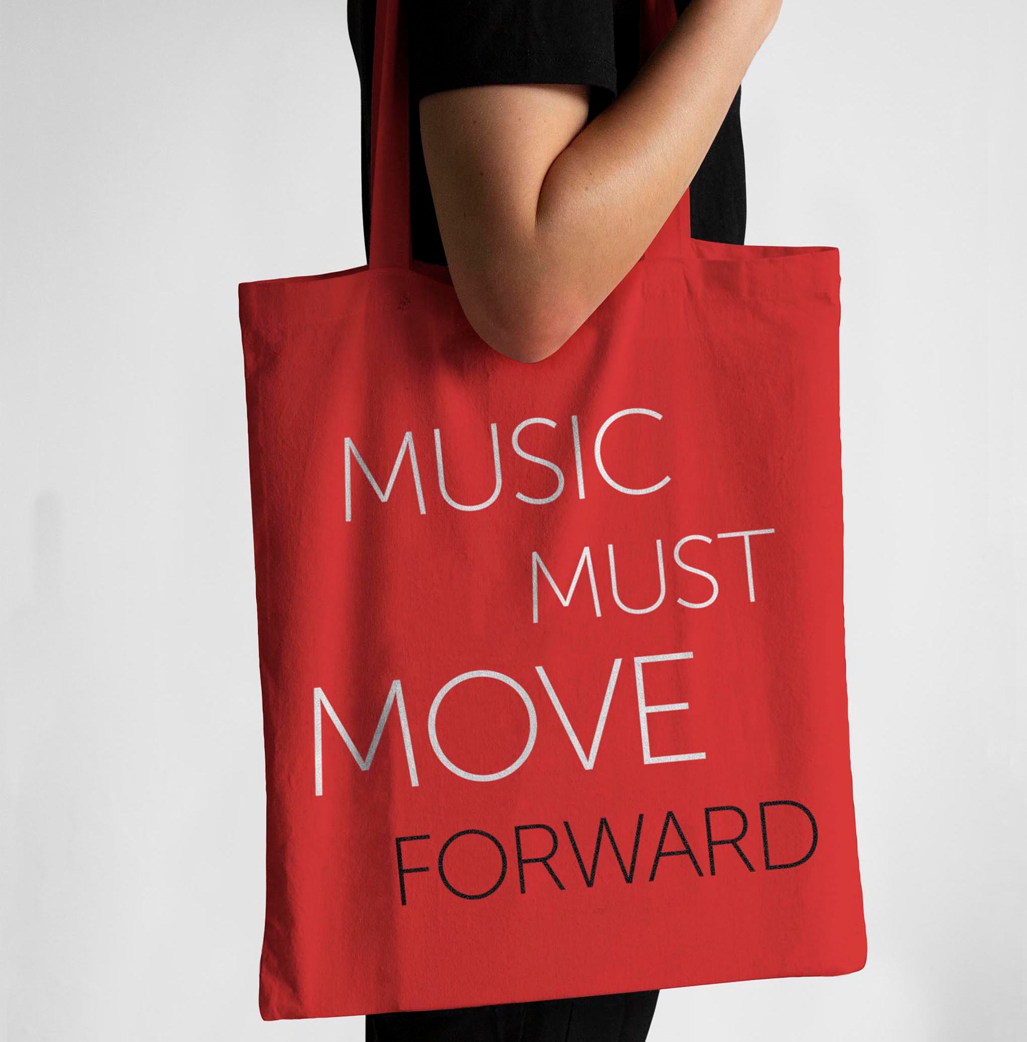
Initially we shied away from musical notation - a bit of a cliché in the broader music sector - but eventually realised that a crescendo symbol was a perfect and ready-made metaphor. It reflects their desire for a more powerful voice, and always shows forward motion along a musical score, never back.
In the new logo a crescendo is used as a subtle underscore and sets the tone for a design toolkit that allows words, images, type and and a three-colour palette to interplay constantly, creating dynamic and unusual layouts.
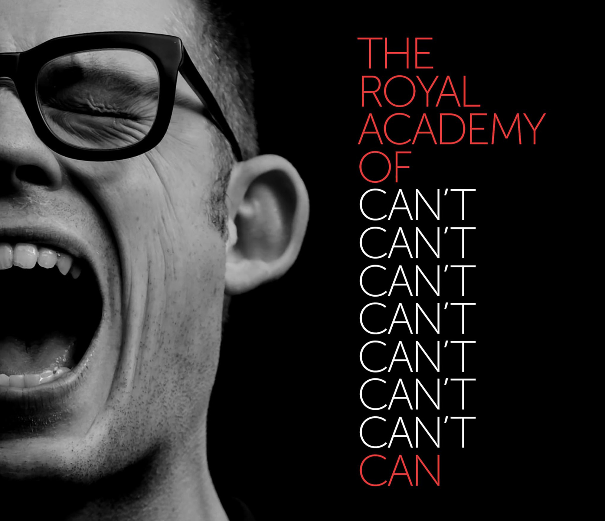
The old logo wasn’t too evocative or special, with a lot of emphasis given to the Royal Charter seal (which isn’t unique to RAM) and a wordmark in a slightly odd semi serif. The new logo drops the Royal Charter seal (although it’s still used in most applications but as a supporting element) and introduces a simple crescendo symbol to underline a tightly stacked typographic composition. I’ll admit that if, previous to today, I had been prompted to draw the crescendo symbol I wouldn’t know how to but when I saw the logo I immediately thought that that must be some kind of music notation symbol so I imagine that for anyone interested in studying music, the subtle symbol will be an instant read. I really like the simplicity of it, its placement, and how well it solves the issue of the long length of “ACADEMY” in the wordmark by providing an anchor that covers the full width of the words. The type may be a little too tightly spaced for my taste but I don’t mind it too much. Mostly I’m surprised that this is Museo and that it manages to look good — it’s the Sans variation, not the Slab (which is my arch nemesis, so that helps).
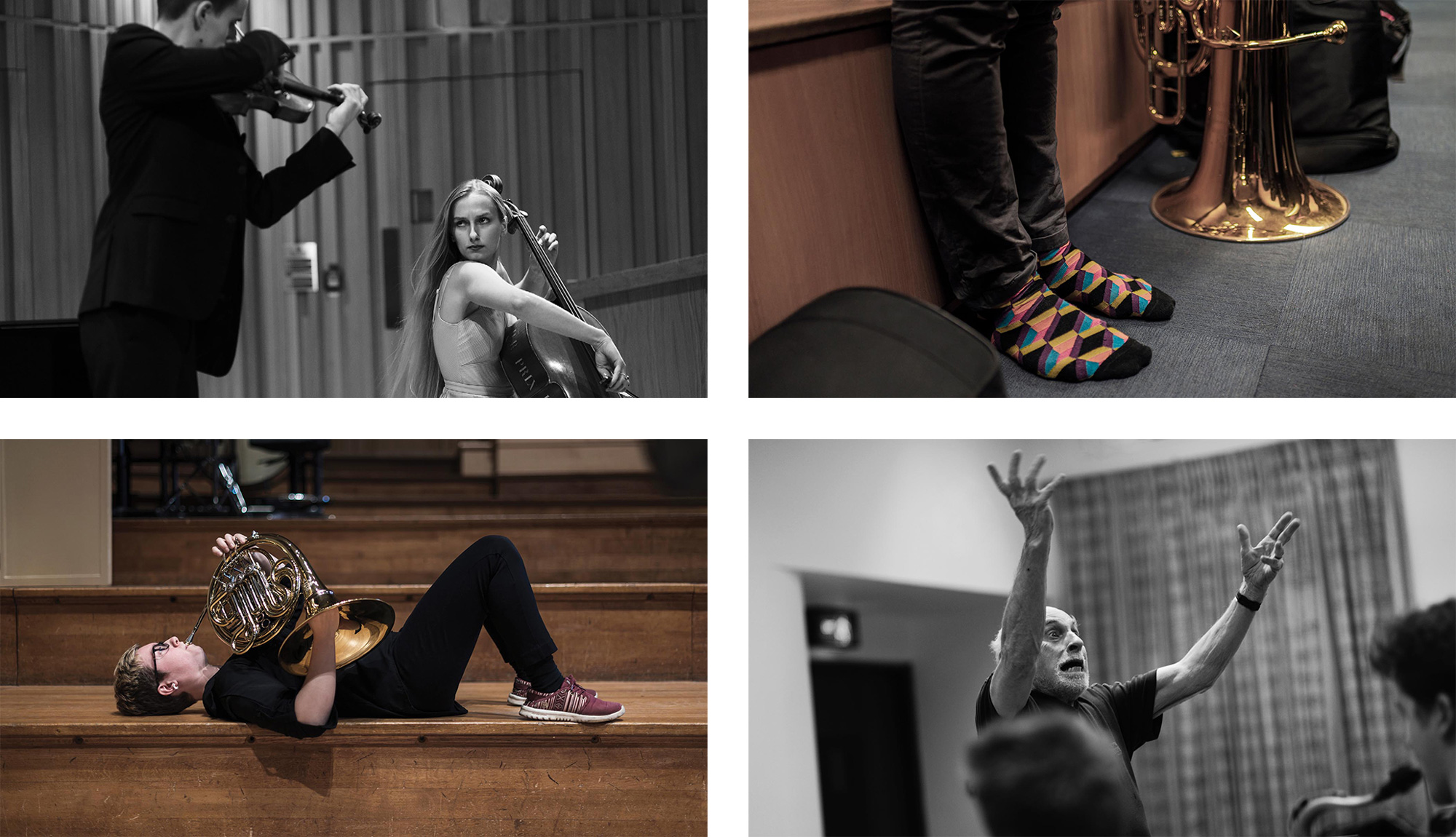
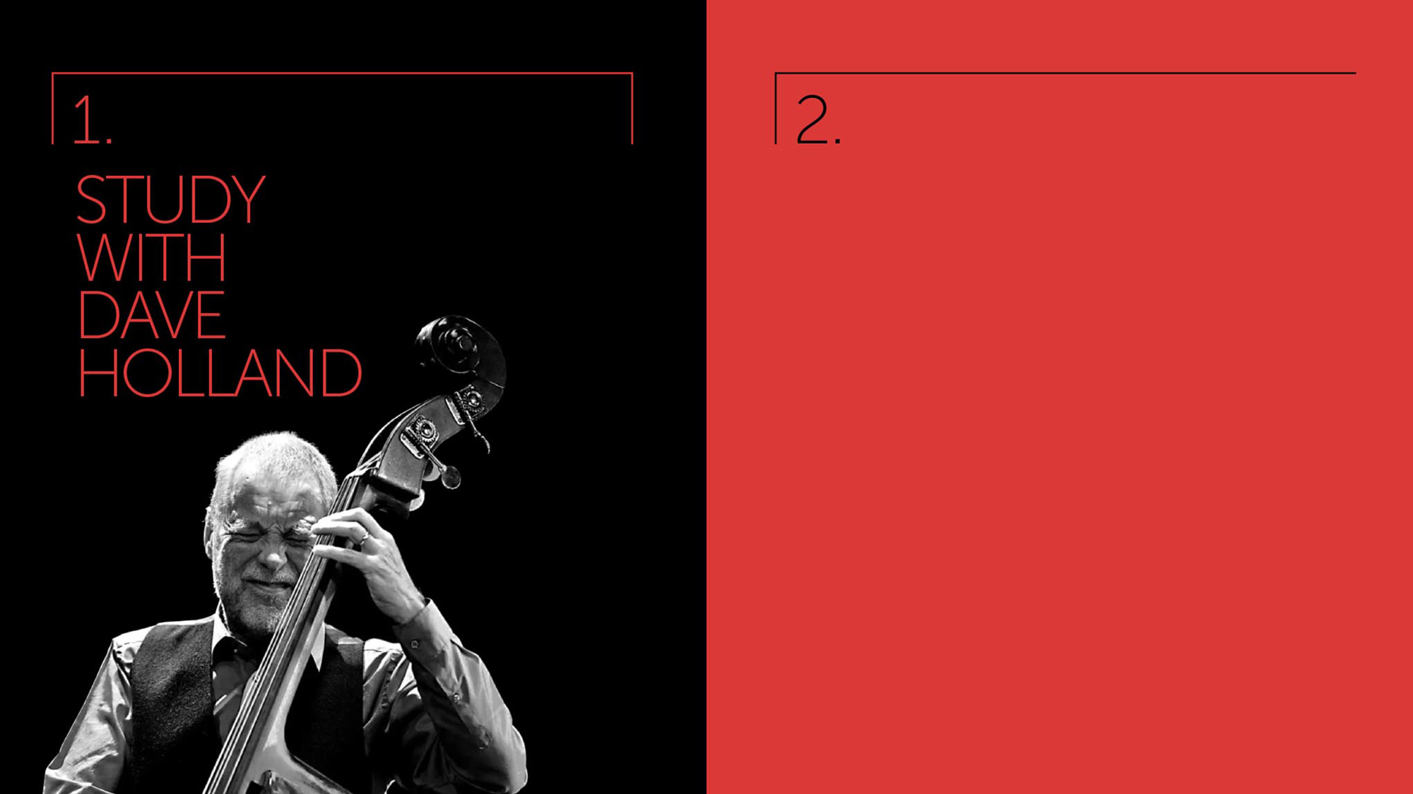
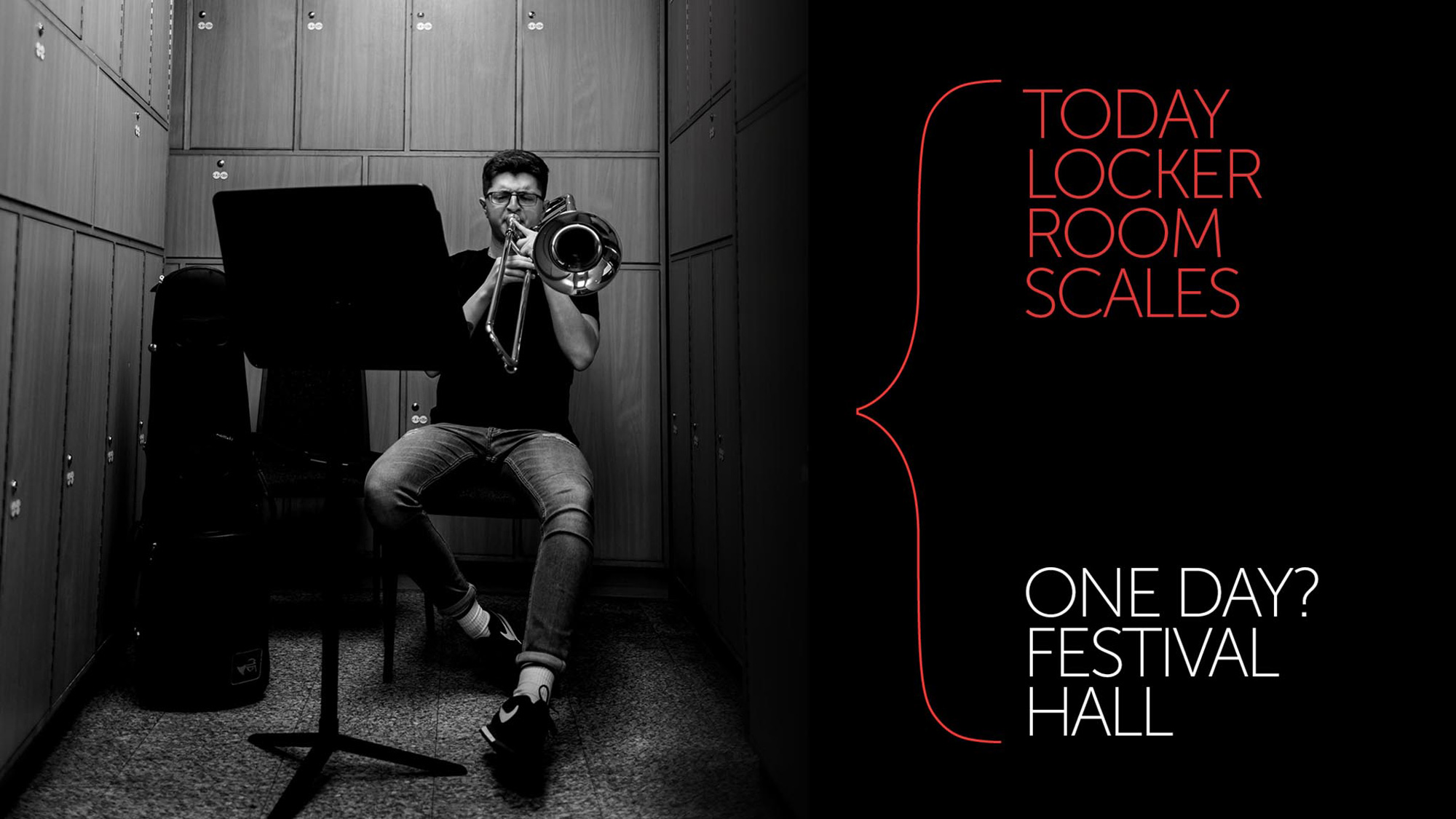
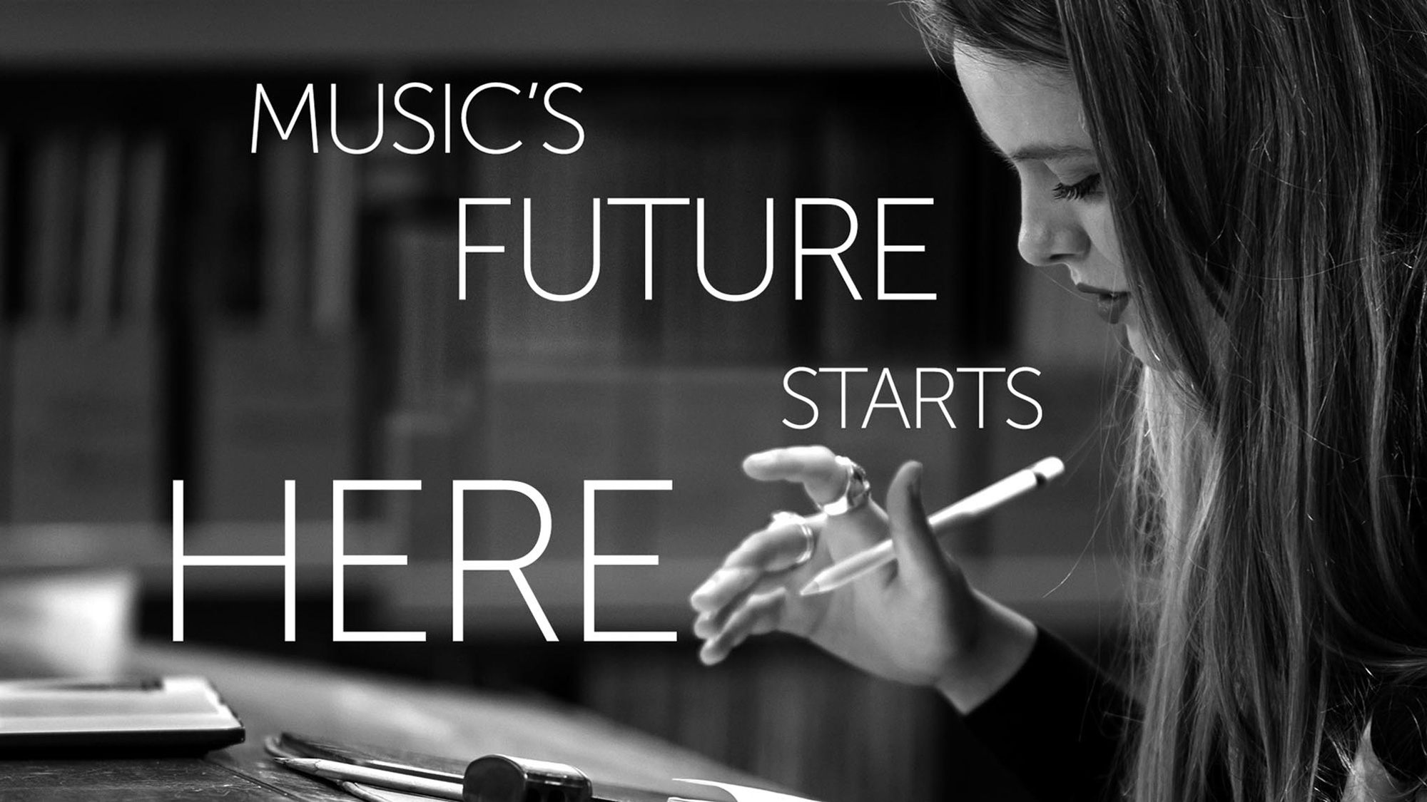
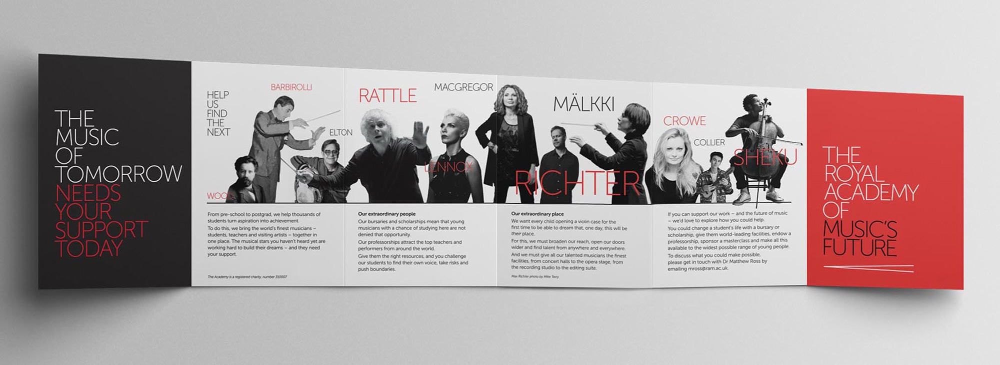
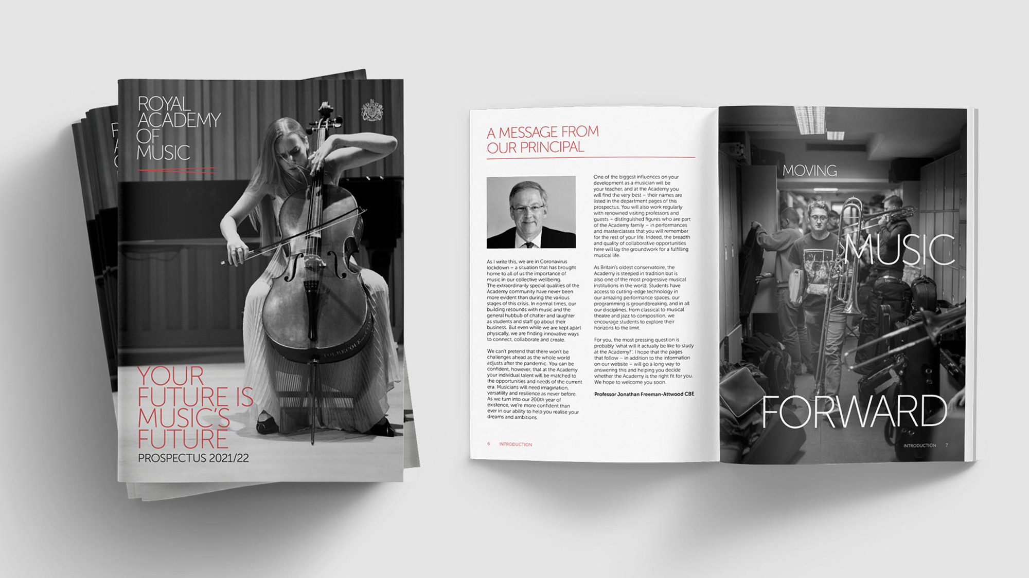
We’re also using their alumni to suggest to students that they might - just might - be the next in line. And a whole series of still and moving images are being captured and curated to reflect life at the Academy - the concentration and passion of the performers and the unique family atmosphere that the Academy has created.
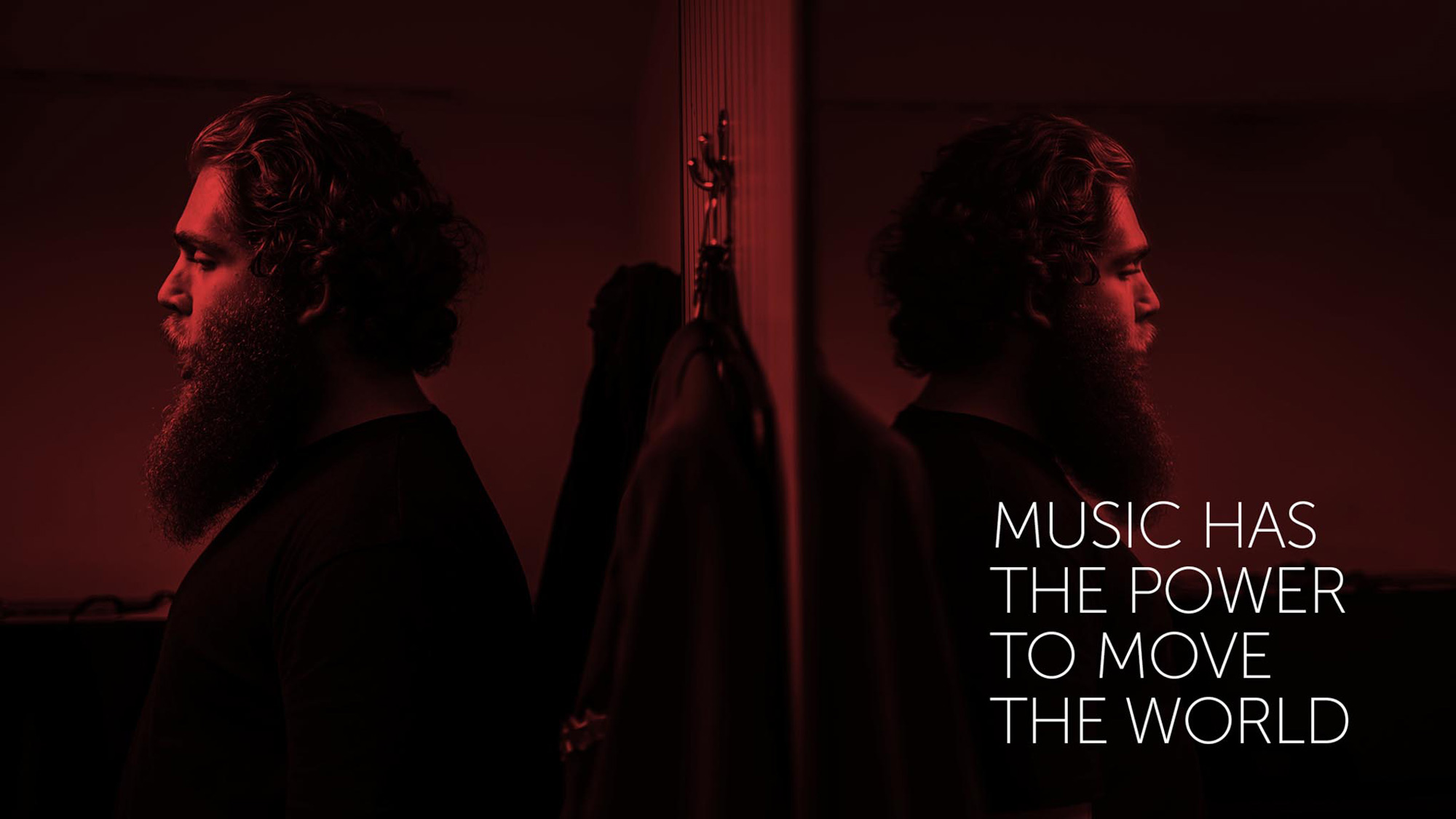
The photographic and filmic style is deliberately gritty and ‘fly-on-the-wall’ - in deliberate contrast to the ‘perfect’ images used by others.
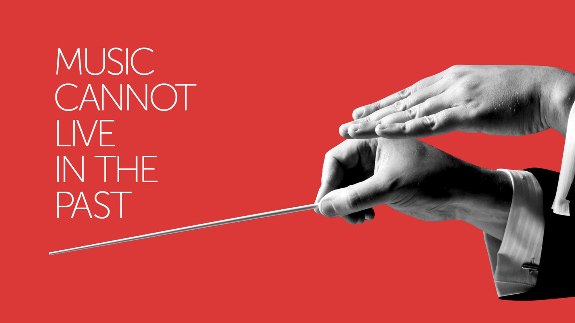
Subtle use of musical notation is included within the scheme - but in a restrained and knowledgeable way.
The use of a single weight of Museo works surprisingly well to establish a relatively recognizable design language and is fairly successful in both the more playful and more restrained typographic approaches shown above. The only approach I’m not a fan of is the silhouetted black and white hand on red, which looks cheap somehow in contrast to the images where the photos bleed into a black background.
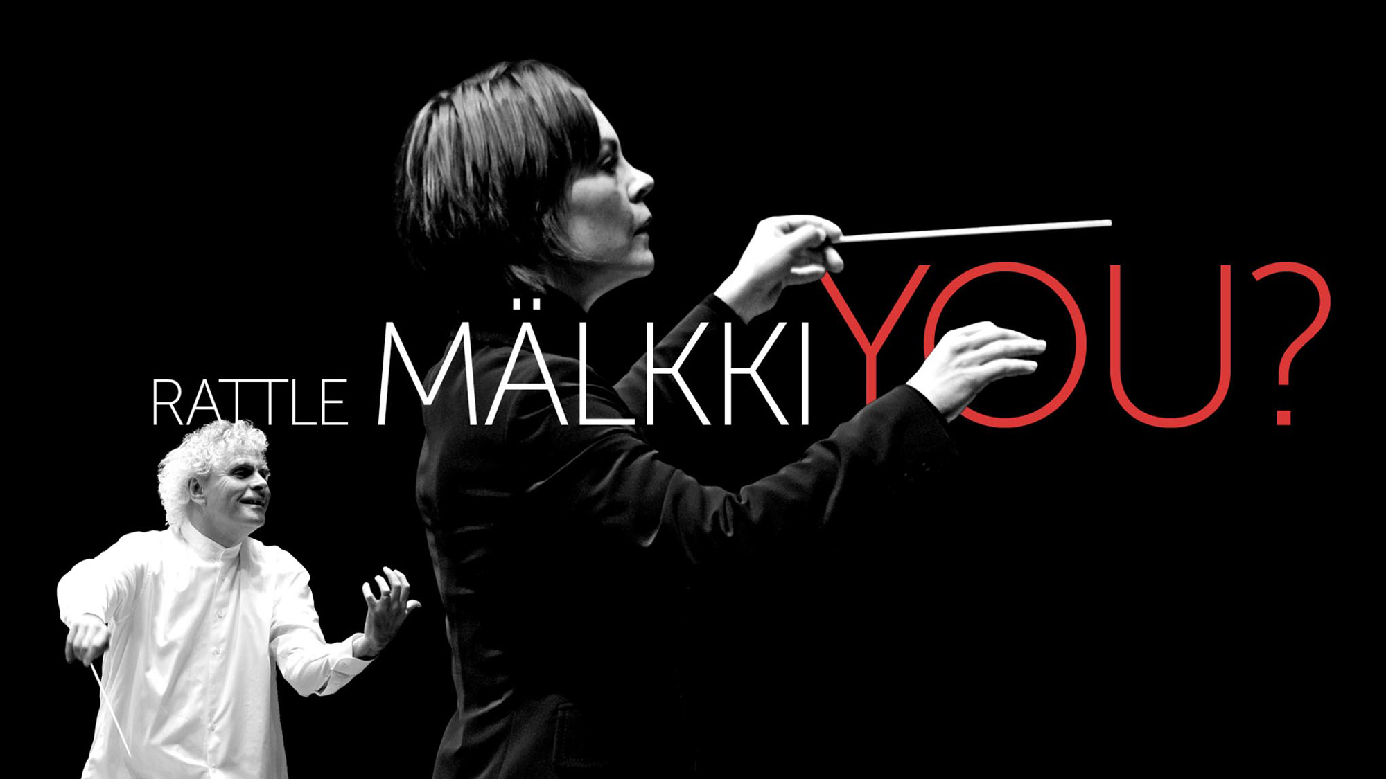
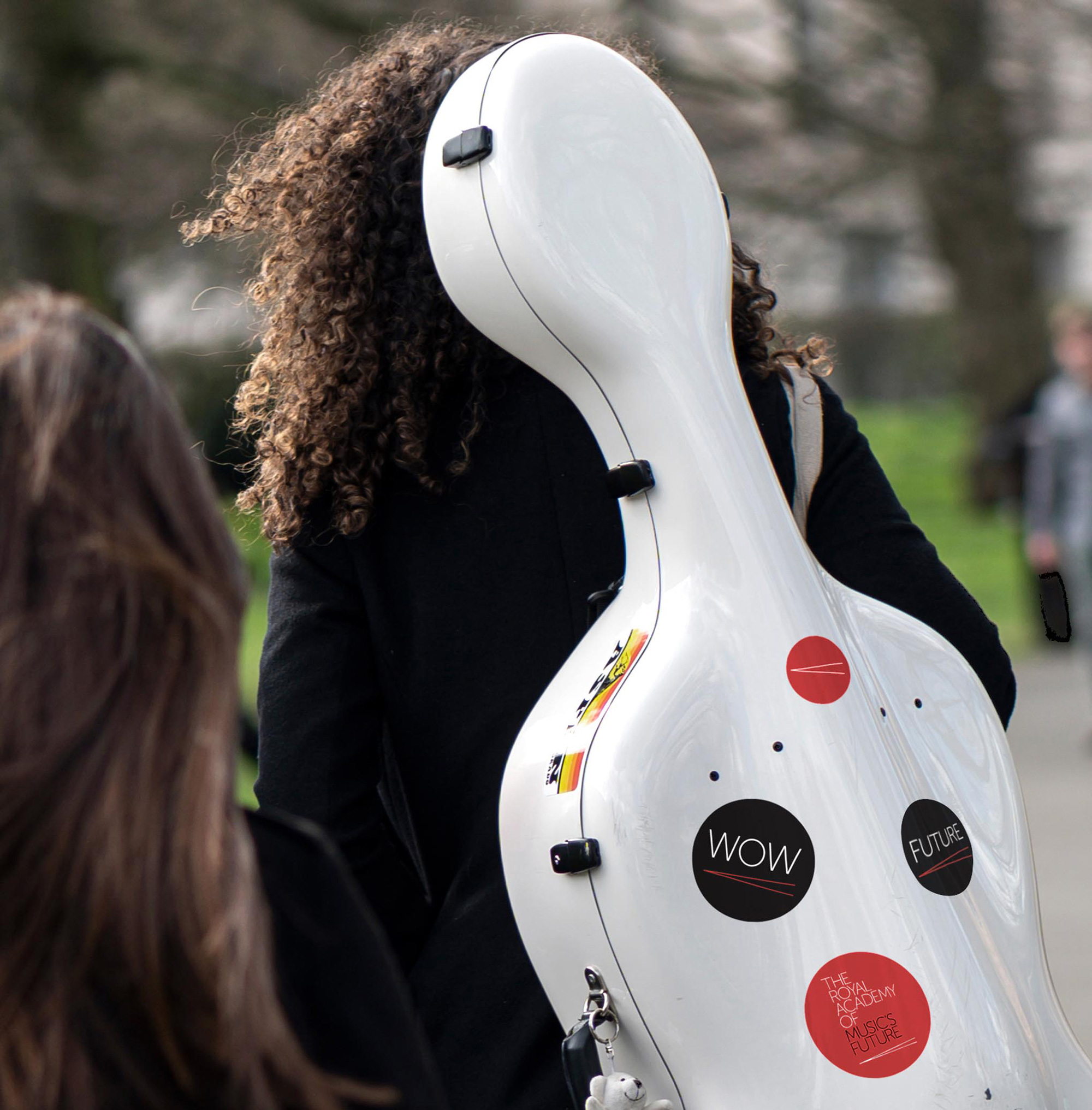
When they communicate with supporters there’s a special logo variant: The Royal Academy of Music’s Future. This allows their core brand and fundraising brand to neatly co-exist - usually a very difficult task. We’re also using slightly more aspirational language for this audience.
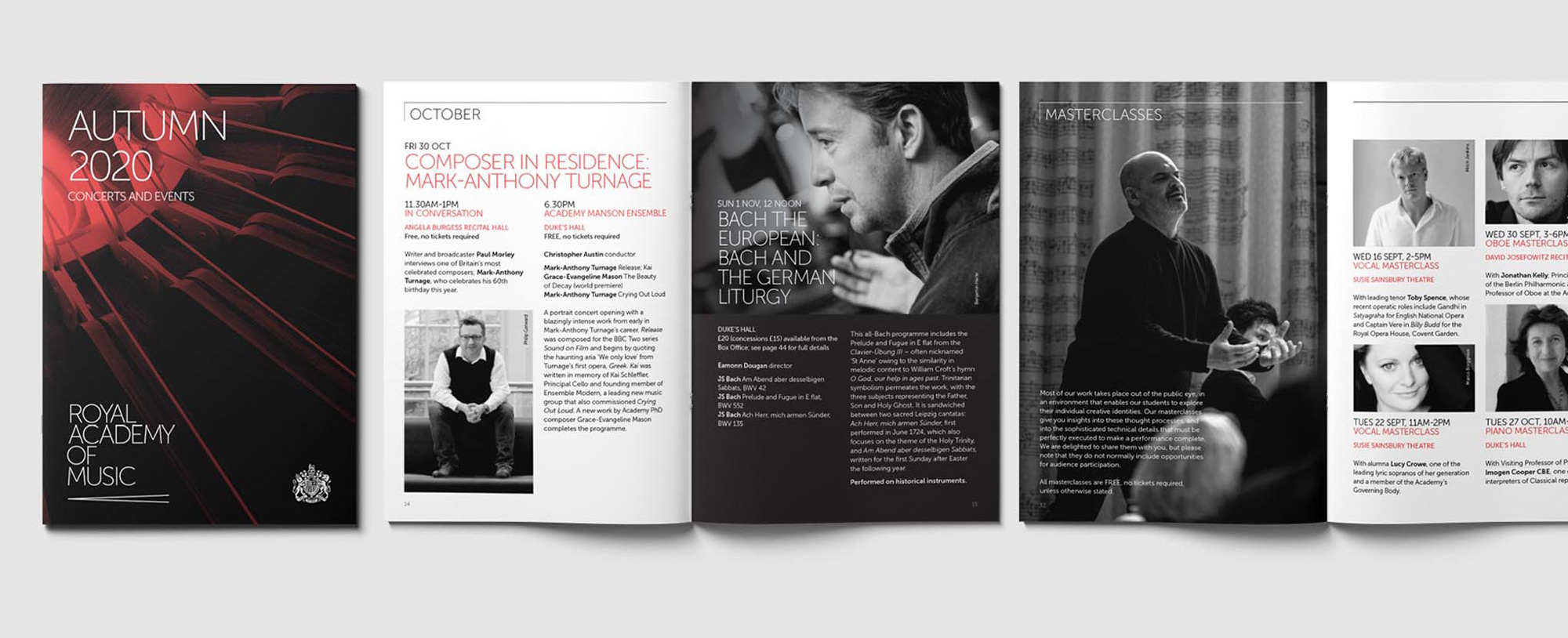
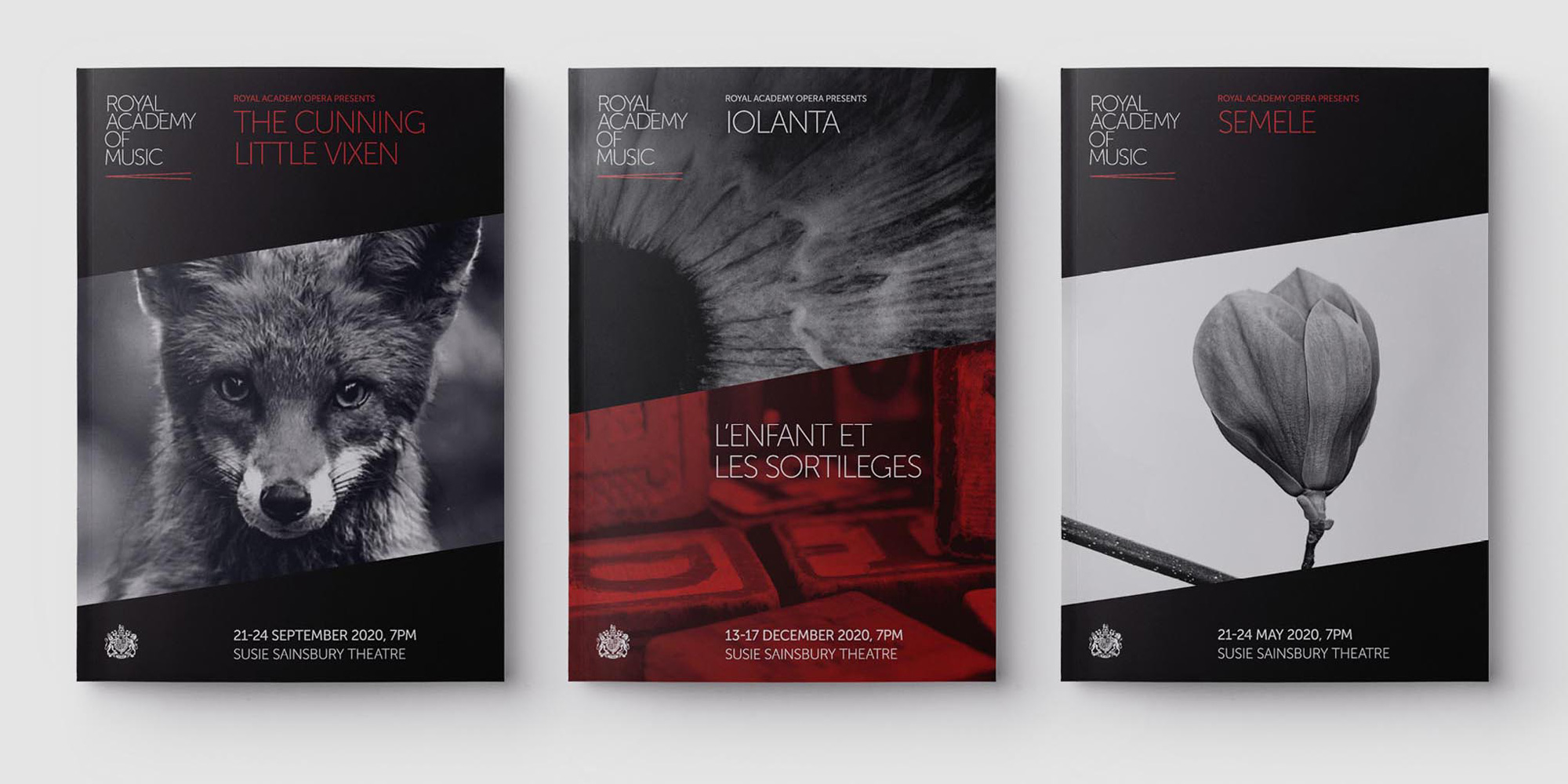
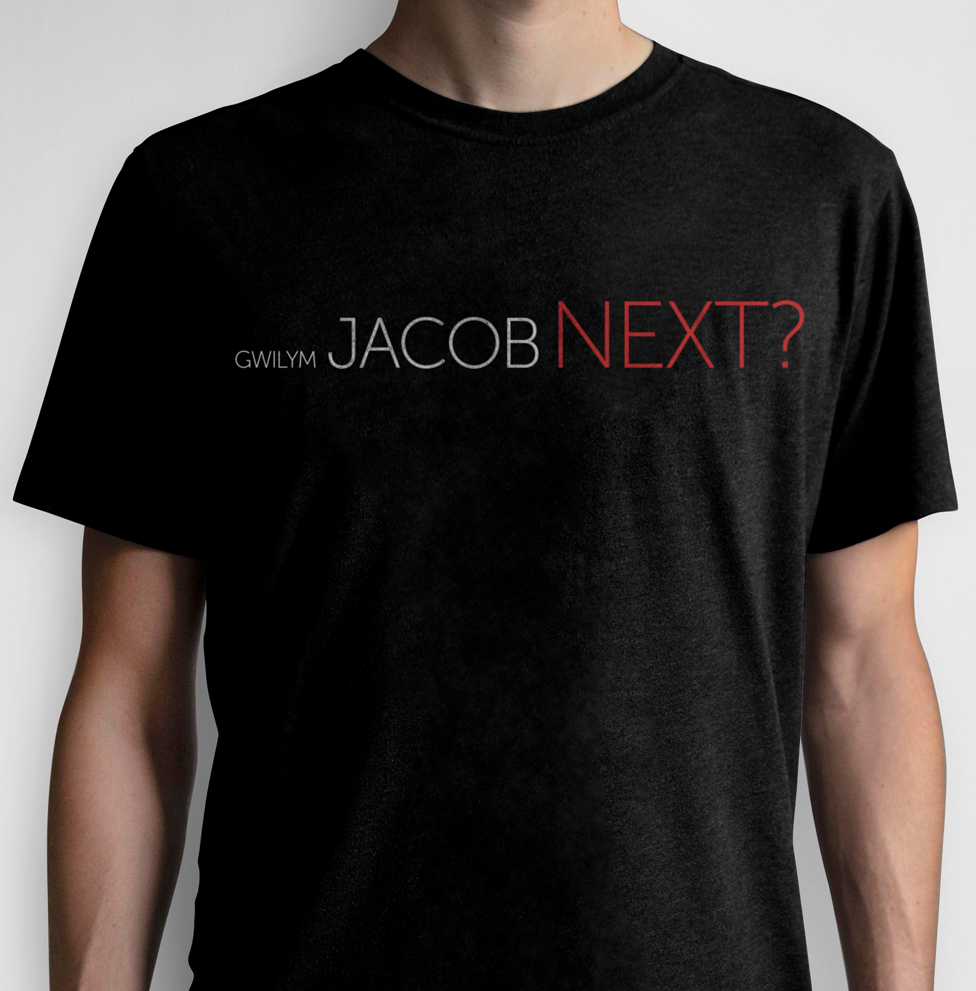
The applications are good, particularly the music program covers that include a visible angle although it loses some points for said angle not matching that of the crescendo symbol, which I realize might be too subtle but in part it’s that subtleness that makes the logo work. Some of the applications have a slightly dated look — I think it might be the red and black duotone photos that give me that vibe. The more swag-y applications below do offer a more contemporary take on the same elements, so I guess it strikes a good balance between old-ish and new-ish.

Overall, for an institution that needs to communicate in a serious yet accessible tone and can’t be too playful or edgy just for the sake of it, everything here looks like it perfectly belongs to the nearly 200-year-old educational music and, if we wanted to get philosophical, this identity could be interpreted as the growing crescendo in the logo as the institution opens up its spectrum of communications to a more visually vocal tone. Or we can not get philosophical and just say this is nice.
 each year since publication began in 2006

 Новости Союза дизайнеров
Все о дизайне в Санкт-Петербурге.
Новости Союза дизайнеров
Все о дизайне в Санкт-Петербурге.