Обзор лучших ресурсов по разработке бренда, разработке упаковки
contact us | ok@ohmycode.ru
contact us | ok@ohmycode.ru
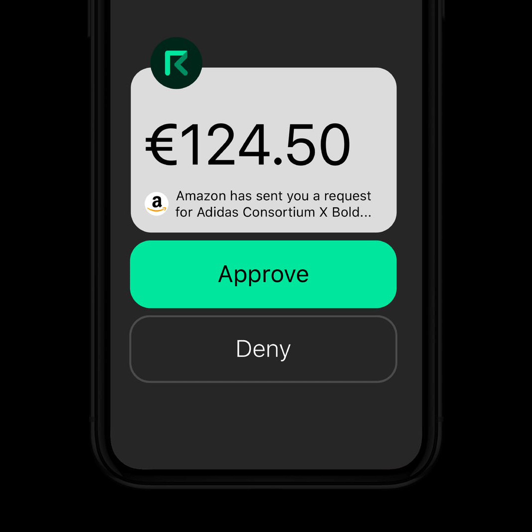
Established in 2017, Request is an open, online platform that enables people to make financial transactions like creating, storing, and accessing invoices and receipts in a universal, decentralized network that accepts any currency, be it dollars, euros, bitcoin, et al. Built around blockchain technology, companies with services like accounting, invoicing, payment processing, and auditing can plug into the same network and communicate with each other using the same single source. Earlier this year, Request introduced a new identity designed by Rotterdam, The Netherlands-based Studio Dumbar.
Working closely with the team from Request, we developed a clear positioning strategy for the brand, which also become the pay-off: the open network for transaction requests. This became the guiding principle for developing the identity and website.
The visual identity reflects the principle of the ‘request’ involved in any transaction, and the general to-and-fro activities of currency conversion. Dynamic and contemporary, the identity references technology but in a way that makes Request stand out from the crowd. Most blockchain brands follow the trend of diamond or crystal-shaped icons. Sidestepping this trend succeeds in setting Request apart from their competitors, opening a new chapter in the FinTech story.
The old logo was alright, with a techie-looking “R” sort of floating in space without a stem. Nothing too exciting or super well done but not bad and the wordmark was in a funky font that stood out. The new logo features a more sturdy “R” monogram, which is a feeling you do want to convey when dealing with financial transactions and establishes the folding gesture — by the line folding into itself and forming the “R” — that becomes the cornerstone of the identity. It’s a nice-looking monogram that works really well on its own — dig the favicon on their website. The wordmark is typeset in Sharp Type’s Beatrice and it looks good, contrasting the smoothness of the monogram with its quirkier structure.
The identity then becomes pretty much all about the smooth folding arrow animations that are beautifully hypnotic. It’s like watching fish swim in patterns. Aside from being real pretty, they also manage to speak to the nature of their business, which is the smooth flow of transactions back and forth. The ethereal quality of the arrows also hints at the proverbial cloud and how all of this happens online. The dark color palette with bursts of bright colors is a nice respite from the more colorful palettes we tend to see. The use of the Beatrice family in its different weights works well throughout the applications and website in creating proper hierarchy without having to mix too many typefaces.
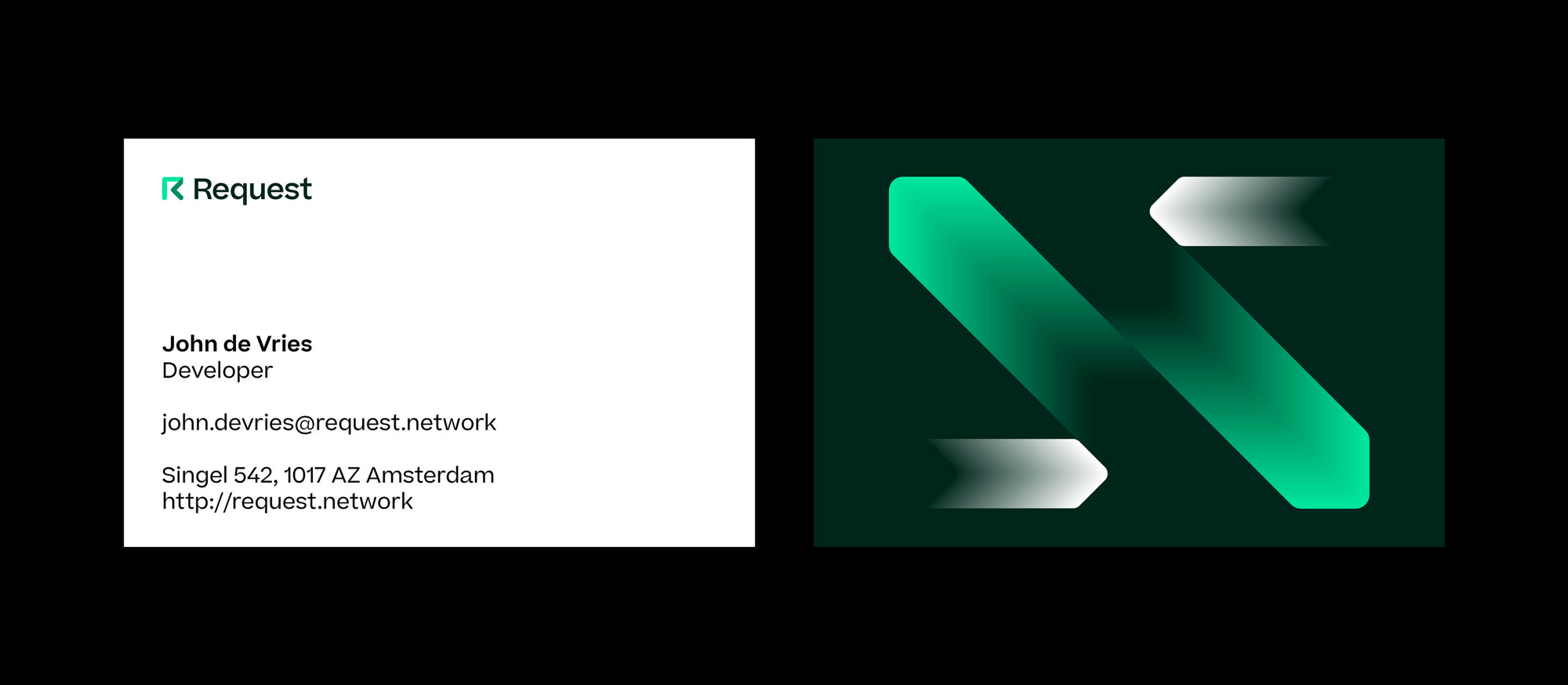
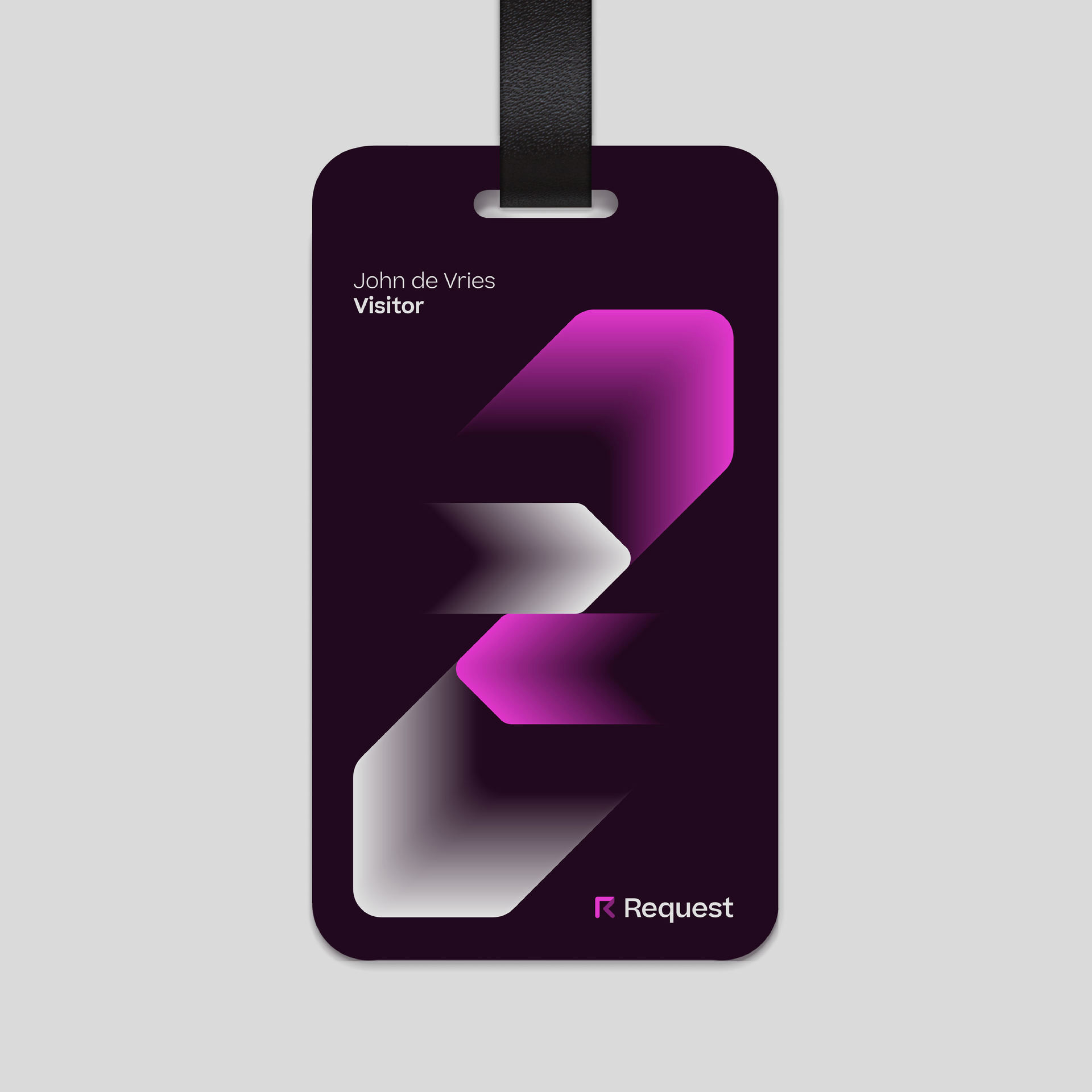
Overall, there is only one “trick” to this identity — the gradient, flowing arrows — but it’s deployed beautifully and in a sufficient number of slightly different ways to keep it engaging and flexible enough for different applications and mediums all while portraying the company as a non-creepy, non-fraud-prone option because scam blockchain platforms simply don’t look this good.
Thanks to Igor Delov for the tip.

 Новости Союза дизайнеров
Все о дизайне в Санкт-Петербурге.
Новости Союза дизайнеров
Все о дизайне в Санкт-Петербурге.