Обзор лучших ресурсов по разработке бренда, разработке упаковки
contact us | ok@ohmycode.ru
contact us | ok@ohmycode.ru
Established in 2019, Institut Français de la Mode in Paris, France, is the result of the merger of two storied schools, the Ecole de la Chambre Syndicale de la Couture Parisienne (established 1927) and IFM (established in 1986). As a higher education institution, it offers Bachelors, Masters, and Doctoral degrees as well as serving as a “training center for apprentices, a provider of executive education, as well as a center of expertise for the textiles, fashion and luxury industries” for 1,000 students. The identity for the new Institut Français de la Mode has been designed by Base.
Our objective with the new identity was to balance the institutional with a young contemporary attitude that would directly talk to potential students. The launch of the newly created fashion design programs had also to be pushed forward by bringing a creative feel across all channels.
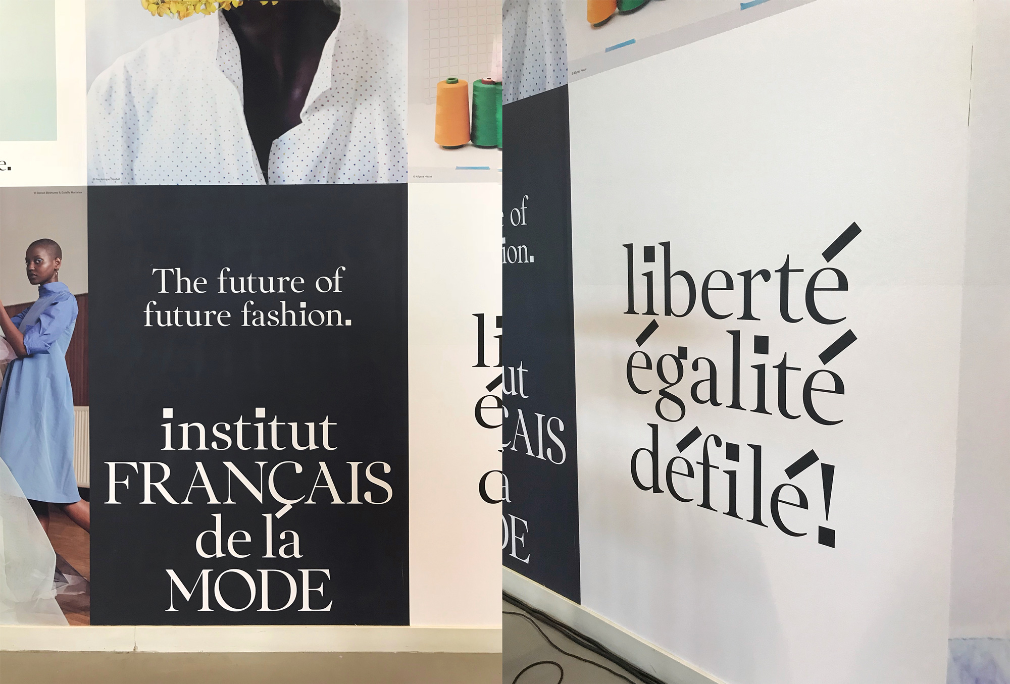
The old logos were both mostly fine — IFM was definitely nicer and more contemporary than Chambre Syndicale’s which looked like the title treatment of an old department store catalog. The new logo successfully bridges old with new through the classical choice of serif for all-things-fashion but giving it a twist with the awkward and oversize tittles and cédille that give the serif a slightly rebellious look. On its own, the logo is not entirely convincing as there aren’t many accents in it, which is what makes the custom font (below) and applications so entertaining. Nonetheless, it sets the tone that there is something funky at work.
Classy and timeless yet quirky, the custom typeface we designed is the written voice of the school. It had to feel somehow ‘French’, this is why we added the oversized accents to an elegant serif font. The accent is what is making French so … French, no?
When I first scrolled through the project, I wasn’t so sure about it, but the more I look at it, the more I enjoy it. The XL and sans serif accents contrast markedly with the serif and I think it serves as a proper metaphor for the sometimes jarring, contradicting, confusing manifestations of fashion. The one thing about the font I’m not entirely convinced by is the numerals being a thin sans serif — you can see those in the posters a few scrolls below — which I feel start going into the trendy Brutalist aesthetic. Although, to be my own devil’s advocate, I do think visually they work well with the accents and punctuation… so maybe it does make sense.
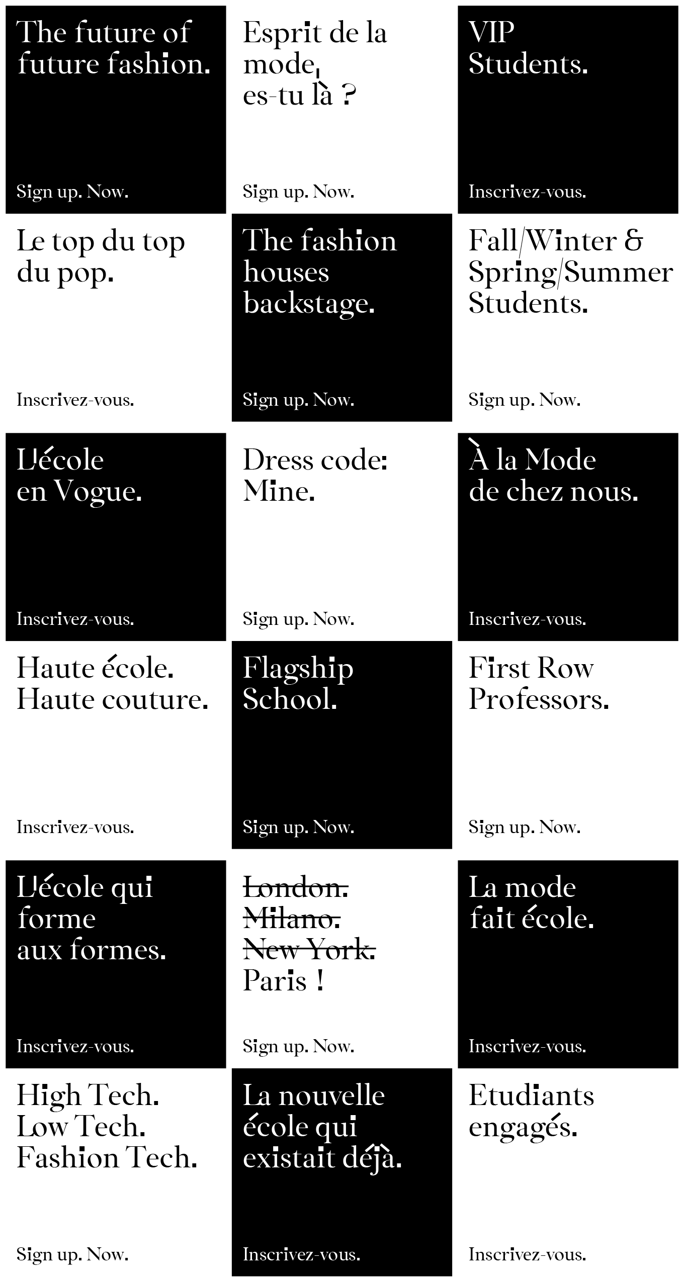
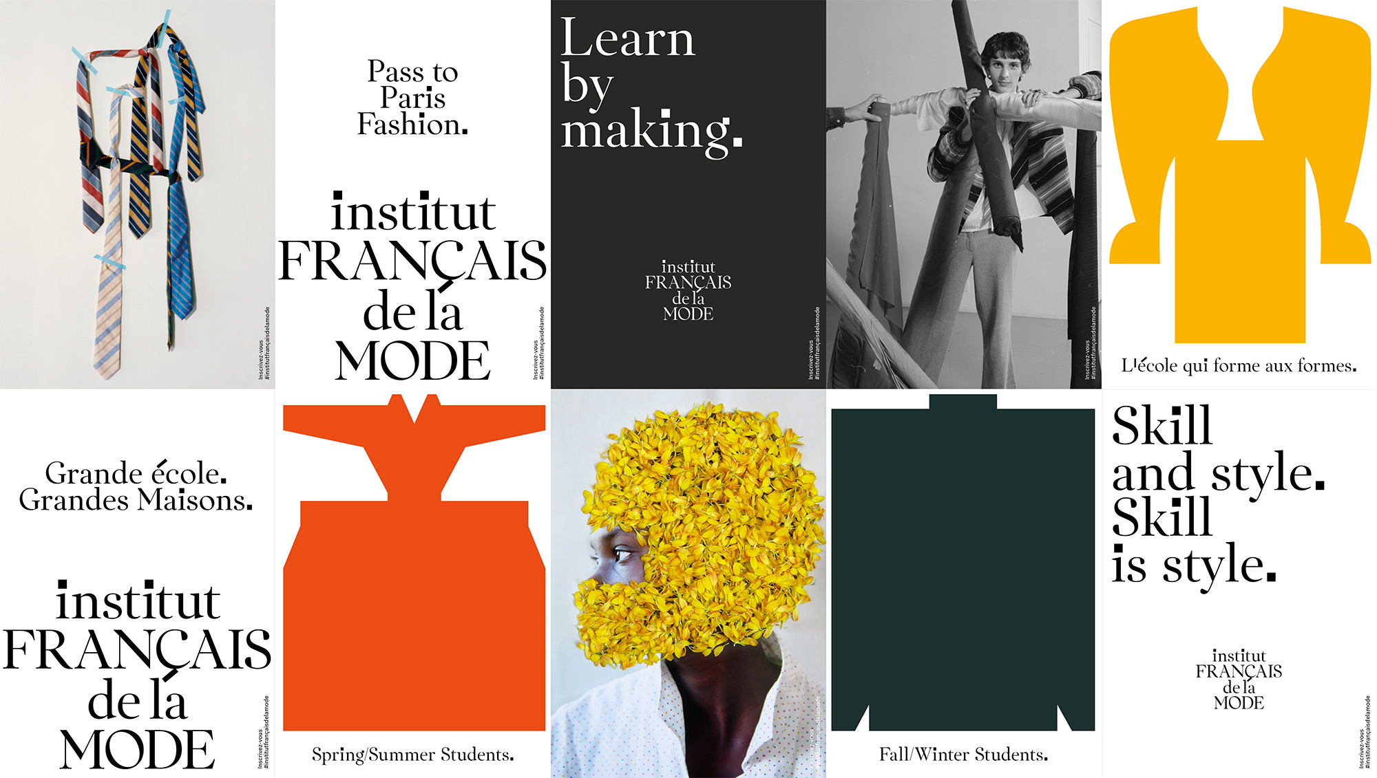
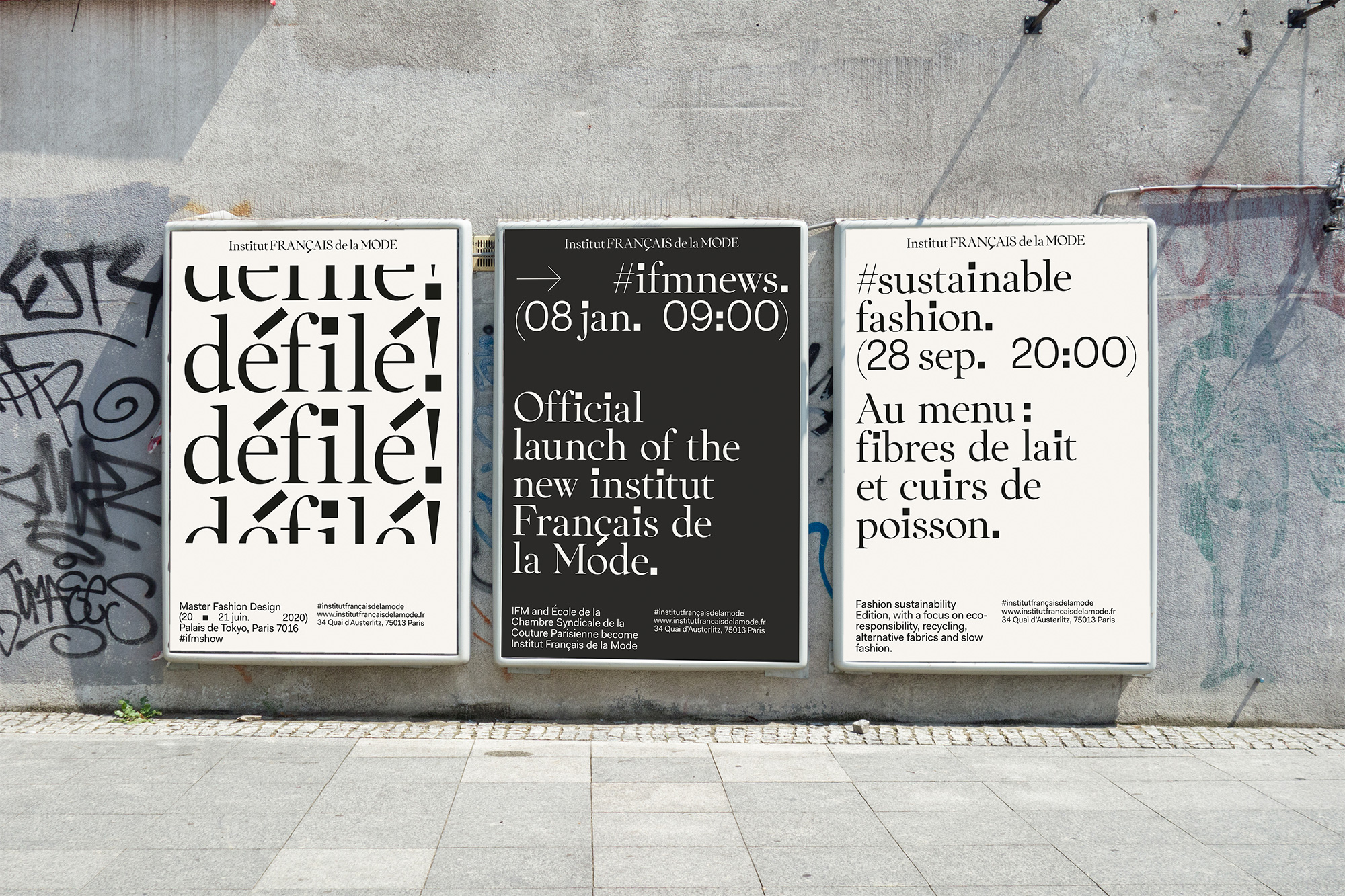
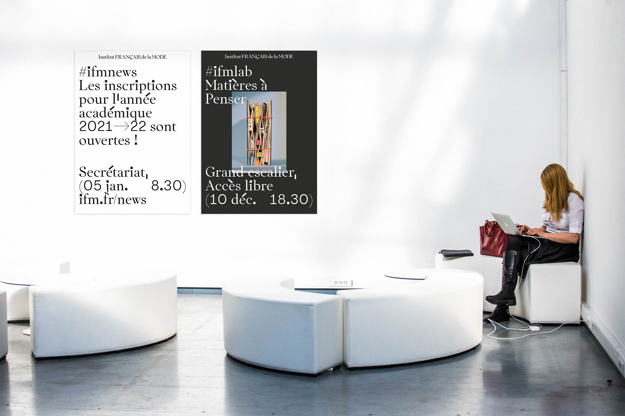
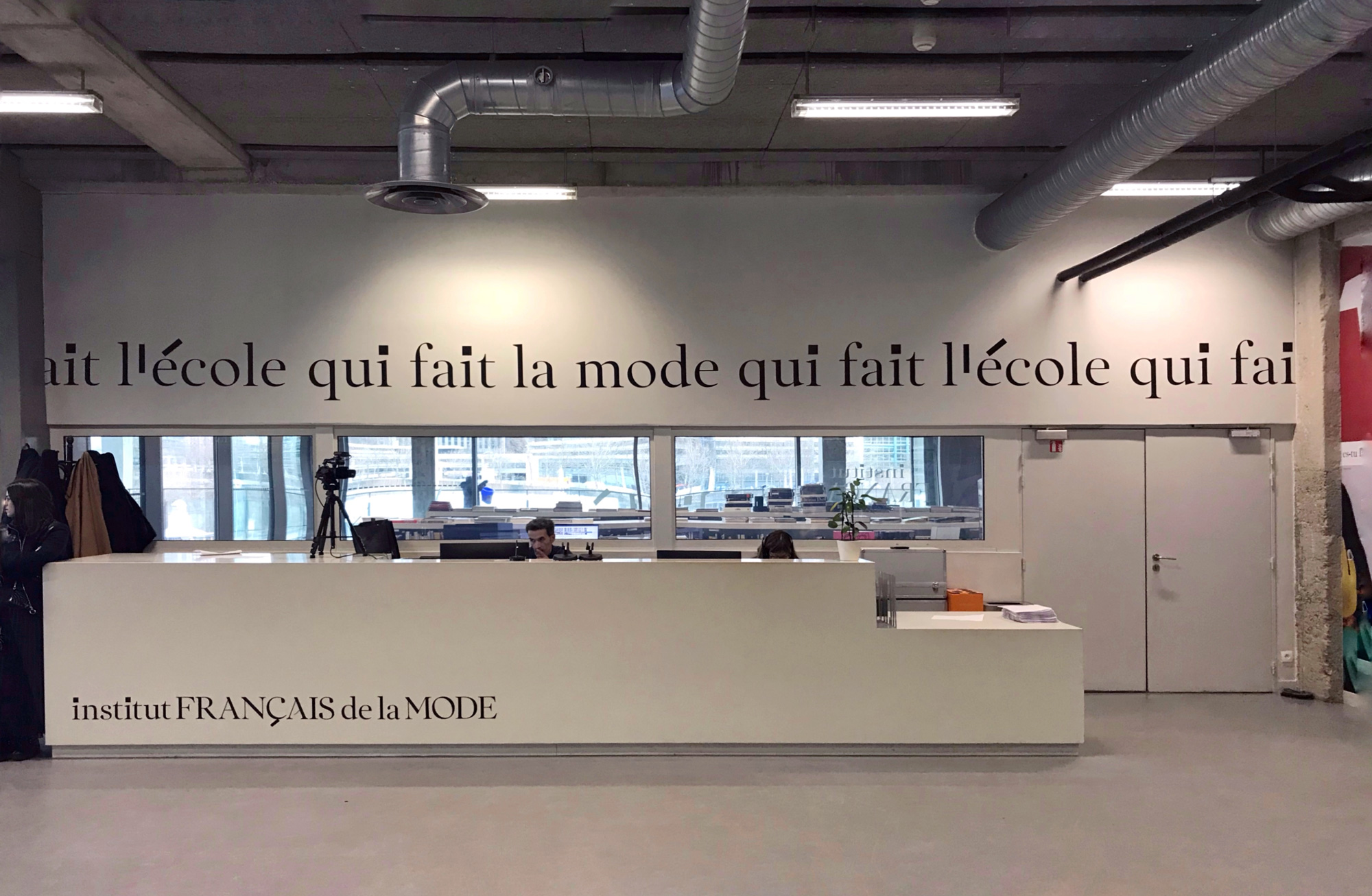
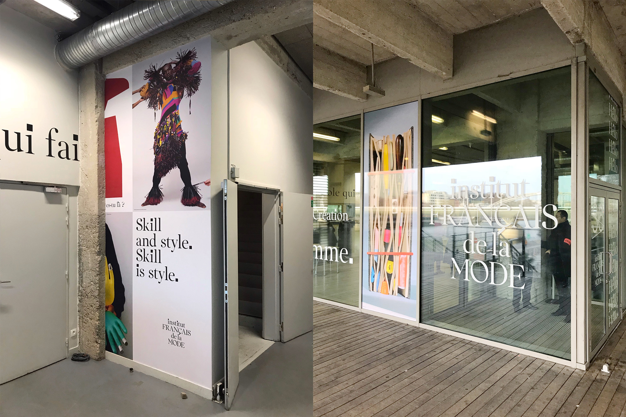
The applications are bold and exuberant, mixing flush-left with centered alignments, tied together by the custom font, which I wonder if it’s enough for the long run? The photography and illustrations peppered through some of the applications are fine but a little random and unrelated, so maybe at some point, those elements will be more cohesive. Overall, this is very appropriate for a fashion school in Paris and it’s a refreshing twist on a serif-based identity without going the full Didone or the full Chobani.

 Новости Союза дизайнеров
Все о дизайне в Санкт-Петербурге.
Новости Союза дизайнеров
Все о дизайне в Санкт-Петербурге.