Обзор лучших ресурсов по разработке бренда, разработке упаковки
contact us | ok@ohmycode.ru
contact us | ok@ohmycode.ru
Established in 1993, Kate Spade is a women life and style fashion house that offers handbags, ready-to-wear, jewelry, footwear, gifts, home décor, and more. Launched originally with her husband Andy Spade with a small collection of six utilitarian nylon handbags designed by Kate Brosnahan Spade (1962 - 2018), the brand gained quick popularity for its colorful and effusive designs. Today it counts with 275 stores worldwide; 4,800 employees; and has $1 billion in revenue. With the launch of the Spring 2019 under the direction of new creative director, Nicola Glass, Kate Spade introduced a new identity earlier this year.
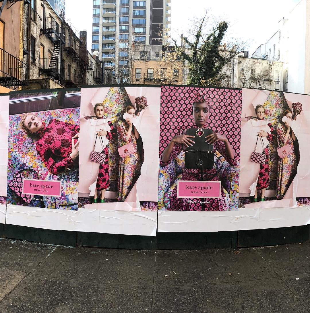
There is no design credit but I assume it was either done in-house or by Partners & Spade, the design firm established by Andy Spade, or a combination of the two. Also, all images in this post are taken from Instagram, so the resolution is not the greatest but it gets the point across. For a few more user images you can browse the #loveinspades tag.
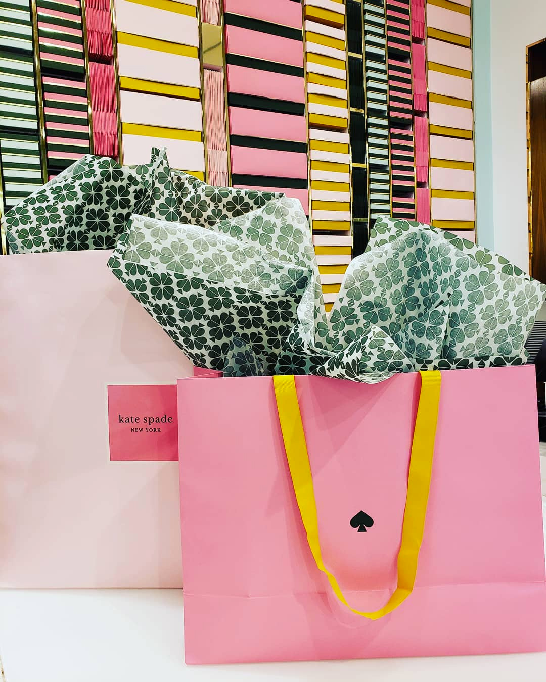
our new logo. our new label. our new pink. (we call it “pink kiss.”) now look a little closer. that’s our new green. we named it “clover.”
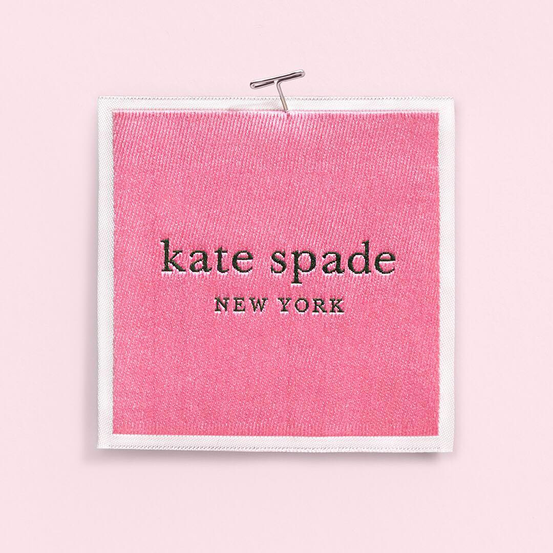
The new logo is mostly the same… a combination of lowercase and uppercase serif nicely spaced. The old one would be more regularly paired with the spade while the new one drops it from the logo since, as you will see, it becomes a big part of the products. The new logo now appears inside a pink box with a white border. It’s not a huge change but it certainly forces it into new uses that make it feel like an evolution of the original even if, for the most part, it’s only the introduction of a container box that’s different. I believe the wordmark has been made a little bolder but unfortunately I couldn’t find a vector or high-res version to really compare.
Update: The logo was redrawn by Commercial Type and a number of optical sizes have been created for different uses.
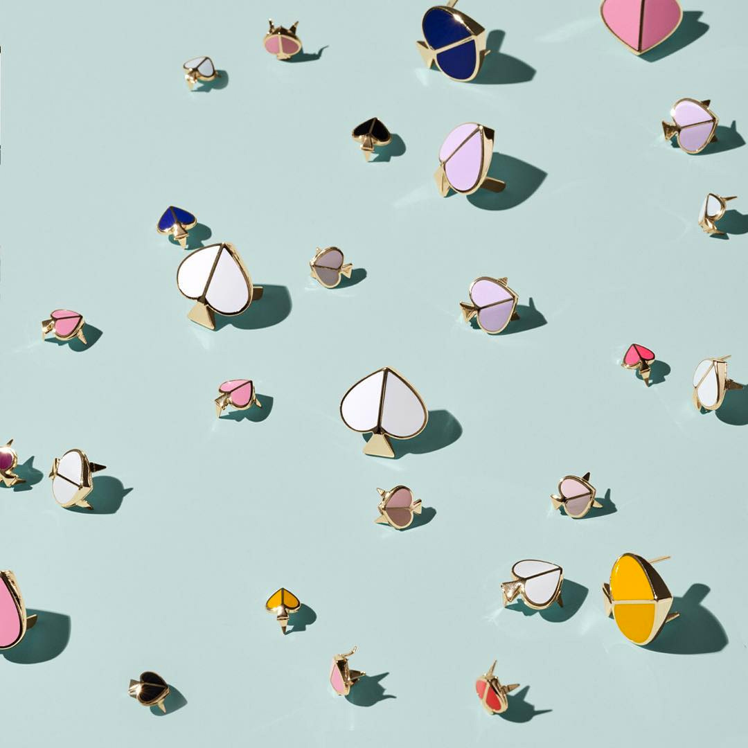
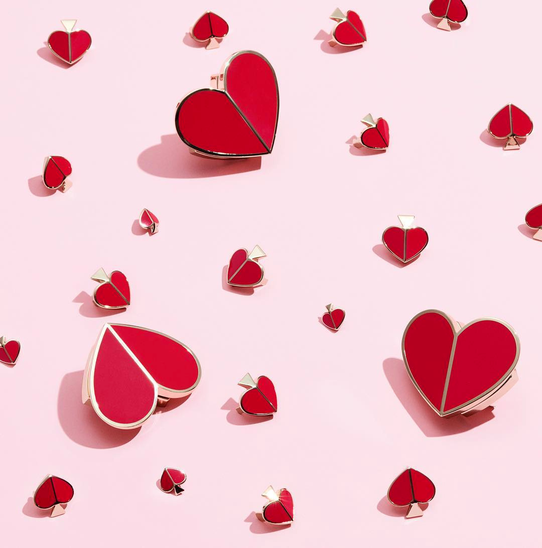
our new spade. we’ve reimagined our signature mark in lots of new ways and thoughtfully worked it into all of our designs for an unexpected surprise.
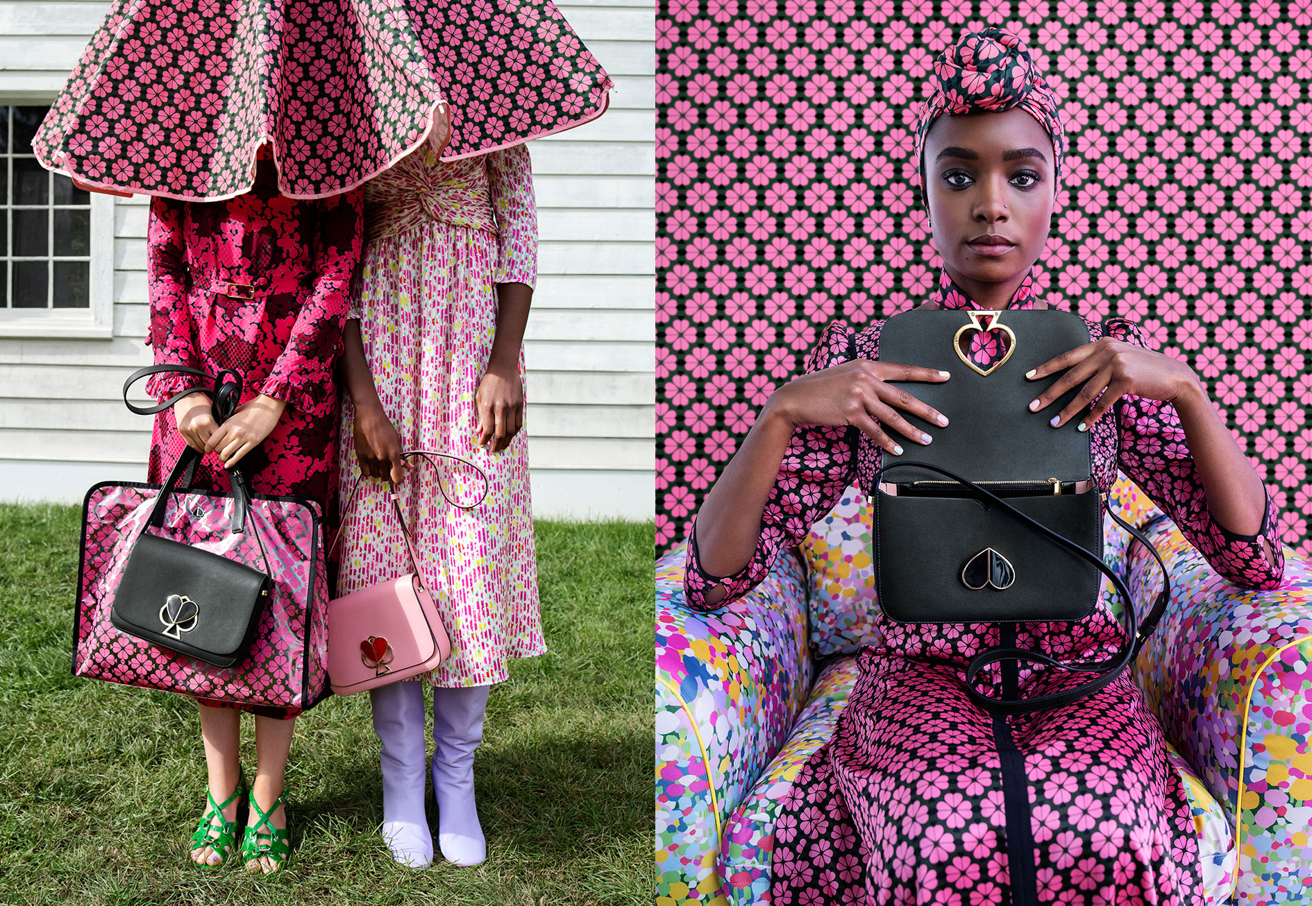
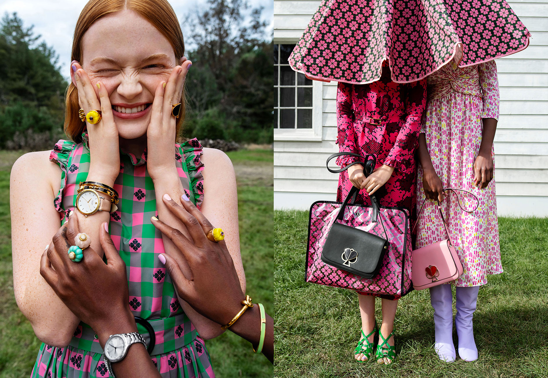
The new spade, as an icon, is lovely — if you have read Brand New for an extended period of time, you know I am a sucker for ink traps, so it’s no surprise I’m really digging this. Aside from personal preferences, what this new spade does very well is look more unique and not like something you would see in a hundred different deck of cards. In the the hardware of the bags (below) and the pattern (further down below), the spade silhouette changes a bit to adapt to its use but the overall shape is super pleasant and how it can transform into a heart when flipped is a major bonus.
our new spade flower pattern: it’s another way we’re weaving our spade into our designs. every blossom is made up of four spades. we’ve embossed this one on smooth leather with 3-d printed patent for our new nicola bag using a technique we developed with one of our tanneries in italy.
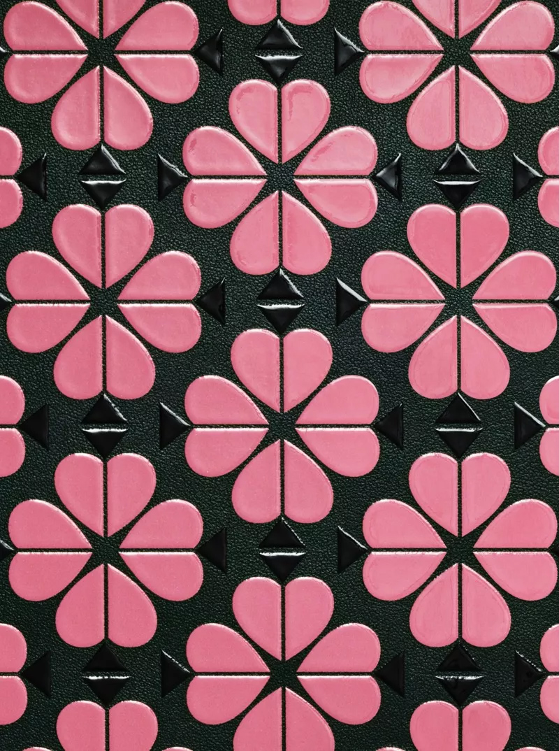
our new tissue paper. you’ll get an even closer look at it when you open one of our new boxes. (can’t wait to show you those.) it’s covered in our new spade flower pattern, which are tiny blossoms made up of four spades.
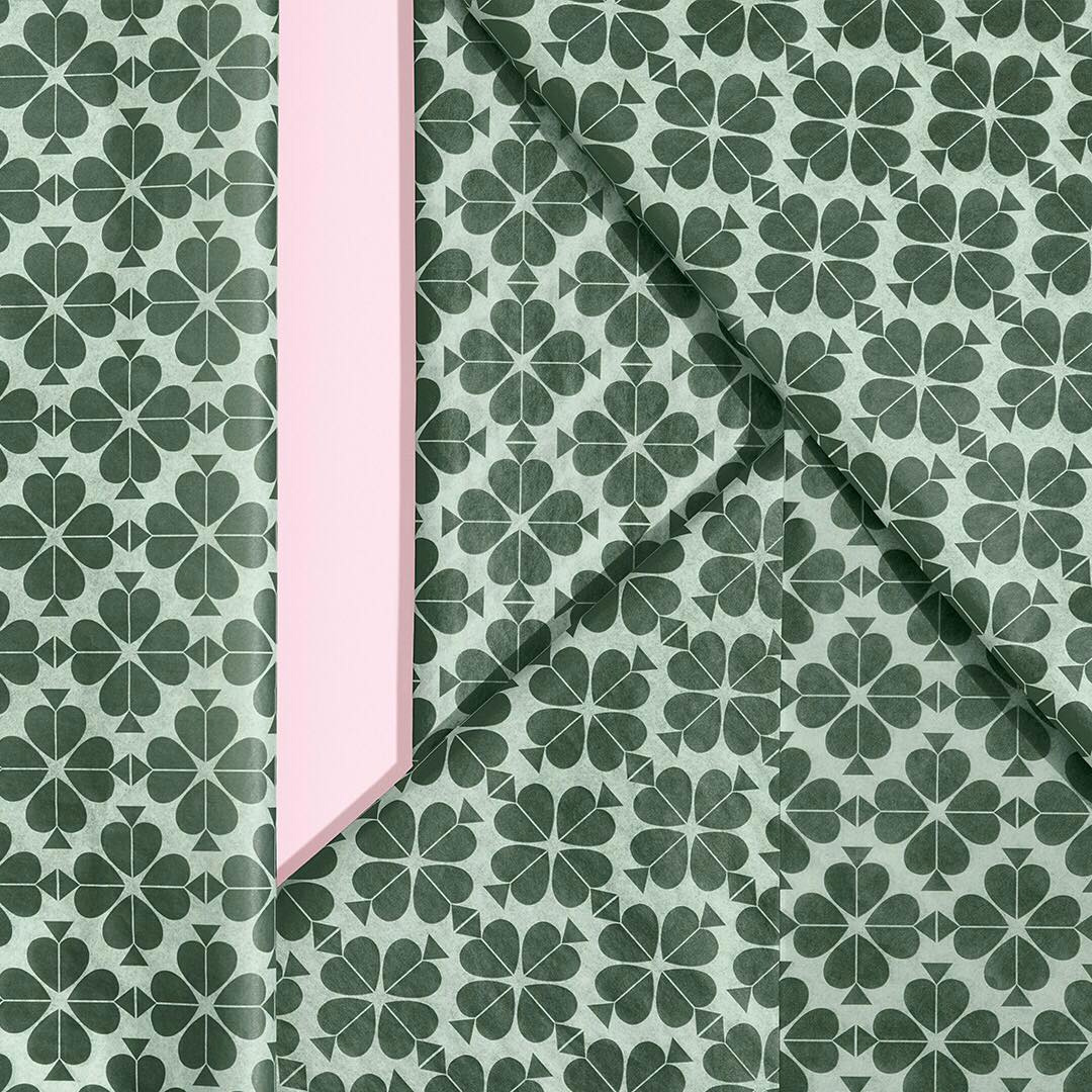
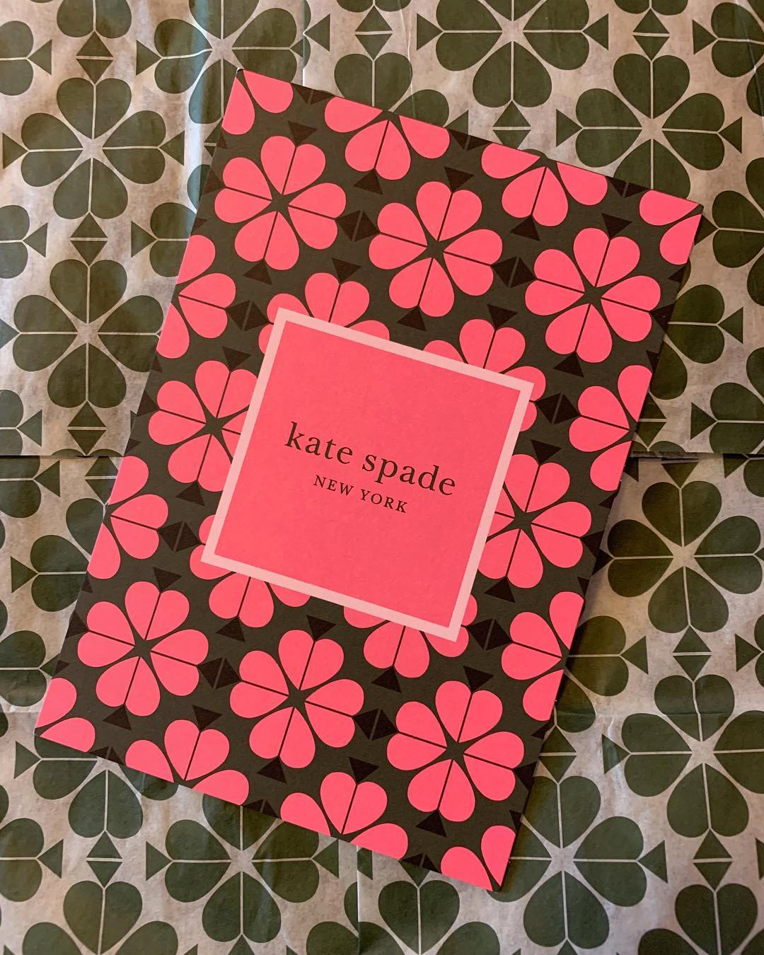
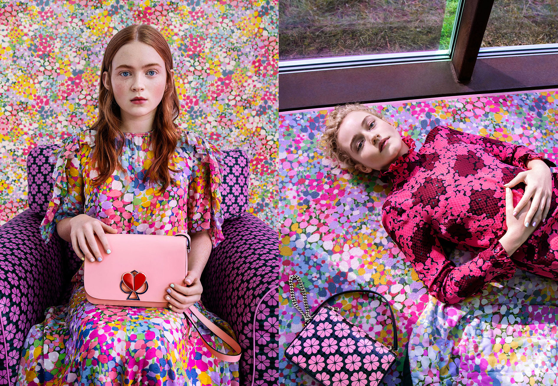
The absolute best part of the new identity is the pattern, made up of blossoms of spades that look delightful in any number of color combinations. The pattern also serves as the cornerstone of the Spring campaign and with good reason. I can’t get enough of it.
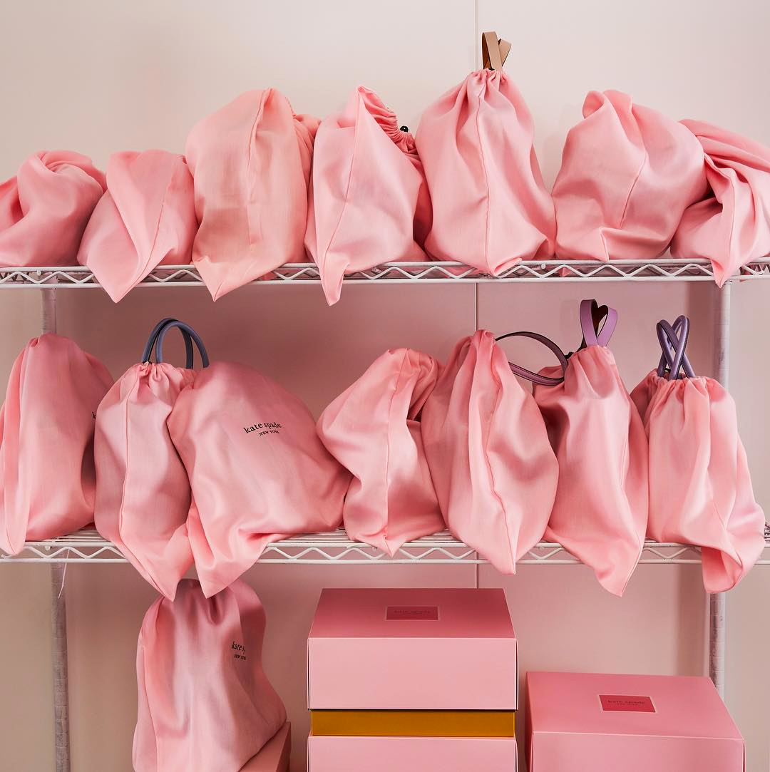
each box has a different combination of our brand colors—the ones we call pink kiss (bright pink) to clover (dark green), cherry blossom (light pink) to honey bee (yellow).
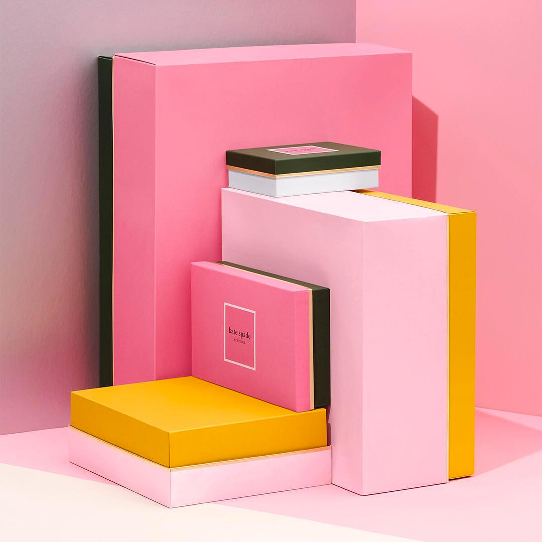
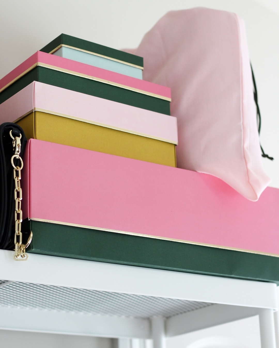
The new boxes are also stunning, with each top and bottom using different combinations of the brand colors and nicely tied through a gold trim.
I don’t know much about fashion but I absolutely love this.
Overall, this is a fantastic evolution that maintains the playfulness that the Kate Spade brand is known for and infuses it with a lot of great variety and energy. I might even get me a little something for myself with that pattern — for design posterity’s sake (and perhaps a Saturday night on the town).
Thanks to Monique Duquette for the tip.

 Новости Союза дизайнеров
Все о дизайне в Санкт-Петербурге.
Новости Союза дизайнеров
Все о дизайне в Санкт-Петербурге.