Обзор лучших ресурсов по разработке бренда, разработке упаковки
contact us | ok@ohmycode.ru
contact us | ok@ohmycode.ru
Established in 2003, Alaffia — a word that is a common greeting in Africa that means a state of peace, health, and well-being — is a beauty brand with a line of all-natural body, hair, and face products made with ingredients sourced from various fair-trade women’s cooperatives in Africa and finished in the company’s facility in Olympia, Washington. A portion of the sales goes directly back to Africa through their Empowerment Projects that include education-based projects, maternal health, eradication of female genital mutilation, eyeglasses, and environmental sustainability. The brand is available in most major retailers (Target, Walmart, et al) and smaller beauty stores. This month, Alaffia introduced a new identity and packaging designed by Oakland, CA-based Chen Design Associates.
Chen Design reclaimed the soul of Alaffia’s brand in large part by streamlining what had become an overworked look and a hard-to-read identity and message.
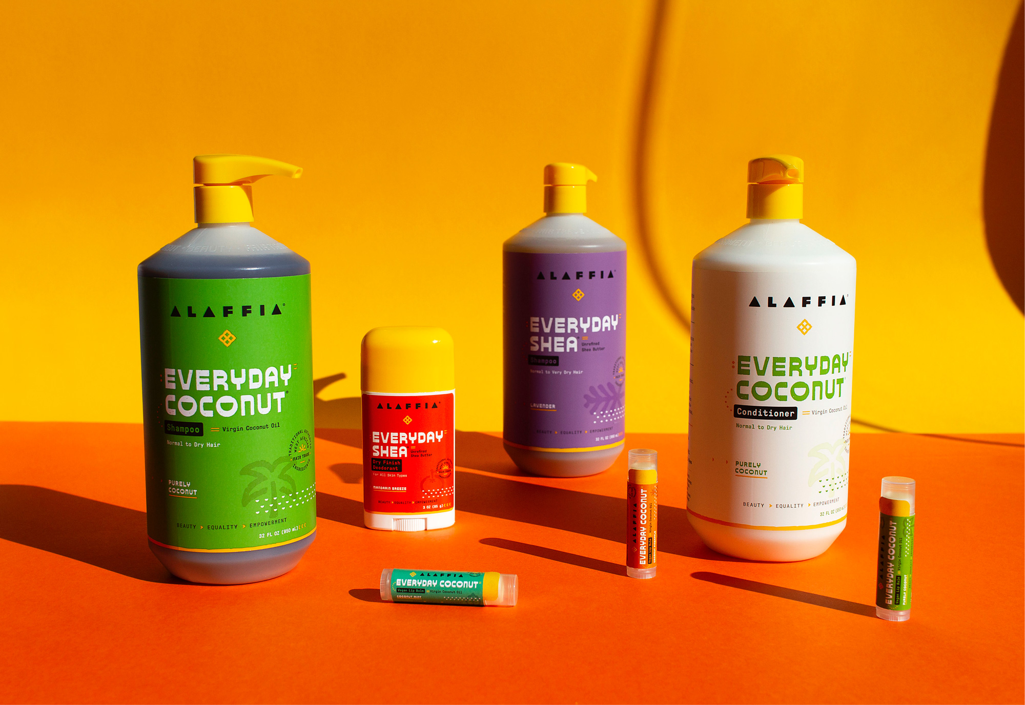
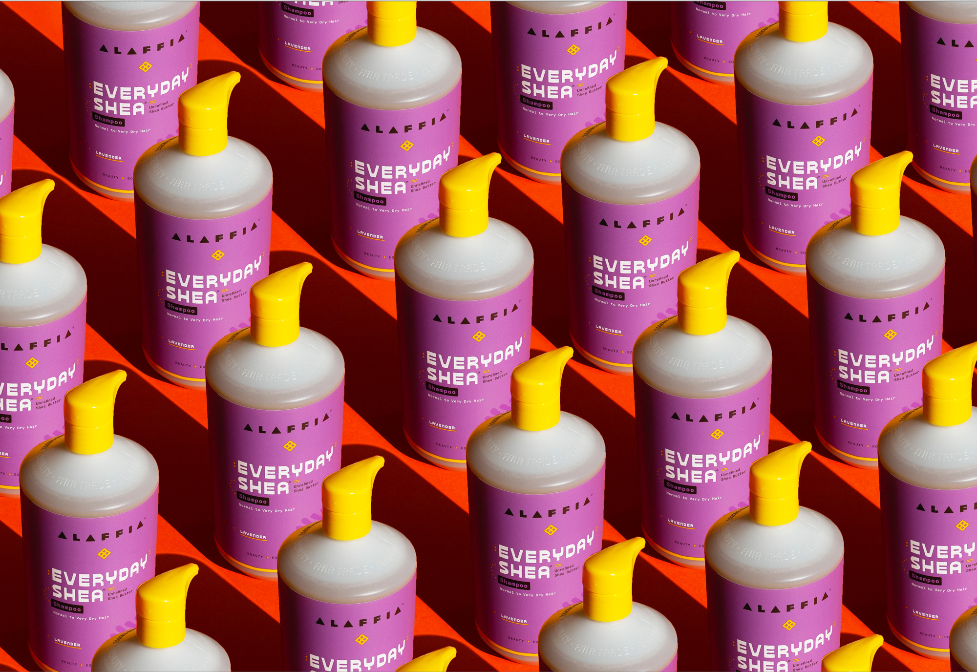
The old logo was mostly fine, with a hand-drawn aesthetic that worked really well in the icon in a more subtle execution but then got too excited in the wordmark, looking perhaps a little too unfinished. Still, not bad. The new logo downplays the icon — called an Eban, a “traditional West African symbol representing protection, security, and love” — which is a bit of a shame because the new execution is really nice with its subtle curves and twinkle shapes in the counterspaces. The wordmark, in a way, maintains the rugged aesthetic of the old logo with a blocky, round-cornered construction that looks as if it could be a pattern on a textile. I wonder if the “A”s would have benefitted from a counterspace as they can feel a little overpowering over the rest of the characters. The loose spacing is maybe too loose, yielding a rather long wordmark. Still, I do like it and how it has a rather organic, nature-y aesthetic.
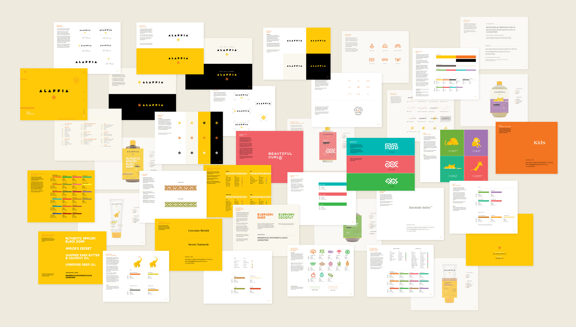
Solving for the challenges of complexity and scale of our client’s extensive offerings, we united six different collections — each with their distinct audiences, multiple lines and scents — cohesively under one parent brand. Chen Design developed a robust and expandable color coding and iconography system to communicate to customers on logical but also subconscious, emotional levels.
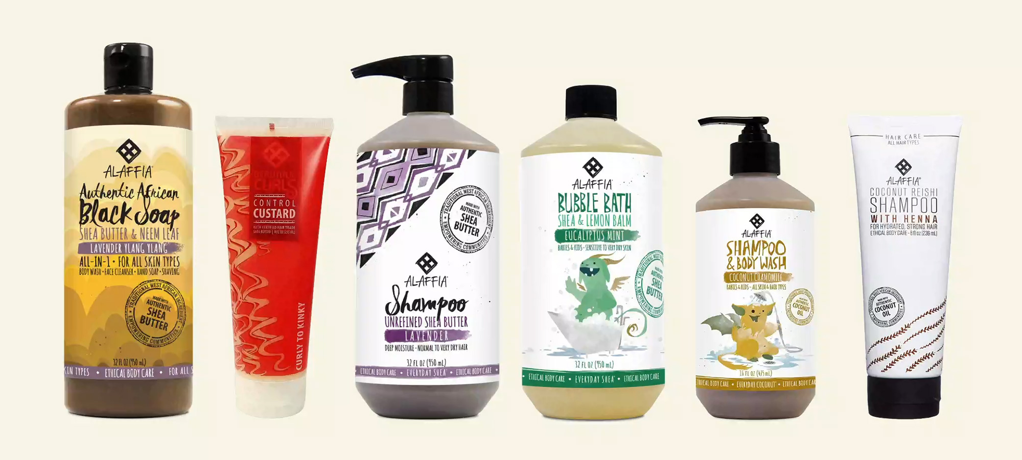
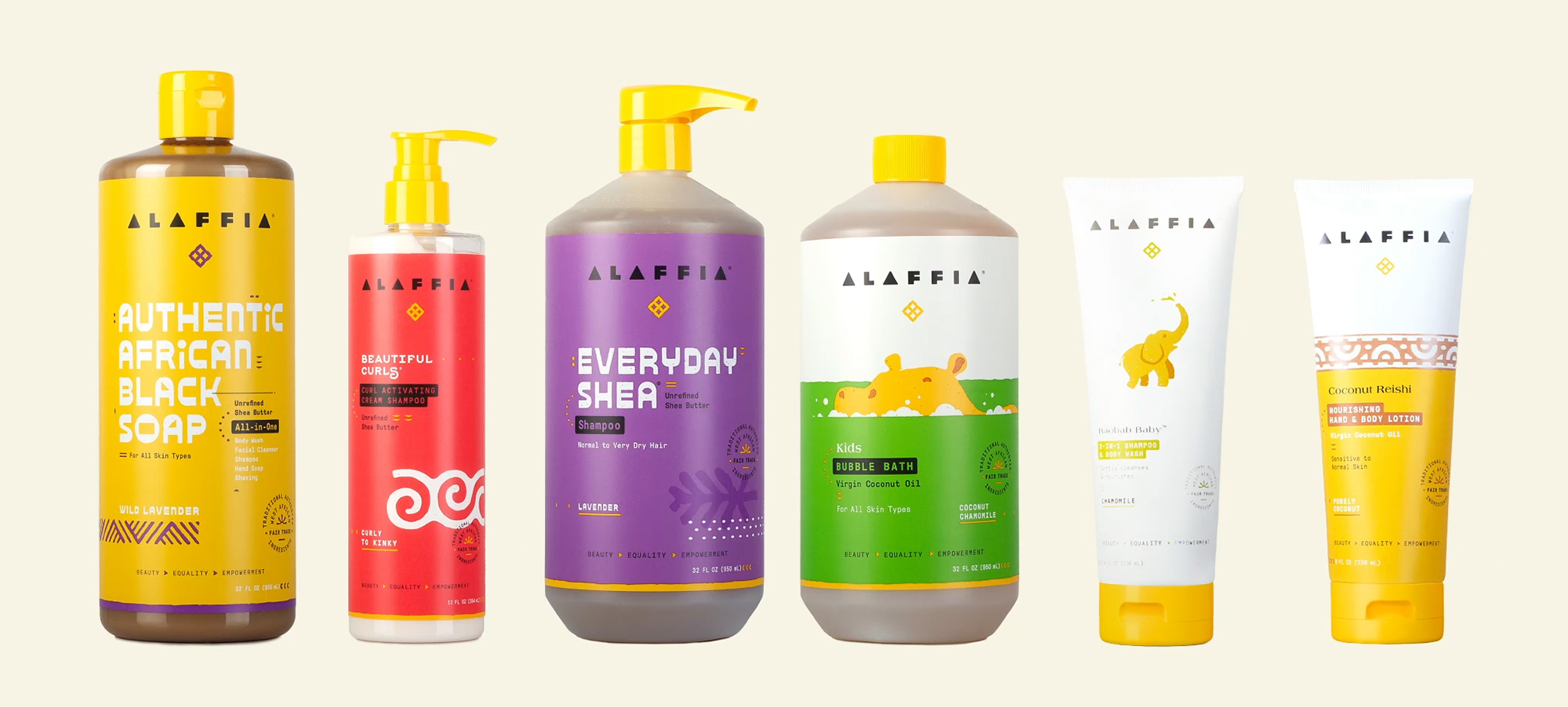
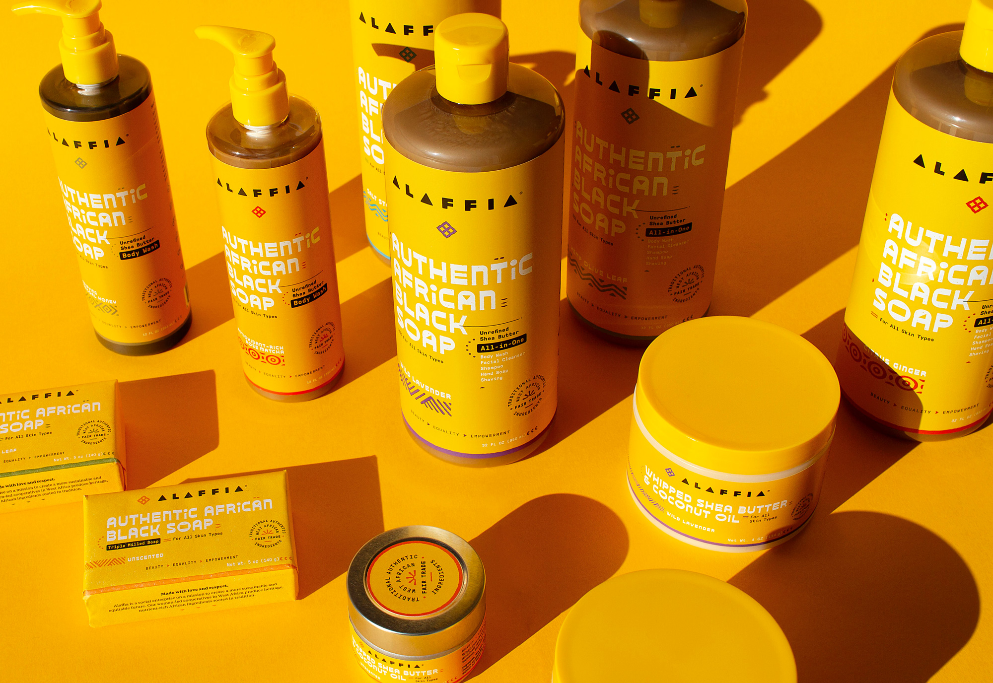
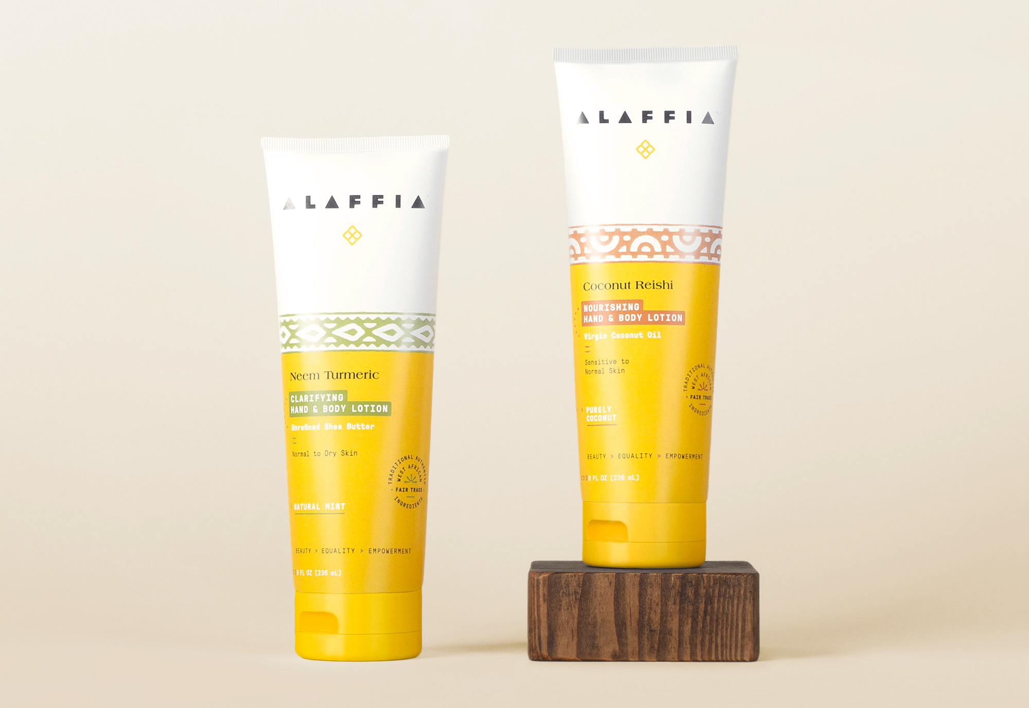
The old packaging was definitely energetic with lots of textures in the background, in the type, and in the illustrations. It wasn’t bad but it wasn’t exactly good either and I think the design was a little too messy for a beauty product. The new packaging manages to be both minimal and ornate, with lots of little elements on each package but with plenty of space around all of them that doesn’t make it feel crowded but also not clinically spare. There are a number of product ranges/collections and each has a few differentiating details but they all share a common layout approach and playful vibe that neatly unifies them.
For the Authentic African Black Soap collection, we customized letterforms that meld a love for handcrafted tradition with a contemporary tastemaker-Africa vibe. Bright colors evoke scents. Geometric forms echo shapes in our revitalized wordmark. Did you catch the bar of soap?
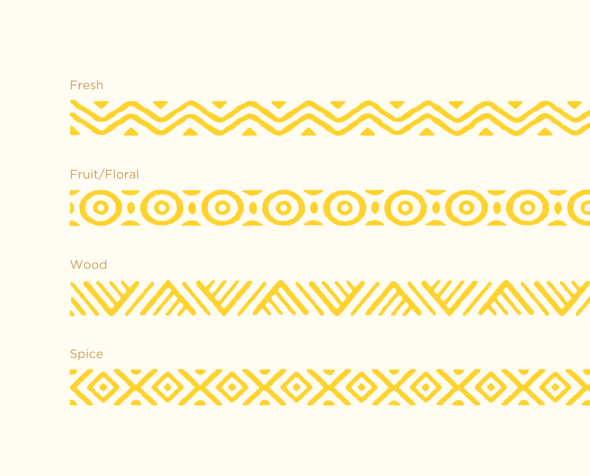
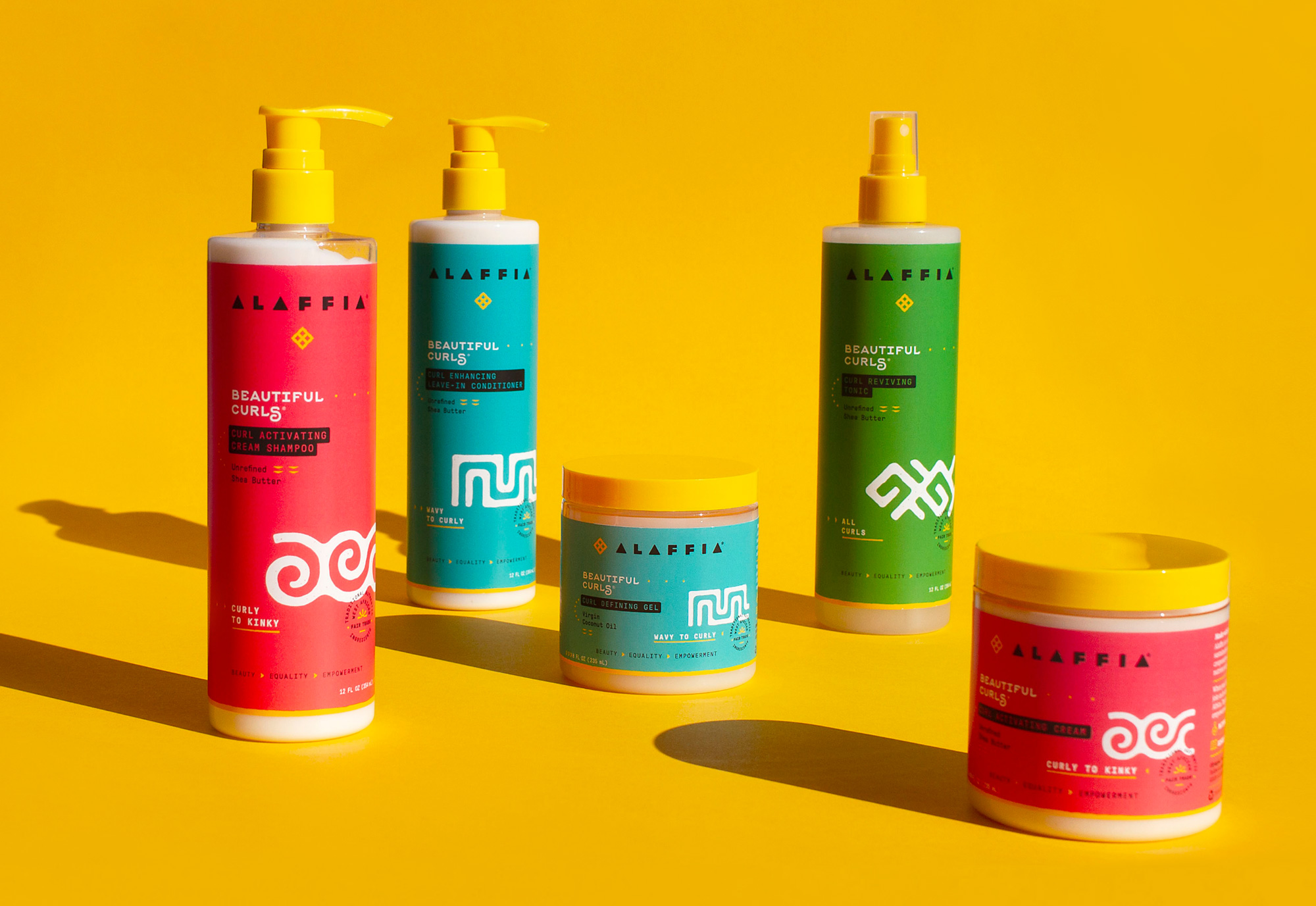
We developed custom icons for each of Alaffia’s scents, honoring traditional African symbology with a contemporary, clean yet organic sensibility.
Our packaging designs for Baobab Baby and Kids speak directly to their specific, respective audiences. Aligned with the African ethos of the brand, we illustrated familiar and beloved animals in their natural habitats, with a nod to each product.
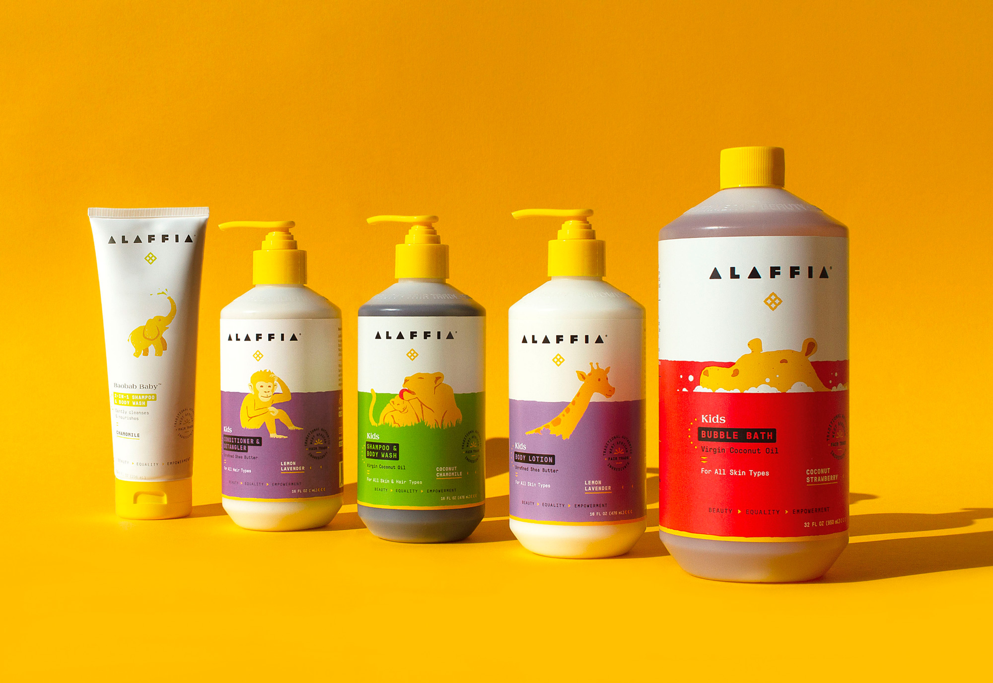
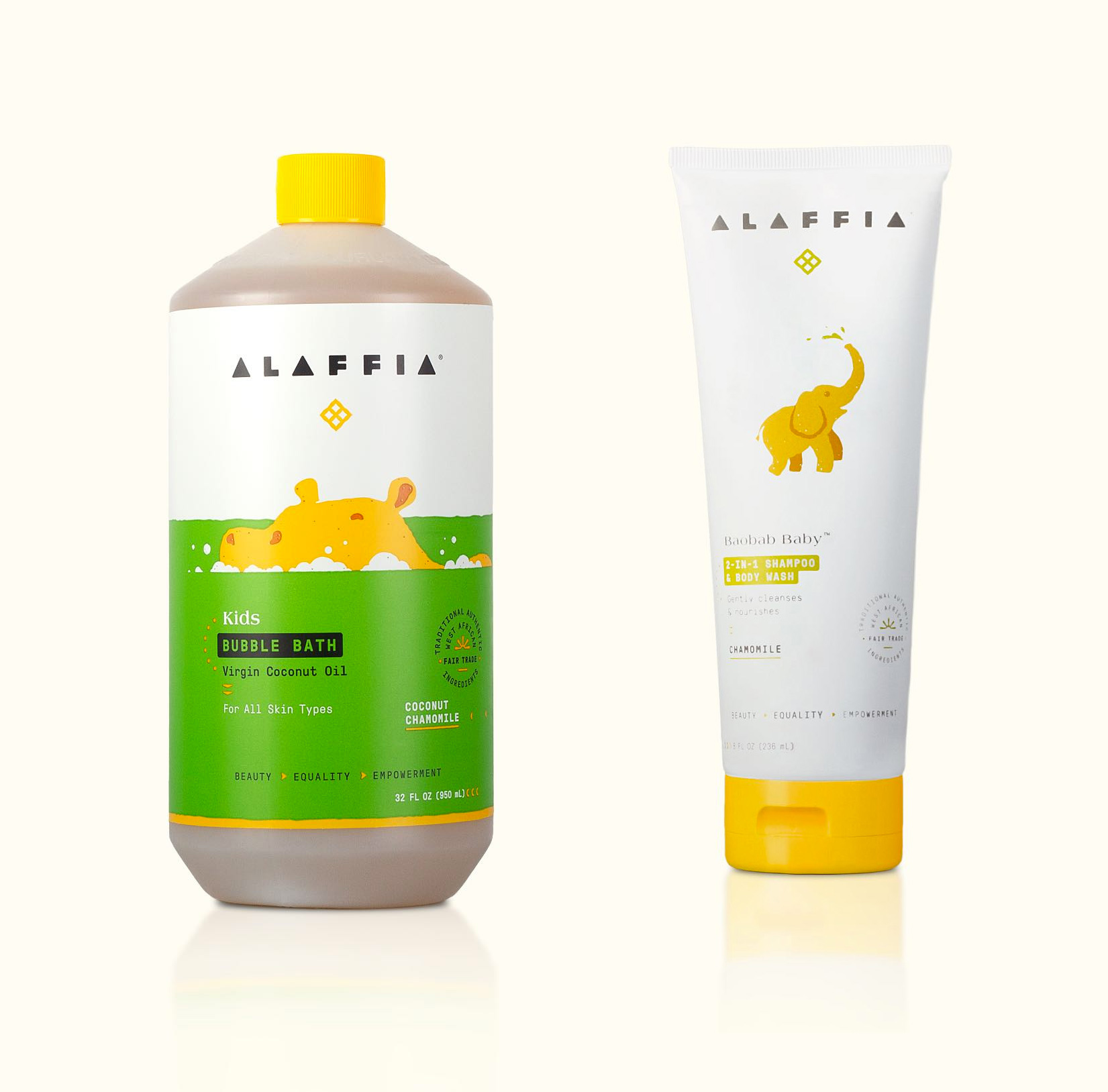
Across all the products there is a great sense of playfulness and integration of African motifs in just the right doses, highlighting the brand’s origins while making it feel right for mainstream retail. Overall, aside from the hippo FTW, this is a great update that gives the products a fun, unique visual language that stands out from the hip and minimal look of its category competitors.
 each year since publication began in 2006

 Новости Союза дизайнеров
Все о дизайне в Санкт-Петербурге.
Новости Союза дизайнеров
Все о дизайне в Санкт-Петербурге.