Обзор лучших ресурсов по разработке бренда, разработке упаковки
contact us | ok@ohmycode.ru
contact us | ok@ohmycode.ru
Established in 2019, Una Europa is an alliance of eight leading European research universities with the intention to “draw on [their] collective strengths to create a truly European inter-university environment”. The universities are: Freie Universität Berlin, Alma Mater Studiorum Università di Bologna, University of Edinburgh, Helsingin Yliopisto/ Helsingfors universitet, Uniwersytet Jagielloński w Krakowie, KU Leuven, Universidad Complutense de Madrid, and Université Paris 1 Panthéon-Sorbonne. With a combined student and staff community of nearly half a million people, one of the goals of the alliance is to create a mega university where students can attend integrated courses in different countries and languages, and university staff and academics can move freely among multiple locations. Recently, Una Europa introduced a new identity designed by Base Design.
The perception of European Academia today is often ‘old-school’, complex, distant and boringly institutional — totally disconnected from the modern and bright working world of the future. This is exactly what drove Una Europa to approach us with a key question at hand: how can we re-shape the conversation around European Academia, creating a more relevant and dynamic representation of our educational system?
The old logo was fine; boring but fine. It had the right ideas of using the EU’s blue and yellow colors and creating a unified monogram from the “U” and “E” but the execution was quite lackluster. The new logo interprets “unity” in a different way, by creating a ligature stemming from the “u” in each of the words and it’s pulled off quite nicely, maintaining good readability thanks in part to the tight letter-spacing. The logo is based on Lineto’s Lettera Text in its lightest weight that is matched with a circle in the same stroke width and it looks good as a unit. The circle is arguably unnecessary but it provides the logo with some extra real estate to claim so that it doesn’t pass unperceived and it helps integrate it with the geometric shapes that make up the identity.
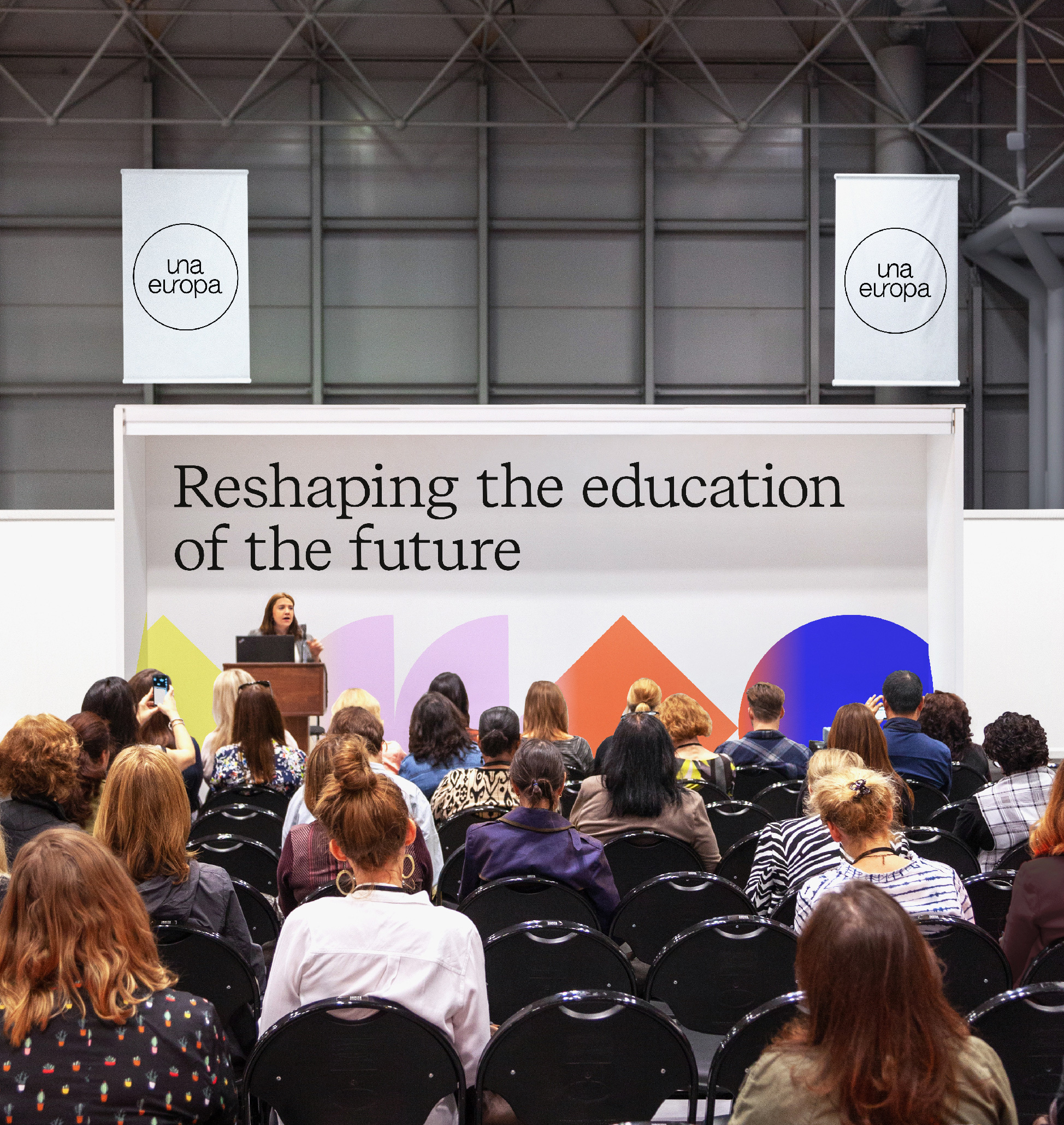
Stepping away from the stereotypically rigid academic aesthetic, we created a modular identity with shapes and colours that interact through gradients and movement — representing the stories of the 8 universities that come together to form a group.
At the core of the identity are these basic geometric shapes that are surprisingly exciting in how they are always used as an endless link and how they bleed into each other through gradients — this effect is very nicely brought to life as you scroll on their website. They are not groundbreaking in any way but I like the straightforwardness of the shapes representing the different schools and working together to complement each other.
To help them perform a radical shift in attitude, we created a manifesto detailing their shared vision and ambitions, that also served as a foundation for their brand story and identity.
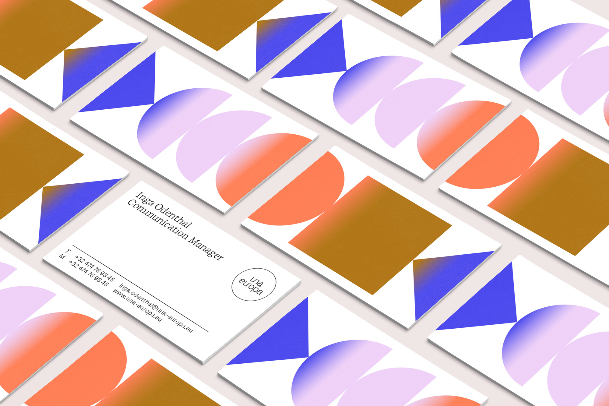
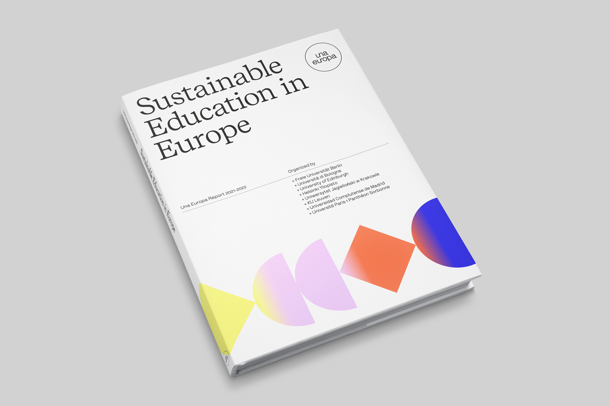
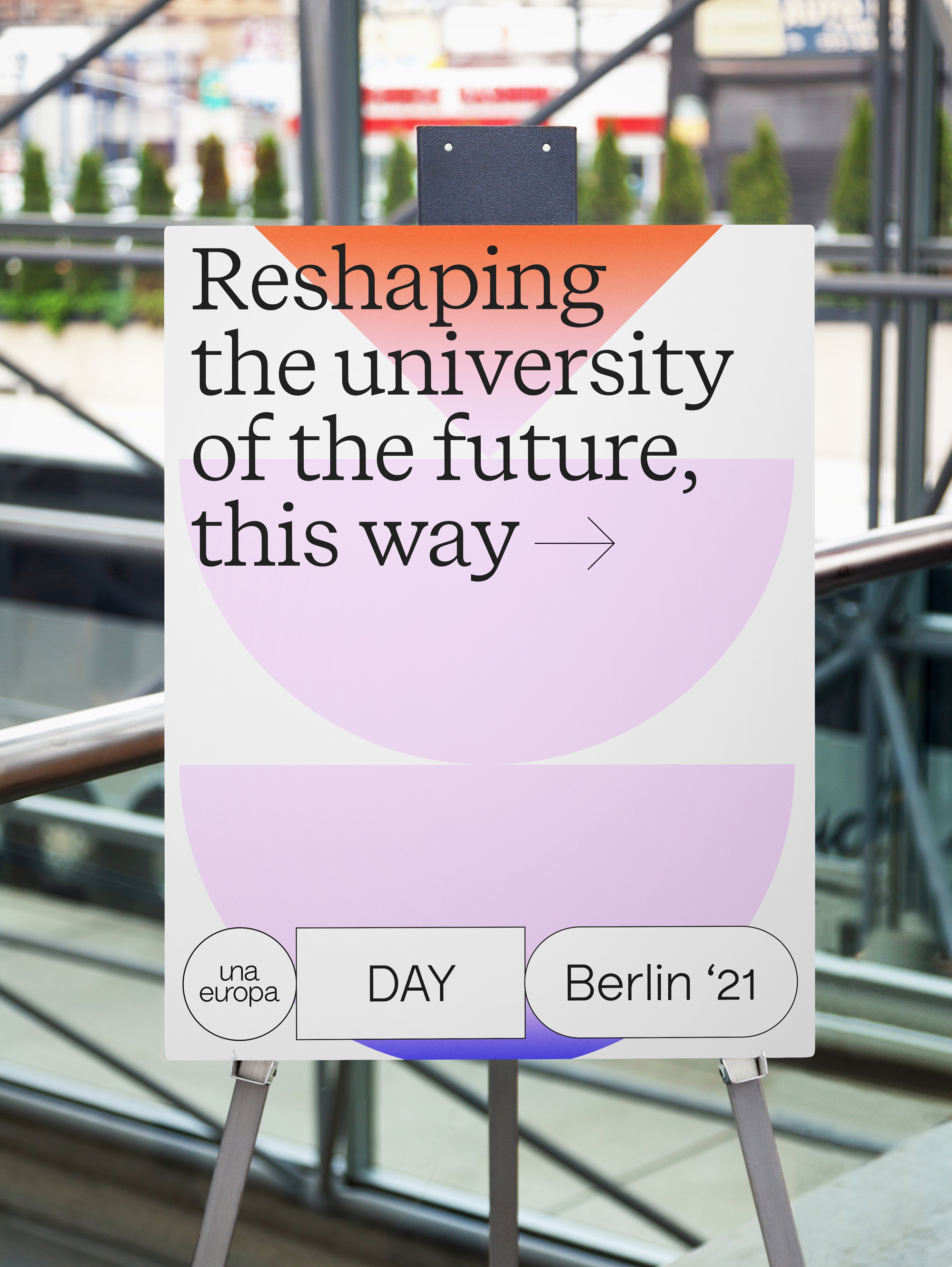
In application, the shapes work in the background or as footers and are complemented by a great serif, Luzi Type’s Recife Text, also in its lightest weight, yielding a very airy sensation in the layouts. In addition, the shapes can also turn into type containers in thin black strokes that can be linked to the logo — it’s an approach we’ve been seeing often recently (A, B, and C) which may make this seem like a trend (which is not totally wrong) but it works well with the overall concept here.
While for most of us here on Brand New this identity may not feel too daring or visually innovative, if you were to look at the websites of each of the eight universities involved — here are three examples (1, 2, and 3) — this certainly defies any expectations associated with those schools and establishes a very distinct and contemporary aura around them that could help attract a new breed of student and staff.
 each year since publication began in 2006

 Новости Союза дизайнеров
Все о дизайне в Санкт-Петербурге.
Новости Союза дизайнеров
Все о дизайне в Санкт-Петербурге.