Обзор лучших ресурсов по разработке бренда, разработке упаковки
contact us | ok@ohmycode.ru
contact us | ok@ohmycode.ru
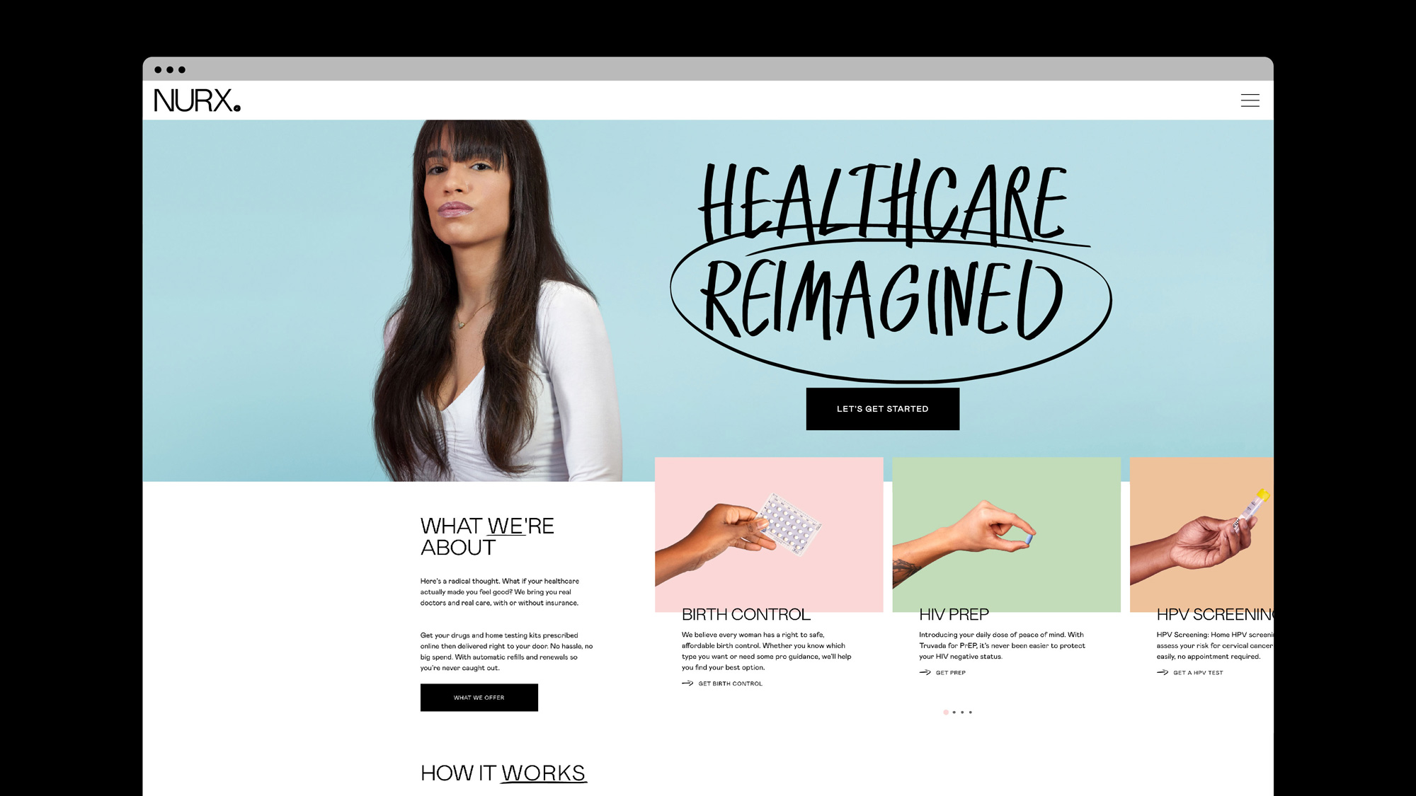
Established in 2015, Nurx (pronounced, more or less, noor-ex) is a telemedicine — the “use of telecommunication and information technology to provide clinical health care from a distance” — platform with a focus on birth control and sexual health treatments without the barriers of traditional U.S. health insurance. Users can safely, securely, and discreetly consult with licensed medical providers and have their medications and test kits delivered to their home, providing a bit of extra privacy. The service is currently available in only 23 states and the District of Columbia but is constantly looking to expand. This month, Nurx introduced a new identity designed by Koto.
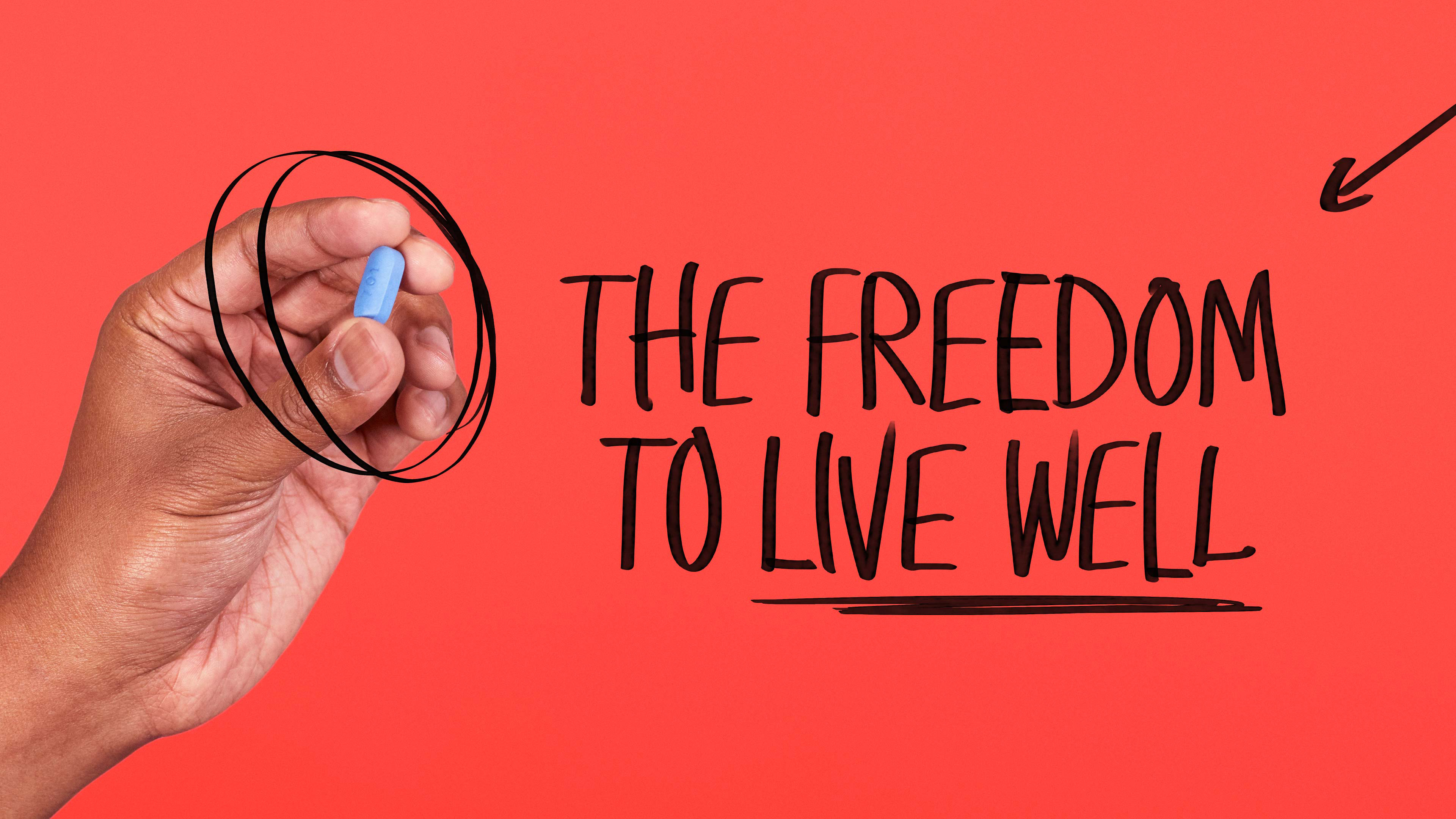
We began by developing a brand strategy based around the three things Nurx gives its users: greater control over their bodies, more choice of affordable treatments and the freedom to live well - in exactly the way they want. This gave the starting point for a bold visual and verbal identity. […] The new brand is anchored by a single-minded wordmark that cements Nurx’s presence in the healthcare space. This is paired with a hand-drawn full-stop to underline their intent, and the start of a new chapter in the healthcare industry.
The old logo was technically okay with the geometric approach to the letters but it was a little bit too friendly, cute, and looking like a dozen other start-ups. The new logo in uppercase and a light sans serif — Colophon’s Mabry — has a much more clinical-slash-pharmaceutical aesthetic that on its own could be a downer but the addition of the scribbled period adds a hint of rebelliousness. The only problem with the period is that it can be hard to discern as a punk-rock element vs. a jagged JPG when the logo is small. It’s nice to see, though, a logo that doesn’t come across as trying to be friendly or lifestyle-y.
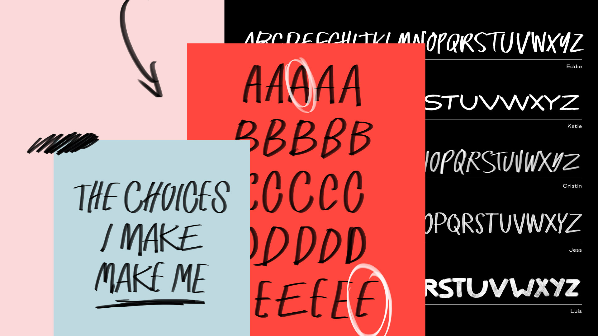
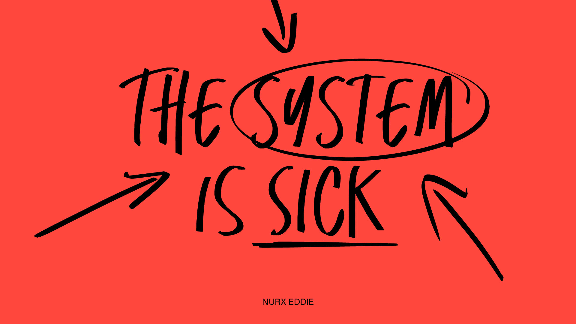
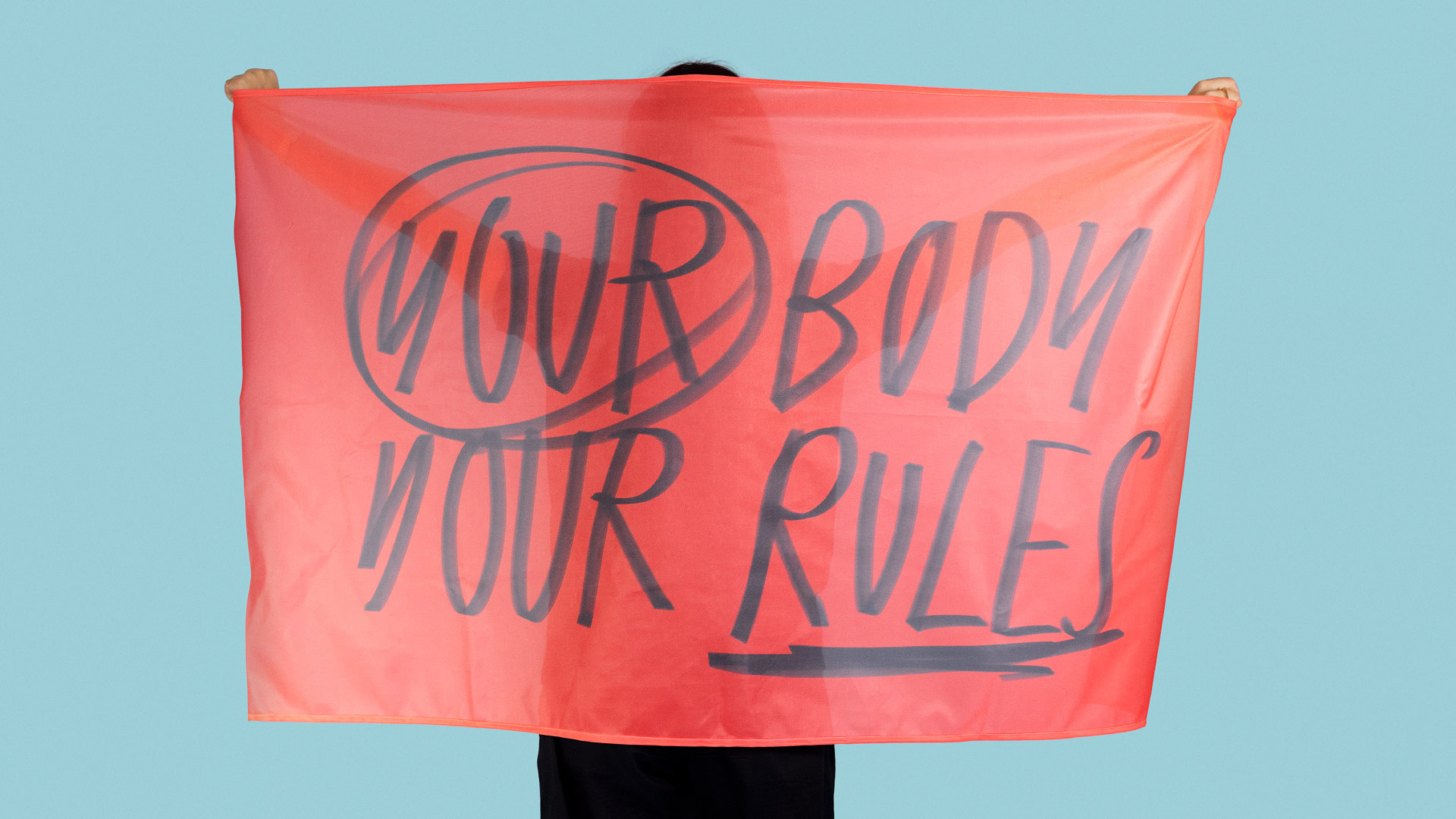
We wanted the new brand to be both a revolutionary rallying cry and a reflection of the high standard of care provided by their qualified physicians. This is reflected in the five new custom typefaces that embody both the spirit of protest and the familiarity of doctors’ handwritten prescriptions.

The hand-drawn aesthetic of the period explodes into a system with scribbles and a set of five hand-drawn fonts that create a bold and energetic contrast with the typography and, both in warp-speed animated GIF form and static, convey the very real frustration almost everyone in the U.S. feels when thinking of healthcare and this has a polite protest vibe to empower its users.
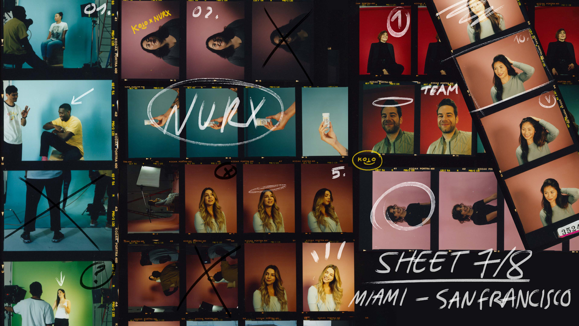
You won’t find models splashed across our website and app. Our actual patients and medical providers are the new face of Nurx, just as they should be! No casting, no retouching. They bring our new look and feel to life by authentically communicating our personality and who we keep top of mind in every decision we make, something that hired models will never be able to achieve.
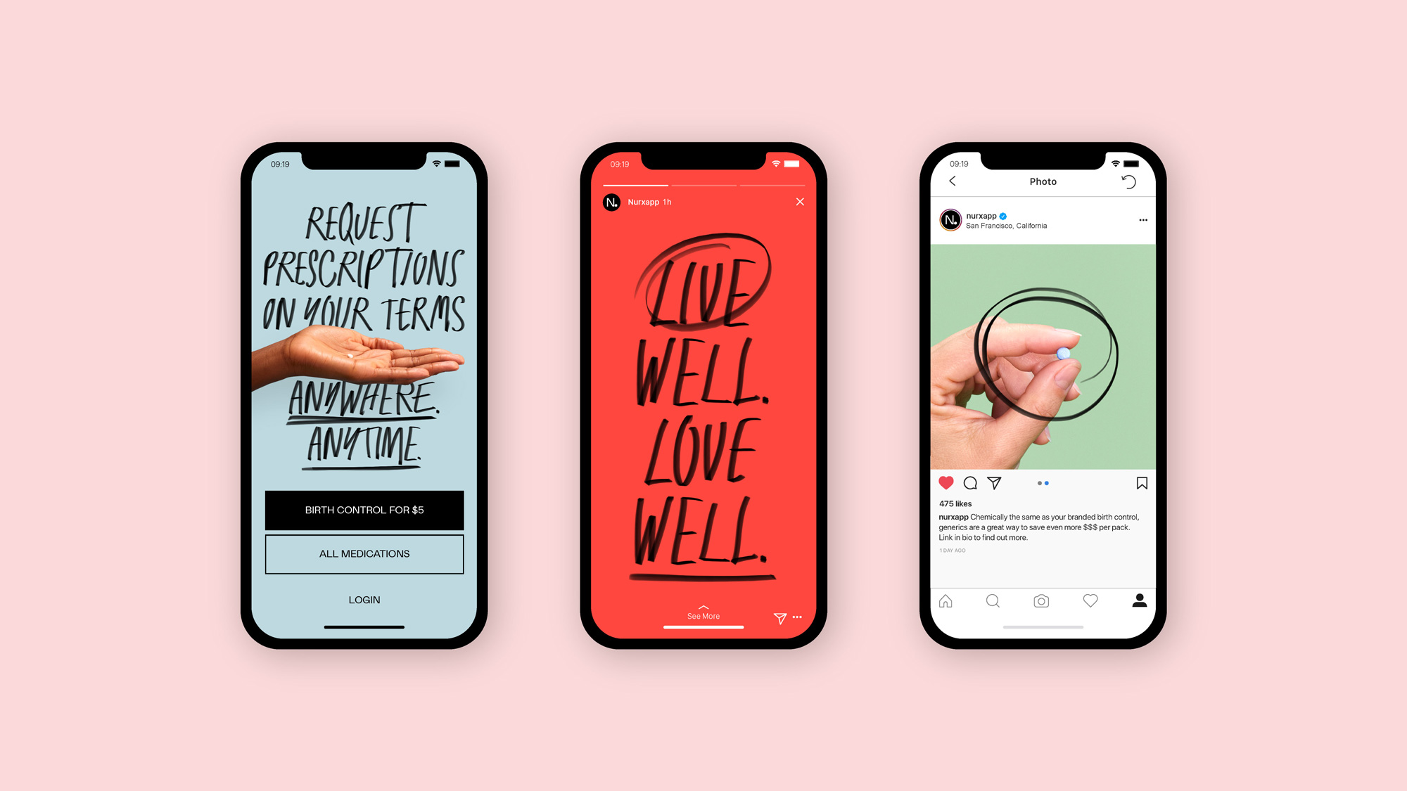
Hand-drawn fonts are hard to pull off convincingly in an identity but this is really well balanced in mixing the five different fonts, the scribbles, the photography, and the normal typography — especially in the website which manages to be both informative and manifesto-y.

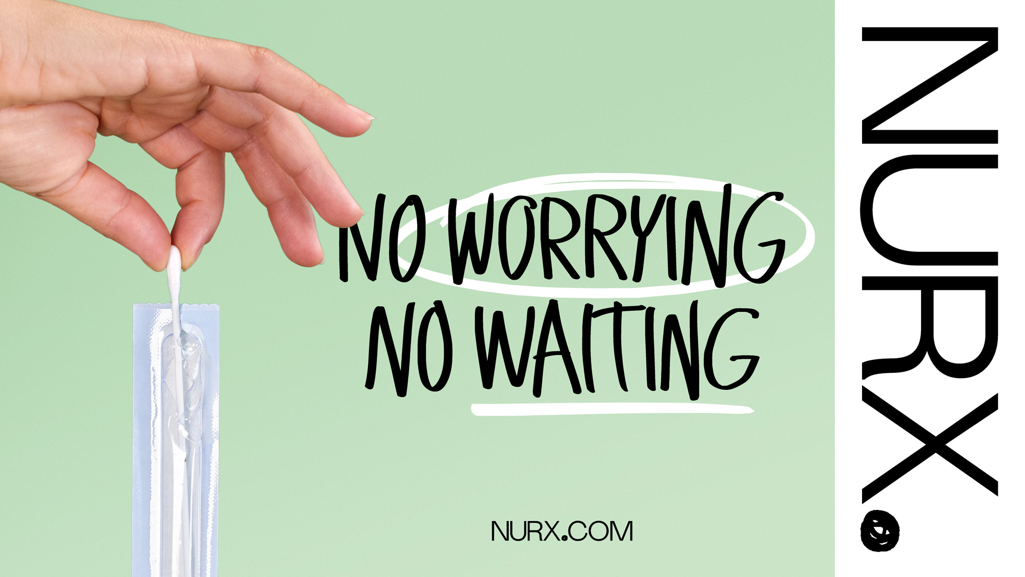
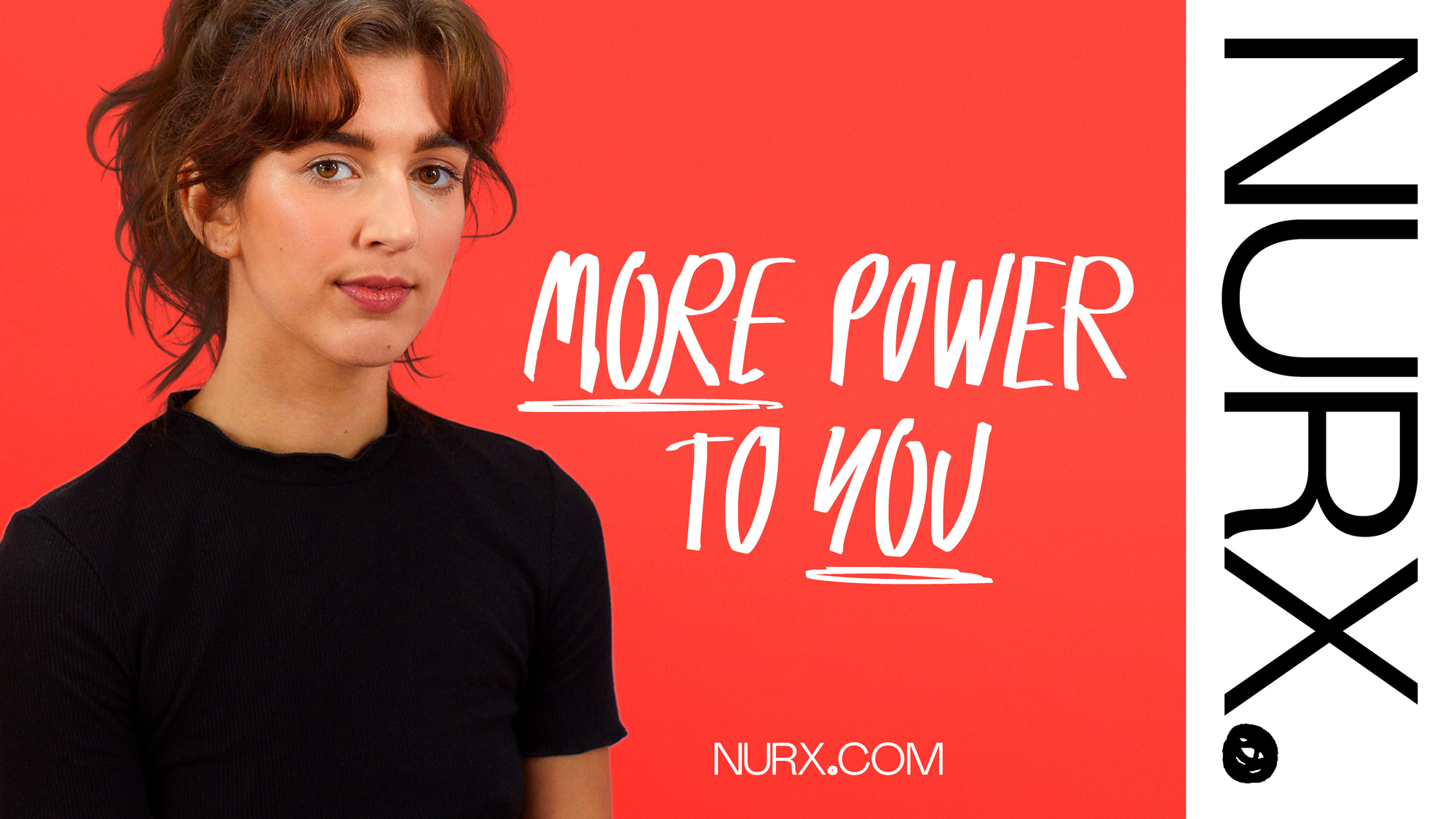
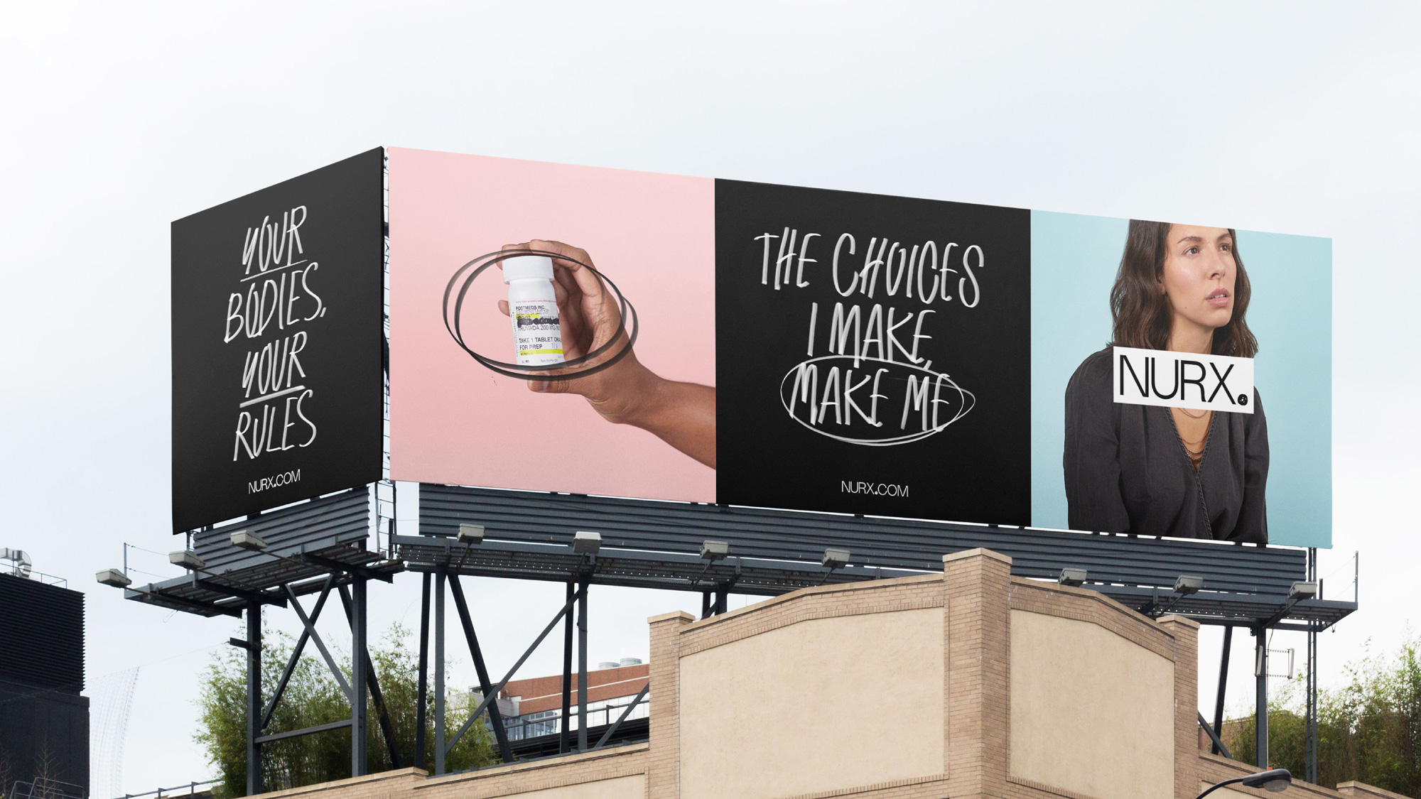
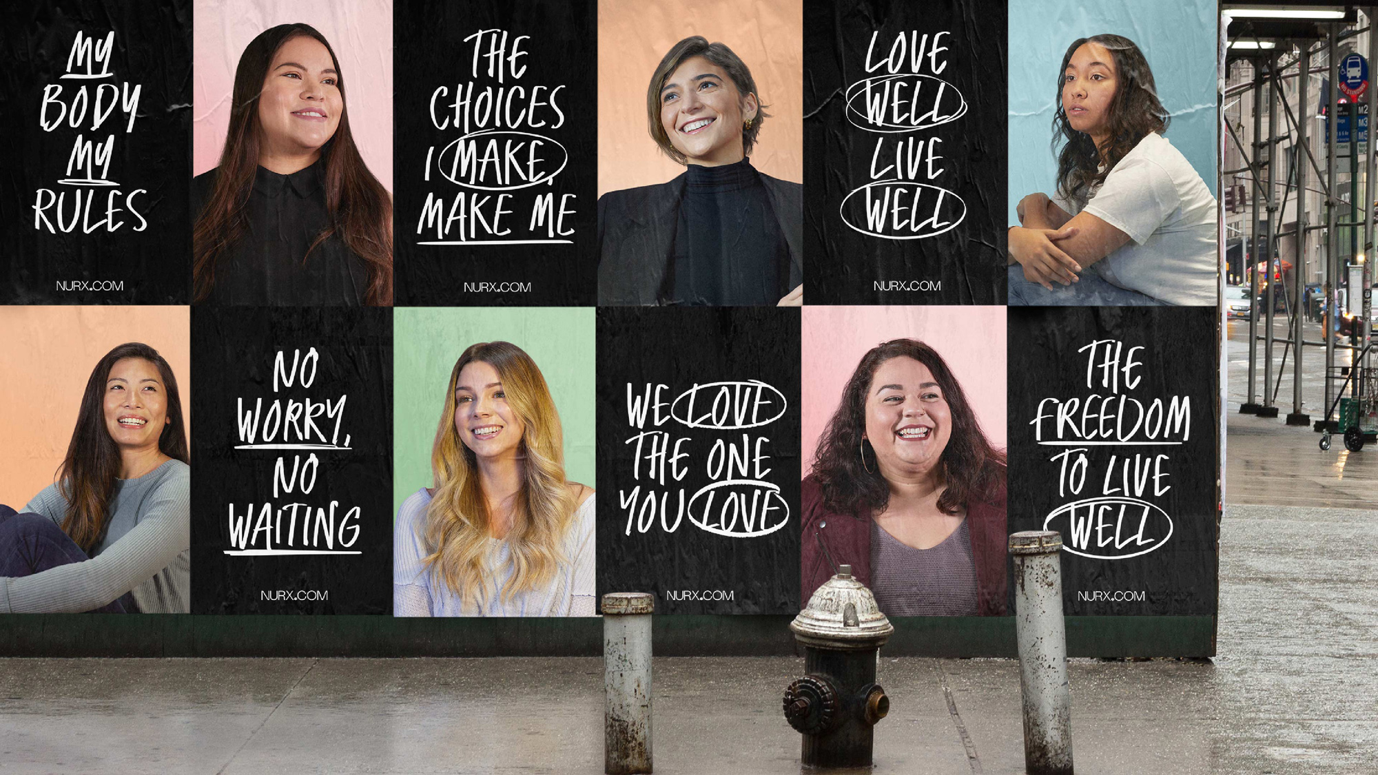
The identity has great flexibility to mix and match its elements in different configurations while still feeling cohesive. The posters and billboard above are fairly different from the two applications above it but they are still clearly part of the same brand.
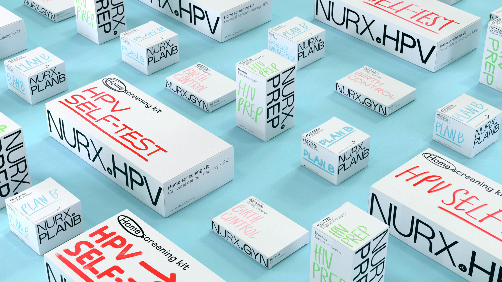
Although I love the packaging and this is a fantastic photo presenting it, I think it defeats the purpose of privacy and discretion. I assume these get shipped in a regular kraft box so the whole neighborhood won’t see what you are getting delivered but once inside the house, these are hard to hide in cases where that’s a concern. So maybe just dialing these down from 11 to a 5 or 6 would be okay. Still, it’s yet another great extension of the identity system and its elements.
Overall, this is a great identity that feels different from a lot of the stuff we’ve been seeing recently by being relatively more rough, rugged, and in your face without the pretty colors, soft sans serifs, and cute illustrations, helping Nurx communicate its mission more effectively and memorably.

 Новости Союза дизайнеров
Все о дизайне в Санкт-Петербурге.
Новости Союза дизайнеров
Все о дизайне в Санкт-Петербурге.