Обзор лучших ресурсов по разработке бренда, разработке упаковки
contact us | ok@ohmycode.ru
contact us | ok@ohmycode.ru
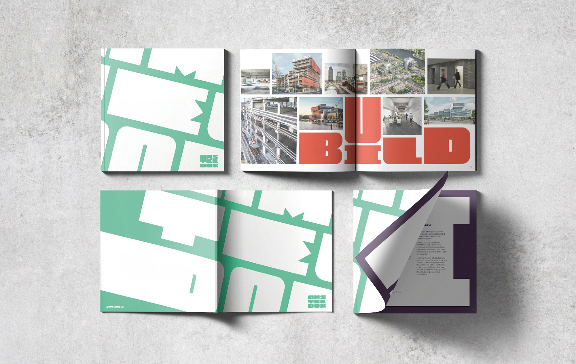
Opened on April 2019, Amsteldok is the new consolidated headquarters of all fifteen WPP agencies in Amsterdam that were previously spread out across eleven different locations. A 1970s building on the banks of the Amstel river has been renovated by WPP’s BDG and now serves as a 204,000-square-foot campus for 1,500 employees. Maintaining the original box-stacked structure, the building has renovated roof terraces, restaurants, a rooftop bar, a business lounge, an event space, and a range of co-working, conference, and hospitality spaces. The identity and signage for Amsteldok has been designed by WPP’s VBAT.
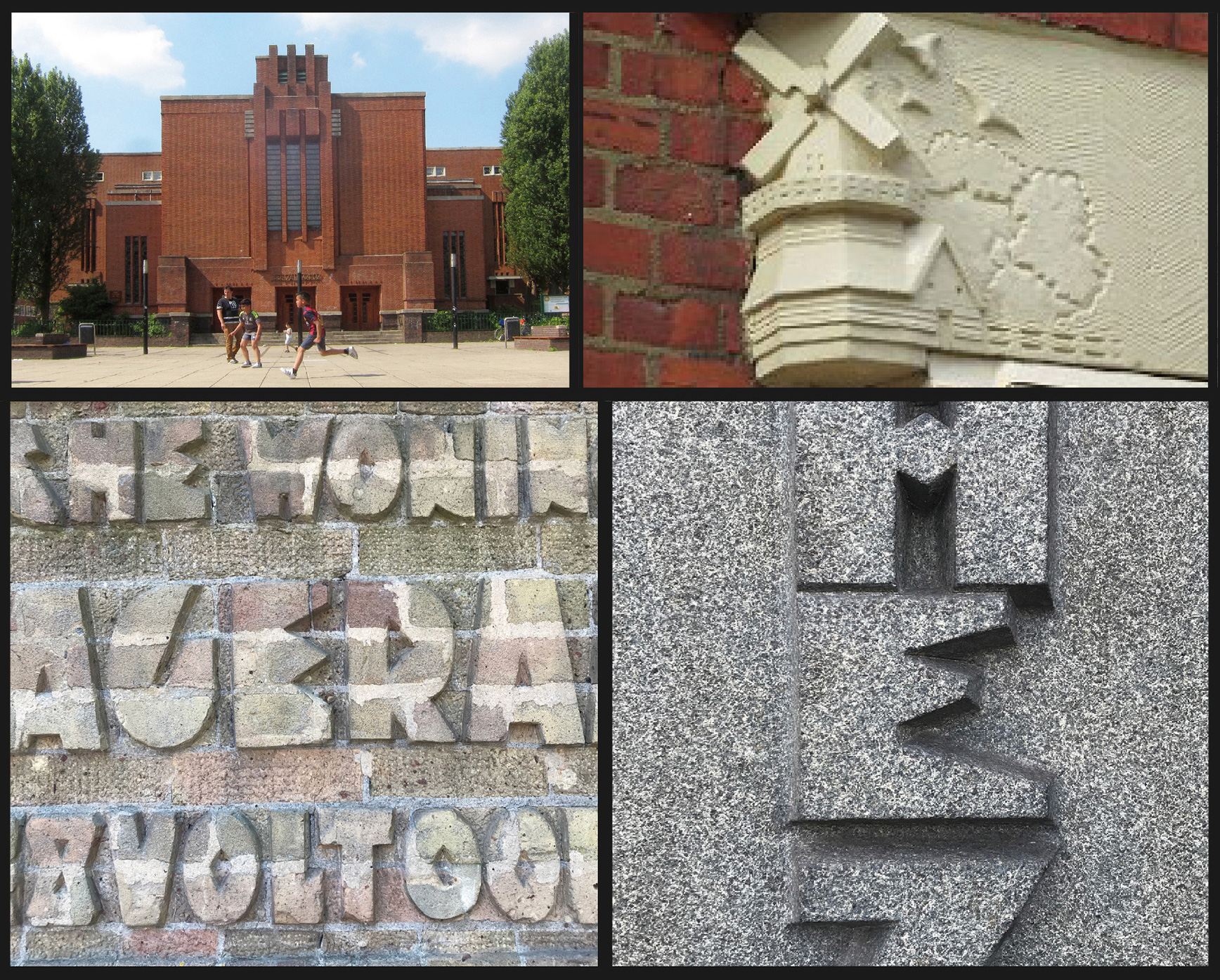
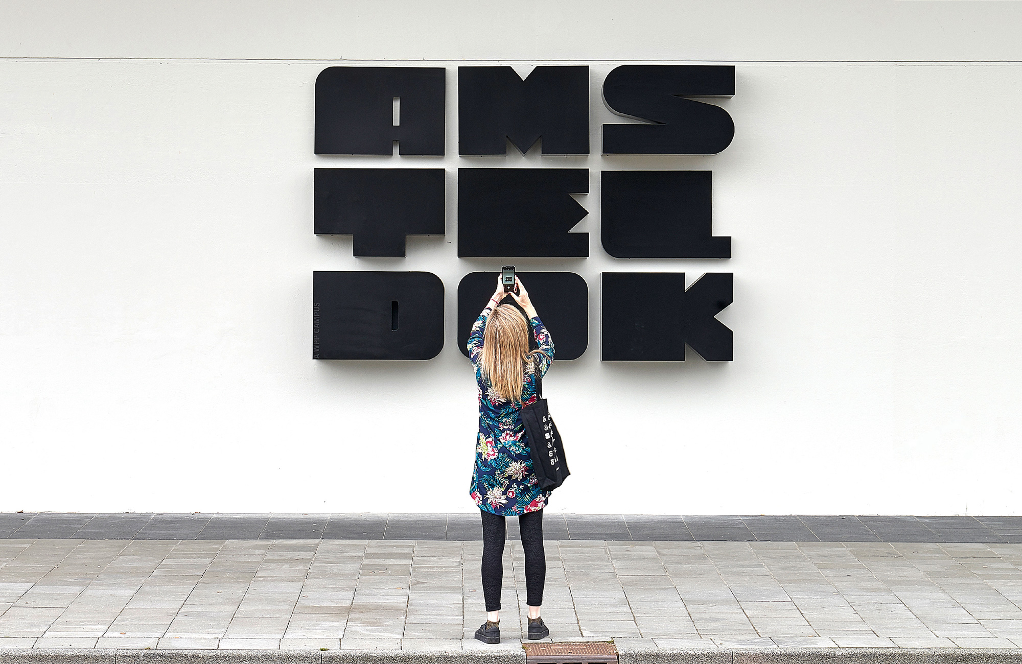
We named the campus Amsteldok. Its name references the campus’s location on the banks of the Amstel River, Amsterdam’s maritime history and the city’s current status as an important gateway to Europe. We wanted a logotype that was directly inspired by the physical structure and found the Amsterdam School of Architecture - an expressive 20th century style predominant throughout the city - an important inspiration for our typographic forms. We envisioned a dynamic logotype that mimicked the campus’s urban verticality, and a graphic language that fully embraced the campus strategy as a ‘breathing space that breaks down walls’. Responsible for all physical and digital environments, we were in a unique position to use design to bring all 15 WPP agencies together. Design would contribute to the campus as a living entity, not just another staid structure. A campus that breathes creativity and collaboration.
I usually put the summary video presentations at the end but this time I think it helps to see the concept and animations upfront.
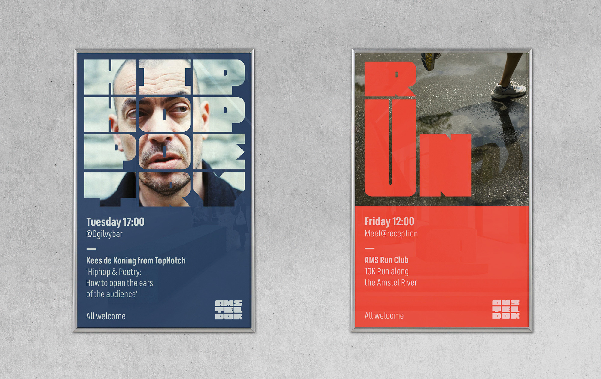
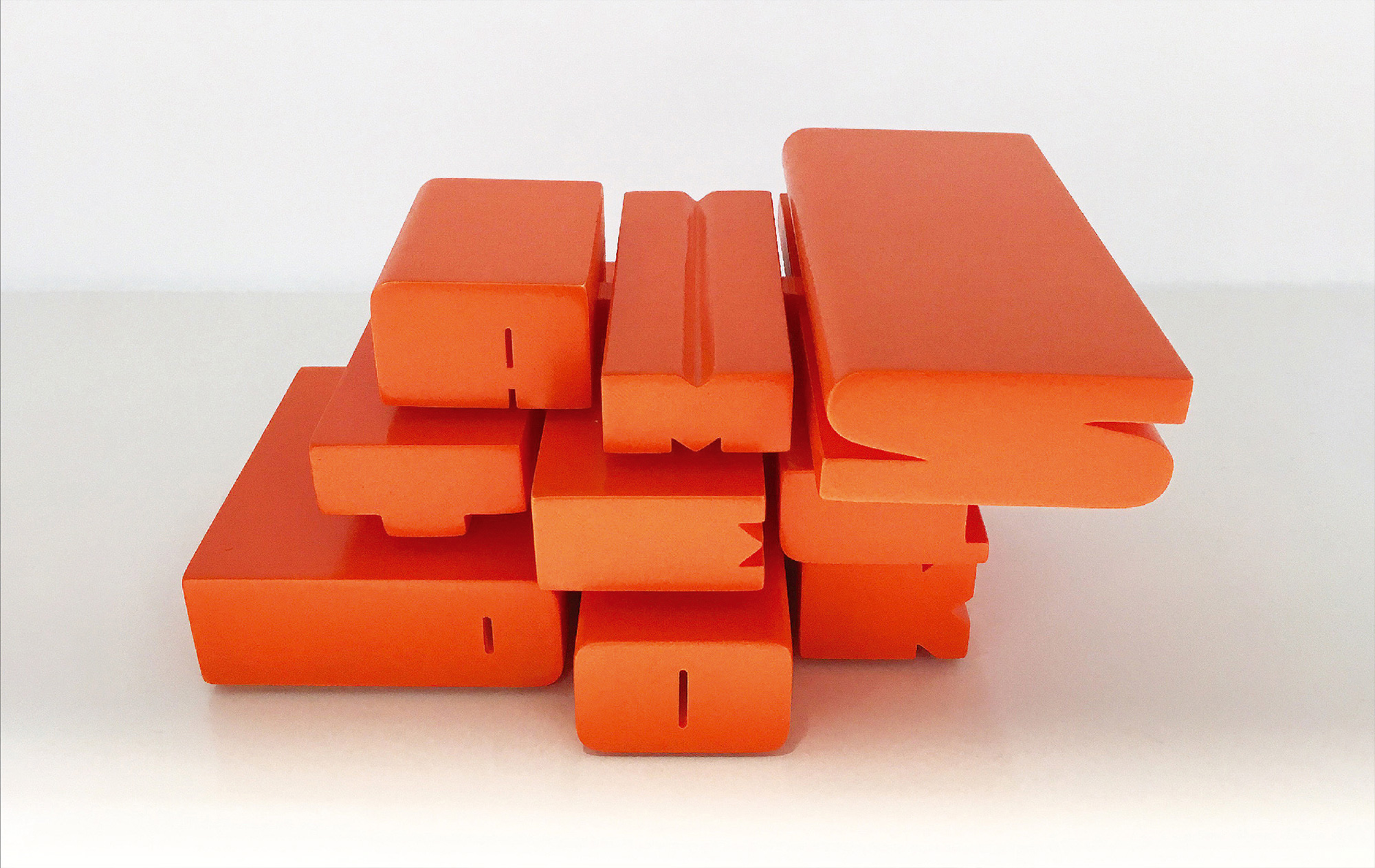
The logotype was created by initially experimenting with the letter proportions, while maintaining the core essence of the mark. Several final versions became “font masters” which could then be interpolated and blended to create a huge number of new variations.
The reinterpretation of the typography found in the neighborhood’s buildings into a contemporary execution is the first great thing about this project. Between VBAT and Fontsmith, they were able to maintain the quirkiness, clunkiness, and charm of the original points of reference and transfer them into a modular, expandable logo and type system for modern-day applications. I probably would have even been satisfied with the static, full-justified version of the logo alone and if it had been repeated ad nauseam in the applications because it’s such a unique set of characters in a tight, bold composition. The variable extensions add layers of welcome whimsy and useful flexibility that have spurred some playful applications.
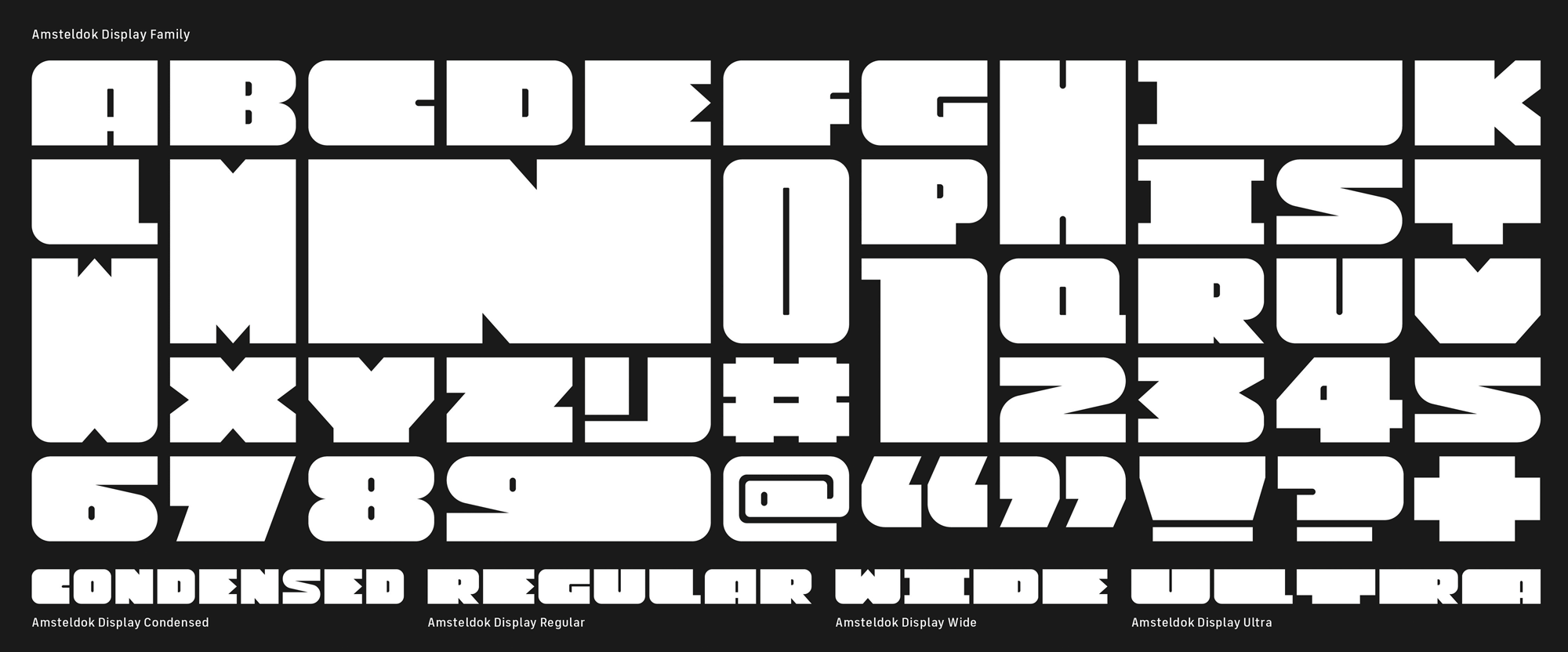
The type family, as a starting point for the animations and applications, is awesome and I love how modular it can be as well as how free it is in deforming characters to fit the different widths.
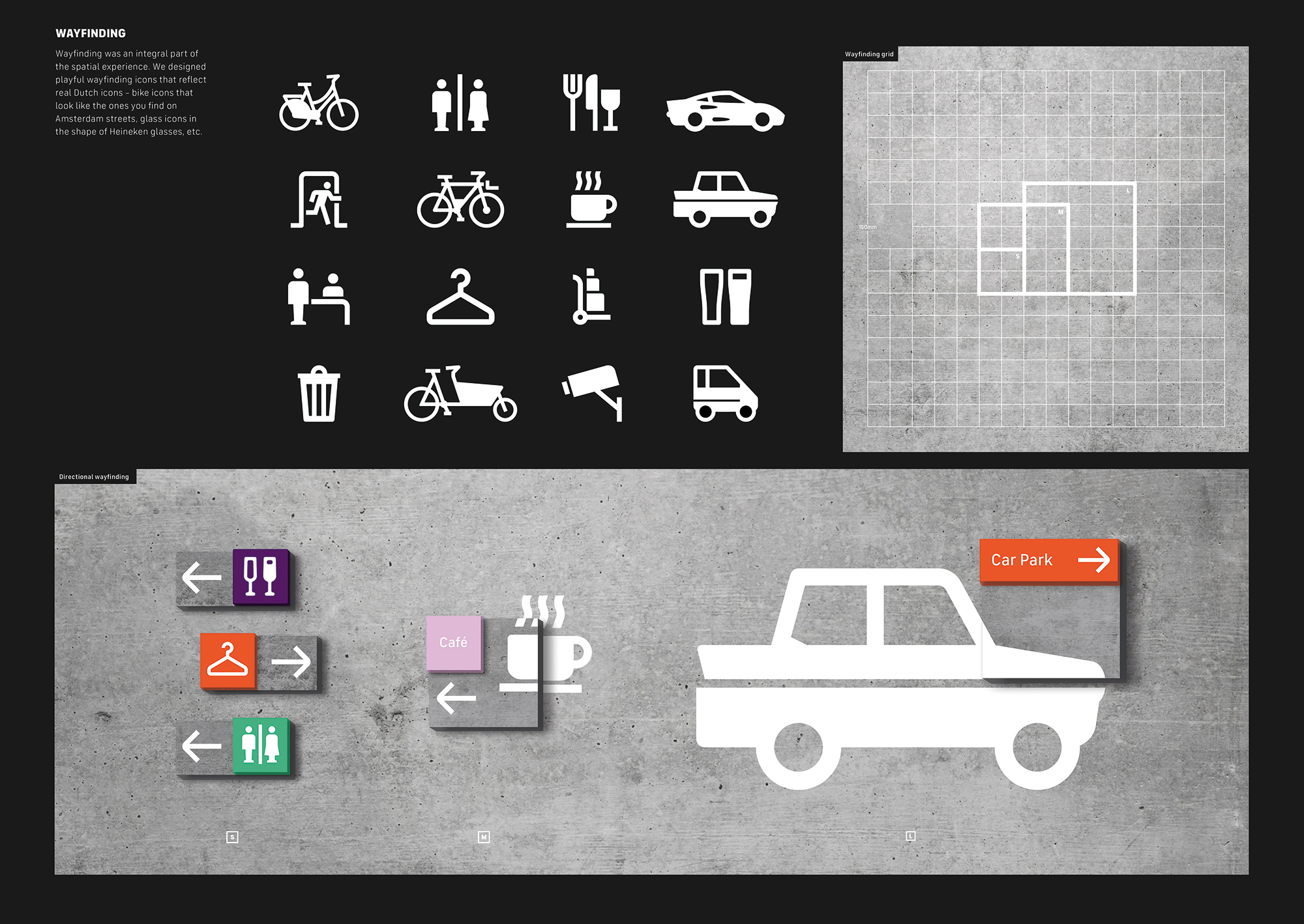
Like all signature Amsterdam School structures, we embedded the identity into the physical campus: tactile hero signage, typographic floor furniture, etched wall renderings, crafted directory totem and embossed counters. The logotype also functions as a template for all online/digital programming and communication - from digital posters, announcements and social events (speakers’ programs). The colour palette was also directly derived from the architectural materials used by the architects. Wayfinding was an integral part of the spatial experience. We designed playful wayfinding icons that reflect familiar Dutch things - bike icons that look like the ones you find on Amsterdam streets, glass icons in the shape of Heineken glasses, etc. All these elements contribute to a real campus identity and unite 15 radically different WPP agencies as a single whole.
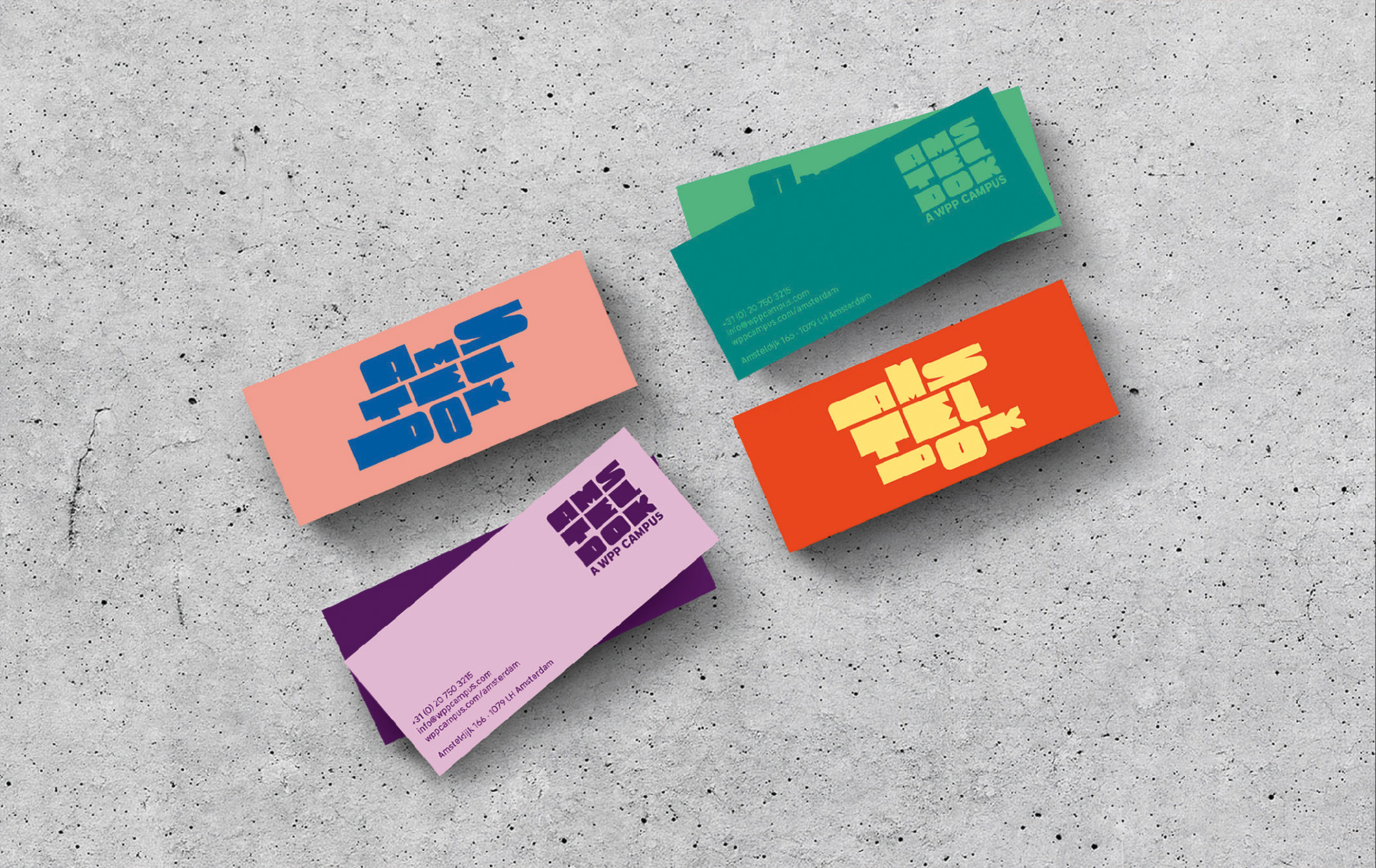
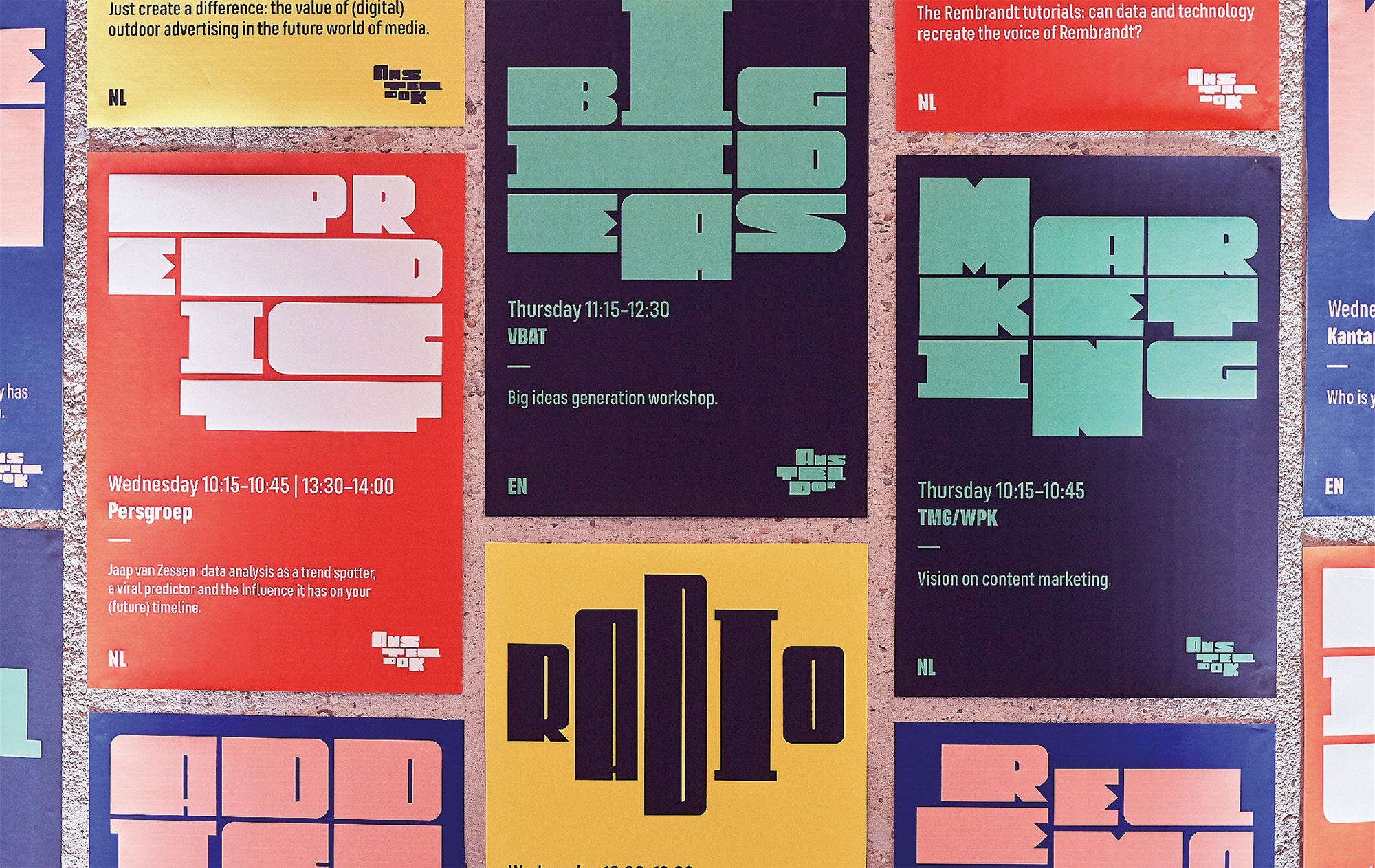
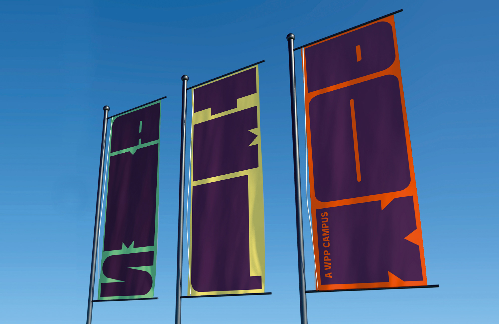
The print applications are good and fun, making the most out of the stretchiness of the type — perhaps sometimes taking it a little too far (like, I’m not sure about that “RADIO” type a few scrolls above) — and pairing it with Fontsmith’s FS Industrie. The only thing I would question is the color palette which is all over the place. It’s good in that, yes, it provides added flexibility but it’s almost like there is no real point of view on the color, just a free-for-all.
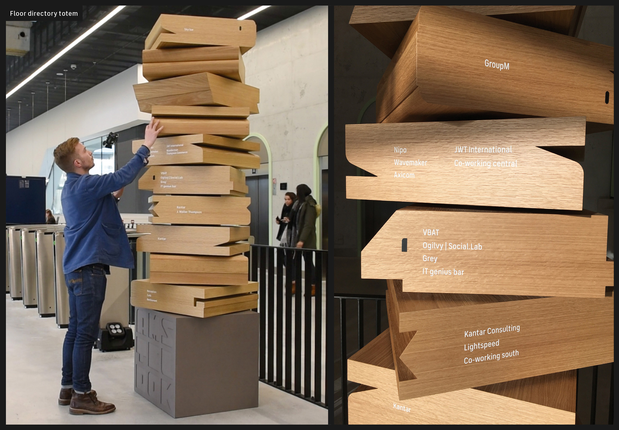
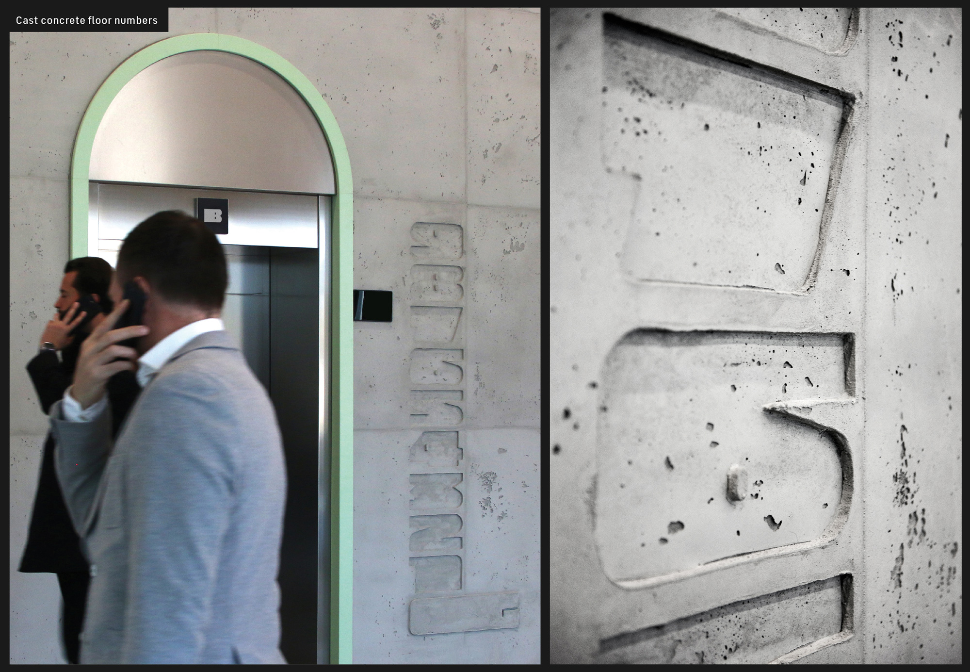
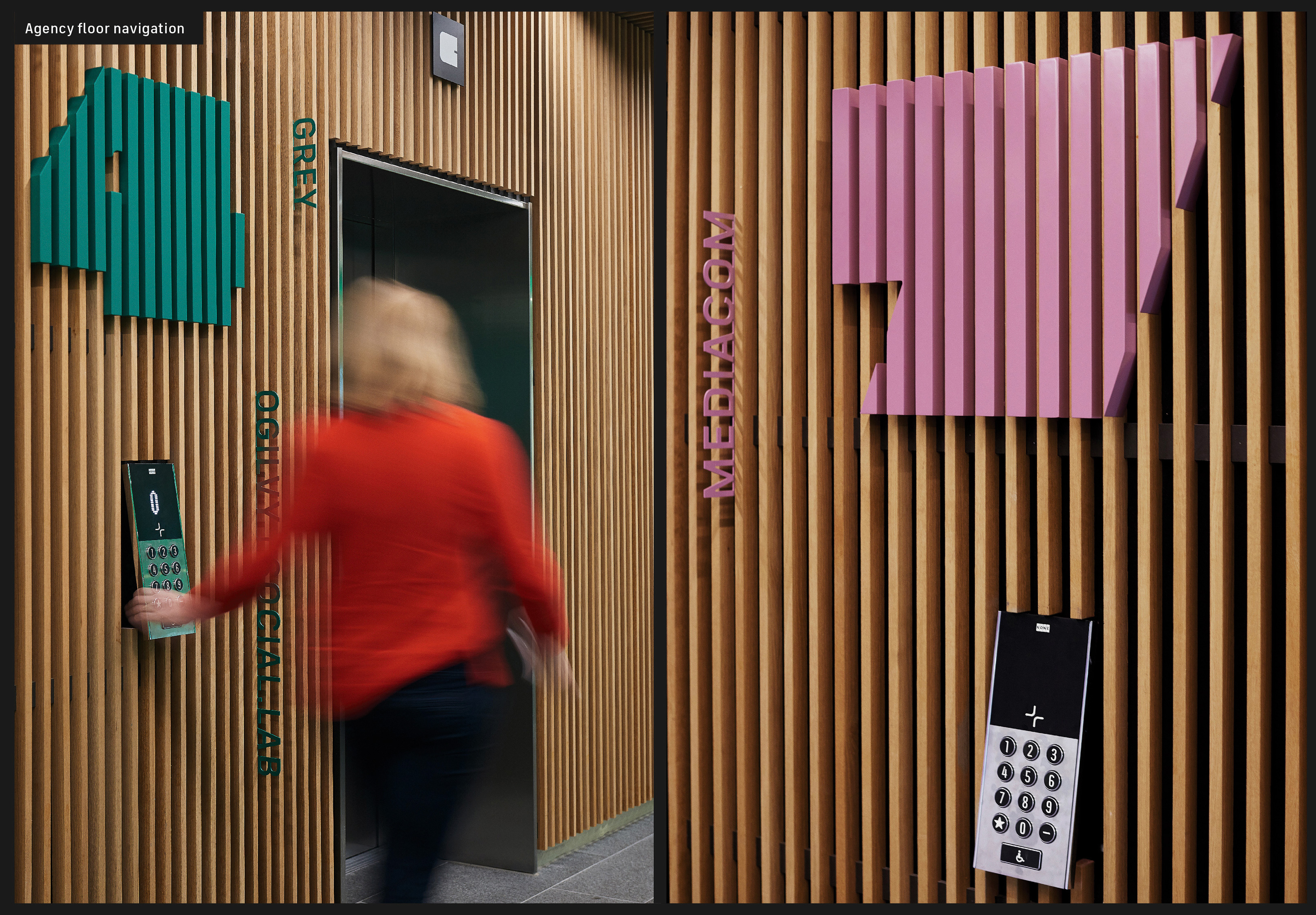
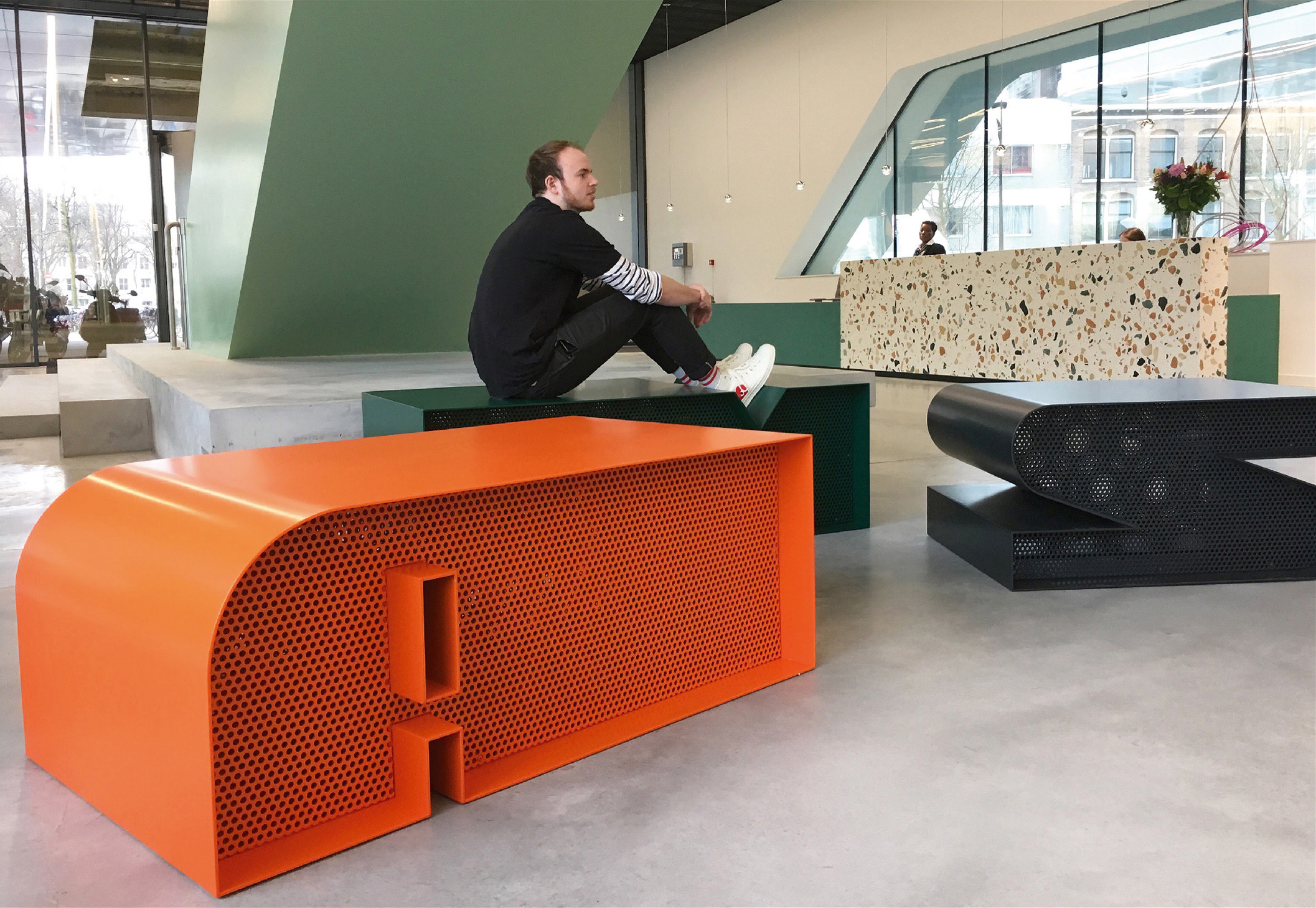
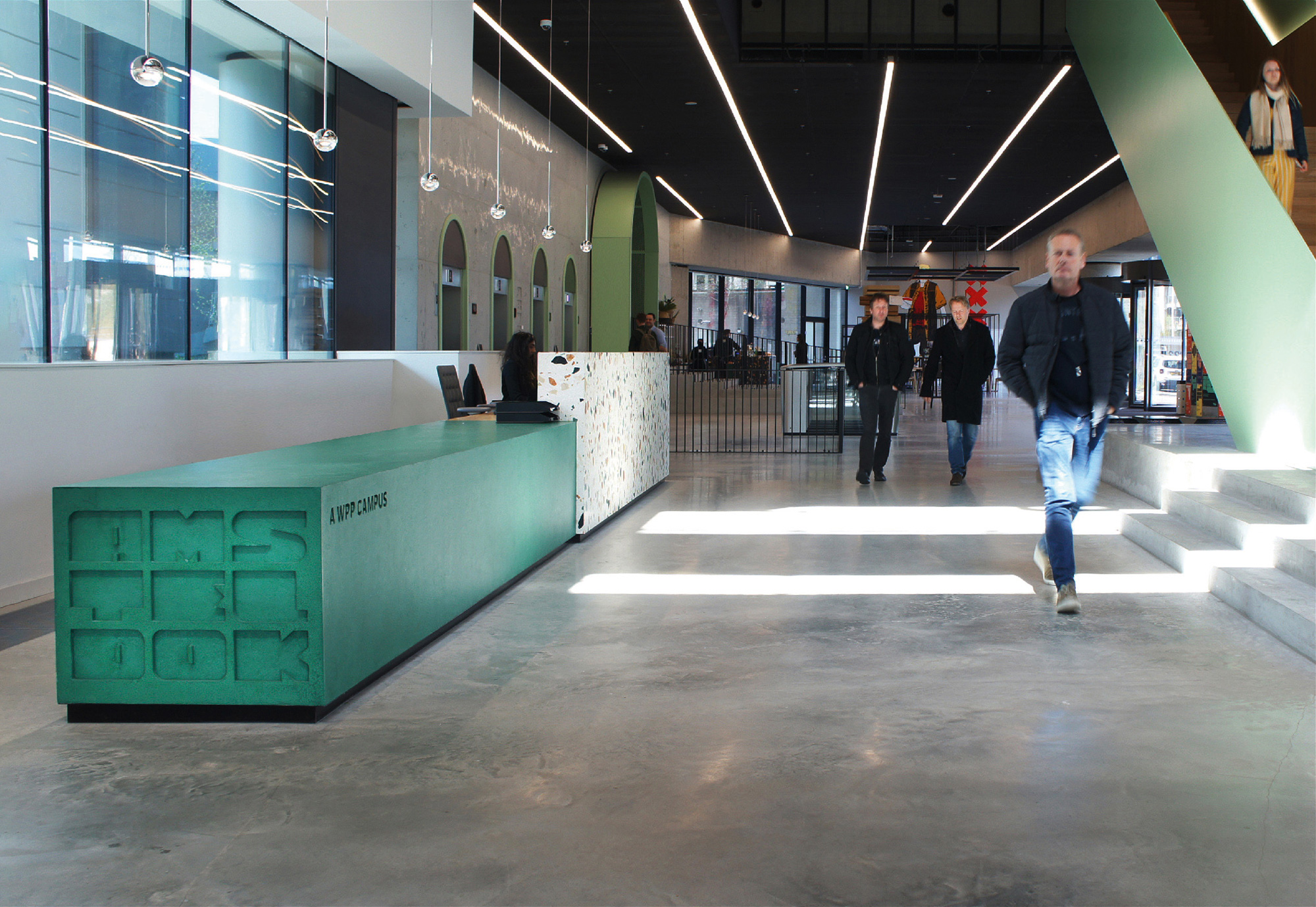
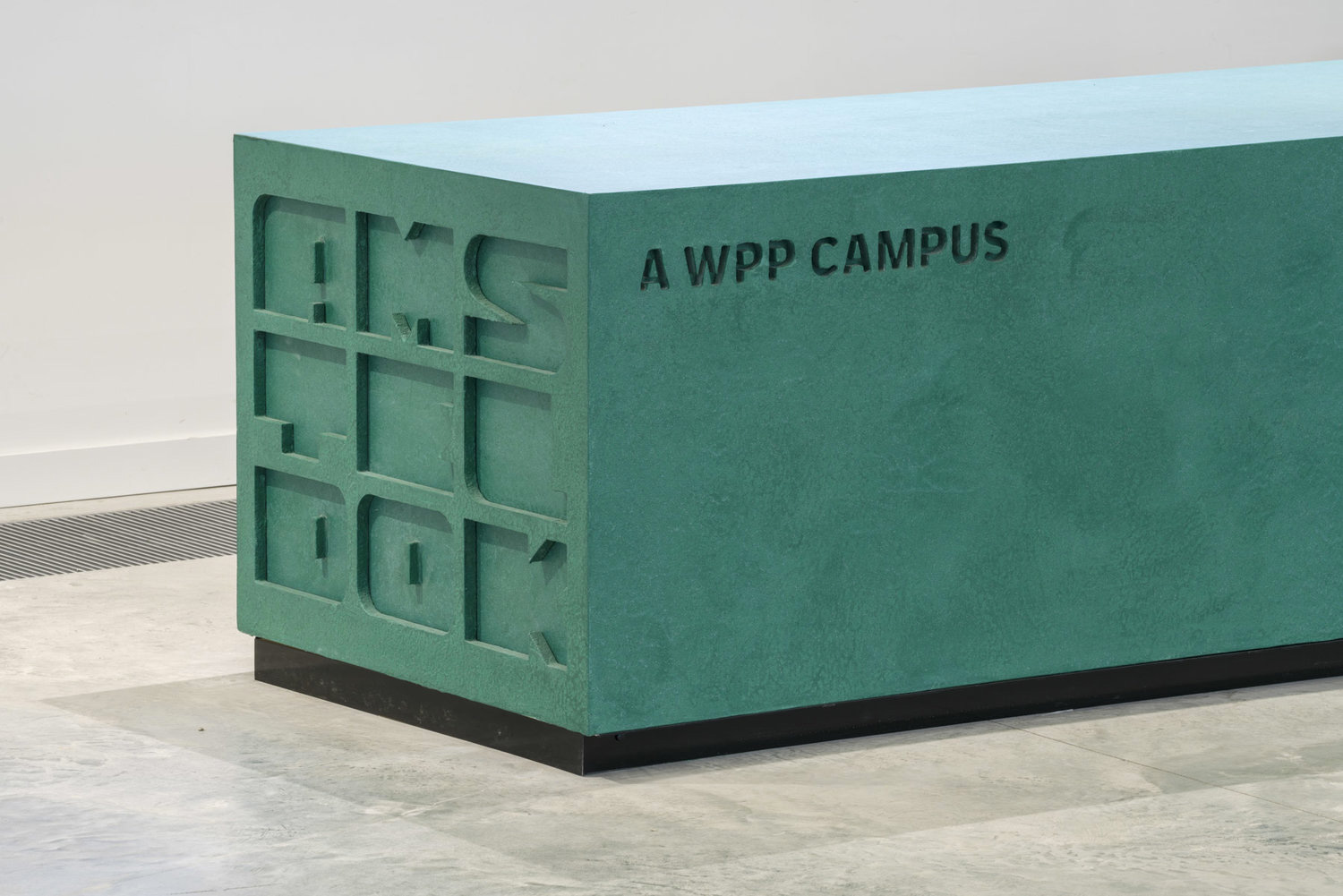
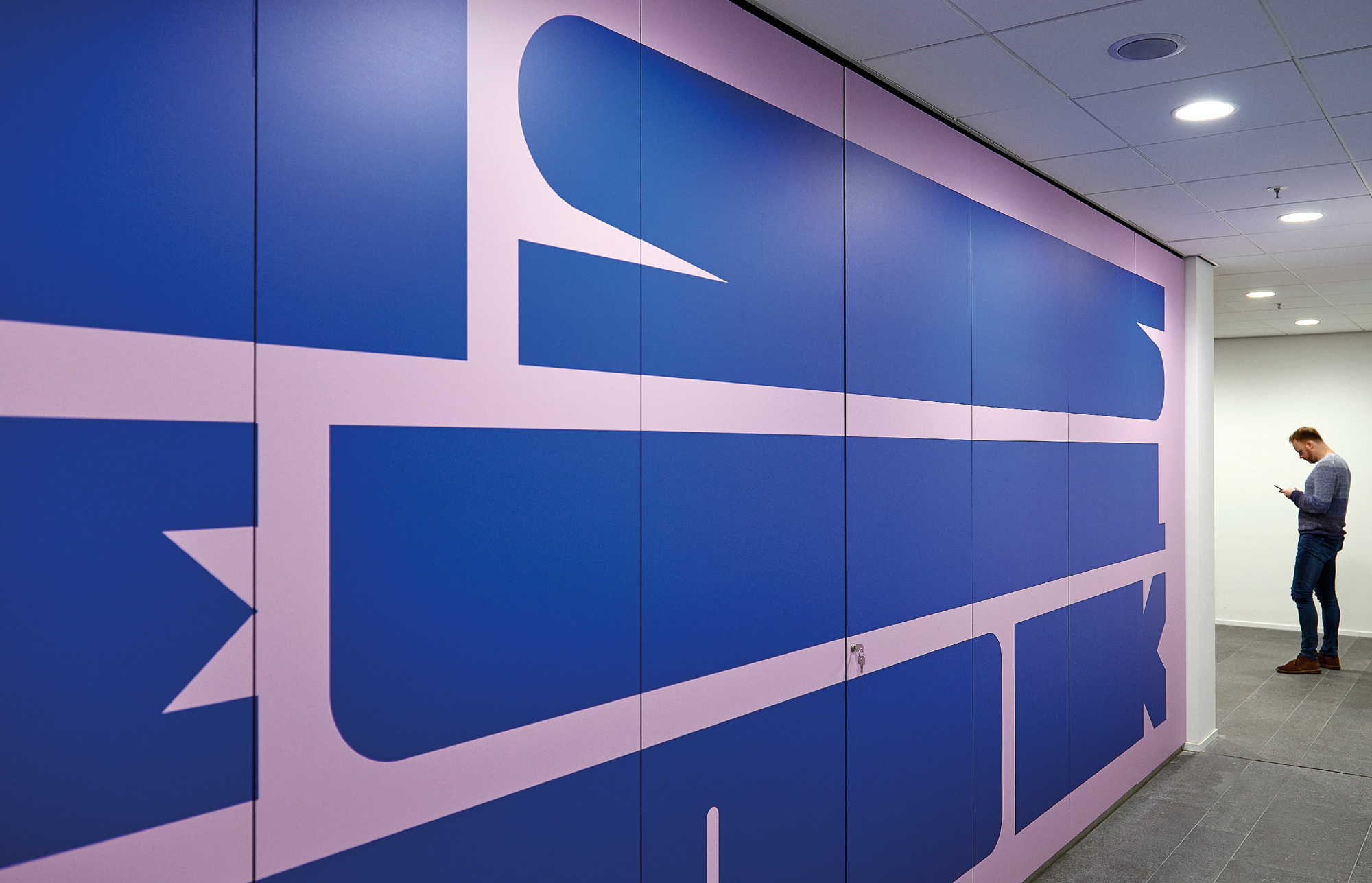
The signage and environmental graphics are out of control cool. Every application in this last group of images is awesome in its own ways and together they create a unique space experience that even though they are wildly different executions — concrete numbers (swoon!), steel benches, wood slats — they are all neatly united by the unique typography.
With a big budget for a creative conglomerate in one of the most design-forward cities in the world this project has a lot going in its favor to start with but this could have easily been a safe, well-appointed corporate headquarters. VBAT (and WPP), however, really embraced the opportunity to do something different and unique and went full-in on bringing the concept to life.

 Новости Союза дизайнеров
Все о дизайне в Санкт-Петербурге.
Новости Союза дизайнеров
Все о дизайне в Санкт-Петербурге.