Обзор лучших ресурсов по разработке бренда, разработке упаковки
contact us | ok@ohmycode.ru
contact us | ok@ohmycode.ru
Helsinki is the capital city and most populous municipality of Finland with approximately 1.4 million people. As Fodor’s explains, it is “Spectacularly entwined with the Baltic’s bays, inlets and islands, Helsinki’s boulevards and backstreets are awash with magnificent architecture, intriguing drinking and dining venues and groundbreaking design.” And from Wikipedia, “Helsinki has one of the highest urban standards of living in the world. In 2011, the British magazine Monocle ranked Helsinki the world’s most liveable city in its liveable cities index. In the Economist Intelligence Unit’s 2016 liveability survey, Helsinki scored ninth place among 140 cities.” So, it’s a nice place. Last year, the city began the process to create an identity that would encompass tourism, business development, and city operations that is now beginning to roll out. The identity has been designed by local firm Werklig.
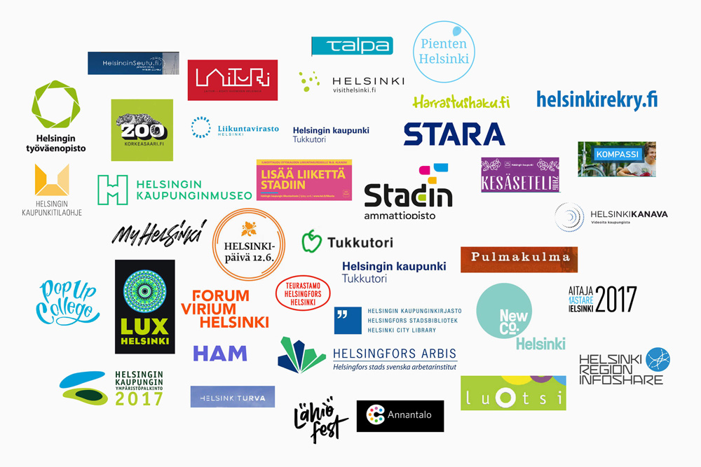
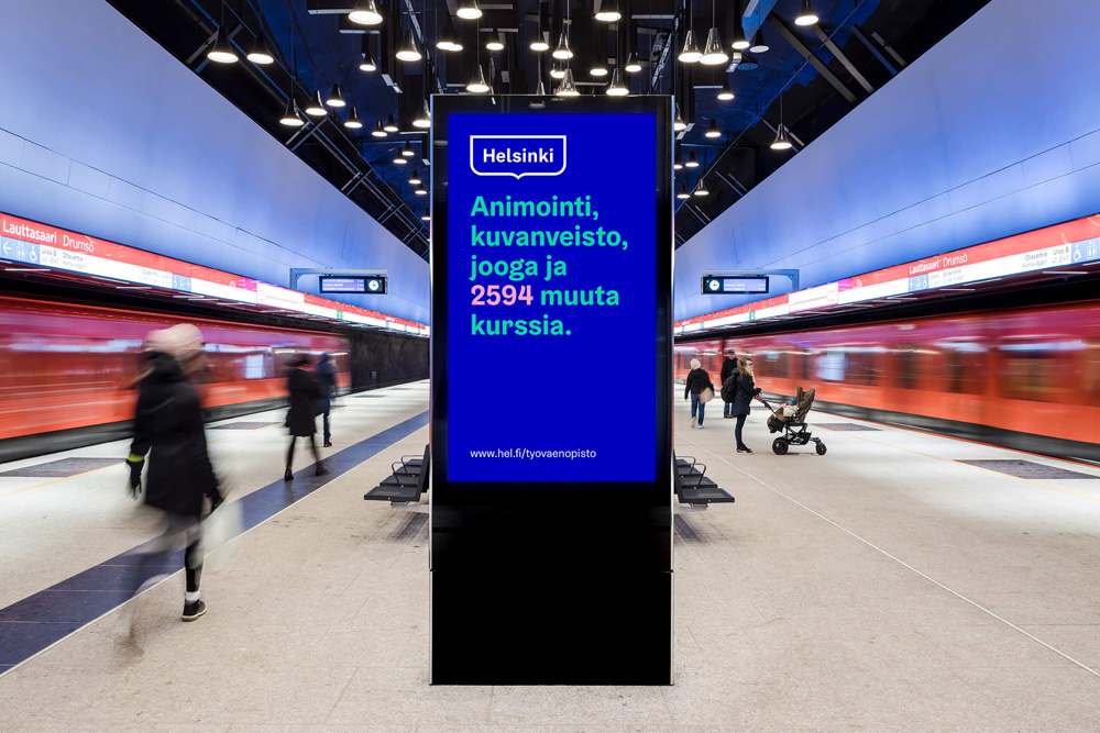
The target audience was basically “everyone”, starting from 40,000 City employees to Helsinki residents, other Finns, foreigners, tourists, immigrants and special groups. This amplified the need for a flexible and memorable identity that is also easy to use.
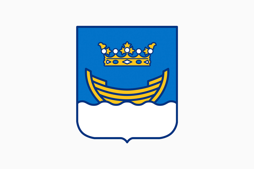
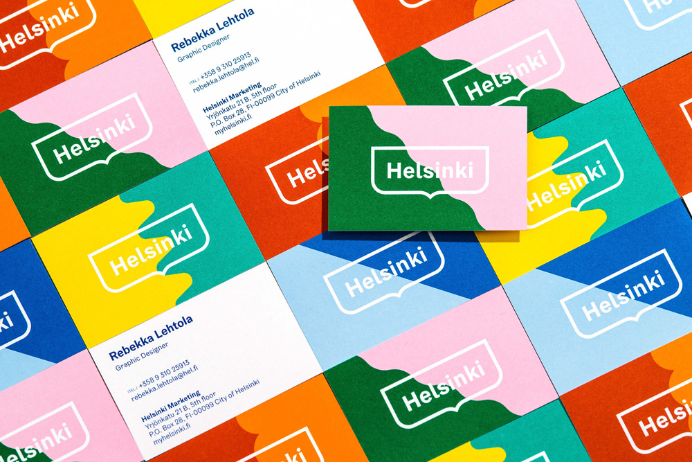
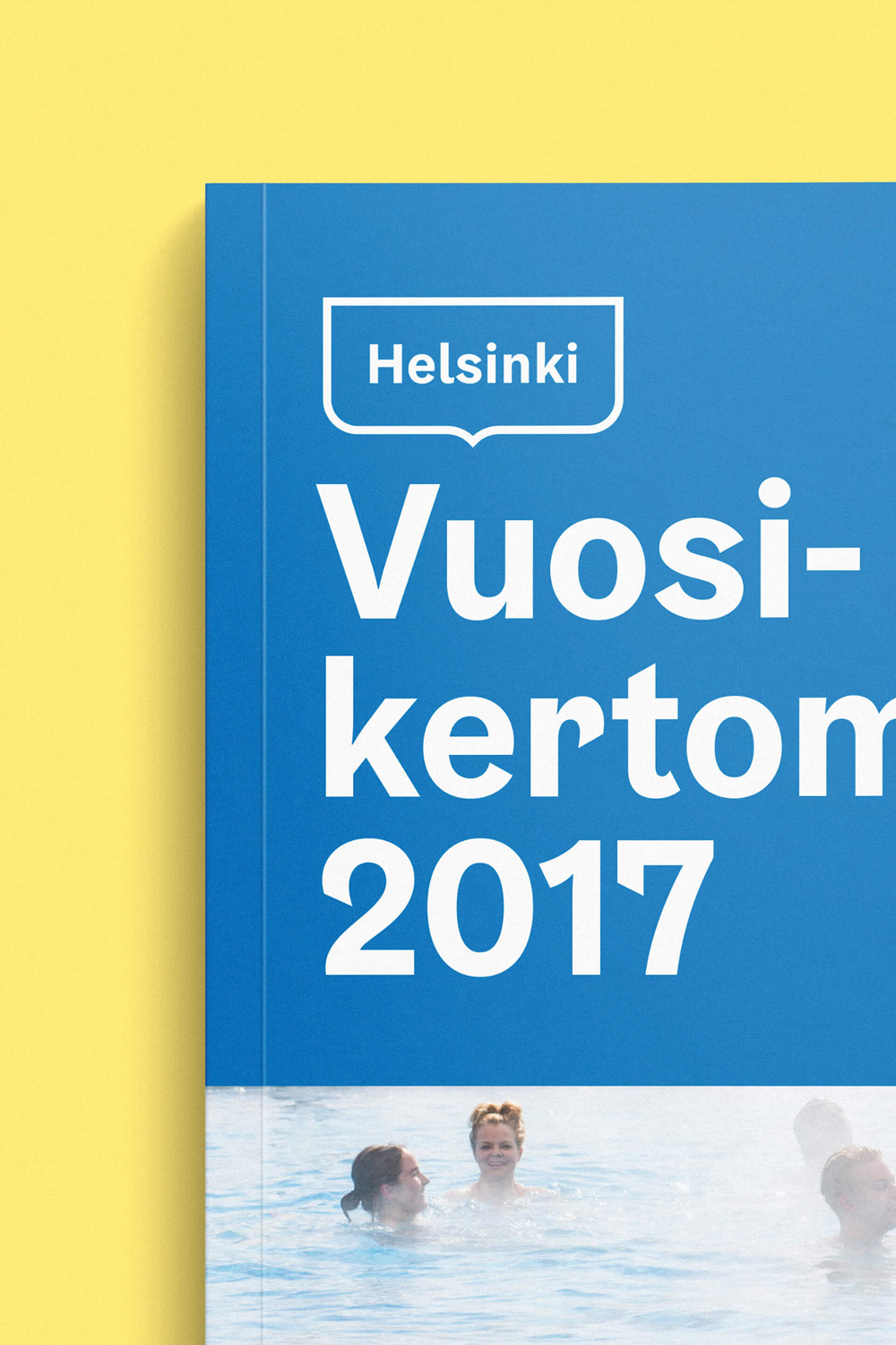
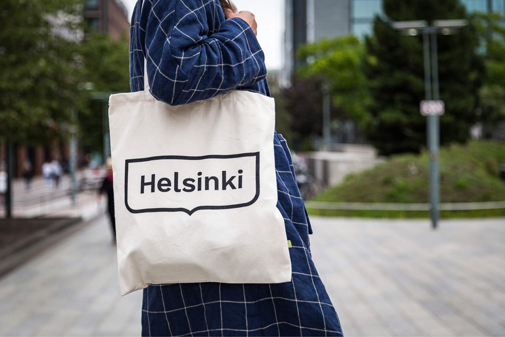
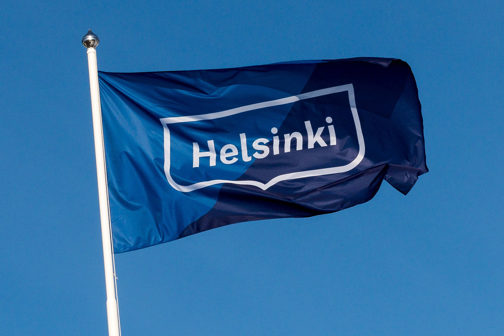
The spearhead of the identity-Helsinki logo-was designed based on the most recognisable Helsinki symbol, the traditional Helsinki crest. The new logo was designed to be adaptive and responsive to any content, for example, different language versions of the logo.
The graphic wave motif (and its variations) used as a graphic element was also derived from the coat of arms.
When I first saw this project — months ago, when only the logo had been announced — I didn’t know the holding shape of the logo came from Helsinki’s coat of arms, since I don’t keep up with all of Europe’s cities’ coats of armseses, and I thought that it was an attractive shape but it seemed kind of random. Now, knowing it comes from the coat of arms — a symbol most locals will be very familiar with — I can fully appreciate its simplicity, effectiveness, and the right amount of flair provided by the little pinch at the bottom. I also love how they took the wave motif from the coat of arms and expanded it into a key identity element that complements the logo (as opposed to making the holding shape wavy on the top). The wordmark is quite nice (check out that angle synergy between the “l” and the “s”!) and because of all the ascenders and the tittles and the lack of descenders it middle-aligns quite neatly in the shape. The color and language variations demonstrate a very satisfying and simple flexibility.
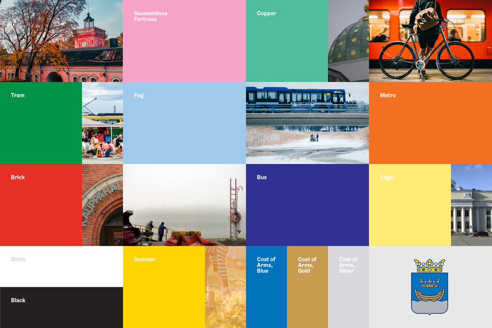
The brand colours are subconsciously familiar to citizens—they are the colours used in the Helsinki crest, the cupola of Helsinki Cathedral and colours of the tram and metro, etc.
A custom typeface with typographic “wavy” details, Helsinki Grotesk by Camelot, was customized to be used consistently in all Helsinki City communication.
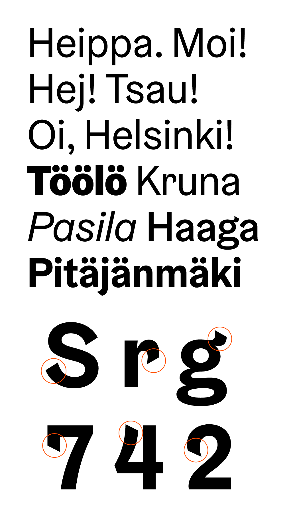
I really like the custom type family as it has a slightly quirky personality but it’s also mostly serious.
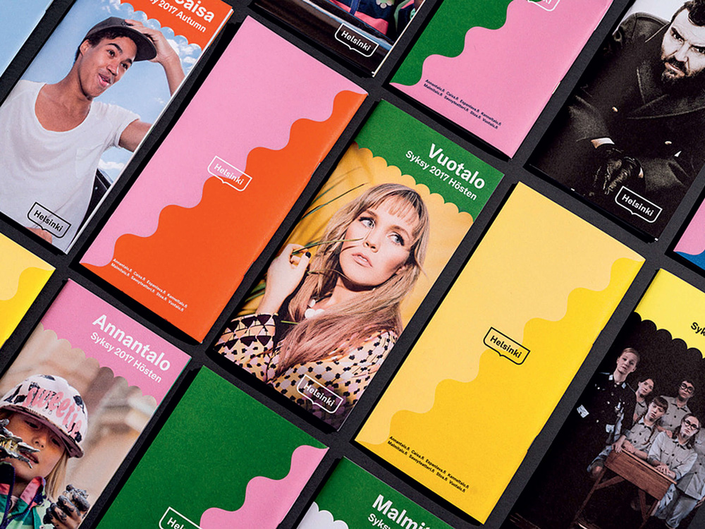
The wave motifs of the identity are my favorite part. They are playful and functional, helping frame content while making the materials look lively. The myhelsinki.fi website is a great example of the duality of the identity in that it looks very put together and official but it also feels loose and relaxed.
This is a very difficult project in that it’s a logo that is going to be used across city services as well as a tourism and marketing brand for the city and I think that Werklig did a fantastic job in arriving at something that is rooted in existing and relevant iconography and the logo’s simplicity allows it to be more serious for city purposes but more effusive for marketing purposes through the wave motifs. Overall, this is a great system with a strong, recognizable logo at its core.
Thanks to Jenni Mällinen for the tip.

 Новости Союза дизайнеров
Все о дизайне в Санкт-Петербурге.
Новости Союза дизайнеров
Все о дизайне в Санкт-Петербурге.