Обзор лучших ресурсов по разработке бренда, разработке упаковки
contact us | ok@ohmycode.ru
contact us | ok@ohmycode.ru
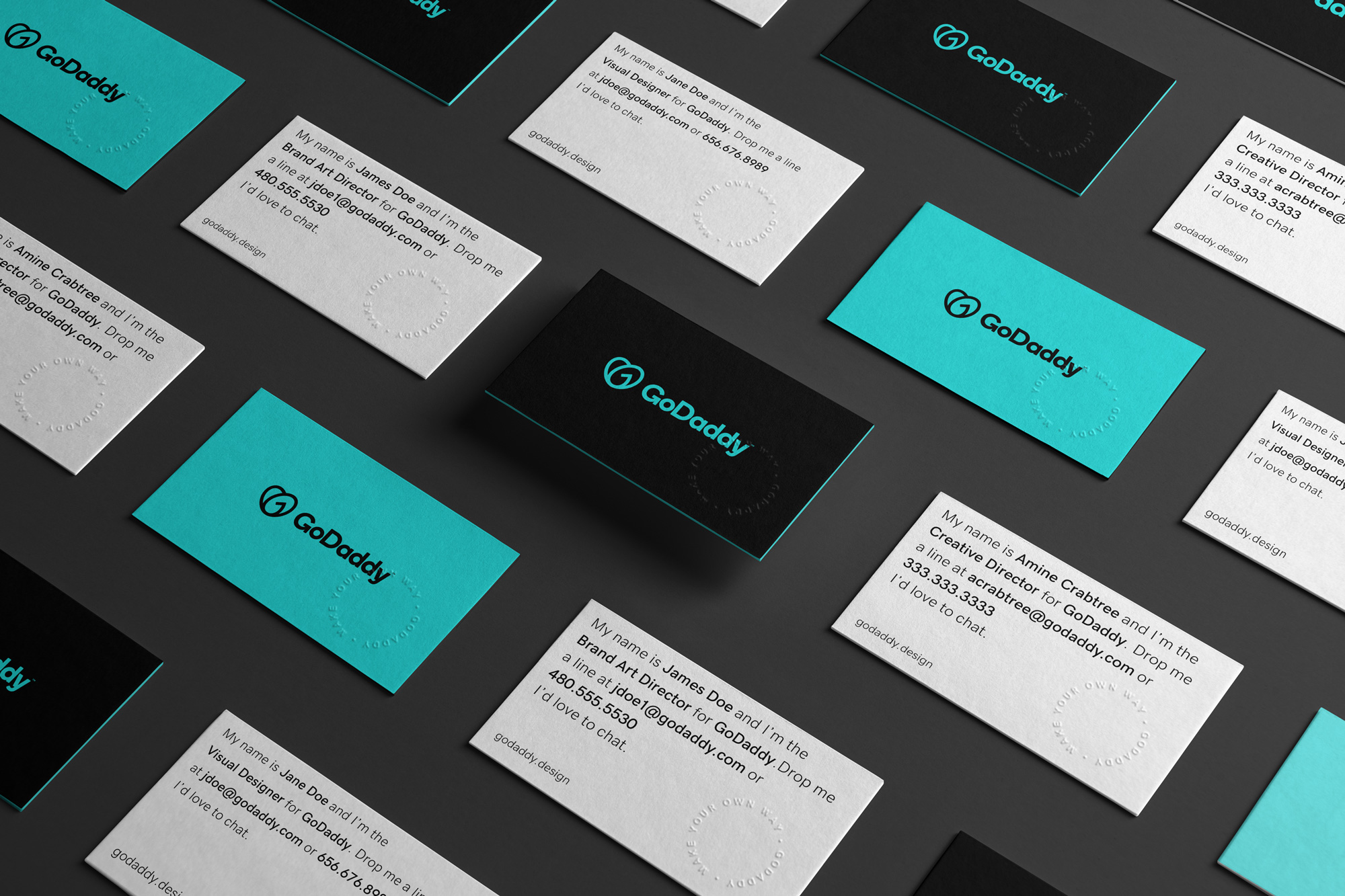
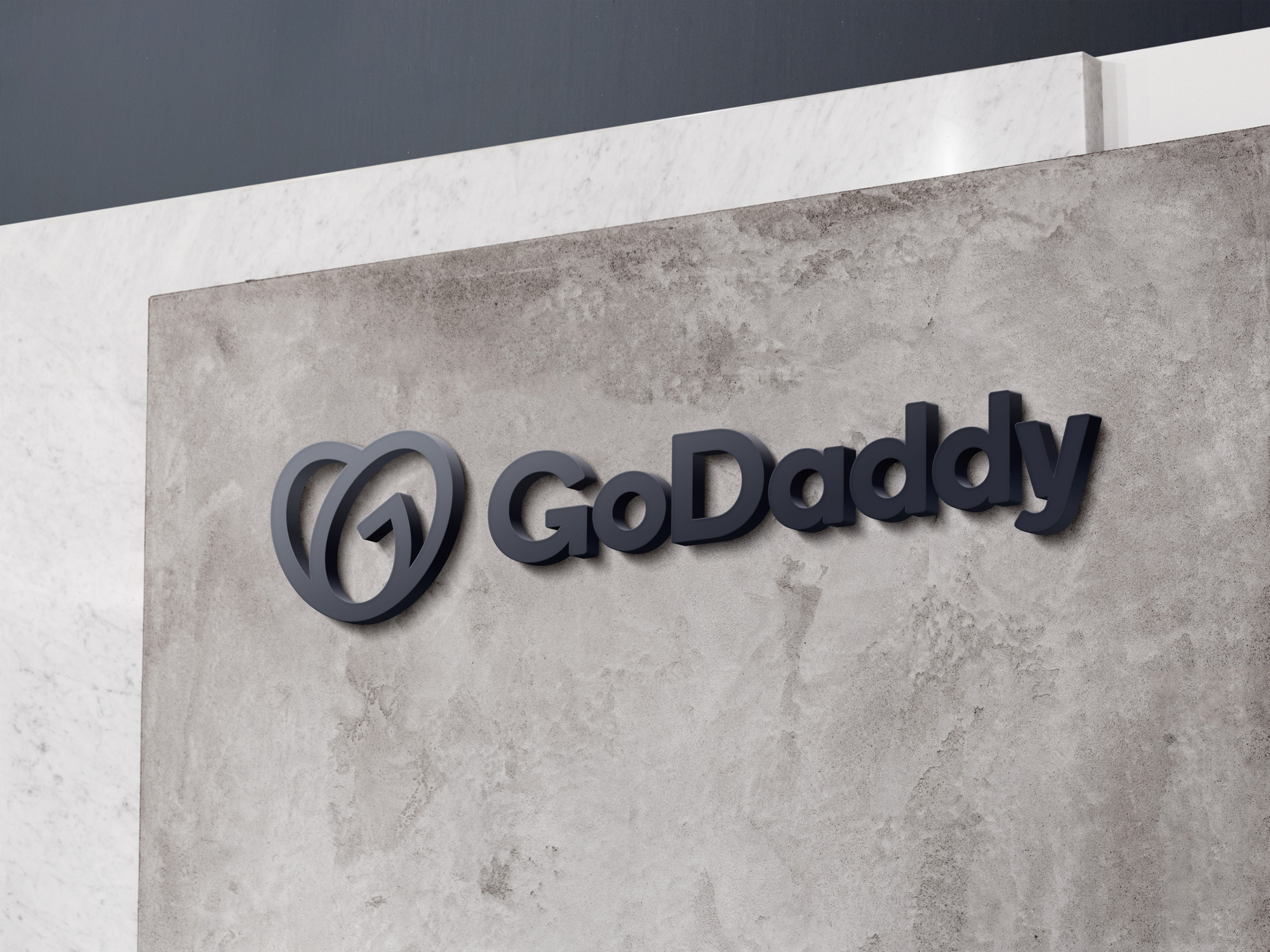
Established in 1997, GoDaddy is a domain registrar and web hosting company. A staggering 78 million domain names have been registered through them and they host over 19 million users. With 14 offices across the world, GoDaddy has evolved from that-place-with-the-weird-name-where-you-can-buy-domains to a well-rounded web service that will help users make something of those domains, providing templates to build websites and marketing tools to promote them. By now, GoDaddy would probably love it if the press didn’t mention their old ads as the company is trying very hard to completely shed the sex-sells approach but, no, we do not forget. This week, GoDaddy introduced a new logo and identity designed in-house.
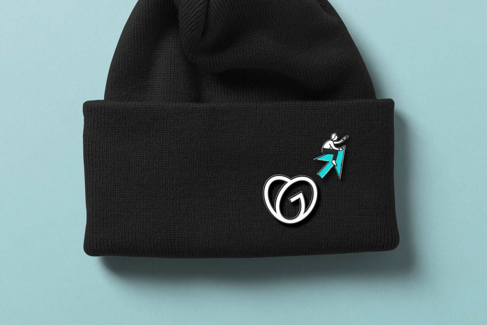
The GO is a clear statement of advocacy for entrepreneurs everywhere — a symbol of empowerment that encourages them to stand on their own two feet.
The GO was created as a visual representation of the space where three ideas meet:
Entrepreneurial spirit
We created the GO’s swooping arcs to represent the indomitable spirit of everyday entrepreneurs. And the word “go” itself is our rallying cry for folks to take the first or next step in their entrepreneurial journey.
Joy
Joy is a corollary to the love that fuels entrepreneurs to make their own way. The GO’s heart shape is a nod to this feeling, while its bold lines radiate the same joy that entrepreneurs everywhere experience.
Humanity
Entrepreneurship should be accessible to everyone, which is why we bring humanity into our digital tools for the benefit of all. The GO’s continuous, overlapping stroke symbolizes the connection all entrepreneurs share, and its generous interior space has room for folks of every stripe.
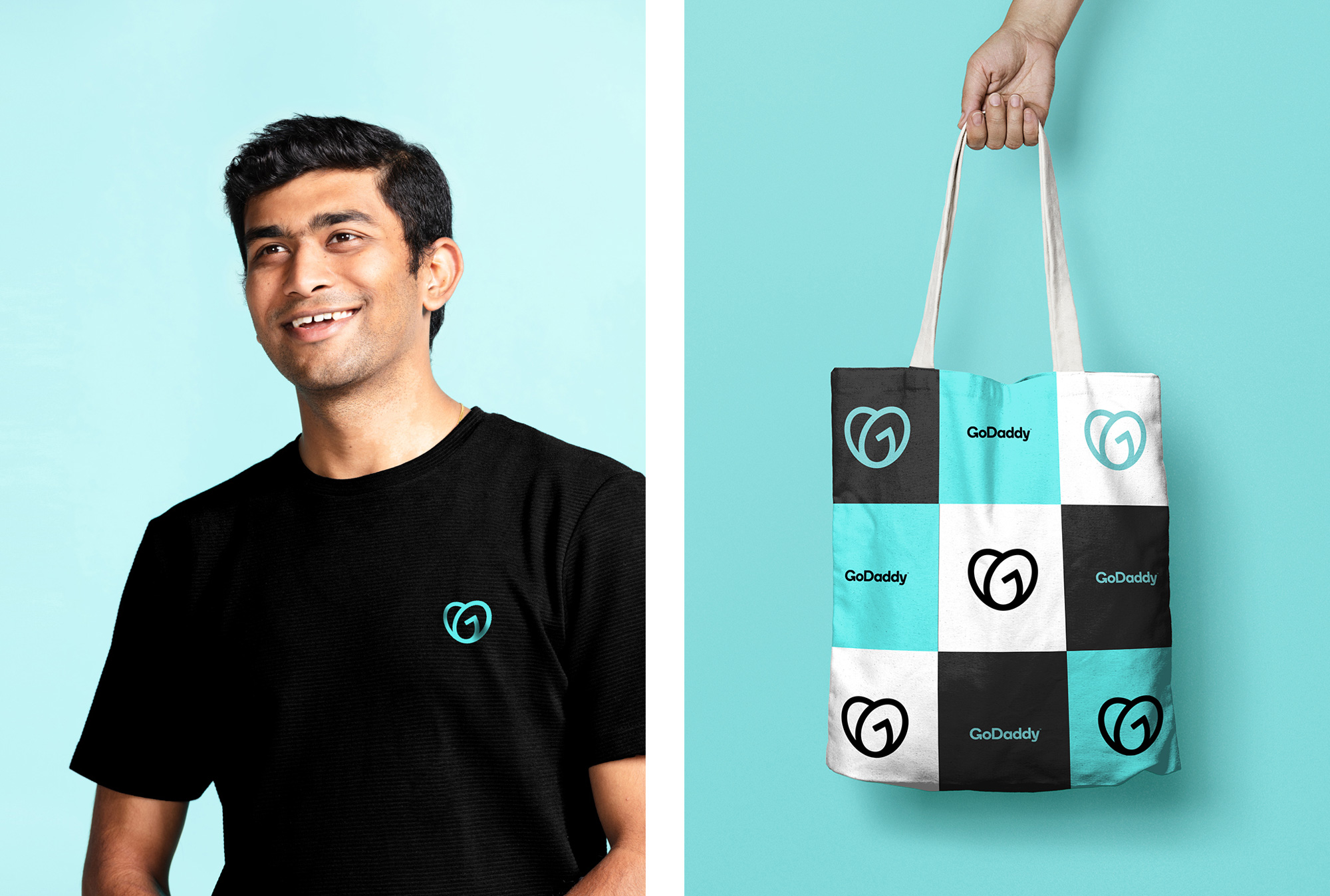
In 2018 GoDaddy began the process of sweeping its old “guy” icon under the rug by dropping it from the logo — visually, it was the last connecting thread to the GoDaddy brand of old that made it even harder to forget about what their brand stood for. After an interim period of no “guy”, the company has introduced a new icon, the “GO” and Imma say “STOP”. There are a number of things that are not necessarily wrong but just very awkward. Based on the animation the logo is meant to be a heart but in its static form it looks like two ovals stacked oddly one on top of the other with the not-so-hidden “G” in there adding a whole lot of confusion. It doesn’t read like a heart at all because there is no depth to the loops and the one line that could make that connection is abruptly ended by trying to make the “G” — that hard-angled line pointing down and left kills this logo. Comparisons to Airbnb’s “Bello” are fair not just for the similar approach in design but the douchiness of giving it a pretentious name. (As much as I liked and championed the Airbnb logo I always disliked that they named it so annoyingly.)
Conceptually and/or contextually there is something very off about the icon too: it looks completely out of place next to the word “GoDaddy” — it’s really impossible to not think “Who’s your daddy?” (and all that that entails) — and, while I get that they are trying to appeal to the entrepreneurial spirit, let’s not kid ourselves, they sell domain names and templates, not dreams. I’m all for companies establishing an emotional connection with its audience and that’s in part what branding is for but this feels very forced and inauthentic. But let’s continue with the design aspects… the wordmark has been slimmed down, which makes for slightly better readability but the squared-off counters have been lost, which is a detail I really liked in the old logo. To the credit of the icon design, the weird angled line is the same thickness and rounded-corner-ness as the “G” in the wordmark. The new blue color is a little annoying in its vibrancy and I’m surprised they moved away so drastically from their green color, which I thought was fairly recognizable. So, to summarize my logo feelings: not a fan.
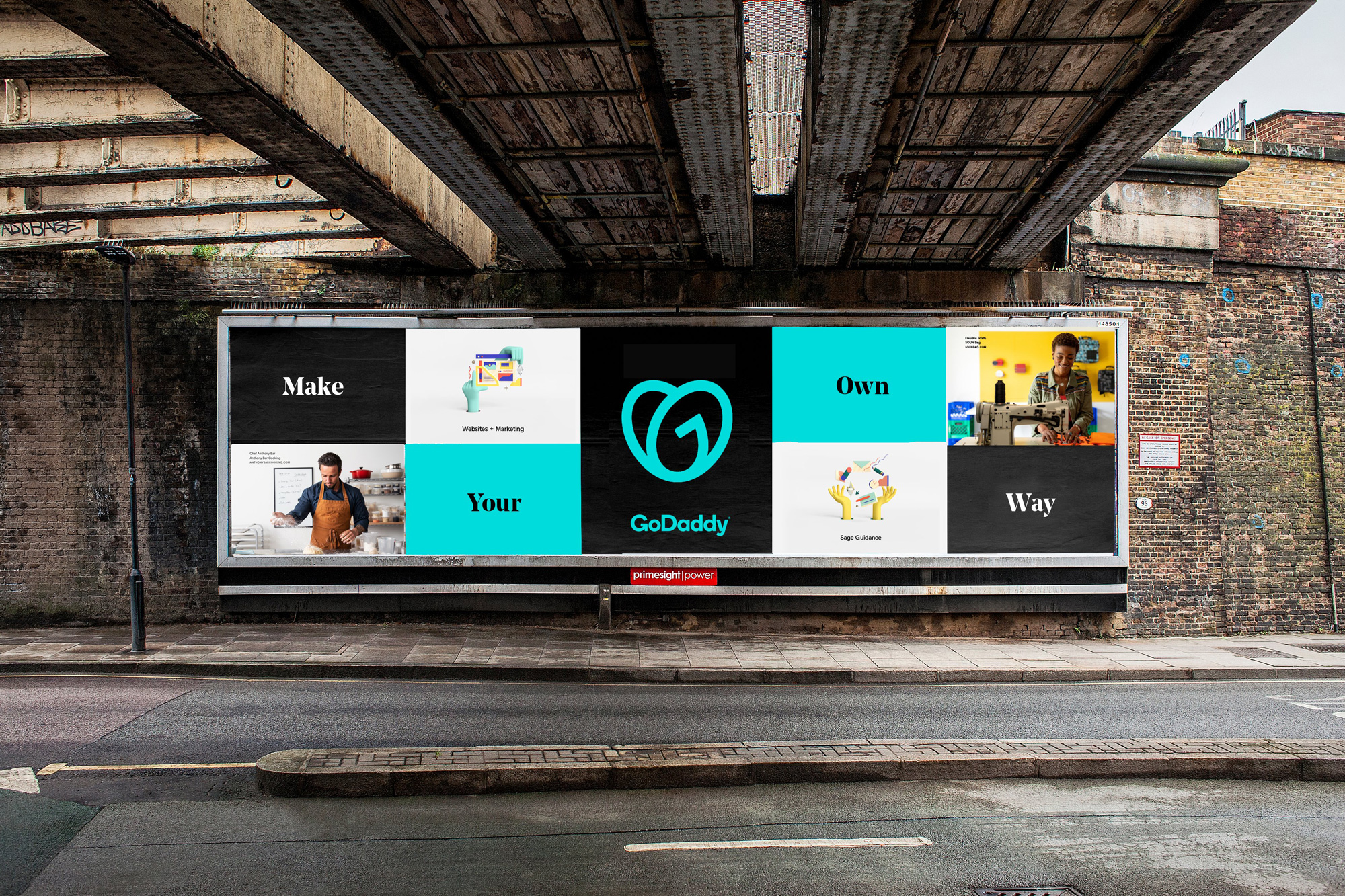
Always bright and dynamic, our brand colors speak to the creativity of our customers. Our wide palette connects with people across the globe and promotes inclusivity for all cultures. We use color to bring joy to our brand.
Our bold, serif headline font is elegant and expressive projecting a fresh, modern voice. It presents a hint of flair for professionalism, giving the brand a distinguished feel. We use it to establish strong moments of brand for customers.
Another big shift in the identity is the use of the bold, pointy, serif trend that has been widely adopted by editorial brands — Medium, The Guardian, BuzzFeed News, and others — and it also feels so out of place for GoDaddy, like a kid putting on their parents clothes. Visually, it’s far too unrelated to the icon or the wordmark and while it works graphically as a headline font — because, well, that’s what it is — it just feels like a gratuitous choice to add a quick dose of maturity.
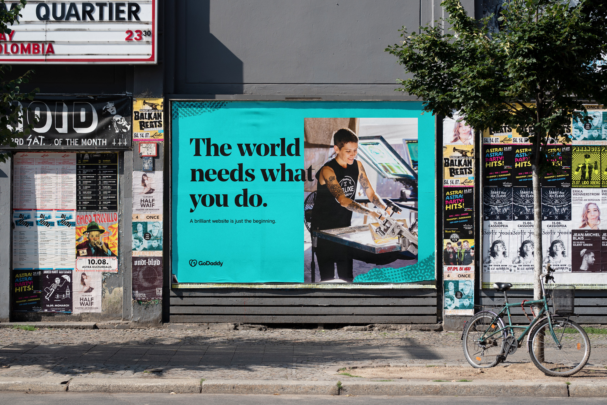
Our photography lets people see themselves in our brand. Whether it’s capturing entrepreneurs in the moment or presenting them as heroes, we want their personality, independence and energy to shine through. When showcasing our products or anything else, our approach to photography is simple — keep it bright, bold and inspiring.
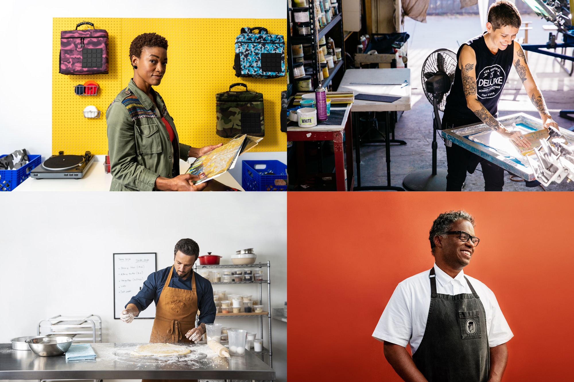
Photos are fine. Not exactly in a cohesive style or art direction but they have the right content.
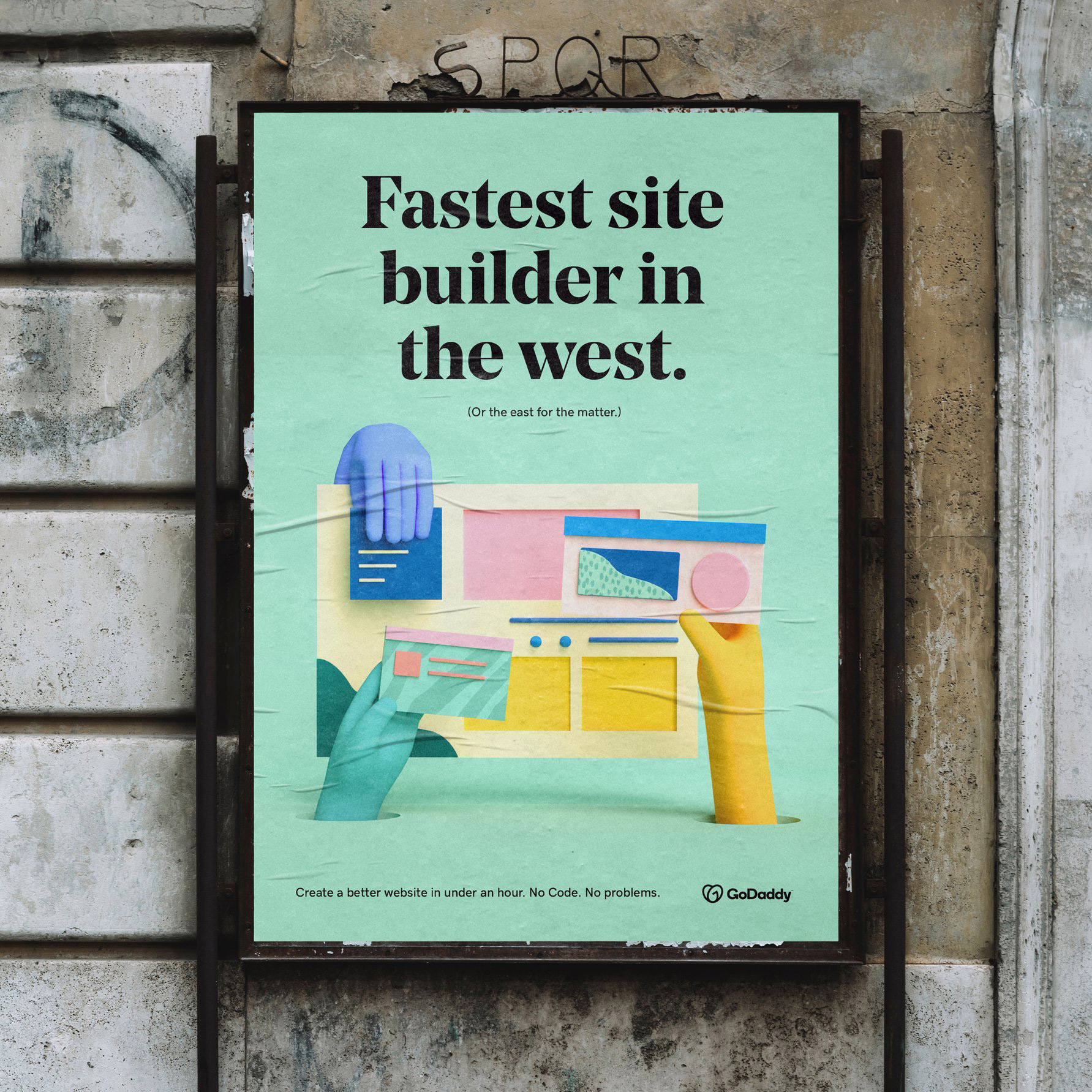
Our hand-drawn illustrations add a touch of humanity to our brand. Some concepts are easier to convey through thoughtful illustrations than through image or word. We apply a light-hearted, editorial approach that intentionally compliments narratives across our experiences.
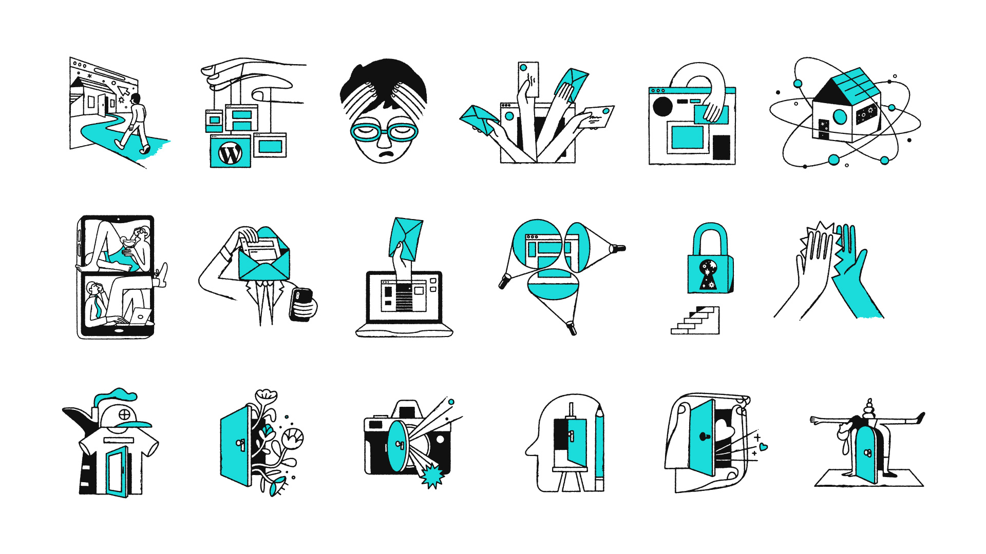
These are pretty cool — a nice step up from the typical mono-thickness-line trend.
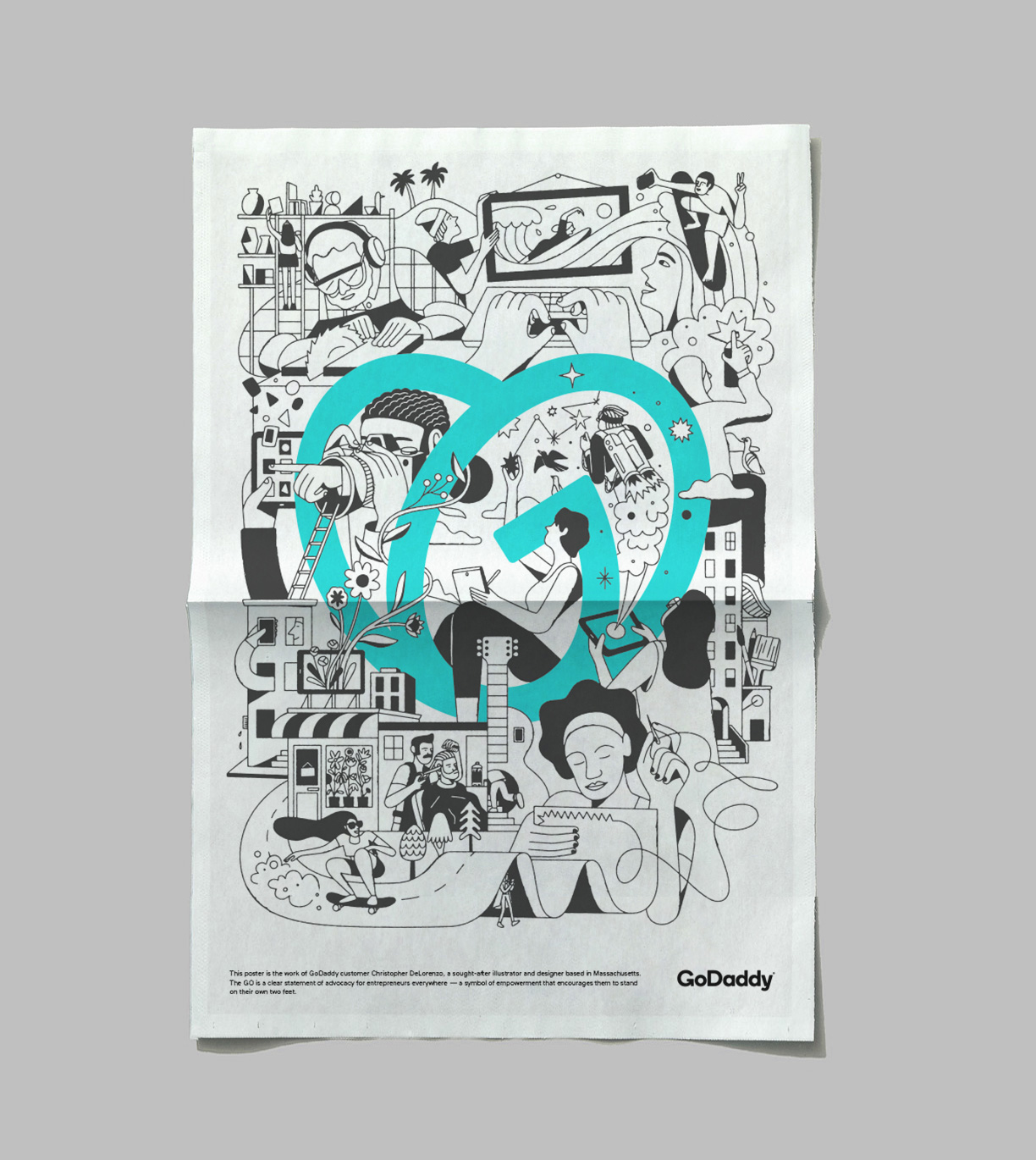
With thoughtful concepts and bold use of color, we use a bit of personality to embody the story of intangible products and complex ideas. We want to create an inspiring world that sparks the possibilities our customers can create.
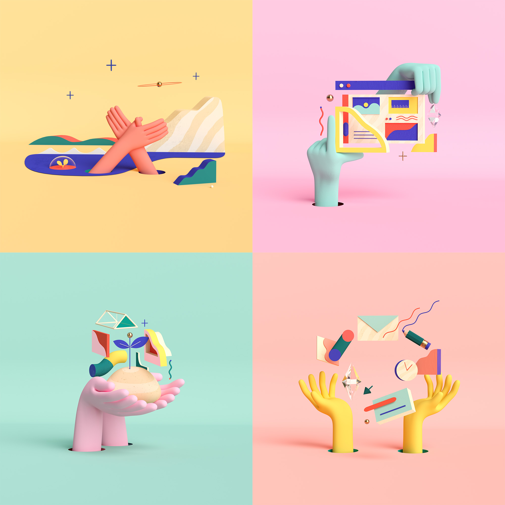
These are also very cool and fun, especially the animated ones. Unrelated to the other illustrations and photos but cool, sure. I could accept the rationalization that both illustration styles feature hands but, like the choice of bold pointy serif, both illustration styles seemed like they were picked to fill a quota of Things That Brands Do Today.
The applications are all fine and good in terms of execution. There is clearly a lot of care being put into the implementation and into building a visual language that can flex in different ways and styles. I don’t think it’s very cohesive or entirely convincing but it does get its messaging across vibrantly.
Overall, for me, there simply is too big of a disconnect between what the company offers and the overly emotional and philosophical positioning behind the new identity — it’s great that GoDaddy is convinced by it and trying to create this atmosphere but I’m not buying it. Maybe I’m alone in this and maybe I have some weird prejudice about GoDaddy not because I’m offended by their old ads — heck, they were fun at the time — but because their old brand, from the name to the logo to the website, had always been so extremely amateur that I can’t suddenly see them in this new heightened light. Nonetheless and I guess what matters in the end is that for any new customer going to buy a domain name at GoDaddy for the first time, it will all look like a respectable place to do so, which hasn’t always been the case.
 each year since publication began in 2006

 Новости Союза дизайнеров
Все о дизайне в Санкт-Петербурге.
Новости Союза дизайнеров
Все о дизайне в Санкт-Петербурге.