Обзор лучших ресурсов по разработке бренда, разработке упаковки
contact us | ok@ohmycode.ru
contact us | ok@ohmycode.ru
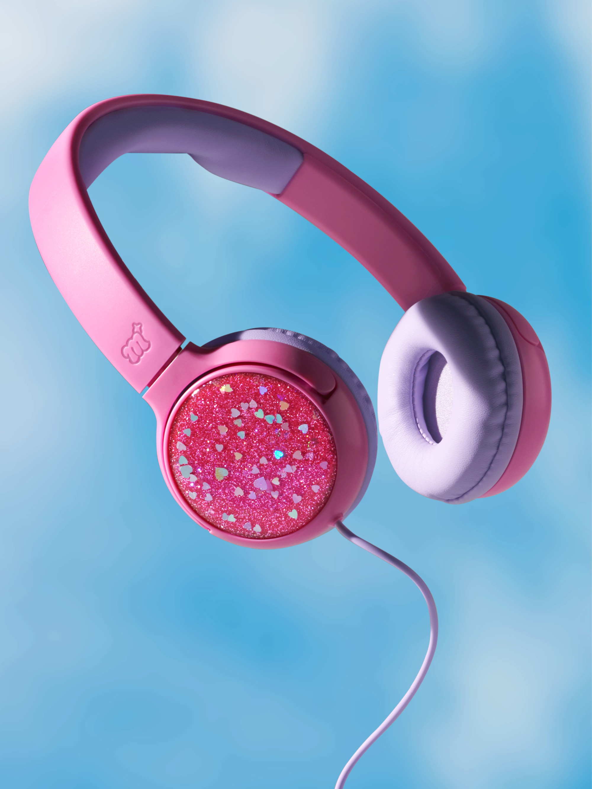
Launched in the Summer of 2019, More Than Magic is a new brand of tween-focused lifestyle products available only at Target. Designed specifically for girls ages 8 to 12, the new product line has over 500 items that range from activewear to sleepwear to accessories to makeup and to then some, all with a healthy serving of glitter, happy colors, and soft textures. The packaging and identity for More Than Magic were designed by COLLINS in collaboration with Target Creative.
Girly. The meaning of this word evolves as young girls define it for themselves. Loud. Messy. Confident. Silly. Strong. Funny. Smart. Bold. Kind. ‘Girly’ is a small word that contains a magnitude of personality and possibility. We wanted to create a brand that allowed room for all of it.
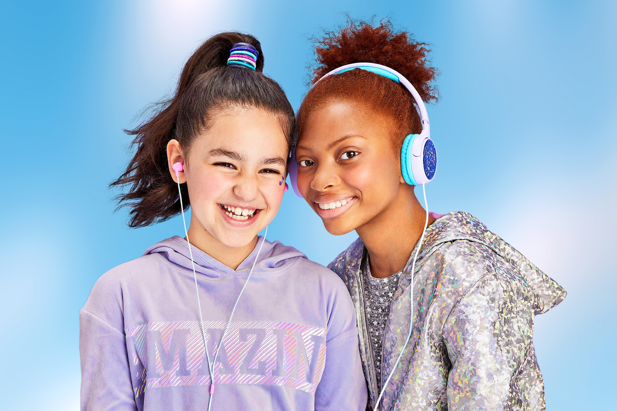
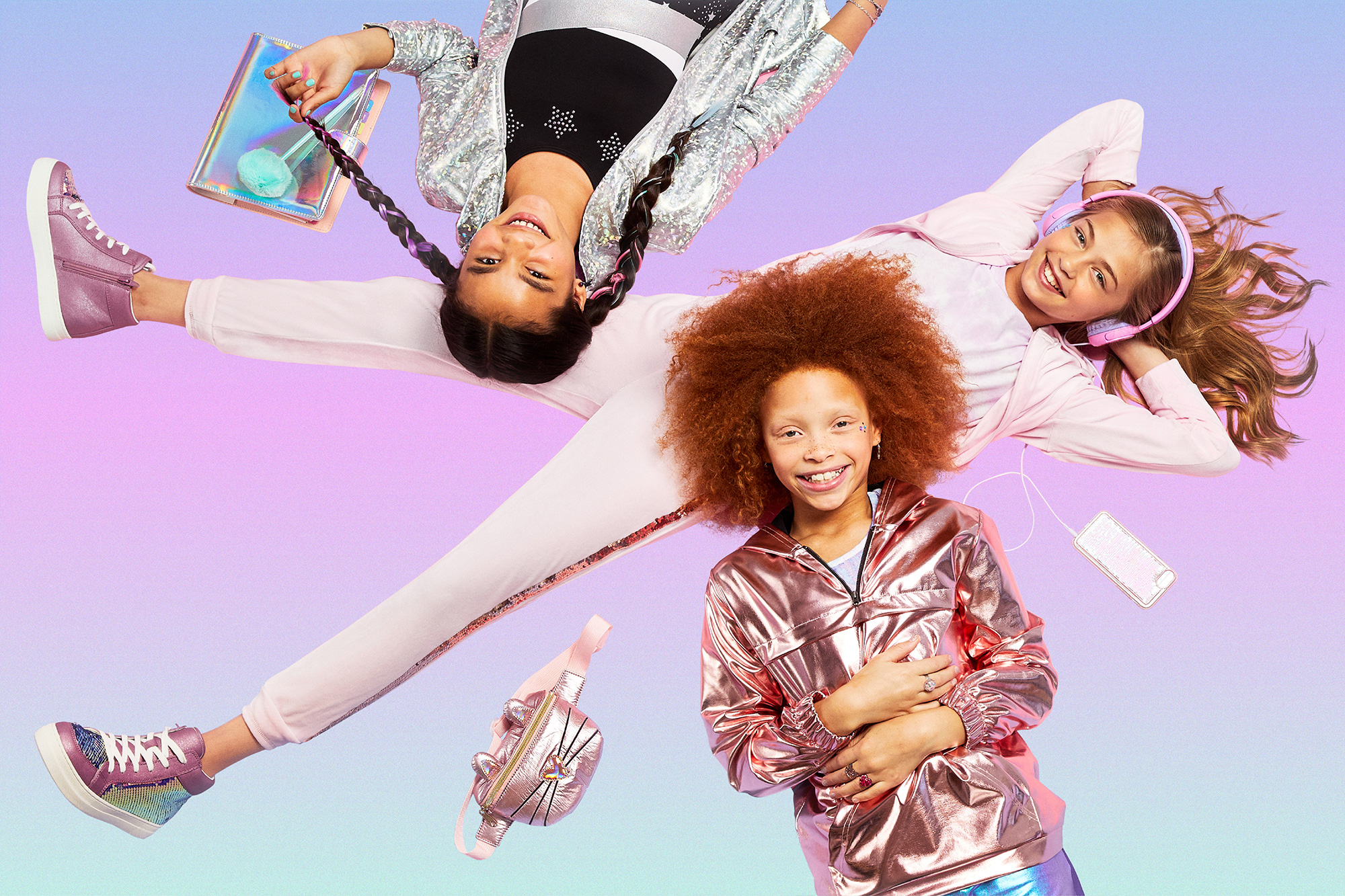
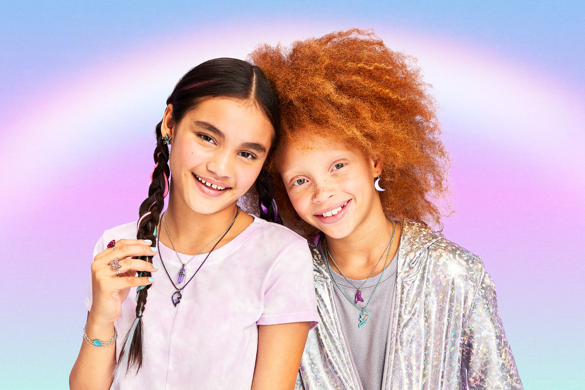
Posting these lookbook images first so that you can get a sense of what the products are like and who the audience is.
Because it ain’t easy being a tween. You’re not a kid. Not yet a teenager. It’s often the resilience of your own imagination that gets you through it. We wanted to speak to this-creating a dreamlike, whimsical world that didn’t advocate perfection or some unrealistic ideal, but rather, magic and the surreal.
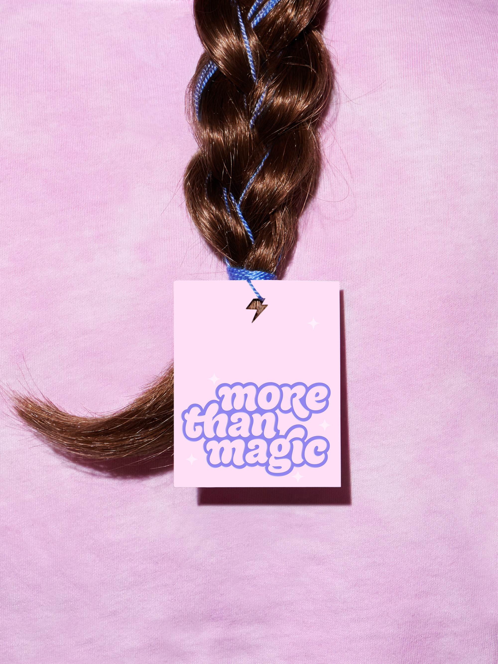
The logo is a fun lettering concoction with a thick-marker-esque foundation and some fun swashes and ligatures — the “gi” one in particular, I think makes the logo. Even the unicase “R” passes muster as it works very will in filling in the space that the lowercase “r” would have left between it and the “e”. Wrapping the wordmark in a thick outline gives the logo a sticker-like appearance that is perfect for the audience — I say that with some authority as I have a member of this audience living under my roof and, boy, does she like stickers. The 3D version has a tacky finish (which looks to be done like that on purpose) that’s actually pretty cool, sort of a hipster My Little Pony vibe that gives the brand a bit of an ironic wink, which kids at these age already start to notice.
‘You don’t have to be perfect to be amazing’-More Than Magic champions girls as they imagine who they are and who they could be. The playful brand illustration style brings more joy across every touchpoint with twinkling, magical creatures and skateboards sparkling off into the distance. Every element in our system is supported by an expansive color strategy that welcomes girls as they experiment with their own personal style and identity.
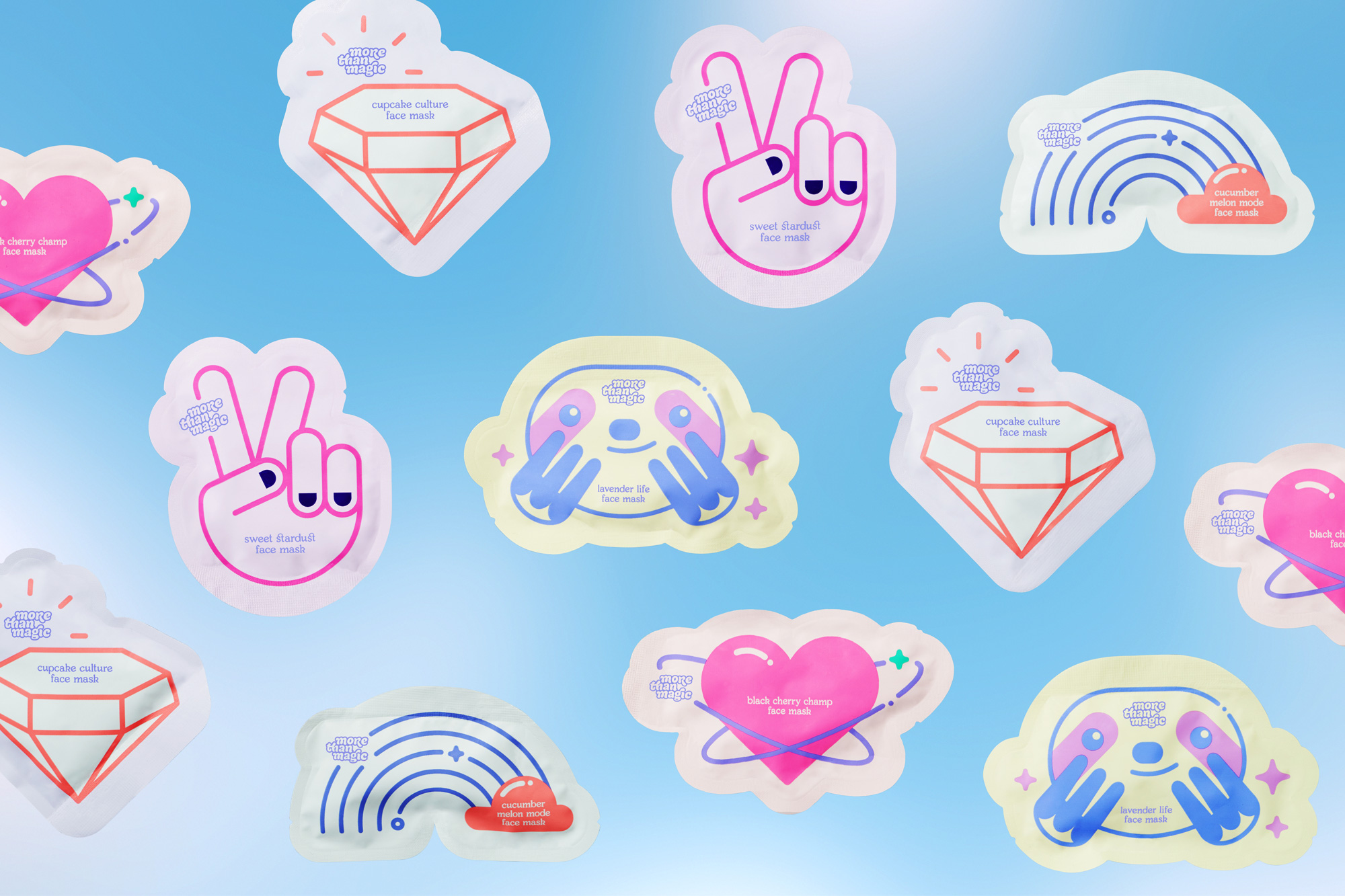
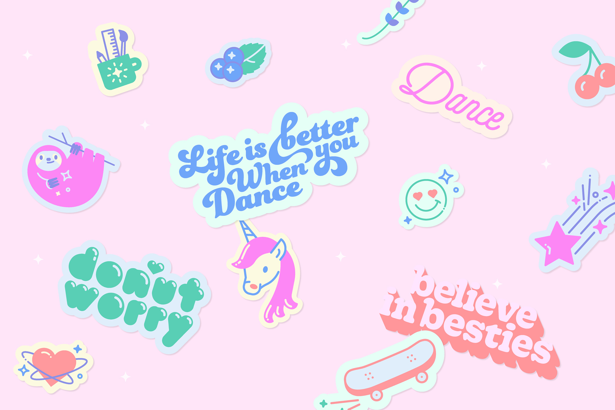
The supporting graphics and type treatments are fine… whereas the logo was unexpected these feel more expected and less unique. Still as supporting elements, they are fun, lively, and appropriate.
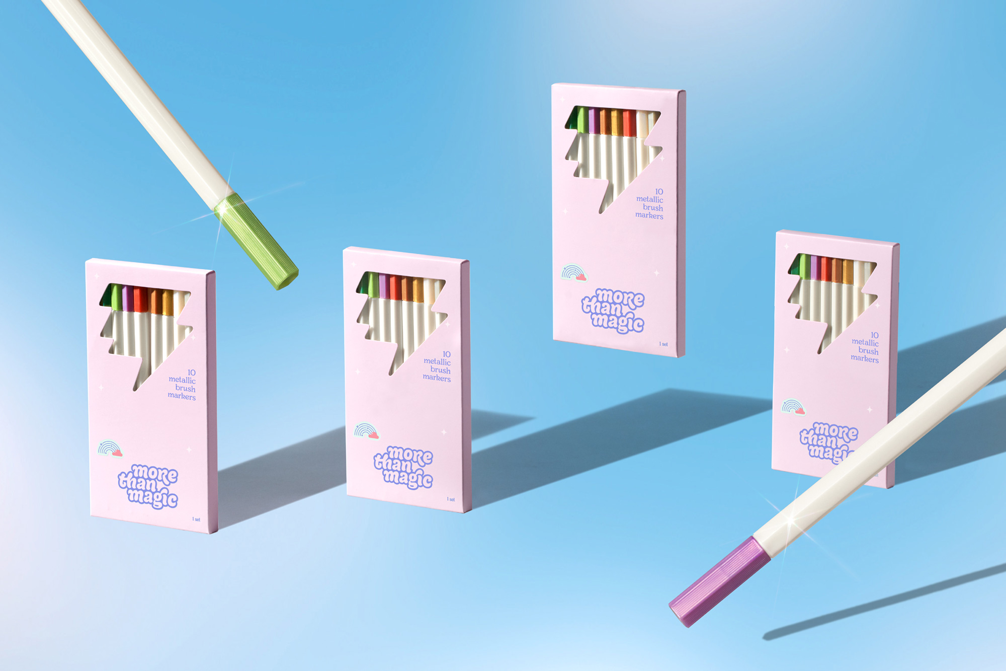
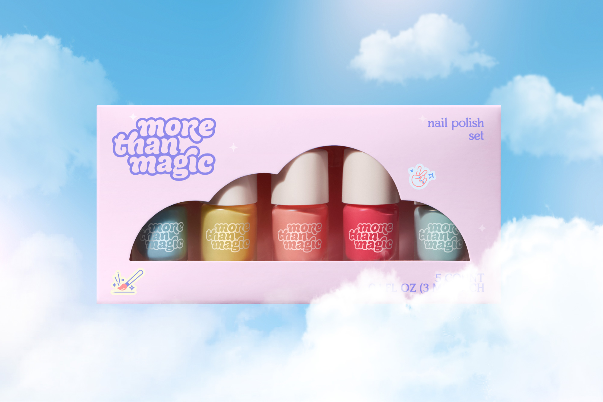
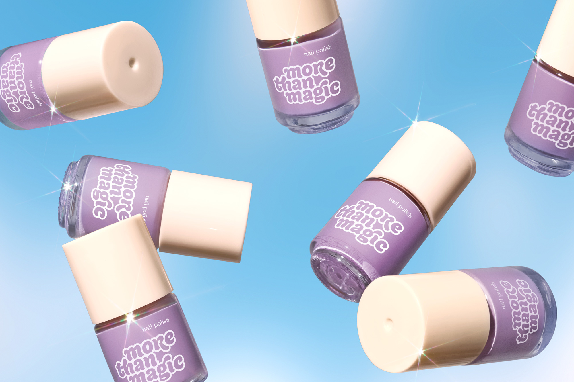
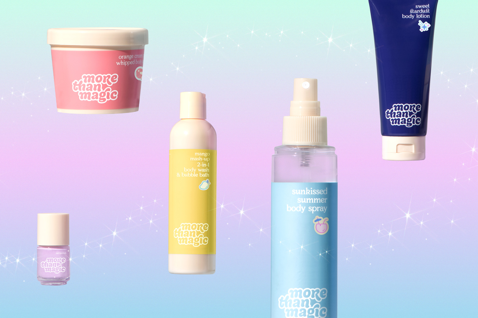
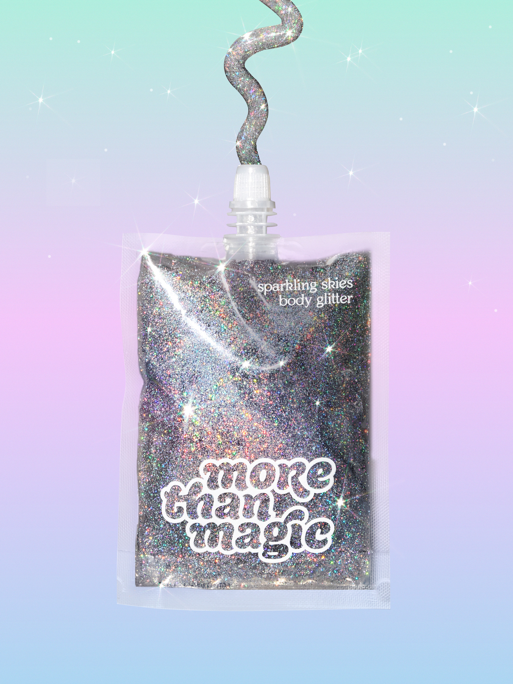
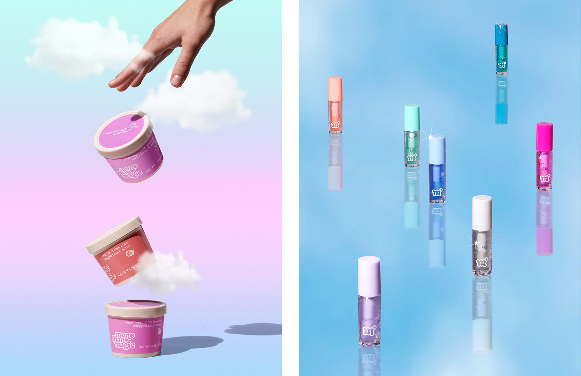
The packaging is fairly straightforward but pretty great and consistent across a crazy range of categories. The logo does a great job in unifying everything and the broad color palette is kept within check before feeling like too much. The use of the supporting graphics feels a little shy, like they are always too small and not entirely integrated into the layouts. The secondary serif typeface is charming and makes for a nice complement to the logo — it reminds of the Mailchimp brand but I doubt many 8-to-12-year-old kids will be worried about that association.
Overall, both the product range and identity around it fit the target audience glitteringly well — I know my kid would buy one of each thing if she could.
Thanks to Lance Rusoff for the tip.
 each year since publication began in 2006

 Новости Союза дизайнеров
Все о дизайне в Санкт-Петербурге.
Новости Союза дизайнеров
Все о дизайне в Санкт-Петербурге.