Обзор лучших ресурсов по разработке бренда, разработке упаковки
contact us | ok@ohmycode.ru
contact us | ok@ohmycode.ru
Established in 1987, Fondation CHU Sainte-Justine (CHU Sainte-Justine Foundation) is a charitable organization associated with CHU Sainte-Justine, the largest mother-child teaching hospital in Canada and one of the largest pediatric centers in North America, with the mission to improve the health of the children, adolescents, and mothers of Québec. Since its creation, the foundation has raised over $565 million that help the hospital treat nearly 300,000 patients a year; deliver nearly 3,500 babies; operate on nearly 10,000 children; and perform 47 bone marrow transplants and 18 organ transplants in 2017. Recently, Fondation CHU Sainte-Justine introduced a new identity designed by lg2.
The new identity aims to bring together all those whose lives have been touched by the Foundation. The new logo was designed with the old and new in mind, building on the original symbol of the mother and child to reflect all the others who play a leading role in the care of the child, from parents to grandparents as well as doctors, researchers, caregivers and sometimes, even donors. These changes to the logo will be brought to life through various graphic platforms as well as in animated versions.
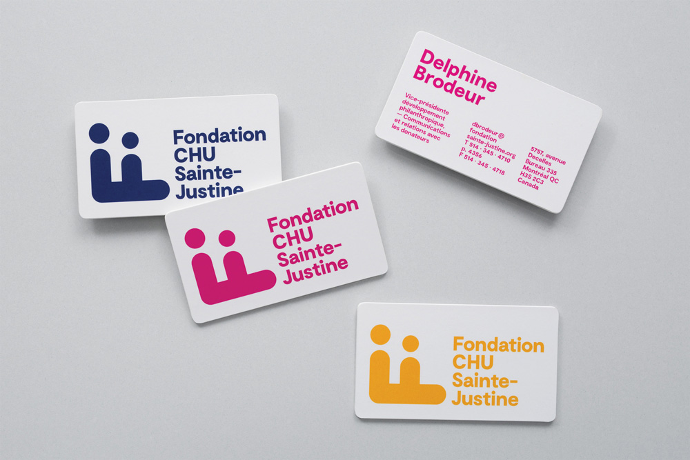
The old logo was mostly okay, with the abstract brush drawing of an adult and a baby but perhaps it was a little too 1980s and the wordmark had no relationship to the icon. The new logo features an even more abstract representation of an adult and a child in the form of a rotated “F” where its two bars are turned into people. It’s no Herb-Lubalin-Families logo but it aims for a similar charm and playfulness. Its sizing and placement might be too overpowering and take away from the concept; I think that if it were smaller in relationship to the wordmark, it would feel more nimble. The wordmark is okay. The dark blue color update is good but perhaps it could have also benefitted from a 2-color execution to make the icon feel less heavy.
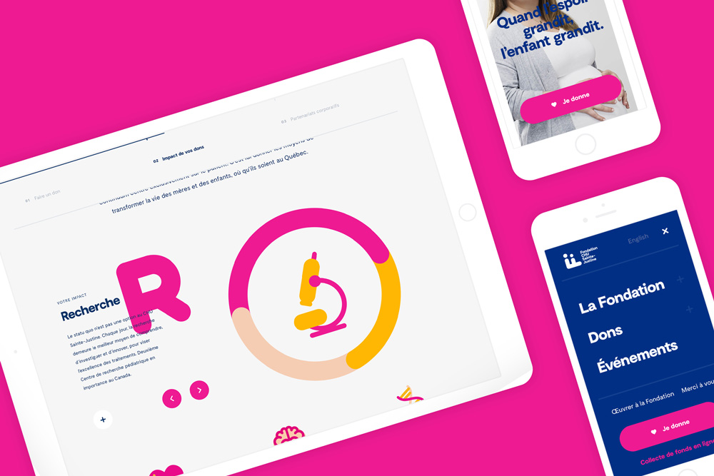
The new visual identity and brand platform were inspired by various existing elements of the CHU Sainte-Justine, such as the artistic installations of the Grand Jardin or the architectural designs of the buildings, which mirror the colour code of the signage. The wide range of warm colours used in the design, in addition to conveying the Foundation’s values, establishes a simple yet strong and universal language, and demonstrates the Foundation’s power to unify.
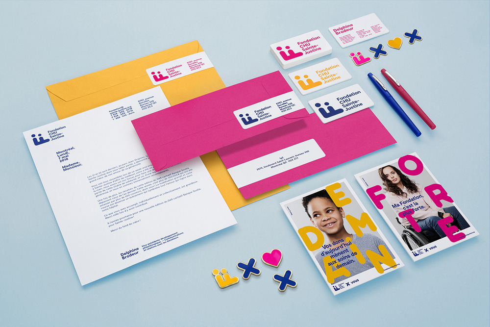
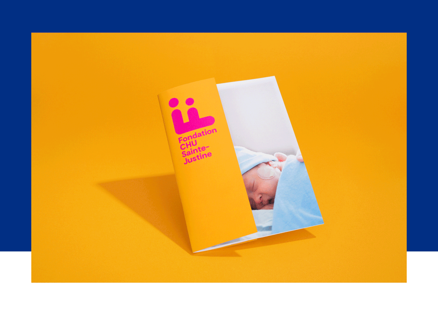
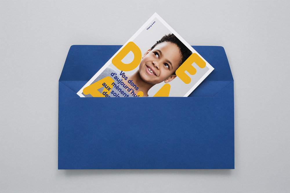
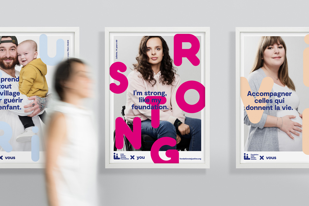
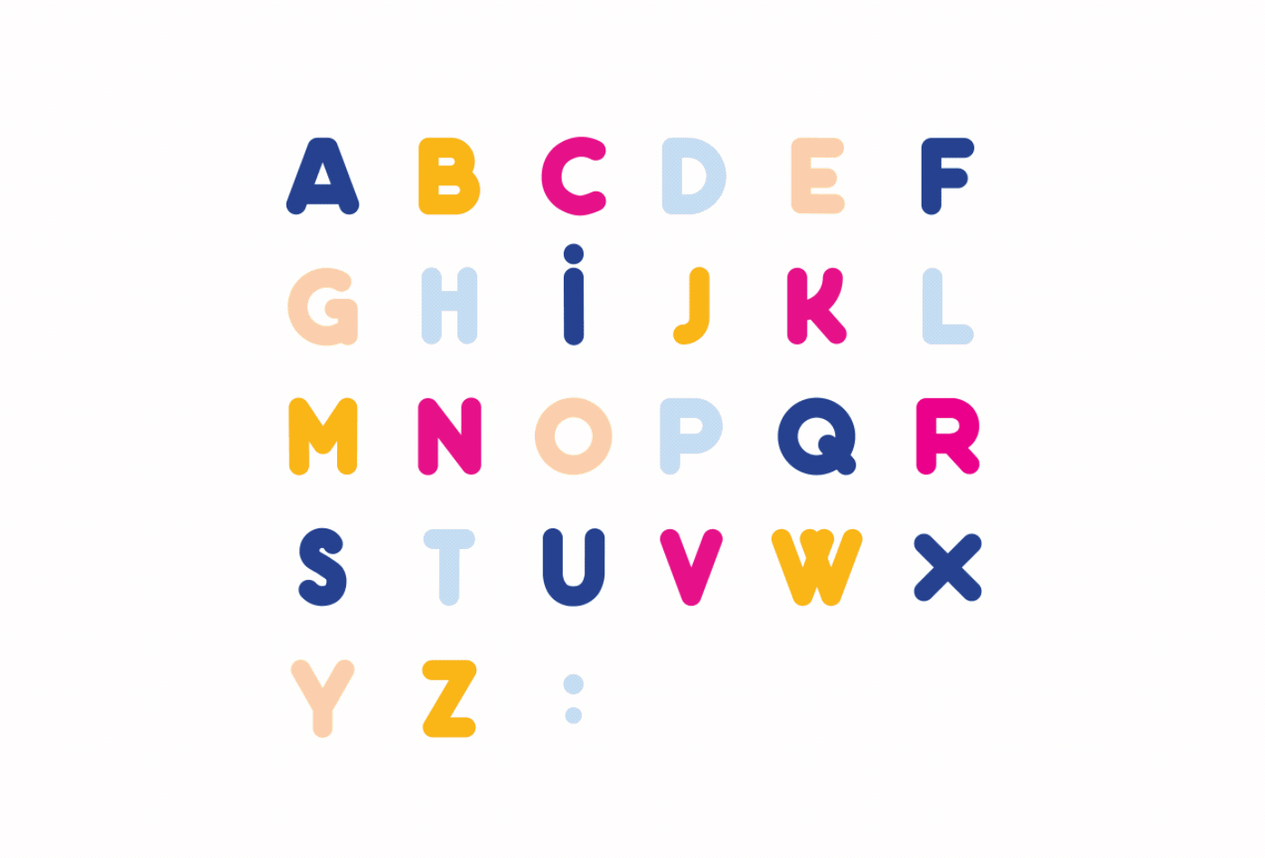
The applications are fun and energetic with a vibrant color palette of warm yellow and pink complementing the dark blue. I like the addition of the big rounded sans serif that sits on top of the images and how it ties in with the icon while the headlines tie in with the wordmark.
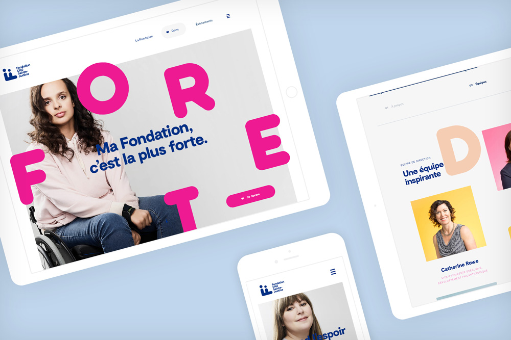
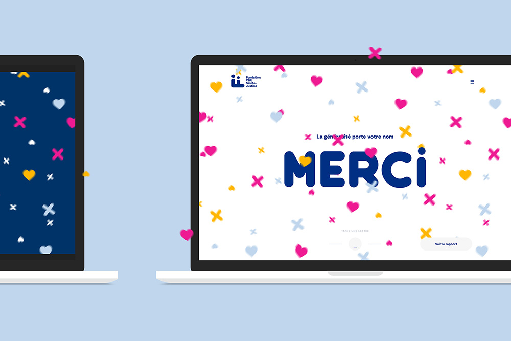
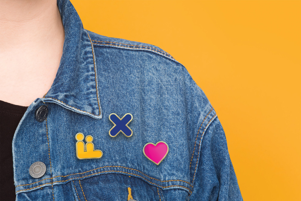
One thing I would question overall is if the identity veers too youthful? With the pins and all the “x”s and heart icons, in certain applications, it could almost pass as a retail shop for teenagers. The website, though, which is probably the most common entry point does feel grown-up and has a good balance of seriousness and approachability. Overall, it’s a solid redesign that makes the foundation look more contemporary and help it communicate with a confident visual voice.

 Новости Союза дизайнеров
Все о дизайне в Санкт-Петербурге.
Новости Союза дизайнеров
Все о дизайне в Санкт-Петербурге.