Обзор лучших ресурсов по разработке бренда, разработке упаковки
contact us | ok@ohmycode.ru
contact us | ok@ohmycode.ru
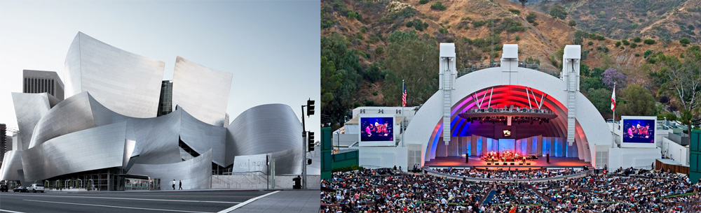
Established in 1919, the Los Angeles Philharmonic (LA Phil) is an orchestra based in Los Angeles, CA, widely recognized as one of the most contemporary, ground-breaking, and innovative in the world. Led by Music and Artistic Director Gustavo Dudamel, it performs more than 250 concerts at its two iconic venues: the Walt Disney Concert Hall (designed by Frank Gehry) for Winter performances and the Hollywood Bowl for Summer. Recently, LA Phil introduced a new identity designed by TBWA\Chiat\Day LA.
In order to look forward—while remaining true to a rich legacy—we took the shapes of the two primary venues associated with the LA Phil, the Walt Disney Concert Hall and the Hollywood Bowl and incorporated their features into the anatomy of the logotype. While this was an effort to disconnect a bit from those venues, as the LA Phil is becoming more of a national and international phenomenon—keeping a nod to that legacy is key, while looking forward, to the next 100 years. In order to move away from the more traditional, albeit modern use of a logomark and logotype, we consolidated the shapes and flows of the venues (the old logomark) and the previous font (Frank, used for the Walt Disney Concert Hall by Frank Gehry) and drew a completely new, modern, yet classic bespoke logotype—in hopes it will withstand the next 100 years (or at least a portion).
The old logo was kind of crummy, with an icon that featured somewhat bland renditions of the two buildings mashed up together that, sure, they were both properly illustrative of the venues but it didn’t make for an interesting or evocative logo. The wordmark was typeset in the custom font, A Font Called Frank, that Bruce Mau Design designed in the mid 1990s for Walt Disney Concert Hall wayfinding and applications — for a fantastic archival image, check this out (those, you young folk, are slides not Instagram frame borders). It was the 1990s and that font made sense at the time and for the venue but to assign it to the philharmonic as well was perhaps not the ideal solution.
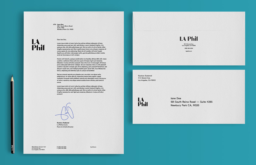
The new logo does away with the literal depiction of the buildings and instead channels them through a slick, custom wordmark. Gehry’s architectural motifs are evident in all the sharp cuts and accentuated curves of the letters while the Hollywood Bowl is more subtly referenced in the negative space of the “A”. All while yielding a more classical, high-contrast sans serif wordmark that feels more appropriate for an orchestra but without feeling old and dusty. Even though the magic underlying grid is built for the horizontal layout of the logo, the stacked version works quite well too.
A couple of nice extensions of the main logo. The YOLA one is particularly effective in extending the visual language while using the pre-established “LA” to create the connection.
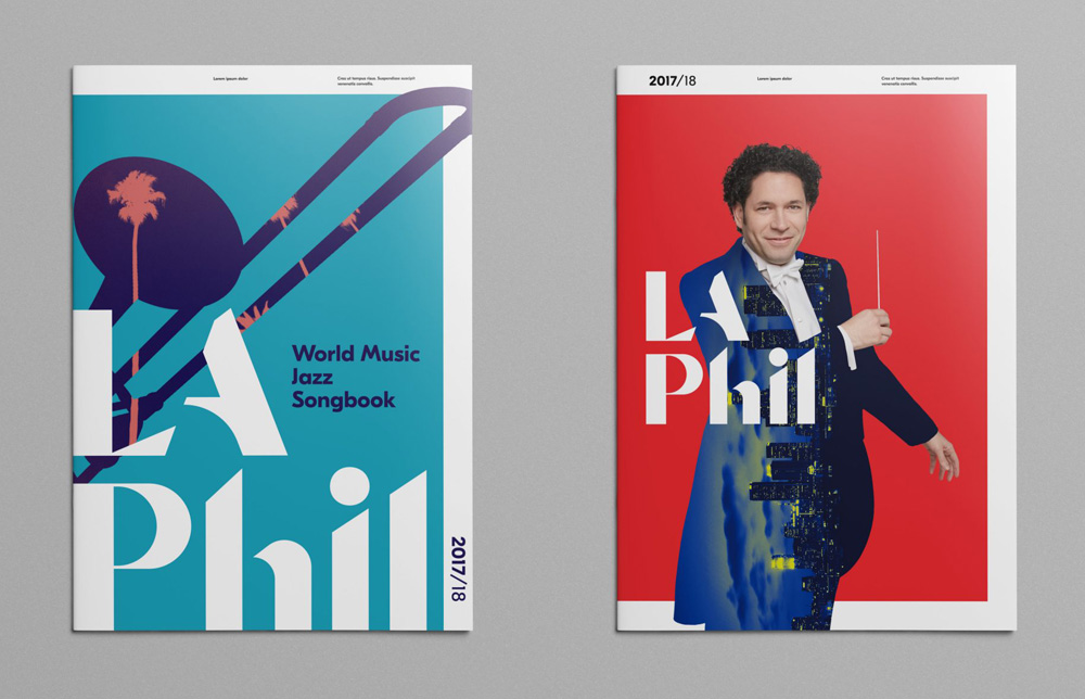
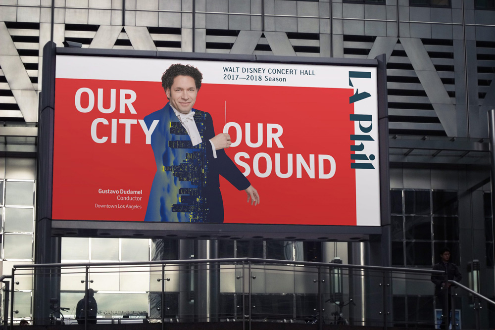
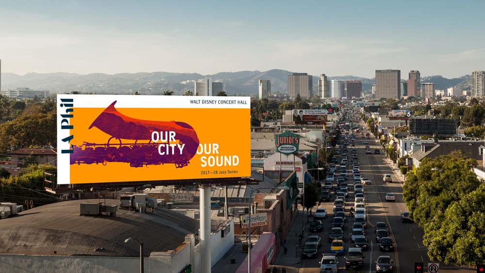
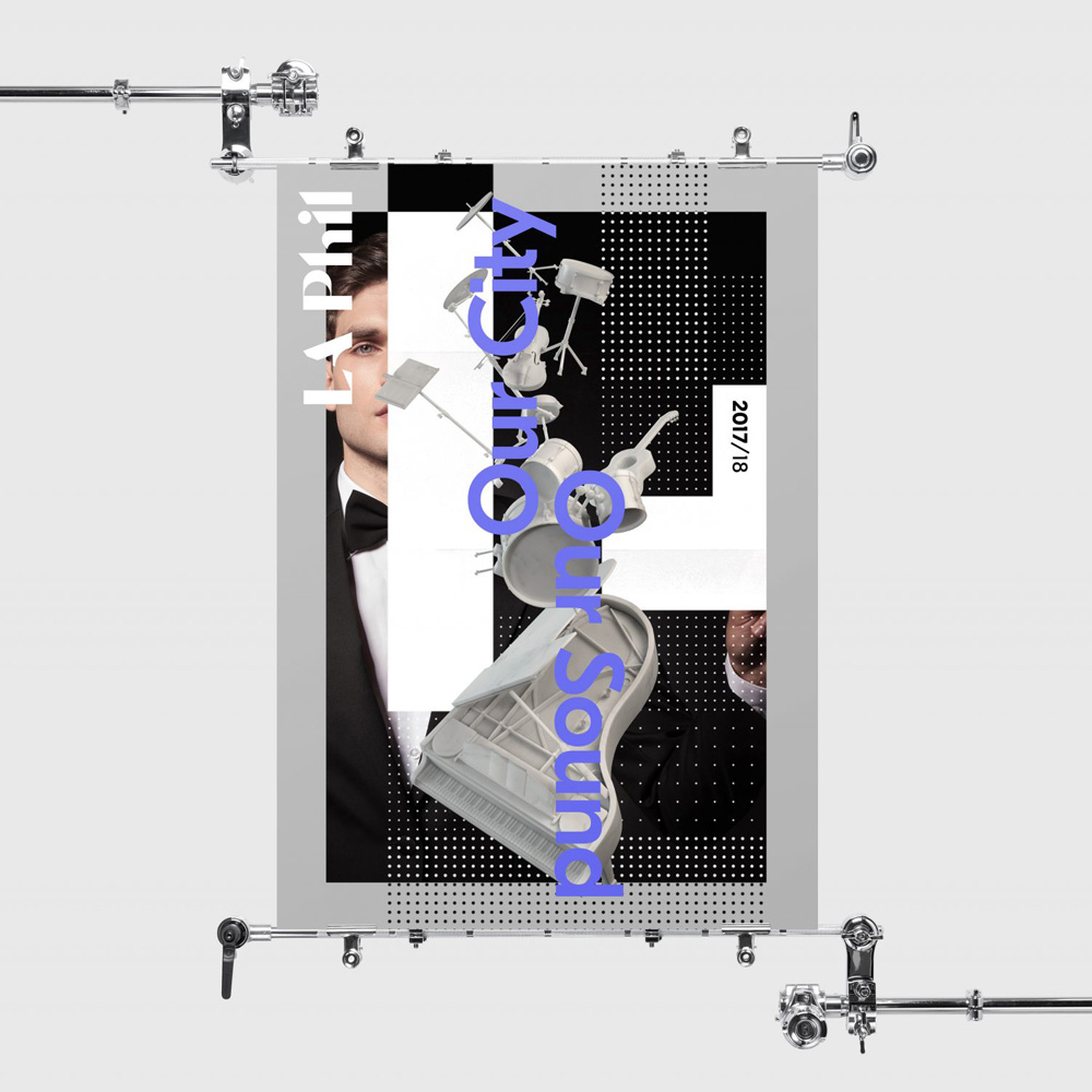
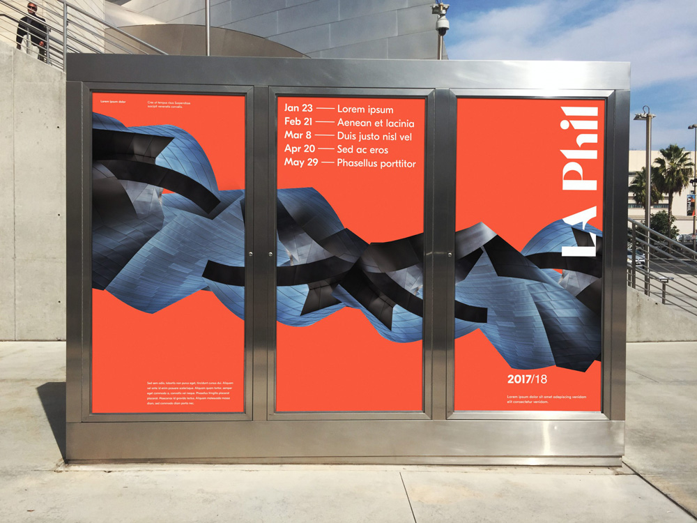
The applications are okay as far as how the logo is integrated into the layouts and I like the half white frame but the silhouetted/masked imagery is kind of cheesy… well, I’ll restate: the instrument silhouettes with landscapes in it are kind of cool but the one with the artistic director is the opposite of cool. The other poster and venue posters might be trying to be too avant garde for their own good. Somewhere in there, though, are the beginnings of a strong identity.
Overall, this is a great update that gives the philharmonic a logo of its own — more representative of what it offers — instead of a Frankenstein-y concoction of its venues.
Thanks to Kyle Thomas Hemingway for the tip.

 Новости Союза дизайнеров
Все о дизайне в Санкт-Петербурге.
Новости Союза дизайнеров
Все о дизайне в Санкт-Петербурге.