contact us | ok@ohmycode.ru
contact us | ok@ohmycode.ru
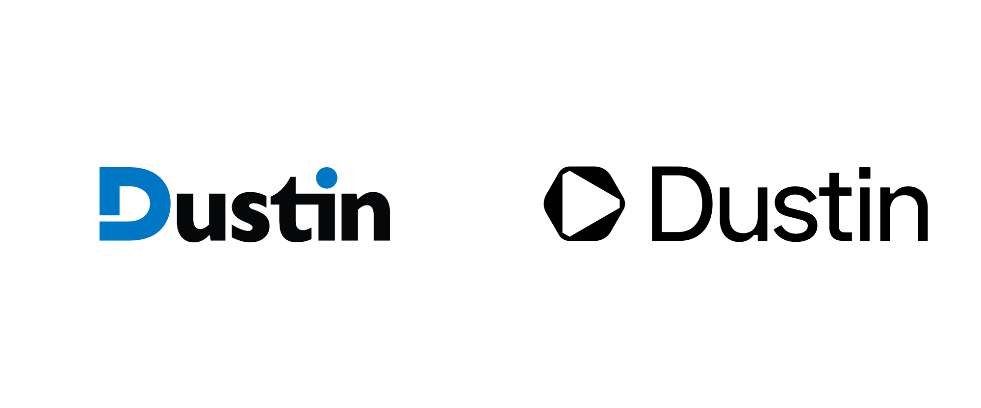
Established in 1984, Dustin is an online based IT-partner with operations in the Nordics and the Netherlands, offering both the products and the hardware as well as the services necessary for companies to establish their IT infrastructures. Dustin began by selling computer-related products — colored floppy disks were their best-sellers — by mail order, opening their online store in 1995, and expanding its reach from Sweden to Denmark, Norway, Finland, and the Netherlands through a number of acquisitions. Now, listed on Nasdaq Stockholm and with more than 1,800 employees, Dustin offers over 255,000 products and IT management services across three business segments: SMB (Small and Medium Sized Businesses), LCP (Large Corporate and Public), and B2C (Business to Consumer). Earlier this year, Dustin introduced a new identity designed by Stockholm, Sweden-based Kurppa Hosk.
[A] new brand platform was developed with a brand promise as one of the principal elements: “We keep things moving”.
To further clarify Dustin’s intent this was complemented by a mission statement: “To provide the right IT solution, to the right customer and user. At the right time. And the right price.”
By delivering on the brand promise and mission, Dustin can make a new vision come true: “To help our customers stay in the forefront”.
To emphasize Dustin’s unrelenting focus on sustainability in all business practices, a new guiding direction was also defined: “Enabling the circularity movement”.
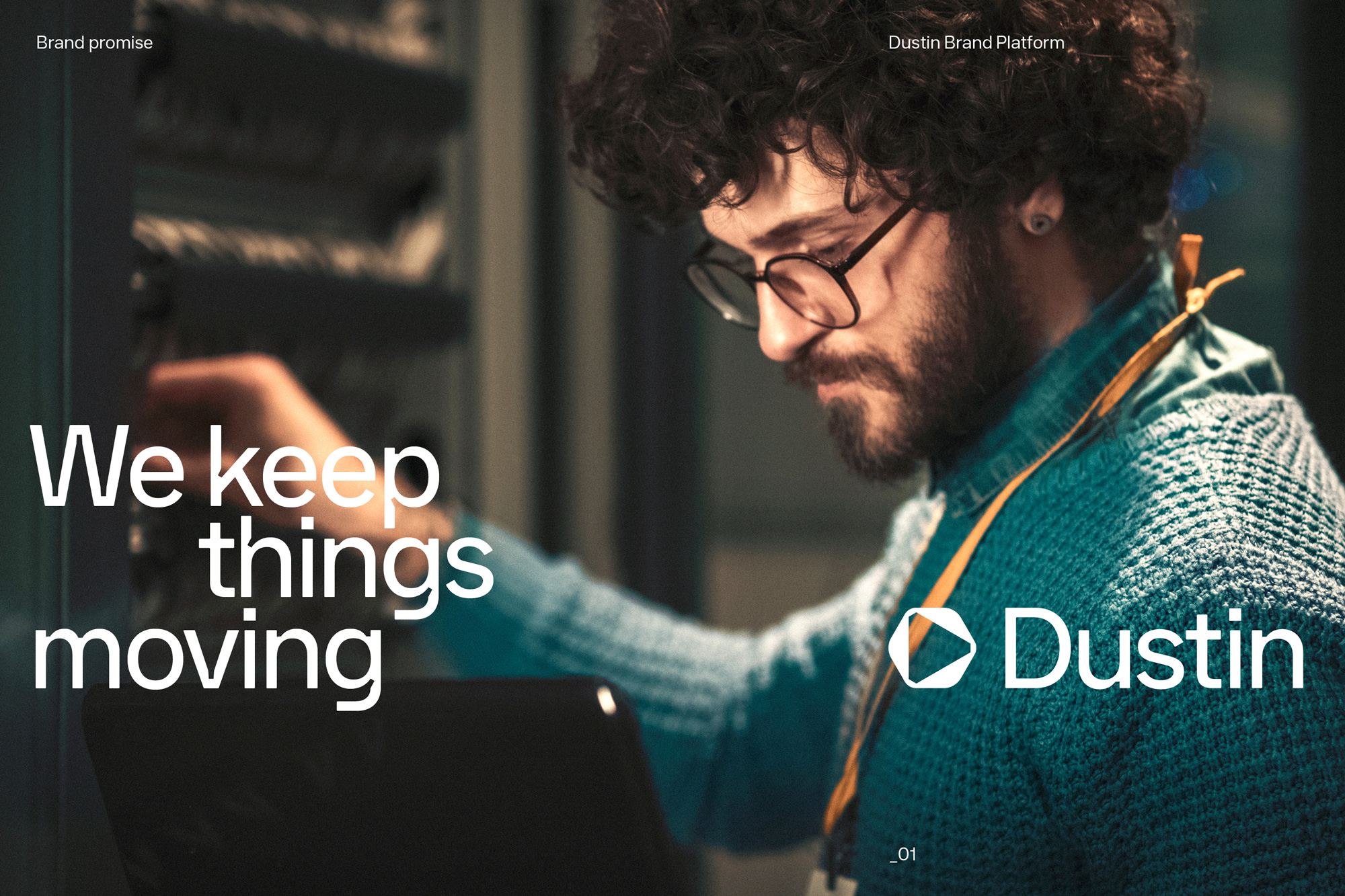
To articulate the new direction of the company and the brand Kurppa Hosk proceeded with the development of a new visual identity including logotype, typography, colors, imagery and iconography. The design elements share a visual DNA ensuring a coherent, yet dynamic, expression across all touch points. The result is a forward looking take on the IT industry, optimized for a digital future.

The old logo, despite its apparent simplicity, had too many unnecessary things going on: the open “D”, the “ti” ligature, and the blue tittle. Sadly, none of it amounted to something meaningful or cohesive. The new logo introduces an icon that gives visual form to the brand promise — “We keep things moving” — with a forward arrowhead inside a curved-corner hexagon that yields an unexpectedly bad-ass icon, one of my favorites in a long time. I love the tension created by the blunt corners of the triangle against the curves of the hexagon and the animation does exactly what my brain wants the icon to do, which is spin the two elements in place, counter to each other. I also like how the triangle can be interpreted as an abstract “D” but even without that read, it’s just an excellent, rather unique icon. The wordmark is good and introduces a similar contrast of blunt-vs-curved in the notches of the letters, which then extends into the full custom type family.
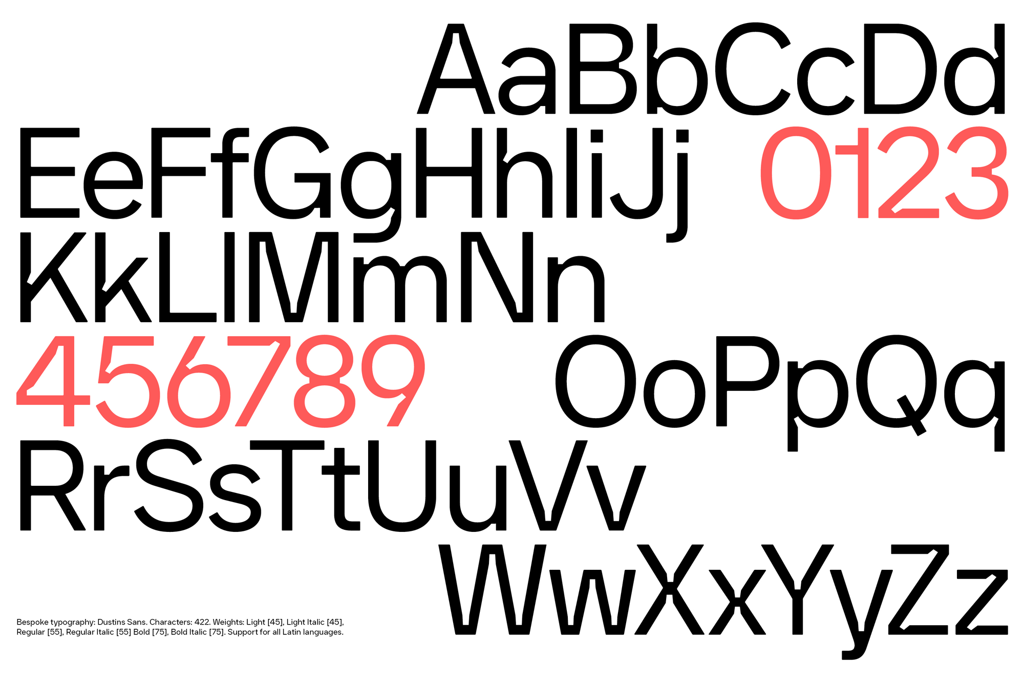
By now I probably don’t have to tell you how much I enjoy ink traps, so I’m predisposed to like this and I do. Especially those numerals. I feel like we’ve seen a number of heavily inktrapped custom fonts recently and this one, in a way, is not that different but I really appreciate how it ties in with the icon.
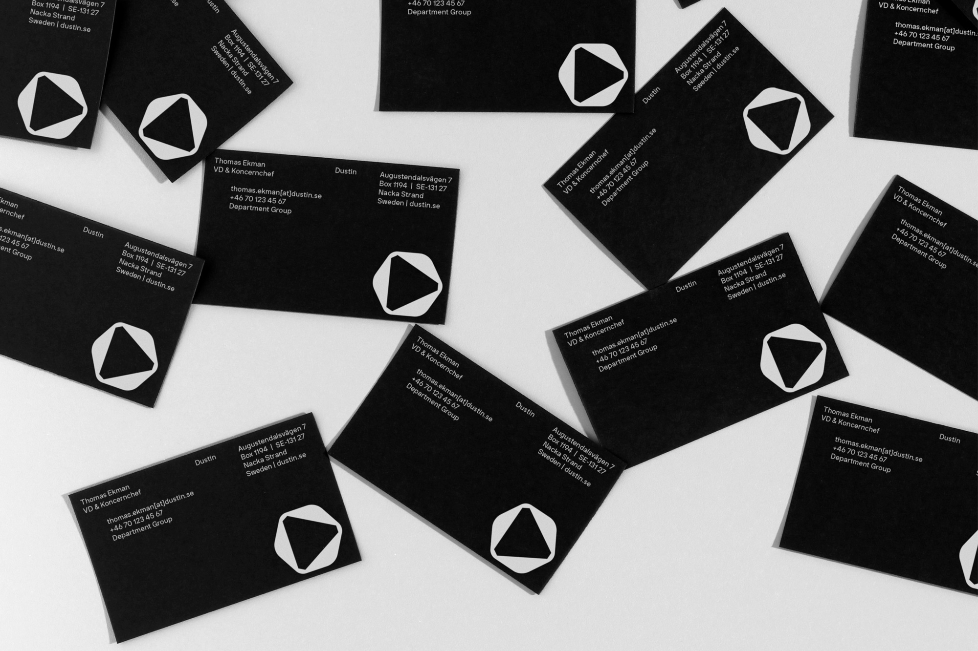
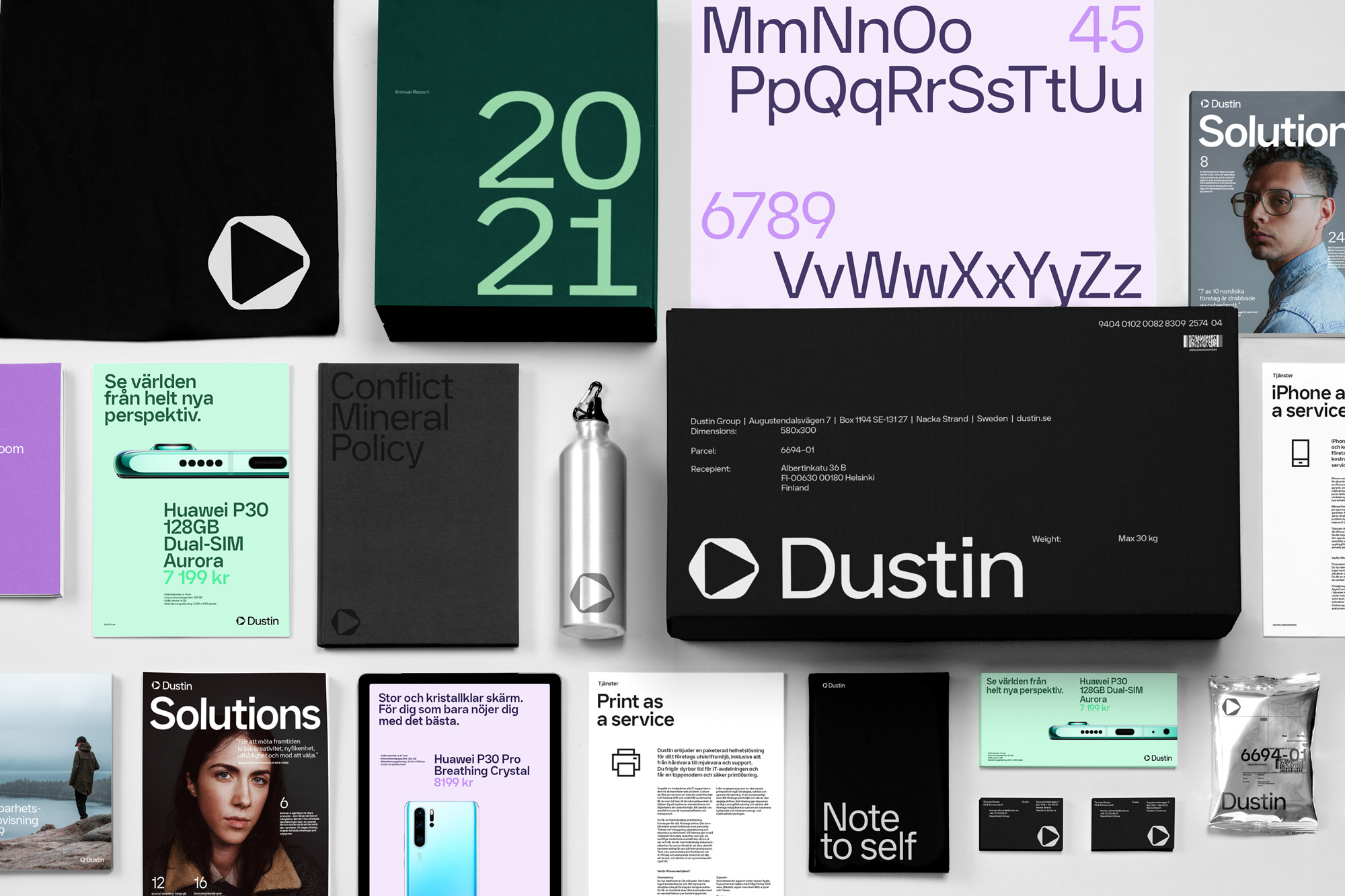
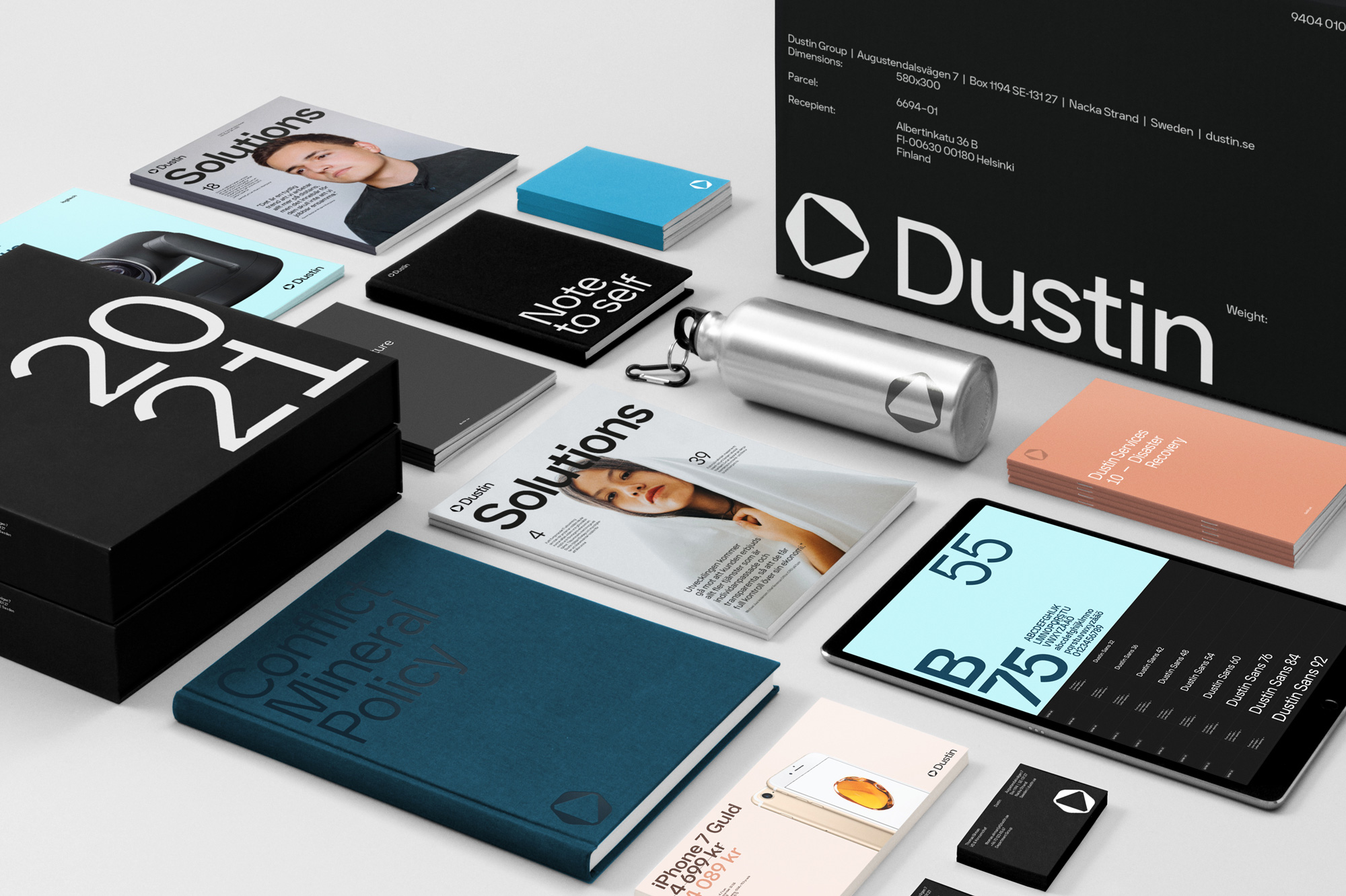
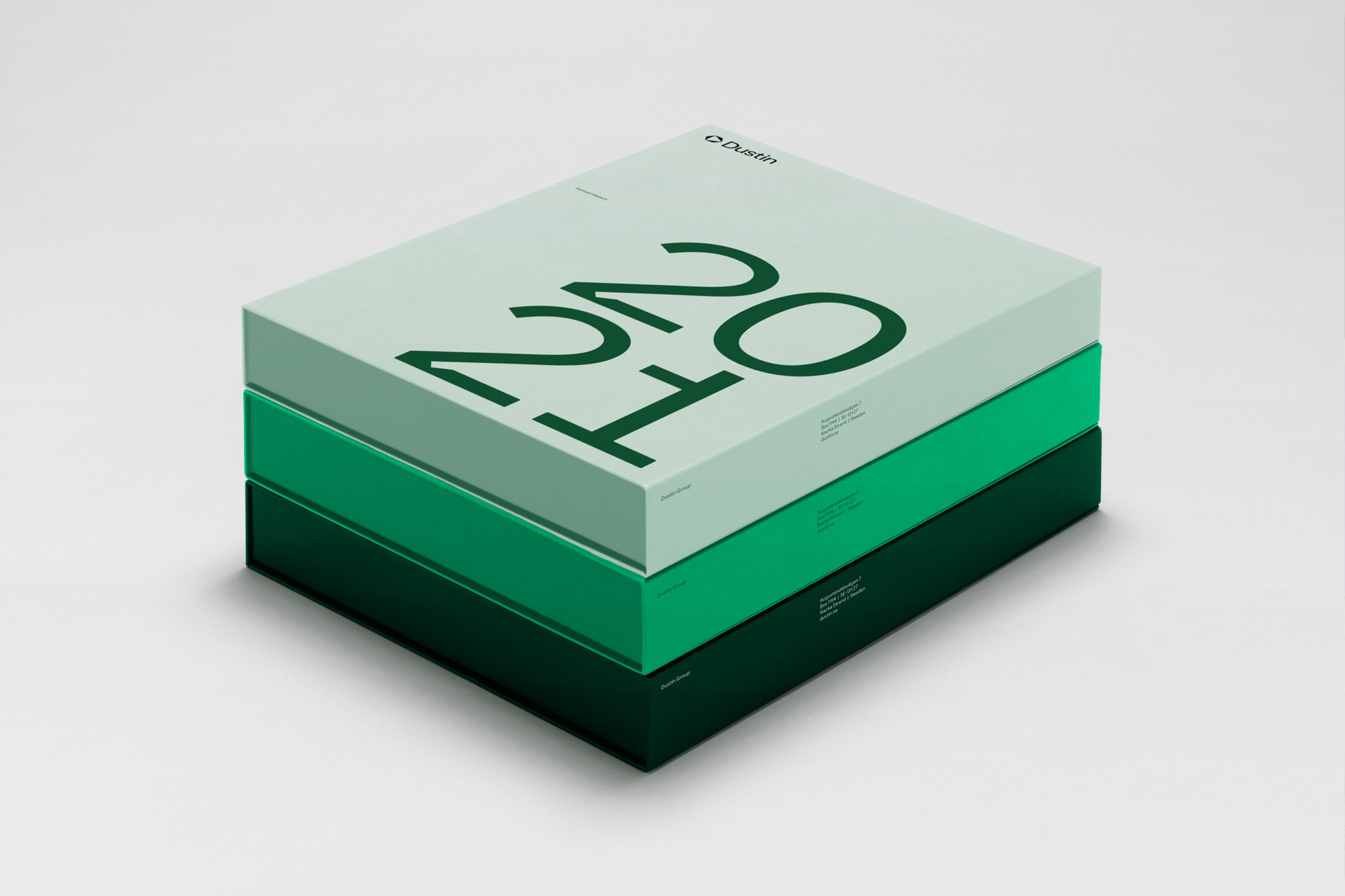
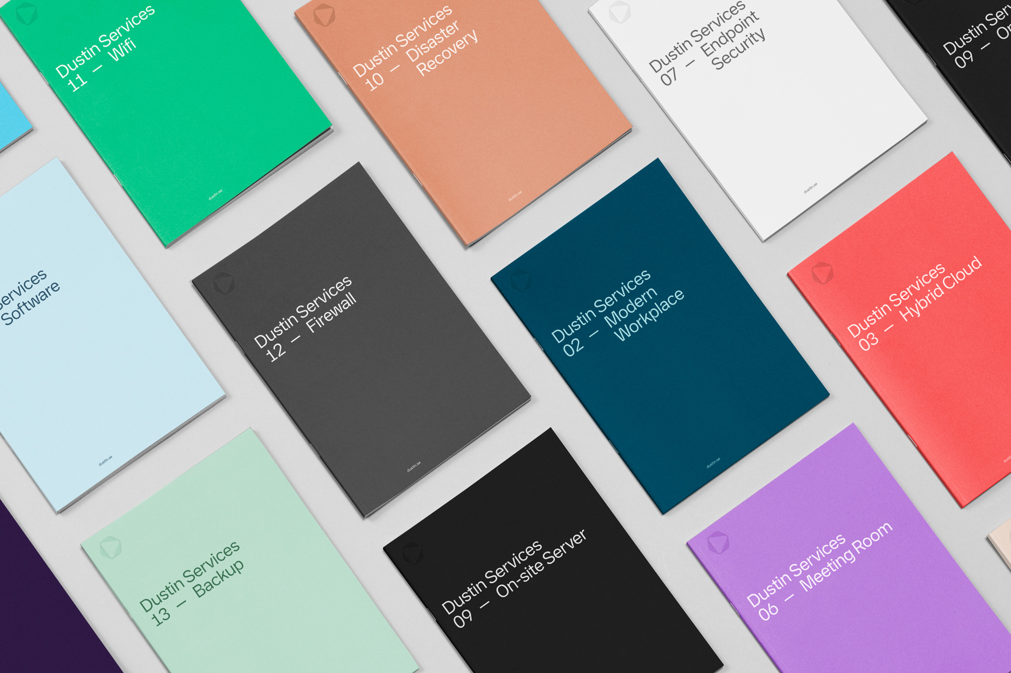
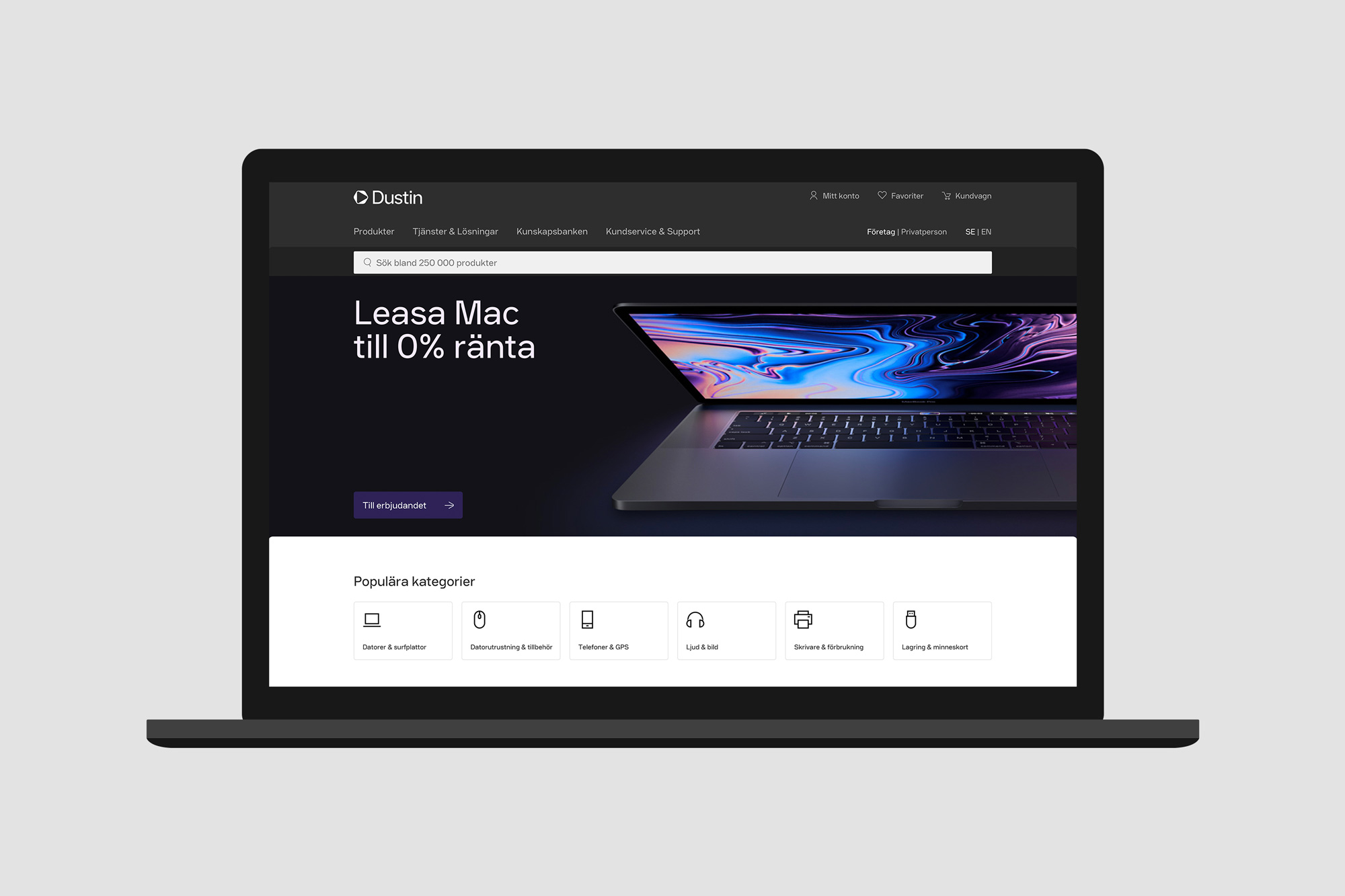
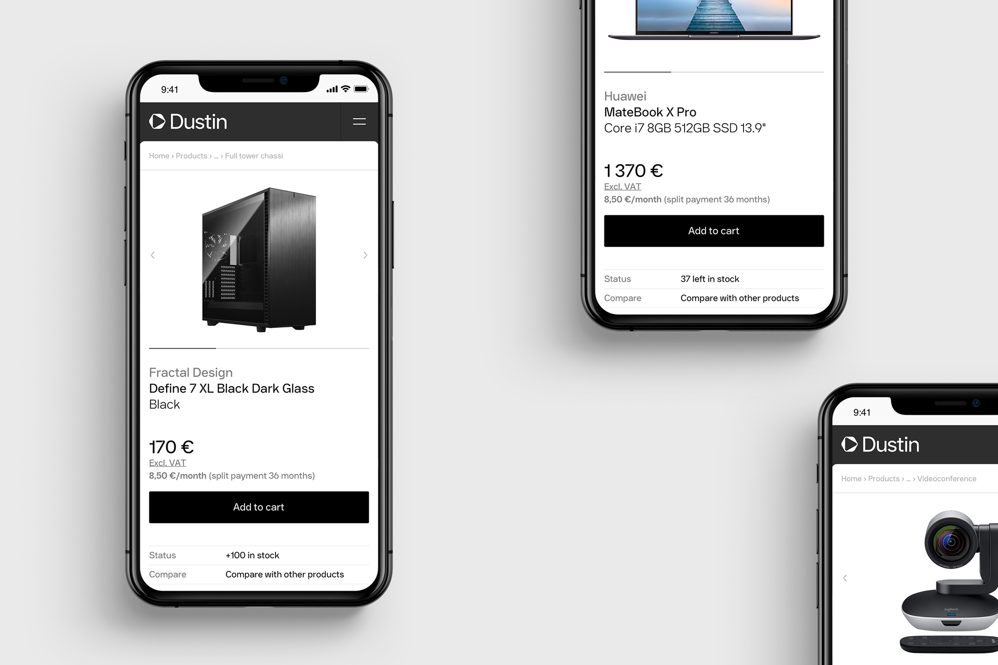
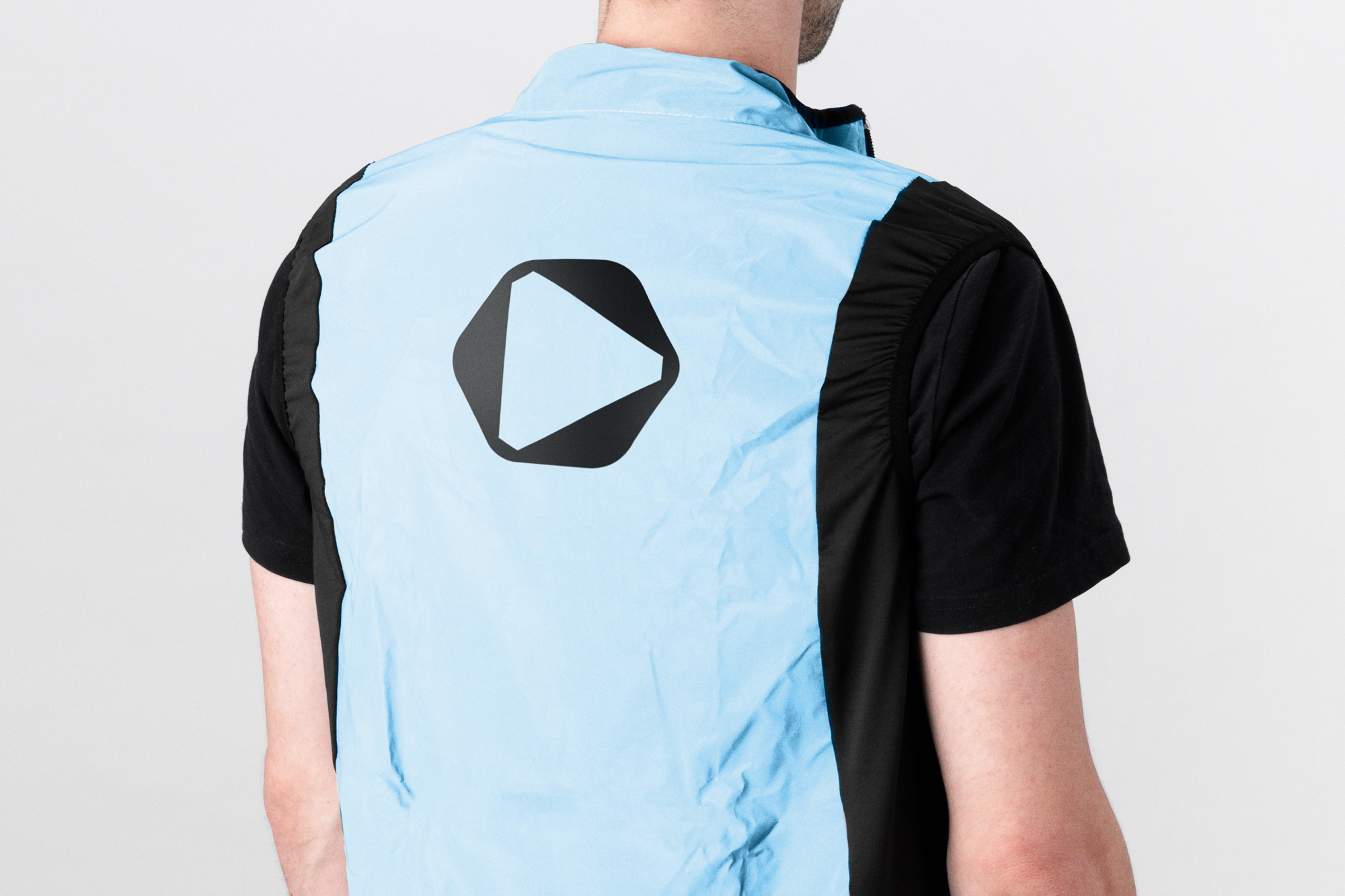
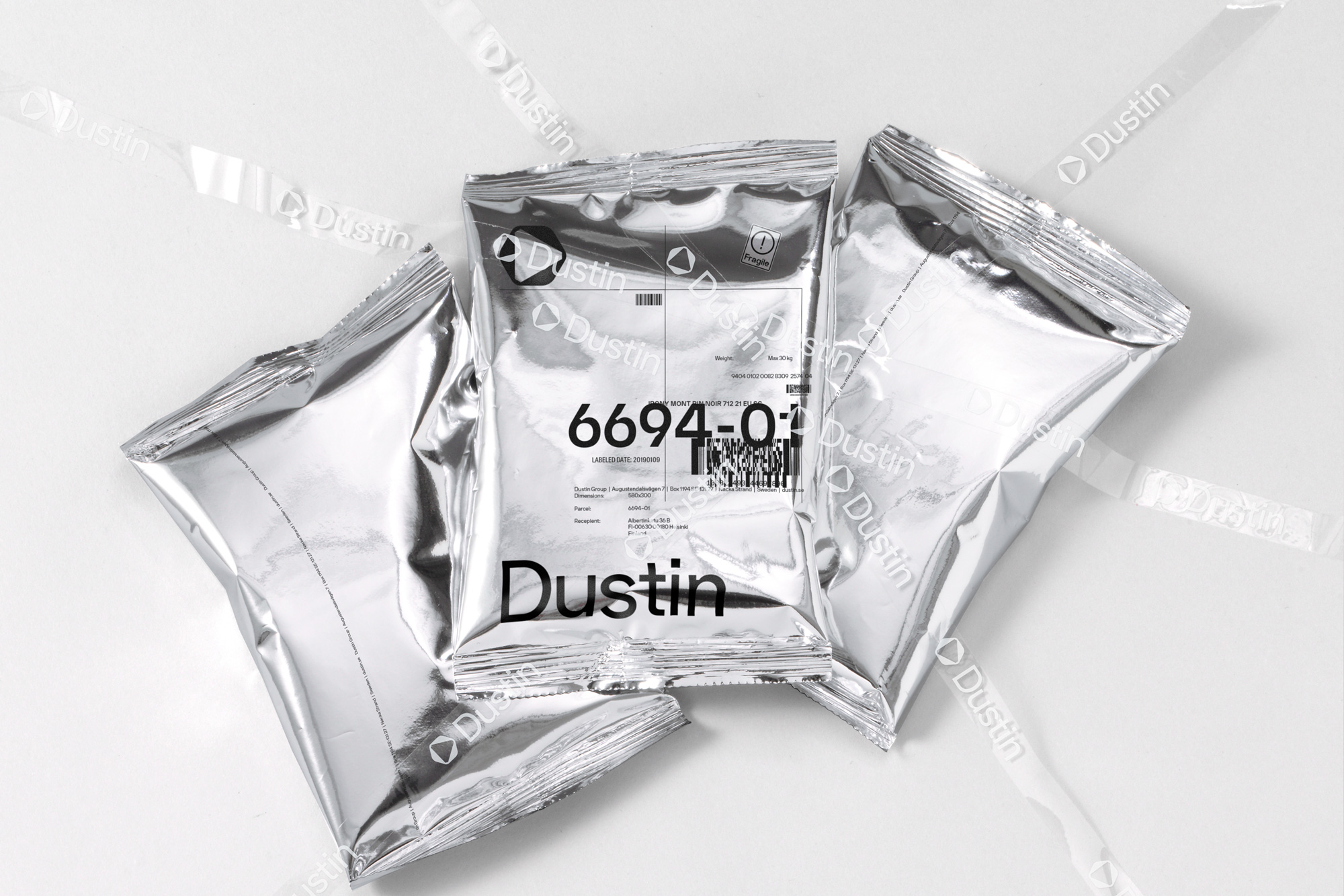
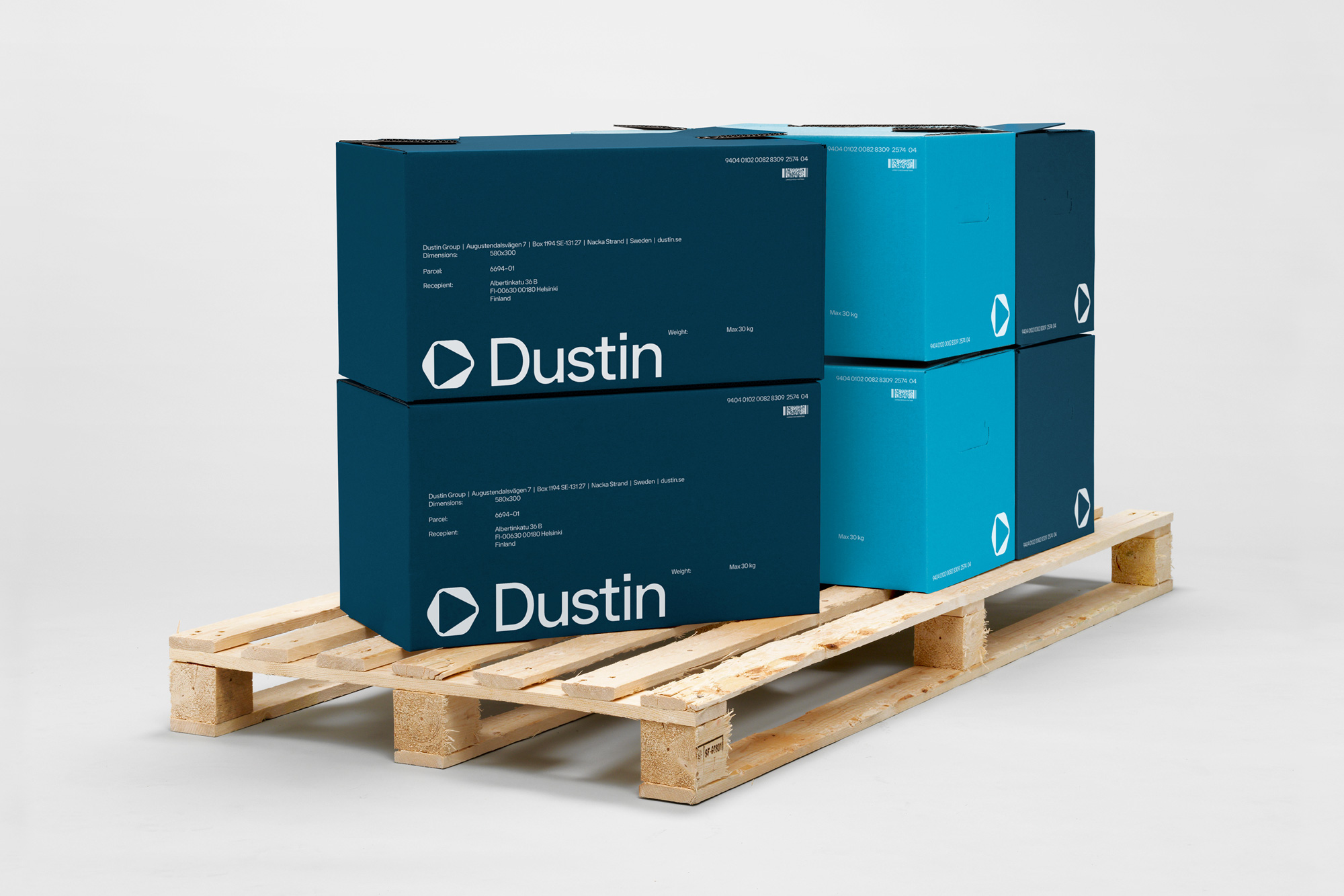
The applications are fairly straightforward in that there isn’t a whole lot going on in the layouts… it’s usually just the logo and type but the balance and contrast of the minimal elements are very nicely nuanced, able to shift from big and bold to small and subtle tones easily.
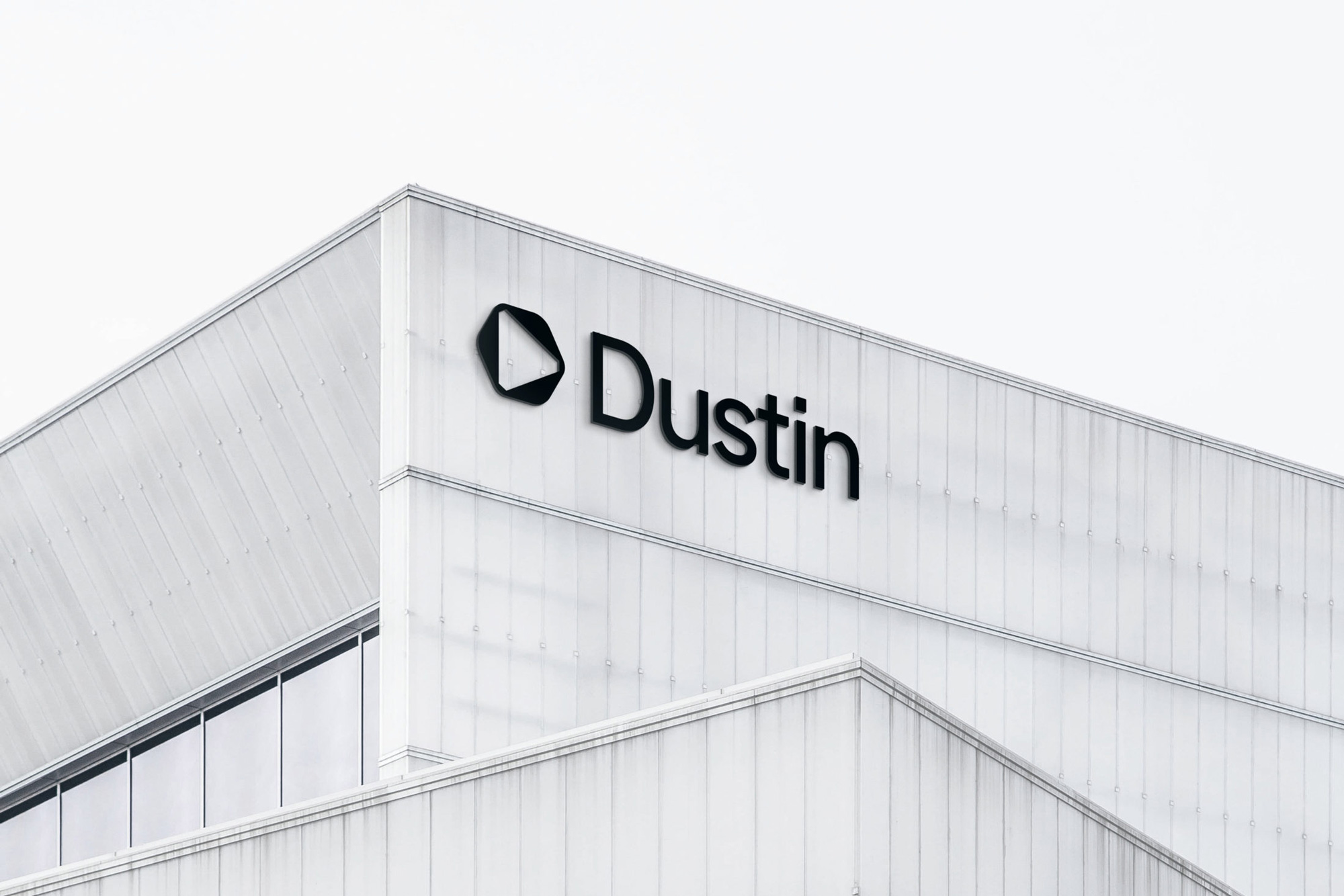
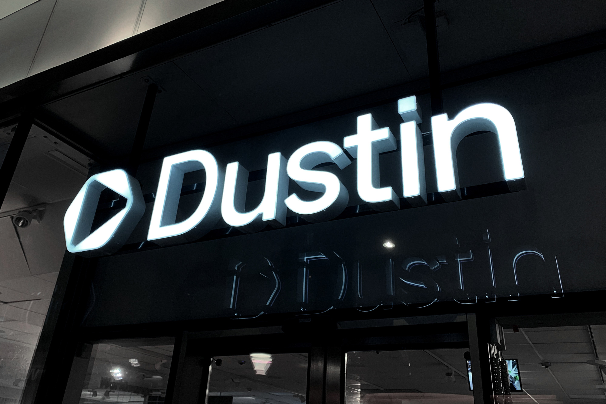
Overall, this has a kind of highly engineered aesthetic where everything has been precisely sized and placed, making the company feel like an IT service and product provider at the top of its game.

 Новости Союза дизайнеров
Все о дизайне в Санкт-Петербурге.