Обзор лучших ресурсов по разработке бренда, разработке упаковки
contact us | ok@ohmycode.ru
contact us | ok@ohmycode.ru
I assume Paris doesn’t need much of an introduction but, for the record, from Wikipedia: “Paris is the capital and most populous city of France, with an area of 105 square kilometres (41 square miles) and an official estimated population of 2,140,526 residents as of 1 January 2019. Since the 17th century, Paris has been one of Europe’s major centres of finance, commerce, fashion, science, and the arts.” This redesign is NOT a tourism brand, it’s for the City of Paris, the organization that provides city services and information — all the unsexy stuff that makes a city work. As the result of an open call for proposals, Paris recently introduced the winning identity designed by local firm Carré Noir.
The logo is based on the nave - the historical symbol of Paris representing a boat, symbol of the capital for over a thousand years. The city’s motto is Fluctuat Nec Mergitur - Fluctuates but never sinks. The visual identity of the city of Paris is a rendez-vous with ourselves, all Parisians and all those who operate and work, night and day to improve our daily lives and enhance the aura of this city like no other.
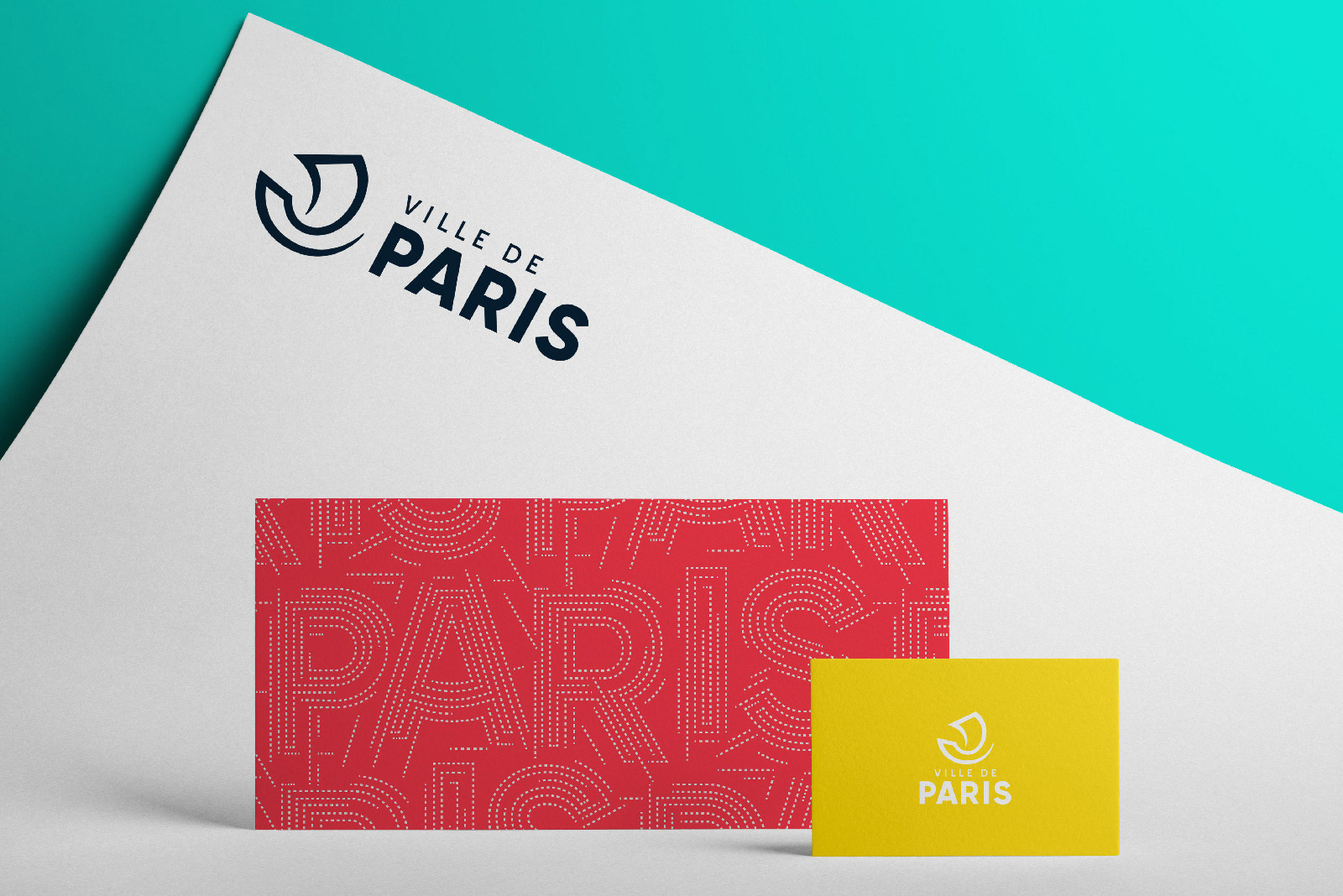
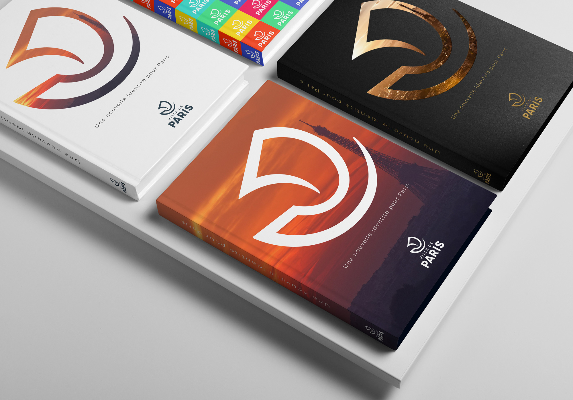
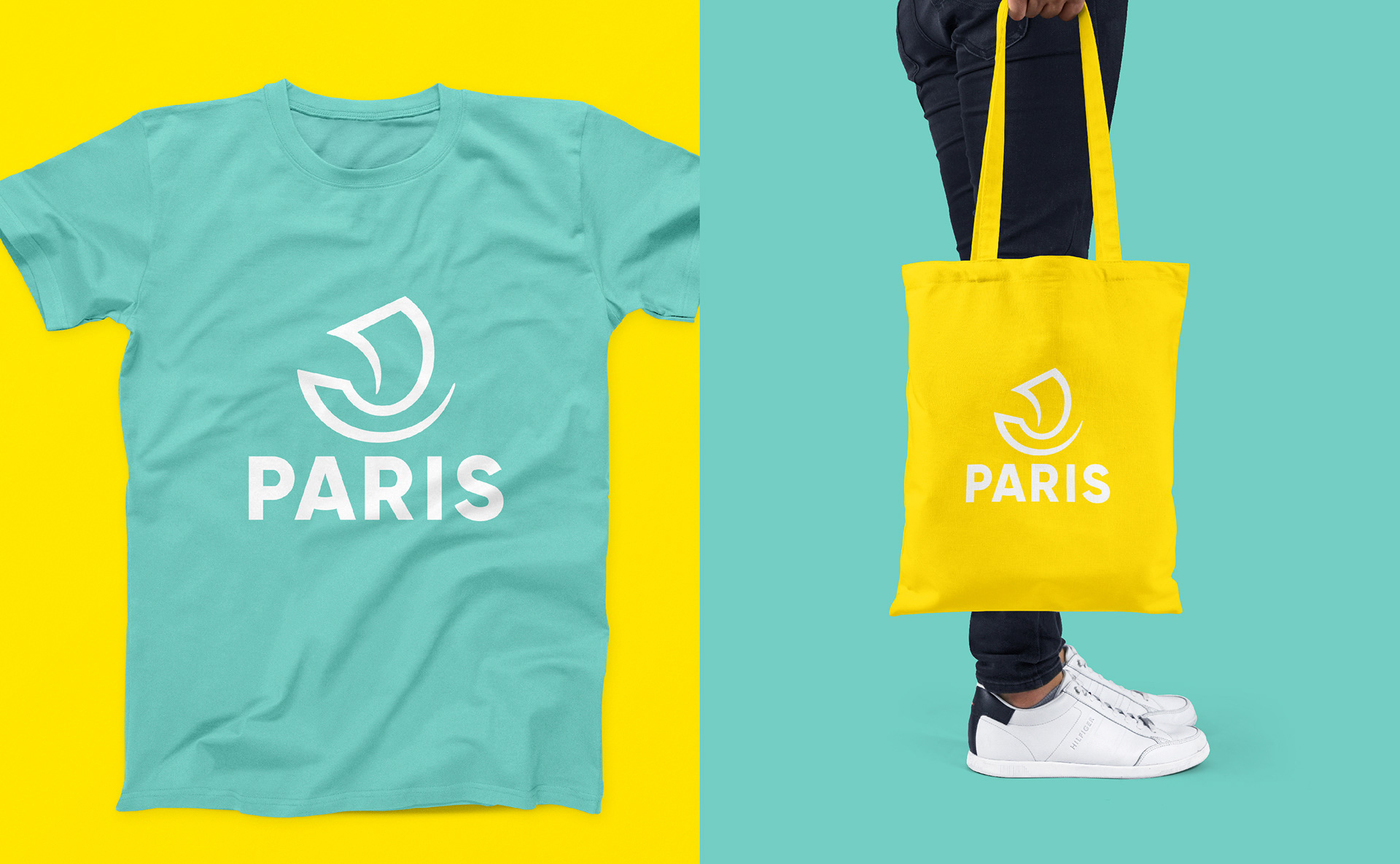
The nave symbol is drawn with a single stroke. The overall shape is based on a circle but the front tip of the nave slightly goes beyond to create more weight on the front area. The mast rests centered on the vertical axis for stability and reminiscent of the nave’s original design. The overall shape is sober, dynamic and elegant at the same time, sophisticated to be unique, simple to be recognizable.The Paris logotype is bold yet remains thin enough in order to create a good balance between the symbol and type. The A has a smile in its crossbar, where Bienvenue / Welcome is in the DNA of Paris. The type is set in capital letters to establish its status as a great, timeless world capital. The logo is set in monochrome navy blue, which brings modernity and elegance.
The old logo had a not-so-stellar ship icon but it still read as a ship and a decent wordmark until it got to the “S”, which went rogue and created a seriously distracting element. Keeping the ship was a must in the brief and even if it wasn’t, it seems like it would be the proper thing to do. The new ship icon is pretty nice — I don’t love it-love it but it’s convincing in form and dynamic in execution. The wordmark is a good complement with its bold weight, contrasting well with the thinner icon. I don’t think the “smile” on the “A” was necessary but there it is.
The color explosion cheapens the logo dramatically. Even though it would be a cliché I think they should have stuck with the red, white, and blue color palette instead of introducing all these random bright colors that take away from the otherwise simple logo.
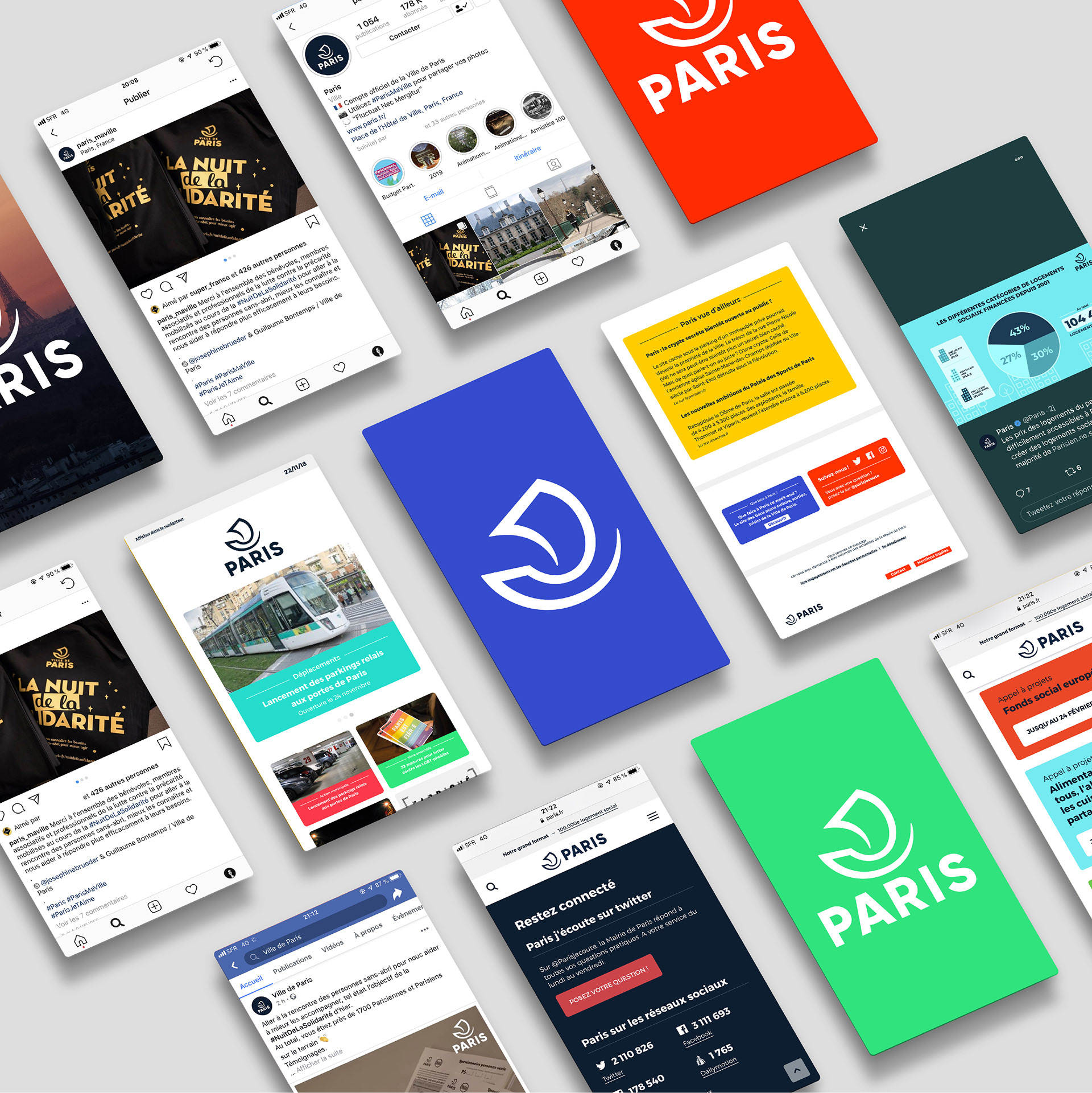
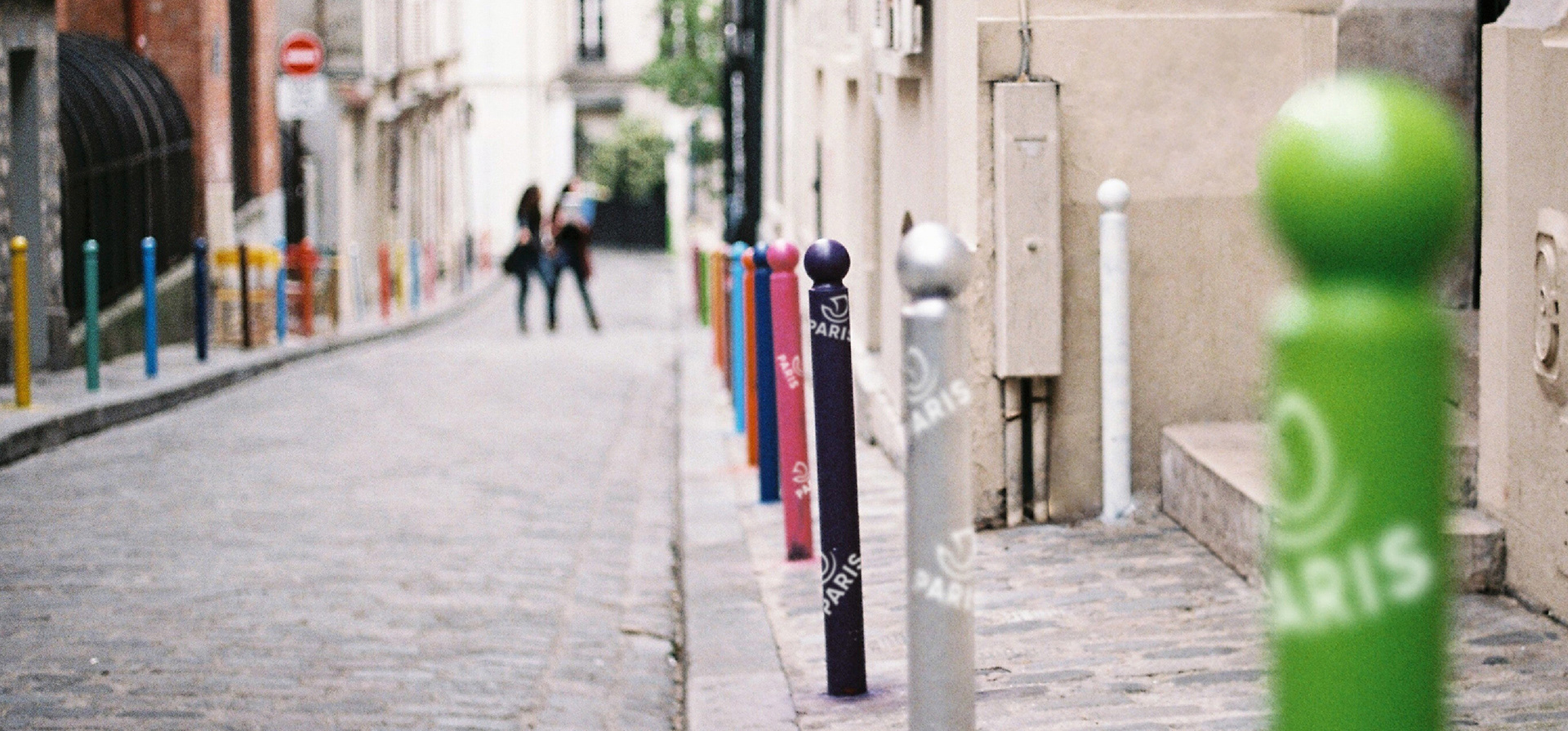
The new identity is digital, modular and allows a cohabitation with the historical identity by bringing a graphic system more adapted to the new uses accompanied by a bright and saturated color palette. The Ville de Paris brand gains in status and sobriety when the brand territory allows a great richness of accompanying colours, this adequacy ultimately creates a lively and rich whole.
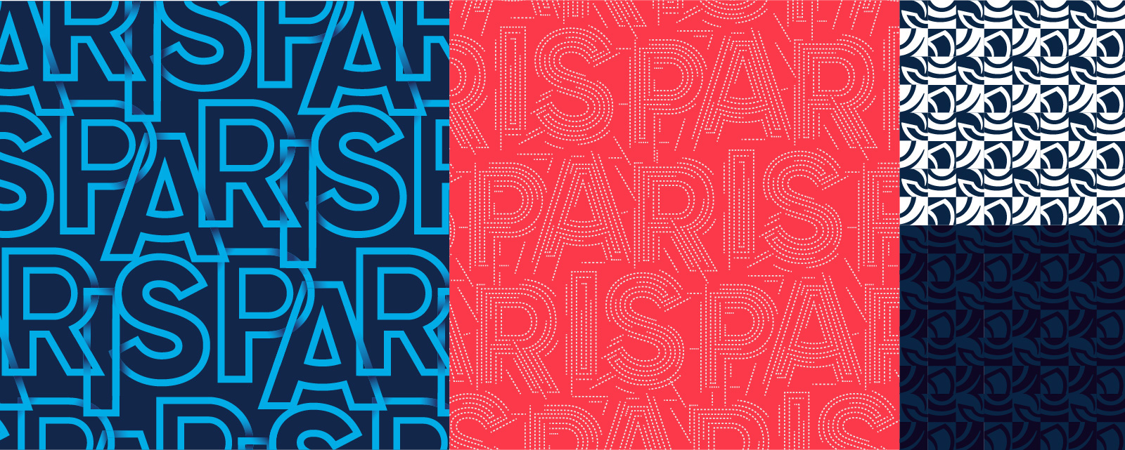
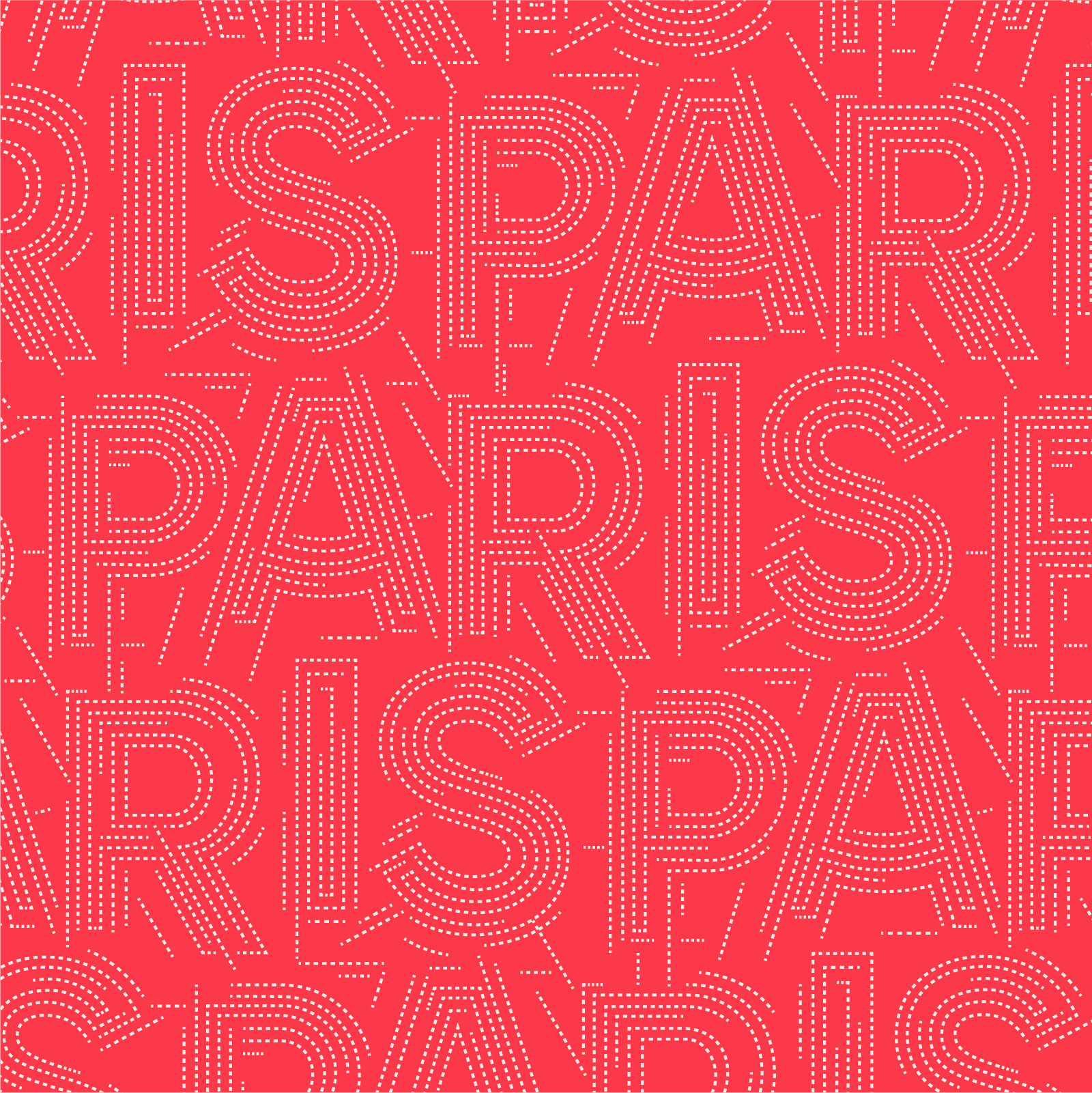
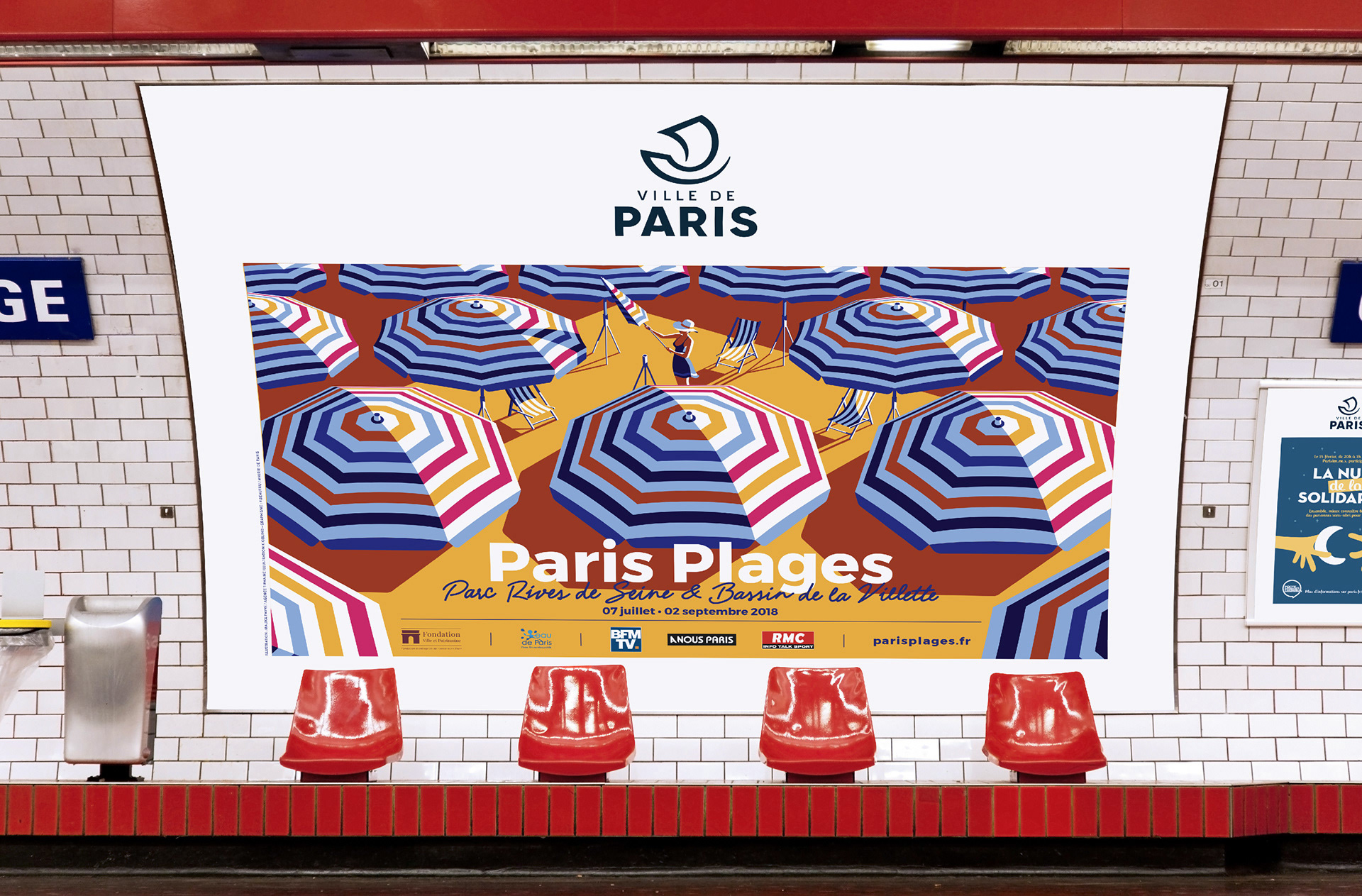
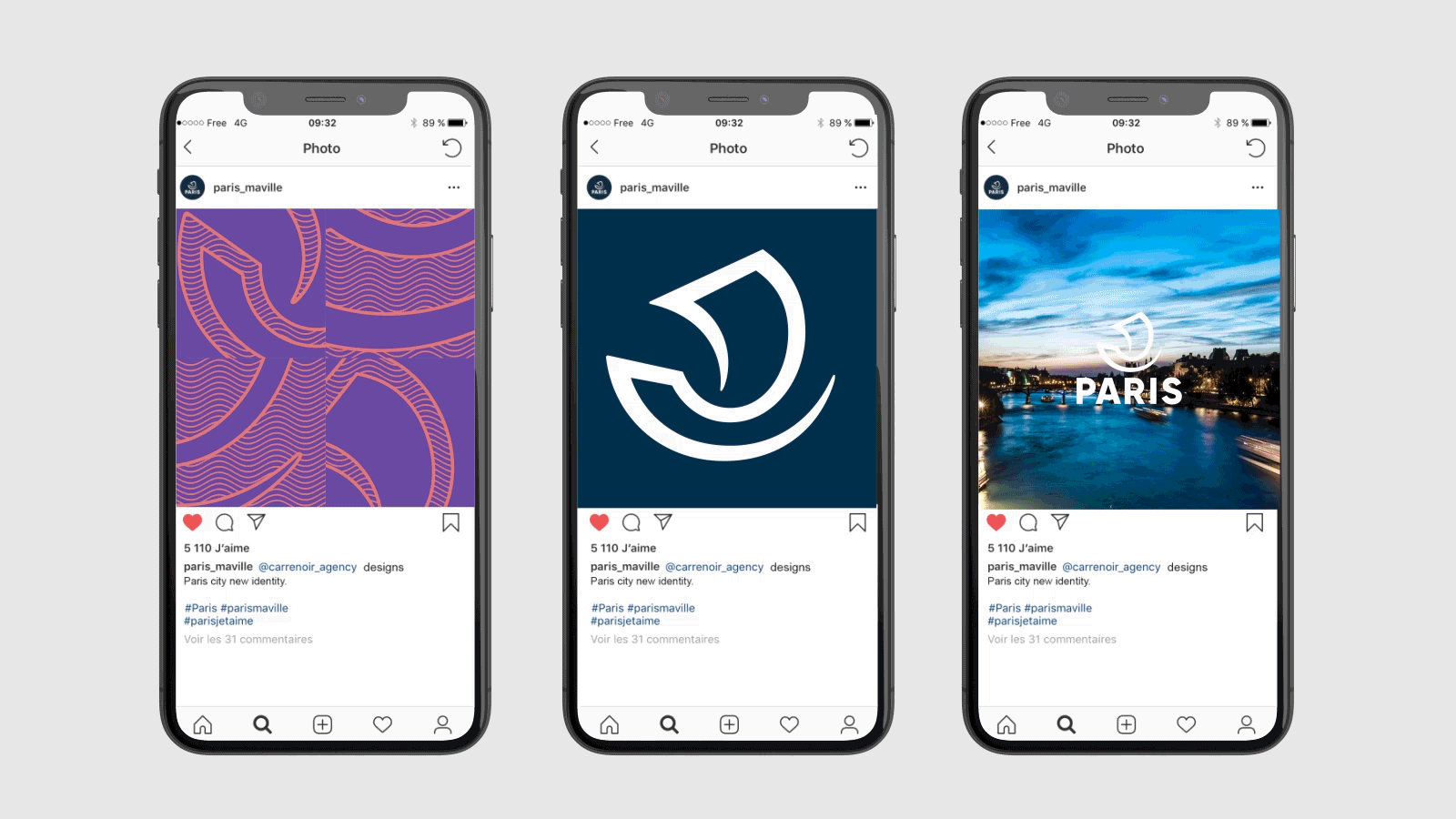
The patterns are kind of cool too, especially the dotted one. The one with the stroke/gradient needs to be redone though… someone messed up the counter spaces of the bowls in the “P” and “R”… “Align Stroke to Outside” — you are welcome. Sarcasm aside… there is something cool about the density of those two wordmark-driven patterns but unfortunately they only appear again once in application.

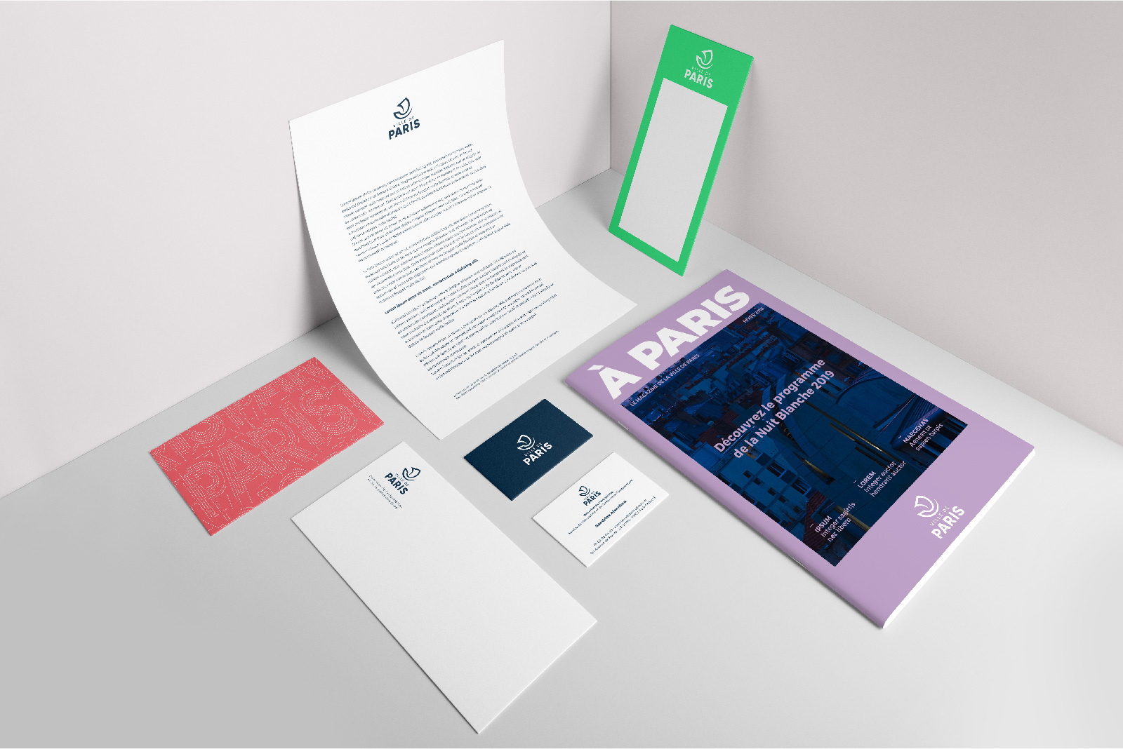
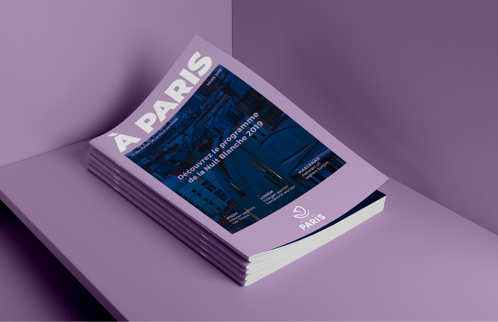
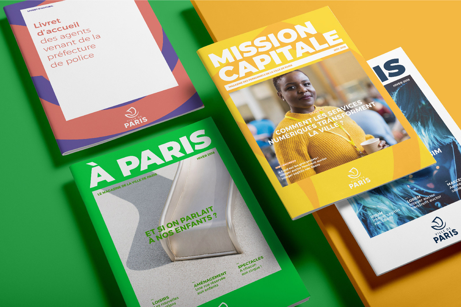
All editorial material was created with the “Marie-Louise” Frame around each visual creating a recognizable and premium feel to the brand. Not only does it allow the logo to have extra leg room but beautifies the visuals encapsulated inside of the frame. Beyond a white frame, we chose to use the frame to create extra branding through color and the magnified nave symbol adding dynamics and vibrancy.
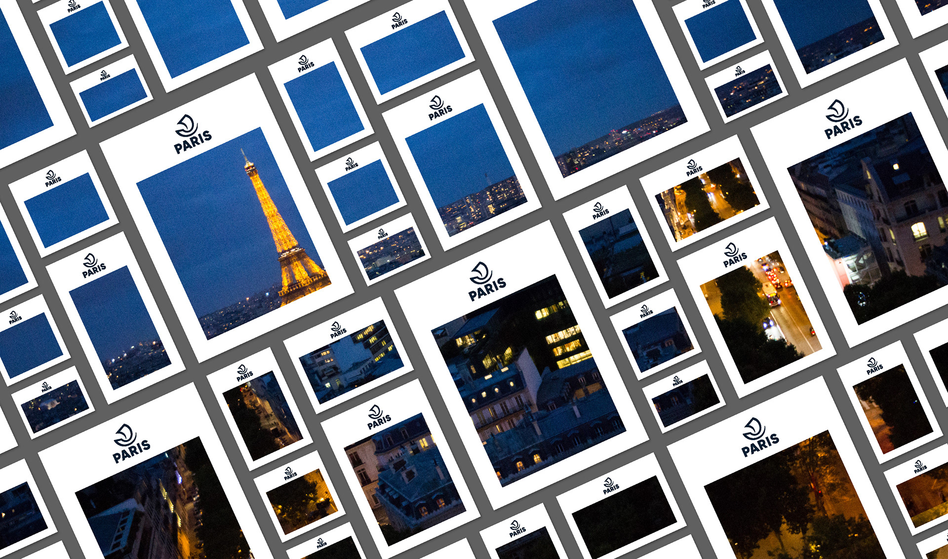
The use of the thick white frame (or colorful thick frame as seen below) is always a decent approach and it almost works here but, in the end, there is something clunky and unrefined about the layouts and the typography is too Montserrat-y, making everything look slightly generic — and just to be clear, the font used throughout is indeed Montserrat.
Overall, the logo is very appropriate for the city at the institutional level, as it’s simple and classy, providing a recognizable element for Parisians. While the identity is serviceable I think it could have been either refined or taken in a more interesting direction.
Thanks to Davar for the tip.

 Новости Союза дизайнеров
Все о дизайне в Санкт-Петербурге.
Новости Союза дизайнеров
Все о дизайне в Санкт-Петербурге.