Обзор лучших ресурсов по разработке бренда, разработке упаковки
contact us | ok@ohmycode.ru
contact us | ok@ohmycode.ru
Established in 1873, Delta Gamma is one of the largest women fraternities* in the U.S. with more than 250,000 initiated members in 152 collegiate chapters and 195 alumnae groups. (* Delta Gamma refers to itself as a fraternity instead of a sorority.) Their Greek letters were chosen by the three young women who founded the fraternity in Oxford, Mississippi, at the Lewis School for Girls when they were unable to go home for the Christmas break, because of their desire to “Do Good”, which remains their motto today. In 1951, the Delta Gamma Foundation, a nonprofit organization, was formed to support fundraising, scholarships, programming and grants and specifically to help the visually impaired and other organizations that promote sight preservation and conservation. This month, Delta Gamma introduced a new identity designed by Columbus, OH-based Ologie.
The Delta Gamma identity represents us visually at the most basic level. It’s a signature, a stamp of quality, and a symbol of pride for all of us to rally behind.
The brand mark is a combination of elements that are unique to Delta Gamma. It represents timelessness and pride, and is deeply rooted in our fraternity’s history.
The wordmark is a distinctive graphic treatment of our name. It’s usually positioned alongside the brand mark to create a recognizable logo for our brand.
The first question that might come to mind, is why an anchor? It was adopted in 1877 as a symbol for hope. The second question that might come to mind, is why hope? It’s one of the values of the fraternity and their original pin featured a letter “H”. So… The old logo depicted the anchor in a rather mundane way, looking like a random marina or seafood restaurant and accompanied by painfully obvious fake small caps with the “D” and the “G” far too bold in contrast to the smaller uppercase letters. The new logo is a lovely and much needed evolution that not just adds sophistication but brings it into the academic world. The anchor is now more minimal and instead of the rope as a garnish it features the Greek letters filling in the counterspaces quite well and supported by a minimal rose graphic that follows the contour of the anchor. The wordmark is set in a very nice serif — ID help, please FF Milo Serif — that looks book-ish and contemporary. The year at the bottom is probably not needed but it does create a good balance with the anchor. Overall, the logo manages to feel feminine, strong, and confident without being heavy-handed about any of those aspects.
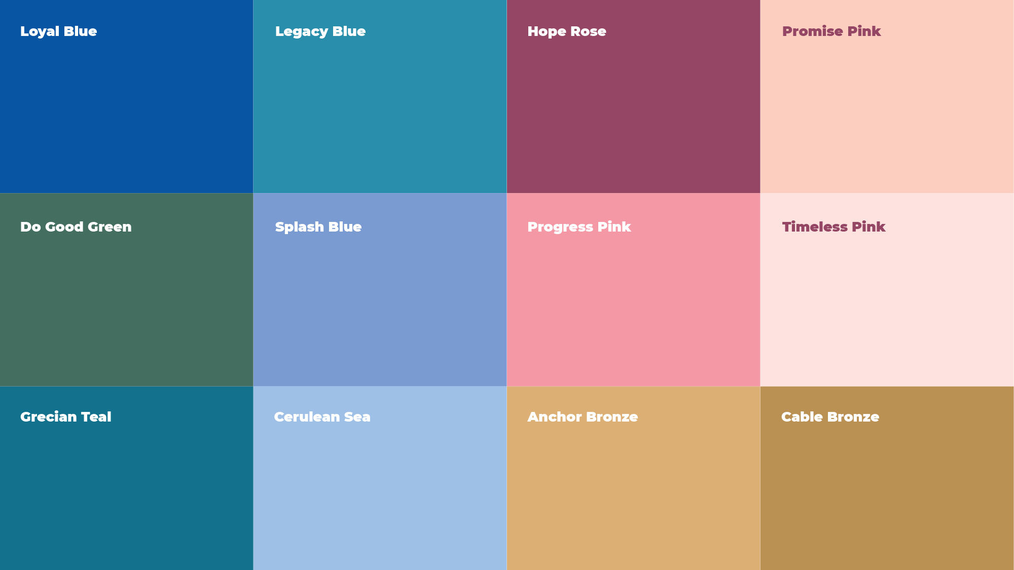
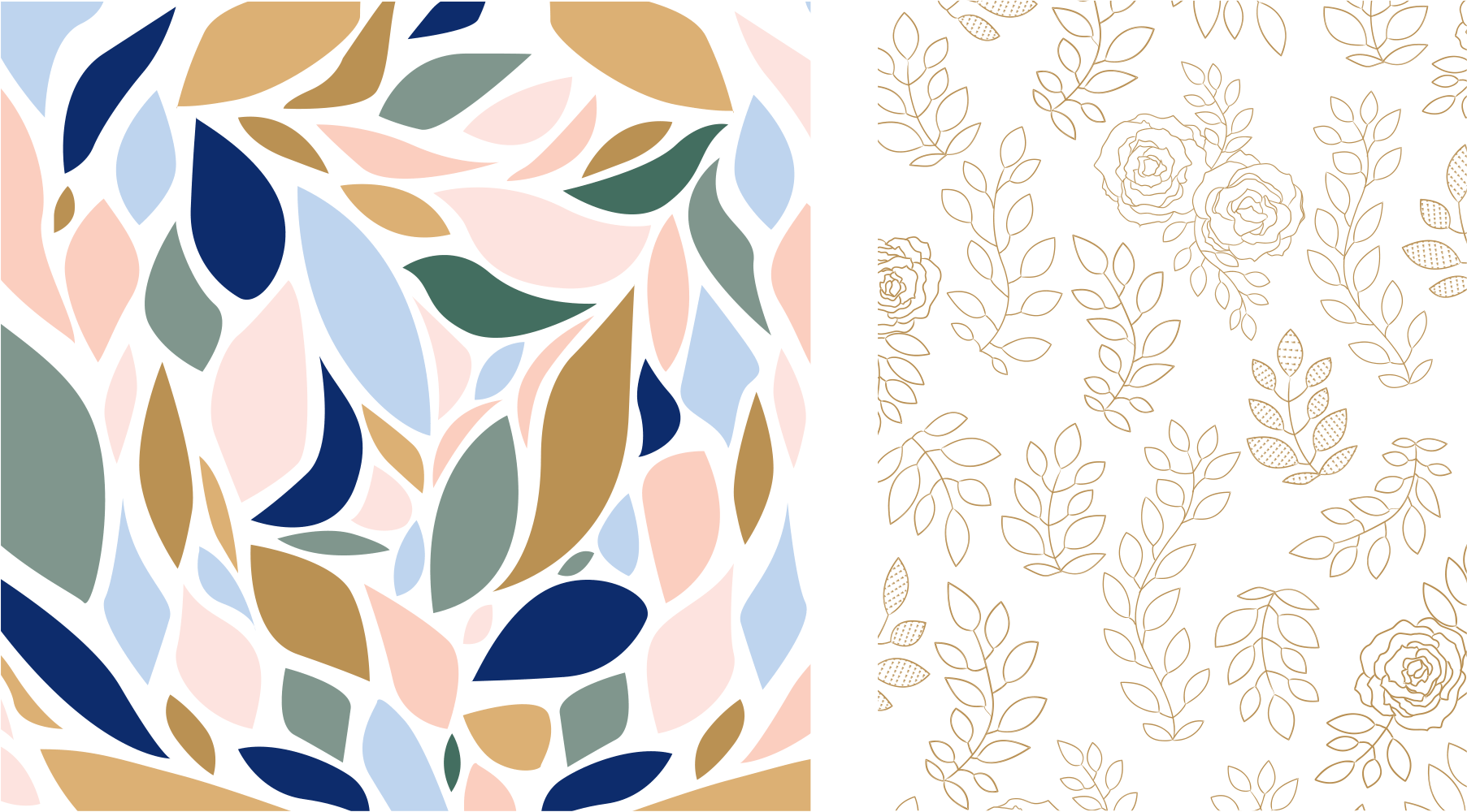
Our color palette is bold and distinctive. It relies primarily on our heritage colors of blue and pink, along with generous white space. Secondary colors are used for deeper levels of content in layouts and for breaking up headlines. By leaning on our heritage colors and plenty of white space, we create a modern look that still connects with our tradition.
The eagle, rose, and pillar badges represent our three entities: fraternity, Foundation, and Housing.
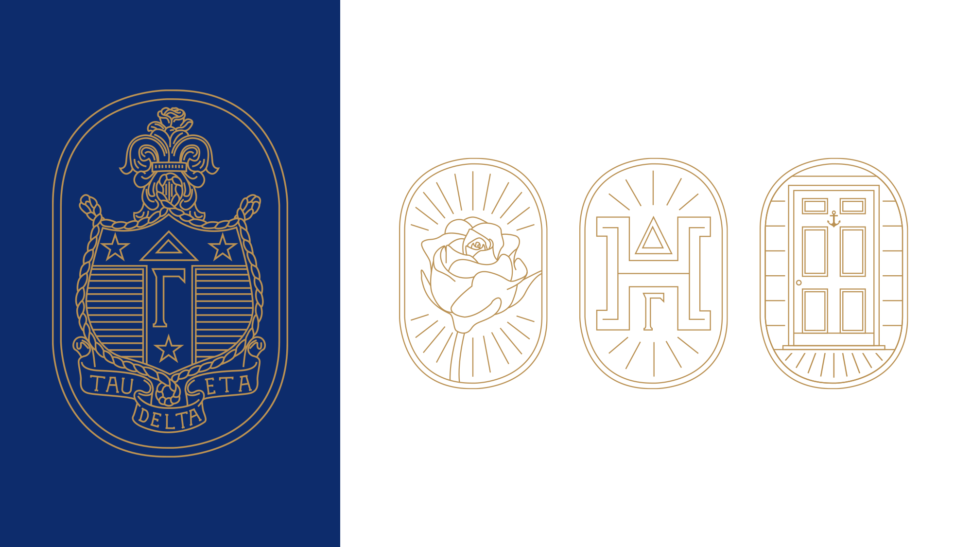
The rose is an iconic symbol of our fraternity that’s deeply rooted in our heritage. The leaves and laurels represent Greek life. Like our floral illustrations, colored leaf backgrounds represent the femininity and beauty of the Delta Gamma spirit.
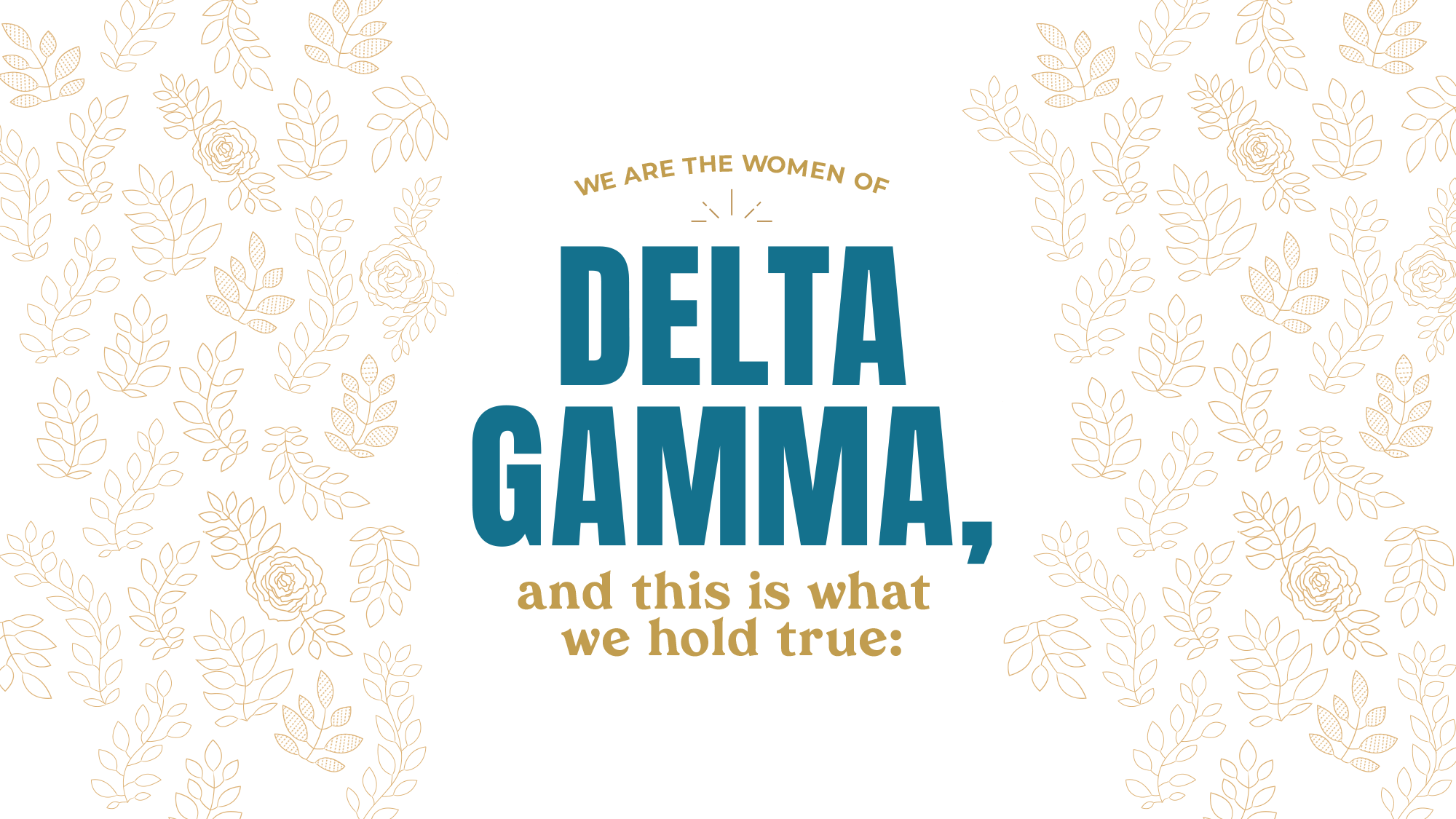
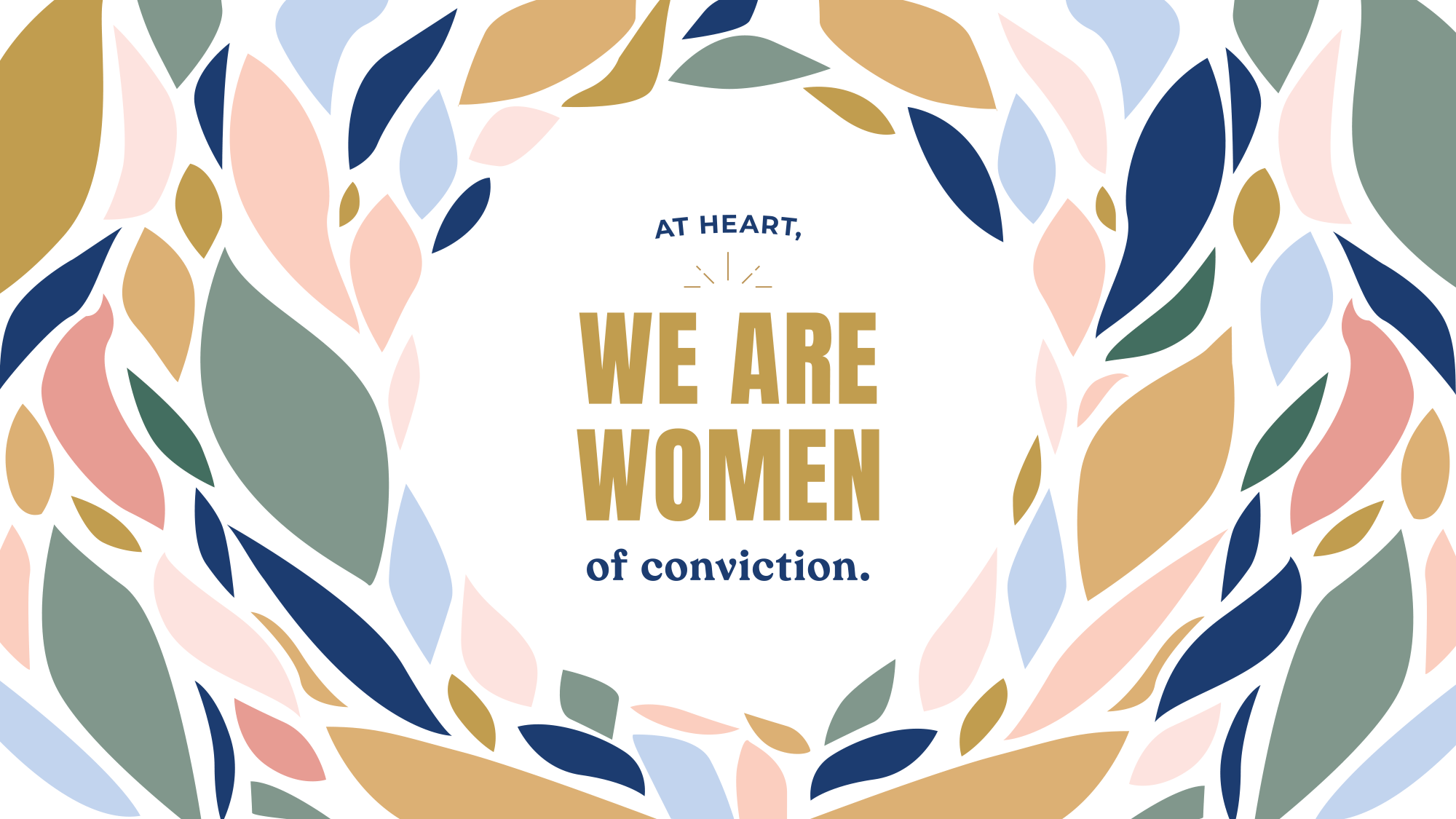
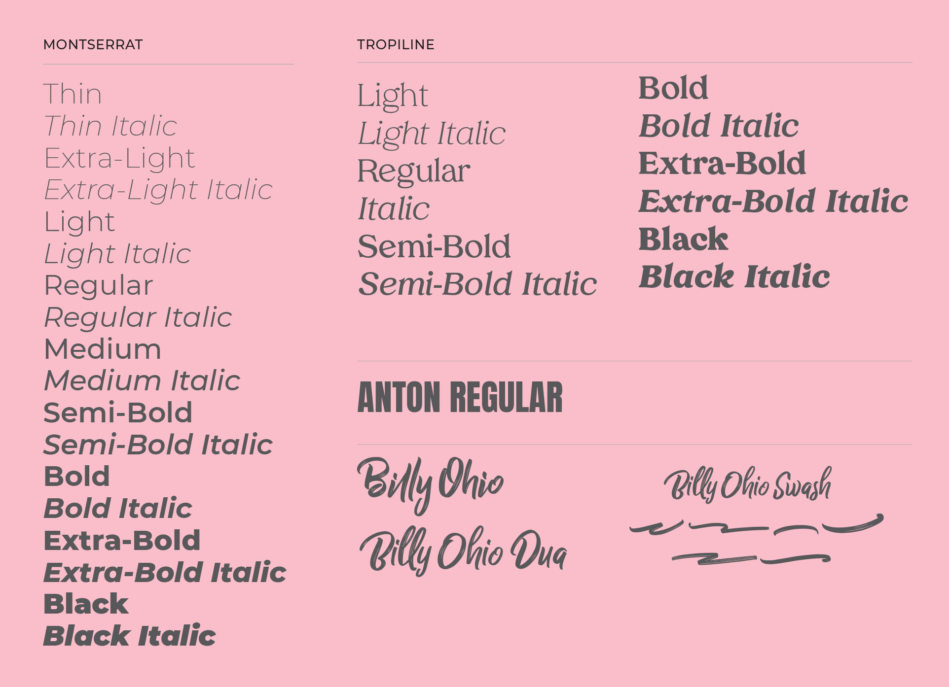
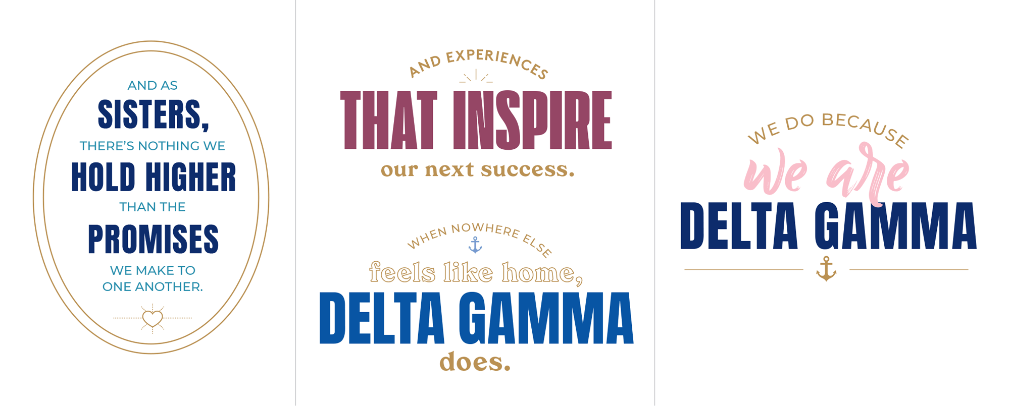
There is a really nice variety to the identity elements: the color palette feels warm and approachable, the typography comes across as both bold and relaxed, and the patterns provide attractive visuals to frame content and messaging. I particularly like the combination of the condensed Anton with the bold Tropiline serif and I’ll admit that I’m a low-key admirer of hand-drawn script fonts… I rarely, if ever, use them but I really like them, in all their inspirational-quote-goodness.
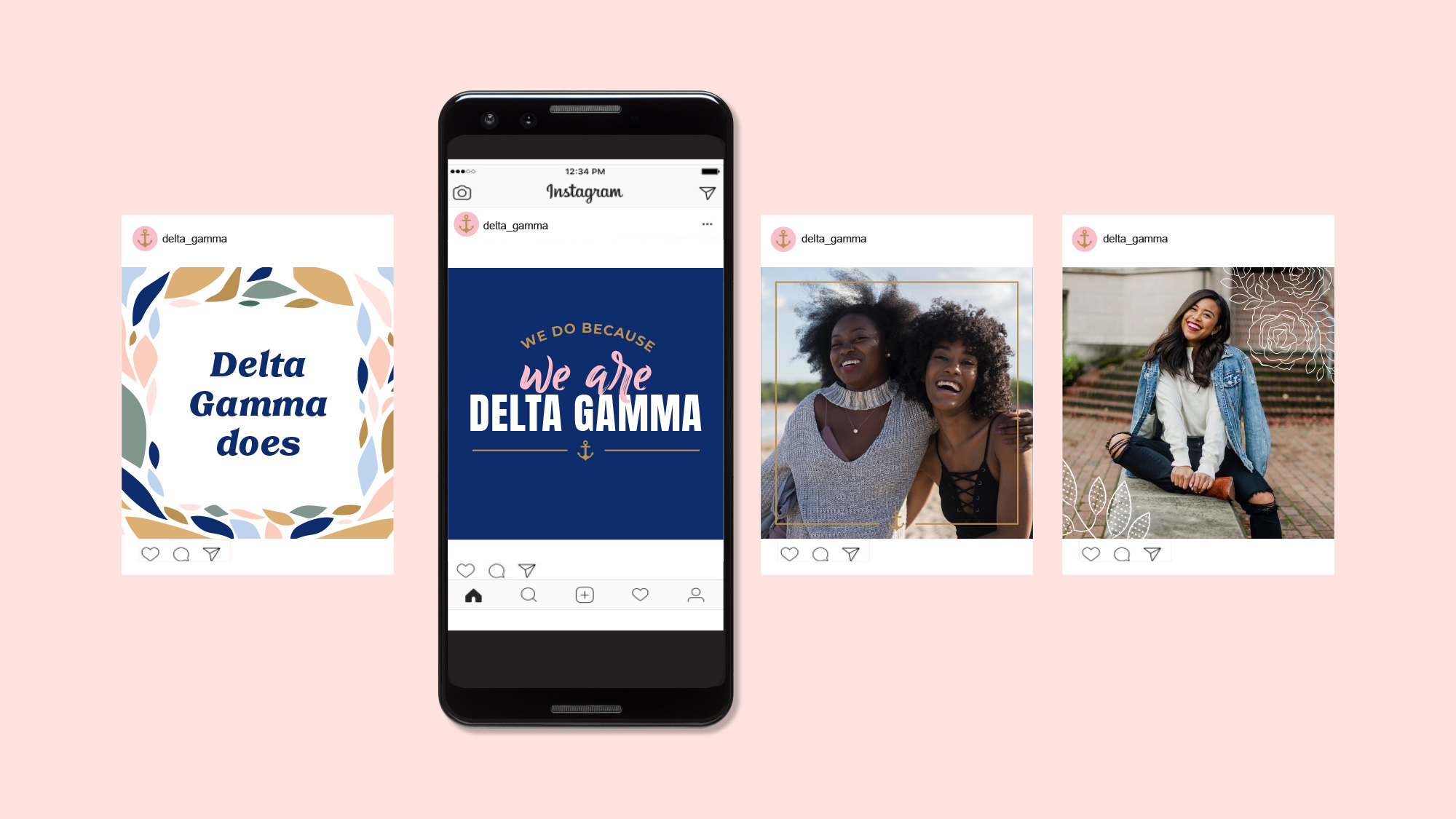

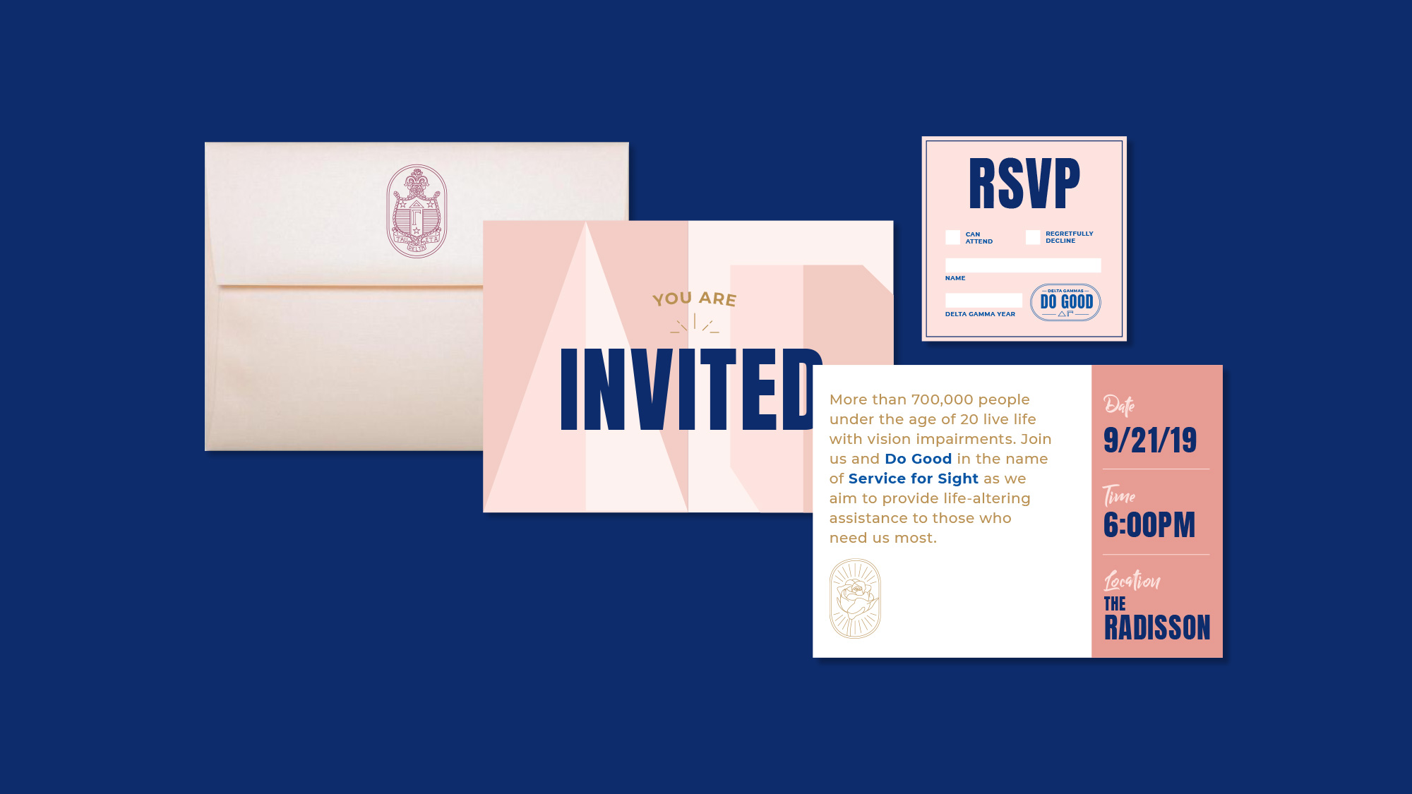
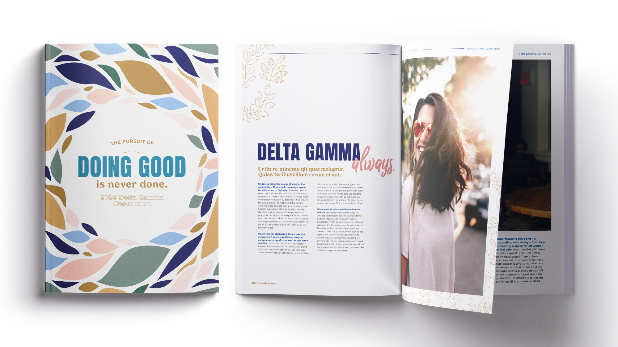
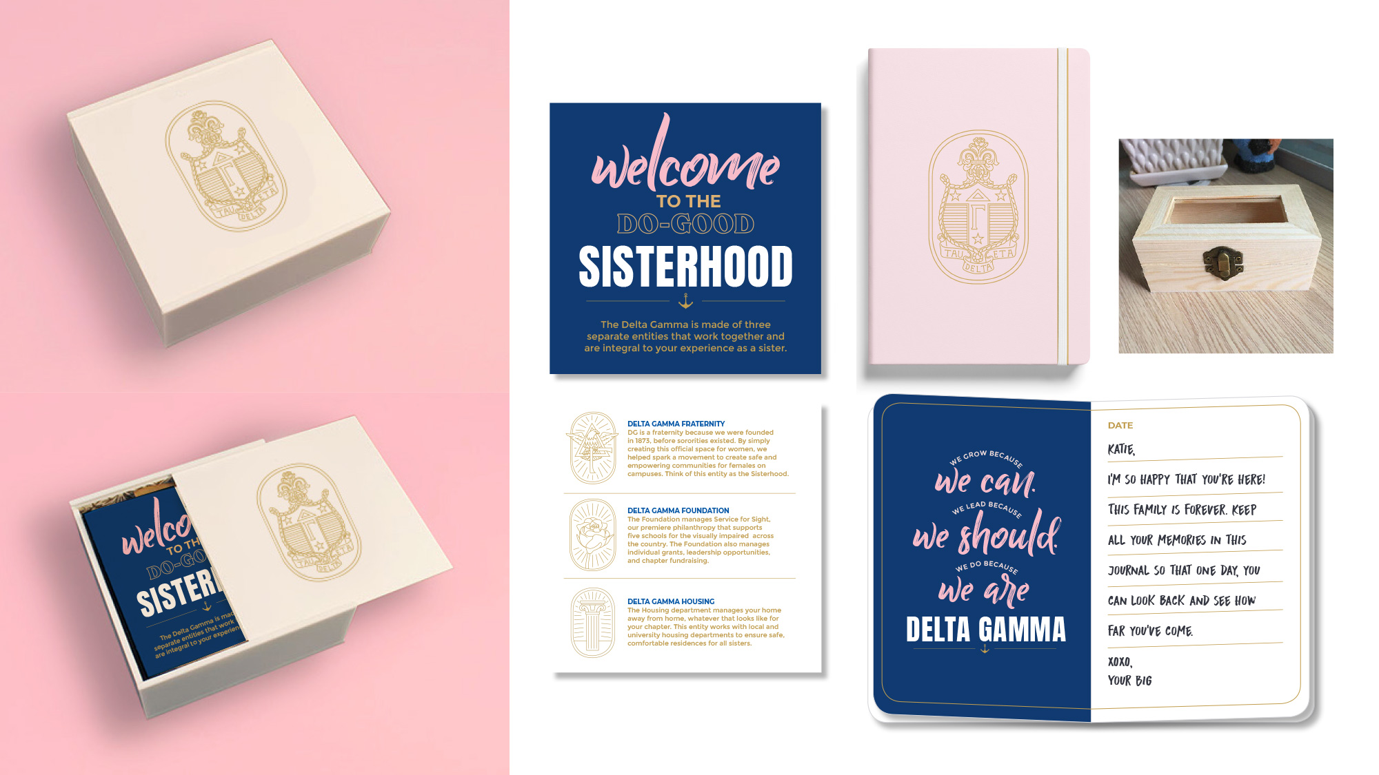
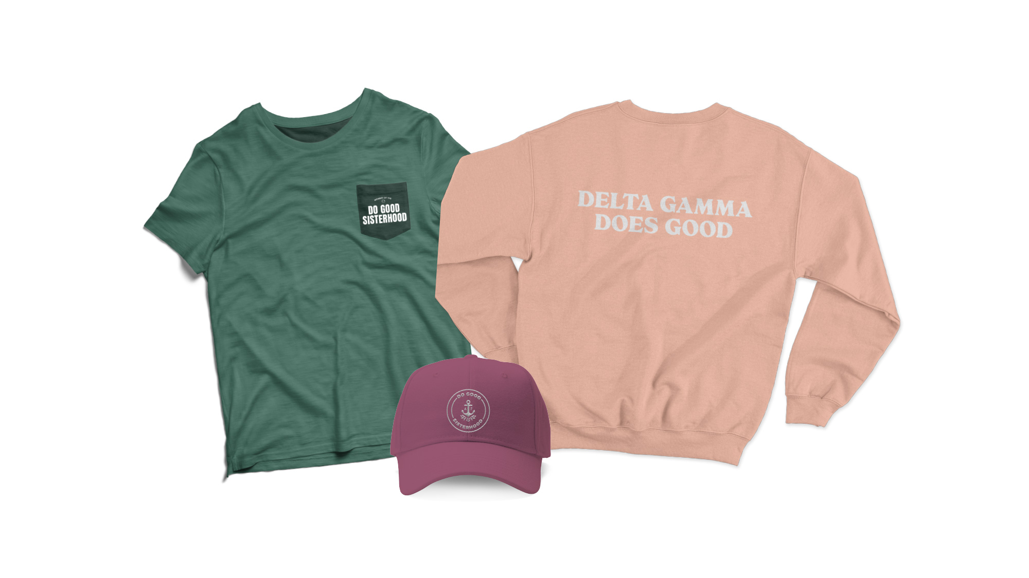
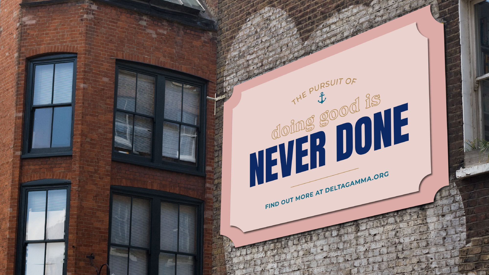
The applications are all fairly good. I’m not the target audience in any way but if I were a teenage woman eager to get into a sorority/fraternity, or an alumnus of Delta Gamma, I would be all over this. I have no idea what other sororities/fraternities’ identities look like but I have a feeling they are not as well considered or as robust as this. Overall, this comes across as inviting, energizing, and fun for past, present, and future members.
 each year since publication began in 2006

 Новости Союза дизайнеров
Все о дизайне в Санкт-Петербурге.
Новости Союза дизайнеров
Все о дизайне в Санкт-Петербурге.