Обзор лучших ресурсов по разработке бренда, разработке упаковки
contact us | ok@ohmycode.ru
contact us | ok@ohmycode.ru
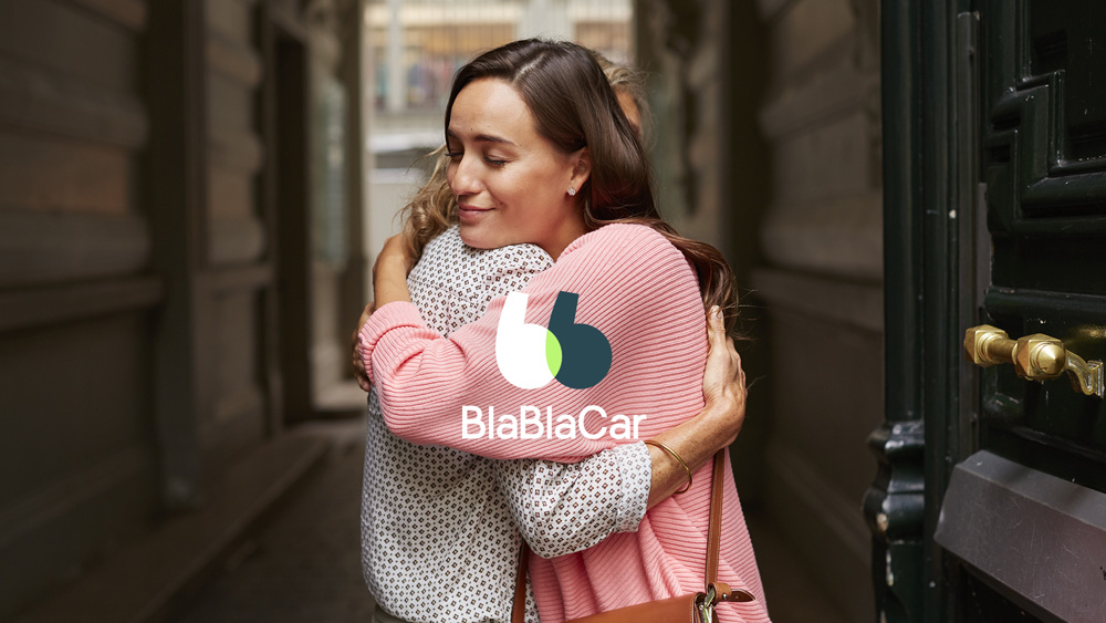
Established in 2006, BlaBlaCar is a long-distance carpooling platform that connects people looking to travel long distances with drivers going the same way, so they can travel together and share the cost. Unlike Uber, Airbnb, et al, BlaBlaCar is not about the driver making a profit and the platform encourages conversations, allowing each member to specify their level of chattiness from “Bla” to “BlaBlaBla”. Based in Paris and available in 22 countries, the platform now counts with 60 million users. This week, BlaBlaCar introduced a new identity designed by London, UK-based Koto.
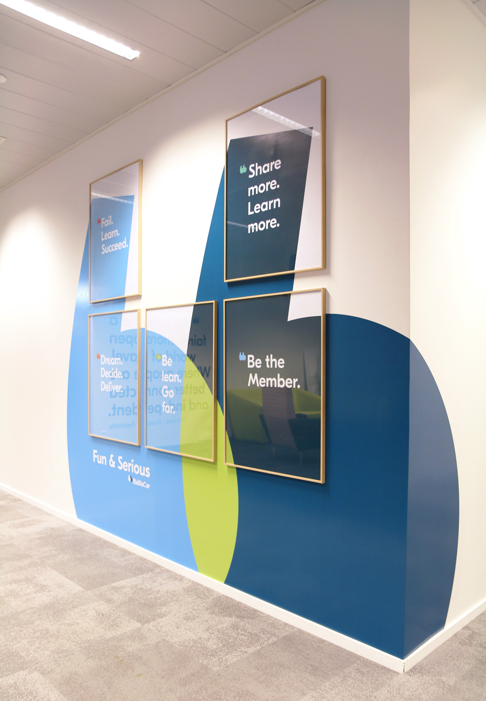
BlaBlaCar founder, Frédéric Mazzella, explains. “Our early branding was functional, designed to educate people about carpooling. Our playful colours reflected the diversity of our community, and our messages were chosen to encourage the adoption of a new mode of transport. But we’ve come a long way in ten years. Today, with a community of over 60 million, we have fully updated our branding to capture what using BlaBlaCar is really about: bringing people closer to each other, and to the places they love”
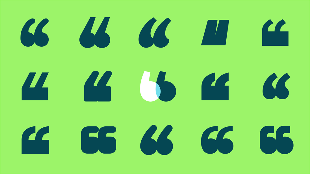
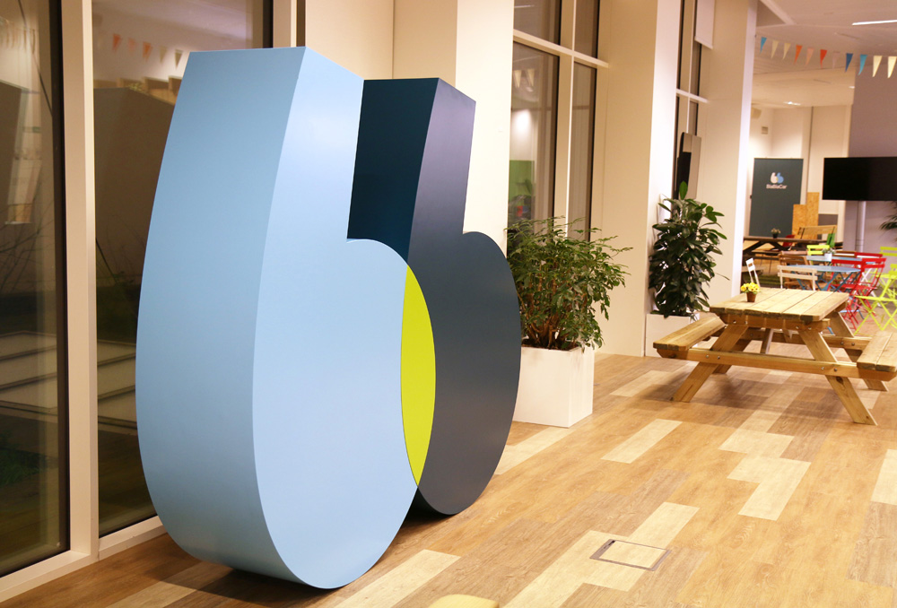
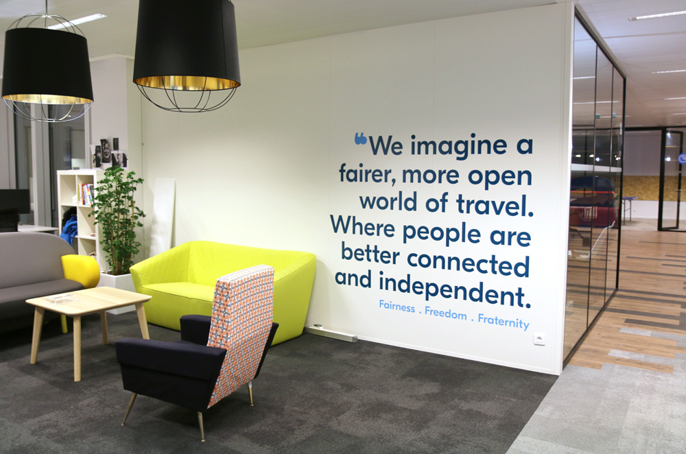
The two b’s of BlaBlaCar have been rendered as speech marks: a universal shorthand for social interaction. The overlap between them reflects the two sides of the passenger-driver experience and the connections made during a journey. By delivering a simple idea via a symbol that transcends a single language, we think BlaBlaCar is poised to become even more recognisable within the many markets in which it operates.
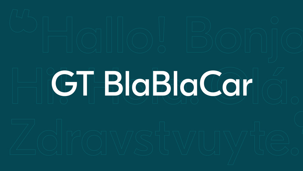
I probably shouldn’t but, for some reason, I kind of really like the old logo. Even though it was kind of crummy, it felt charmingly dorky. But, yeah, you don’t build the Uber/Lyft of long-distance ridesharing with a charmingly dorky logo — well… you can, but you shouldn’t. The new logo features a fun icon of two single quote marks (that also look like “b”s) overlapping, which depending on your tolerance for personal space, it might be the right or wrong message to send. Without reading too much into it, though, yes, the icon conveys the idea of two entities — driver and rider — joining together for the same cause. It’s a good-looking icon and its boldness allows it to work independently. The wordmark retains some of the dorkiness of the old one and avoids the geometric sans serif trap.
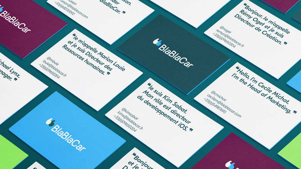
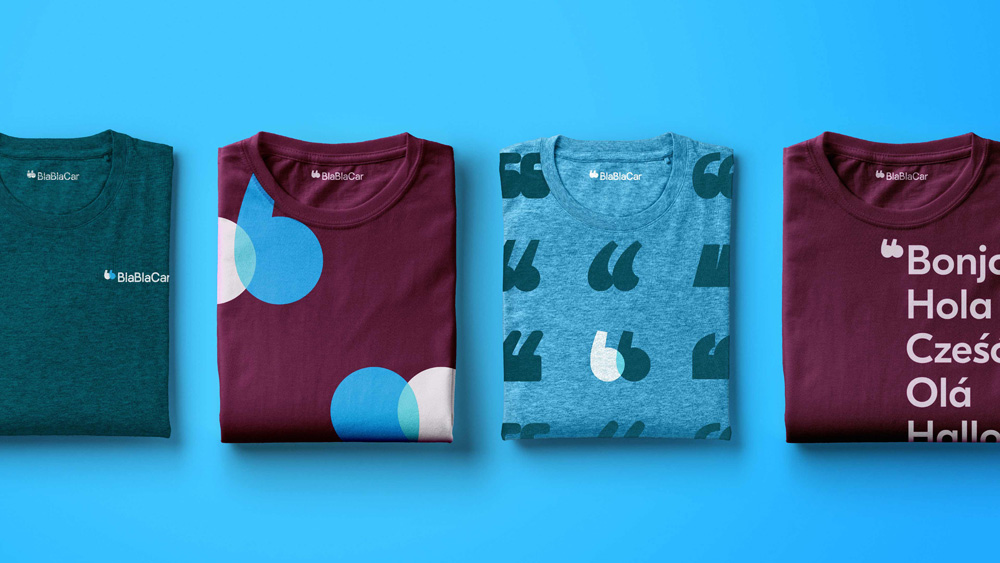
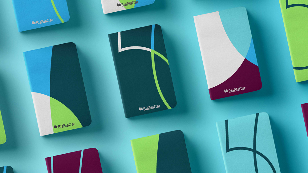
The applications are energetic, colorful, and — I don’t know if this is an entirely good thing — very varied, with 3 or 4 visual directions at play that make it hard to really get a sense of what the brand’s visual platform is. This is also evident in the ads below, where sometimes they use photography, sometimes illustration, sometimes both… without successfully complementing each other. It’s all well done, don’t get me wrong, but it’s maybe too many things at play competing for brand dominance.
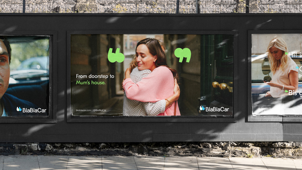
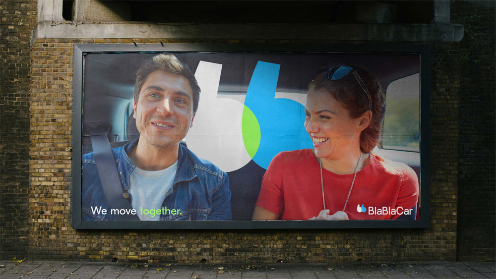
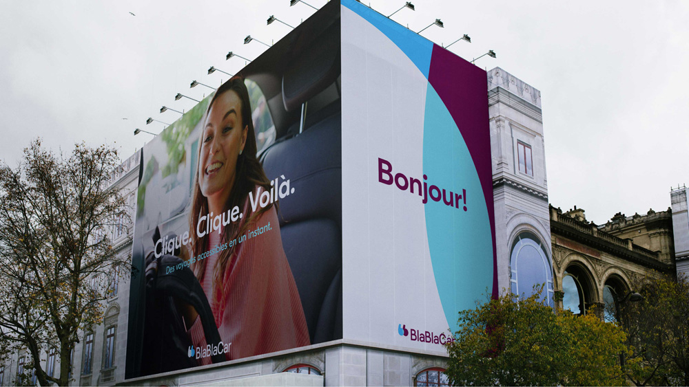
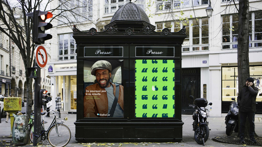
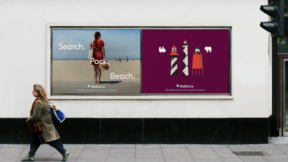
Overall, what this redesign does very well is establish a sense of joy and openness, giving users more confidence to trust the app, trust strangers, and hit the road.

 Новости Союза дизайнеров
Все о дизайне в Санкт-Петербурге.
Новости Союза дизайнеров
Все о дизайне в Санкт-Петербурге.