contact us | ok@ohmycode.ru
contact us | ok@ohmycode.ru

Established in 1652, Irkutsk is a Russian city in southeastern Siberia, on the bank of Baikal, the world’s largest freshwater lake. Home to a population of approximately 620,000 people, its varied terrain, in a seismically active zone, provides wildly different temperatures, from -22°F to 80°F. A little more interpretation of the city is provided in the opening quote. Recently approved by the Economy Committee of Irkutsk City Government, Irkutsk will soon be implementing a new identity designed by London, UK-based INSTID.
Centuries ago, local merchants discovered Alaska and hauled icebergs from Alaska to California; Irkutsk was the capital of a massive province spanning from the Urals to Alaska and even governed Hawaii. In the 20th century, Irkutsk was a centre for space and airplane construction industries. Today, it is a depressed post-industrial town, too far away from it all and having little going on to justify a dedicated trip. It picks tourism crumbs from Baikal, and is not a destination in its own right.
In branding Irkutsk, we chose to focus on the city’s enduring spirit rather than its current offerings, with the intention that the brand should not only attract visitors, but activate the city’s own people and rejuvenate urban culture.
Irkutsk spirit is about living amongst raw elements: the massive Baikal next door, the seismic land, the unusually wide span of observable sky - living and in a way, becoming a force of nature of one’s own.
Irkutsk’s target image is that of a city-performance, a perpetual festival, an experiment zone, where a visitor feels as if taken apart to atoms and reconstructed into a more potent and powerful being. The experience of visiting Irkutsk is similar to that of encountering a whale or a dinosaur. The city speaks the language of charged elementary particles. It is awkward, it is uncomfortable, it is tense, but if one gives in to it, one leaves with a massively broadened mind.
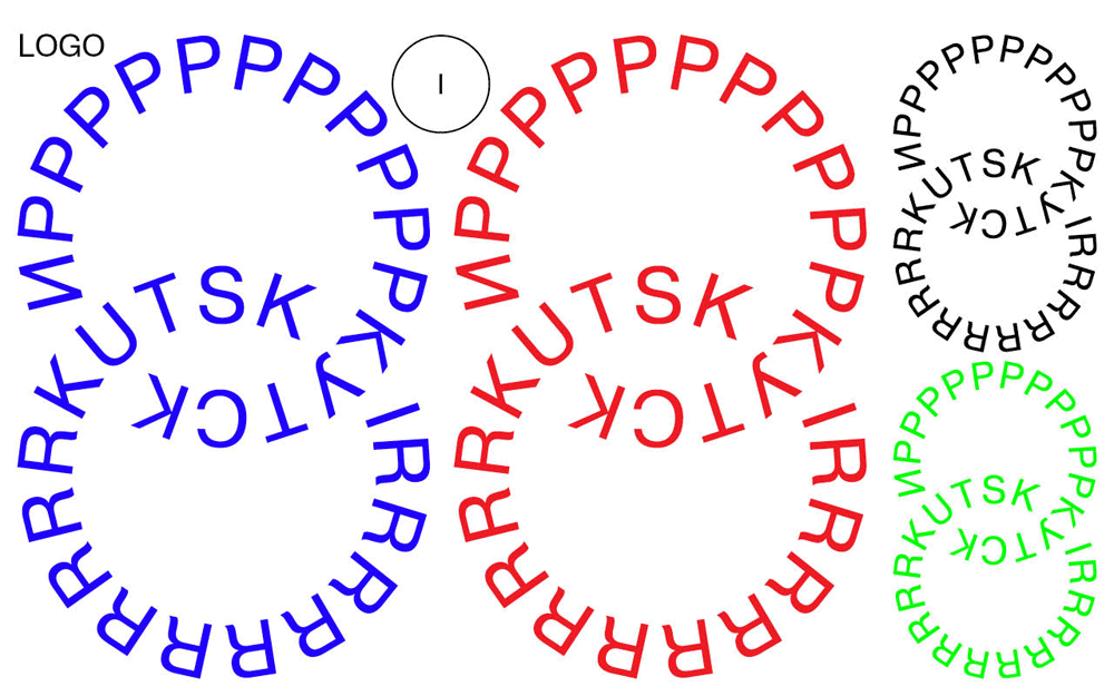
If this morning you woke up and thought, “I hope to see something different today on Brand New”, it’s your lucky day. The whole identity is a bit of a shock and it starts with the logo that presents the name of the city in Latin and Cyrillic as interlocking circles with the second letter of each repeated as many times as necessary. Why? It doesn’t really matter as pretty much everything else in this project asks “Why not?”. For some really strange reason I rather like the logo. Despite its chaos-ness, the way the two languages interlock brings some order that creates an interesting tension in the logo. I even like, or appreciate, the use of Helvetica in this case.
The brand core idea is: “Plug In!”, and the character is: free, spontaneous, wilfull, protesting, active, contrasting, sharp and bright.
The visual means for expressing the brand core messages are:
Electric charge - tense proportions, contracts, and disproportions
Lift - abstract and absolute visual means: colours, forms, and textures
Turn over - minimal standards, deliberate breach of genre principles and rules.
Irkutsk visual style is very spontaneous and liberating. Its every application aims to be powerful and emotionally charged enough to attract attention, give one energy to make a trip to Irkutsk.
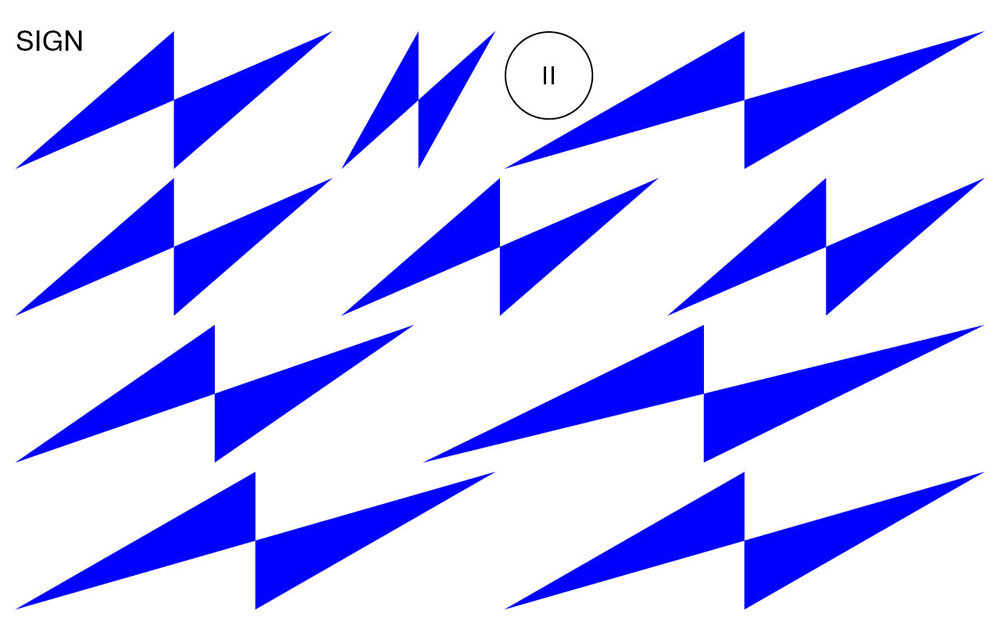
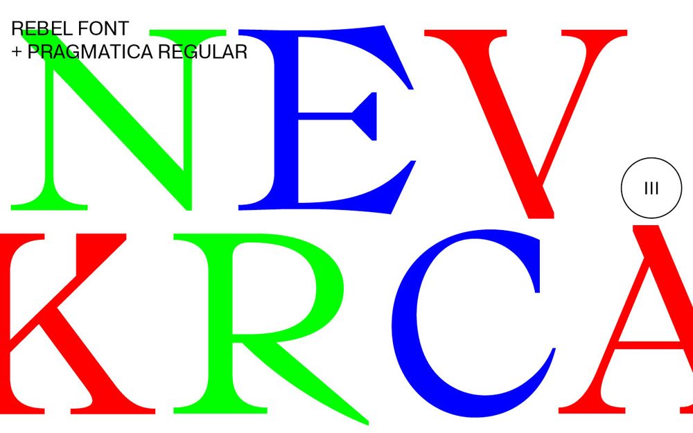
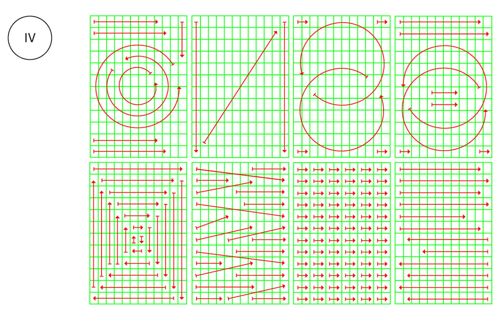
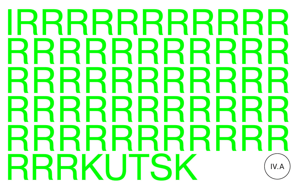
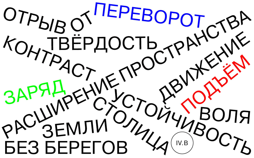
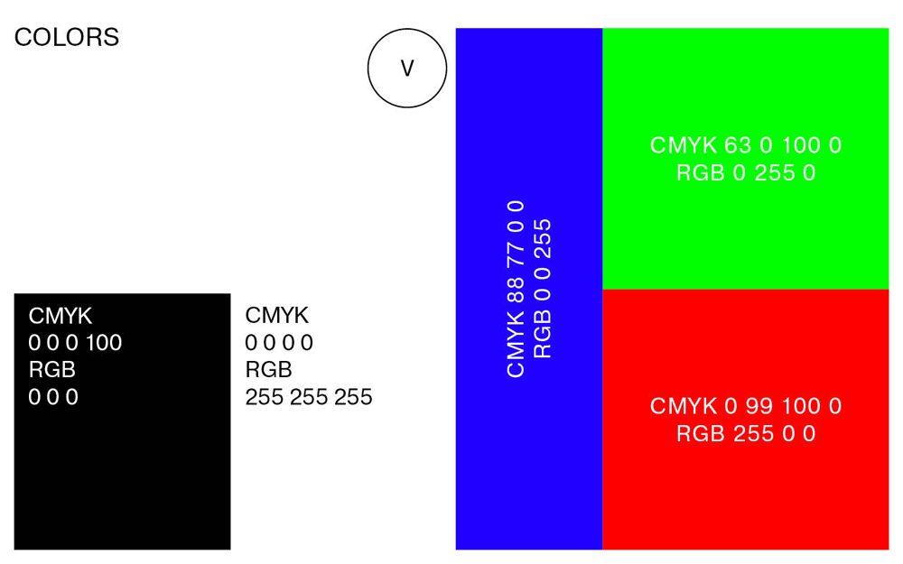
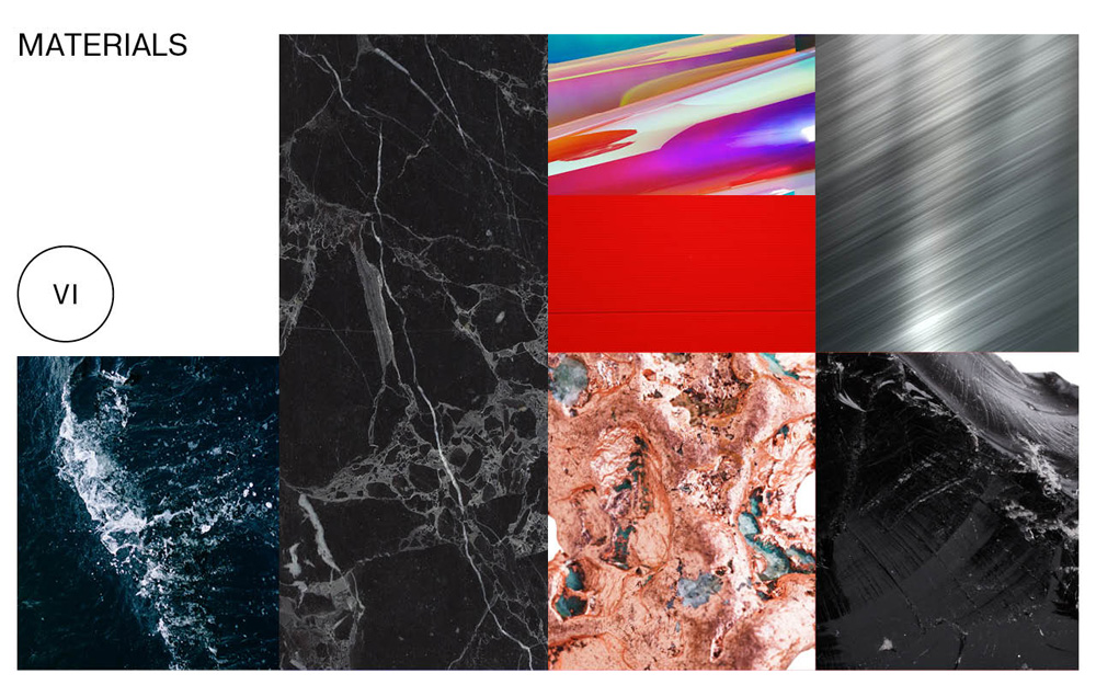
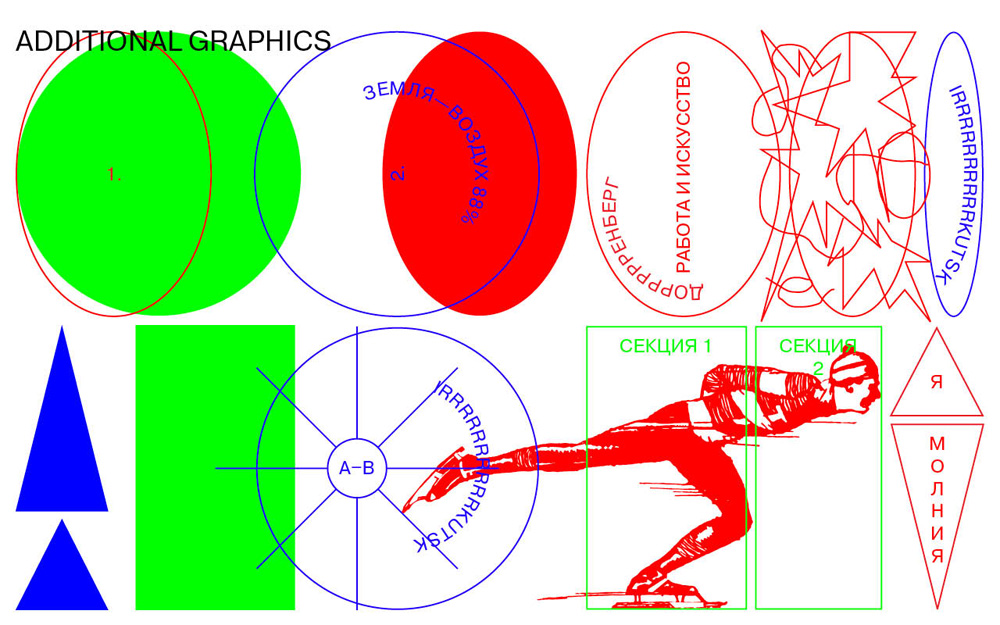
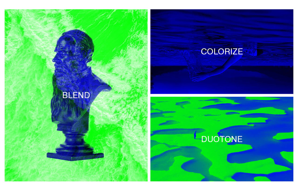
If the logo felt a little crazy, things turn all-out-bananas with the identity elements that include an electric charge icon, arrows free to go in any direction, a crazy serif, an RGB color palette, and a slew of of textures, photos, and clip-art. Like the logo, there is a wild looseness to it but paired with a somewhat strict application that feels like, literally, capturing lightning in a bottle… and hoping it doesn’t explode.
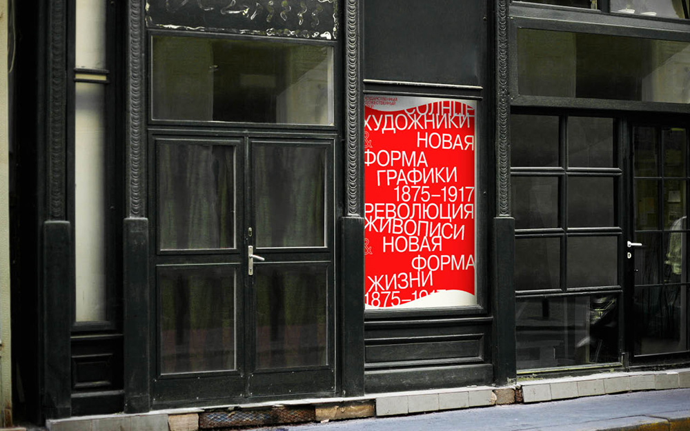
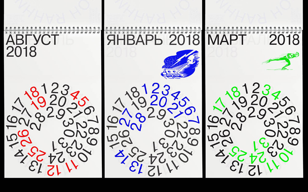
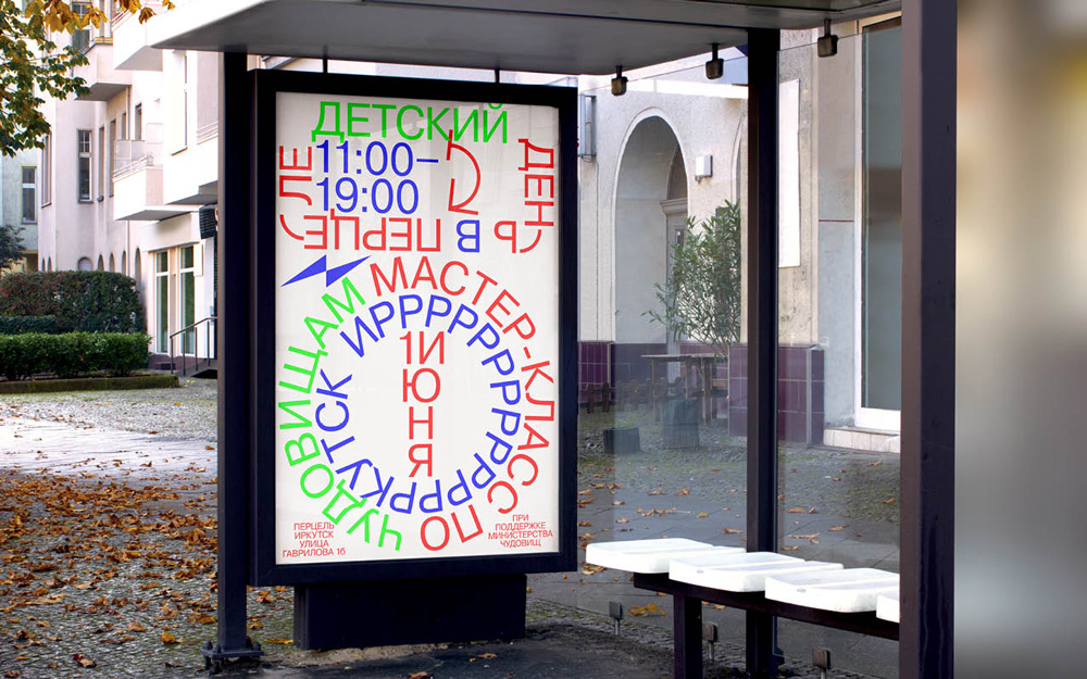
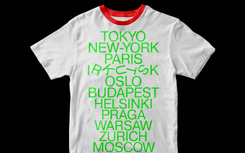
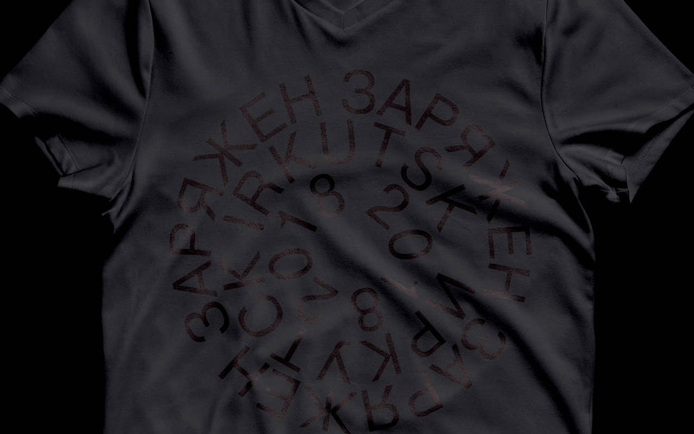
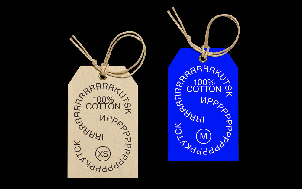
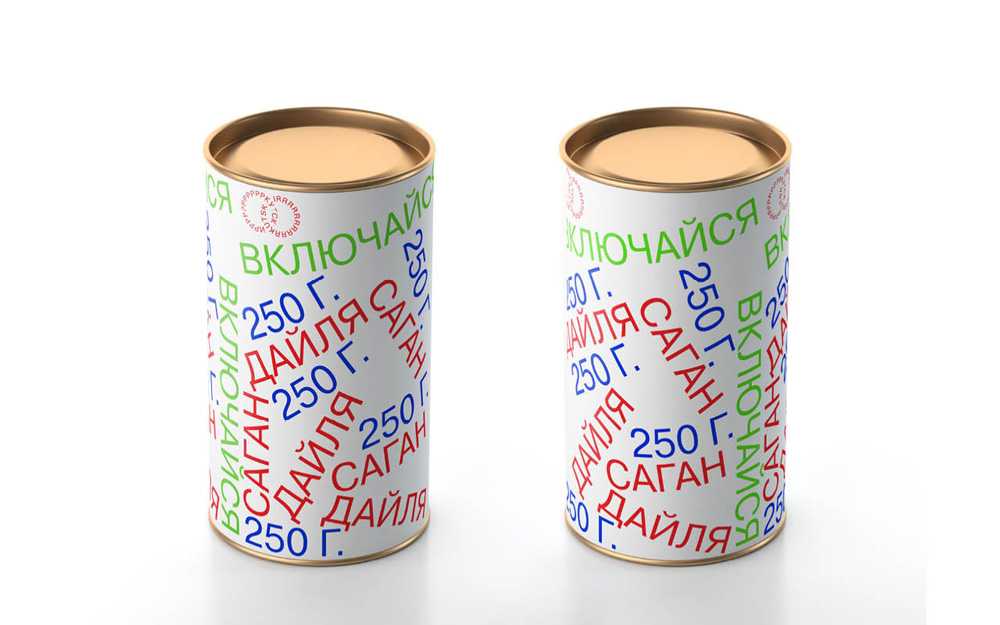
However, it does explode. And things get stranger and looser in the applications and there is also a bit of self-deprecating humor as in the t-shirt that shows all the cool cities around the world with Irkutsk crumbling down among them. The RGB color palette can feel tiring at times but it’s hard to argue against its ability to demand attention.
Overall, this is clearly not an identity for any city — understatement of the year, I know — as it has an interesting self-awareness of the position the city has in terms of its place in the world (literally, culturally, economically, touristically, etc.) and takes a nothing-to-lose approach that could potentially invigorate the city. As groovy as the whole thing is I do have to wonder if it sends the wrong message, as the identity feels like a year-round rave that makes Burning Man look like Disney on Ice and doesn’t capture the history, architecture, or environment of the place. But maybe that approach would hold it back too, presenting it as just another quaint city, whereas this is clearly meant to energize and move it forward.

 Новости Союза дизайнеров
Все о дизайне в Санкт-Петербурге.