Обзор лучших ресурсов по разработке бренда, разработке упаковки
contact us | ok@ohmycode.ru
contact us | ok@ohmycode.ru
Established in 2014 from the merger of Opera Vlaanderen (established 1907) and the Royal Ballet of Flanders (established 1969), Opera Ballet Vlaanderen (OBV) is the largest cultural institution in the Flanders region, the Dutch-speaking northern portion of Belgium. For both its opera and ballet productions OBV brings together classic and contemporary sensibilities performing both in Antwerp, Belgium and touring internationally. The opera recently received the International Opera Award for Best Opera Company so you gotta know it’s lit. This month, OBV introduced a new identity designed by London, UK-based Pentagram partner Marina Willer.
Pentagram partner Marina Willer and her team have worked closely with the directors to create a new visual expression of their mission statement - ‘Never the Same’. Opera Ballet Vlaanderen prides itself on being a constant generator of new ideas and remarkable collaborations. The new identity had to reflect these ideas, as well as embodying the institution’s role in the wider community and its work to develop talent, participation and education across and beyond the Flanders region.
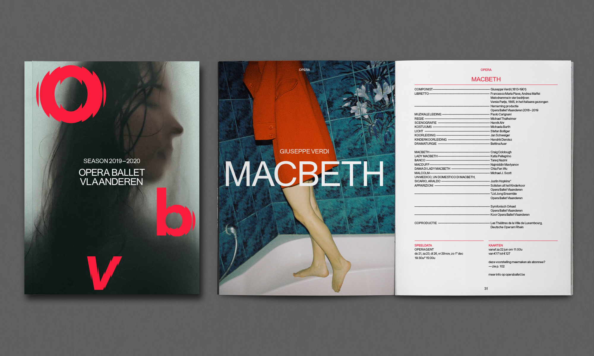
To emphasise Opera Ballet Vlaanderen’s dual role in expressing and promoting global cultural exchanges while strengthening and celebrating Flanders’ strong, regional sense of identity, the new brand identity centres on the institution’s Flemish name. By focusing on the abbreviation ‘OBV’, the goal has been to create a clear, concise symbol; easily recognised across the world.
There was also a strong desire to create an identity that reflected the movement and vitality that came with the merger of the Opera and Ballet companies. While built around typography, the new visual system is designed to express movement and transformation and embrace the transitory nature of performance art. It is both a response and a tribute to words of ballet director Larbi Charkaou - “dance is essentially transience. One movement disappears in the other. It is a temporary sketch of reality. Transience is a pacesetter for new hope.”
The key concept of the new identity, however, is flexibility. Although designed to be deployed in a bold, confident manner and appear in large proportion, the three letters are always accompanied by the full name of the company — Opera Ballet Vlaanderen, allowing OBV to speak in a subtler tone if required.
The old logo, in its rounded sans serif, was a little too friendly for an opera and ballet company — perhaps more than friendly, it was overly safe and non-committal to a point of view or tone of voice but understandable being the first logo for the merged companies. The new logo does not play it safe and is certainly committed to establishing a stand-out personality. The faceted motion letters sidestep any and all clichés of either opera or ballet logos and manage to capture both the motion of dance and the reverberation of opera in a striking graphic approach. I love the energy of the logo and how it’s able to convey motion without animation — and how, when it’s animated, it does it in an unconventional way. If I had one complaint it would be the italic “v” in contrast to the other two letters but I get that it represents the one word that identifies the location.
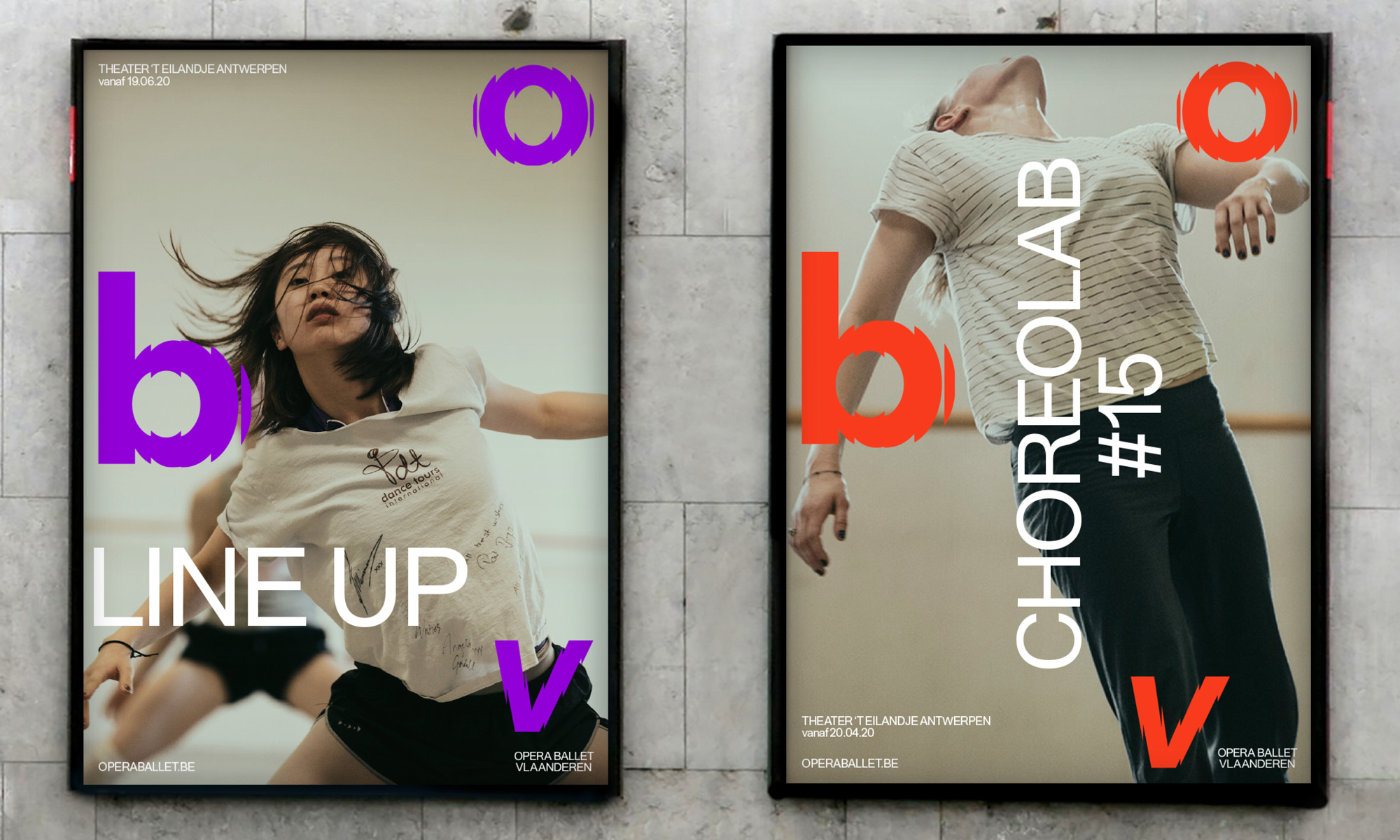
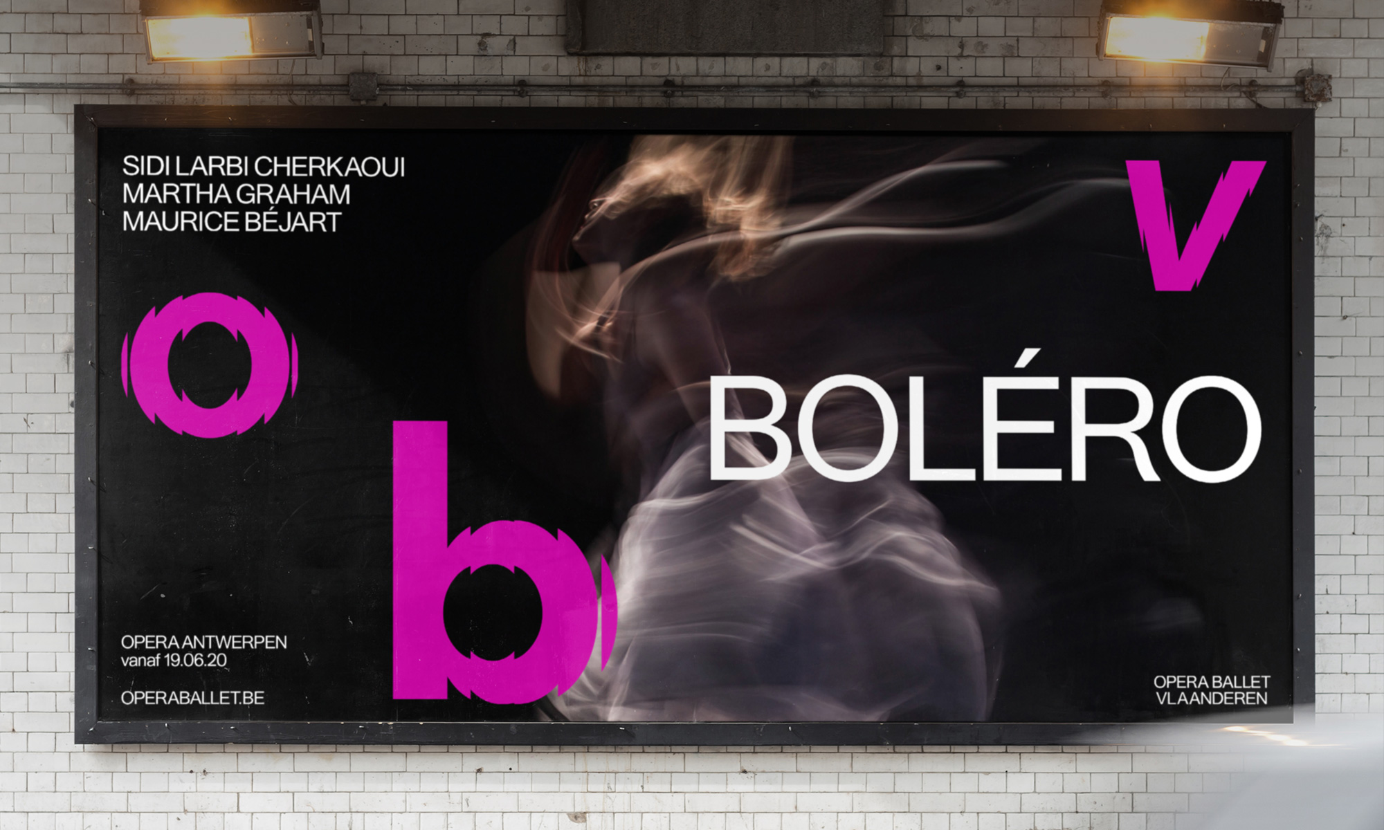
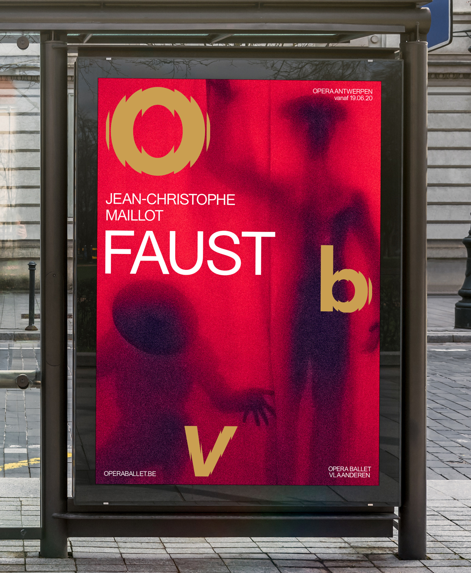
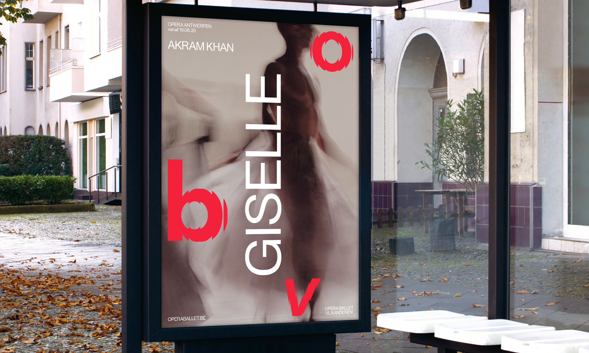
In application, the letters can be separated in different ways and either the “O” or the “b” are enlarged to represent whether an ad or poster is promoting opera or ballet. I’m not sure if I like the colored logo on the applications or if all-white type would have been better — I love the red and gold combination of Faust but the purple and black of Boléro isn’t as powerful. Nonetheless, it’s quite nice. The identity uses a thin-ish, deadpan-esque sans serif that works well as a contrast to the bold logo and strong imagery. Overall, a great example of how a classic cultural institution can adopt a non-traditional identity and maintain gravitas for purists and a jolt of excitement for new audiences.

 Новости Союза дизайнеров
Все о дизайне в Санкт-Петербурге.
Новости Союза дизайнеров
Все о дизайне в Санкт-Петербурге.