contact us | ok@ohmycode.ru
contact us | ok@ohmycode.ru
Established in 1918, the Ministry for Foreign Affairs of Finland is a ministry in the Finnish Government responsible for preparing and implementing the government’s foreign policy, for representing Finland in the world, and for building a secure and predictable future for all Finns. It counts with 90 offices around the world that include embassies and consular offices. This January, the Ministry introduced a new identity designed by Helsinki, Finland-based 358.
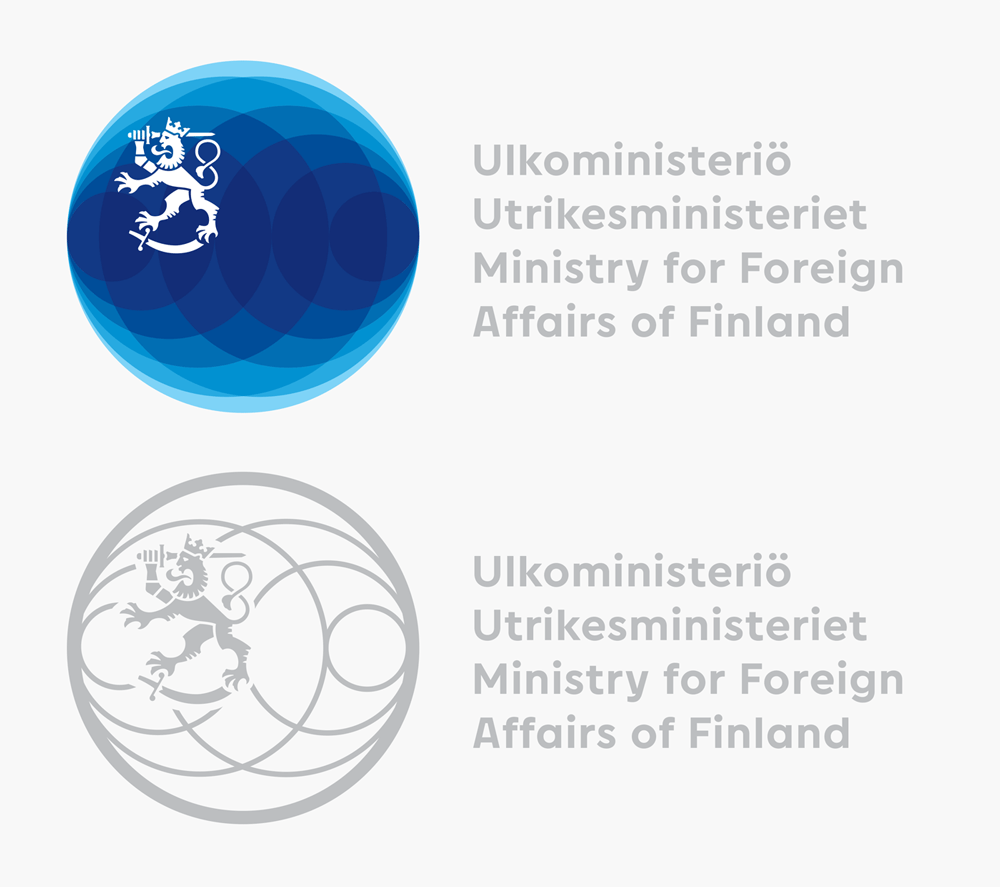
The new visual identity of the Ministry for Foreign Affairs and the diplomatic missions is being taken into use on 18 January. The Global Cycles concept of the new identity illustrates an internationally credible, agile and innovative actor that operates in a stable manner and exerts influence in a tumultuous world. The undulations of the globe-shaped basic blue logo denote things that affect Finland and that Finland can influence through the Foreign Service. The identity is designed to be flexible for different uses and adapts to both dignified representation and marketing-oriented needs.
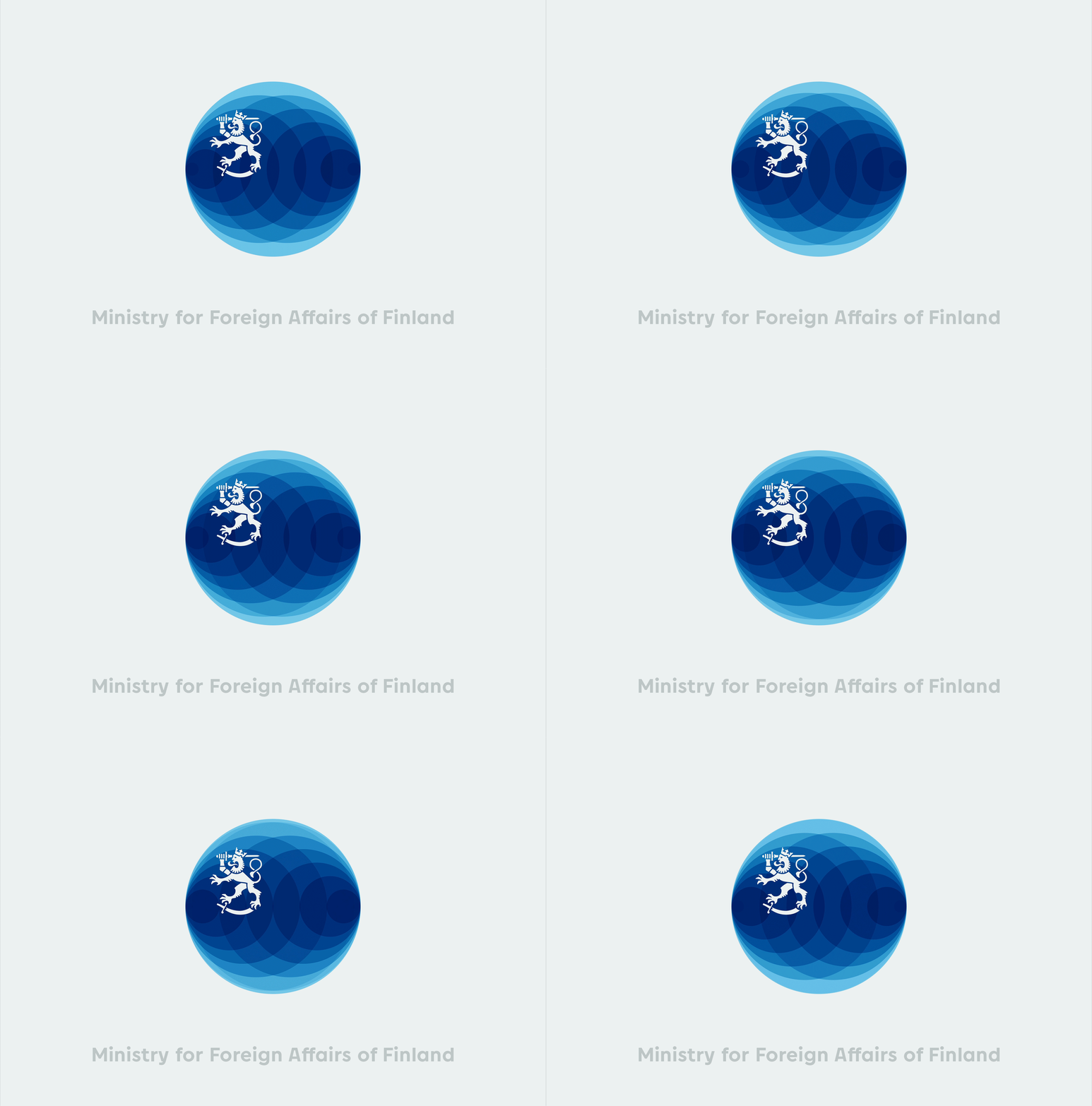
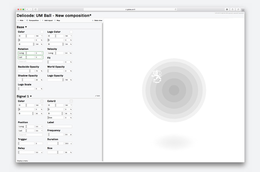
The identity tool runs a real-time rendered 3d model of the globe based on WebGL. The user can add signals and adjust its color, size, frequency, speed and location. This creates a base for the dynamic identity. After adding signals and assigning functions to them they are attached to data sources such as Excel, sound or touch data.
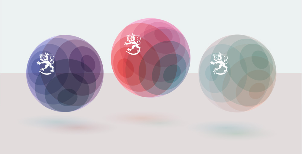
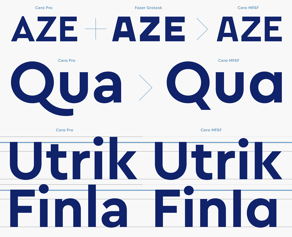
The old logo was remarkably un-Finnish as they usually have some pretty tight design all around. The lion, from Finland’s coat of arms, was simply slapped on top of a generic globe graphic and paired with a bland serif wordmark underneath and a bland sans serif even more blandly set on a curve. The new logo is exactly the kind of stuff I would expect from Finland’s government. It’s slick, it’s graphic, and it’s boldly executed. The lion has been redrawn for better reproduction not only at small sizes but also to withstand the changing textures of the globe and its off-center position somehow makes it more bad-ass. In its main, static, full-color application the logo is attractive and engaging enough and it could have probably been left at that but the data-driven aspect adds a great layer of both conceptual meaning and graphic application. The wordmark is contemporary and serious with a number of cool modifications to TypeMates’ Cera Pro.
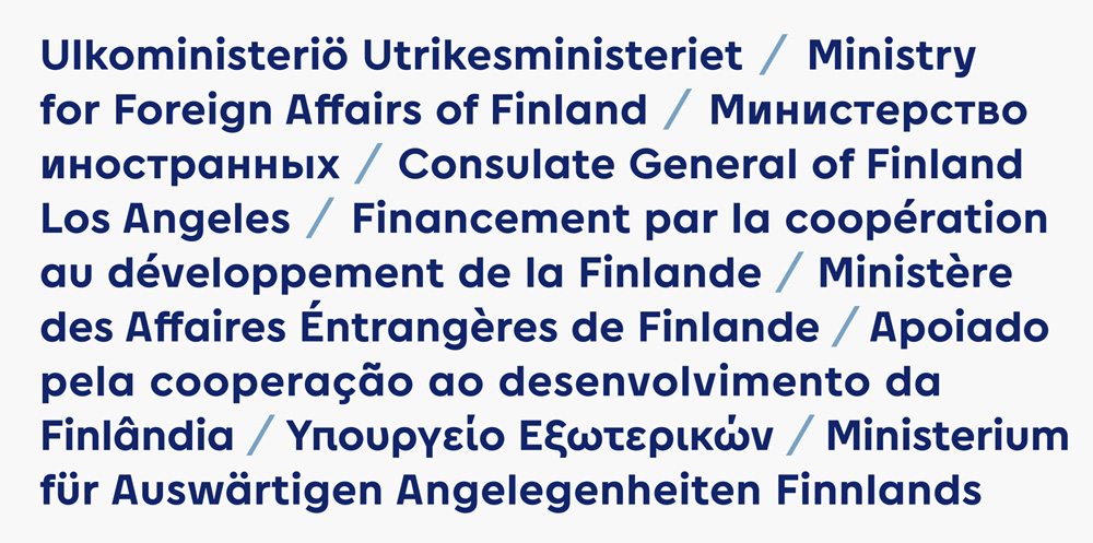
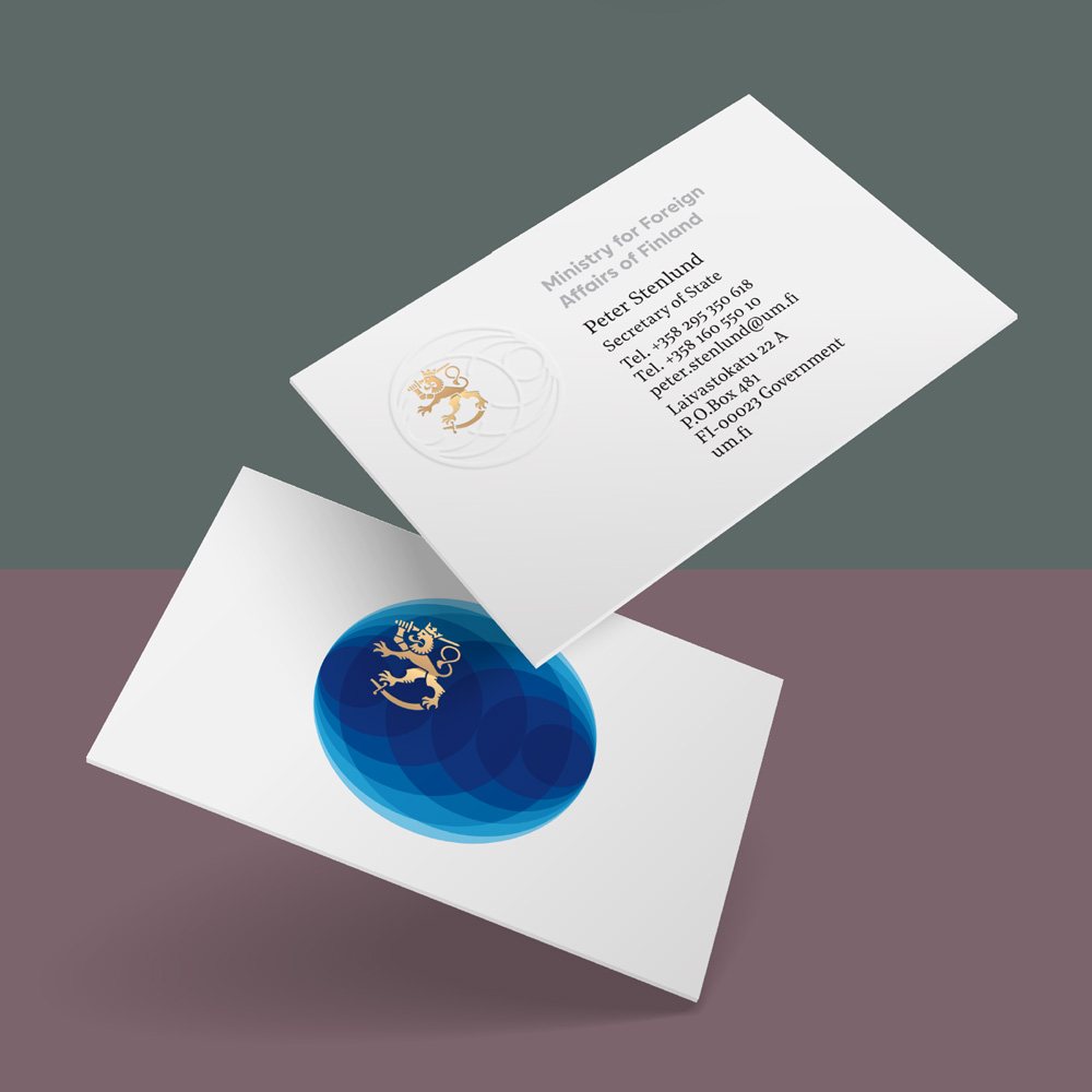
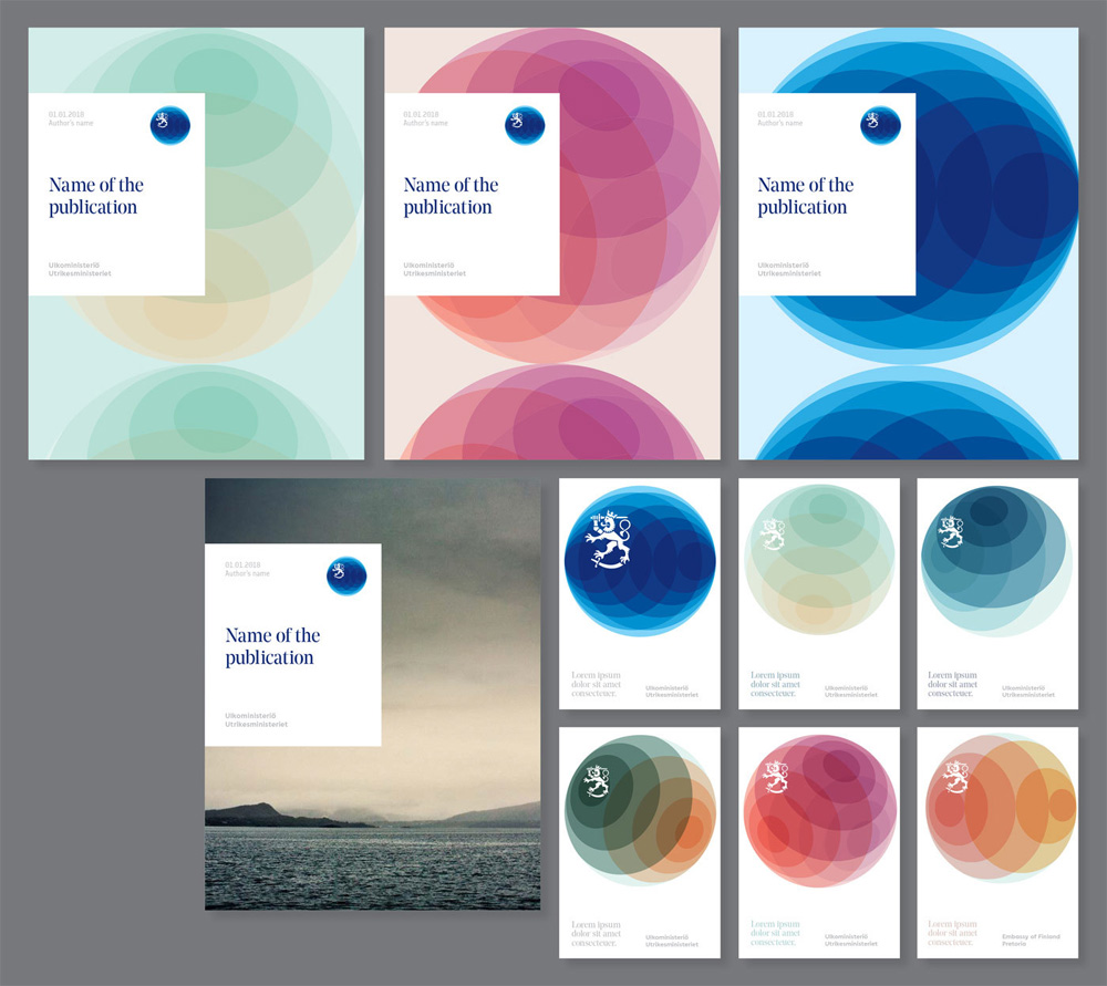
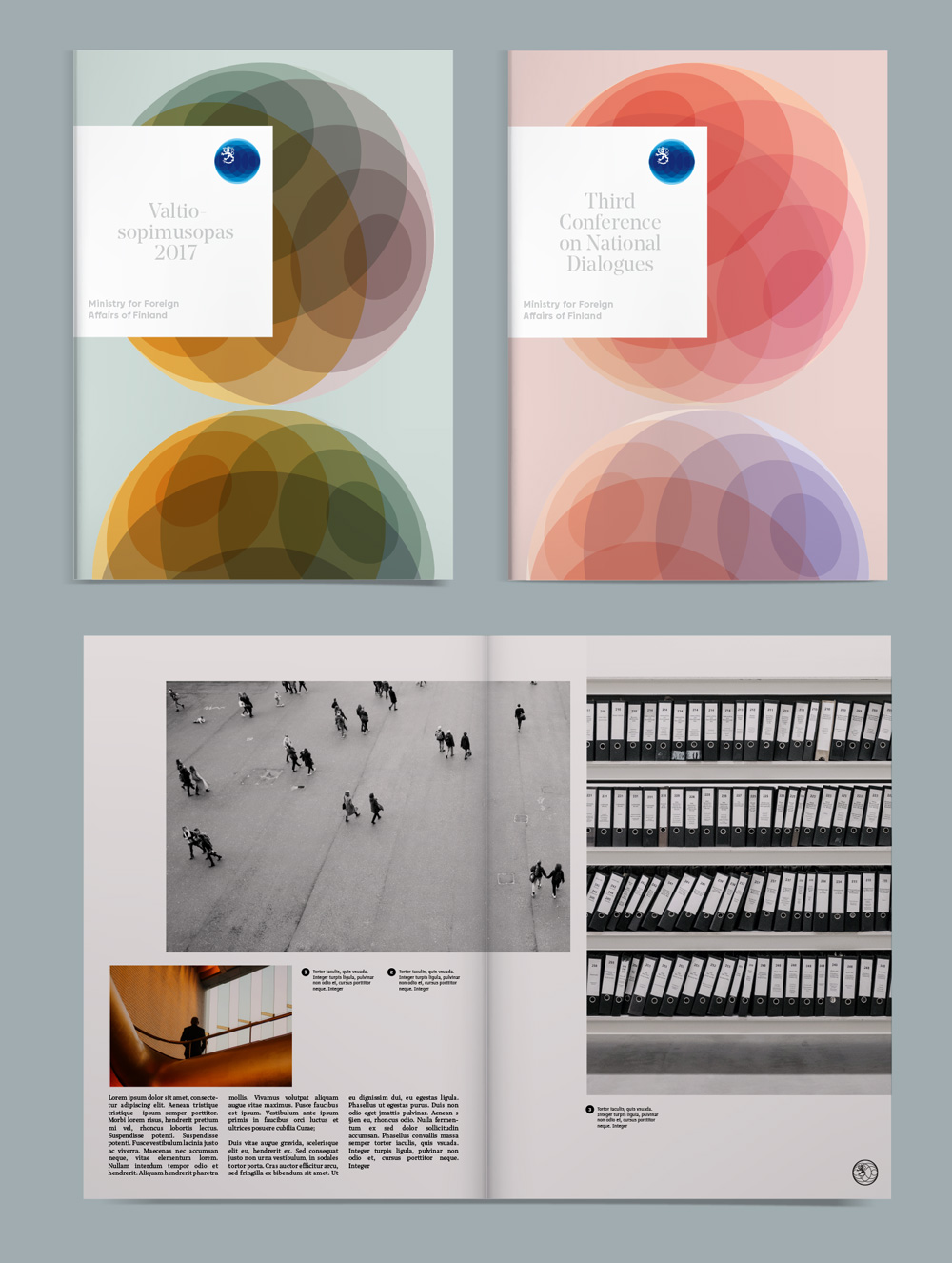
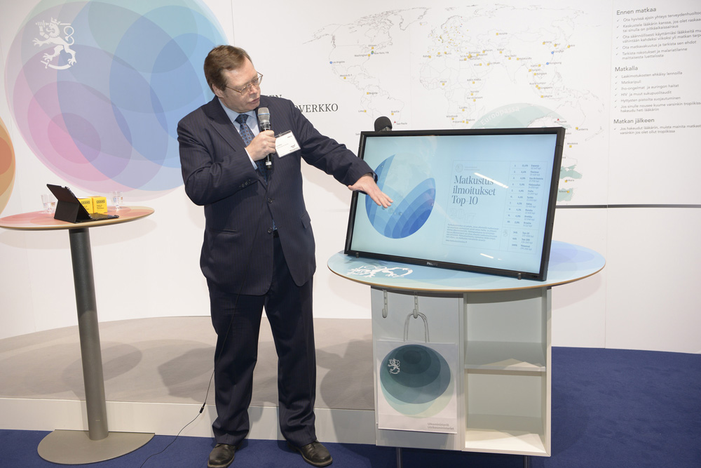
The applications make great use of the possible variations of the globe that yields some lovely color combinations and compositions, applied through crisp layouts that mix in blocks of white and Noe Display that add up to that Nordic aesthetic that manages to be both edgy and solemn. Overall, a thoughtful, attractive, and appropriate design.
Thanks to Roope Sandberg for the tip.

 Новости Союза дизайнеров
Все о дизайне в Санкт-Петербурге.