contact us | ok@ohmycode.ru
contact us | ok@ohmycode.ru
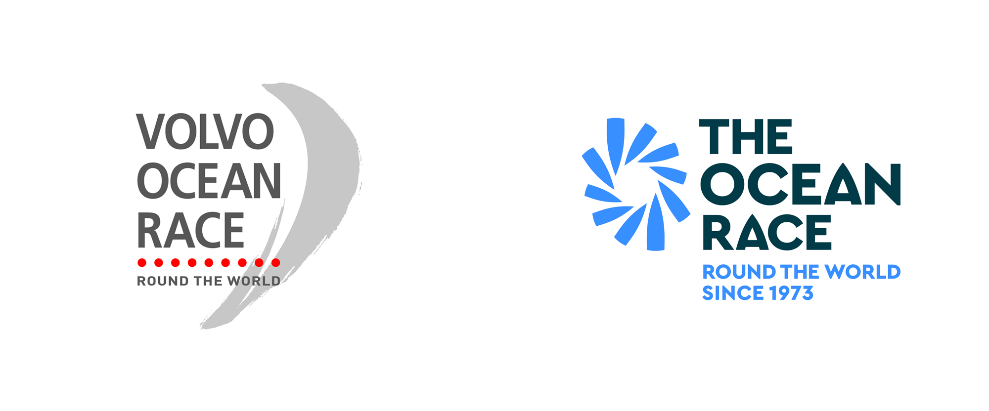
Established in 1973, The Ocean Race is a yacht race around the world held every three years. Originally and previously named after its sponsors — “Whitbread Round the World Race” until 2001 and “Volvo Ocean Race” until 2018 — the event features a small number of boats, between seven and ten, competing in nine to eleven legs, some of them 20 days long, traveling more than 40,000 nautical miles over the course of seven months. It’s a grueling endurance competition across four oceans and six continents. With a recent change in ownership and in preparation for the 2021-22 event, The Ocean Race introduced a new identity designed by the Barcelona, Spain, office of Mucho.
Mucho was hired to collaborate with The Ocean Race in redefining brand values and crafting a fresh brand narrative as well as creating a new visual language, looking to reshape the attitude of the race going forward. The objective was to capture the essence and equity of a legendary brand whilst opening it up to a new audiences through a meaningful, versatile and engaging brand expression.
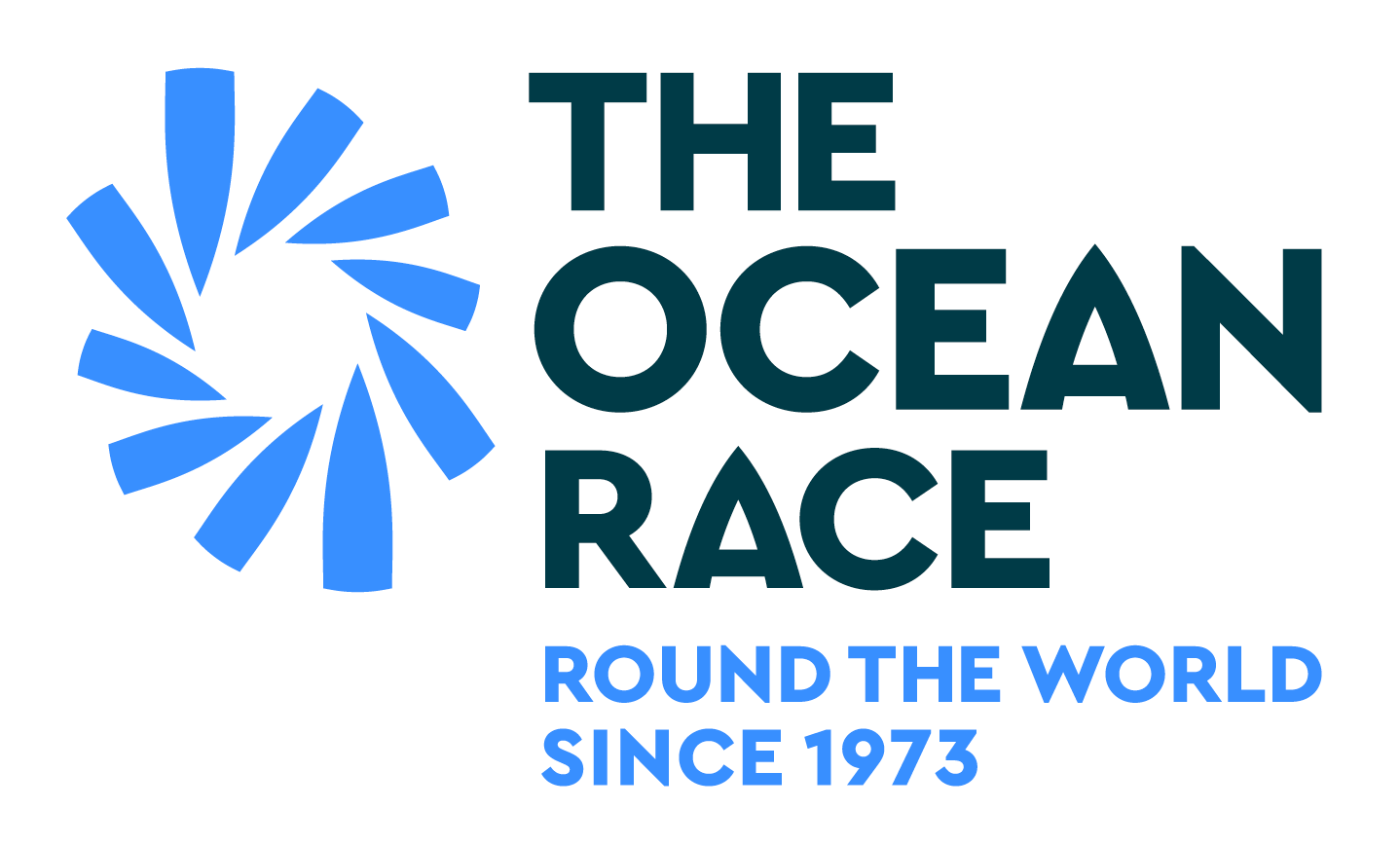
The symbol’s role is crucial in expressing the shift in the brand’s essence and narrative. Sustainability, competition and team effort are all represented by the simple shape and organic movement symbolizing boats sailing with the wind in their sails. The logotype is a simple uppercase structure that highlights the importance of the word OCEAN in The Ocean Race.
The old logo was half fine, half terrible with a decent brush-styled sail graphic but the least exciting typography possible that looked as if the font didn’t load and a dotted red line as slick as an inflatable banana boat. Considering the ton of money that goes into the boats and teams, the logo was surprisingly cheap-looking. The new logo is such a vast improvement, with a lovely asymmetric icon and a geometric sans wordmark accentuated by custom “A”s that look like yachts from above and a low crossbar that gives it an Art Deco vibe that evokes 1920s travel posters. Although I really like the look of the icon, if you stop to think about it, it’s a little awkward in how it has all the boats facing each other as if they were being sucked into a whirlpool. The propeller-like animation helps snap me out of such dark thoughts though and major bonus points for the flexibility of the icon and wordmark.
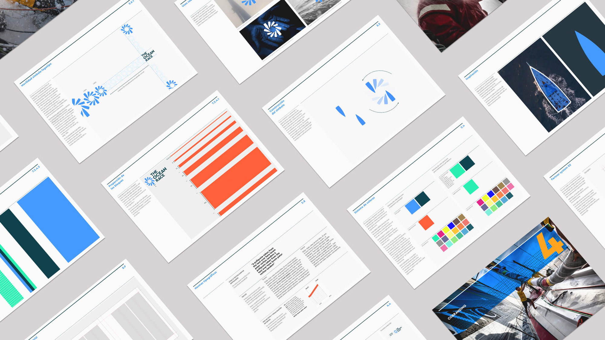
Graphic tools have been created to define the visual language that accompany the identity. These will work across dynamic and static media. A collection of horizontal and vertical shapes using some of the corporate colors mixed with patterns inspired by graphics of ‘wind directions’ all work together to create an holistic, rich, visually exciting brand identity.
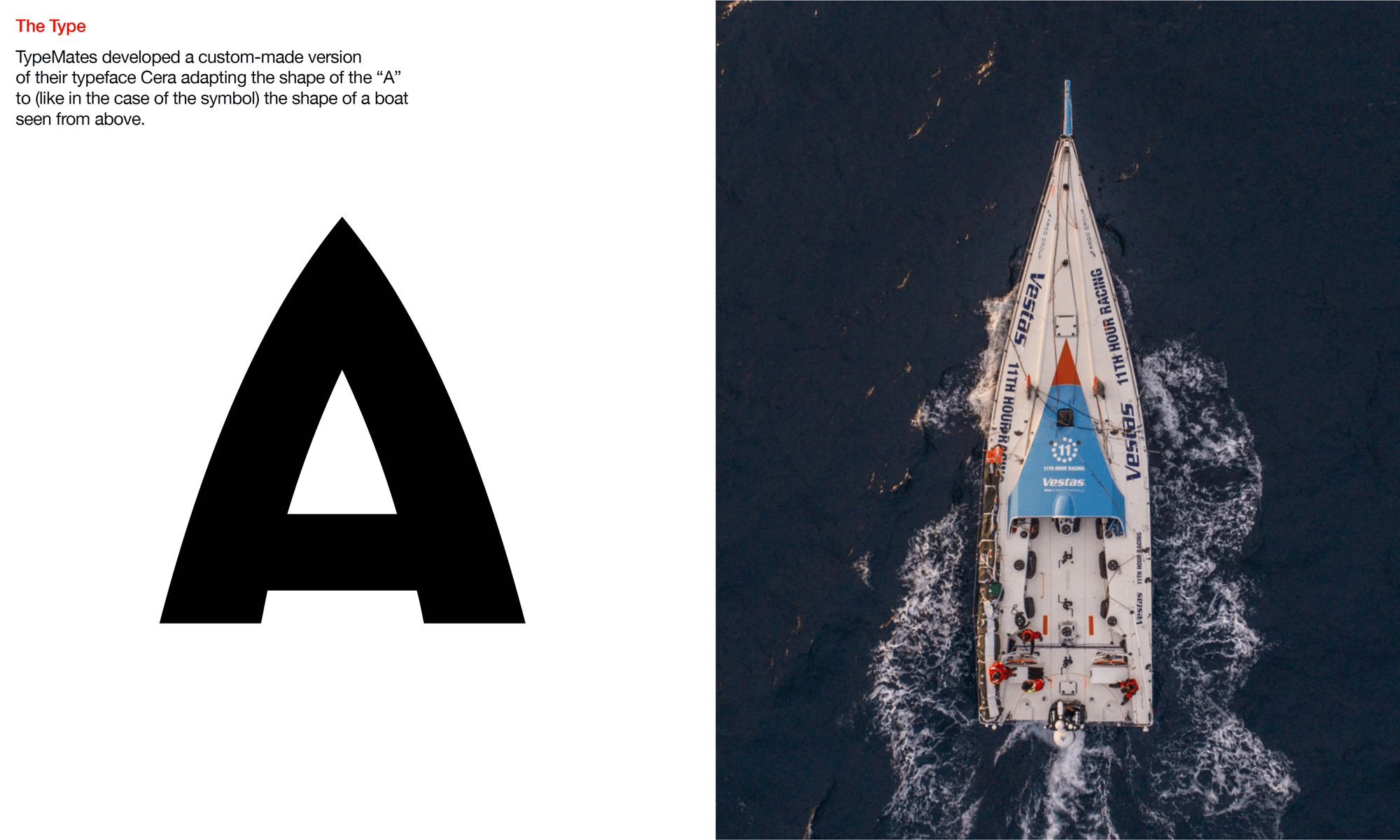
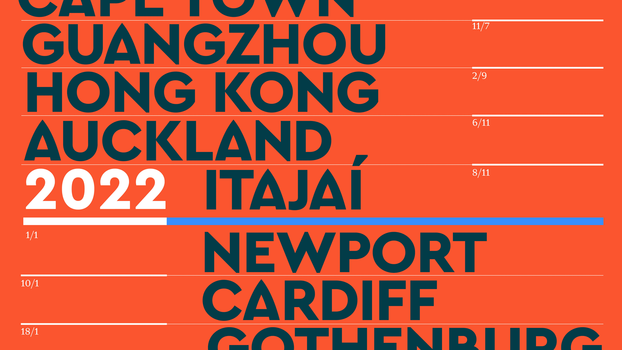
It’s funny what a big change a single letter makes to a typeface. In its uppercase, TypeMates’ Cera, already has a vintage Art Deco aesthetic but the custom “A” really turns up the volume on that while creating a strong unifying visual cue for all the applications.
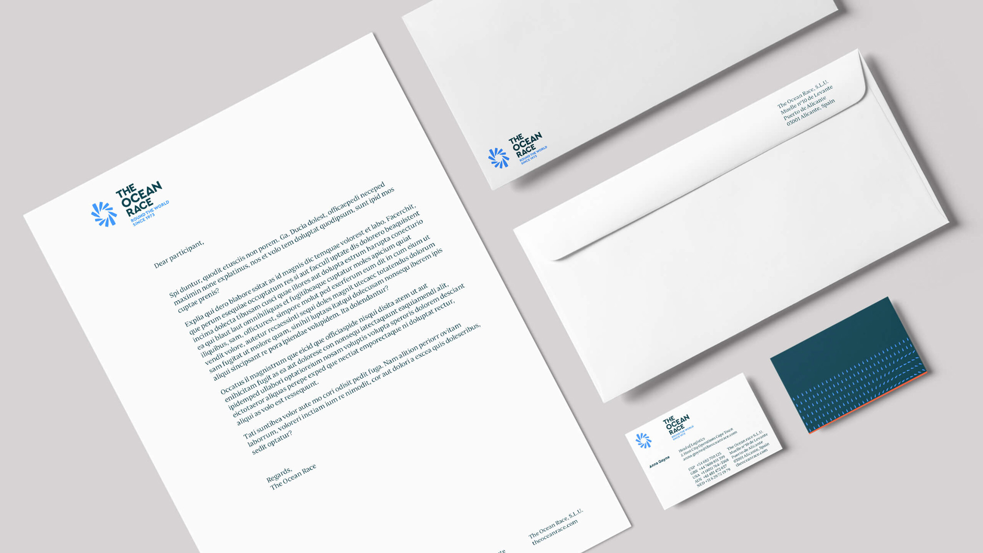
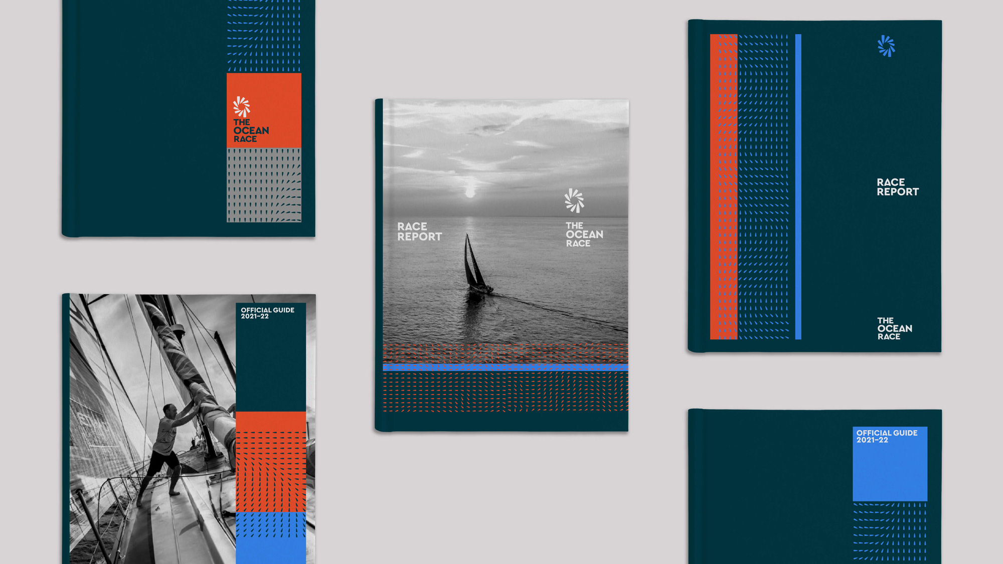
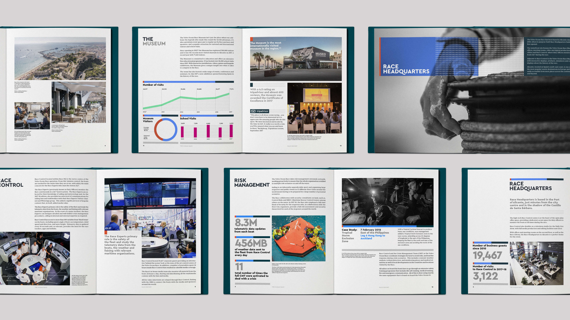
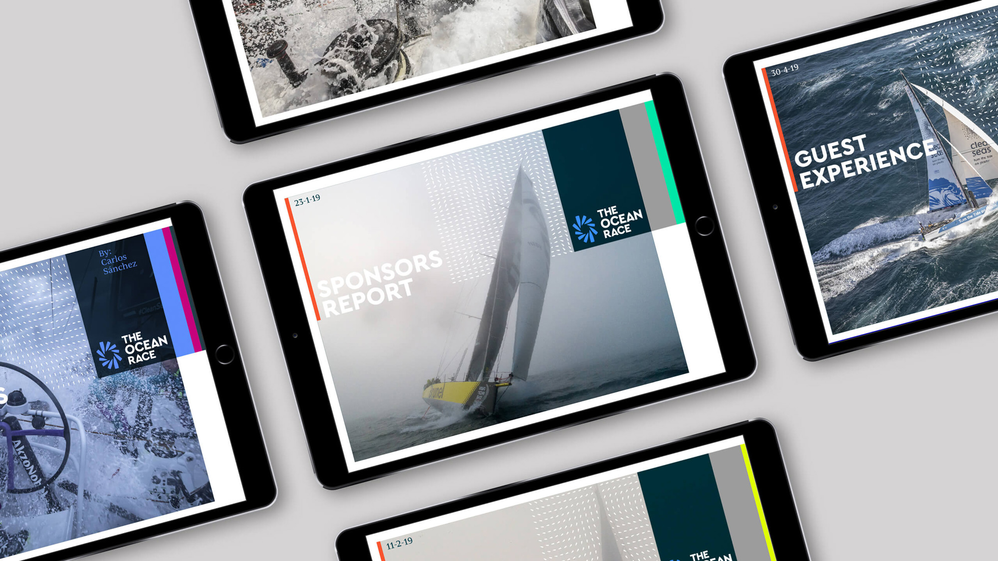
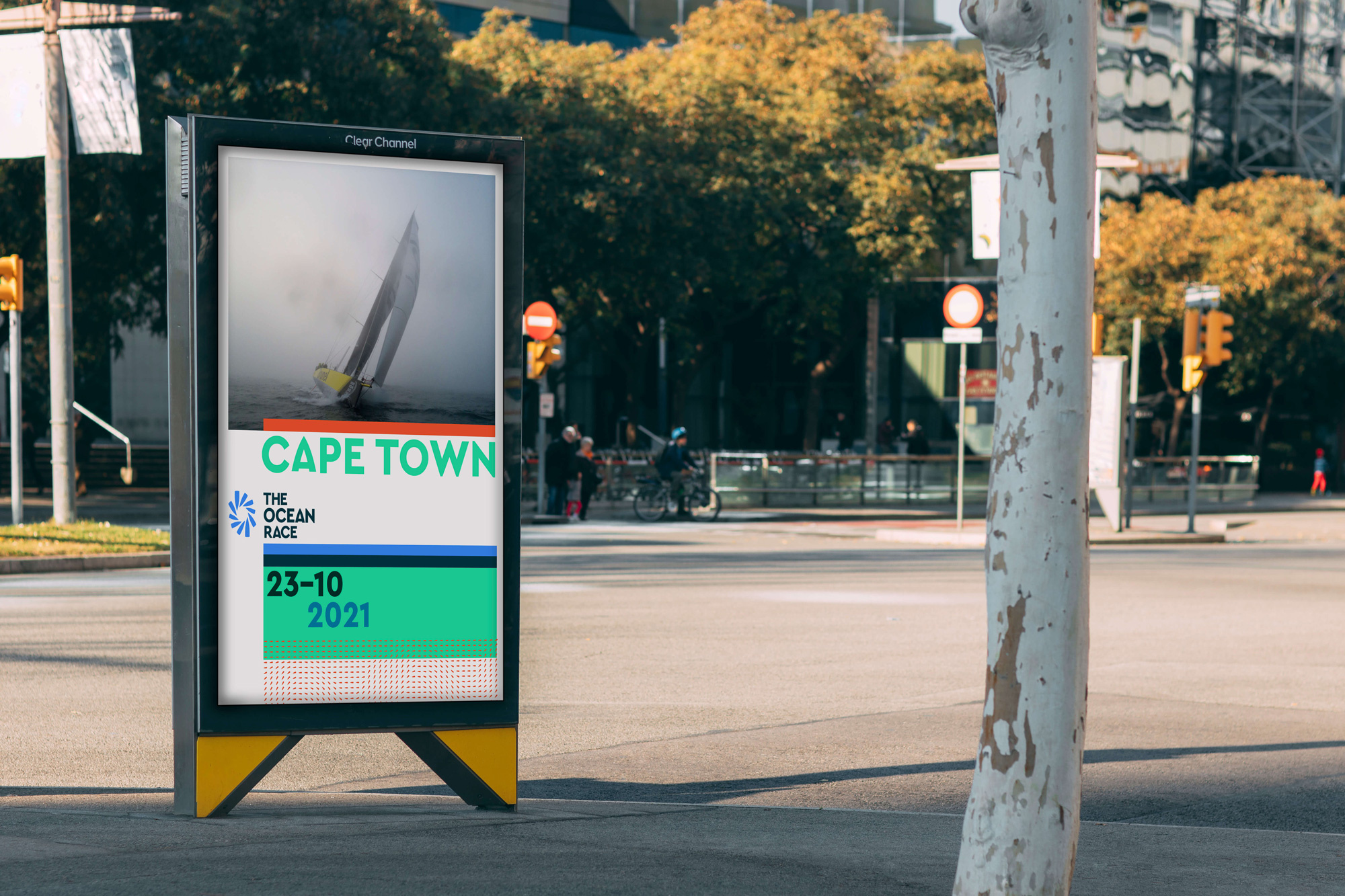
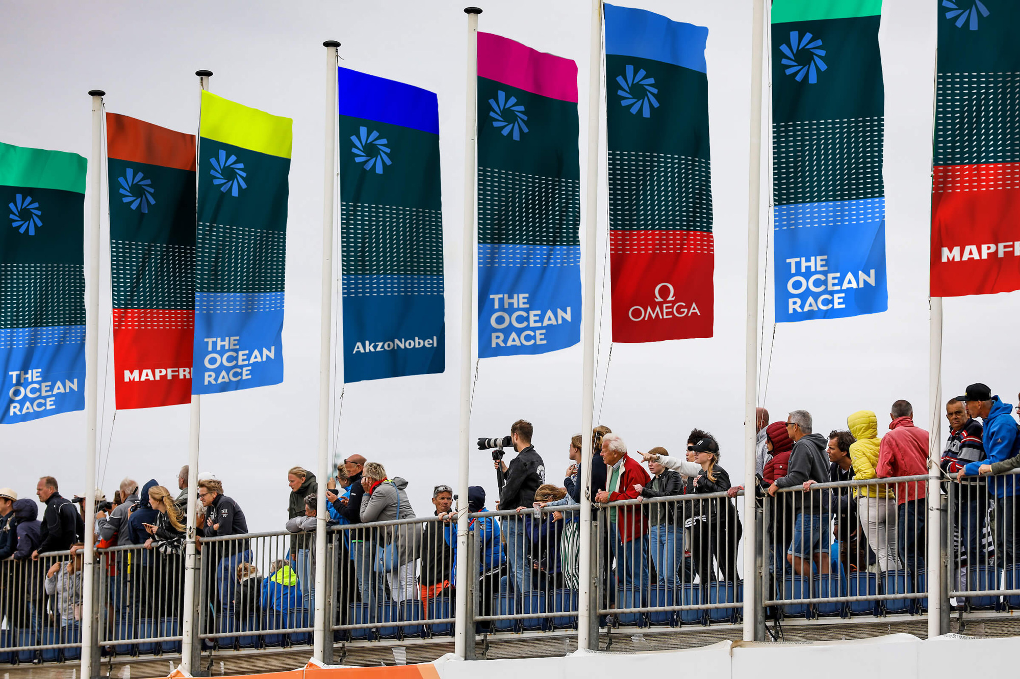
The identity mixes blocks of colors with a wind-vector pattern made of more little boats that, being loosely spaced, overlays quite nicely over other elements. The main color palette of dark and light blue is fine and the addition of mint and orange as accents is at times a little jarring but it definitely pops, as seen in the ad.
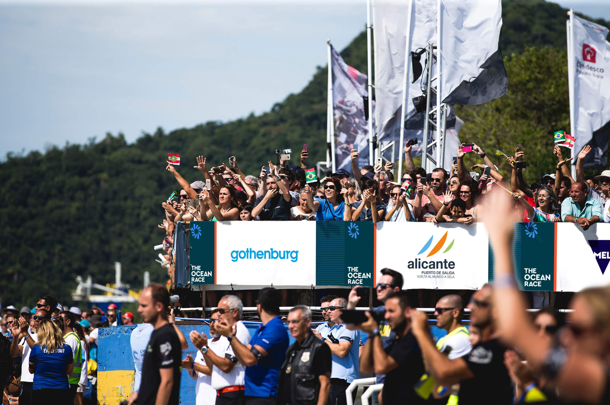
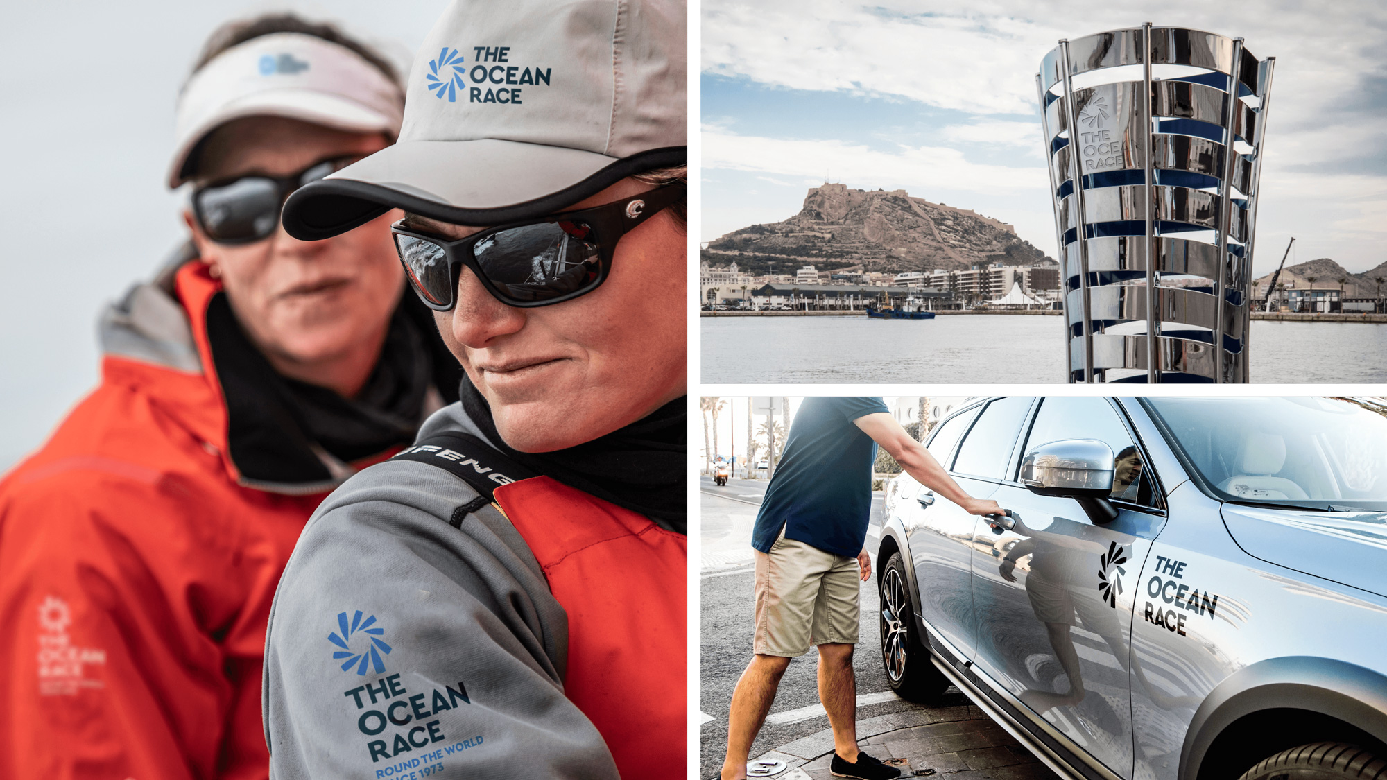
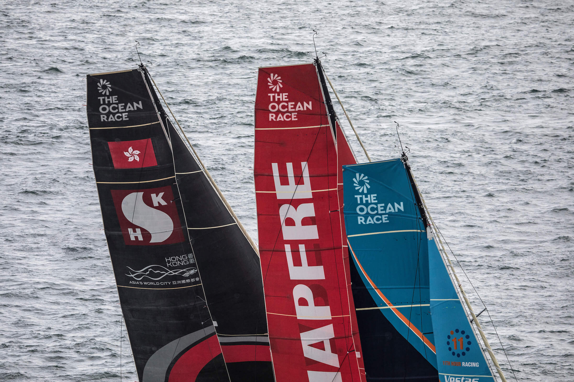
There are also some really nice motion things going on in the video above like the single little boat marker that moves up and down, the blocks and strips of color sailing into place, and the animated wind-vector boats. Overall, this has a subtle mix of elegance, adventure, and history that feels quite appropriate for this particular and peculiar event.

 Новости Союза дизайнеров
Все о дизайне в Санкт-Петербурге.