contact us | ok@ohmycode.ru
contact us | ok@ohmycode.ru
Established in 1996 and originally named Asian Australian Artists’ Association (hence the four “A”s), 4A Centre for Contemporary Asian Art is an independent non-profit organization in Sydney, Australia, that facilitates cultural dialogue between Australia and Asia. Through their gallery space they offer year-round exhibits, programs, and events while they also engage in advocacy in relation to Asian and Australian cultural relations. With their 20th anniversary in sight, 4A introduced a new identity designed by the Sydney office of Futurebrand.
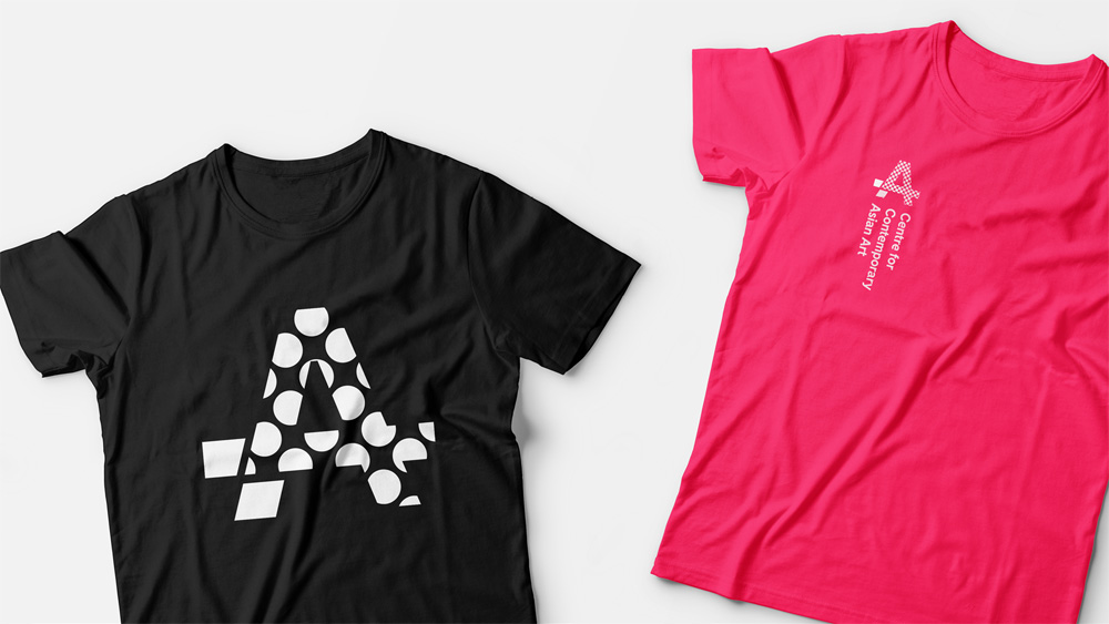
Contemporary art isn’t meant to answer questions - its task is to provoke more questions and challenge audiences. With this in mind, our approach was to have audiences feel challenged, asking more questions than they did prior to visiting 4A. The brand takes descriptions of artists’ work and translates them through various regional languages. Each translation creates a slight shift in the original meaning of the work, adding new and challenging ideas of what the work means to the various audiences that view it. To accompany this translation strip a dynamic logo has been designed that changes its internal design based on the works it is promoting.
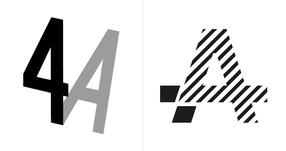
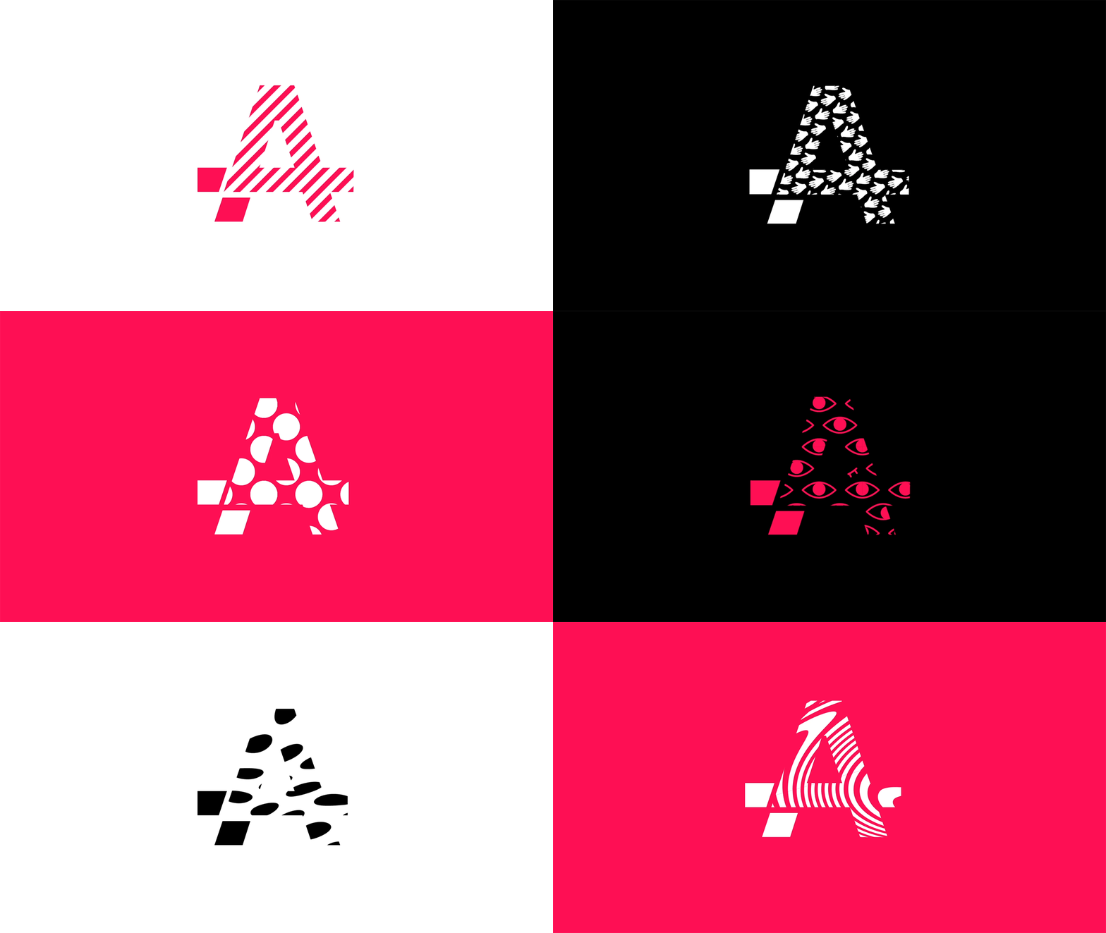
The old logo was fairly clever, rendering the “A” as the shadow of the “4” but the execution was somewhat lackluster and the gray color palette made it feel gloomy like a cloudy day. The new logo is also clever in its fusing of the “4” and the “A” in a way that is less obvious — meaning the viewer has to look for the “4” and the “A” as opposed to the old one that handed it in a gray platter. It’s a cool-looking monogram while also being distinguishing for the organization. The option to fill the “4” with different graphics gives it an extra layer of grooviness and is a fresh approach to the logo-as-window technique. The wordmark has a Jonathan Barnbrook-light aesthetic that’s interesting and provides a bit of a jarring sensation when looking at the name. I’m not sure it’s the right complement to the monogram but it’s also not wrong by any means.
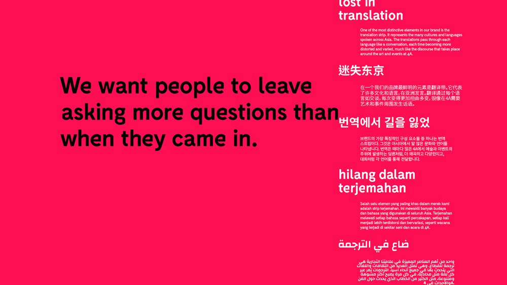
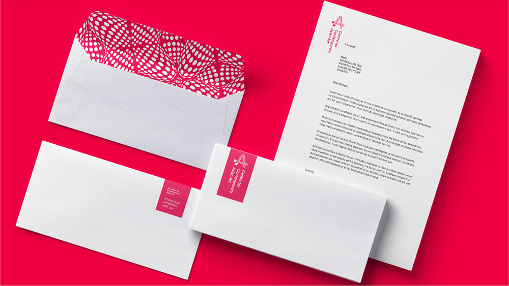
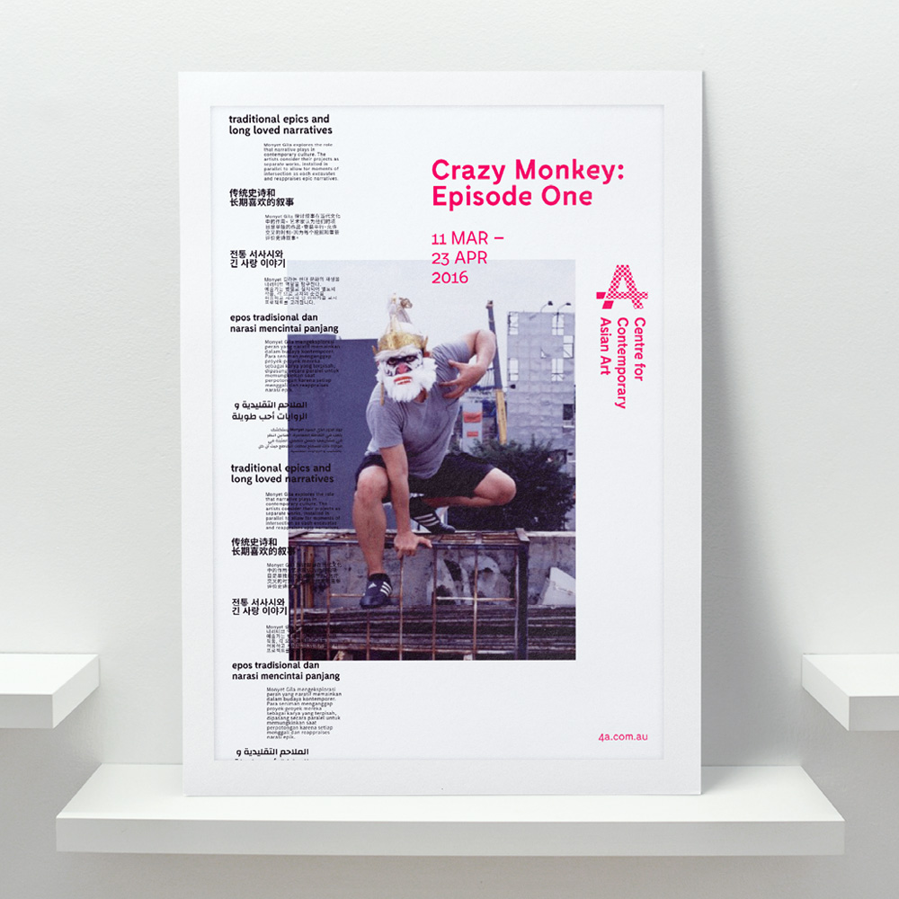
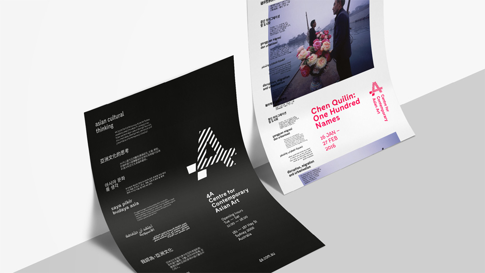
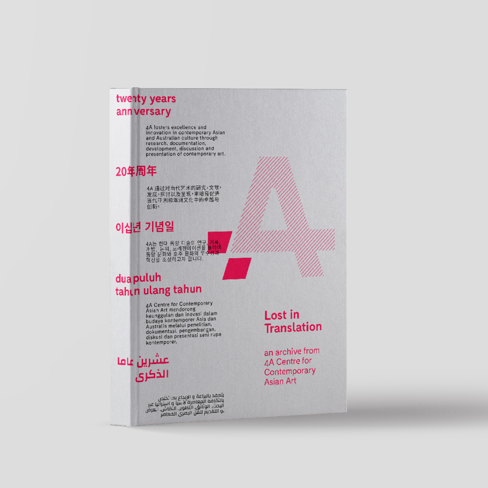
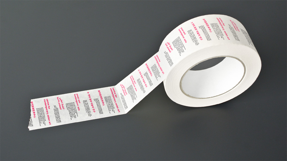
Apart from the logo, the main identity element is the “Translation Strip”, basically a strip of text that mixes Latin and Asian alphabets that contain artists’ work descriptions. At the top of the strip the identity can build in the organization’s name and mission or serve as the introductory headline and paragraph for the initiative or exhibition it’s promoting. It provides a great texture and a strong element to layer information and visuals while also establishing a consistent visual language across applications. The only problem would be that maybe it’s too much text or hard-to-discern text that any of the messaging at the top might get lost. Still, applications like the posters and catalog have a groovy academic feel with an edge.
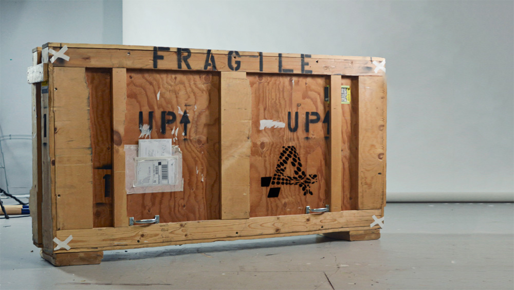
Best crate ever.
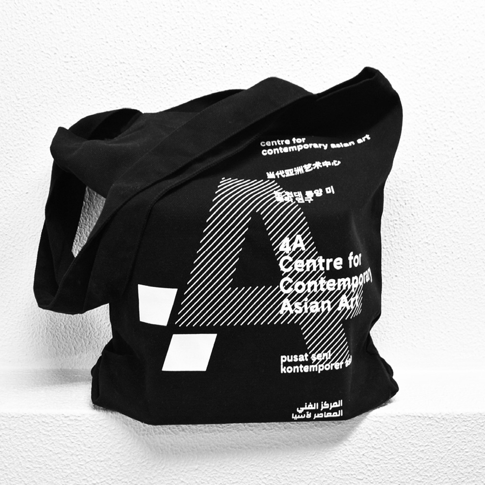
Even in small doses and in a single color, as the strip is applied in the tote above, the identity is able to convey a sense of layering and duality. Overall, the identity does achieve that slightly uncomfortable feeling that contemporary art strives for while giving the organization its own voice that doesn’t rely only on the work or artists it represents.

 Новости Союза дизайнеров
Все о дизайне в Санкт-Петербурге.