Обзор лучших ресурсов по разработке бренда, разработке упаковки
contact us | ok@ohmycode.ru
contact us | ok@ohmycode.ru
One of the oldest cities in the United States, Boston needs little introduction so I will spare you and instead let Wikipedia do the heavy fact-providing. This isn’t our typical destination or city branding project either as this identity is for the government of the City of Boston; not the tourism agency, not the business development agency but the day-to-day office that keeps the city and its citizens citizen-ing. The identity was part of the initial assignment given to IDEO of redesigning the city’s website. The new site (and identity) launched back in July of 2016, so this is a little older than I would like but I had flagged it for posting and somehow forgot until I received another tip last month.
In the process of the site redesign, IDEO also helped to create a visual identity system that underscores Boston’s strengths: the city’s confidence, humility, personality, and optimism.
In addition to the web architecture and redesign, IDEO also produced a comprehensive style guide to help maintain design consistency, so departments can add content without compromising the overall integrity of the site, as well as a brand look that the city has decided to adopt across nearly all of its consumer-facing media. Now you’ll see the famous underlined B on T-shirts, banners, and even snow shovels.
A lovely microsite with the brand guidelines is available here.

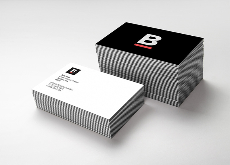
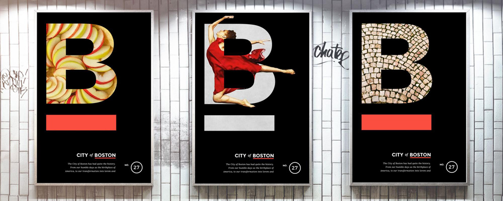
The new mark for Boston is not just the letter B but a bold letter B. Underlined. When something matters, we underline it. We use the B as a way to strike a friendly tone. While the seal is a symbol of authority, the B and the longer City of Boston logo is our way of showing we are human.

The old logo wasn’t really a logo but the city’s official seal, in use since 1823 and to remain in use going forward. I struggled with whether to do the header image as a Before/After or New but I am guessing the official seal was probably overused as a logo in materials where it shouldn’t have been. (Also, Google-Image-search “City of Boston Logo” and the results leave little doubt.) The new logo is a simple, stately wordmark typeset in Montserrat from Google Fonts. Nothing fancy or flashy, just sturdy and functional with the option to shorten into a “B” monogram, with a thick red underline. Nothing fancy or flas… Wait, I said that already… So you get the point. Arguably, this logo could say City of Chicago, City of Omaha, City of Seattle, and it would have the same effect but there is something that makes this quite fitting for Boston.
Boston’s digital seal is used in place of the official seal on all digital properties and communications. The seal was created to work better at small sizes and on screens. There will also be times when a cleaner, more modern interpretation of the traditional seal is needed for print pieces.
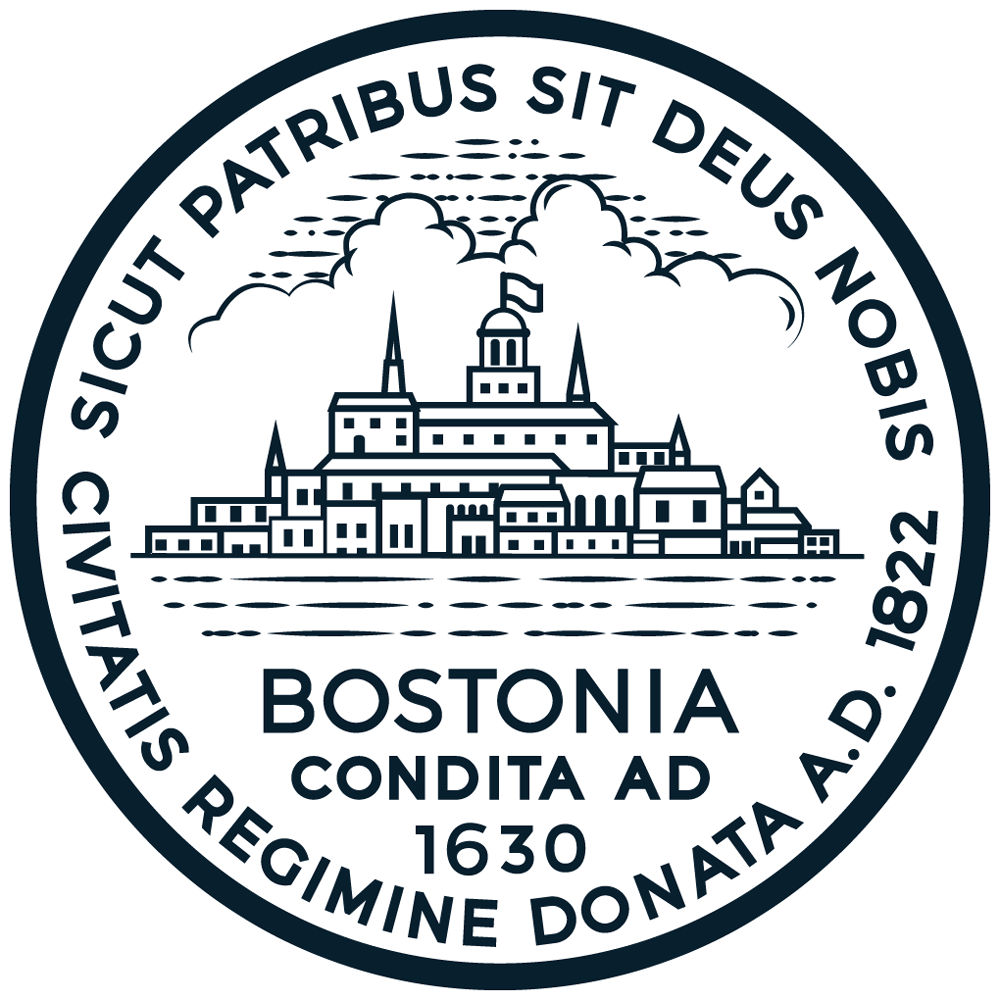

The digital seal DOES NOT replace the official seal, as noted in the quote. Instead it’s a more marketable, reproducible rendition that helps add some official-ness to the pared down aesthetic. Small, the digital seal looks nice but blowing it up reveals a less than stellar execution; mainly in how the sky, clouds, and river were drawn by one person and the buildings by another. That, or the same person couldn’t choose what style to do the seal in and did some elements in a more traditional engraving style and the buildings in a poor-person’s version of the Dribbble style. Also, the typography on a circle needed a lot more TLC.
There are a ton of icons! A ton. The departmental set is particularly good through the very simple repetition of the red underline which helps tie them back to the wordmark and monogram. The icons themselves could use some more consistency among them but as a whole they look very convincing.
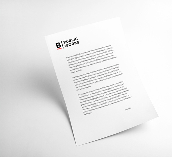

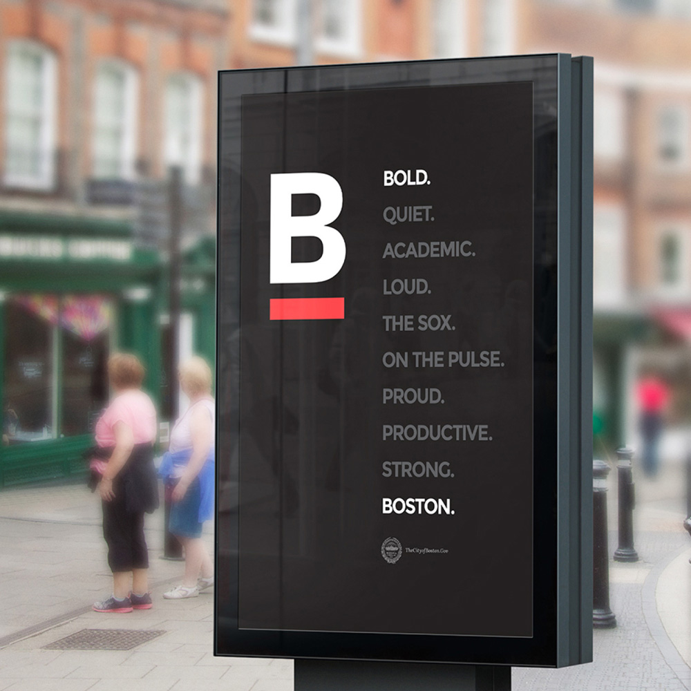
The application (or the application renders) are okay… If they had received the same attention to detail as the website, they could be amazing. The ads directly above are the best interpretation of the style — would have liked to see the black background be the darker blue instead. I actually find an application like this one more interesting in the sense that it takes something mundane like a community meeting notice and the identity makes it look good.
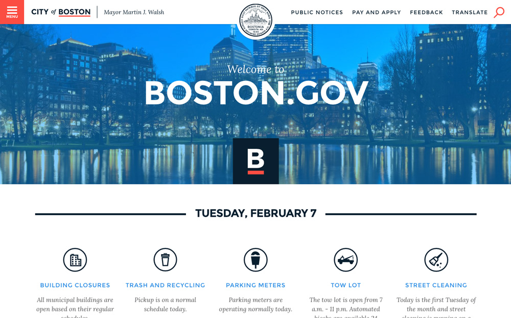
The ultimate application, though, and where clearly the biggest amount of energy went into, is the boston.gov website. It looks pristine, bold, and like there are actual human beings working in the city. The website feels alive and that the actions citizens take on it won’t just go into a digital black hole. Overall, with the website as the main delivery for the identity, this is a fantastic example of city government branding where there aren’t any flashy aesthetics that make tax-payers complain about their use of taxes but looks so put-together that it may make tax-payers feel pleased with how their taxes are being used.
Thanks to Jonathan Keller for the tip.

 Новости Союза дизайнеров
Все о дизайне в Санкт-Петербурге.
Новости Союза дизайнеров
Все о дизайне в Санкт-Петербурге.