Обзор лучших ресурсов по разработке бренда, разработке упаковки
contact us | ok@ohmycode.ru
contact us | ok@ohmycode.ru
Established in 1960 and known as Bloodwise since 2015 (it was previously “Leukaemia and Lymphoma Research” and originally “Leukaemia Research Fund”), Blood Cancer UK is a charity dedicated to funding research for and supporting people affected by blood cancers including leukemia, lymphoma, and myeloma — combined the third biggest cancer killers in the UK, claiming more lives than breast or prostate cancer. The charity funds world-class research (over £500million invested to date), ensures everyone affected has access to the right support at the right time, and campaigns for better treatments and care. At the end of last month, Blood Cancer UK introduced its new name and identity designed by London, UK-based Pentagram partner Marina Willer.
To connect the different strands and convey both the practical and the emotional elements, Pentagram’s team proposed the word ‘Because’ as a way of referring each activity and each individual back to the same cause. This became a central part of the tone of voice:
Because we research, we care, we support.
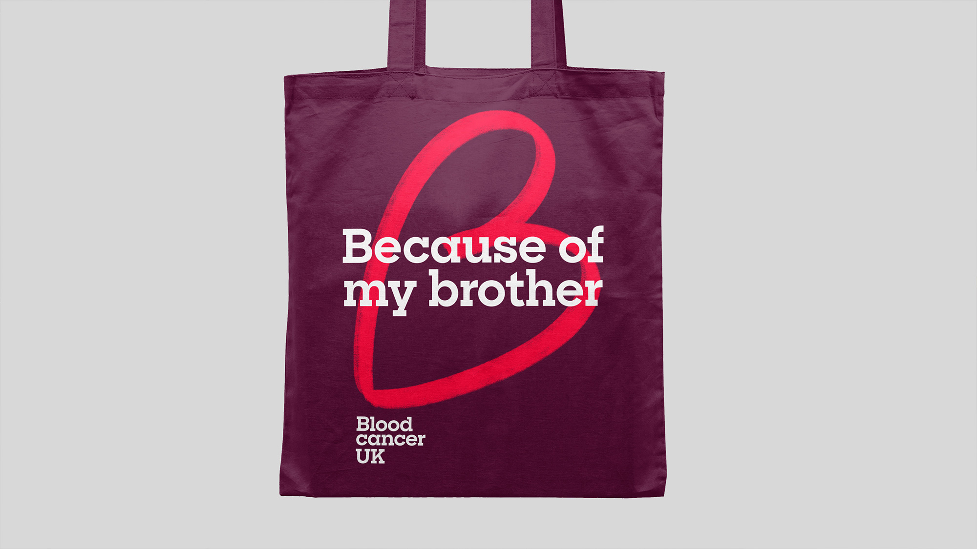
Because of Lisa, because of Norah, because of Richard.
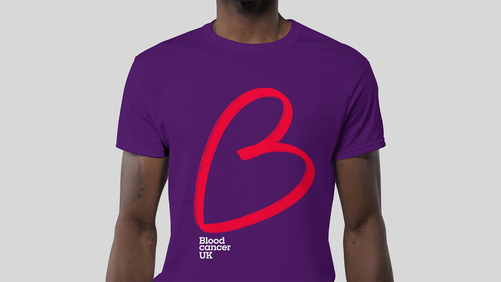
The symbol is a hand-drawn letter ‘B’, which stands for Blood Cancer UK. It also connects links with ‘Because’ and resembles a love heart—a simple symbol that embodies passion, conviction and kindness. The typography is friendly and yet scientific to indicate professional rigour and the colour red (already used by the charity), also expresses its passion for this important cause.
As well as the logo, Pentagram’s team created the tone of voice, graphic language, animation and photography style.
While the old name had the right intention, I can definitely see how it didn’t work on behalf of the charity as it wasn’t clear it was about cancer and while the new name may be 100% prescriptive it is also 100% effective in clarifying what and for whom this charity is. The old logo didn’t help much either by looking like a pharmaceutical corporation or business magazine — anything but a charity aiming to help people — and even with the tagline underneath the dry wordmark, it didn’t quite inspire a connection. The new logo features — prominently! — a lovely, hand-drawn “B”-slash-heart that has a warm and genuine effusiveness to it because of its size in relation to the wordmark. While “B”s have been turned into hearts before, this one is appropriate multiple times over as a “B” for “Blood”, a “B” for “Because”, and a “B” for “Beat” (as in in beat the damn thing). The execution of it is great too, with just the right amount of texture to make it look good at big sizes and the right angle/tilt/baseline-shift to make it read like a heart easily. The wordmark, in Sharp Slab, looks industrious and hard-working, serving as a great complement and contrast to the more emotion-driven “B”.
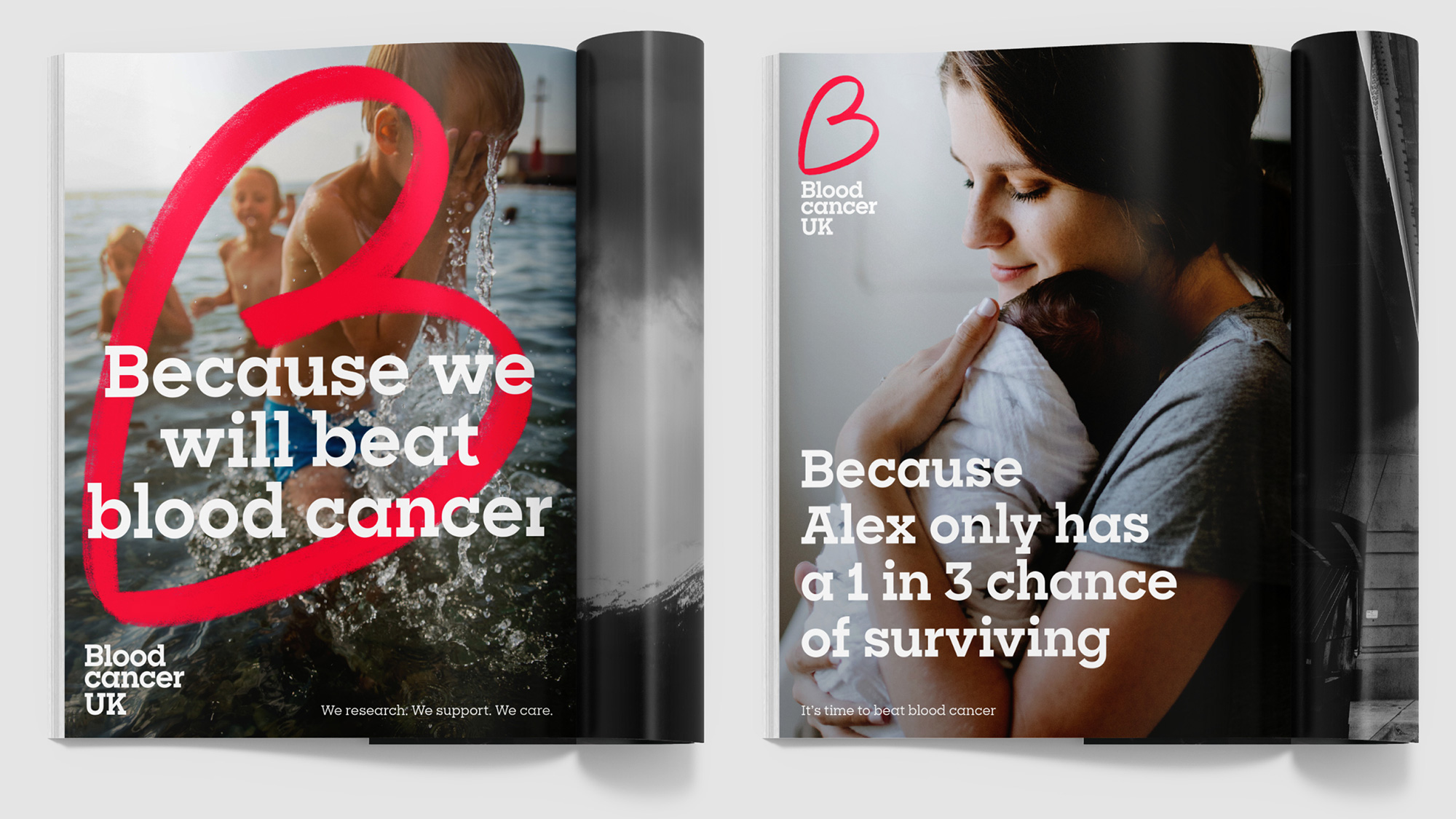
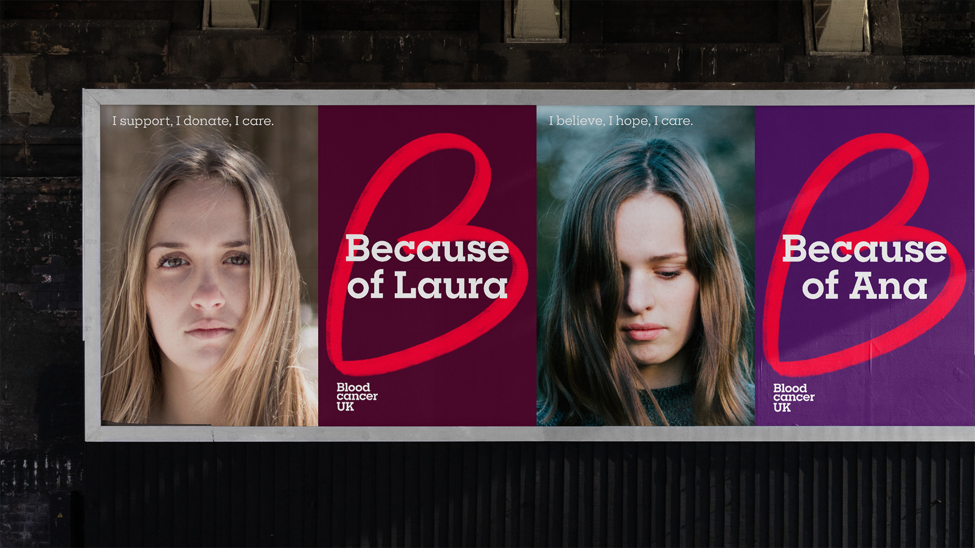
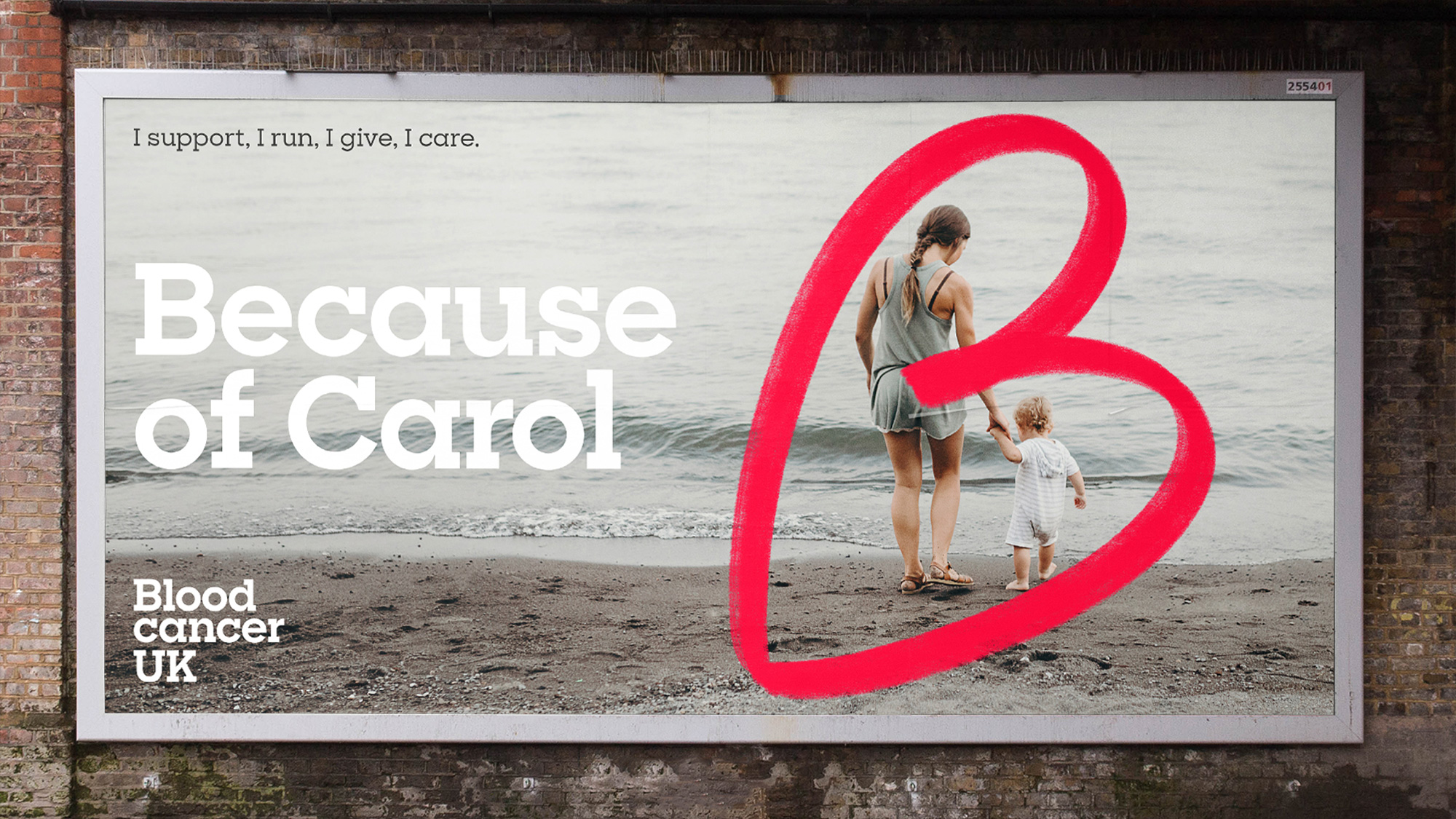
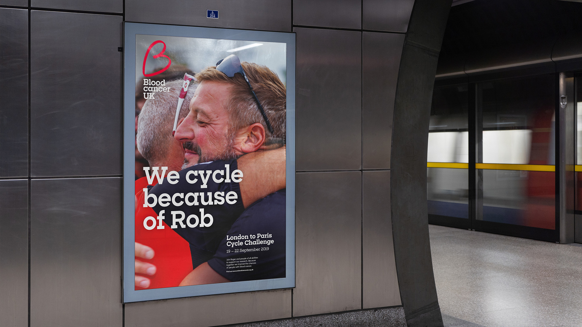
The communication applications are amazingly simple and effective, anchored by a strong and memorable copywriting approach of starting a statement with “Because”, which allows for multiple entry points to talk about what the organization does and, more importantly, why it does it by including names and portraits of people affected. In application, the “B” is used even bigger as a backdrop for the copywriting (which looks great on top of a photograph) and still anchored in the same spot on top of the wordmark that sits at the bottom-left corner. Super simple but super effective.
Overall, a great evolution that makes the charity look and feel more human while being both clear and emotional in its messaging.
 each year since publication began in 2006

 Новости Союза дизайнеров
Все о дизайне в Санкт-Петербурге.
Новости Союза дизайнеров
Все о дизайне в Санкт-Петербурге.