Обзор лучших ресурсов по разработке бренда, разработке упаковки
contact us | ok@ohmycode.ru
contact us | ok@ohmycode.ru
Established in 1902, The British Academy is the UK’s national body for the humanities and social sciences, focusing on “the study of peoples, cultures and societies, past, present and future”. A self-governing and independent registered charity, headquartered in London, the organization serves three roles: as an independent fellowship of world-leading scholars and researchers, a funding body that supports new research, and a forum for debate and engagement. Earlier this month, The British Academy introduced a new identity designed by Manchester, UK-based Only.
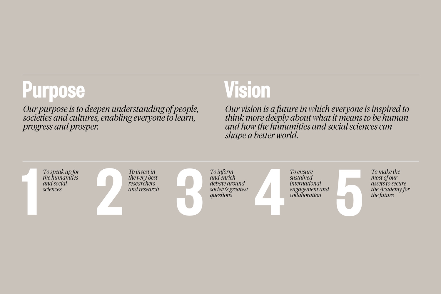
At a time of misinformation, distrust of expertise and increased social division, the role of the Academy has never been so critical. Moving beyond prestige and academic rigour, we helped the Academy to unite behind progressive principles. Discovery, Humanity and Ambition became the watchwords for an institution committed to helping people to learn, progress and prosper.
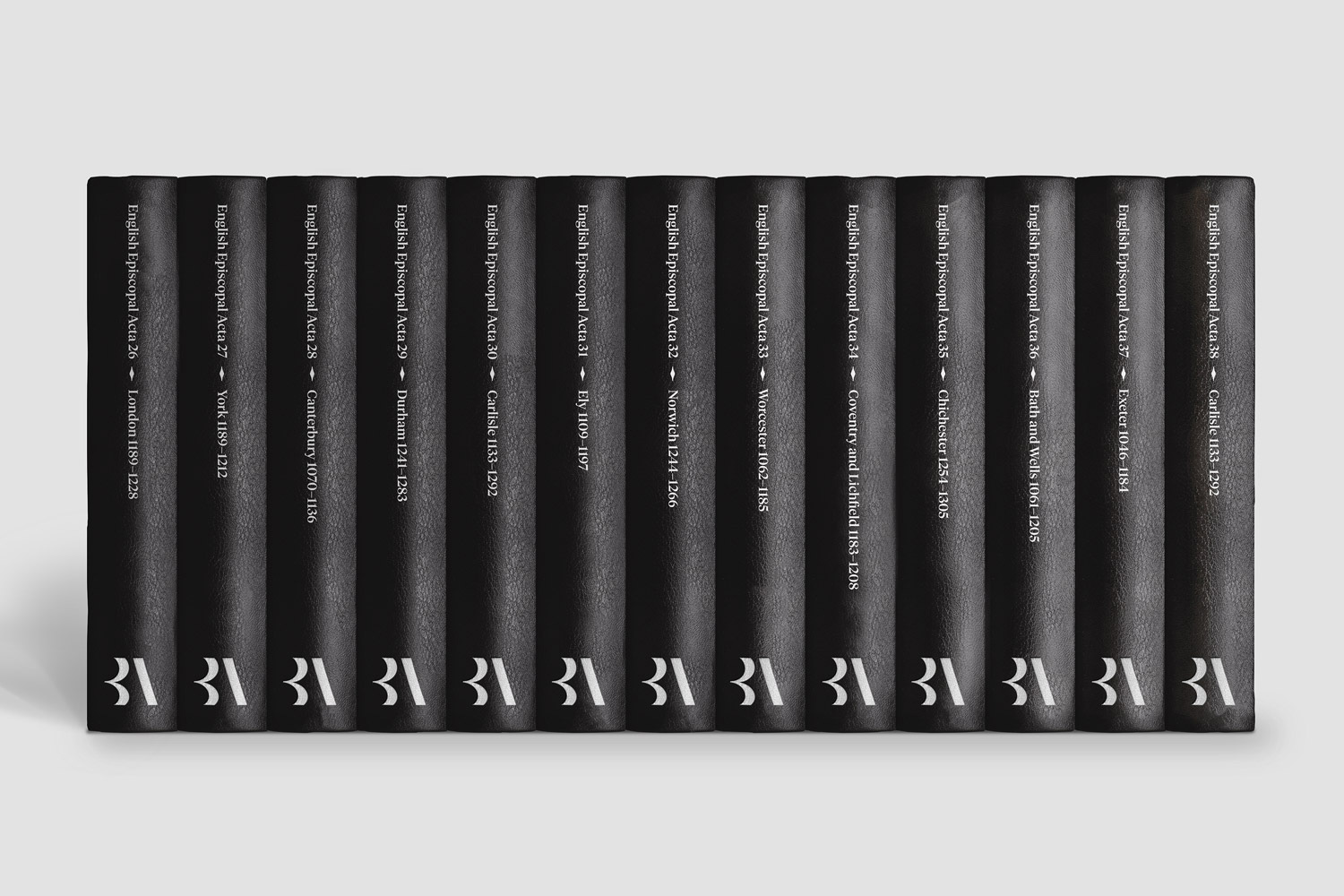
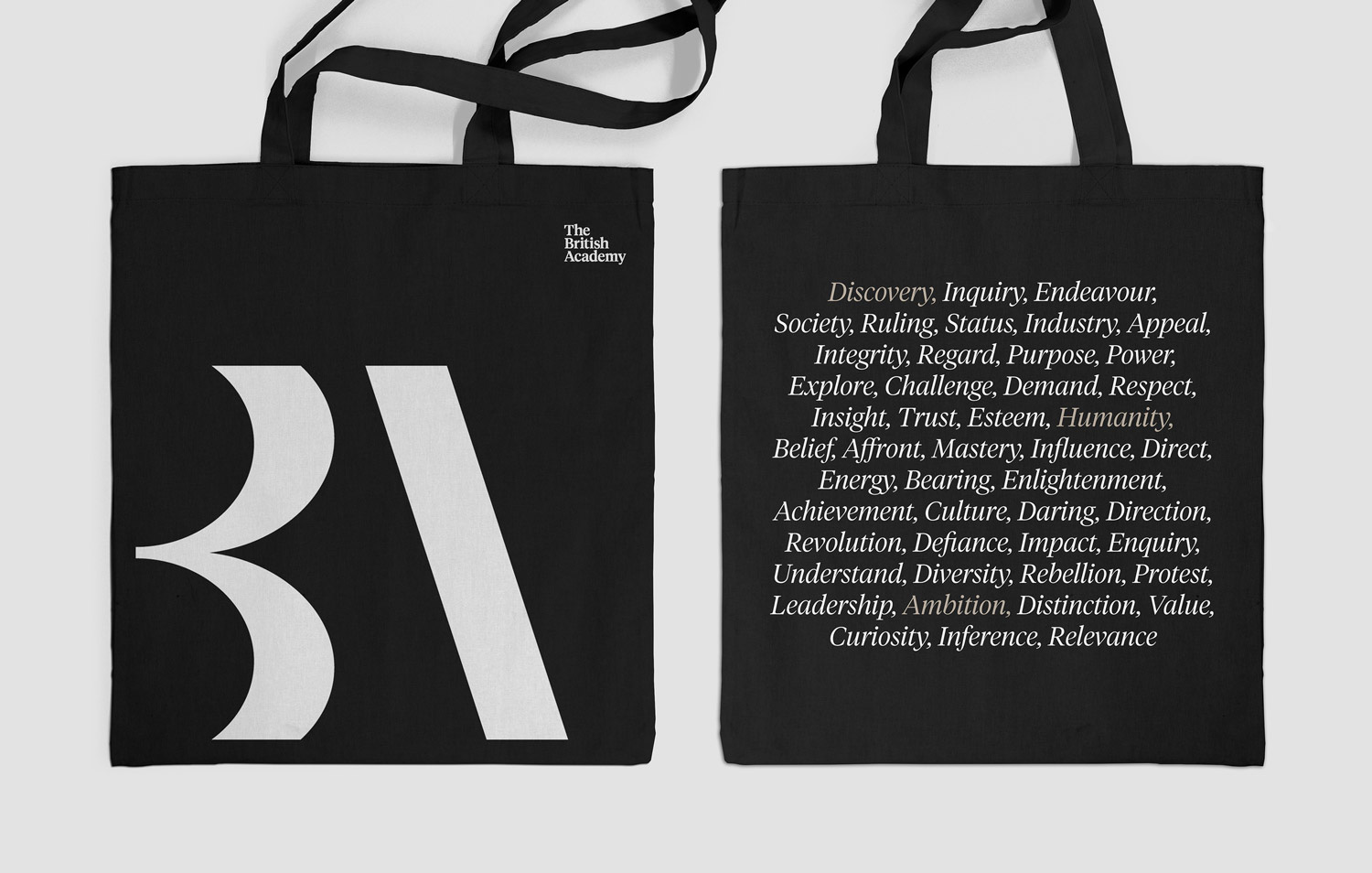
The British Academy has been a leader in its disciplines for over 100 years. We reintroduced the definite article to reassert authority and crafted a monogram for confident application. The unique crop of the letterforms in the marque offers a modern solution that invites a closer look and hints at the Academy’s commitment to ensuring progress through academic discovery.
The old logo played the scholarly hand pretty heavily with serif typography for days and a busy seal depicting Clio, the muse of history in Greek mythology. It wasn’t great and it wasn’t terrible but, mainly, it wasn’t a practical logo. The new logo introduces a monogram that provides more flexibility and establishes a graphic mark that is easier to remember, recognize, and associate with the organization. It’s a slightly strange monogram, though, as its two letters don’t quite share the same approach: the “B” seems to be tightly cropped and gives the illusion that the rest of the “B” continues outside but the “A” is just one of the legs without the cropping effect. I understand the intention is to create two abstract renditions of the letters but, Gestalt-ingly, my brain is looking to complete the missing pieces in some sort of logical way.
Nonetheless, as an abstraction, it’s a solid combination of shapes and I like how the “B” looks like an open book. The monogram is very nicely paired with Klim Type Foundry’s Tiempos Headline, keeping the scholarly feel of the old logo but in a much more contemporary way. Please notice how the top of the “T” in “The” is what aligns with the top of the monogram while the “h” shoots up — this may seem obvious but less experienced hands might have simply aligned-to-top the wordmark with the monogram without that small consideration.
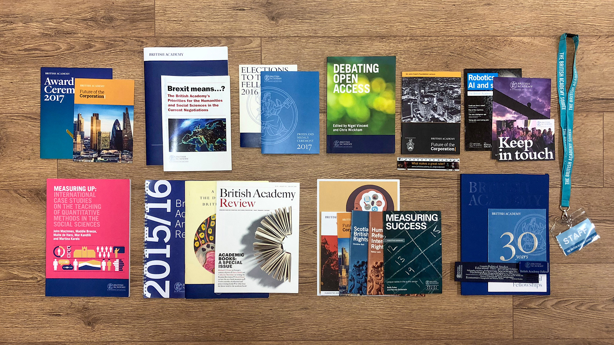
The samples of the old look were competently done but there was a clear lack of consistency and intention, making each piece look as if it came from a different organization.
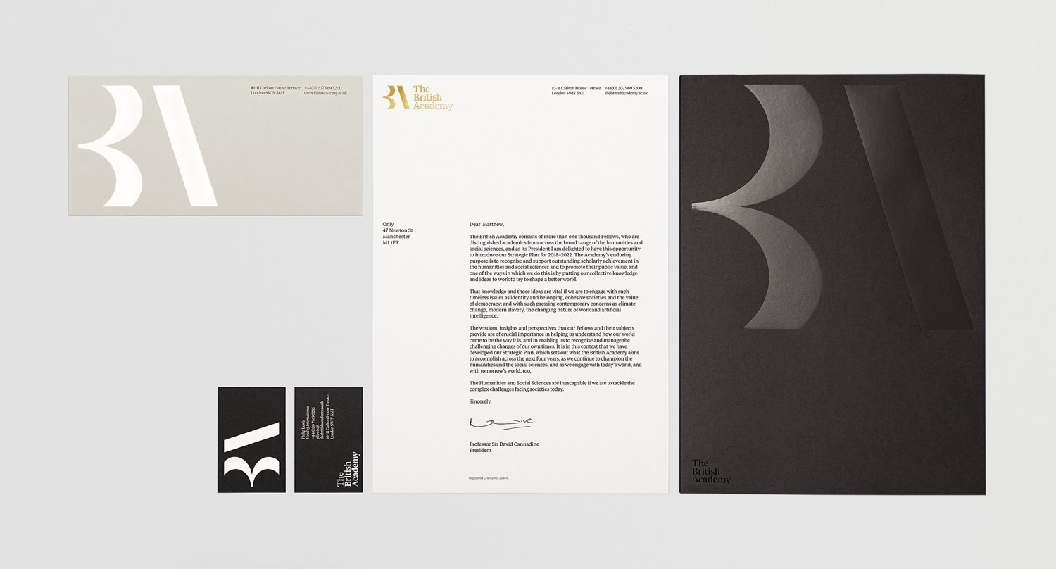
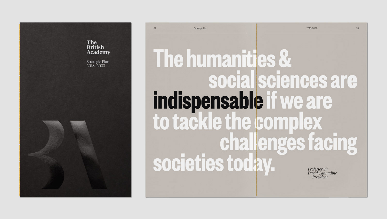
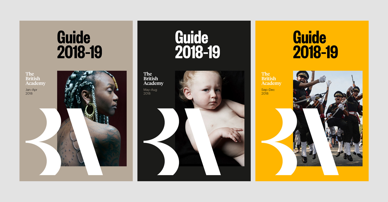
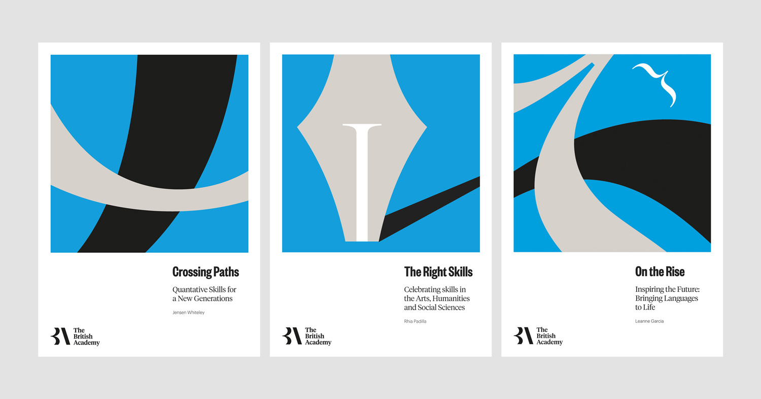
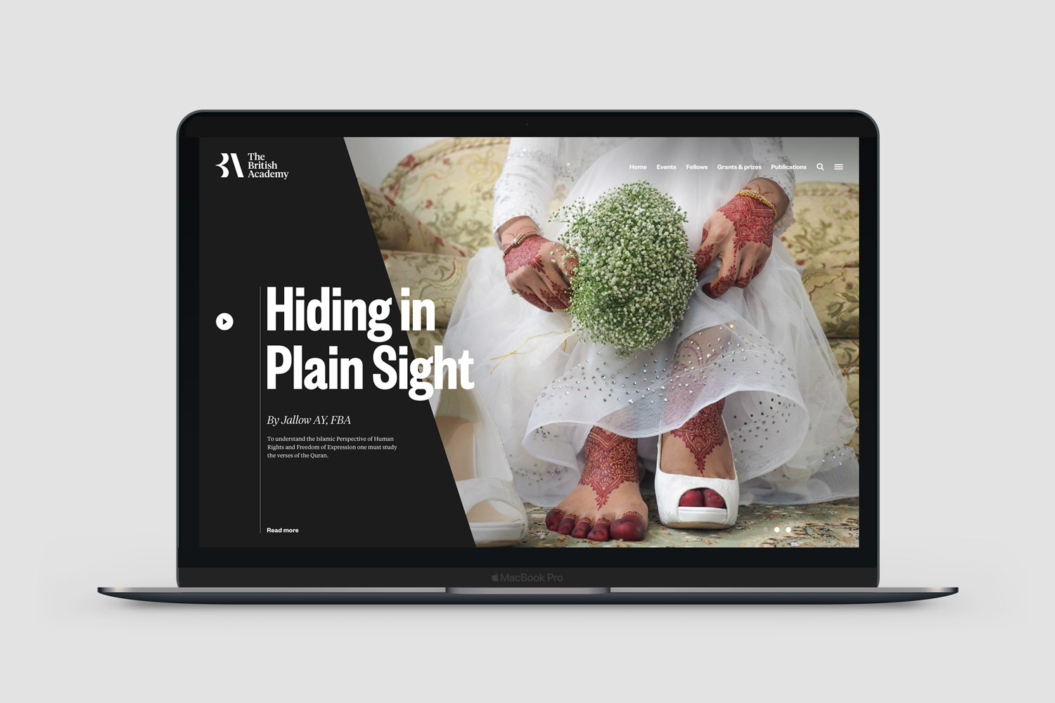
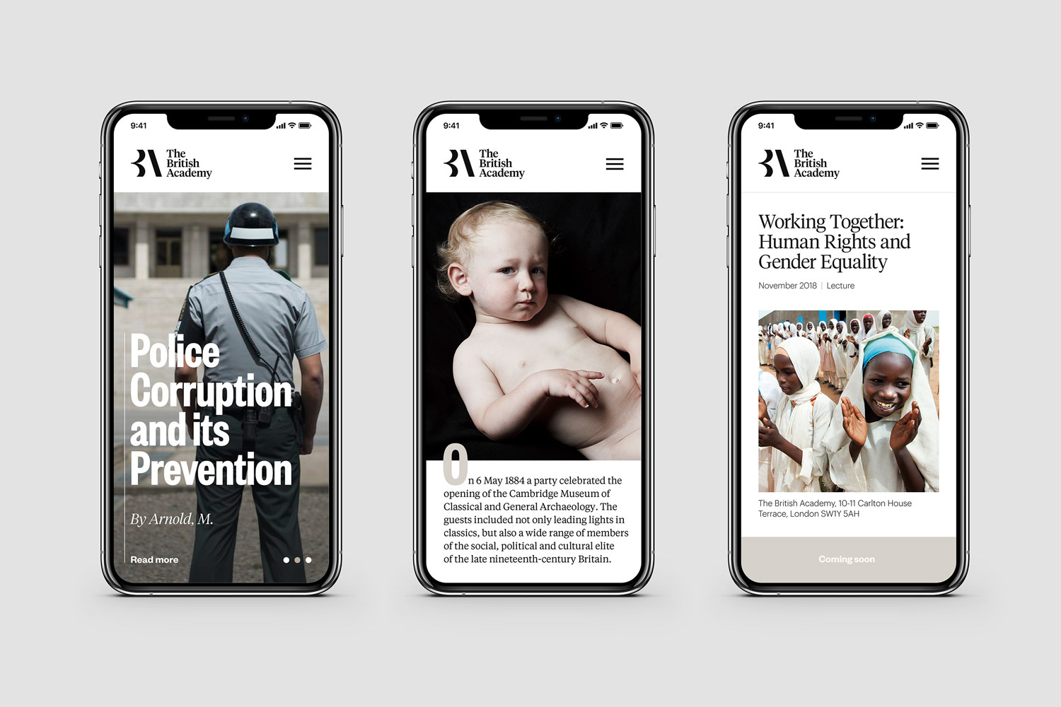
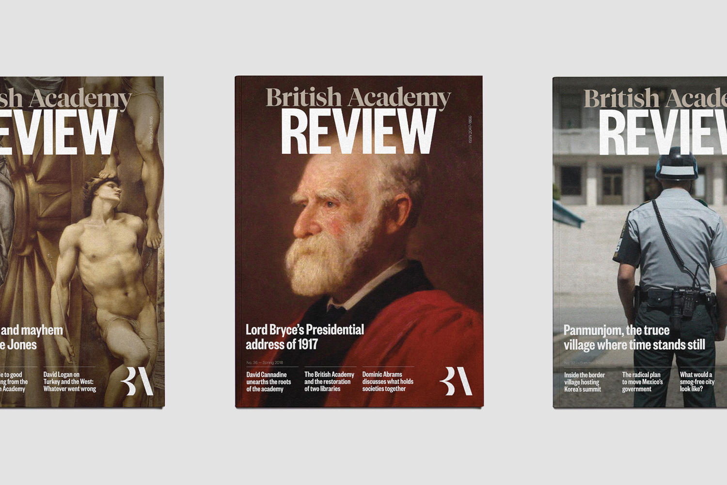
The visual identity starts with prestige and a close association with 10-11 Carlton House Terrace, the historic home of the Academy. Bold verbal and typographic expression lends confidence and modern relevance. A vibrant secondary palette hints at the diversity of subjects and perspectives brought together by the Academy. Imagery plays a key role in representing the Academy’s unique perspective on the human condition and connecting the study of the humanities and social sciences with some of the greatest challenges facing society today.
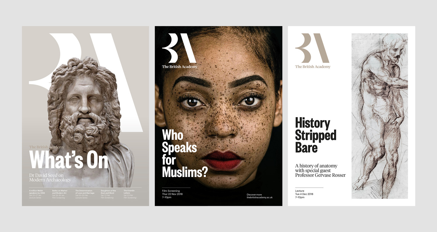
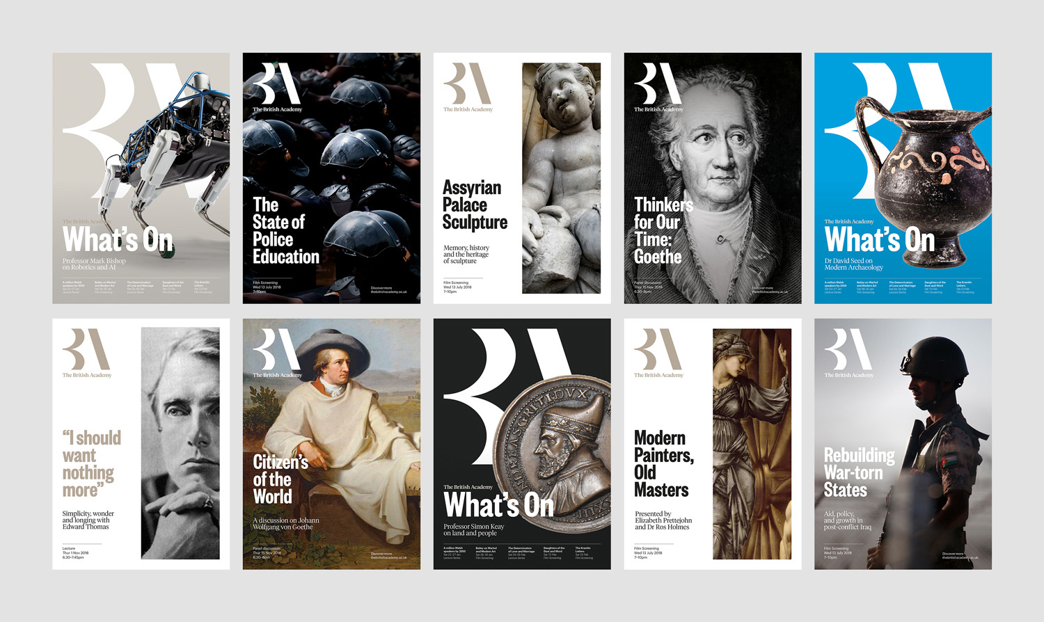
The identity uses a great combination of Tiempos and, also from Klim, Founders Grotesk X-Condensed, that yields a very satisfying balance of serif and sans serif that allows the different applications to be bolder or quieter but all in the same visual tone. I like how the monogram can be used small in the corner or large with either artwork falling on top of it or resting underneath it.
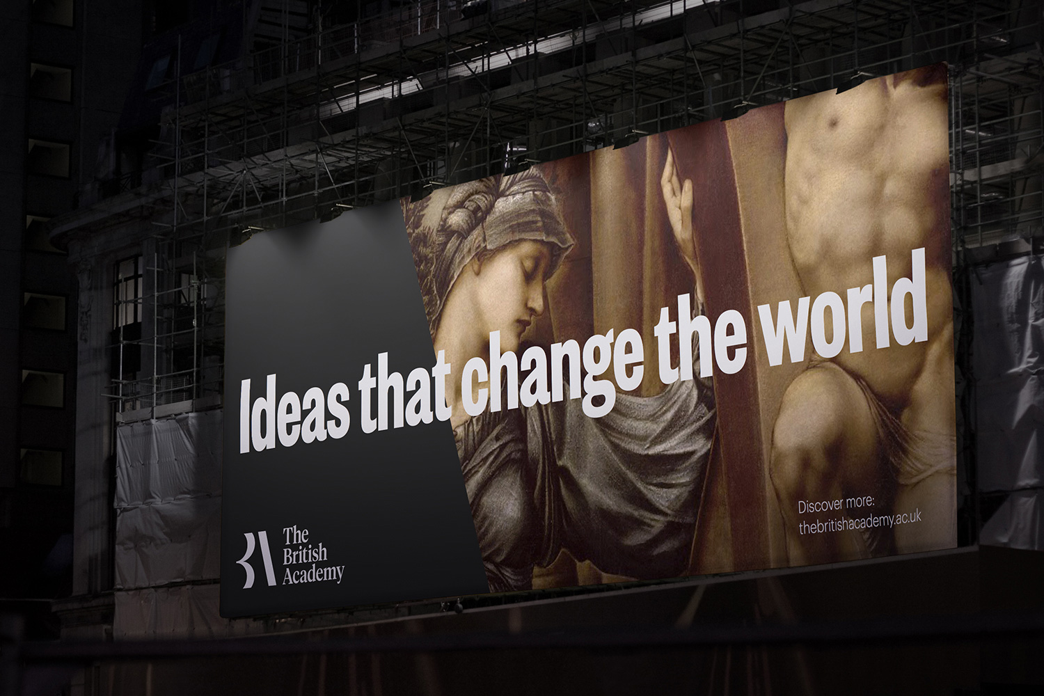
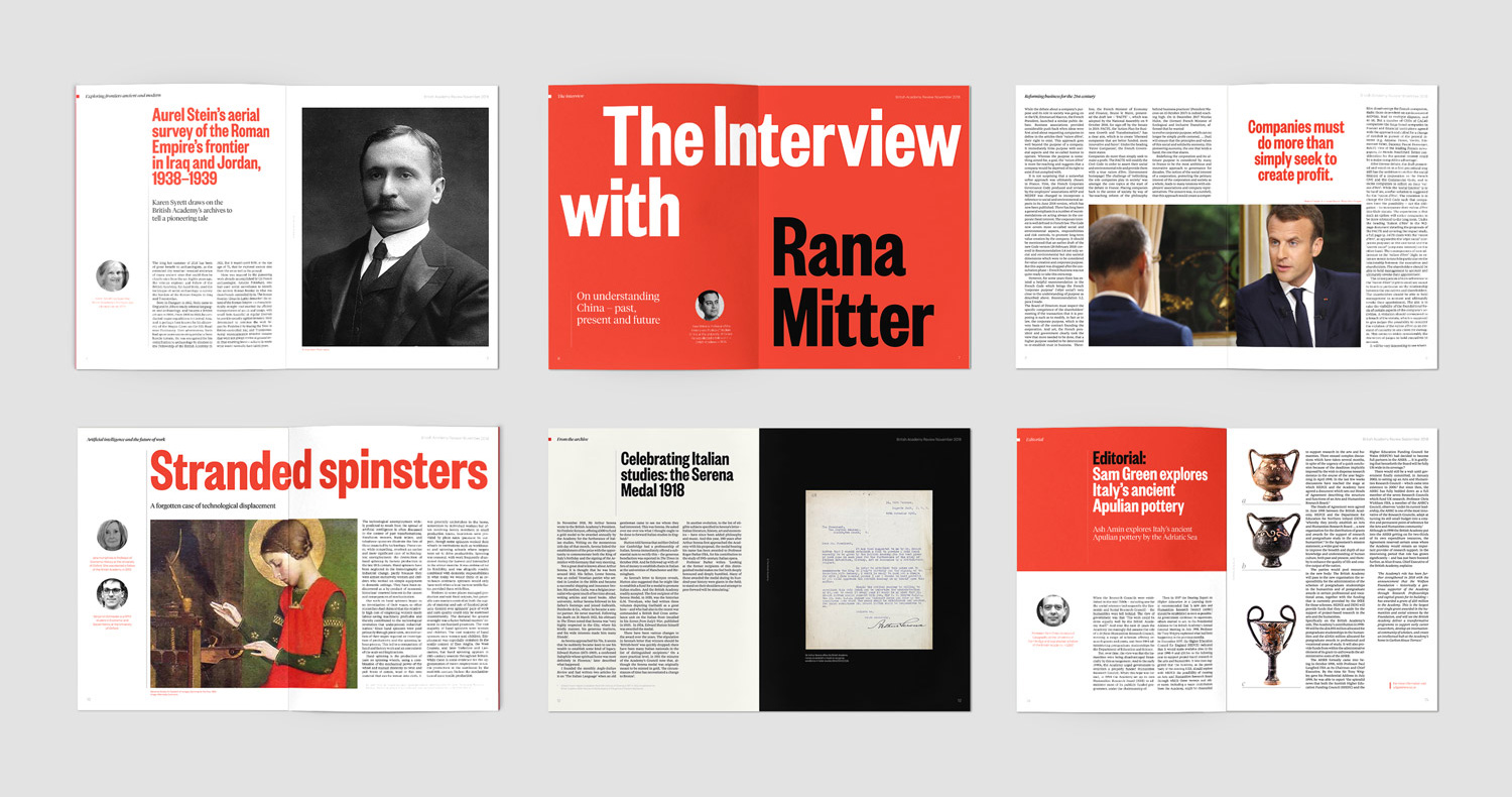
It’s uplifting to see strong typography — without many tricks or visual pow-wow — become such a clearly-defining identity for an institution. This is almost like The New York Times’ use of Cheltenham and Franklin Gothic, that can be used in various combinations and still maintain uniformity. Overall, a very fitting redesign.

 Новости Союза дизайнеров
Все о дизайне в Санкт-Петербурге.
Новости Союза дизайнеров
Все о дизайне в Санкт-Петербурге.