Обзор лучших ресурсов по разработке бренда, разработке упаковки
contact us | ok@ohmycode.ru
contact us | ok@ohmycode.ru
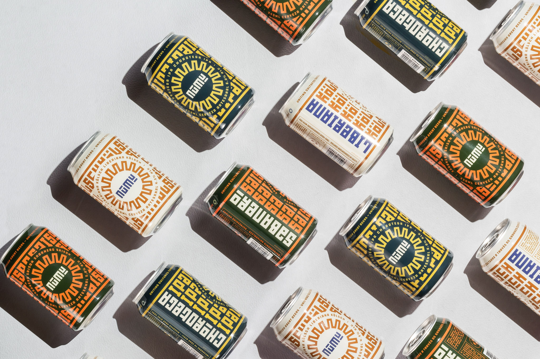
Established in 2018, NUMU is a craft brewery based in Liberia, Costa Rica, in what is known as the Chorotega Region, named after one of the most powerful American Indian tribes, that resided in the northwest of the country. NUMU, which means “sun” in the Chorotega language, was founded by a former Chicago, IL, resident who moved to Costa Rica with his family (and dog) to establish the brewery along with a local head brewer and a marketing and sales partner (and avid home brewer). They produce three flagship beers available in cans and on draft and they create other traditional styles, experimental, seasonal, and collaborative beers offered in their two tap room locations in Liberia. The identity and packaging for NUMU were designed by San José, Costa Rica-based Pupila.
Design wise, we went back to the roots (notice a pattern?) and studied the Chorotega indigenous culture that inhabited the region where this beer gets produced, Guanacaste, a warm land on the north of Costa Rica, full of history, beautiful beaches, and now delicious beer. The result is a contemporary reinterpretation of their artwork, characterized by symmetrical shapes, patterns and earthy tones.
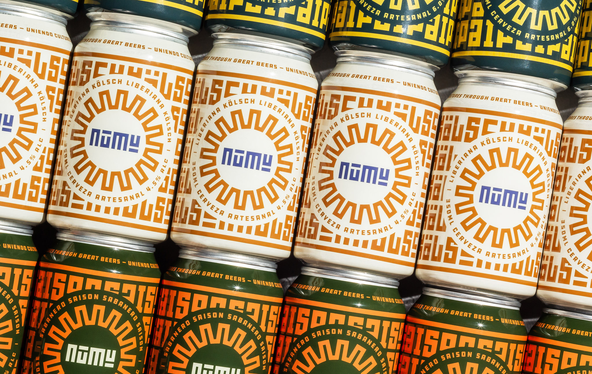
The full (or badge-like) logo is the most effective in bridging the name of the beer with a visual representation as the wordmark is surrounded by an abstract sun rendered in the same blocky style as the name and together they create a wonderfully textural logo. My one minor complaint is that I think the sun graphic could be a little thinner to match the thickness of the wordmark and to feel a little less overpowering. The smaller typography around the sun works very well but knowing that the type used is DDC Hardware is funny because it’s probably the last association I would have made with a visual language that’s otherwise based on an American Indian tribe culture. The wordmark on its own is great too, abstracting the four letters to their most basic representation using only straight strokes. Shifting the line on the “U” from top to bottom gives the wordmark a nicer rhythm than if they had kept it the same or just made the “U” as a flipped version of the “N”.

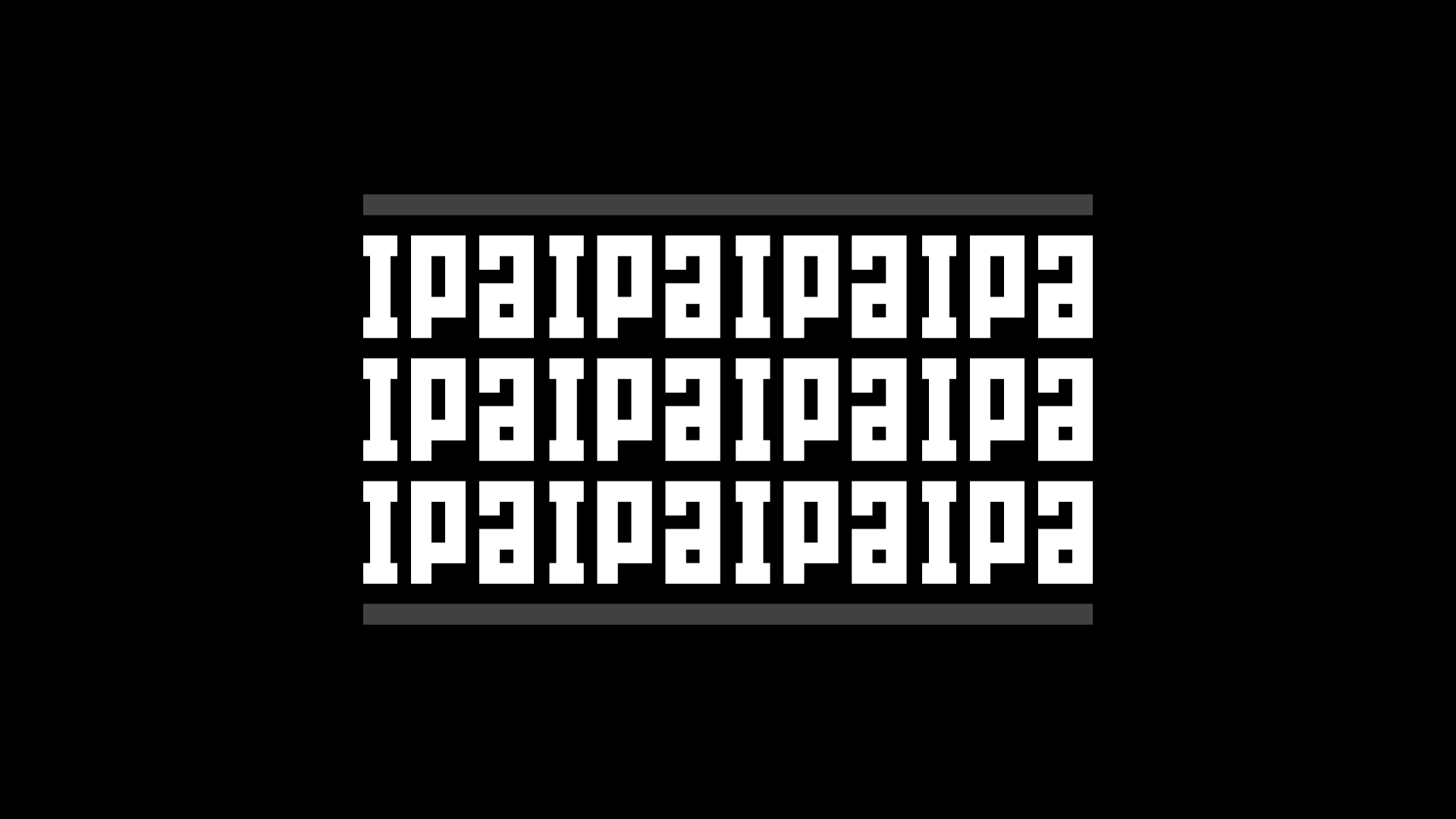
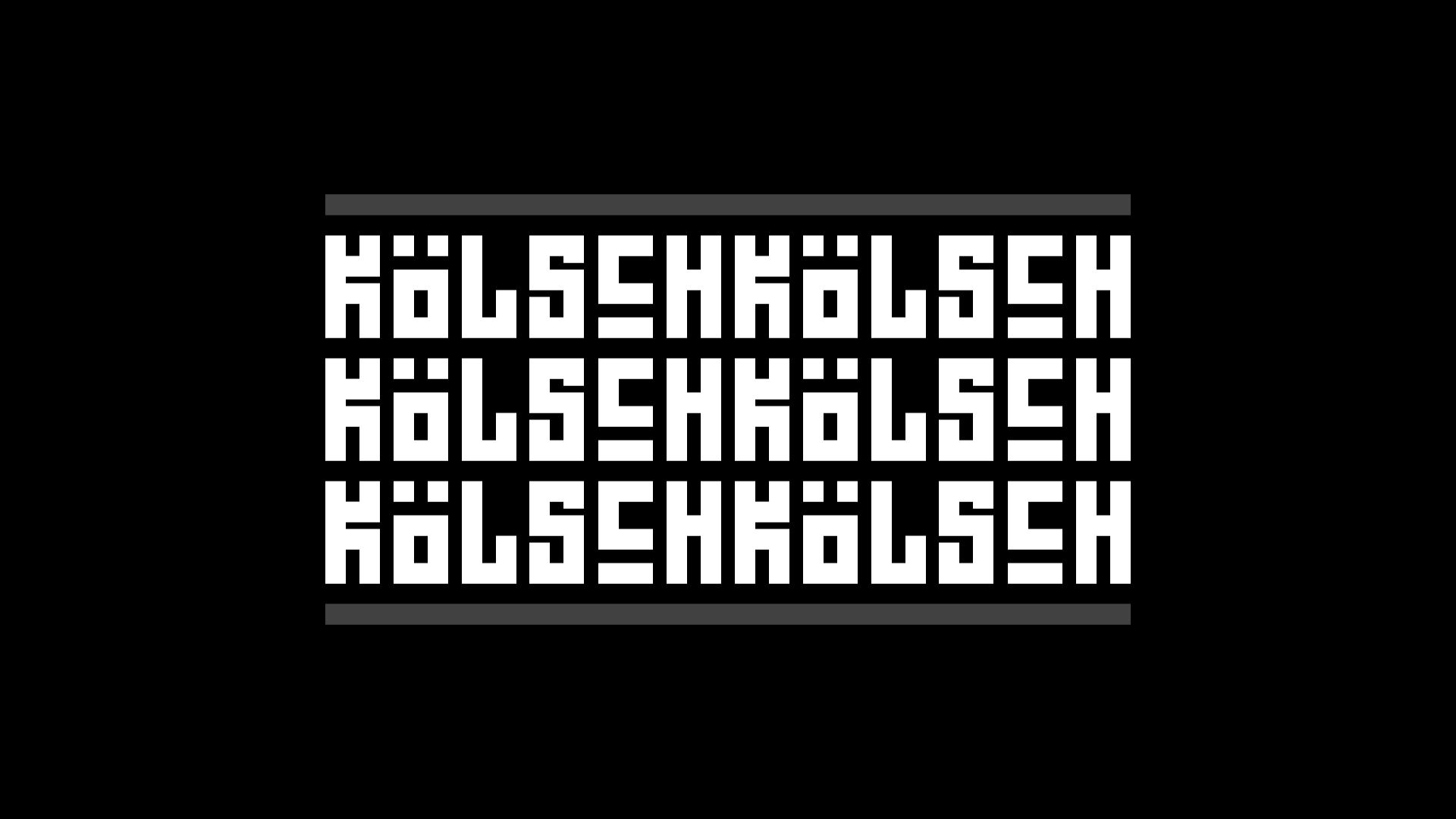
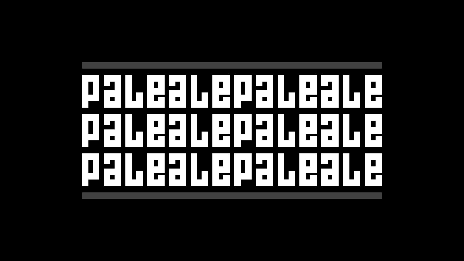
The custom typeface is all kinds of wonderfully clunky, especially the lowercase. It’s probably not something I would buy if it were a retail font because I don’t think I would ever be able to use it but, here, as an extension of the wordmark and sun graphic, it works perfectly.
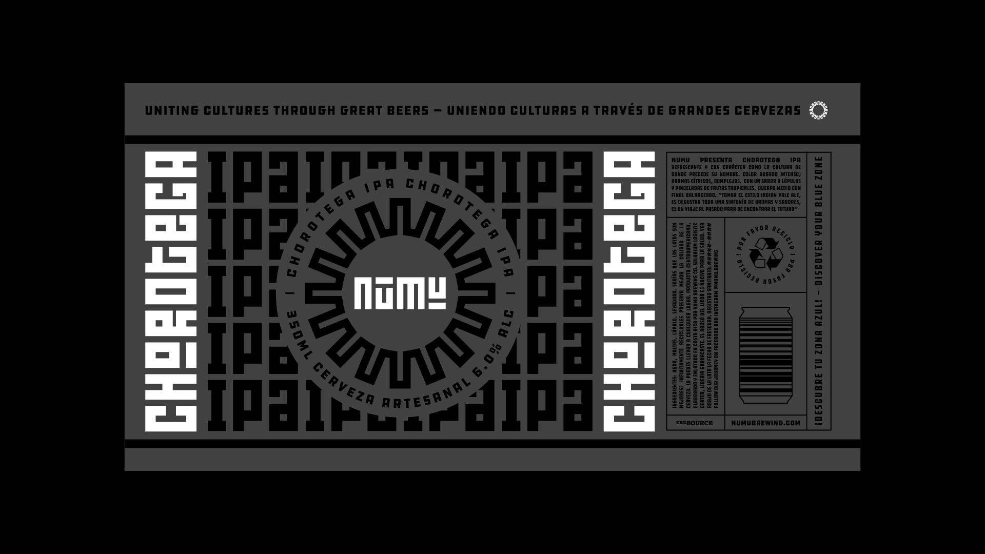
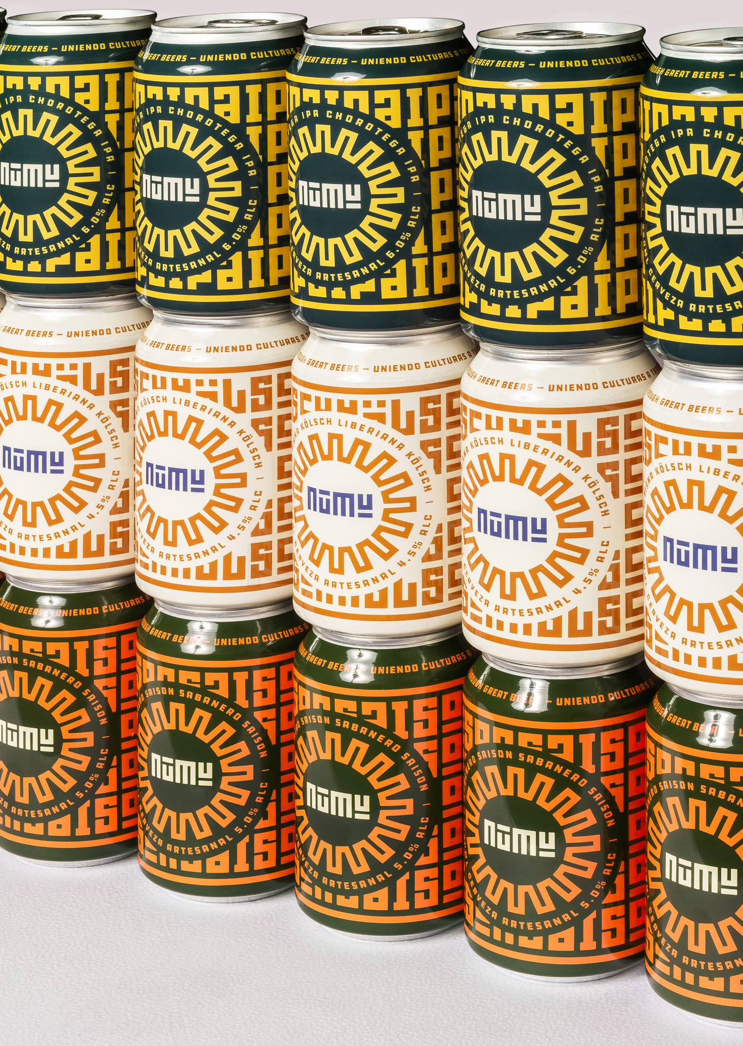
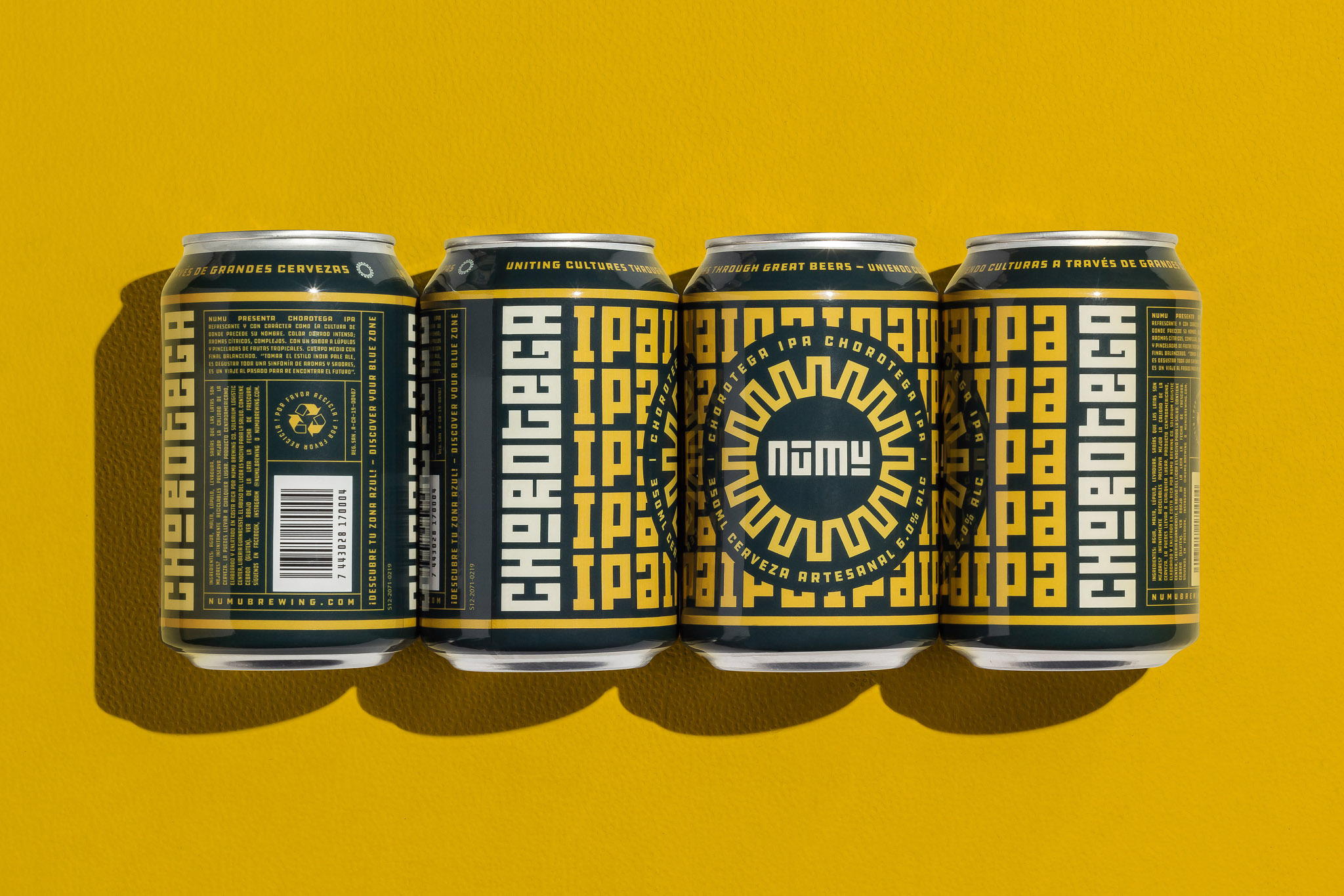
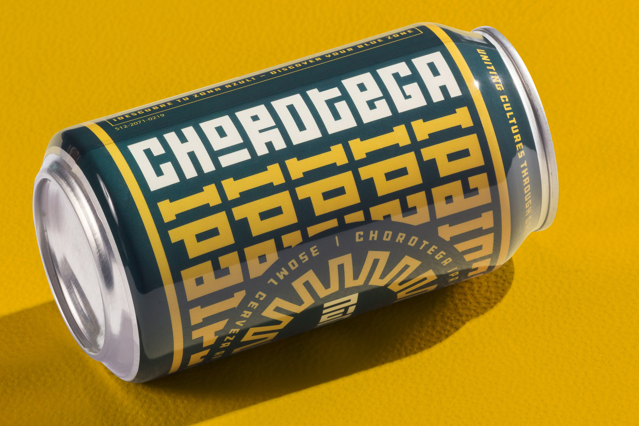
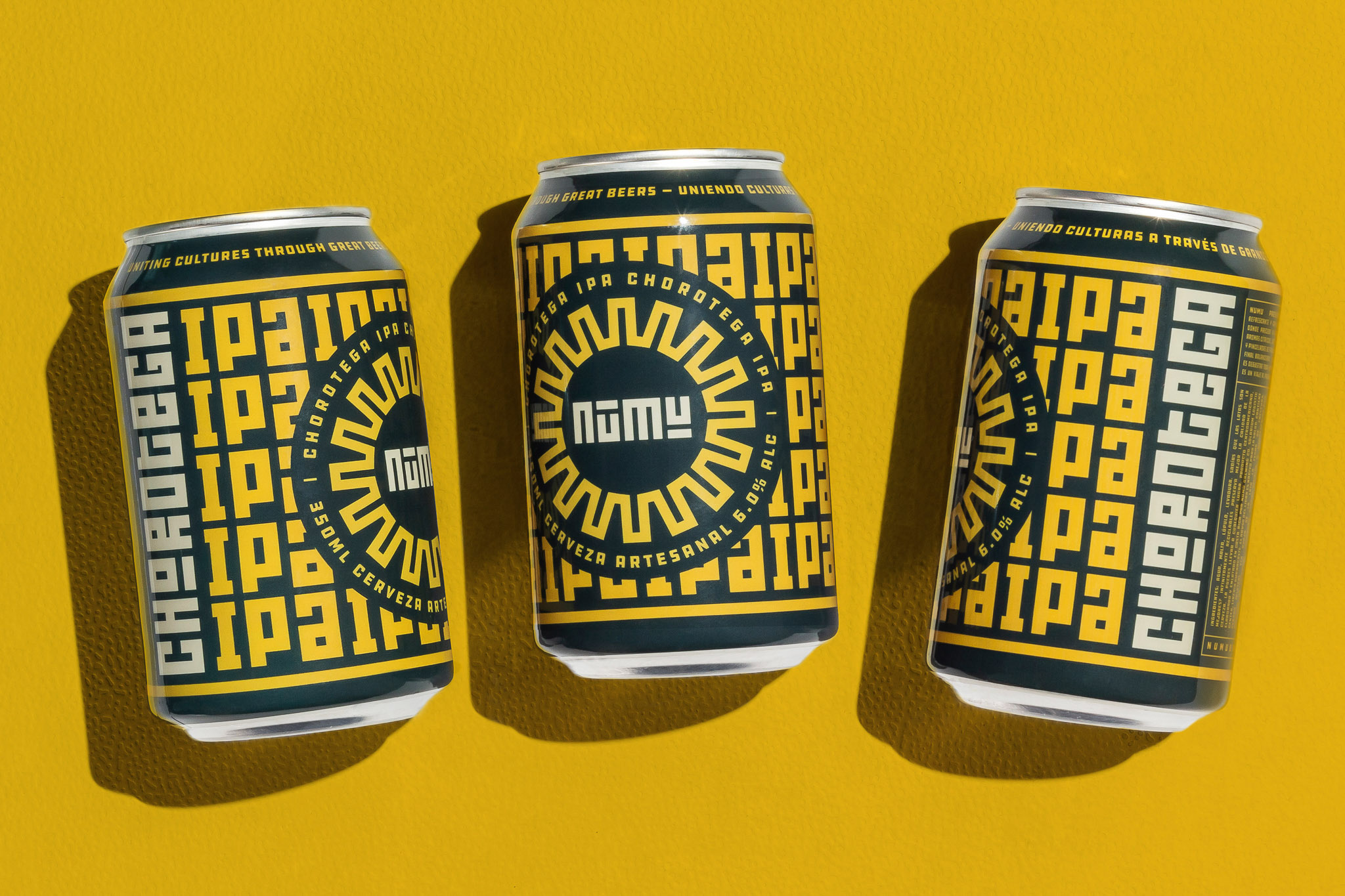
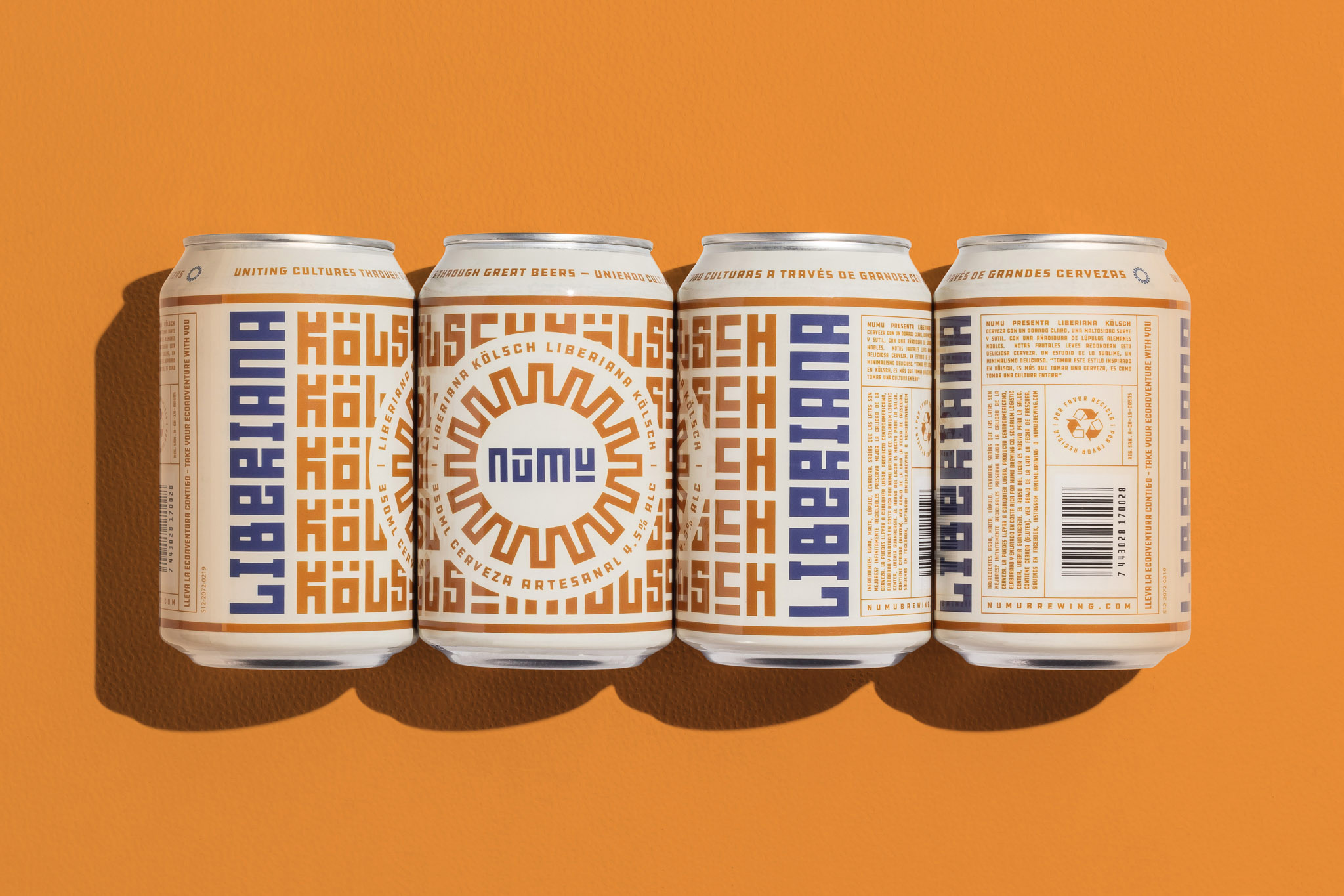
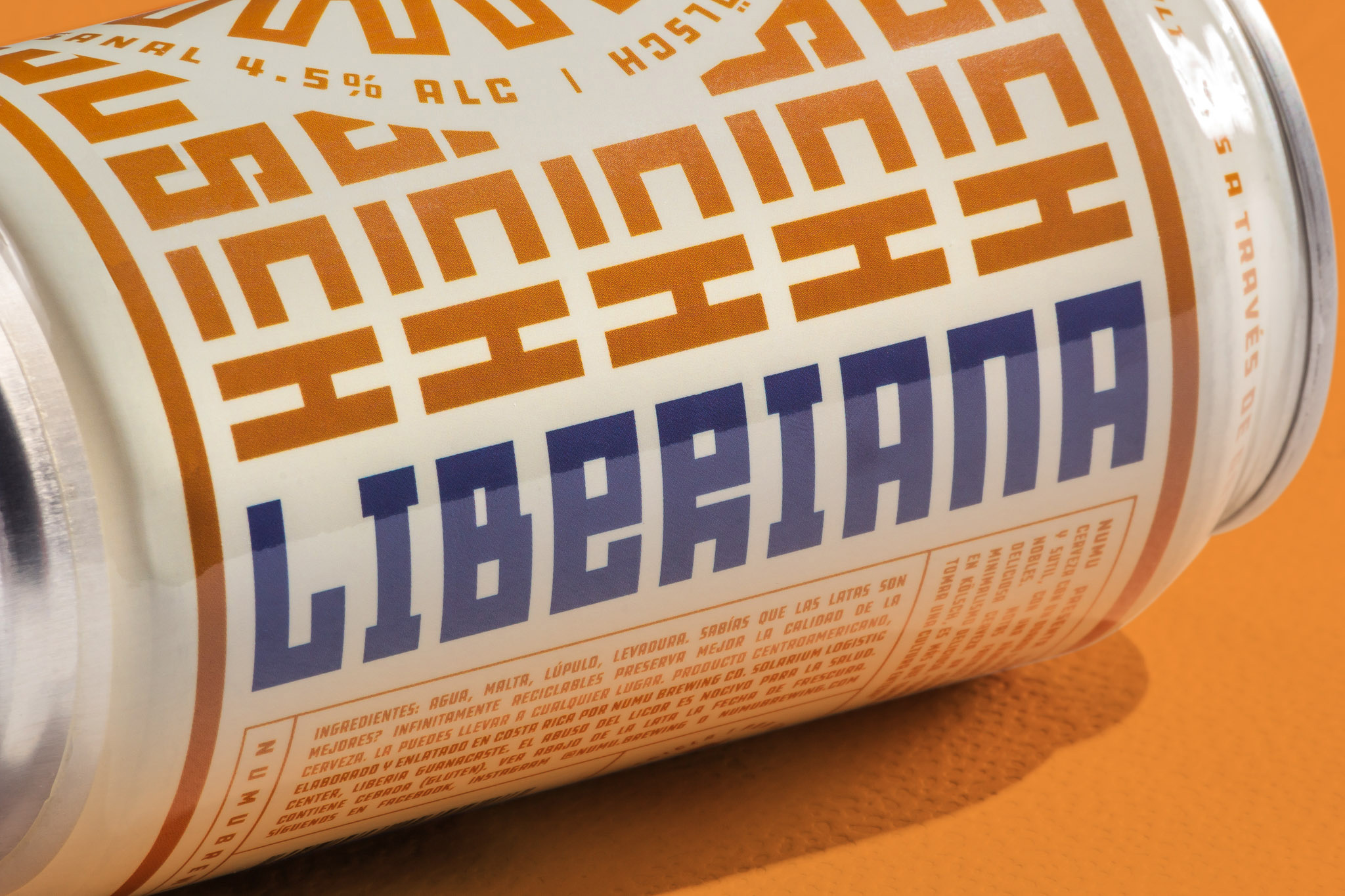
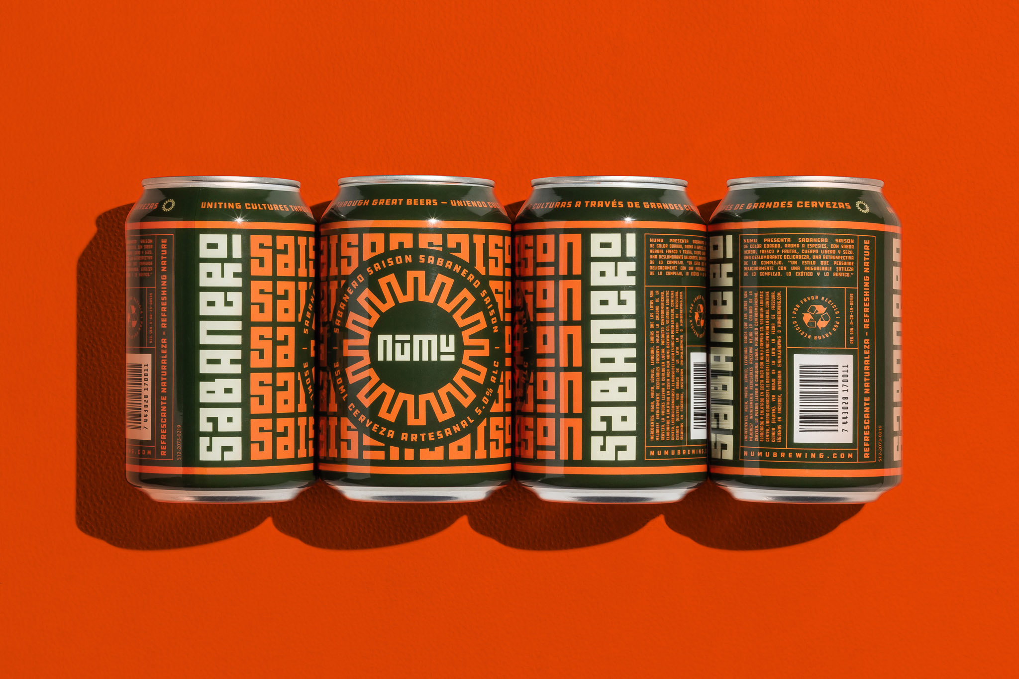
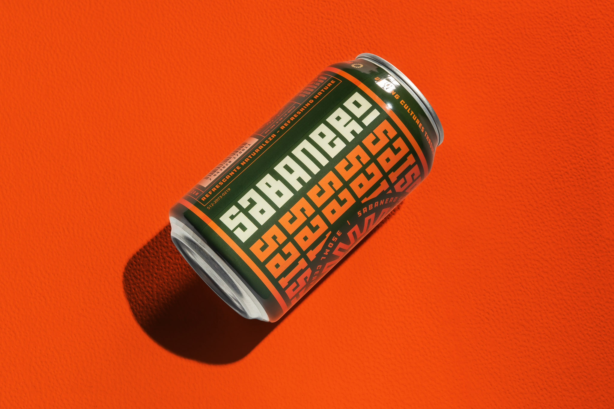
The cans are simply fantastic. I love how badge is encased in a circle that obscures the patterned background as it creates a great contrast to all the 90-degree angularity of the typeface. The name of the beer going sideways on both ends of the can serves as a great container for the “front” of the can. Even the back of the can is cool. The color palette is rich and warm — perhaps the only selection I would have changed is the blue on the kölsch to be a green like the other two beers.
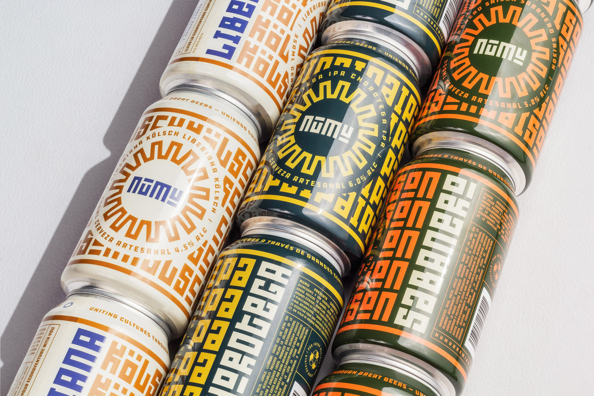
Overall, this has such an effusive presence, which is a significant achievement given the squareness of the visual language and, most successfully, it looks like a beer that honors the history of the region in an authentic and unique way.
 each year since publication began in 2006

 Новости Союза дизайнеров
Все о дизайне в Санкт-Петербурге.
Новости Союза дизайнеров
Все о дизайне в Санкт-Петербурге.