Обзор лучших ресурсов по разработке бренда, разработке упаковки
contact us | ok@ohmycode.ru
contact us | ok@ohmycode.ru
Doctor Kellyann Petrucci is a board-certified naturopathic physician and nutritionist with a Master of Science degree and a certification in biological medicine at the Paracelsus Klinik in Switzerland, which has led her to become a lifestyle and innovative health care expert, author of various books, and media personality appearing on numerous national TV shows. She is best known for championing bone broth as a source for fixing much of what ails us. While she has had products on the market for some time, this year a full line-up of Dr. Kellyann-branded products will be rolled out across CVS pharmacies (9,800 locations) with a new identity and packaging designed by San Francisco, CA-based Lobster Phone.
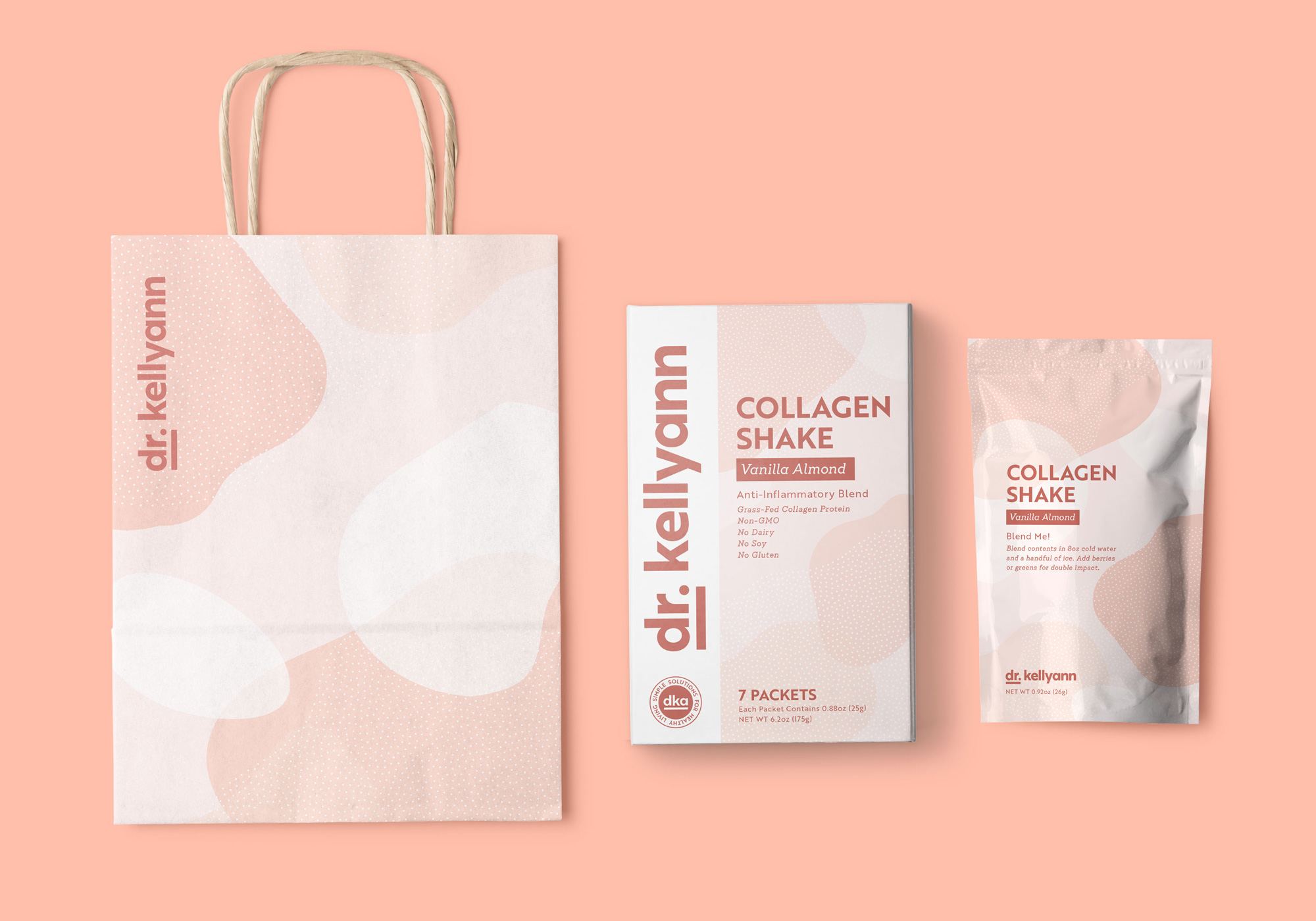
Dr. Kellyann’s signature had been used to communicate approval, but it could easily be confused for a celebrity endorsement, and carried a lightness that made it feel too delicate. We wanted to maintain the brand’s friendliness, but also give it the ability to scale - providing strength and flexibility, with the credibility of a doctor’s stamp. And so we did just that, turned the brand’s logo into a seal of approval. The word mark has a boldness and weight that feels distinct, but a subtle softness to each letterform that feels approachable. An official stamp version of the logo that says ‘DKA simple solutions for healthy living’ allows for additional flexibility across interfaces and package sizes, while still clearly stating the brand’s mission and purpose. The underline makes it abundantly clear - this stamp carries a guarantee of ingredients, flavor and credibility.
The old logo made sense as a way to build a personal brand based on recognition with a picture of Kellyann enclosed in a thin-stroke circle that matched the thickness of the wordmark. Not an amazing logo by any means, but undoubtedly effective. The new logo works on the assumption that the consumer will know who Dr. Kellyann is and, if they don’t, it’s okay too as the logo has a fairly confident vibe to it. I may be gullible but there is something convincing about the underline under “dr.” — it’s, like, well she is emphatically a doctor. Execution-wise, I’m not sure the all-lowercase approach was right but I also get that it makes it more friendly and accessible and the font choice is nice. I would have extended the “y” to align at the bottom of the underline.
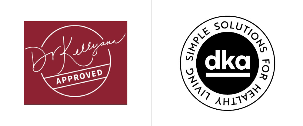
The old seal was flimsy, with a very thin signature, an awkward angle, and a poor lock-up of the elements. The new “dka” seal is much better designed and nicely executed. I do wonder if “dka” is a proper shorthand for the full “dr. kellyann” — it’s a bit forced. But it’s being put to good use on her Instagram account so it’s bound to become associated with her brand.
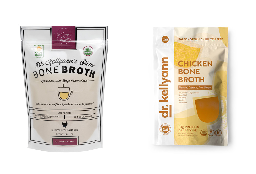
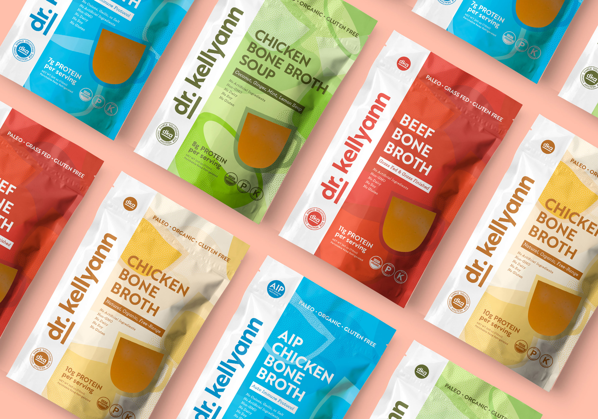
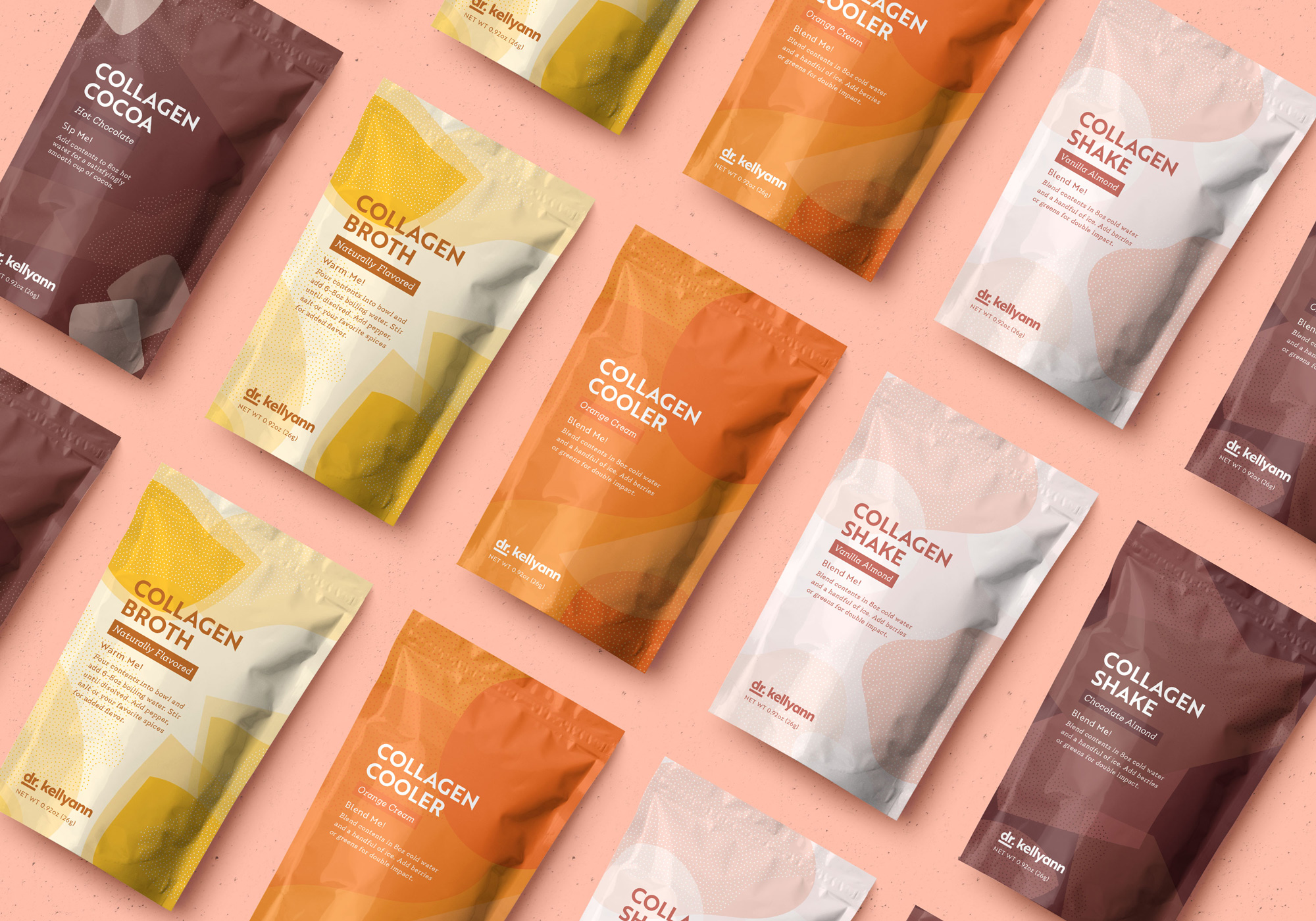
The old packaging was not good; it wasn’t awful but it was definitely something I would skip from looking at on the shelf, whereas the new one would definitely catch my attention — especially when it comes to bone broth where most brands simply look like regular broth.
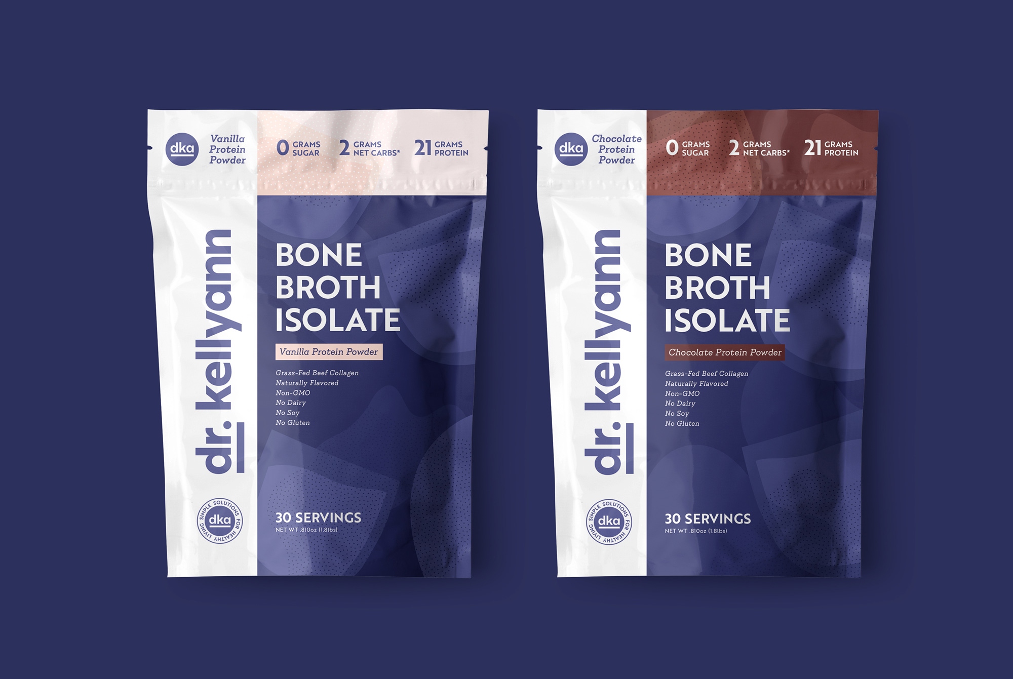
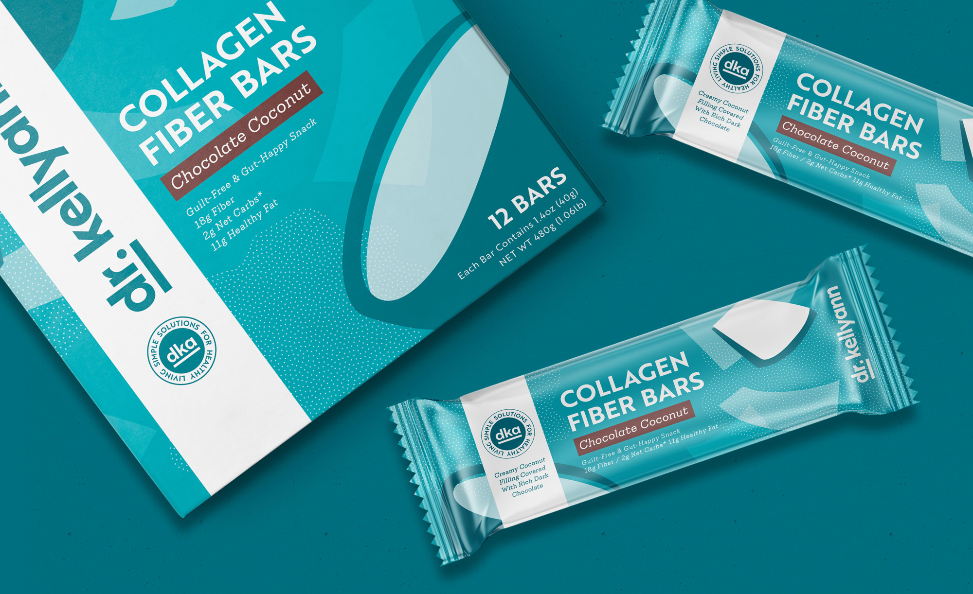
With food packaging, you generally see one of two things: either a photograph, or an illustration. This product line is not going to be plated, but it will taste delicious - we needed something new, something category-defining. We were inspired by beauty brands; Dr. Kellyann is an advocate for beauty being about how you feel, and we always design to draw out certain emotions. So in this instance, we needed graphics that somehow communicate that its contents taste delicious, and make you feel beautiful.
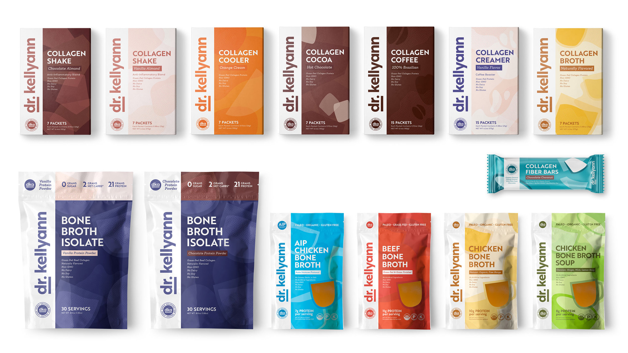
Flavor has never been represented like this before. While we maintained an illustrative quality, we played with geometry and art for a more abstract presentation. For the broth, the shapes appear as translucent cups holding liquid; bolder colors and fuller forms give it weight, as protein can be used for bulking, while still feeling playful and subtly feminine. The colors and shapes directly reflect the flavor and contents, with a pattern-based system that can be flexible for any product they may release in the future. The system is iconic, scalable, and most importantly, fun - moving Dr. Kellyann’s brand into a broader market without losing its authentic roots.
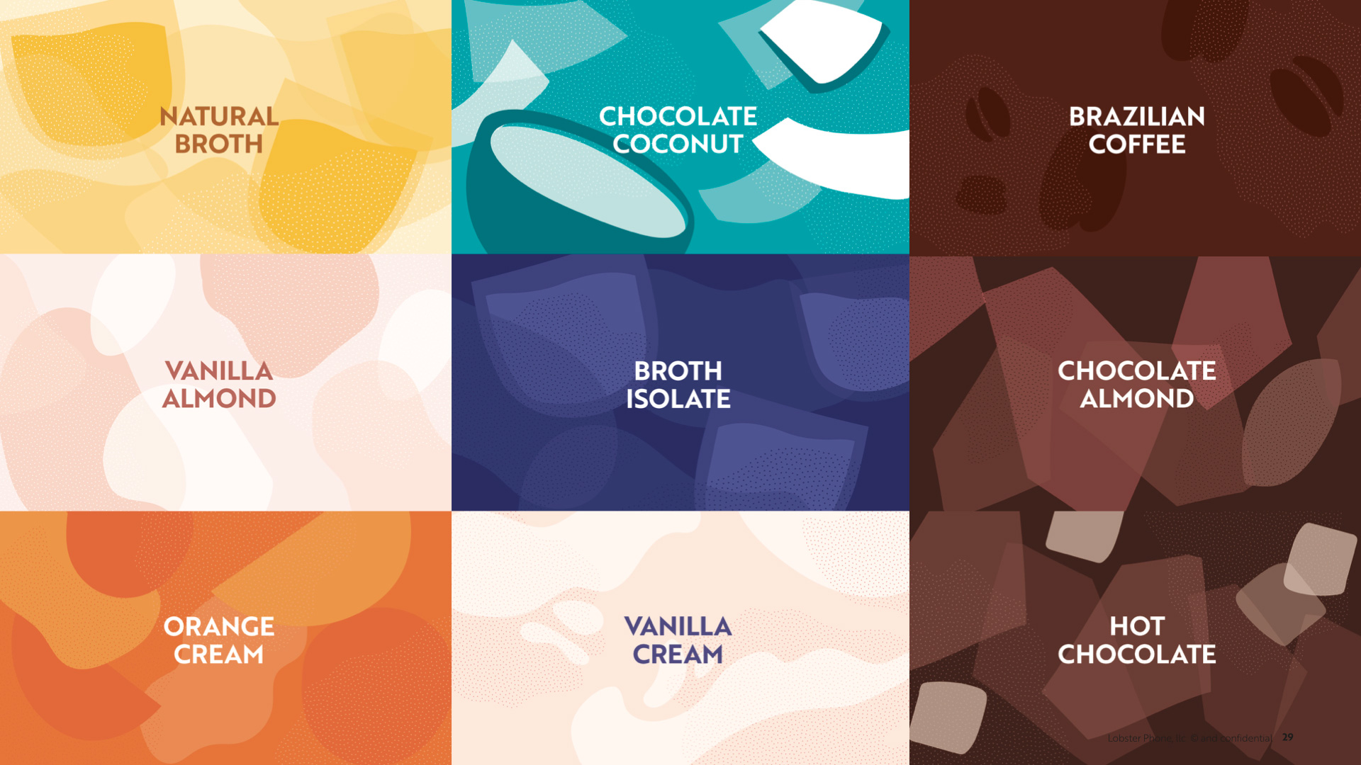
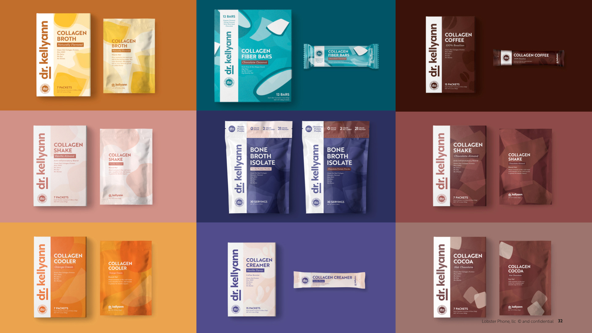
The strong white band running vertically in the different containers is a great way to tie all the products together and creates a strong point of differentiation. Occupying so much of the packaging, it’s clear that they are betting on Dr. Kellyann’s recognition — but, again, if no one knows who she is, the packaging literally reads as being doctor-approved and that may be enough to get someone to give this a try. I like the abstraction aspect of the illustrations but I don’t find them entirely appealing as a food ingredient. However, I do appreciate the comparison to beauty and cosmetic brands as these do have a scientific vibe to them. And, for the most part, they serve as a subtle texture to the big and bold typography on the packaging, which is nicely laid out and color-coded.
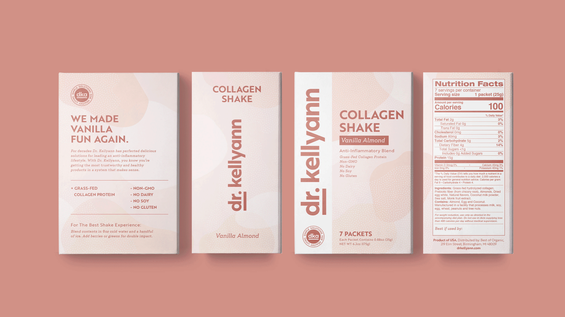
The one element that does irk me is the cup viewing cut-out… which is too literal in contrast with the rest of the illustrations. I would have preferred one of those amoeba shapes to serve as the window.
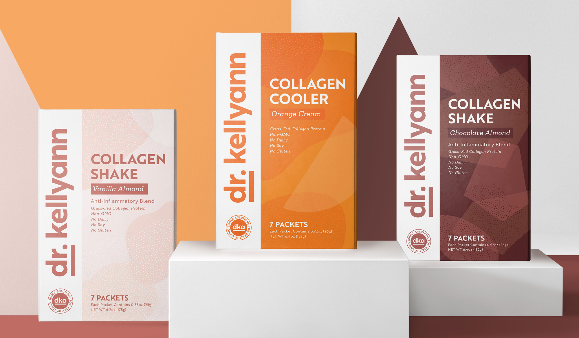
Overall, this is a strong direction to introduce to the market, with a clear system across the various products, all anchored by the big use of the logo and an aesthetic that will look at home in a chain of pharmacies.

 Новости Союза дизайнеров
Все о дизайне в Санкт-Петербурге.
Новости Союза дизайнеров
Все о дизайне в Санкт-Петербурге.