Обзор лучших ресурсов по разработке бренда, разработке упаковки
contact us | ok@ohmycode.ru
contact us | ok@ohmycode.ru
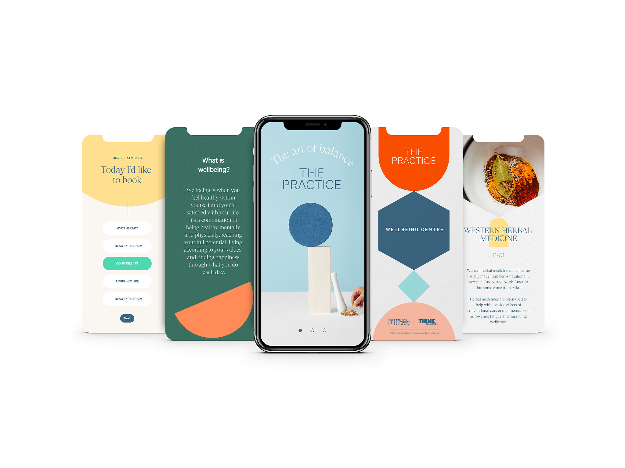
Established in 2015 (originally as Think Wellbeing Centres), The Practice is a student-led clinic offering holistic health and wellbeing services at affordable prices. The wellbeing centers are part of Torrens University, a private university in Australia with campuses in Adelaide, Brisbane, Melbourne, and Sydney, and were created in partnership with Think Education, a higher education and vocational education and training provider in Australia (hence the previous name). The centers, located in Brisbane, Melbourne, and Sydney, are open to the public and offer naturopathy, nutrition, western herbal medicine, chinese medicine and acupuncture, clinical myotherapy, counseling, and beauty and aesthetic treatments — all consultations are supervised by qualified and experienced practitioners but the main goal is to allow students to learn while, well, they practice. The Practice recently introduced its new name and identity, designed by the Sydney office of SomeOne.
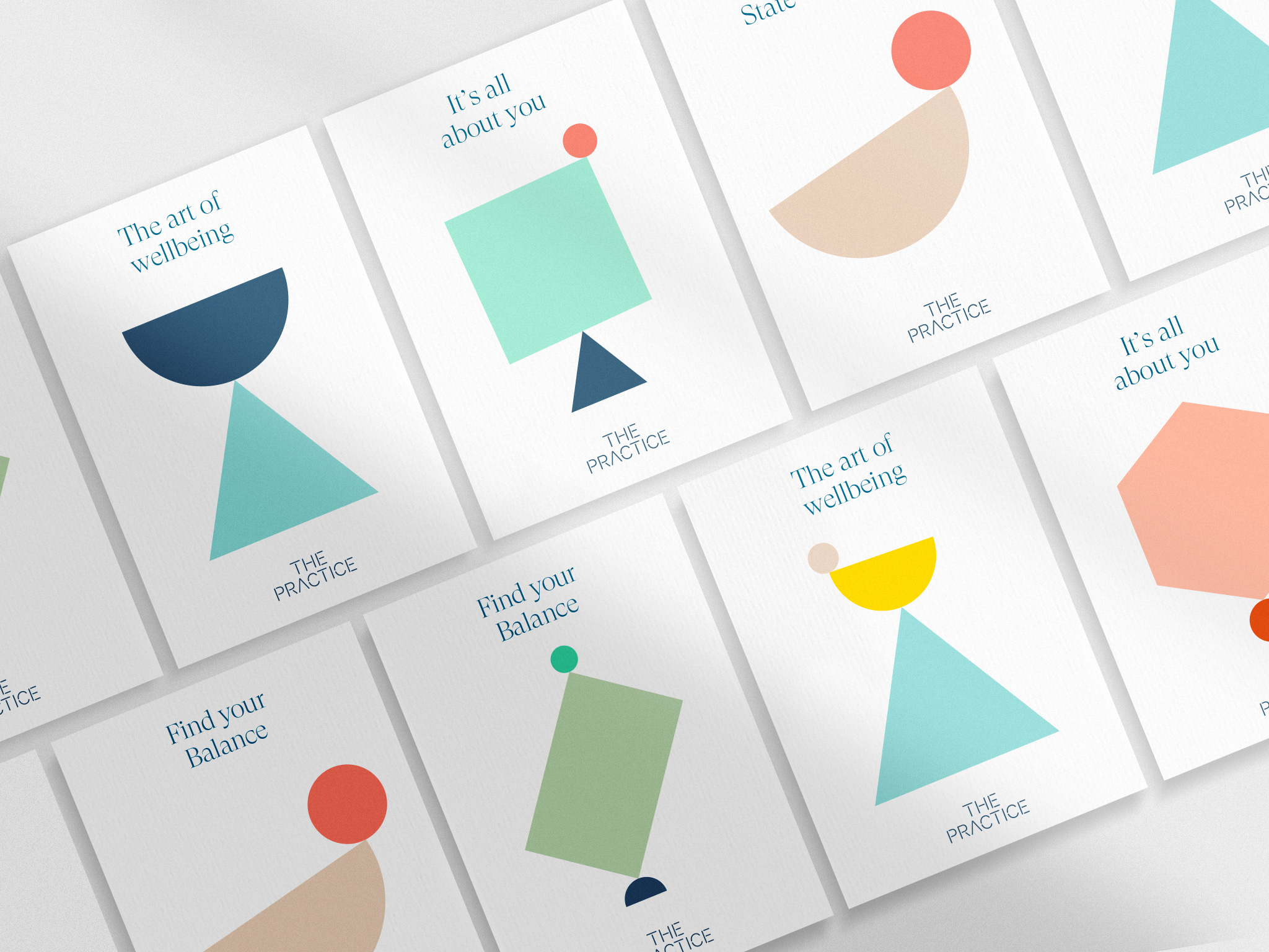
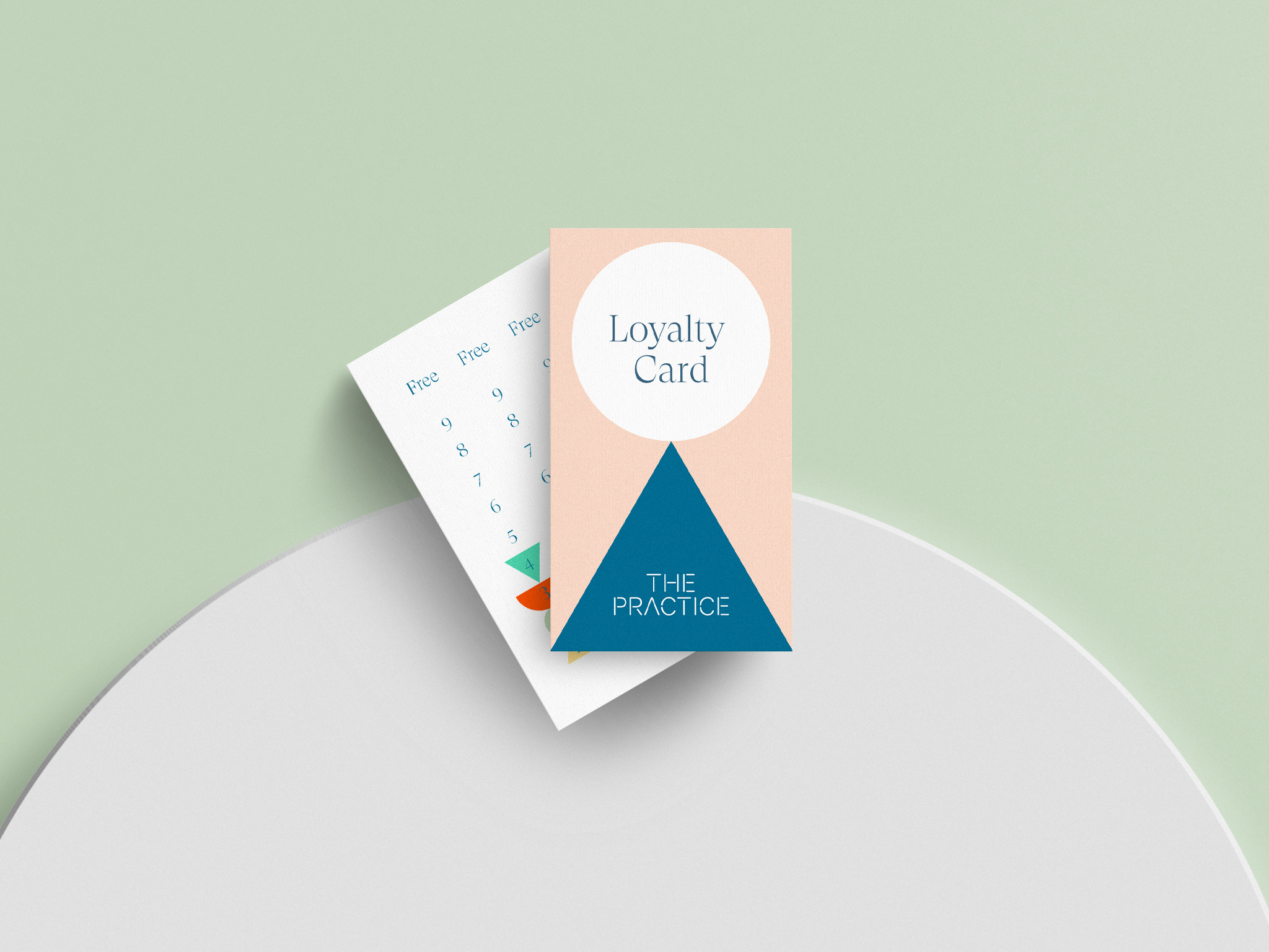
The old logo was not good at all with far too many “graphic” ideas going on, from the roughed-up frame to the plant in the “I” to the cheesy typeface — it looked more like the logo for a wheatgrass drink than a clinic. The new logo is a relatively simple wordmark in a rounded sans serif stencil that isn’t much to look at. It’s fine but it’s not particularly arresting and I actively dislike the “A” without the crossbar because all other letters are complete so it draws unnecessary attention. What it does well, though, is introduce the idea of loose elements coming together in balance as part of the bigger brand idea that revolves around geometric shapes balancing on each other.
With so many things defining who we are and how we’re perceived by others in today’s world it can often be difficult to find a healthy balance in our lives. It’s tough. For everyone.
And it’s this realisation that inspired the identity for The Practice. As a wellbeing clinic they practise identifying and addressing imbalances in body and mind to help people get back on track.
It’s a brand and organisation all about balance.
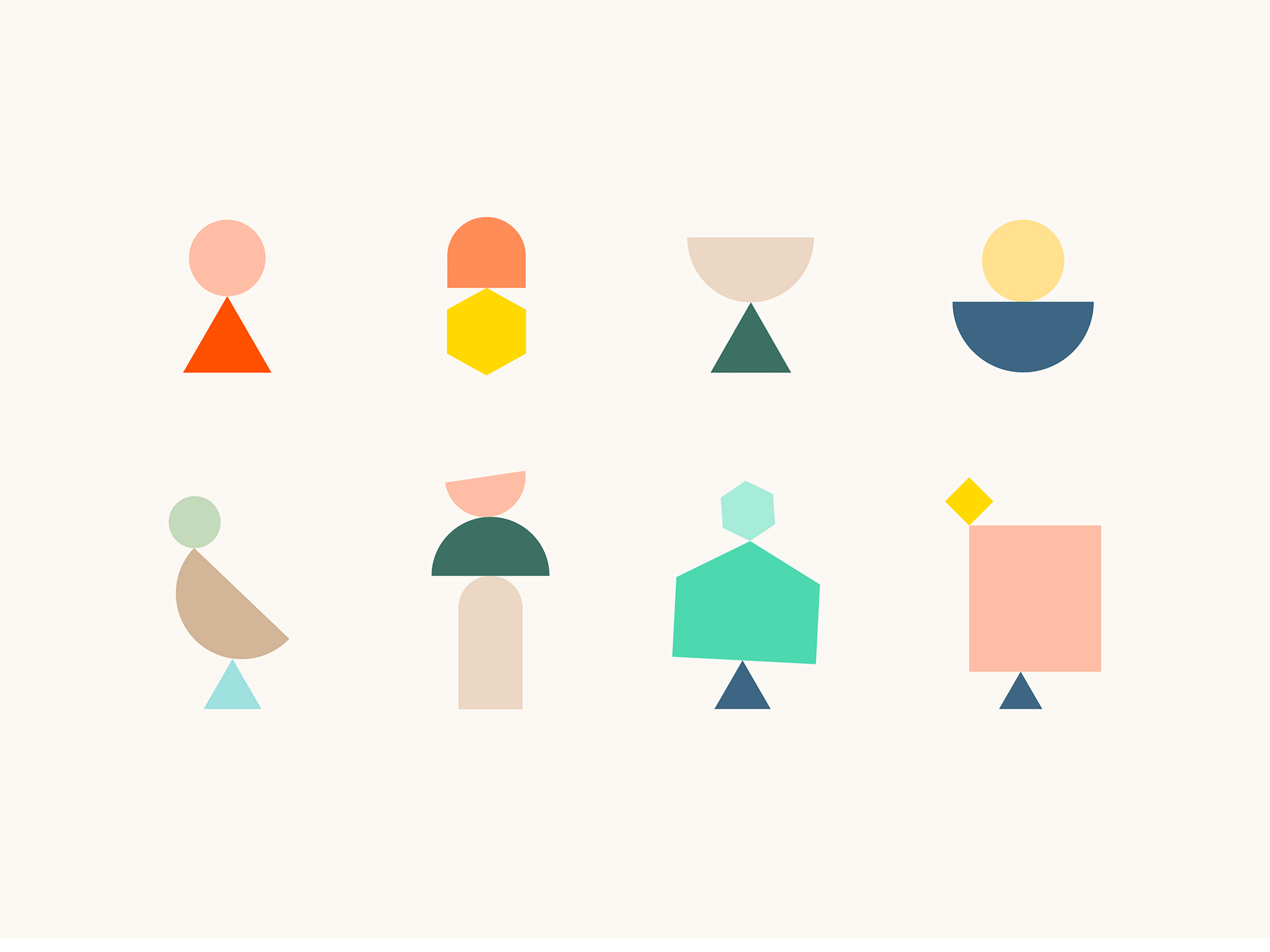
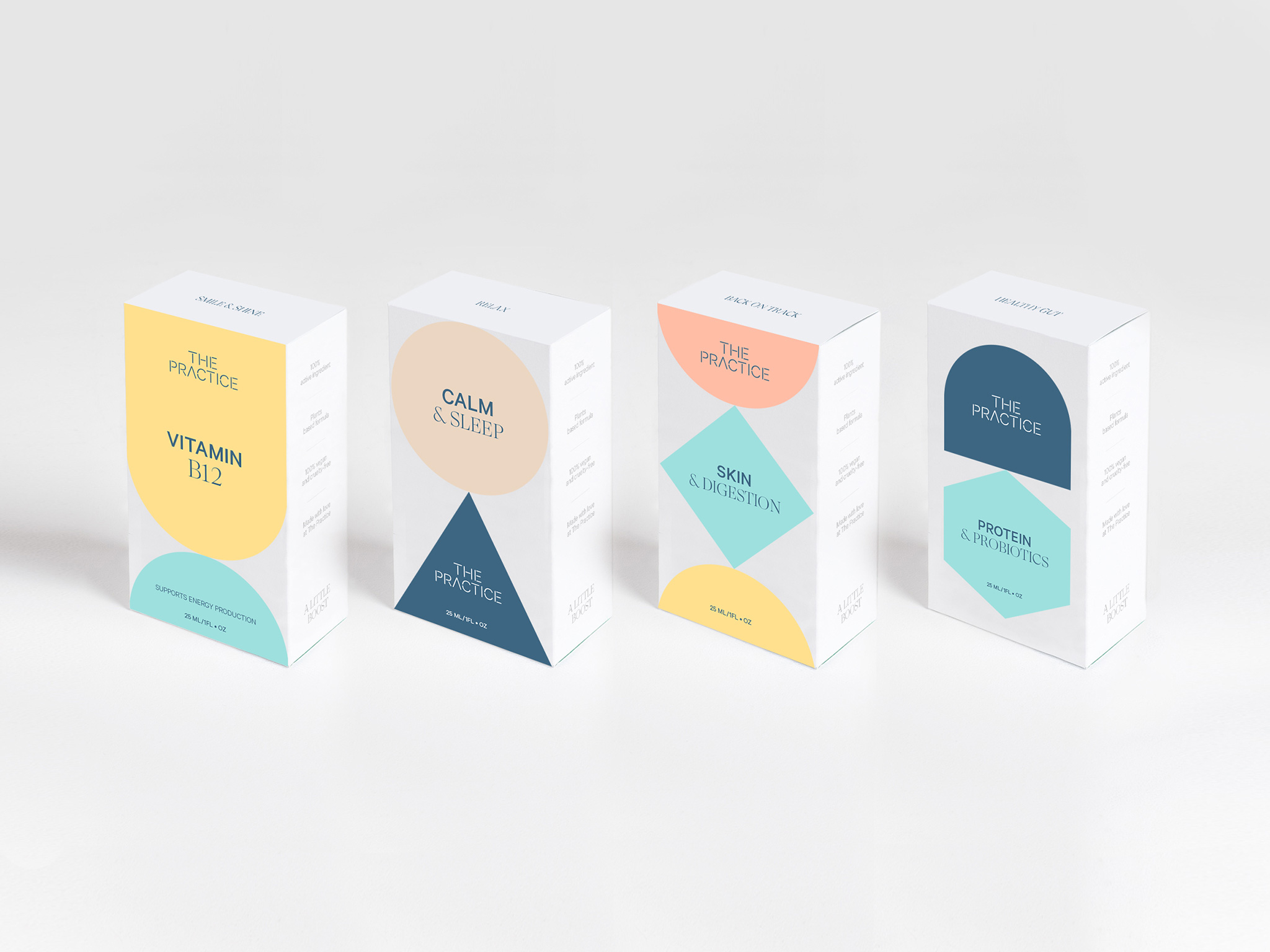
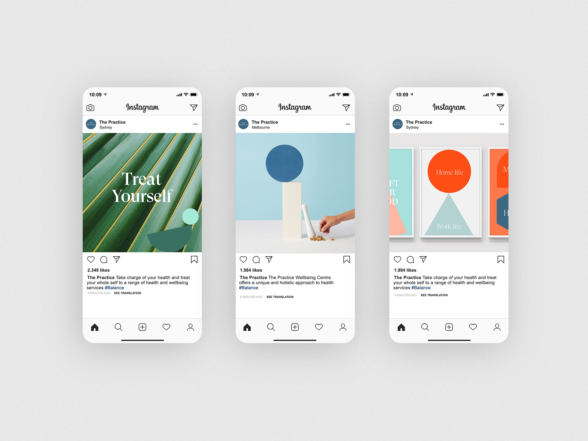
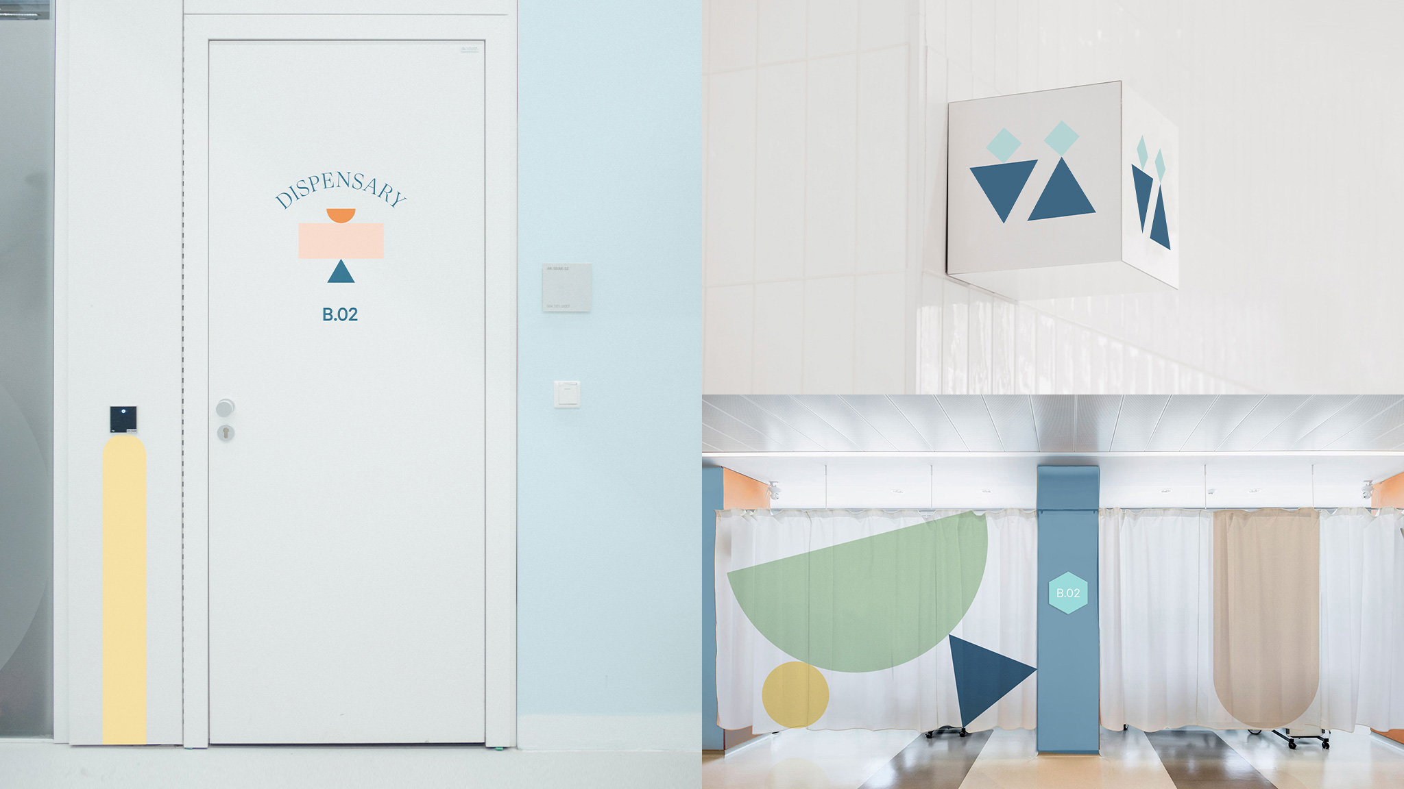
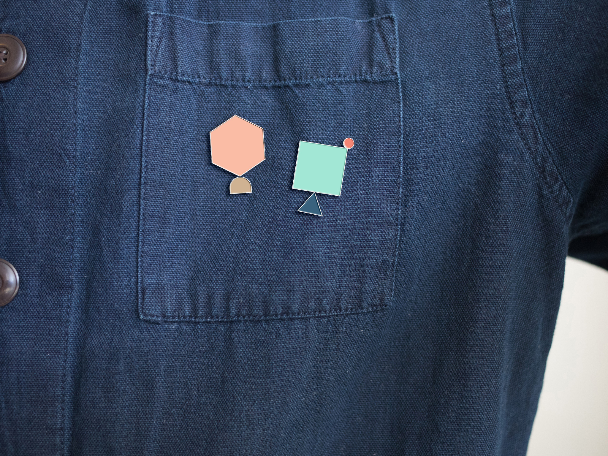
And that’s exactly what inspired the new visual identity. Carefully balanced forms that stack atop one a other to form ‘totems’ — graphic devices that symbolise the myriad ways in which people’s lives can be balanced. Each one unique. Just like human beings.
This is a practice for students — people who are still learning, still perfecting their craft. So we had some fun with how the forms stack up, deliberately allowing for combinations that are off-balance; reflecting the learning curve of the students.
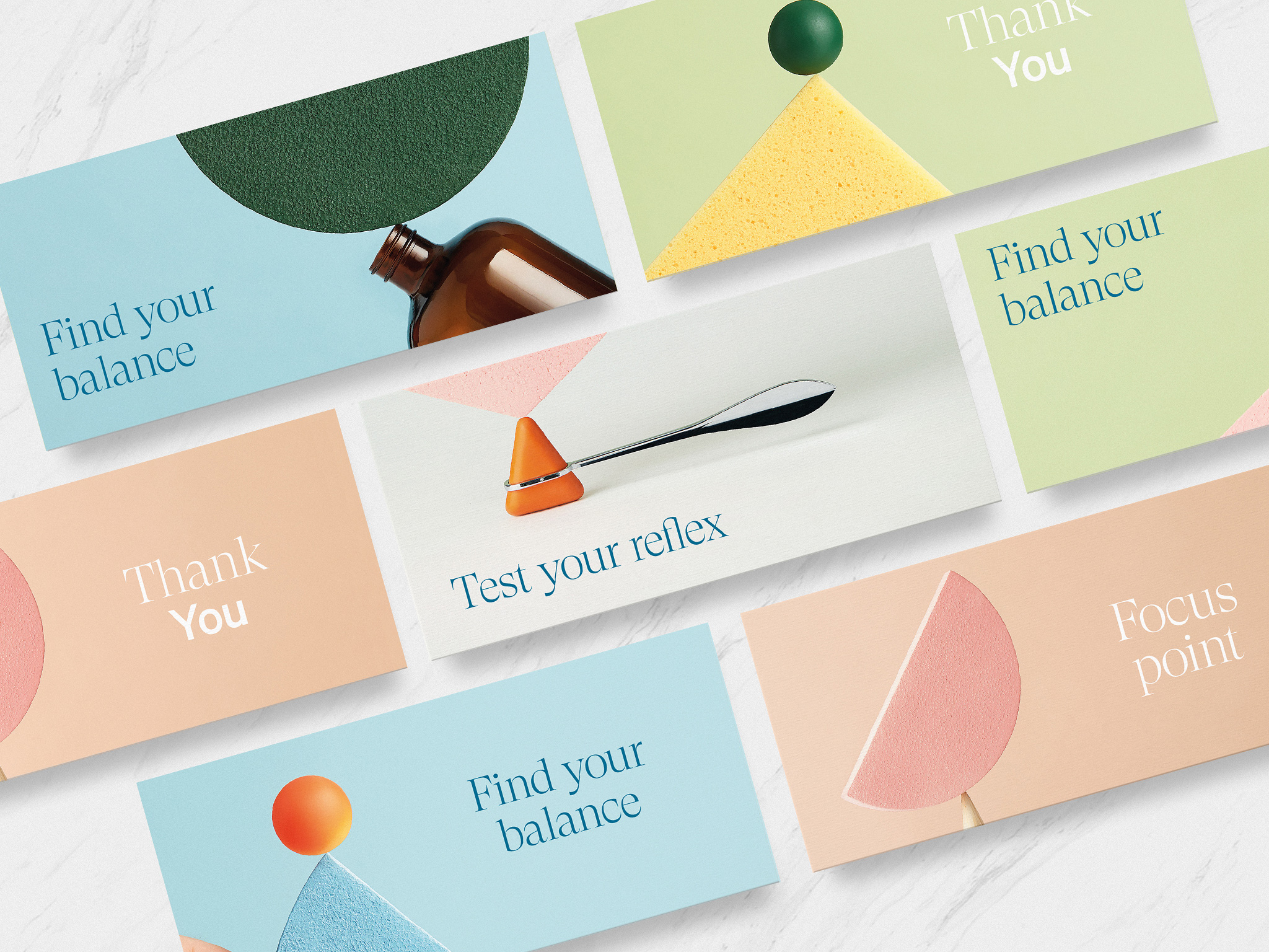
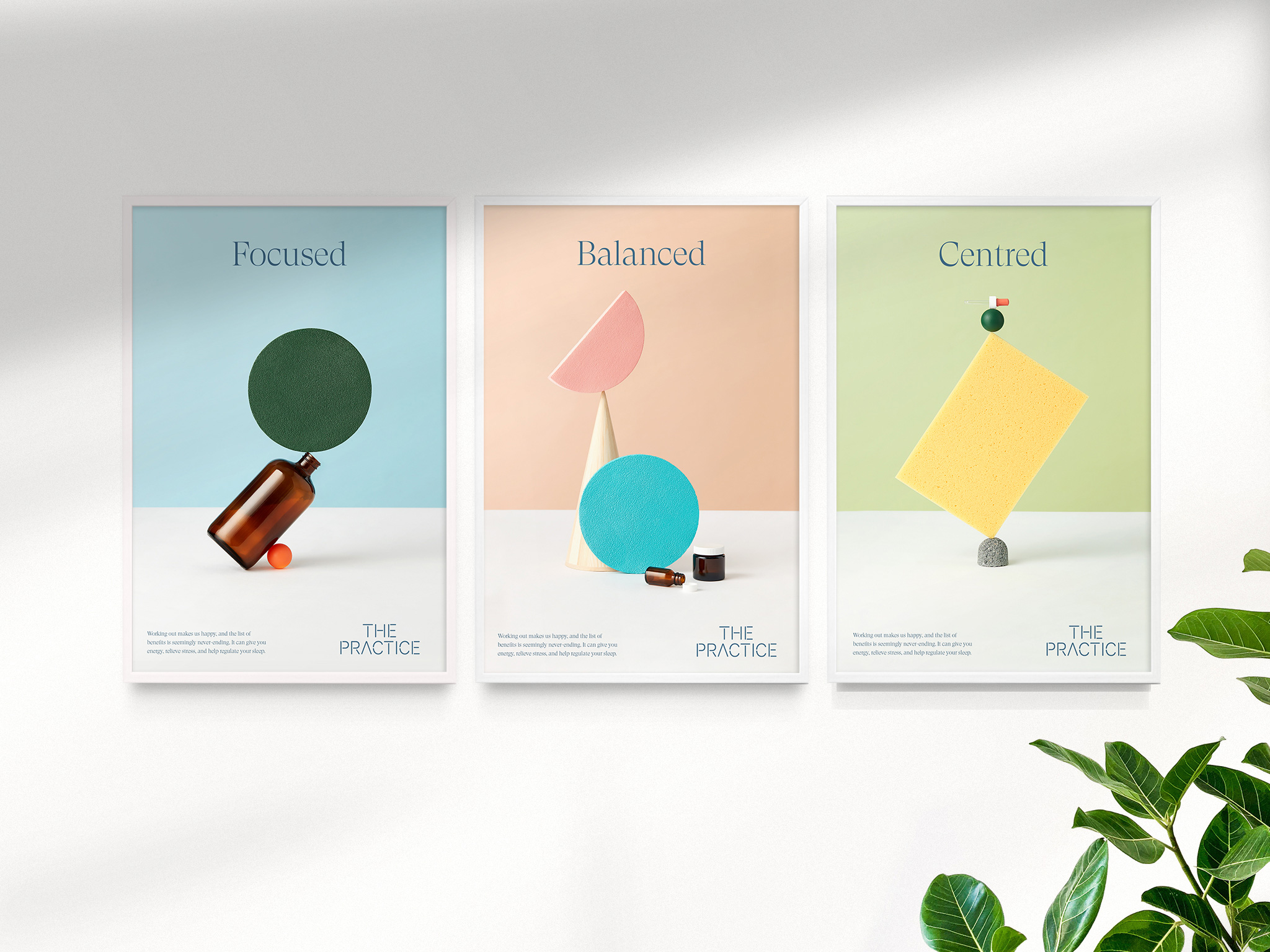
Working with the talented Andrea Venegas, we shot a bespoke, handcrafted suite of photography which we’ve aptly titled ‘the art of balance’ that introduces real-world elements related to The Practice’s different disciplines — a reflex hammer, dispensary bottles, and herbal ingredients all feature, carefully balanced in-camera (no CGI here).
We tasked ourselves to build beautiful images with nothing but our hands and a camera. And a few pieces of blu-tac when a stack wouldn’t play ball. The purpose of the photography was really to show that with some care and patience, balance is possible without fakery — just as in life.
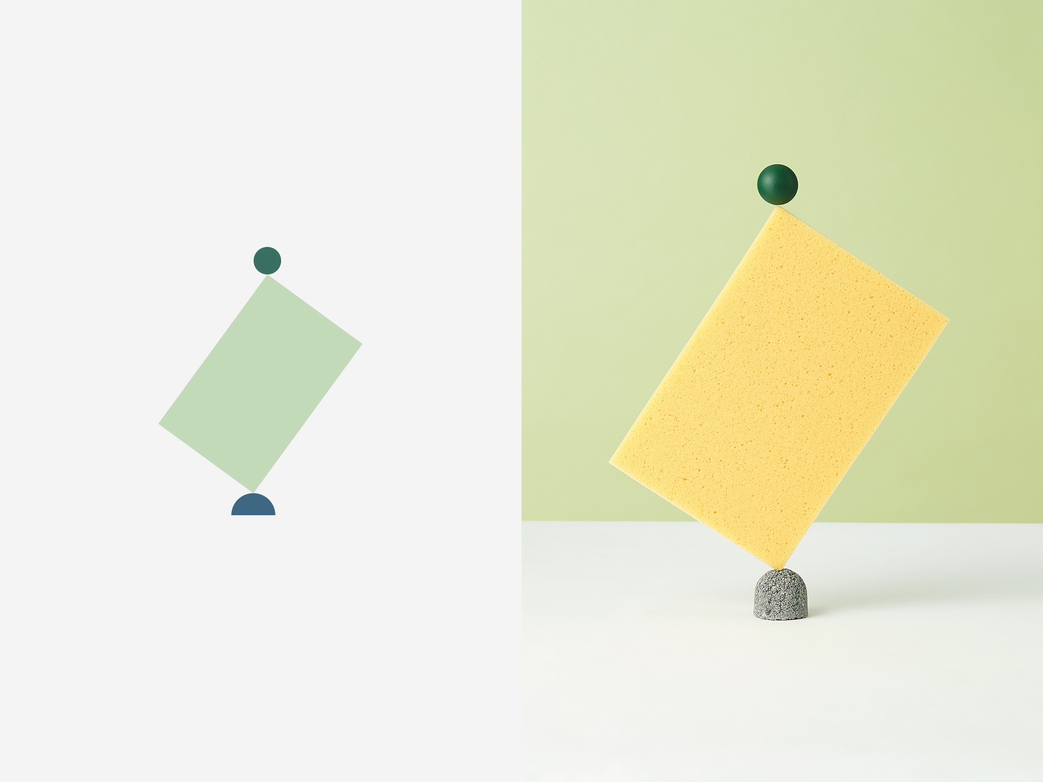
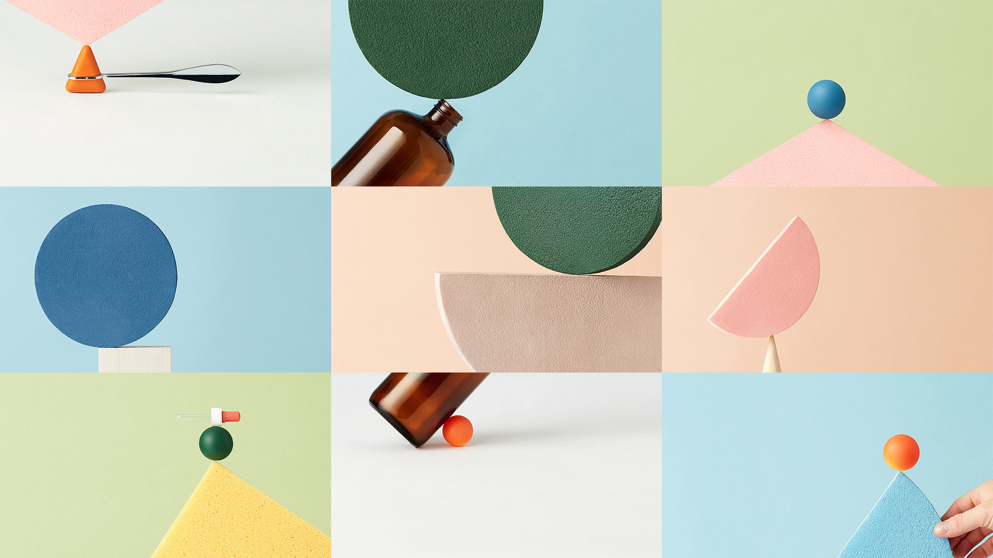
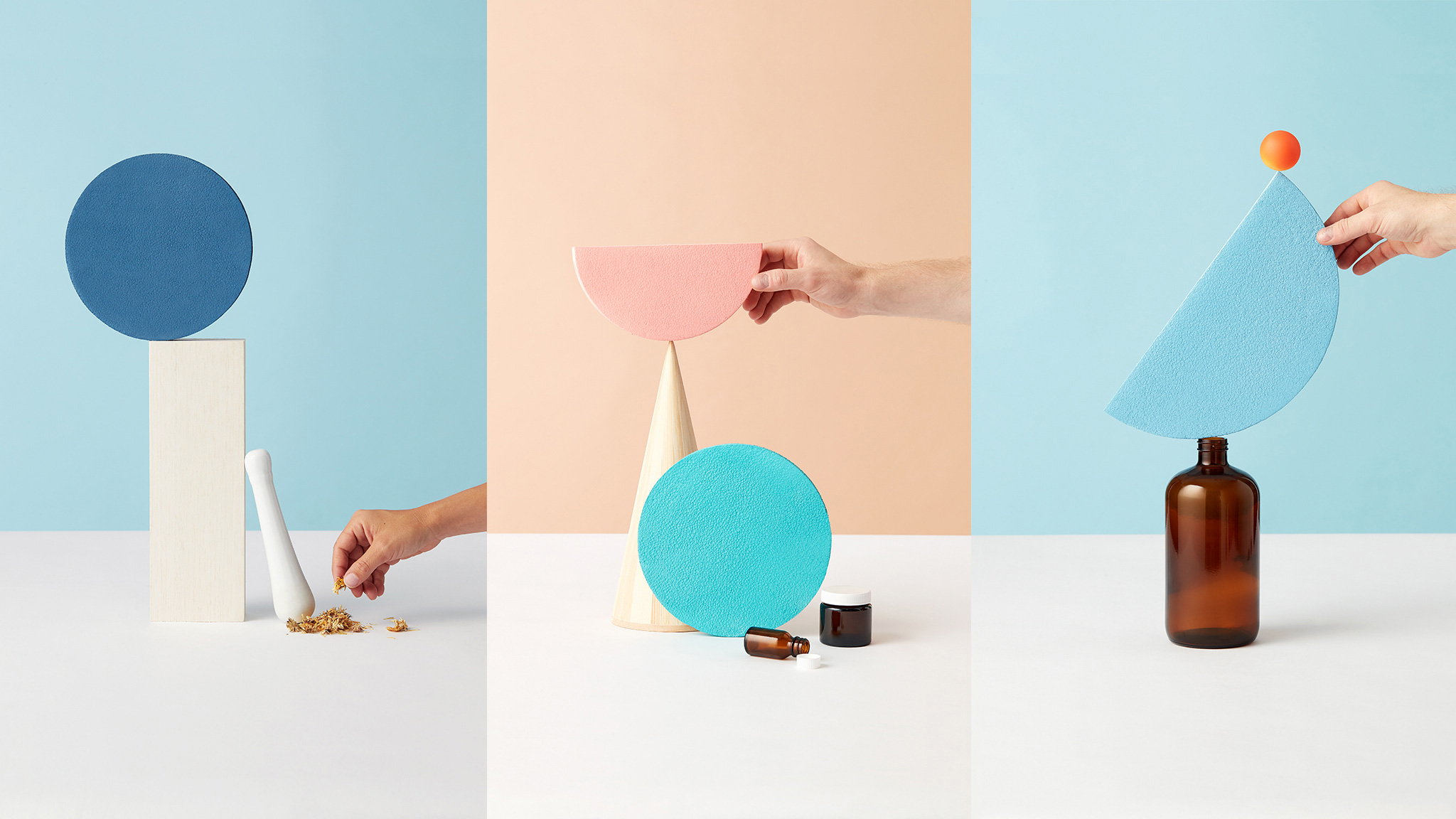
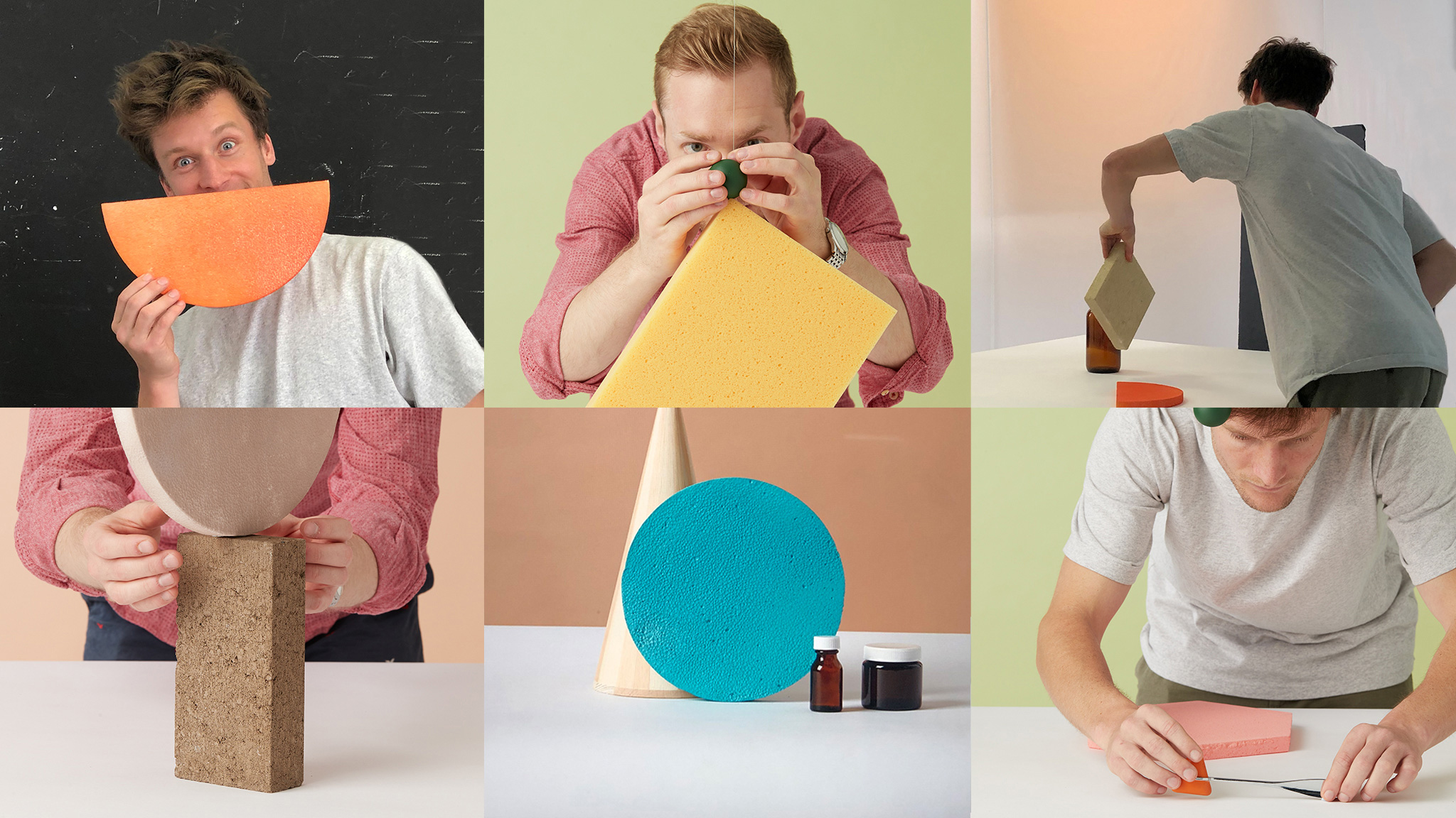
Needless to say, the compositions are the highlight of this project. They would be cool enough in vector form but recreating many of those compositions in real life and photographing them without relying on 3D rendering, takes this to the next level. The color palette across illustration and photography is lovely, sitting somewhere between the two trends of either extra bright colors or pastels.
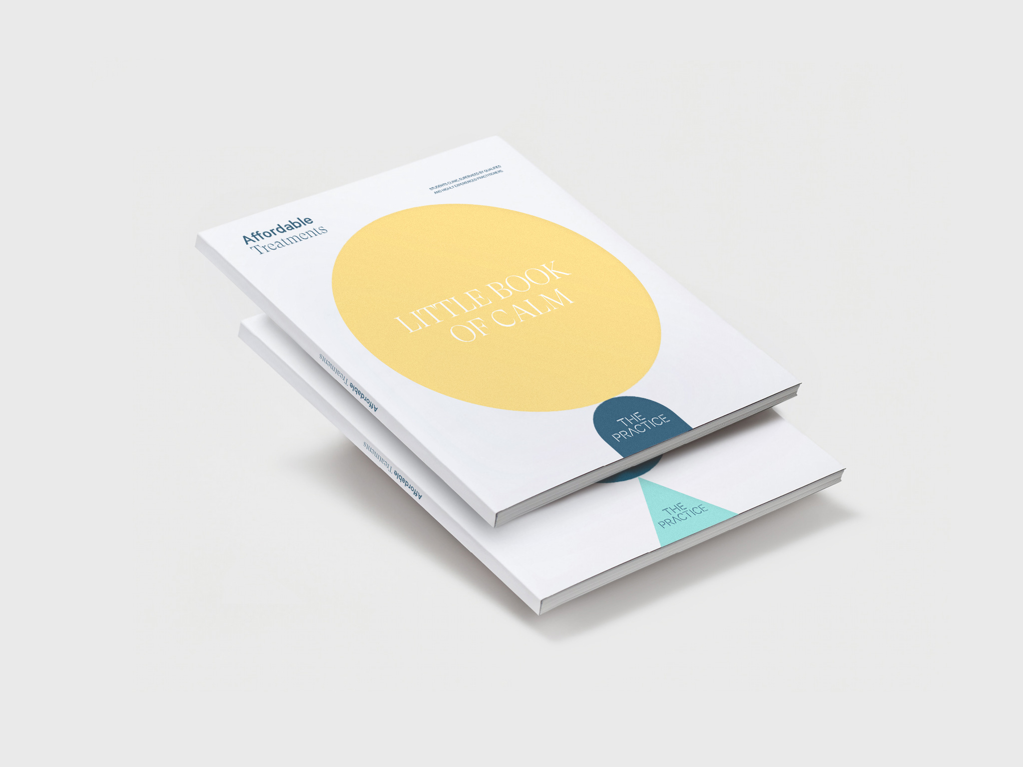
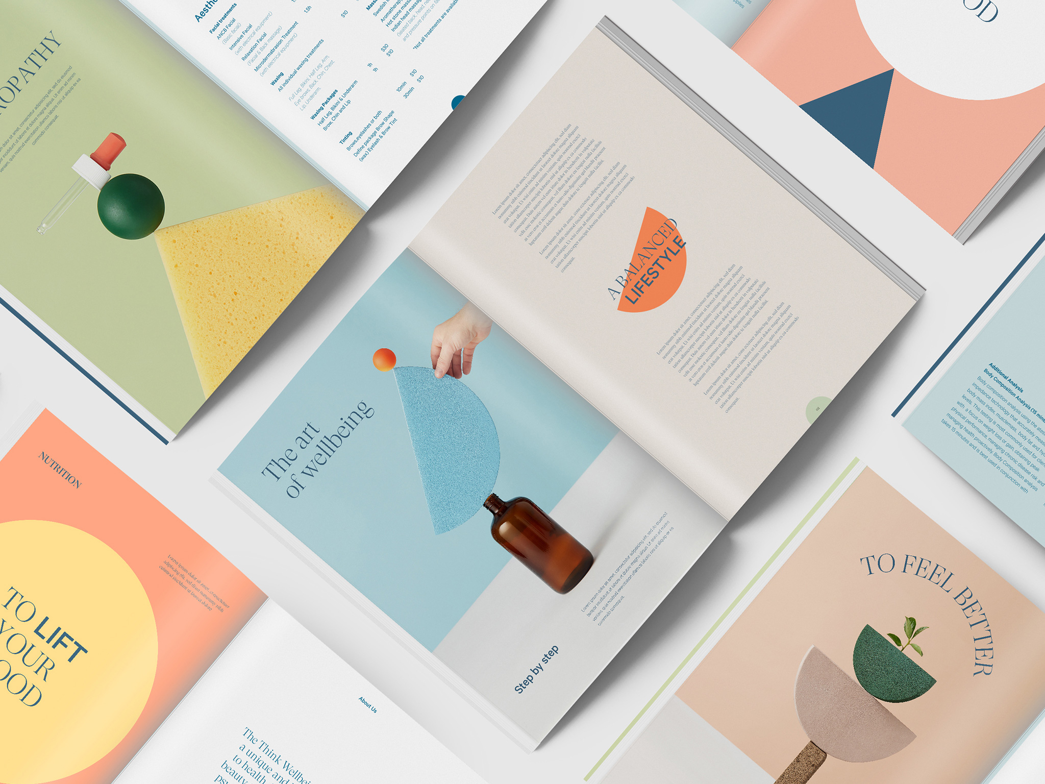
In application I really like how they are able to move between the vector and photographic shapes, sometimes even in the same object as in the brochure where the cover uses the vector versions while the spreads pay off with the photos. The thin serif used throughout works very well with the imagery, giving it a refined and slightly grown-up look that helps create some confidence in patients that the students won’t leave an acupuncture needle on their head when they walk out. The logo, though, in hindsight, after seeing it in applications, seems out of place with its stencil approach and clashes with everything else around it.
Animation principles are based on relaxing, soothing movements that also play on points of tension. One mimics breathing patterns (regulated and hyperventilated), another is based on muscle stretch movements, and one sees shapes sliding over one another before turning back just before they fall. All of these animated movements connect in some way to every day human behaviours — abstracted to create a set of assets that become rather satisfying loops you could watch over and over.
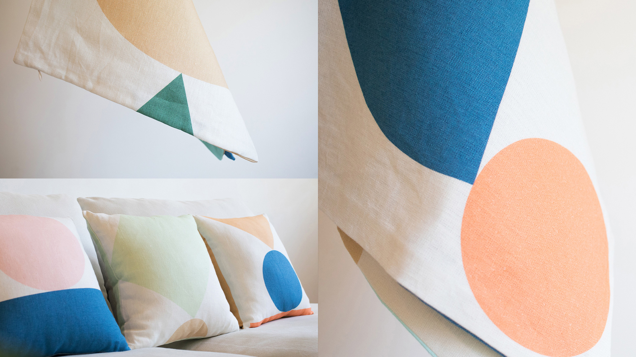
Overall, this is all far more sophisticated and thoughtful than any student-led clinic I can think of — it’s even better than most full-on professional wellbeing and health clinics — all while avoiding health industry clichés. Also, I would pay money for those cushions.
 each year since publication began in 2006

 Новости Союза дизайнеров
Все о дизайне в Санкт-Петербурге.
Новости Союза дизайнеров
Все о дизайне в Санкт-Петербурге.