contact us | ok@ohmycode.ru
contact us | ok@ohmycode.ru
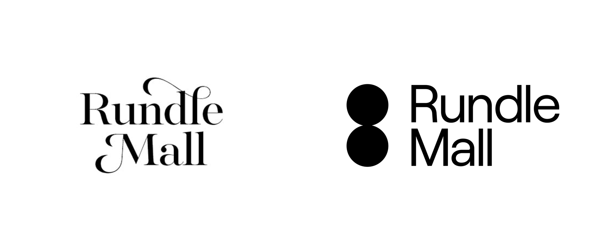
Opened in 1976, Rundle Mall in Adelaide is one of the longest and busiest shopping malls in Australia with more than 1,000 retailers and services attracting over 400,000 visitors and locals each week — that’s 24 million in a year. A pedestrian street mall, Rundle Mall covers four blocks closed to traffic and its tenants are housed in a mix of new constructions and nineteenth-century buildings from when the city was founded. Its 1,700 feet of paving allow for a bustling feeling in its center corridor that is also home to a number of sculptures, including a group of four life-size bronze pigs and The Spheres, a 13-foot-tall, 7-foot-wide pair of stainless steel balls balanced on one another, around which a new identity was designed by Adelaide- and Melbourne-based Simple.
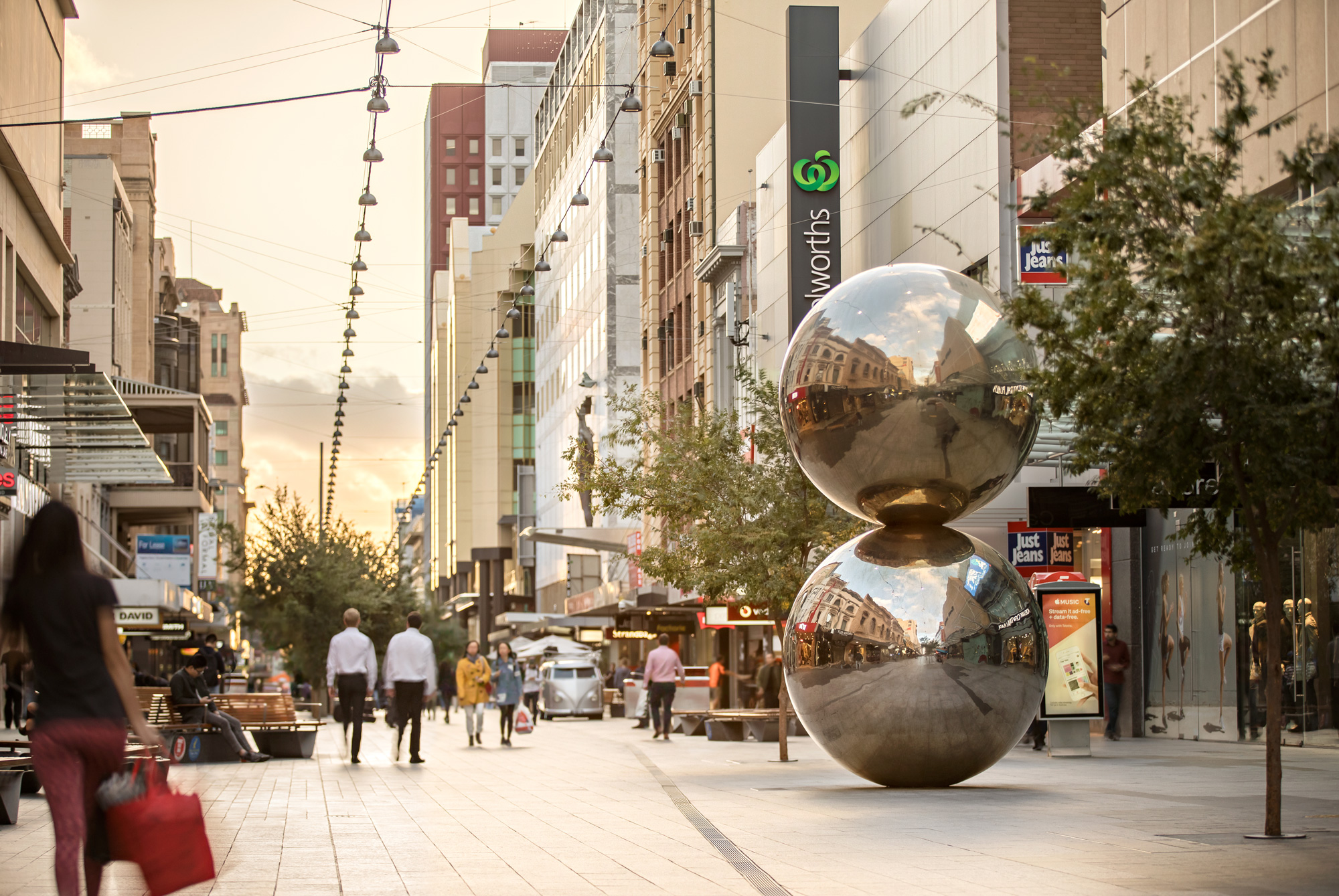
The old logo had the right intention in feeling and looking like a high-end, Victorian-esque destination with its exuberant swooshes and contrasting serif but it wasn’t very good or thought-out. The new logo adopts The Spheres — the mall’s most recognizable landmark — as its icon in a simple and bold abstraction that may seem weird for anyone not familiar with the mall but given that malls usually attract repeat visitors, it’s probably a 100% recognizable motif. Paired with a deadpan sans serif, the new logo looks more like a hip, Brooklyn-esque retail destination than the old-timey, antiquated department store vibe the old logo exuded.

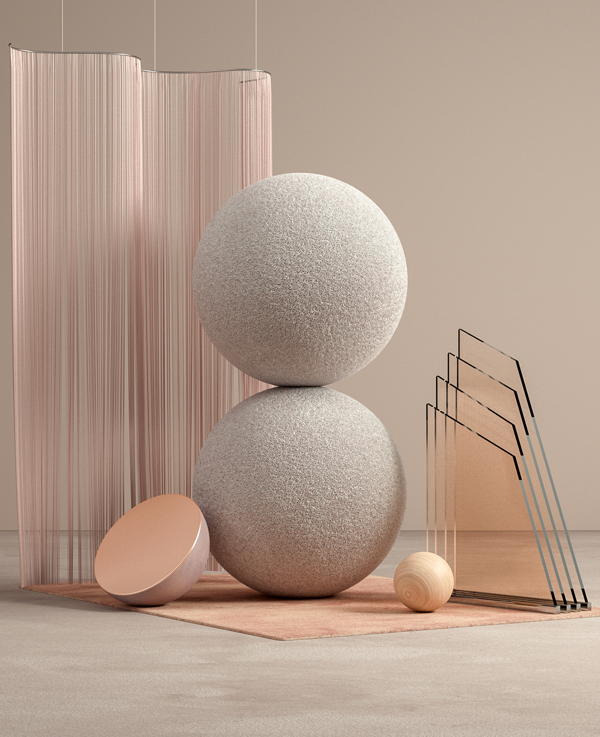
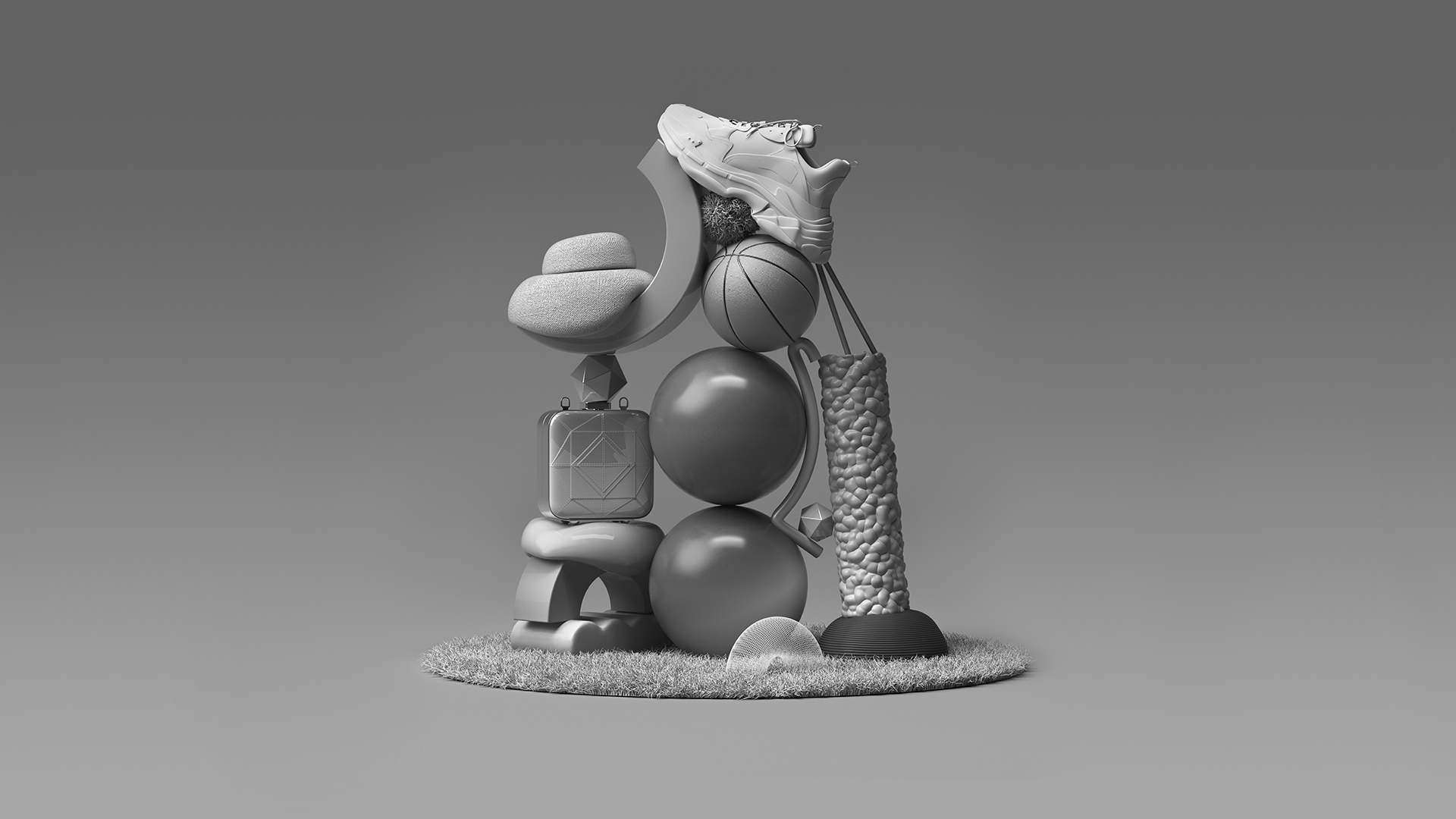
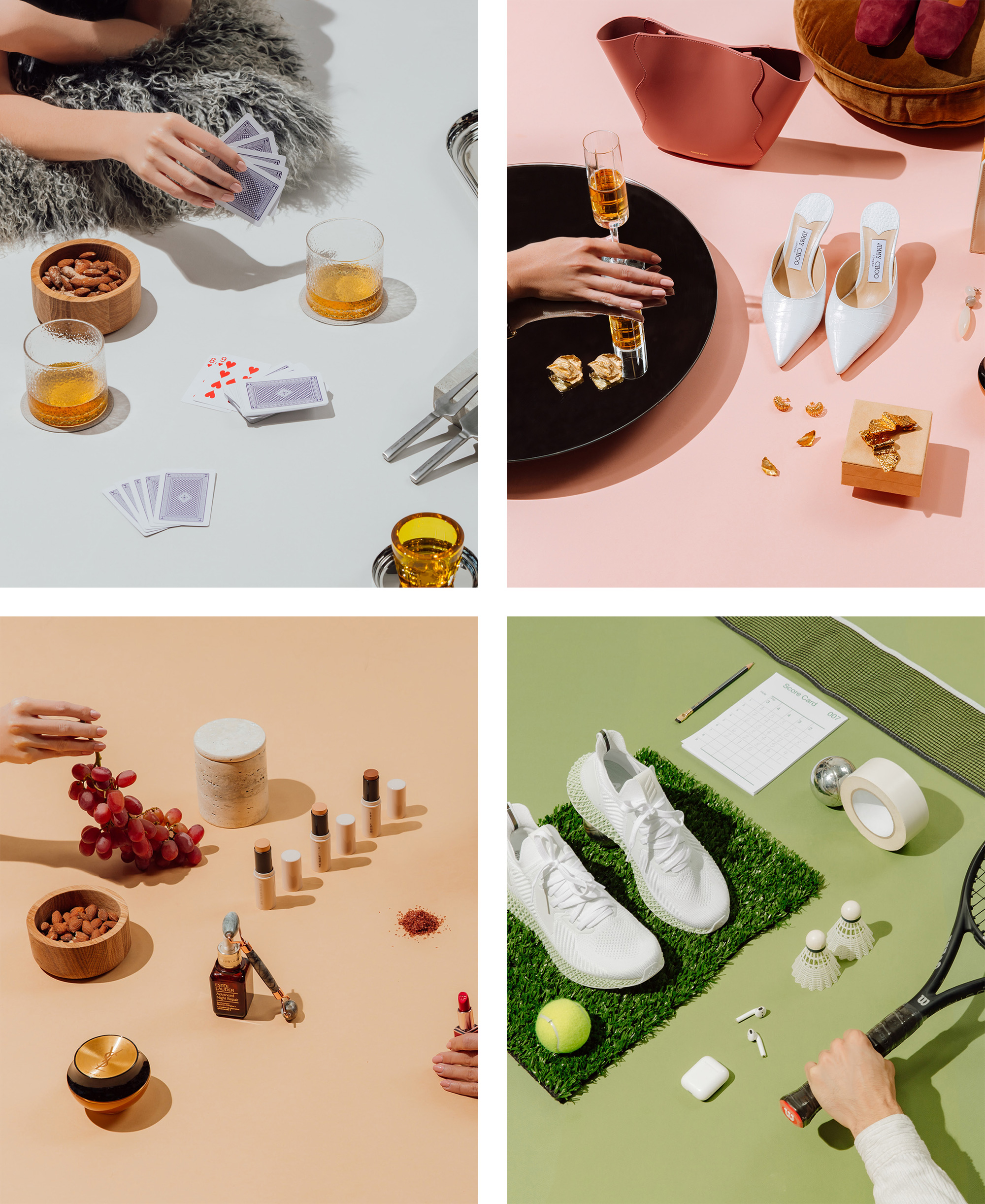
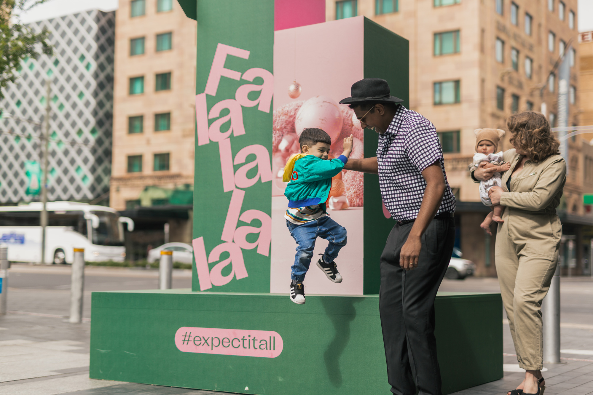
The icon can revert back to its original, 3D sphere form in a series of renderings that pair the mall’s balls with a range of exotic accoutrements that are a little odd but done with enough confidence that they work. These compositions, along with product photography (below), serve as the imagery for the applications.
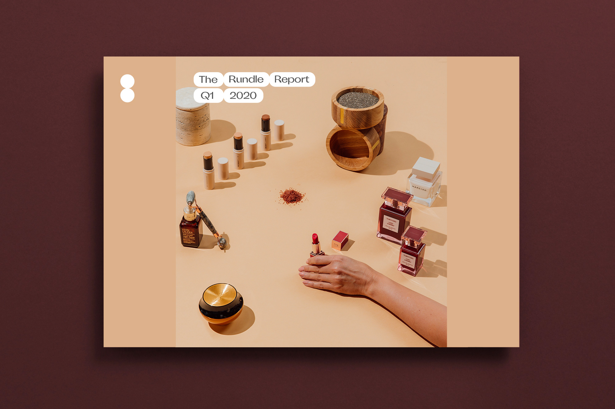
The icon can then expand into a series of elongated pill shapes that can hold text. I like the detail of how the shapes still minimally overlap at the edges, just like the icon. The font inside is a little odd and too quirky… I think sticking with whatever sans serif they used for the logo would have worked better. Still, it’s a simple system that can be deployed consistently with the imagery as the main attraction.
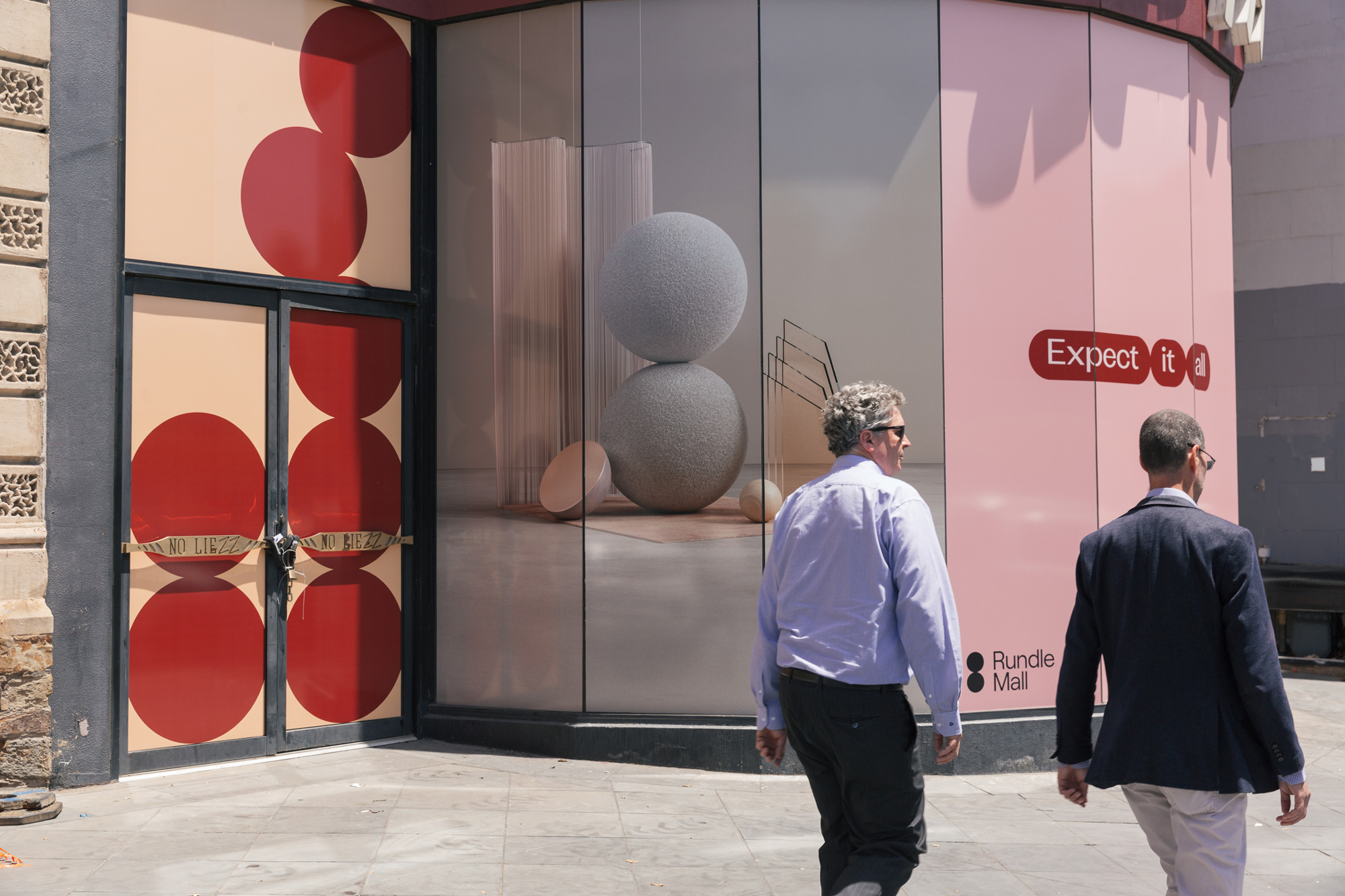
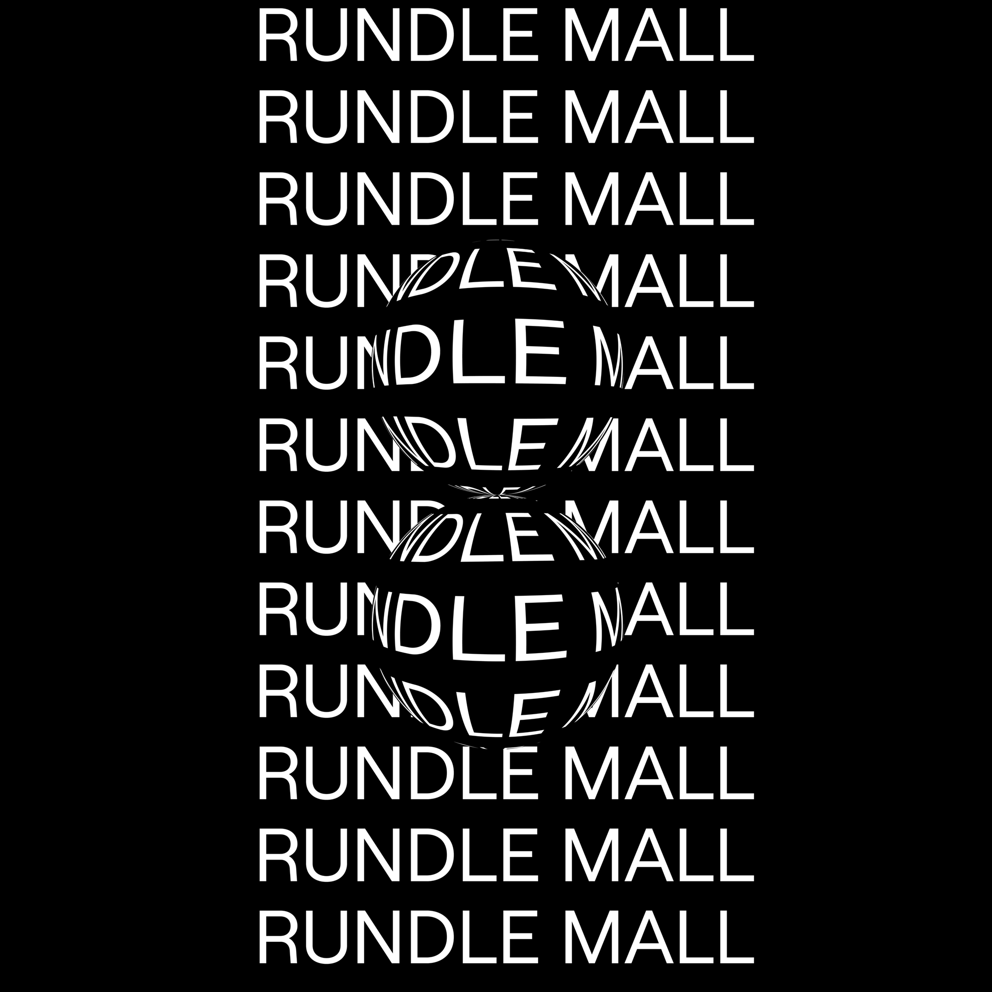
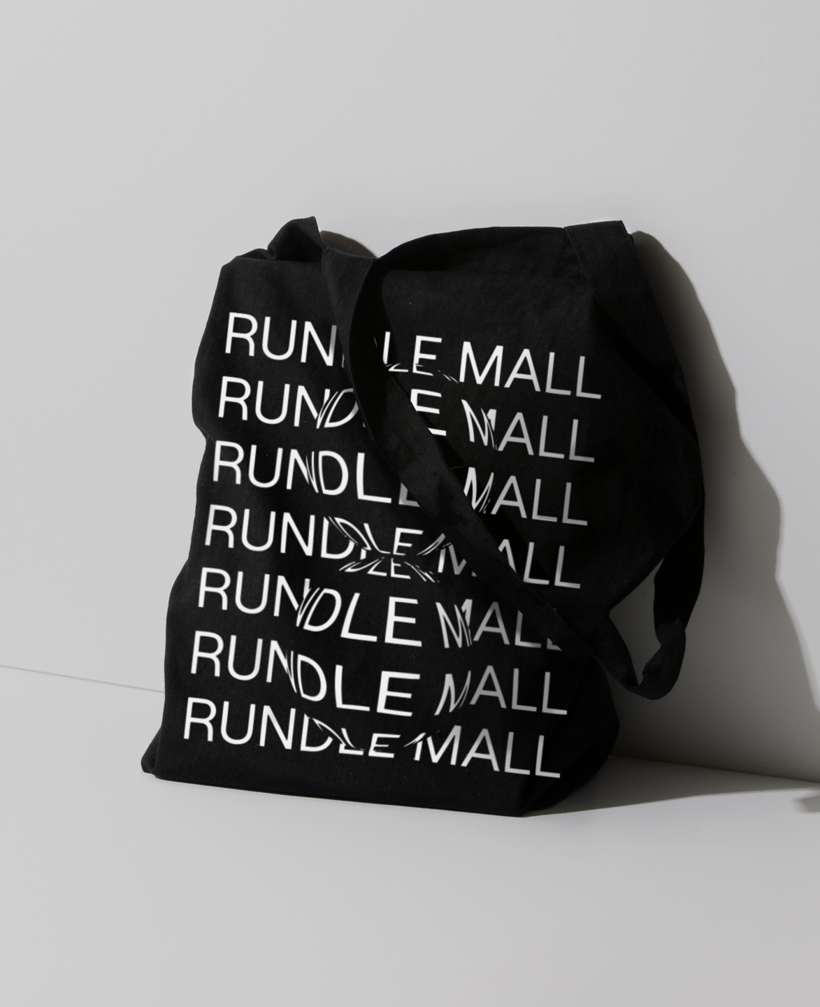
A couple of random things: the warped effect application above that starts to feel a little too cool for a pedestrian mall but will allow it as a fun flex and a charming new year animation below that makes good use of the new logo for “2020”.
Overall, given the general struggle of brick-and-mortar retailers — which I am guessing is an affliction that extends to Australia — anything that helps make a mall an enticing destination is a boon and this identity does that effectively and in a relatively exciting way.

 Новости Союза дизайнеров
Все о дизайне в Санкт-Петербурге.