Обзор лучших ресурсов по разработке бренда, разработке упаковки
contact us | ok@ohmycode.ru
contact us | ok@ohmycode.ru
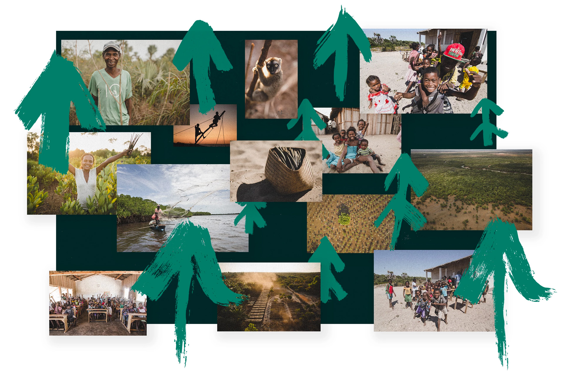
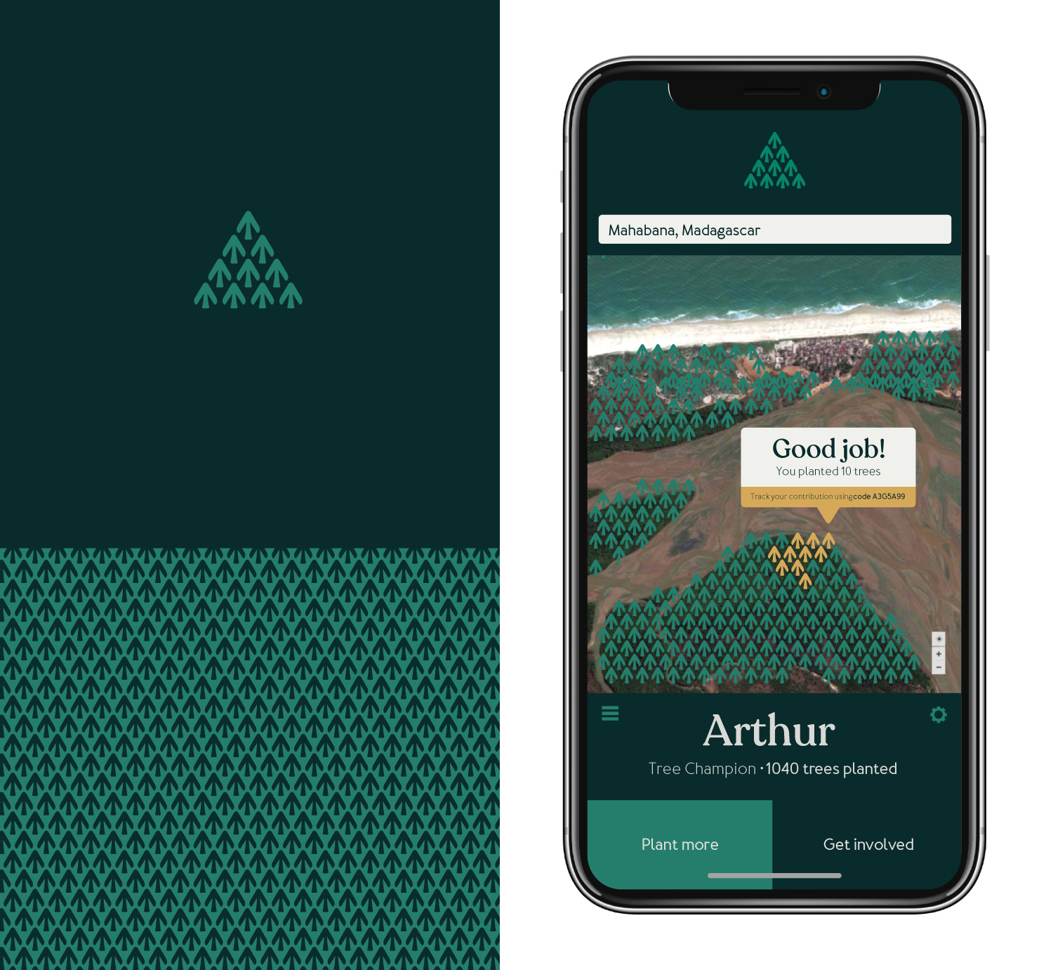
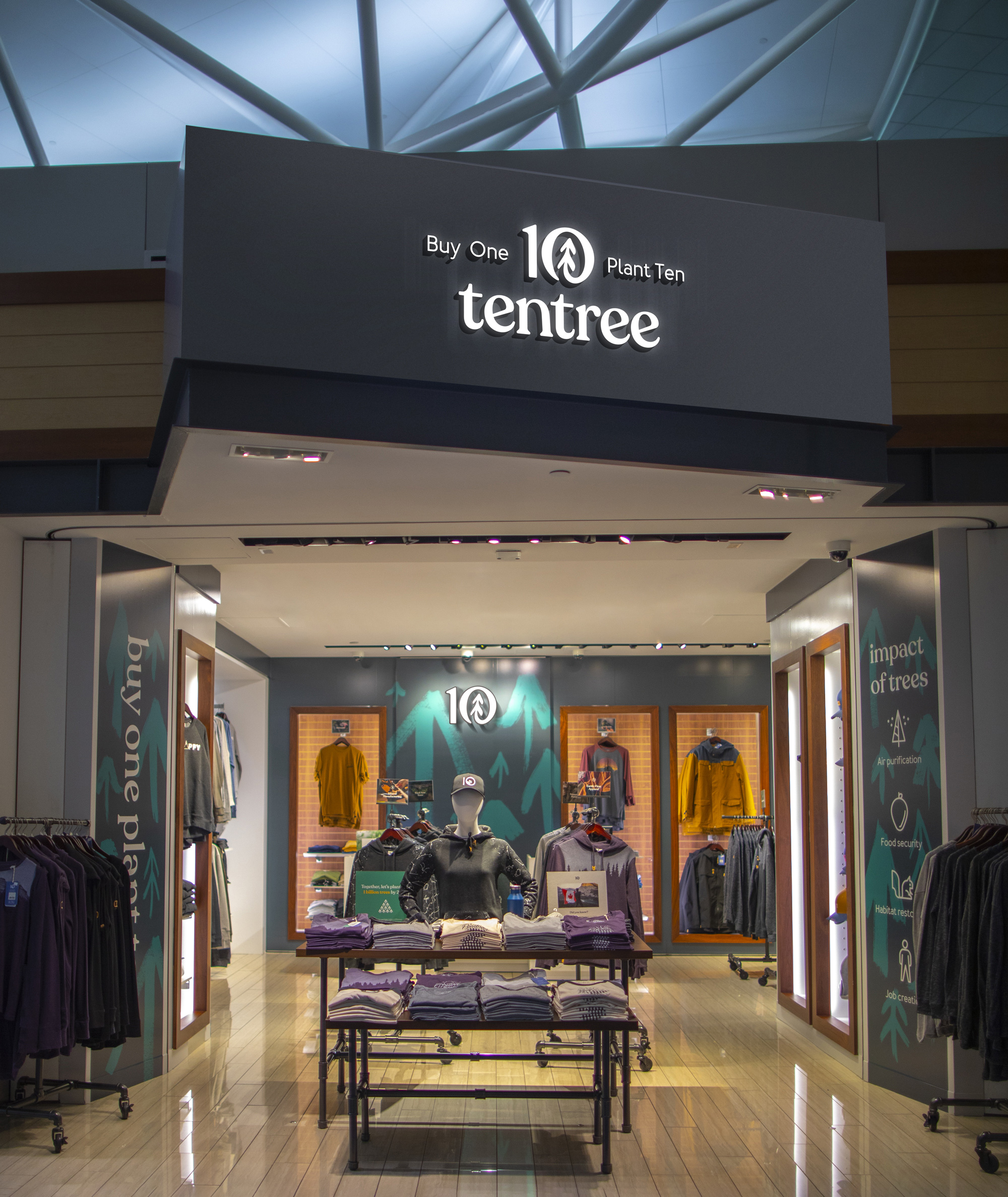
Established in 2012, Tentree is an outdoor apparel brand whose main mission is not to sell merch but to plant 1 billion trees by 2030, which they achieve by planting ten trees for each and every product sold (hence the name). Based in Vancouver, Canada, the company partners with different reforestation organizations around the world who in turn work with local people to plant the trees — as of this writing, 34,163,070 trees have been planted in Madagascar, Indonesia, Senegal, Nepal, and Canada. Tentree gathered exceptional attention earlier this year with an Instagram post — currently the 4th most-liked post on Instagram ever — that promised to plant 500,000 trees if they reached 5 million likes. It has more than 15 million so far. This month, Tentree introduced a new identity designed in collaboration by their in-house design team and Sid Lee.
[The] new logo needed key elements from nature, so we took inspiration from a tree’s cycle of growth and the cycle of nature. The new logo utilizes the upward growth and the positive impact of trees. The zero embodies the constant circularity within nature and our drive for sustainability. Like a recycling symbol or mobius strip, it’s a constant cycle.
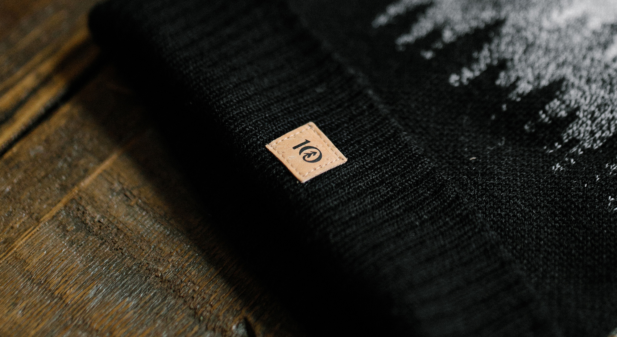
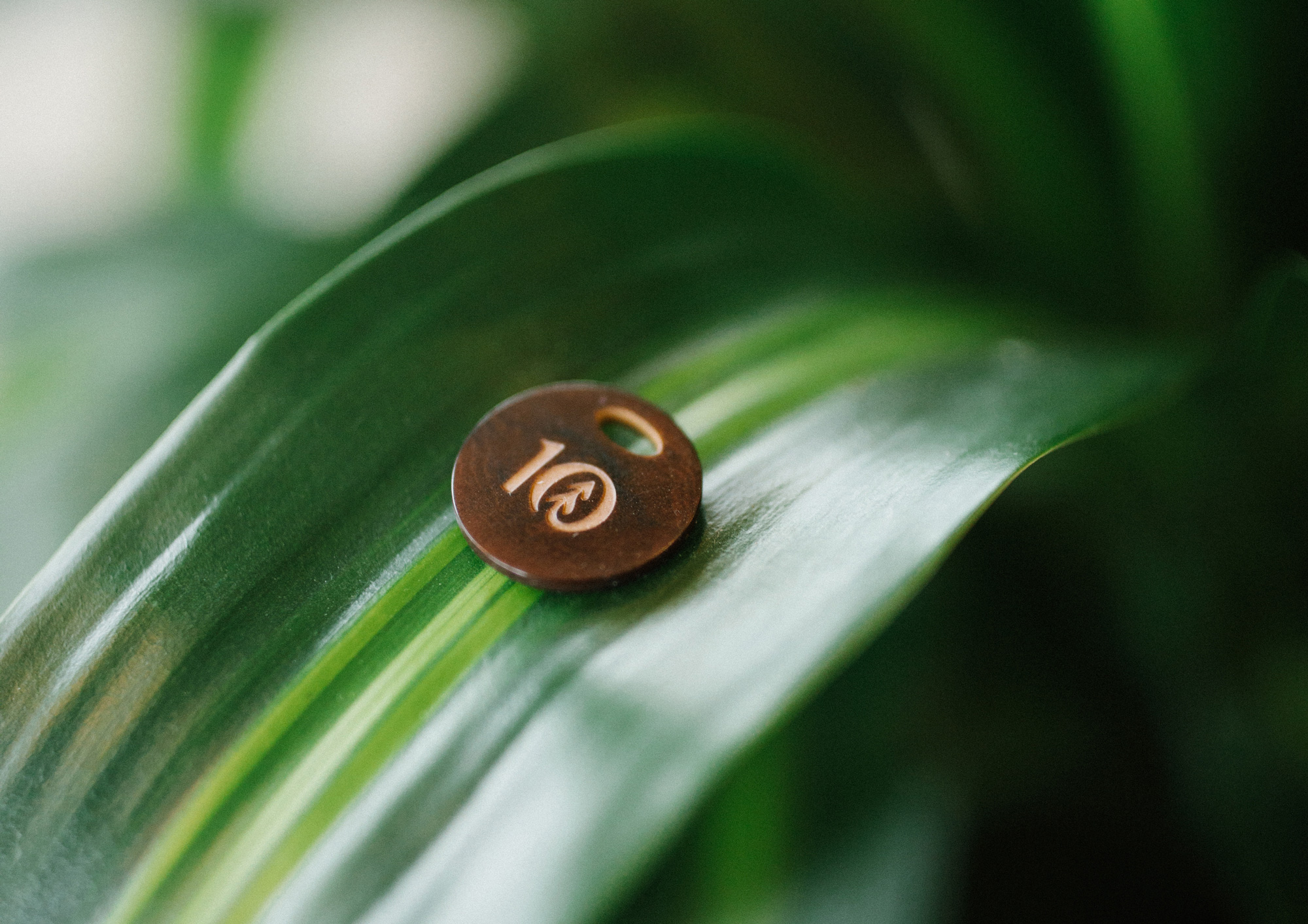
The old logo was awfully “cold” for a company doing so much caring about the world… the blue color, the basic sans serif, and the stiff “10” (which read more like an “I” and and “O”) were not on par with the mission or even the products. The new logo is a fantastic evolution that completely turns around the personality of the logo and is at least, um, ten times better. The new “10” icon is lovely, with a great abstract drawing of a tree — instead of the very literal rendition of the old one — that has been craftily integrated into the zero. Looking at the icon up close, it’s a champion of bezier use… all the curves are smooth while maintaining an extremely pleasant and minimal wobbliness that gives the icon a lot of character. The wordmark, in the Chobani Nouveau Typographic Style, is, unsurprisingly, quite nice as well, giving the logo plenty of warmth and lovability.
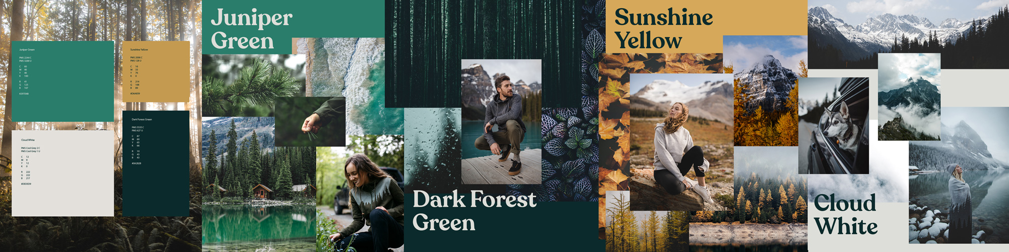
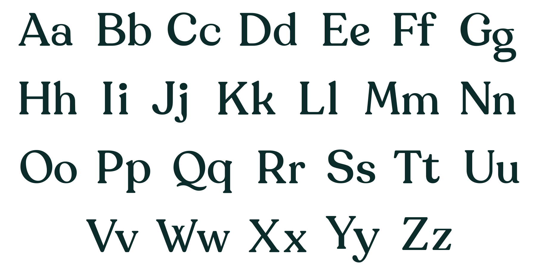
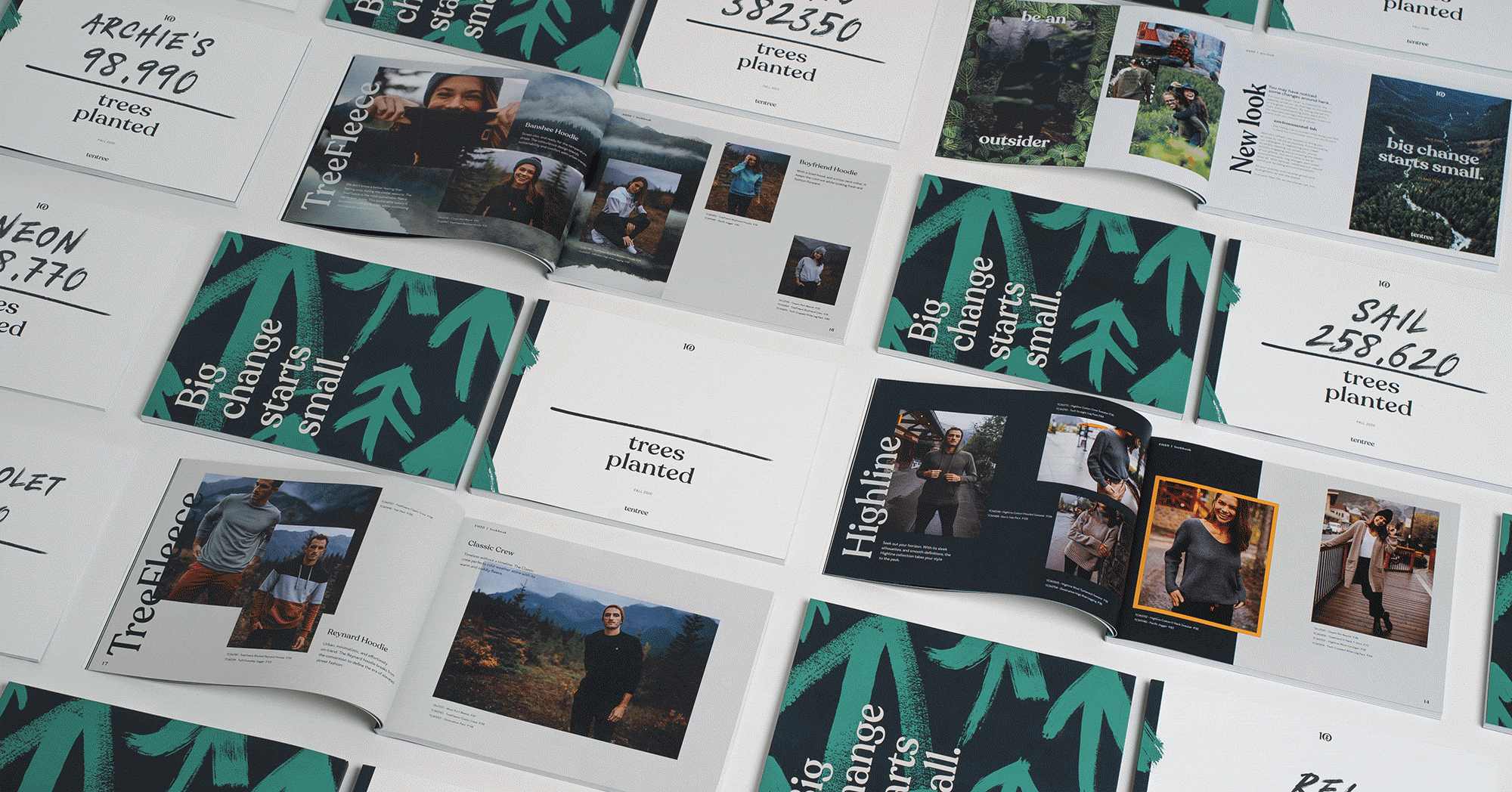
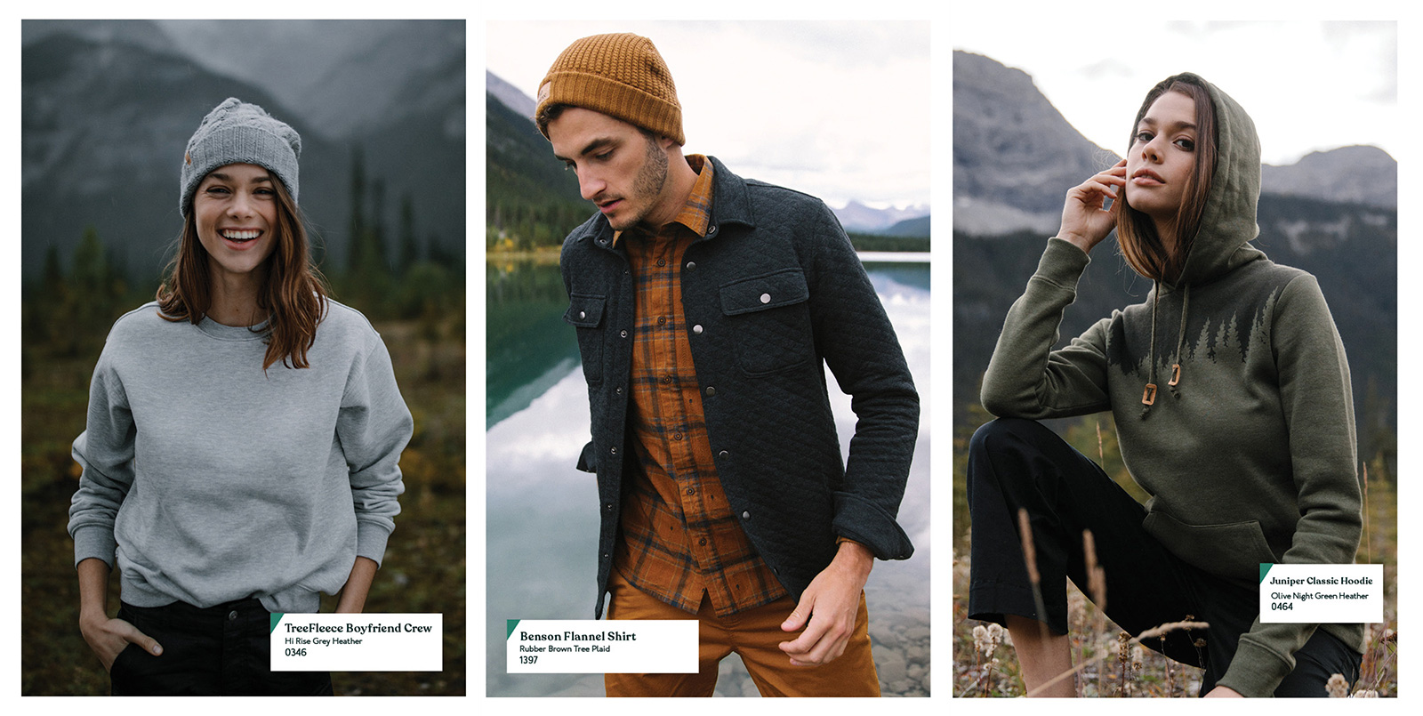
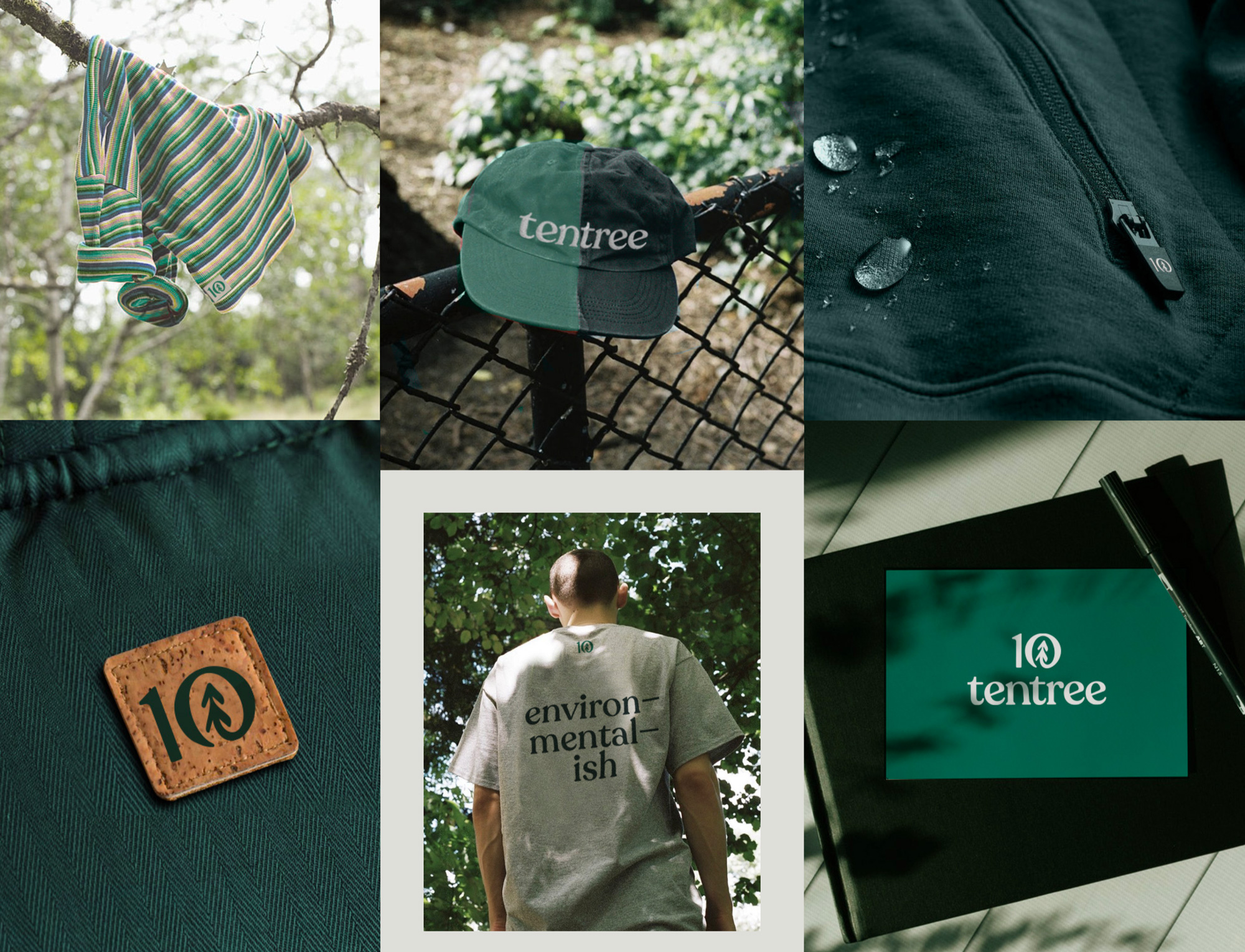
We are also presenting a whole new font and colour palette. The main brand colors we’ve chosen are all inspired by colours in the world. These earthy hues that naturally paint our landscapes are used throughout our new branding. In terms of typography, we chose a font that’s timeless and classic, but with distinct strokes. We wanted a look that our customers would be proud and excited to wear.
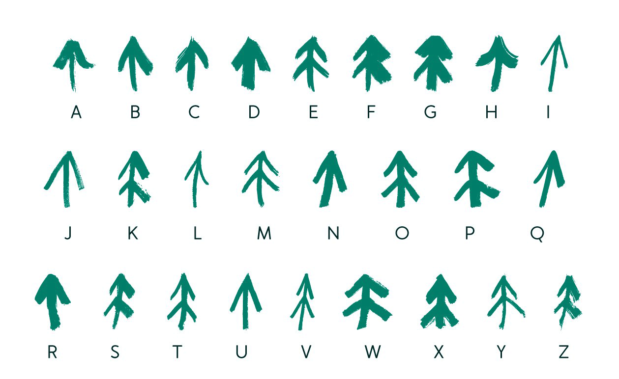
An additional element we have included in our new branding was a new alphabet out of trees. We took inspiration from the trees with no two are alike! Each brushstroke tree represents the uniqueness of the company and each of our supporters. The brush stroke texture and feel represents our individual imperfections and the rustic outdoorsy lifestyle that we’re all about.
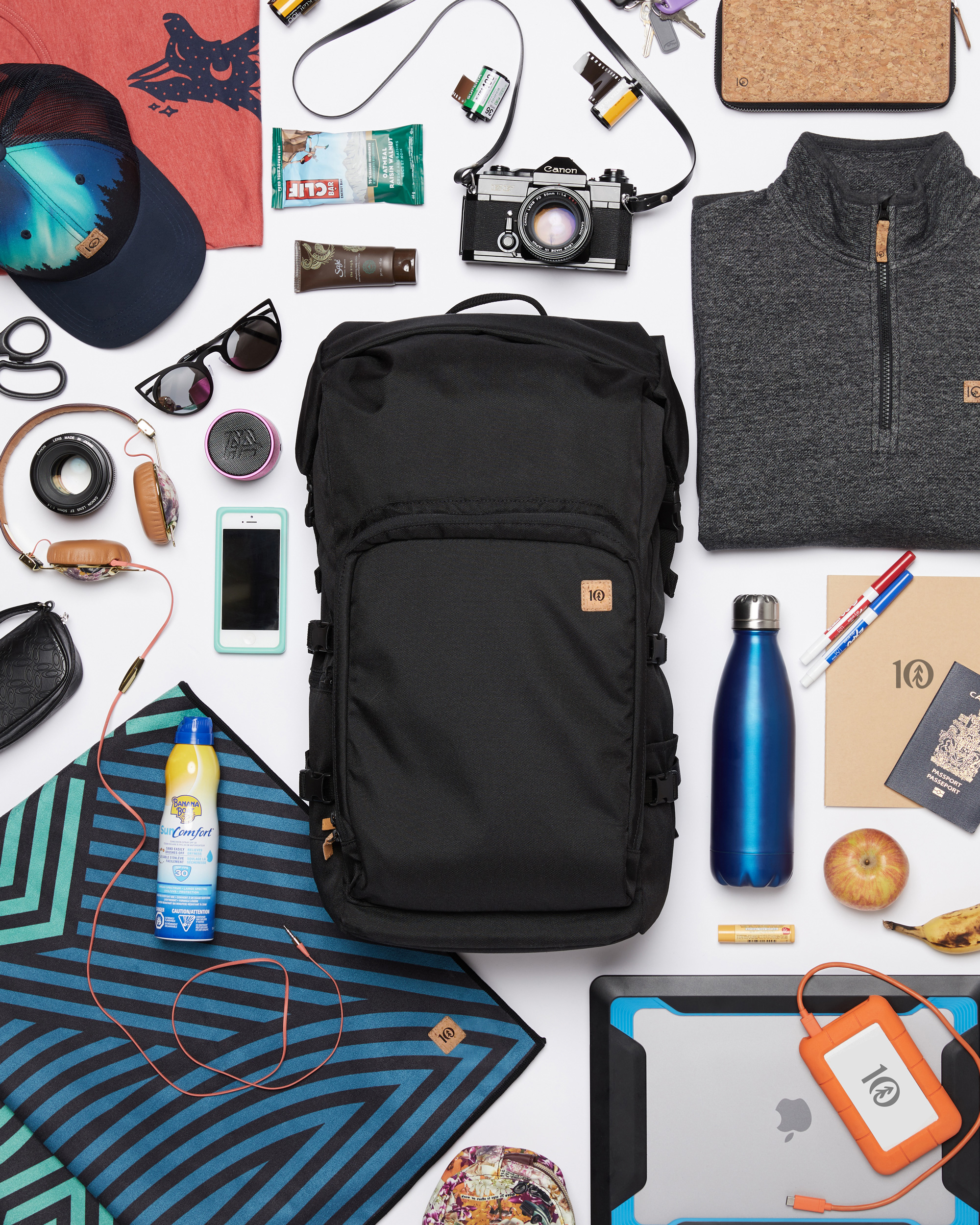
The identity elements are all great, starting with the aforementioned Chobani-esque typeface that is supported by an earthy color palette that doesn’t feel cloying and a fun set of tree brush-stroke drawings built into a font for ease of use. These all come together very convincingly in application with the help of great photography and products that simply look good.
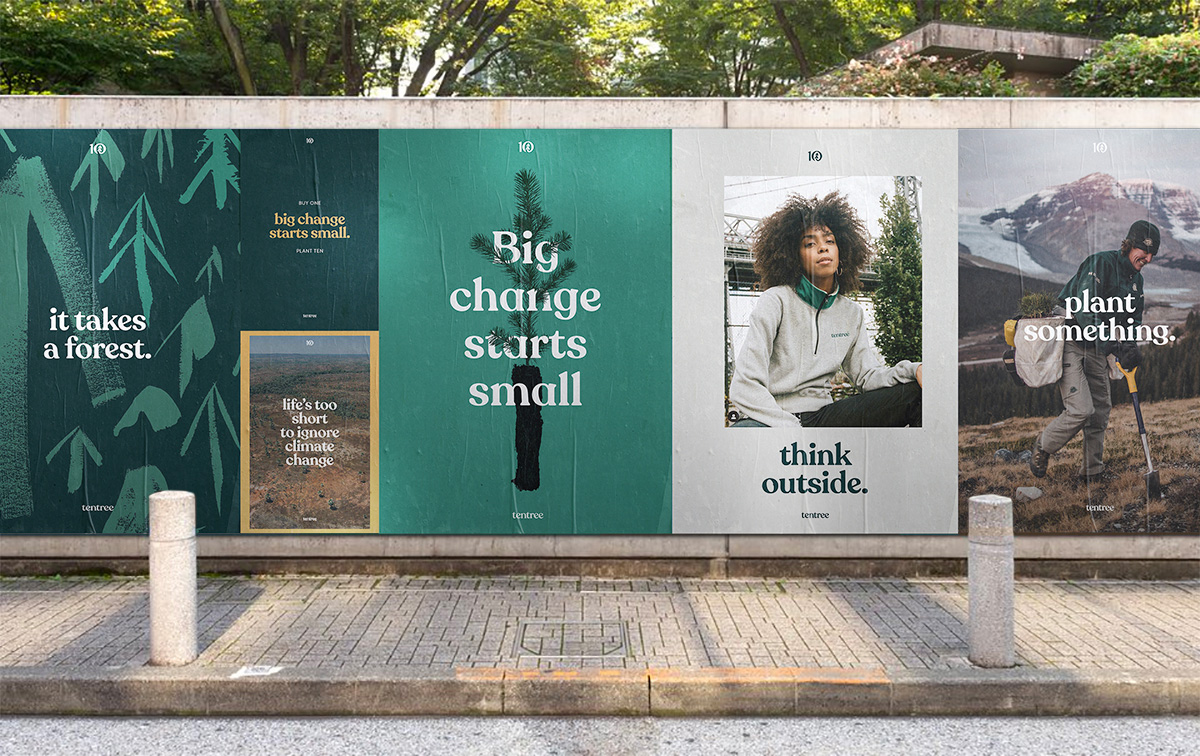
Overall, unless you hate the Earth and the idea of planting trees, this is all very hard to dislike. The typography may be deemed too on-trend but that’s a minor quibble for an identity that is very much on point with the mission and authenticity of the company.
 each year since publication began in 2006

 Новости Союза дизайнеров
Все о дизайне в Санкт-Петербурге.
Новости Союза дизайнеров
Все о дизайне в Санкт-Петербурге.