contact us | ok@ohmycode.ru
contact us | ok@ohmycode.ru
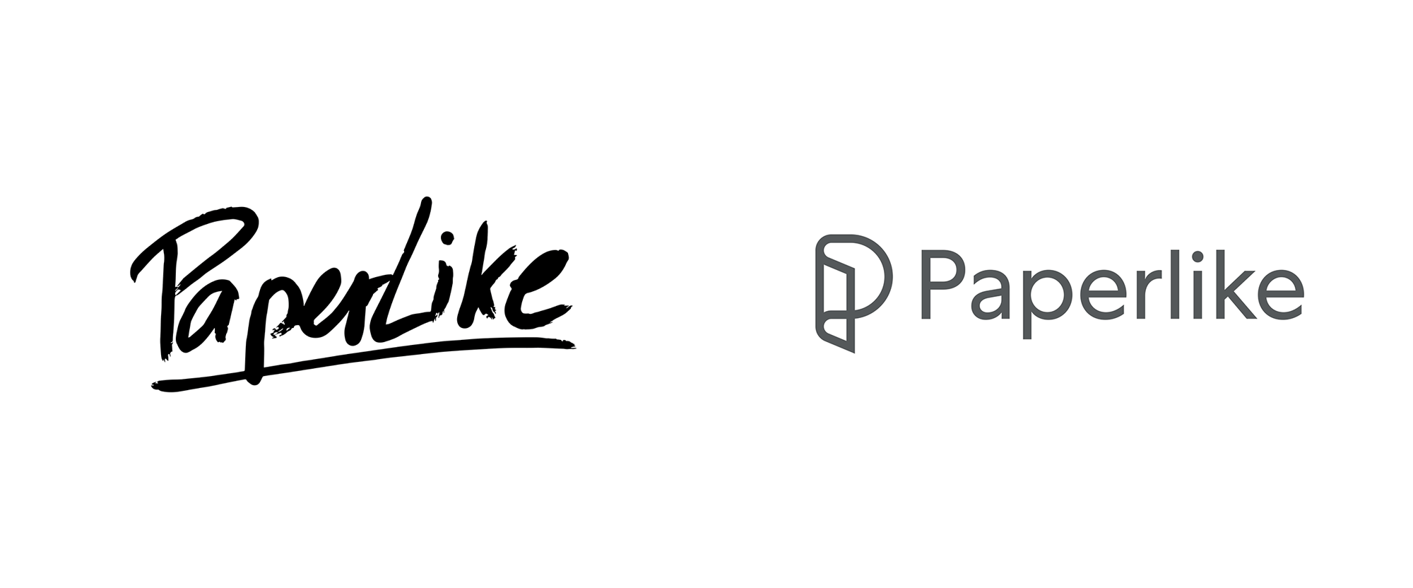
Created in 2017 by Hamburg, Germany-based Jan Sapper, Paperlike is an iPad screen protector that makes writing, sketching, and/or drawing on it, in combination with the Apple Pencil, feel like you’re doing it on paper. Launched successfully as a Kickstarter campaign with 1,914 backers, version 1 was a success, but instead of resting on its paper-like laurels, Jan and his team have revisited the product to launch version 2 with improved texture and screen refraction. Its second, funded Kickstarter campaign attracted almost 10,000 backers and the product will now also be available in retail stores worldwide. The new identity has been designed by Copenhagen, Denmark-based Daniel Flösser.
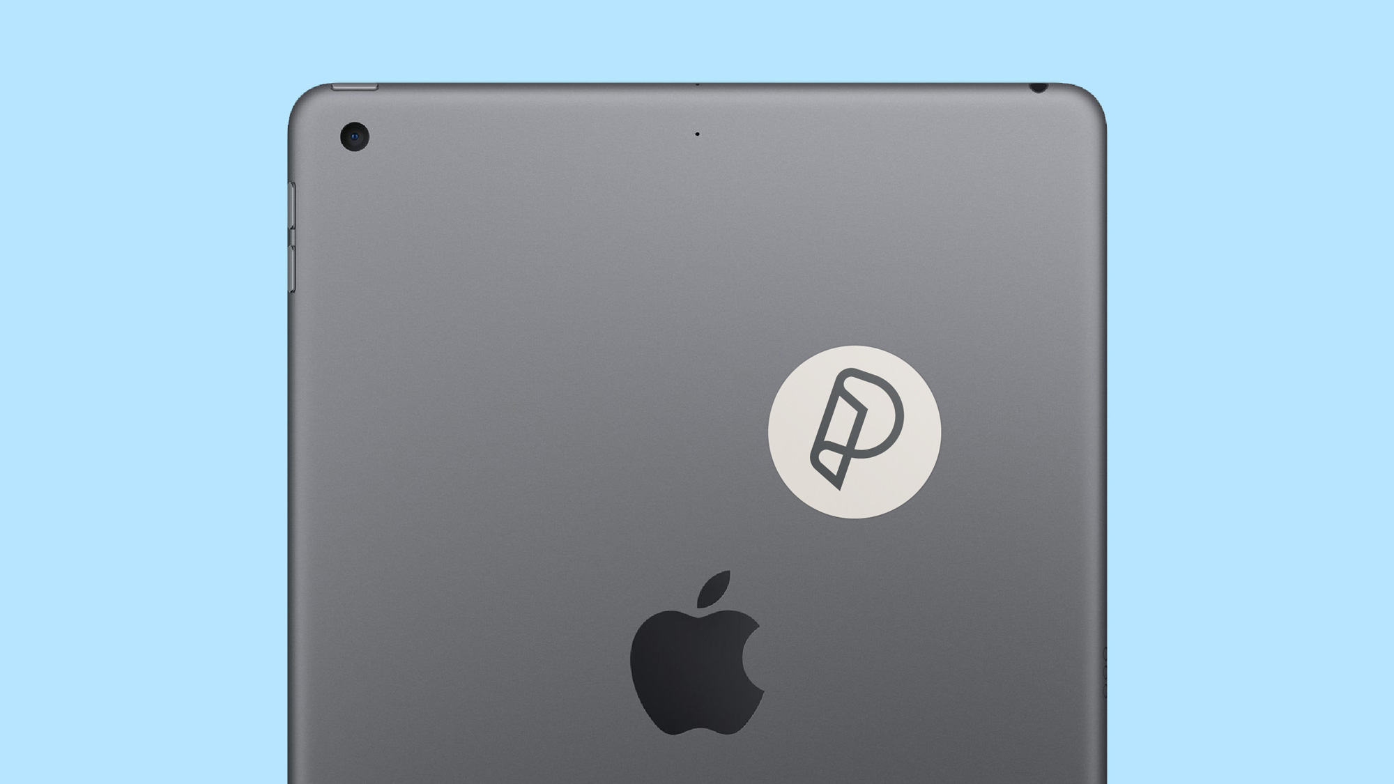
Correlating with the launch of an updated version of the Paperlike, and a move into physical retail, we launched a new identity. It’s rare to have a product brand with a name that speaks to the product function in such a straight talking way, without being generic. We wanted to create an identity that continued this direct approach, and the logo does just that by being a visual representation of the product, swaying into P for Paperlike. The result is a strikingly simple visual identity, activated across website, retail, packaging design and more.

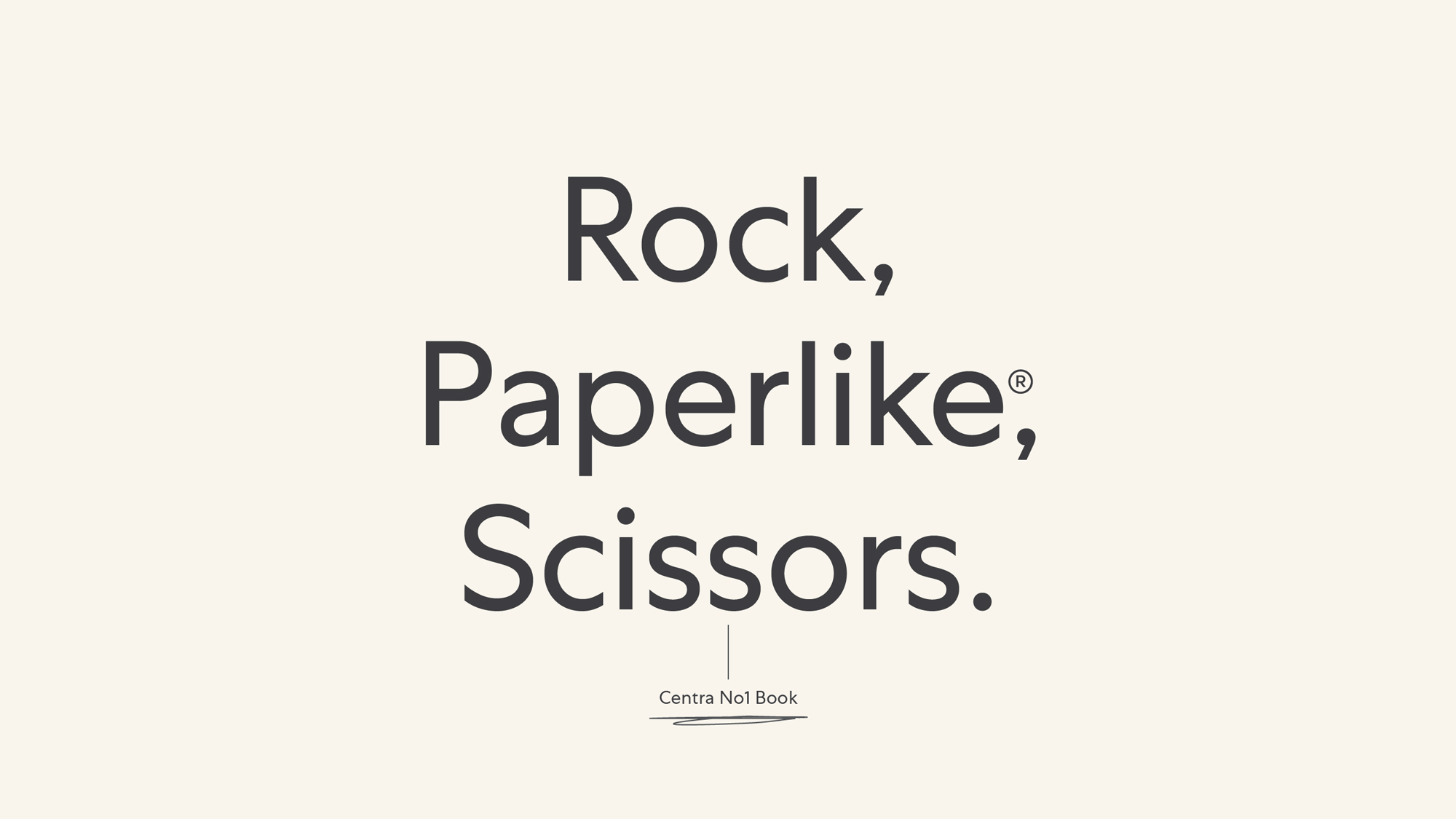
The old logo had the right idea of conveying the sense that its product would maintain the roughness and texture of drawing on paper through its marker-drawn wordmark but the execution was pretty bad, looking like they held auditions to find the person with the worst handwriting possible. Too bad I didn’t know about it as I would have won. Point being, it wasn’t a logo that made it feel like my experience using this product would be enhanced but rather that it would be somewhat unpleasant. And why didn’t they fix the “Pap” spacing?! Anyway, enough about the old logo. The new logo may have lost the paper-ish texture but the slick new approach makes it feel like this is a high quality, professional product that positions it more as a productivity tool than an artsy whim. The icon/monogram is quite nice, folding a depiction of the product into a “P” — simple but effective and manages to speak to the malleability and transparency of the cover. The wordmark, in Centra No.1, looks elegant but also software-like, as something that could come out of Apple or Microsoft, which gives it a more mature appearance. Additional golf claps for the thickness of the icon matching the thickness of the wordmark.
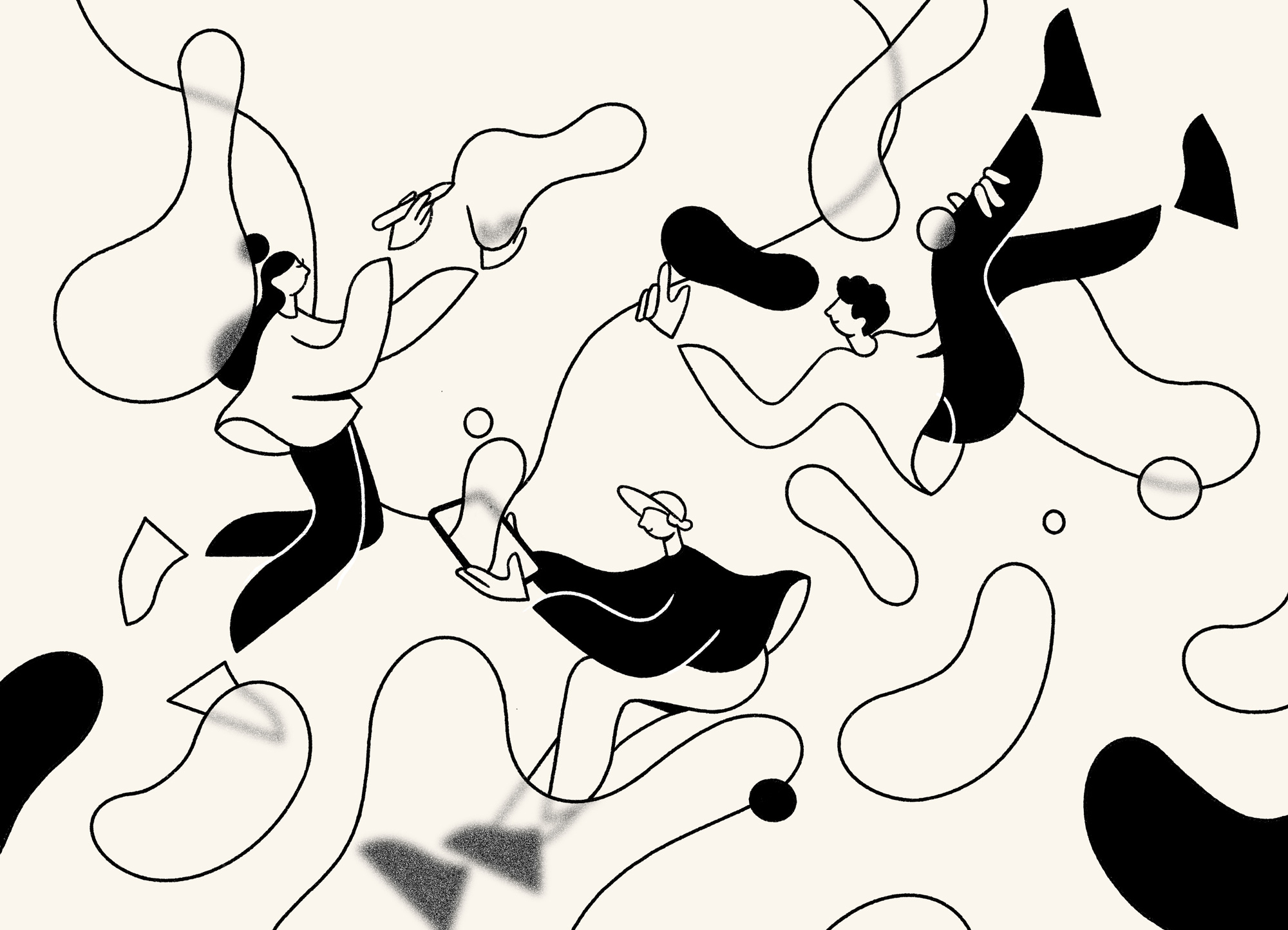
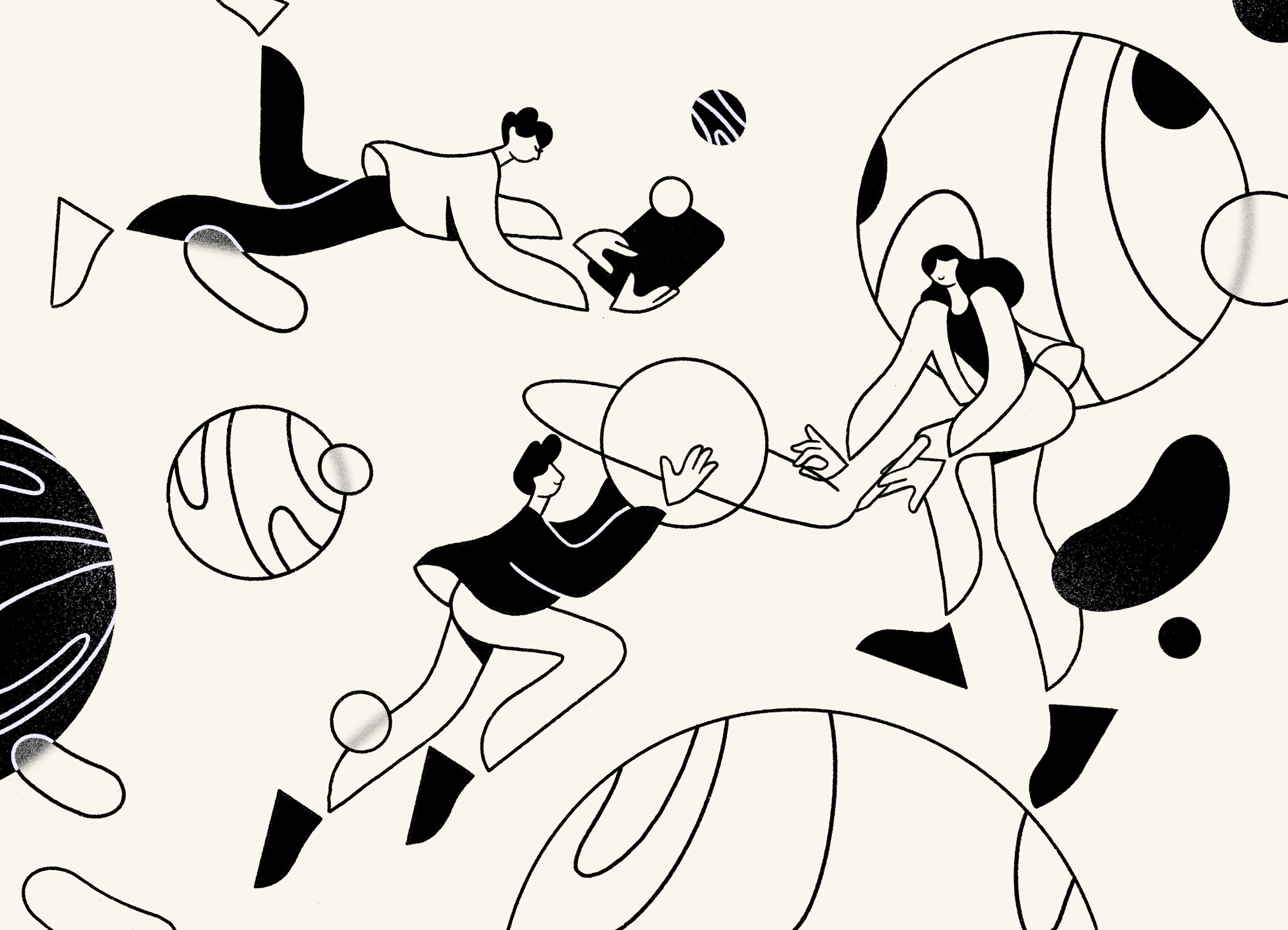
While the illustrations aren’t surprising in their faceless approach — and they might seem more familiar than usual as they were done by the same illustrator that did Onfido — I would say that this is the one project where they are the most appropriate, highlighting the ability to make slick yet rough lines on the iPad. I really like the little touches of overlaid blurriness that hint at the texture of the cover.
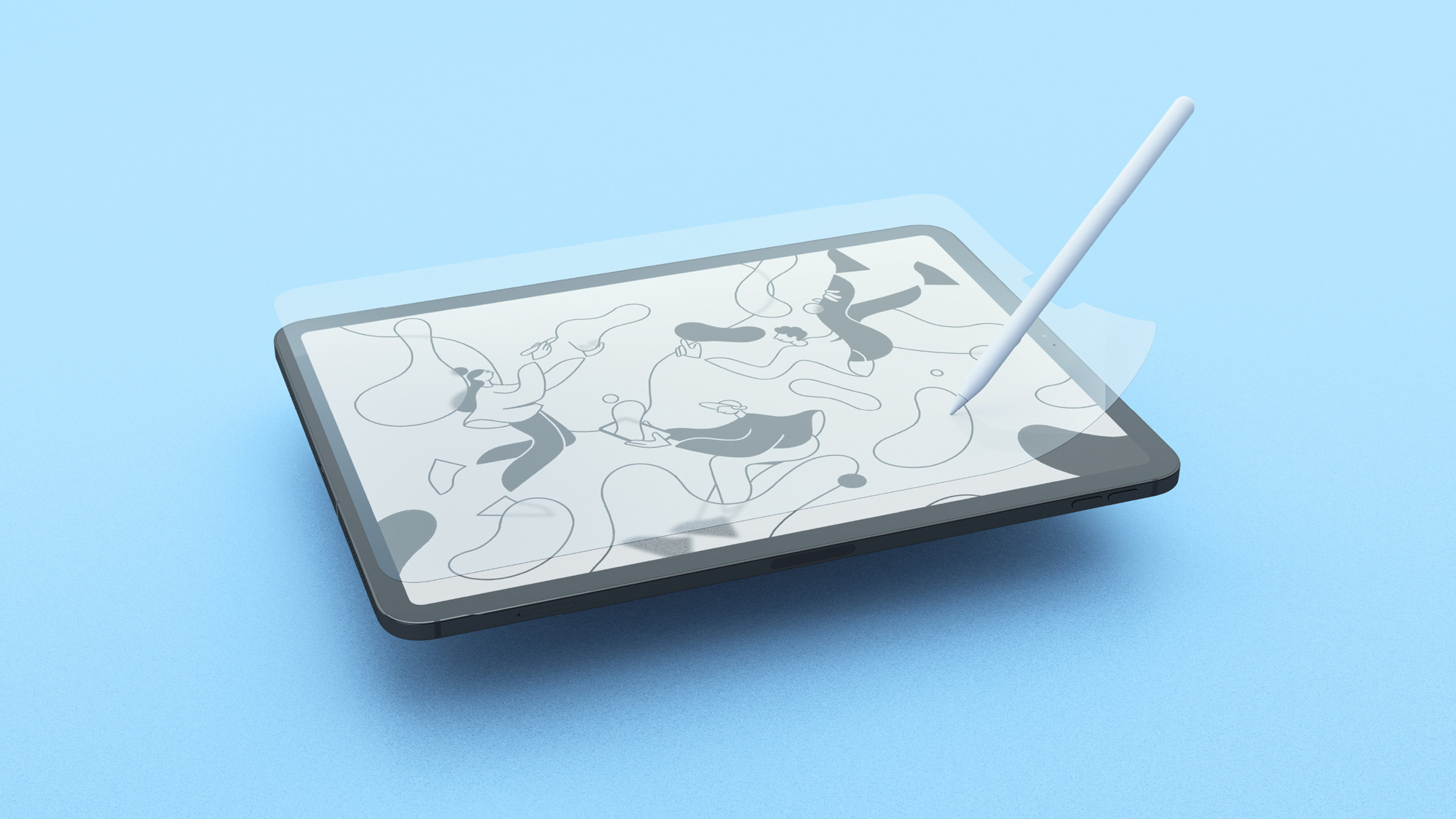
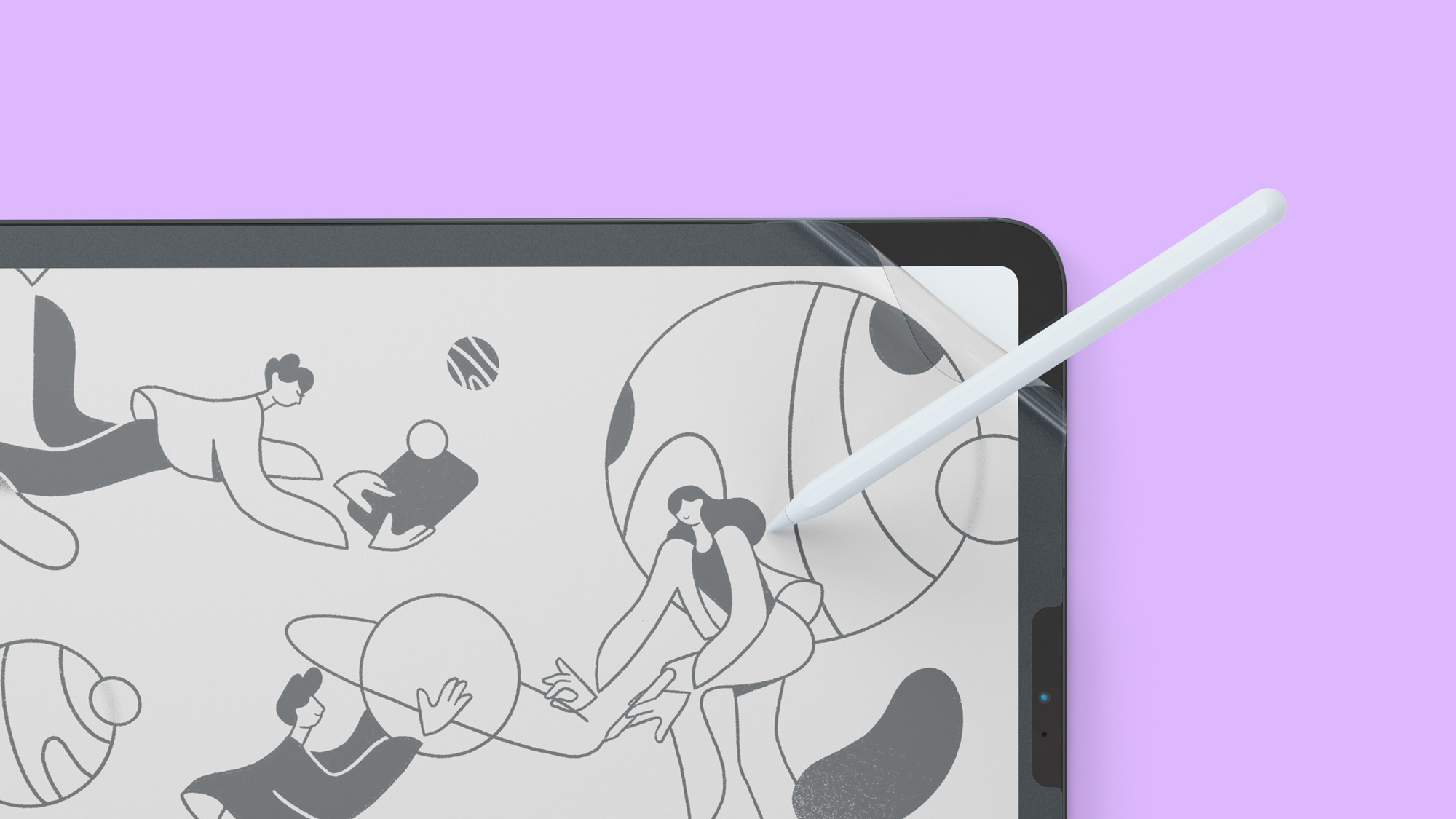
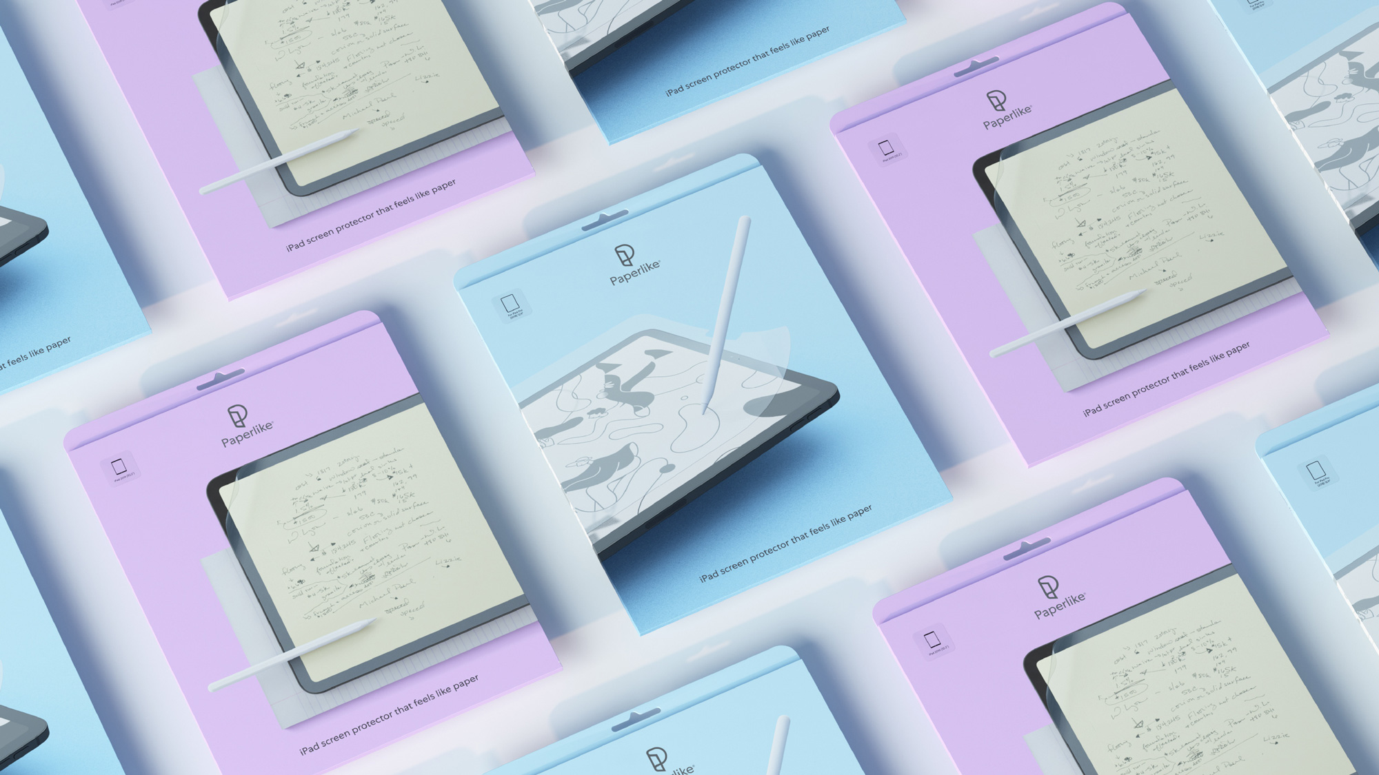
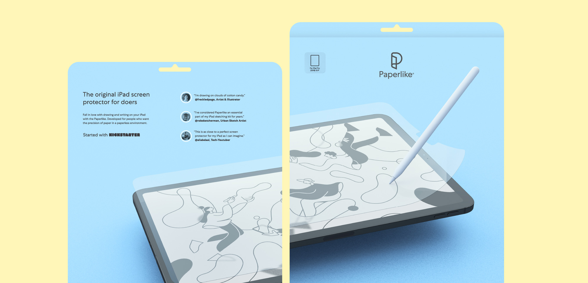
The packaging looks great in all its simplicity. It’s amazing what can be done with great product photography and then getting out of the way as a designer. The packaging would look so natural at an Apple Store, making it look almost like a default iPad accessory, not in trying to pass as an Apple product but something that is a perfect, natural fit.
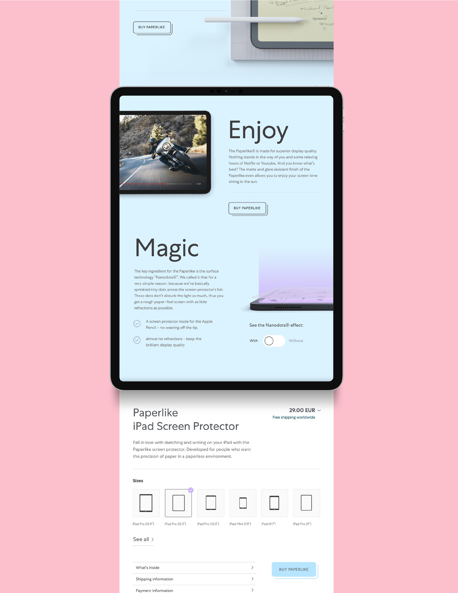
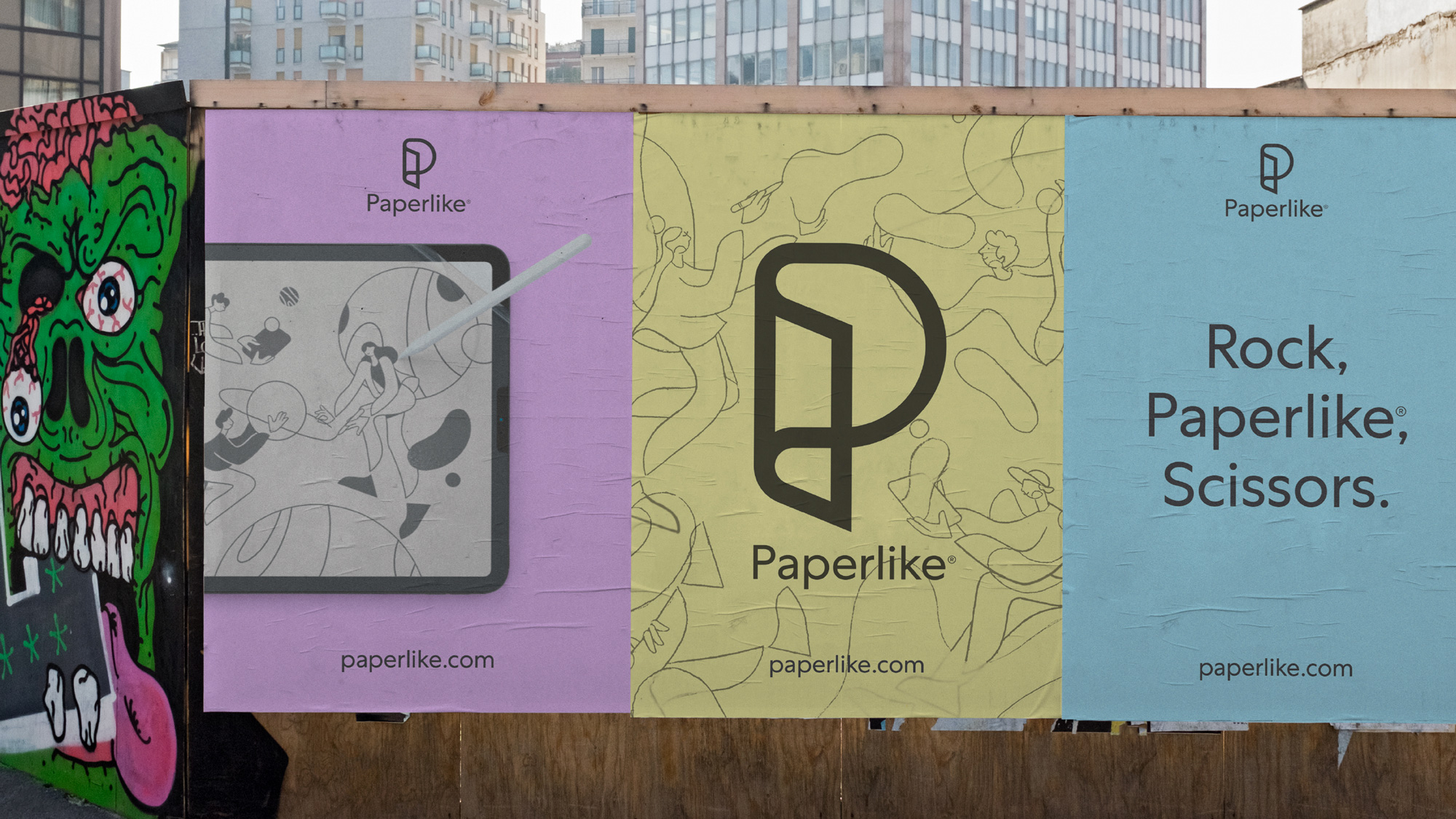
Overall, a classy update that transitions the product into a higher-end offering and almost a no-brainer for new customers and even version 1 users enticed to upgrade, not just from the improved product but the grown-up evolution.

 Новости Союза дизайнеров
Все о дизайне в Санкт-Петербурге.