Обзор лучших ресурсов по разработке бренда, разработке упаковки
contact us | ok@ohmycode.ru
contact us | ok@ohmycode.ru
First celebrated in 1956, the Eurovision Song Contest is an annual international TV song competition hosted and “played” by member countries of the European Broadcasting Union. Each country is represented by a singer performing an original song and then the viewing public selects the winner. Nearly 200 million people watch the televised event, which itself is quite a spectacle. Past winners have included ABBA and Celine Dion before either were ABBA or Celine Dion as we know them today. Each year, the competition is hosted by a different country and as long as they use the Eurovision logo, each edition has its own identity. Taking place in Kyiv, Ukraine, this May, this year’s identity has been designed by local firms banda.agency and Republique.
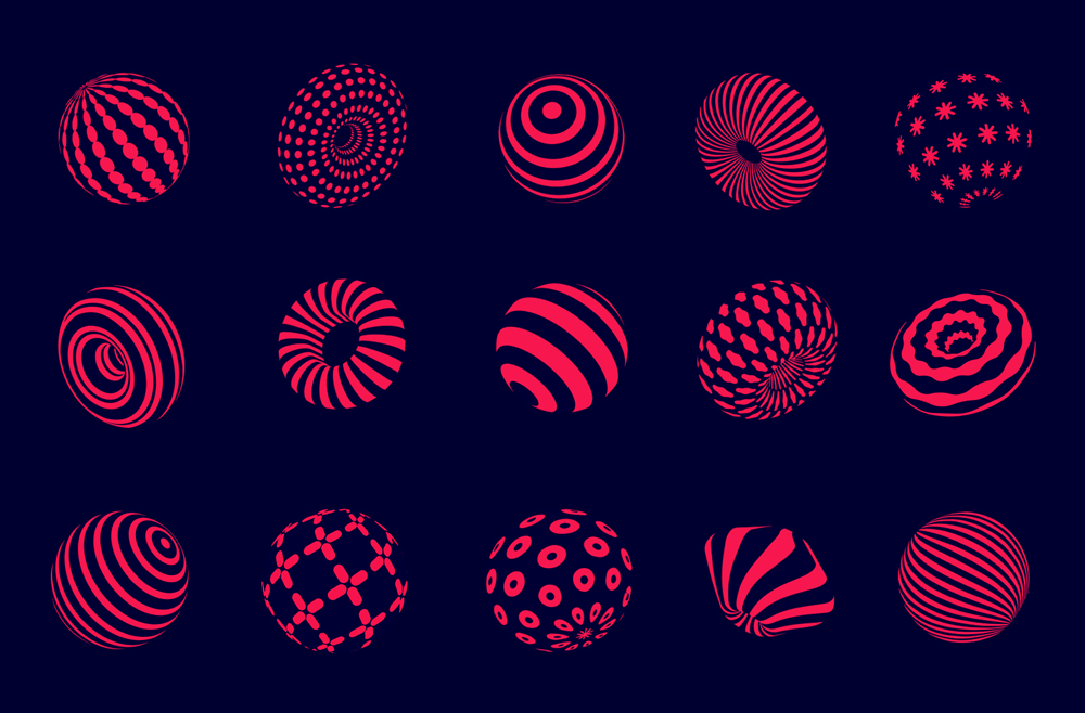
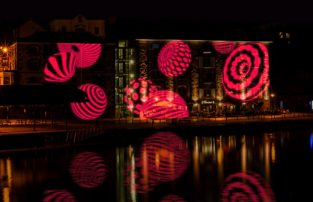
We started looking for the symbol that would be authentic for Ukrainian culture as well as identify mission of the contest. Therefore, as a basis for Eurovision - 2017 visual identity we have chosen traditional ukrainian necklace, elements of which symbolise participants of the contest. Bead after bead, countries, which take part in Eurovision, together create a captivating celebration of music.
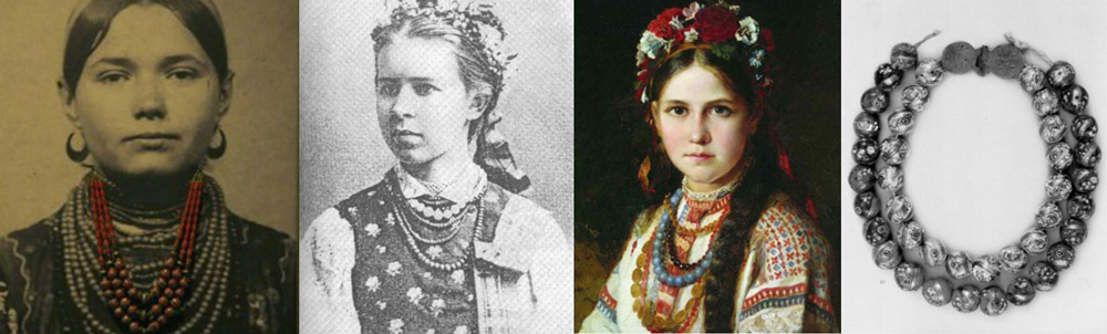
Having used a traditional Ukrainian symbol, we have also given it a modern look with bright live patterns. Every element of the necklace has its unique design and shape, which symbolises a simple truth: we are all different, but every year we meet together for one beautiful cause.
The last couple of years I have received tips for the Eurovision Song Contest but neither 2015 nor 2016 caught my attention and in all cases I find the obligatory use and integration of the Eurovision logo to be too much of a detraction to the work. This year, though, even if the Eurovision logo stands out even more than past editions, the identity behind it (literally) is awesome and strong enough that I can (again, literally) look past it. And it’s not that the Eurovision logo is bad but it’s not a logo that has been designed to integrate gently with anything else. Anyway…
The bead concept is well founded in a piece of Ukrainian tradition and then it’s excitingly visualized as a range of groovy patterns mapped around spheres and donut-like beads. The mix of shapes used in the patterns is varied and eclectic but nicely unified by the coral red color. On their own they look rad but they also work together in a surprisingly not cloying way when they form a necklace. As a lock-up with the tagline and the Eurovision logo, it’s not really that good and the use of Gotham seems off but it’s easy to move past it as the applications are quite entertaining.
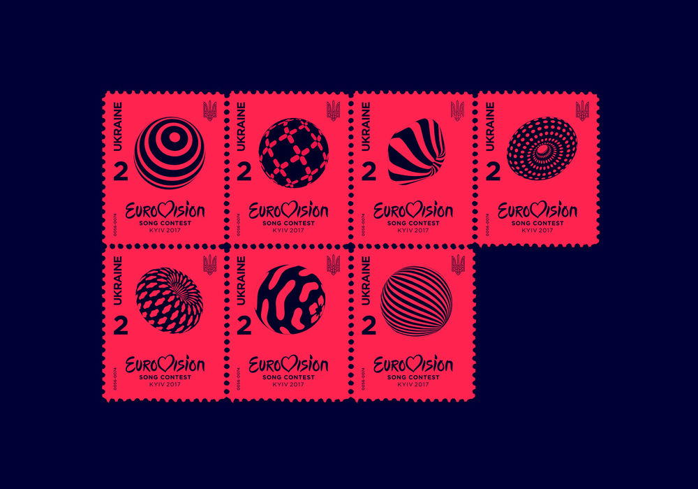
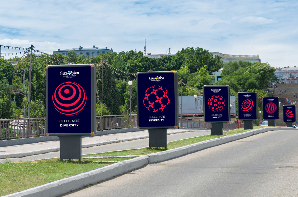
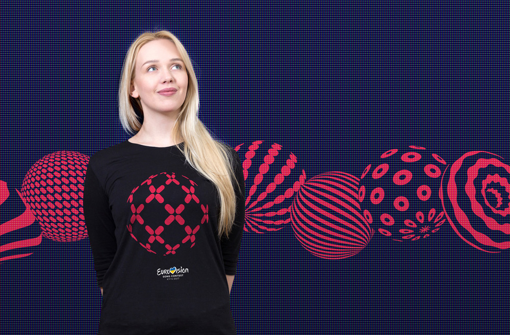
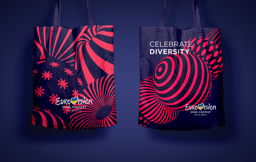
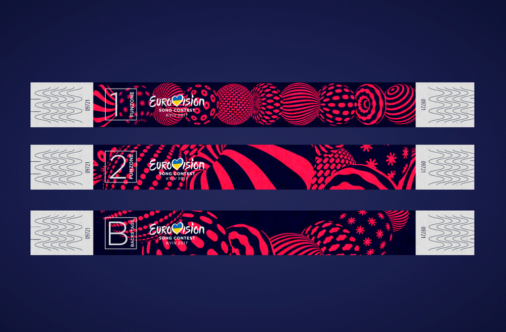
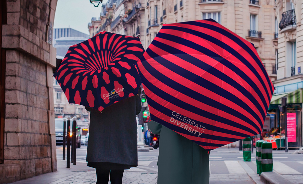
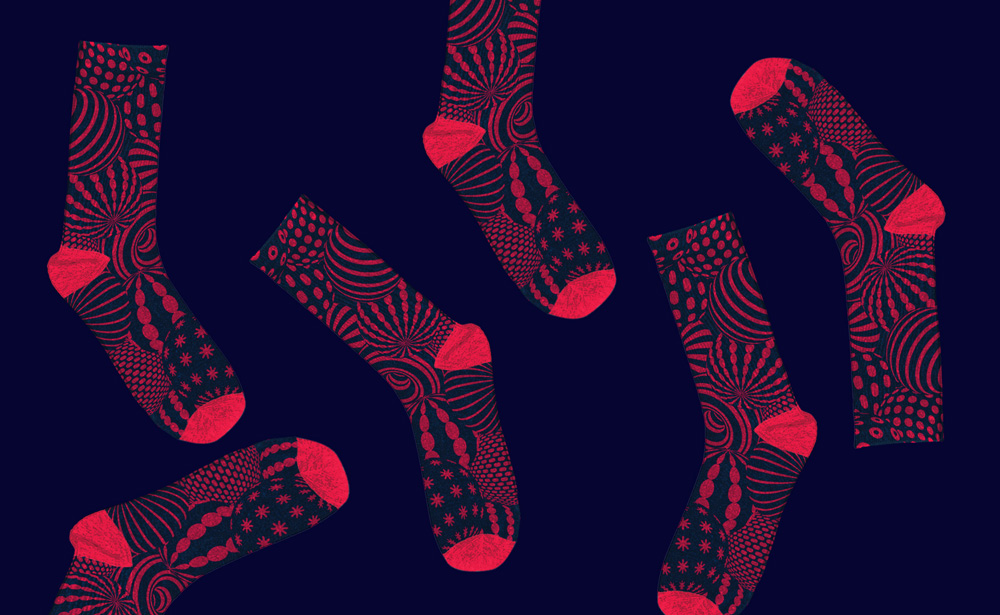
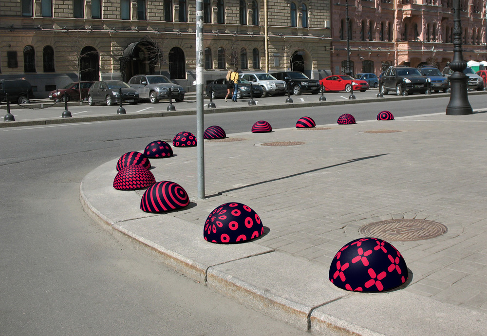
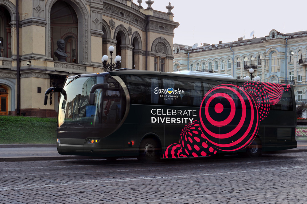
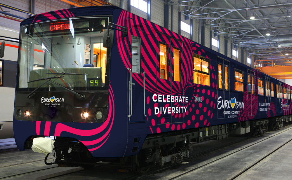
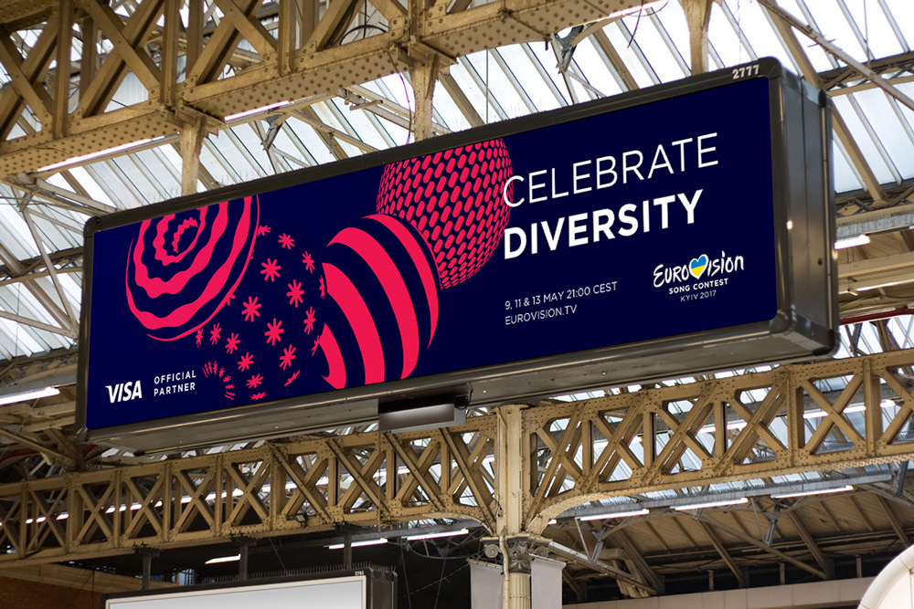
I usually interrupt the visuals earlier on in the post to add some comments but these are best enjoyed in succession and the premise is consistent across all applications, from wristbands to bus wraps: big beads in any configuration that looks fun, Eurovision logo and tagline placed where they are least in the way. Some of the renders are quite out there but if even a fraction of them are made, it’s a win. I’m looking at you, socks.
I wish the bead animations were more ambitious — something like this — instead of just rotating the objects with the patterns being static. Perhaps they are saving it for the broadcast. Nonetheless, this is a smart and attractive identity system that plays out perfectly across many platforms… it doesn’t quite scream “Singing Competition!” but since the audience is so familiar with the Eurovision brand, it’s not that big an issue.
Thanks to Kristoffer Olsson for the tip.

 Новости Союза дизайнеров
Все о дизайне в Санкт-Петербурге.
Новости Союза дизайнеров
Все о дизайне в Санкт-Петербурге.