Обзор лучших ресурсов по разработке бренда, разработке упаковки
contact us | ok@ohmycode.ru
contact us | ok@ohmycode.ru
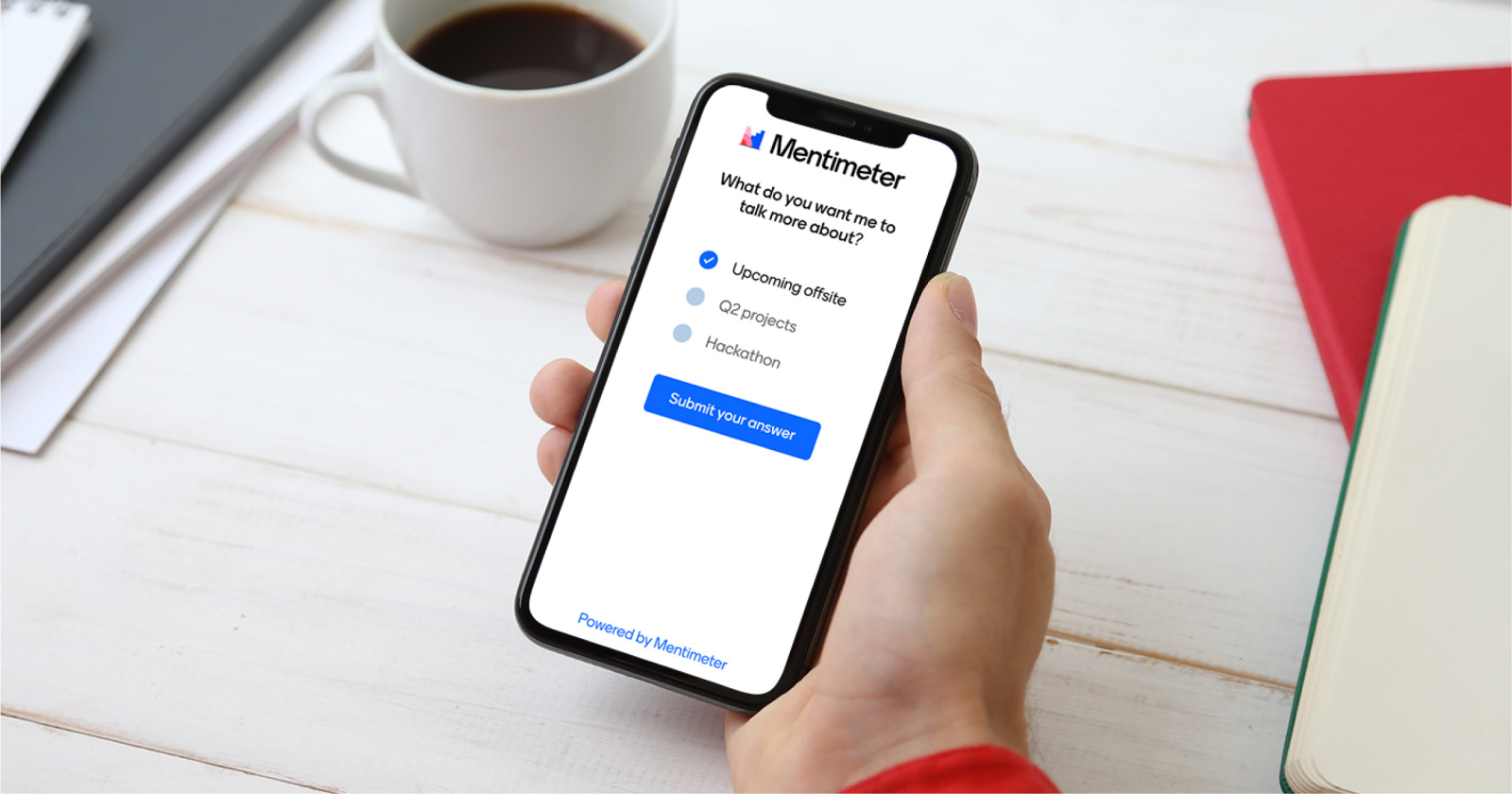
Established in 2014, Mentimeter is an interactive presentation platform that allows presenters to receive real-time data input from an audience. The way it works is that a presenter will have a slide with a multiple-choice question and the audience can access that question online through a menti.com short URL on their phones and the presenter’s slide will populate with the answers as they come in through data visualizations. You can create full presentations directly on it or there is a PowerPoint plug-in — no Keynote yet, which is a shame as I would definitely give this a try. Based in Stockholm, Sweden, Mentimeter has 84 employees with paid customers — there is a free version but “Data may be anonymized and used for inspiration” — in more than 120 countries. Recently, Mentimeter introduced a new identity designed by Stockholm-based Bold.
Our new identity takes its visual cues from bars, pies, lines and dots; the most commonly used data graphics. They are the building blocks of a Menti experience. Our logotype combines the fun and seriousness that our users tell us makes Mentimeter so special. It is made from two elements, the Mentimeter symbol and wordmark.
The symbol is a playful take on well-known data visualizations. There’s our main symbol, but just like every Menti is unique, we’ve developed a family of ever-changing variations. And yes if you think the icon looks a bit like an M you get extra points. Where our symbol expresses the fun and energy of Mentimeter, our wordmark represents the reliability and user-friendliness of our platform.
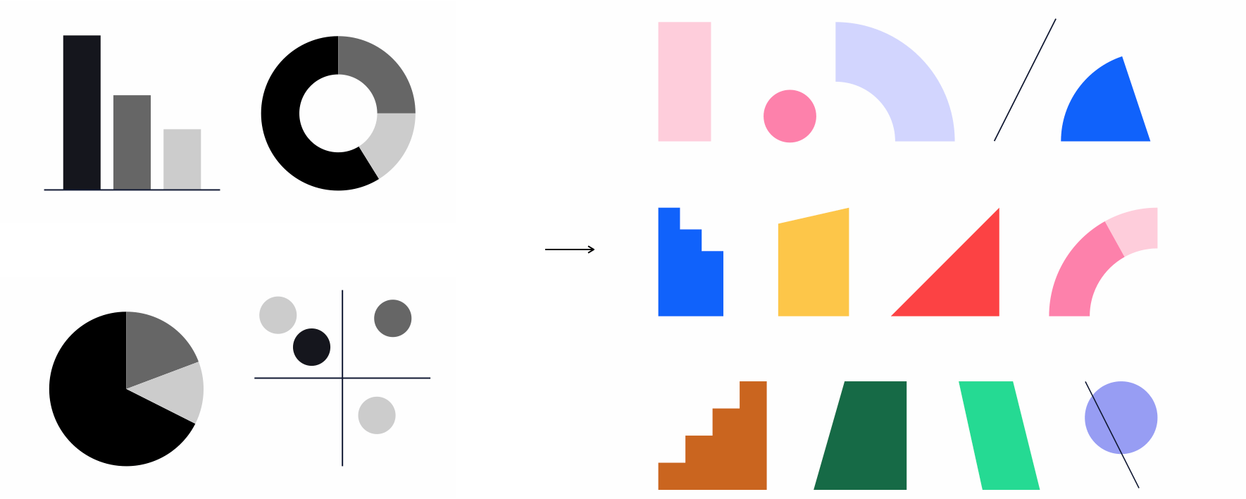
The old logo was pretty decent — and a huge improvement over the company’s original logo — with a simple bar chart inside a speech bubble that connected the idea of letting the audience’s voice be heard and channeling that into data visualization. The wordmark was solid too. If it had any shortcomings maybe it would be that it was too literal and not much fun. The new logo is less literal and more fun, with an abstract “M” constructed from flotsam and jetsam of data visualization language. I’m not convinced it would be an instantly recognizable reference without an explanation but it’s a logo that certainly spikes curiosity. The animations help in that the bits and pieces animate, more or less, the way data visualizations would and I do enjoy all the different variations. The wordmark, part of a new type family, is nice… I like the dramatic plunge of the “M” and the tilted “e”s add some welcome rhythm.
As part of our identity, we have created a bespoke typeface called Menti Sans. With its quirky details, it is a subtle reference to the world of bar charts, without compromising on accessibility.
While this falls under the general deadpan sans serif trend, the display style has some really cool quirks and, like most Letters from Sweden work, it’s super nicely done.
The pattern above doesn’t appear anywhere else in the applications or website but I would definitely like to see more of this.
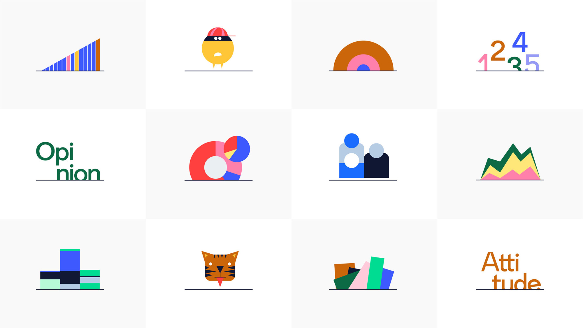
Aside from the odd emoji-like illustrations of the tiger and yellow bandit, the above is an interesting way of creating a unique visual language by building on the thin underline used in the monogram and treating it as an horizon from which things emerge, whether it’s charts or type — the approach looks fairly interesting in the application directly below.
We don’t see ourselves as just a tech company, but as a platform for enabling better human interactions. That’s why there’s a lot of room for stories in our new brand, which can be brought to life through genuine real-life photography, playful portraits or our new illustration style.
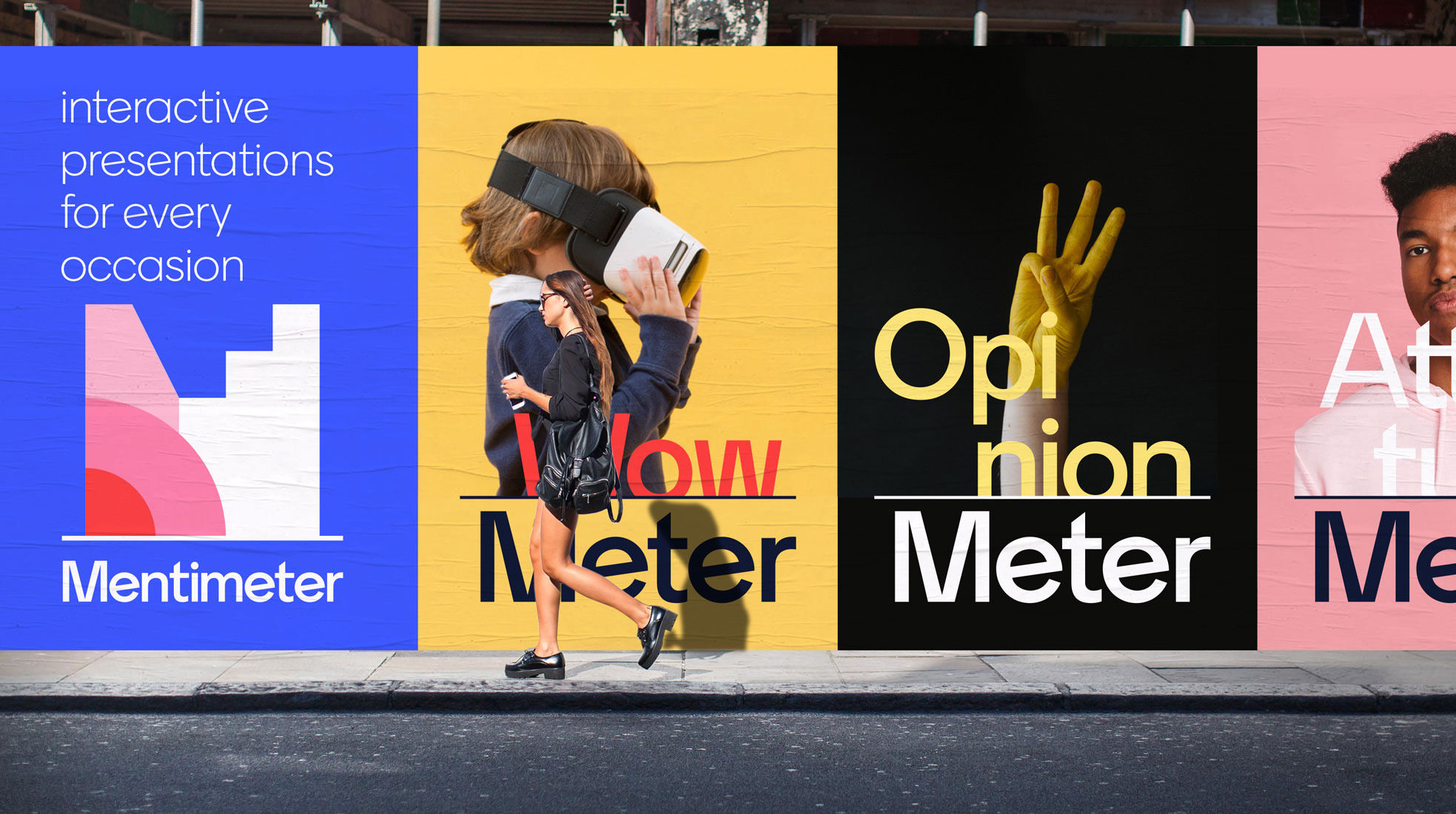
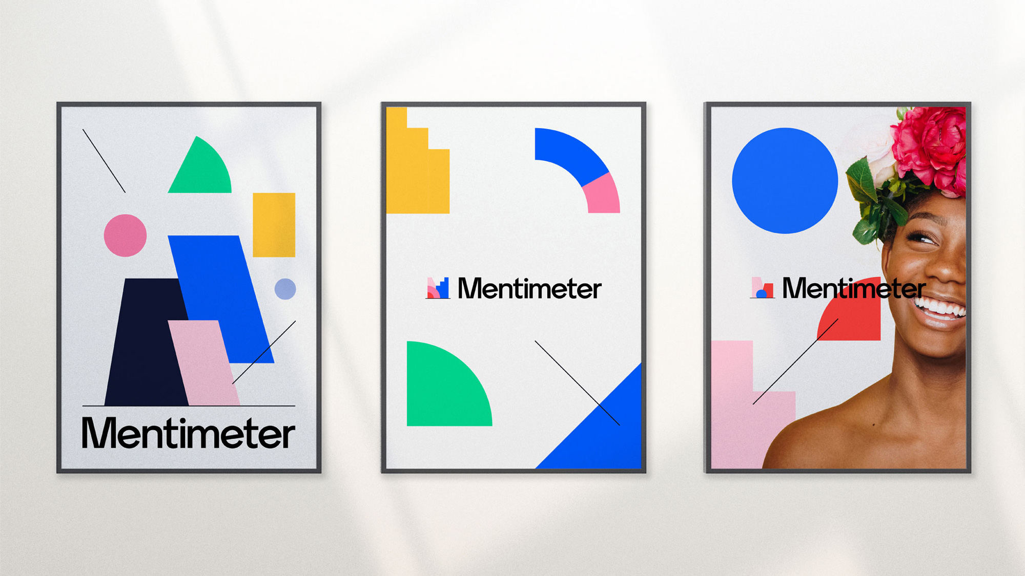
Not much in application though and the two images above are somewhat random… like, why is the person in the posters wearing a giant flower on their head? It has nothing to do with anything. Or why is the hand in the wild postings painted yellow? It’s just weird, BUT, visually, they are definitely engaging. Overall, this feels right for the product and creates an identity that feels, in a way, less passive and more interactive… a subtle reflection on what their software does.
 each year since publication began in 2006

 Новости Союза дизайнеров
Все о дизайне в Санкт-Петербурге.
Новости Союза дизайнеров
Все о дизайне в Санкт-Петербурге.